
✅
Demo to preview the plugin:
✅
Introduction
Create clear, interactive waterfall charts with customizable colors, dynamic data, and workflow-driven updates. Perfect for visualizing cumulative increases and decreases in financial reports, performance breakdowns, and analytical dashboards.
Key Features
- Waterfall Chart Display – Visualize cumulative increases and decreases in a clear, structured waterfall layout.
- Dynamic Data Support – Connect the chart to dynamic app data for automatic real-time updates.
- Subtotal Configuration – Define specific values (e.g., start and end) as subtotals within the chart.
- Customizable Colors – Adjust bar colors, including reversed palettes for positive and negative values.
- Label & Bar Controls – Customize labels and bar width for improved readability.
- Helpful Tooltips – Show detailed value information when hovering over chart elements.
- Responsive Layout – Automatically adapts to different screen sizes and devices.
- Export Options – Export chart data for sharing or external use.
Prerequisites
- A Bubble app with access to install plugins
- Basic understanding of Bubble dynamic data sources
- A dataset containing:
- A list of labels (e.g., months, categories, steps)
- A list of numeric values (positive and/or negative)
- Workflow knowledge if you plan to update the chart dynamically

How to setup
Step 1 – Install the Plugin
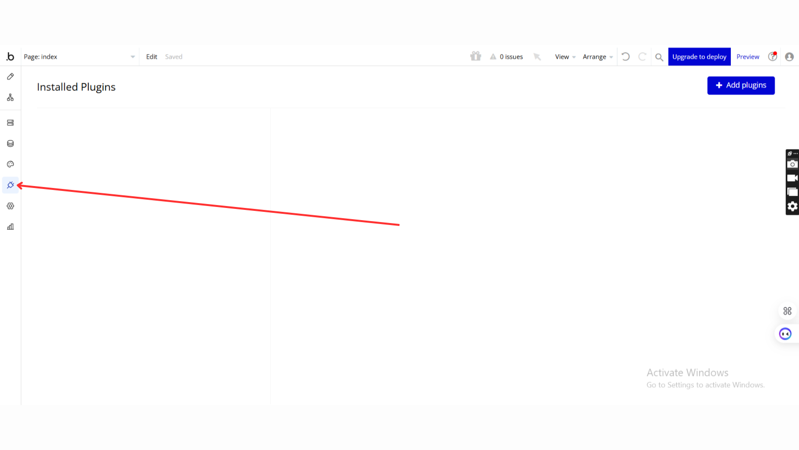
- Go to the Plugin Tab
- Open your Bubble Editor.
- Navigate to the Plugins tab on the left panel.
- Add Plugins
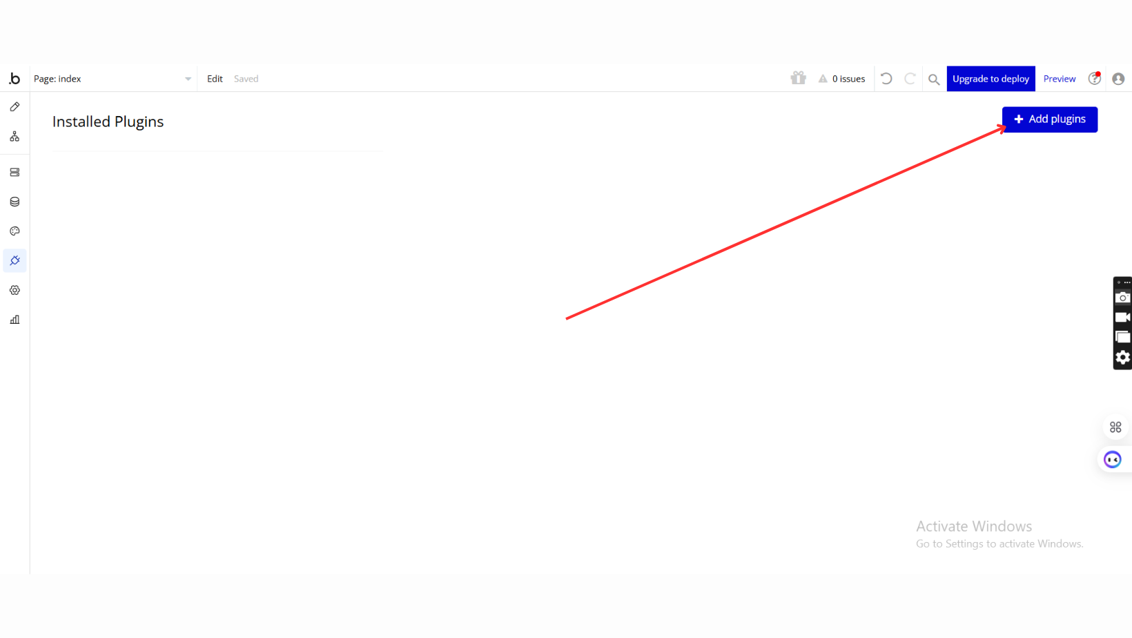
- Once in the Plugins tab, click the Add Plugins button.
- Search for the Plugin
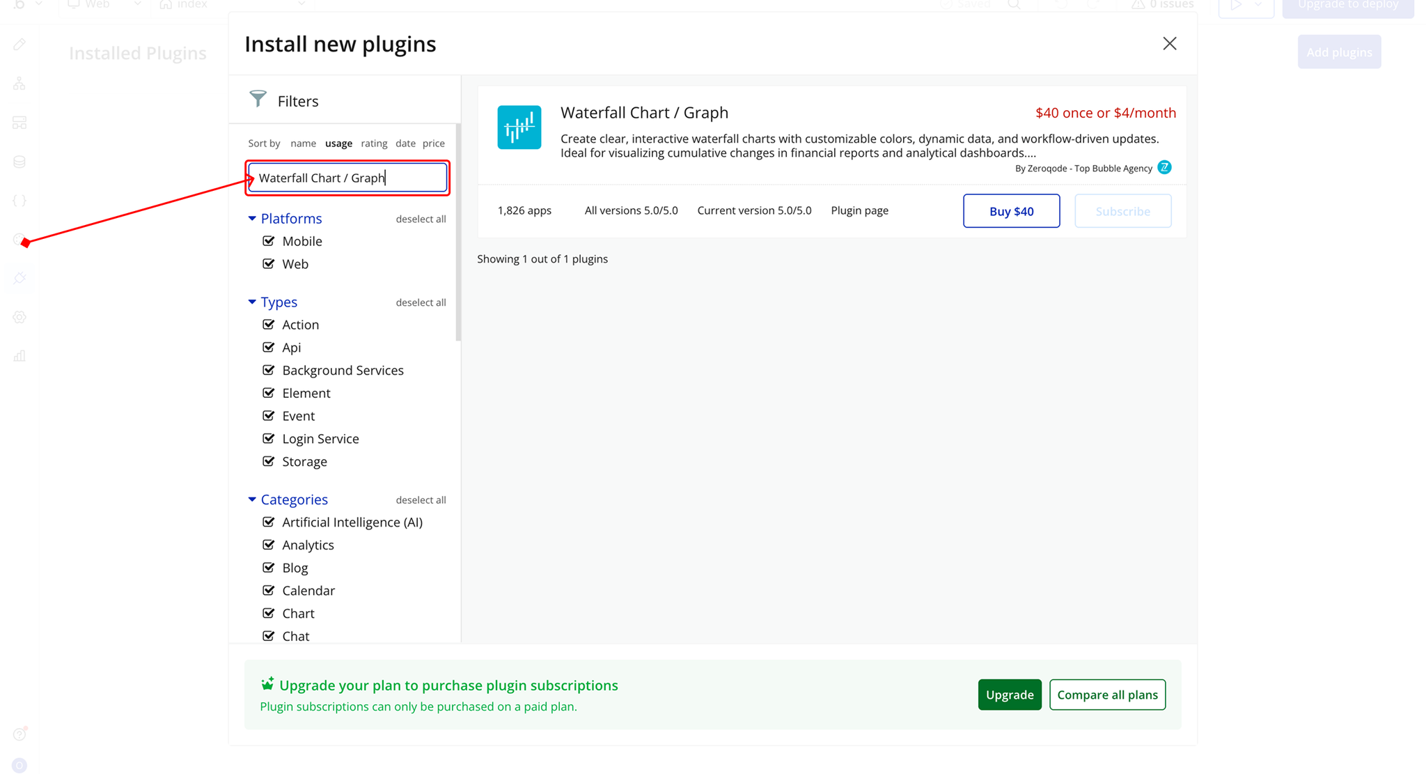
- Use the search bar to type Waterfall Chart / Graph.
- Locate the plugin in the search results.
- Install/Buy
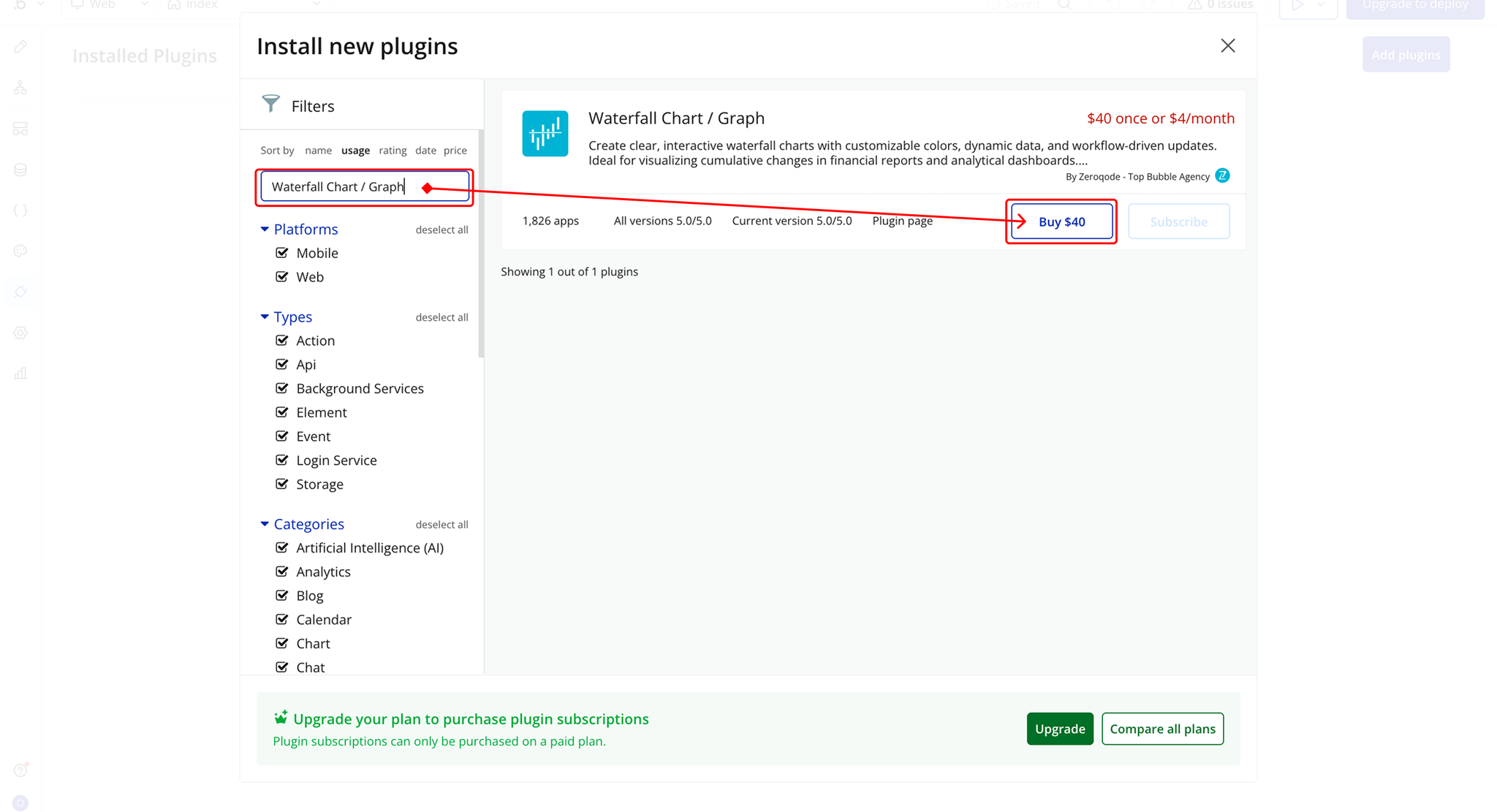
- If the plugin is free, click Install to add it to your application.
- For a paid plugin, click Buy and follow the purchase instructions.
- Payment Information (For Paid Plugins)
- If the plugin is a paid one, fill in your payment details and make payment.
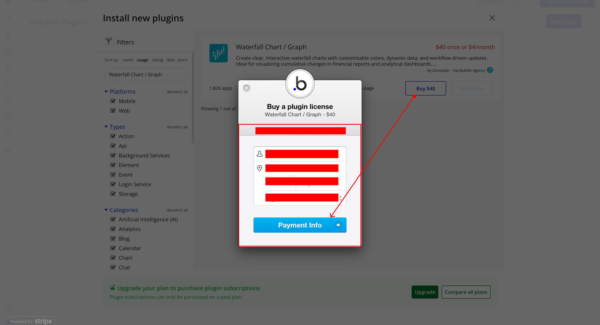
- Charges will be added to your Bubble billing account.
- Remember, if you unsubscribe from the plugin shortly after installation, charges will be prorated based on the days used.
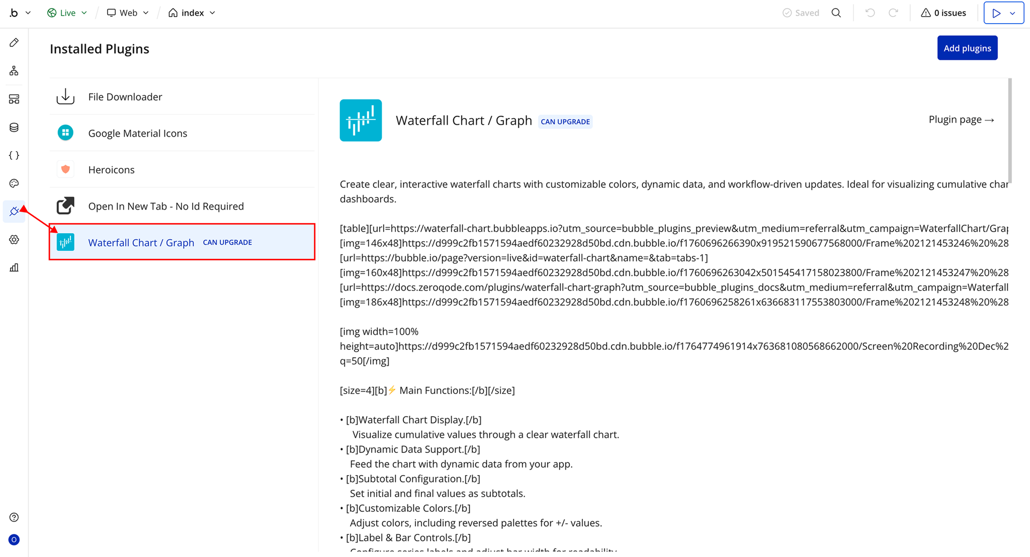
- Plugin Installed
- Once installed, the plugin will appear under the Installed Plugins list in your Bubble Editor.
Step 2 – Add the Plugin Element to Your Page
- Open the Design tab in your Bubble editor.
- Search for the Waterfall Chart element in the Elements panel.
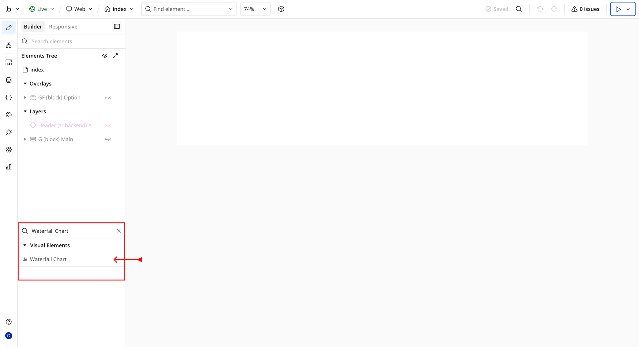
- You’ll see one option:
- Waterfall Chart
- Drag and drop the element onto your page.
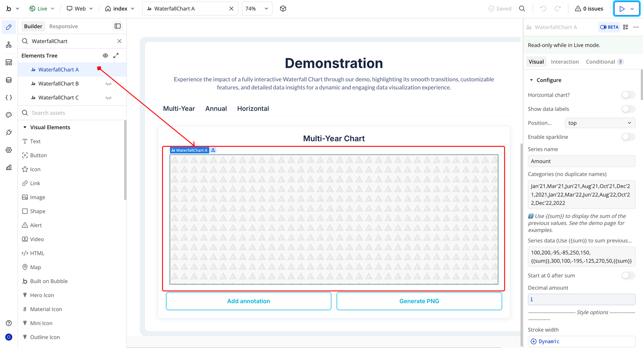
Plugin Element Properties - Waterfall Chart
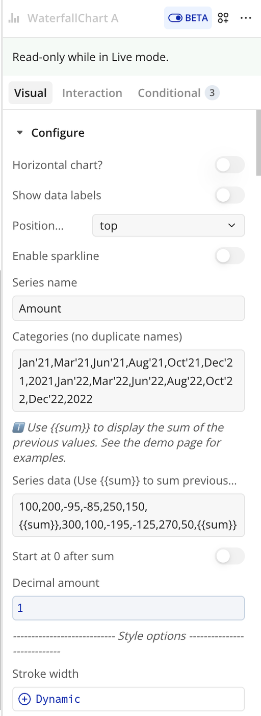
Fields
Chart Setup
Title | Description | Type |
Chart Setup | — | — |
Horizontal chart? | Displays the chart horizontally instead of vertically (crosshairs not supported in horizontal mode). | Checkbox (yes/no) |
Enable sparkline | Creates a compact chart by hiding axes, legend, and grid. | Checkbox (yes/no) |
Series name | Name of the data series shown in legend and tooltips. | Text (optional) |
Categories (no duplicate names) | Comma-separated X-axis labels. Duplicate names are not allowed. | Text |
Series data (Use {{sum}} to sum previous values) | Comma-separated Y-axis values. Use {{sum}} for cumulative totals. | Text |
Start at 0 after sum | Resets cumulative calculation after {{sum}}. | Checkbox (yes/no) |
Decimal amount | Number of decimal places for values. | Number (optional) |
Bar Appearance
Title | Description | Type |
Bar Appearance | — | — |
Stroke width | Border thickness of bars. | Number (optional) |
Dash width | Creates dashed borders when above 0. | Number (optional) |
Column width | Width of bars (0–100). | Number |
Bar height | Height of bars in horizontal mode (0–100). | Number |
Border radius | Rounds the corners of bars. | Number |
Color style | Bar color type: solid or gradient. | Dropdown |
Chart color | Primary bar color. | Text |
Fill color opacity | Opacity of bar fill (0–1). | Number |
Chart – Gradient to color | Secondary gradient color. | Text |
Gradient type | Direction of gradient (horizontal/vertical). | Dropdown (optional) |
Color list | Comma-separated colors for individual bars. | Text (optional) |
Negative Values
Title | Description | Type |
Negative Values | — | — |
Color negative values differently | Enables custom styling for negative values. | Checkbox (yes/no) |
Negative – Chart color | Color for negative bars. | Color |
Negative – Gradient to color | Gradient color for negative bars. | Color |
Drop Shadow
Title | Description | Type |
Drop Shadow | — | — |
Enable dropshadow | Adds shadow effect to bars. | Checkbox (yes/no) |
Dropshadow color | Color of the shadow. | Color (optional) |
Dropshadow blur | Blur intensity (0–100). | Number (optional) |
Dropshadow vertical offset | Vertical offset (px). | Number (optional) |
Dropshadow horizontal offset | Horizontal offset (px). | Number (optional) |
Dropshadow opacity | Opacity of shadow (0–1). | Number (optional) |
Tooltip
Title | Description | Type |
Tooltip | — | — |
Show tooltip | Enables tooltip on hover. | Checkbox (yes/no) |
Show category on tooltip | Displays category inside tooltip. | Checkbox (yes/no) |
Enable fixed tooltip | Fixes tooltip position. | Checkbox (yes/no) |
Tooltip style | Tooltip theme (light/dark). | Dropdown |
Custom Tooltip ID | ID of a custom Bubble tooltip element. | Text (optional) |
Custom tooltip Y offset | Vertical offset for custom tooltip. | Number |
Grid Settings
Title | Description | Type |
Grid Settings | — | — |
Show grid | Displays grid lines. | Checkbox (yes/no) |
Grid color | Color of grid lines. | Color |
Grid stroke dash array | Dash pattern for grid lines. | Text (optional) |
Show x-axis grid lines | Shows vertical grid lines. | Checkbox (yes/no) |
Show y-axis grid lines | Shows horizontal grid lines. | Checkbox (yes/no) |
Grid padding top | Top padding (px). | Number |
Grid padding bottom | Bottom padding (px). | Number |
Grid padding left | Left padding (px). | Number |
Grid padding right | Right padding (px). | Number |
X-Axis and Y-Axis
Title | Description | Type |
X-Axis | — | — |
X-axis font color | Color of X-axis labels. | Color |
X-axis font size | Font size of X-axis labels. | Number |
Show x-axis border | Displays X-axis line. | Checkbox |
X-axis border height | Thickness of border. | Number |
X-axis border color | Border color. | Color |
Show x-axis ticks | Displays ticks. | Checkbox |
X-axis ticks height | Height of ticks. | Number |
X-axis ticks color | Color of ticks. | Color |
Y-Axis | — | — |
Y-axis font color | Color of Y-axis labels. | Color |
Y-axis font size | Font size of Y-axis labels. | Number |
Show y-axis ticks | Displays ticks. | Checkbox |
Y-axis ticks color | Color of ticks. | Color |
Show y-axis border | Displays Y-axis line. | Checkbox |
Y-axis border color | Color of border. | Color |
Axis Formatting
Title | Description | Type |
Axis Formatting | — | — |
Show Y-axis labels | Displays Y-axis labels. | Checkbox |
Show X-axis labels | Displays X-axis labels. | Checkbox |
X-axis label offset | Vertical offset. | Number |
X-axis labels min height | Minimum label height. | Number (optional) |
X-axis labels max height | Maximum label height. | Number |
Y-axis prefix | Prefix for values (e.g., $). | Text |
Y-axis suffix | Suffix for values (e.g., %). | Text |
Y axis min value | Minimum Y value. | Number |
Y axis max value | Maximum Y value. | Number |
Tick amount X-axis | Number of ticks. | Number |
Tick amount Y-axis | Number of ticks. | Number |
Reverse Y-axis | Reverses direction. | Checkbox |
Crosshair
Title | Description | Type |
Crosshair | — | — |
Show x-axis tooltip | Enables X-axis crosshair. | Checkbox |
X-axis crosshair color | Color of crosshair. | Color |
X-axis crosshair line width | Thickness. | Number |
X-axis crosshair dash array | Dash pattern. | Number |
Crosshair background color | Background color. | Color |
Show y-axis tooltip | Enables Y-axis crosshair. | Checkbox |
Y-axis crosshair color | Color. | Color |
Y-axis crosshair dash array | Dash pattern. | Number |
Y-axis crosshair line width | Thickness. | Number |
Legend
Title | Description | Type |
Legend | — | — |
Show legend | Displays legend. | Checkbox |
Legend position | Position (top, bottom, left, right). | Dropdown |
Legend font color | Text color. | Text |
Legend font size | Font size. | Number |
X offset legend | Horizontal offset. | Number |
Y offset legend | Vertical offset. | Number |
Behavior
Title | Description | Type |
Behavior | — | — |
Do not refresh chart | Prevents auto refresh. | Checkbox |
Auto format large numbers | Formats numbers (e.g., 1200 → 1.2k). | Checkbox |
Enable animation | Enables animation. | Checkbox |
Animation speed | Duration in ms. | Number |
Reset hover state on mouse leave | Clears hover states. | Checkbox |
Enable color change on hover | Changes bar color on hover. | Checkbox |
Data Labels
Title | Description | Type |
Data Labels | — | — |
Show data labels | Displays values on bars. | Checkbox |
Position datalabels | Position: top, center, bottom. | Dropdown |
Data label font size | Font size. | Number |
Data label font color | Font color. | Color |
Decimal separator | Character for decimals. | Text |
Thousand separator | Character for thousands. | Text |
Element Actions
Remove Annotation
Removes a specific annotation from the chart based on its identifier or configuration. Use this action when you want to delete a single annotation without clearing all annotations.
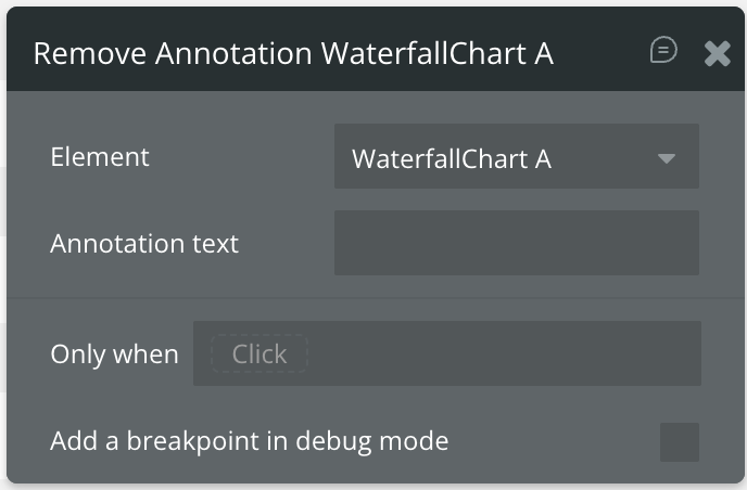
Title | Description | Type |
Annotation text | The exact text of the annotation label used to identify and remove the specific annotation from the chart. | Text |
Clear Annotations
Removes all existing Y-axis annotations from the chart, including lines, ranges, and labels previously added using the annotation action.
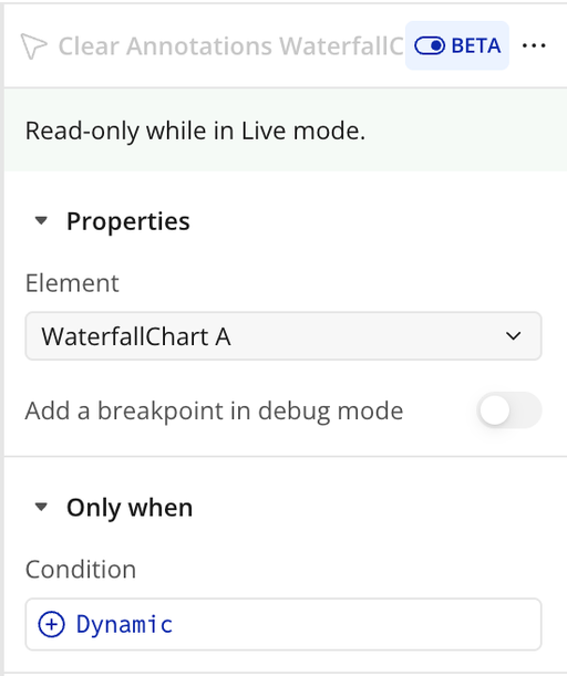
Generate PNG URL
Generates a downloadable PNG image of the current chart and returns a URL that can be used to download, share, or store the image externally.
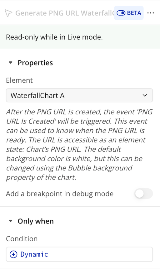
Add Y-axis Annotation
Adds a horizontal annotation line to the chart at a specified Y-axis value. Useful for highlighting targets, thresholds, averages, or important reference points.
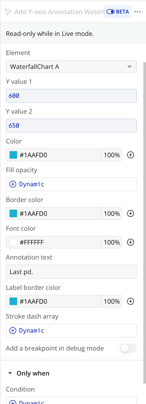
Title | Description | Type |
Y value 1 | The starting Y-axis value where the annotation begins. Defines the position of the line or highlighted range. | Number |
Y value 2 | Optional ending Y-axis value. If provided, a highlighted range is created between Y value 1 and Y value 2. | Number (optional) |
Color | Background color of the annotation range (when using two Y values). | Color |
Fill opacity | Opacity of the annotation background (0–1). | Number |
Border color | Color of the annotation line or range border. | Color |
Font color | Color of the annotation label text. | Color |
Annotation text | Text displayed alongside the annotation (e.g., “Target”, “Threshold”). | Text |
Label border color | Border color of the annotation label container. | Color |
Stroke dash array | Defines the dash pattern of the annotation border (0 = solid line). | Number |
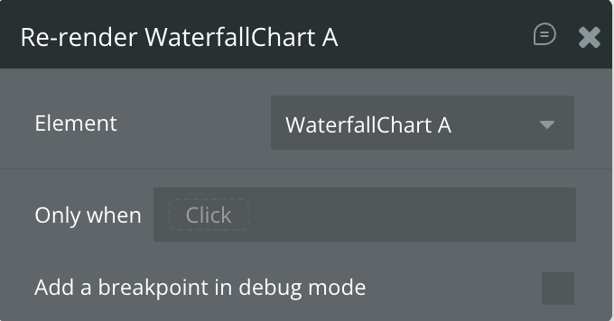
Re-render
Manually refreshes and redraws the chart using the current settings and data. Use this action when automatic refresh is disabled or when you want to force the chart to update after dynamic changes.
Exposed States
Title | Description | Type |
Selected label | The category label of the currently selected (clicked) data point. | Text |
Selected value | The numeric value of the currently selected (clicked) data point. | Number |
Is loaded? | Indicates whether the chart has fully loaded and is ready for interaction. | Checkbox (yes/no) |
Selected index value | The index position (starting from 0) of the currently selected data point. | Number |
Last selected label on hover | The category label of the most recently hovered data point. | Text |
Last selected value on hover | The numeric value of the most recently hovered data point. | Number |
PNG URL | The generated PNG image URL of the chart (available after running the “Generate PNG URL” action). | Text |
Last selected index on hover | The index position (starting from 0) of the most recently hovered data point. | Number |
Element Events
Title | Description |
Data point is clicked | Triggered when a user clicks on a chart data point. Use this event to access the selected label, value, and index states. |
PNG URL Is Created | Triggered after the chart PNG image has been successfully generated and the PNG URL state is available. |
Workflow example
Workflow 1: Clear Chart Annotations
- Place the Waterfall Chart plugin element on the page.
- Add a Button labeled Clear Annotation.
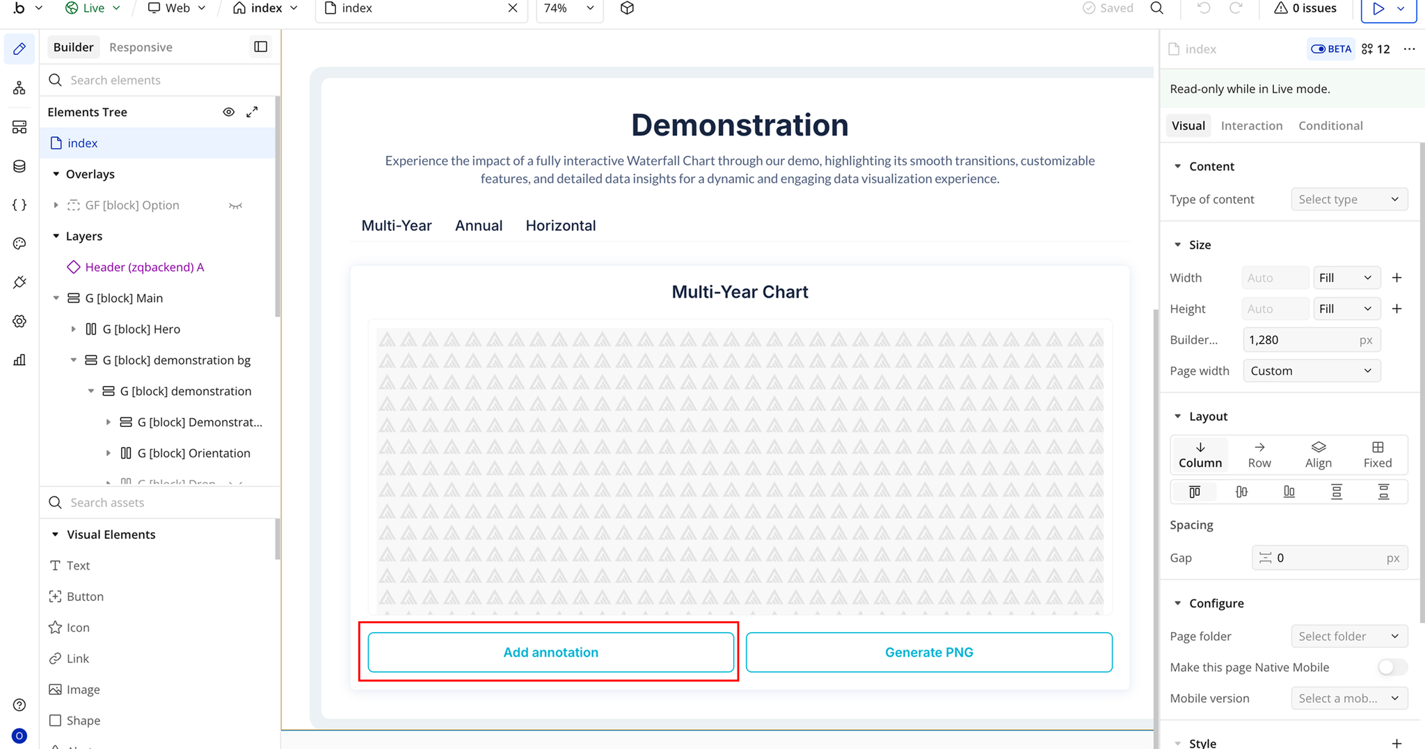
- Create a workflow: When Clear Annotation Button is clicked.
- Add the plugin action Clear Annotations A Waterfall Chart.
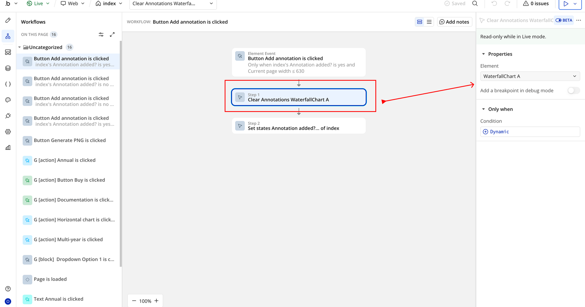
- In the Element field, select the Waterfall Chart element placed on the page.
Workflow 2: Generate Chart as PNG
- Add a Button labeled Generate PNG.
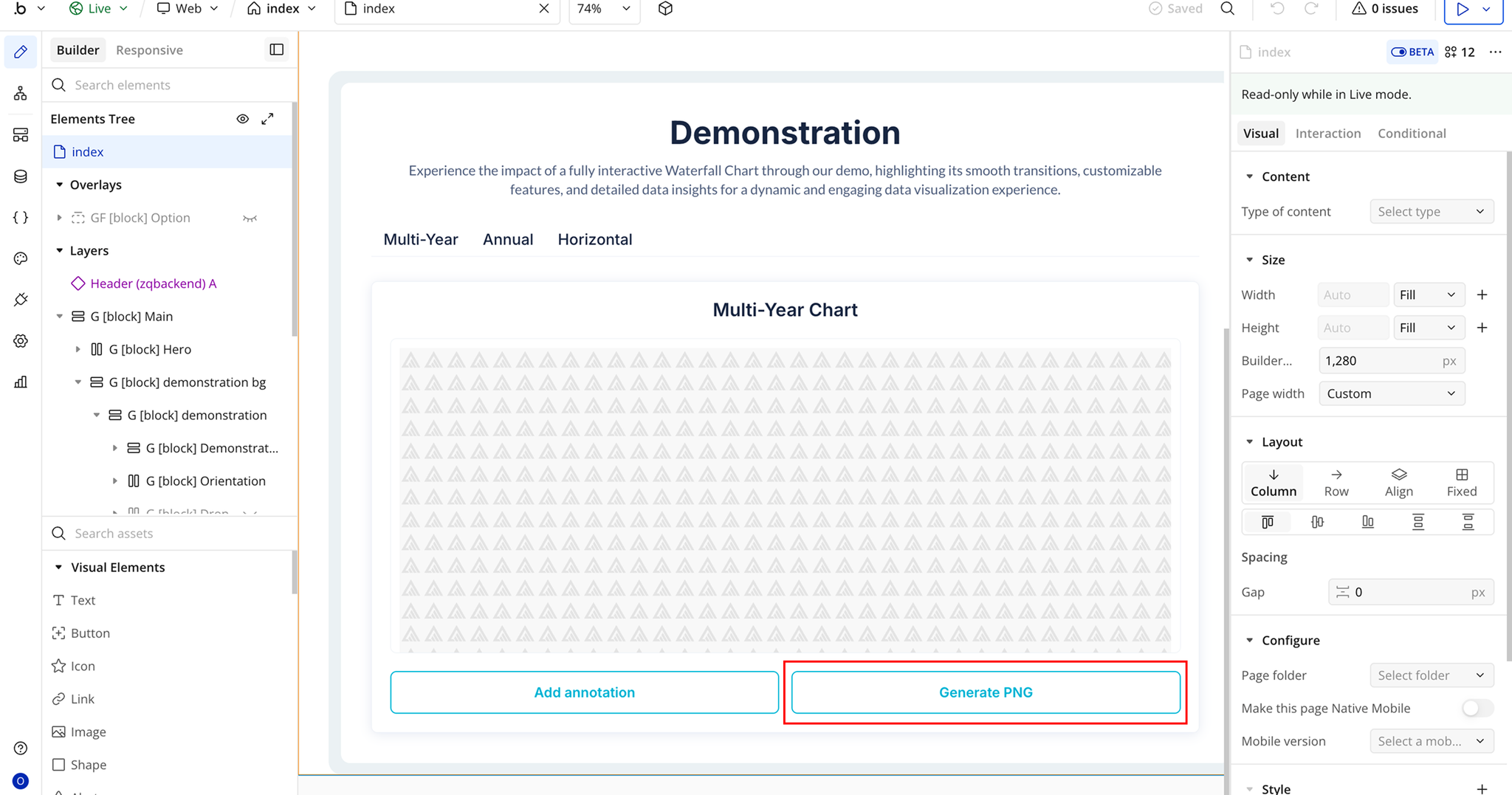
- Create a workflow: When Generate PNG Button is clicked.
- Add the plugin action Generate PNG URL A Waterfall Chart.
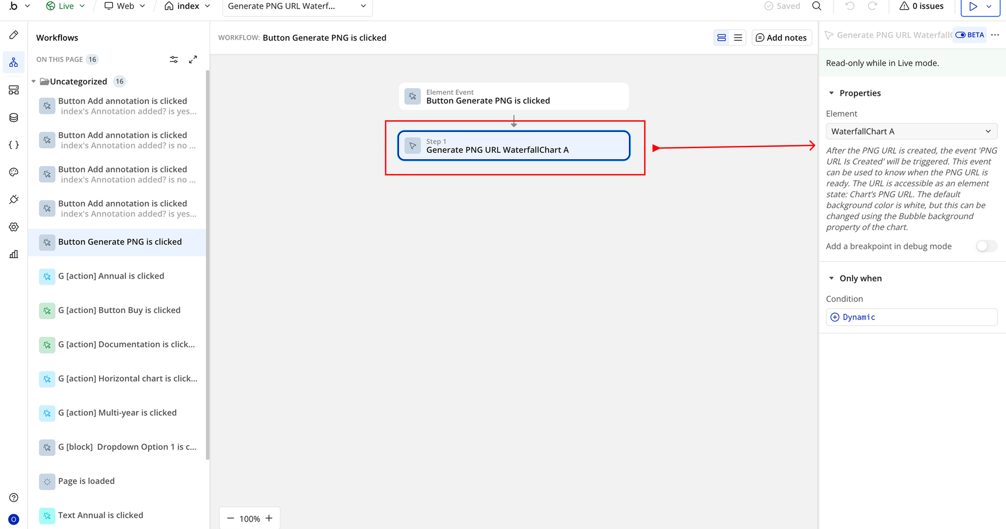
- In the Element field, select the Waterfall Chart element placed on the page.

Changelogs
Update 14.08.26 - Version 3.1.0
- Bubble Plugin Page Update (Sorting).
Update 26.03.26 - Version 3.0.0
- Bubble Plugin Page Update (Docs).
Update 04.12.25 - Version 2.1.0
- Bubble Plugin Page Update (Description and GIF).
Update 02.10.25 - Version 2.0.0
- Bubble Plugin Page Update (GIF).
Update 09.07.25 - Version 1.9.0
- Bubble Plugin Page Update (Logo).
Update 20.06.25 - Version 1.8.0
- Bubble Plugin Page Update (Logo).
Update 14.11.24 - Version 1.7.0
- Minor update (Marketing update).
Update 01.11.24 - Version 1.6.0
- Minor update (Marketing update).
Update 09.10.24 - Version 1.5.0
- Acquired by Zeroqode.
Update 14.03.24 - Version 1.4.0
- Fixed a bug regarding the Thousand Separator + Added the "Auto Format Large Numbers" feature.
Update 20.11.23 - Version 1.3.2
- Patch.
Update 06.11.23 - Version 1.3.1
- Upgraded to the latest version of ApexCharts.
Update 06.11.23 - Version 1.3.0
- Added border radius property.
Update 02.11.23 - Version 1.2.2
- Description update.
Update 02.11.23 - Version 1.2.1
- Improvements.
Update 25.07.23 - Version 1.2.0
- Improvements.
Update 28.03.23 - Version 1.1.0
- You can now supply a comma separated 'Color list'.
Update 20.01.23 - Version 1.0.0
- Launch.
Update 11.01.23 - Version 0.0.2
- Improvements.
Update 11.01.23 - Version 0.0.1
- Pre-launch.