
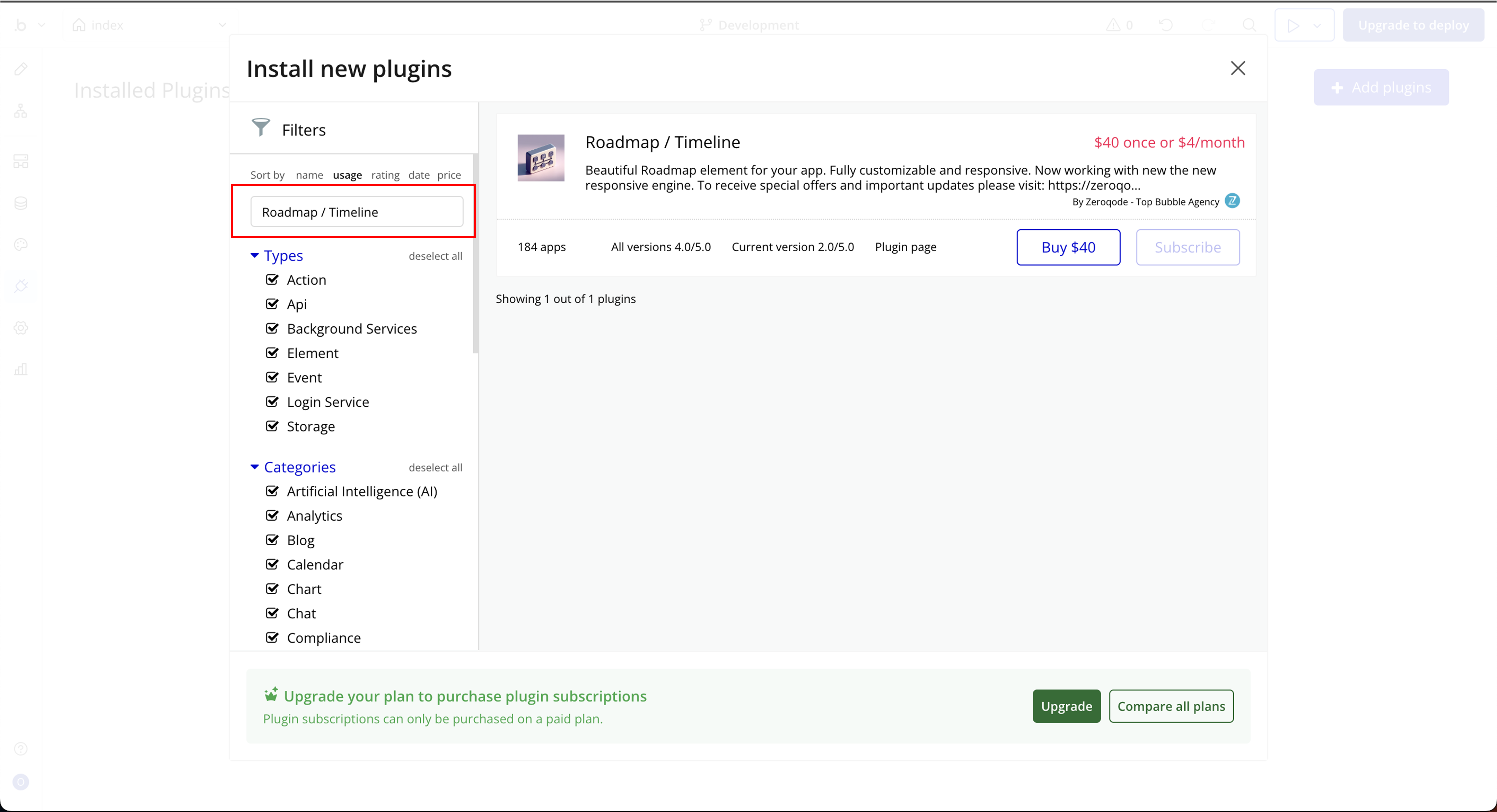
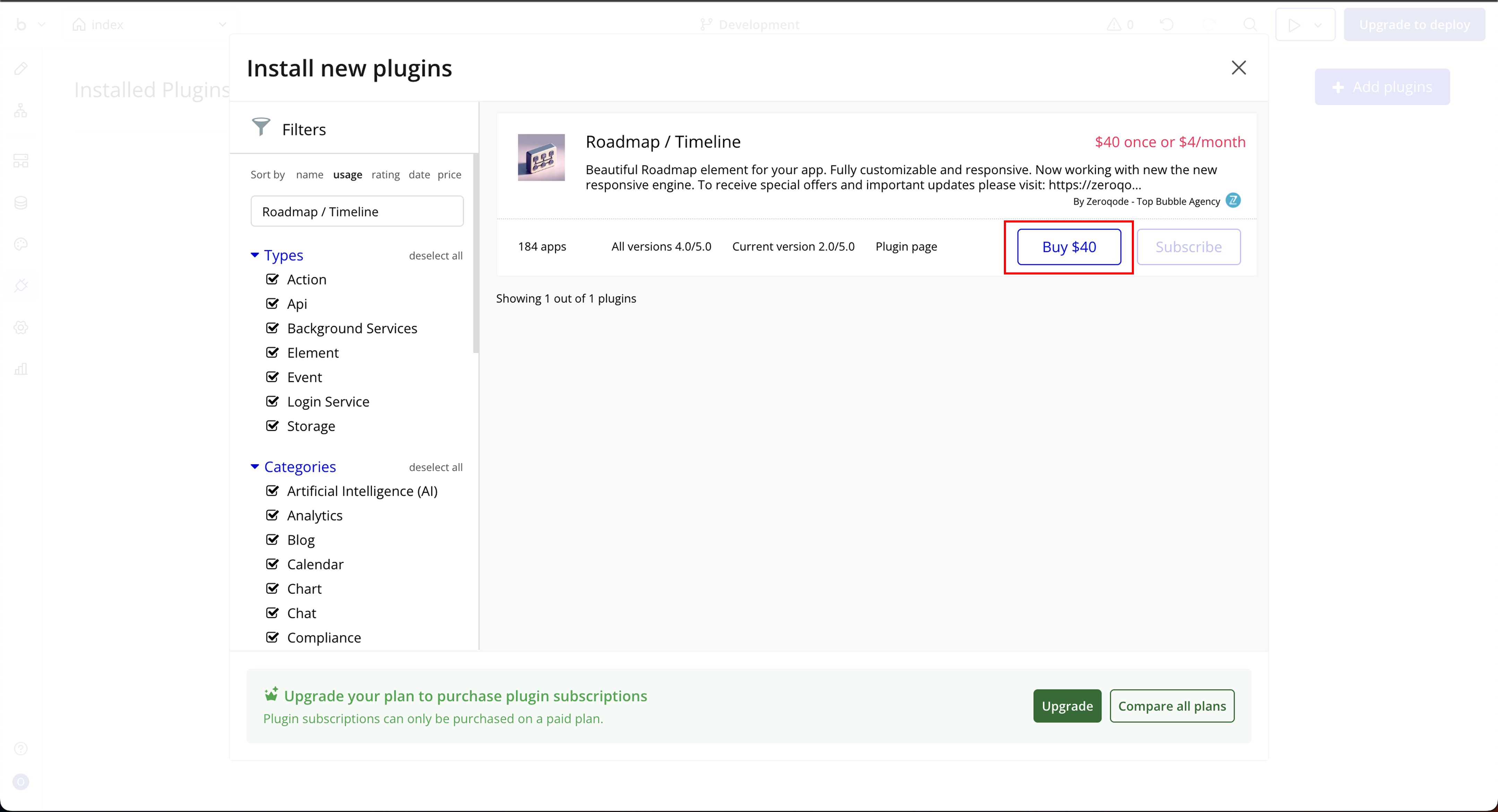
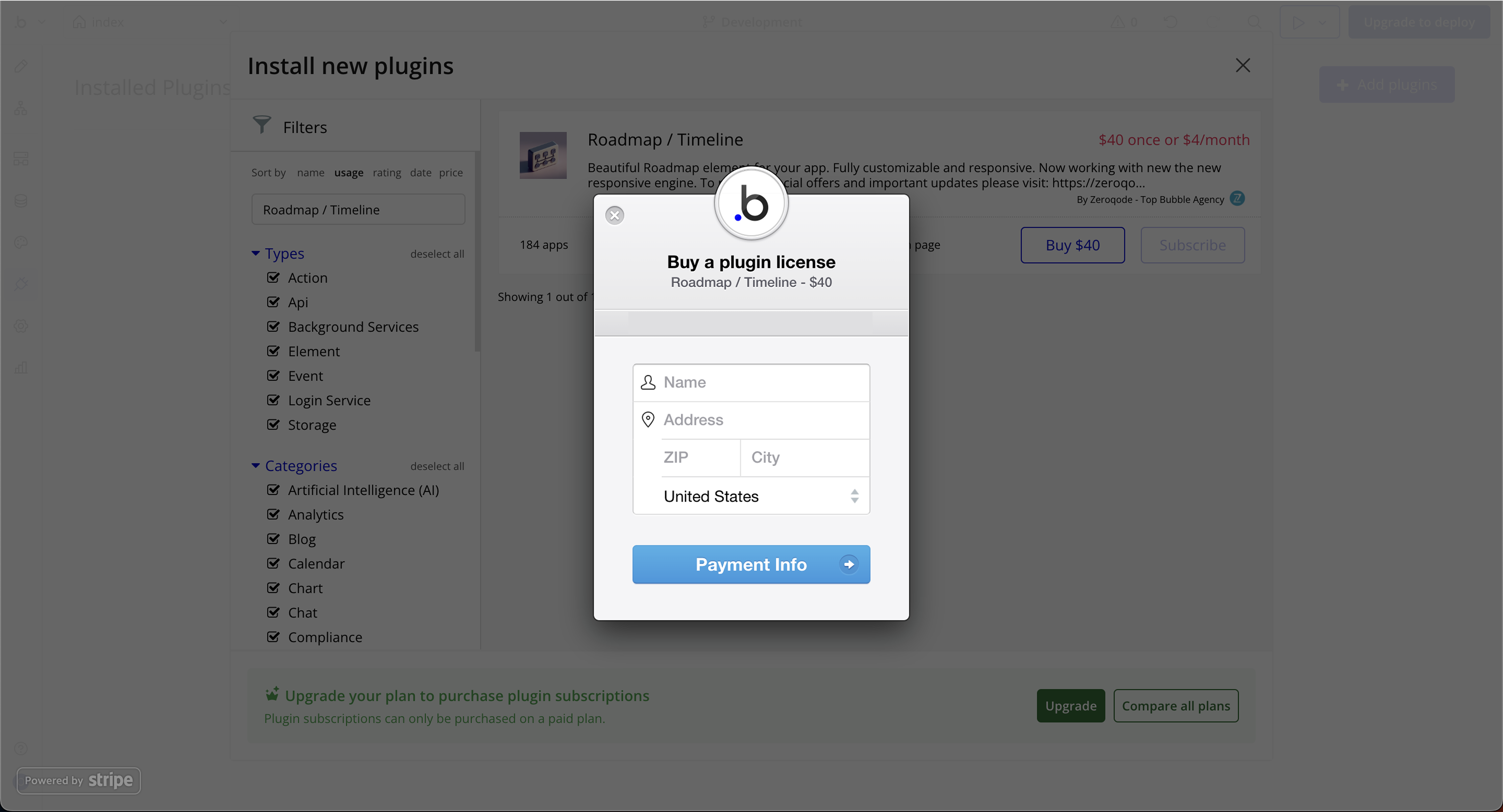
Link to the plugin page:
Demo to preview the plugin:
Live Demo:
Introduction
The Roadmap plugin is a fully customizable and responsive element that allows you to visually display a timeline of milestones, steps, or events. It is perfect for showcasing product roadmaps, project progress, or any step-by-step process in your Bubble app.
Key Features
Prerequisite
- Bubble Account: An active Bubble.io account is required to install and use the plugin.
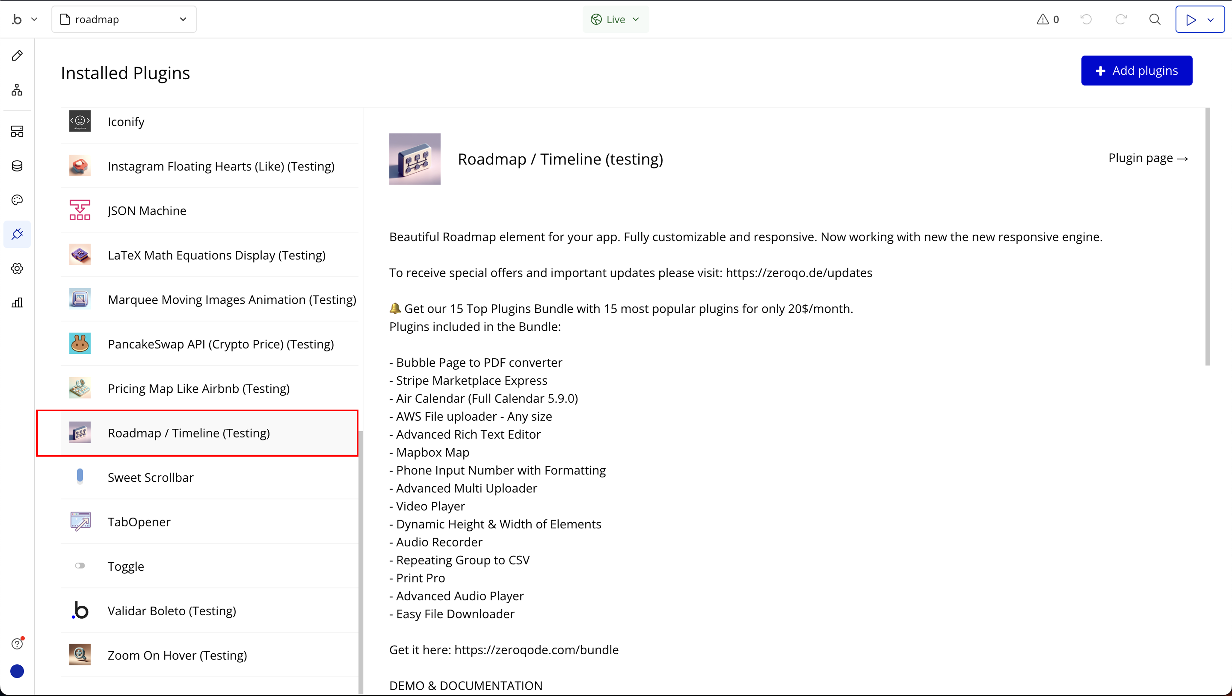
- Plugin Installation: The plugin can be installed directly from the Zeroqode Plugin Store or from the Plugins section of your Bubble Editor.
- Familiarity with Bubble Workflows: Basic knowledge of Bubble workflows is required to dynamically control progress values and actions.

How to setup
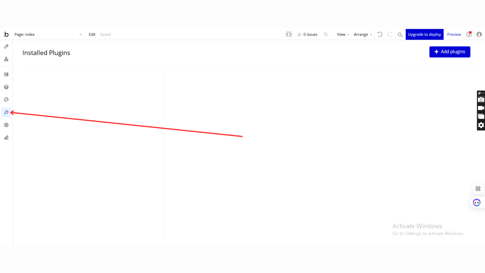
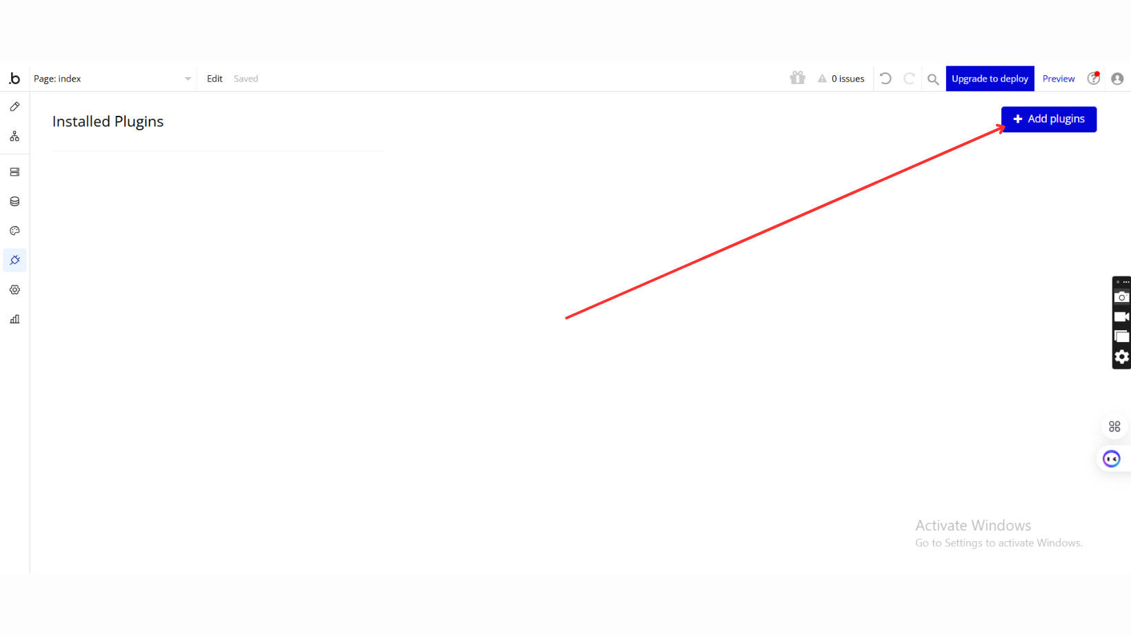
Step 1: Installation
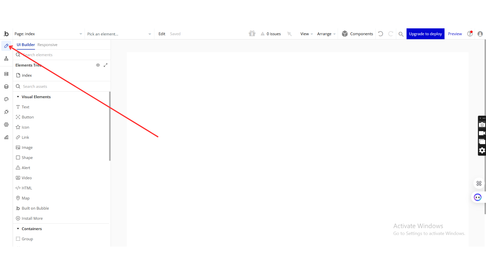
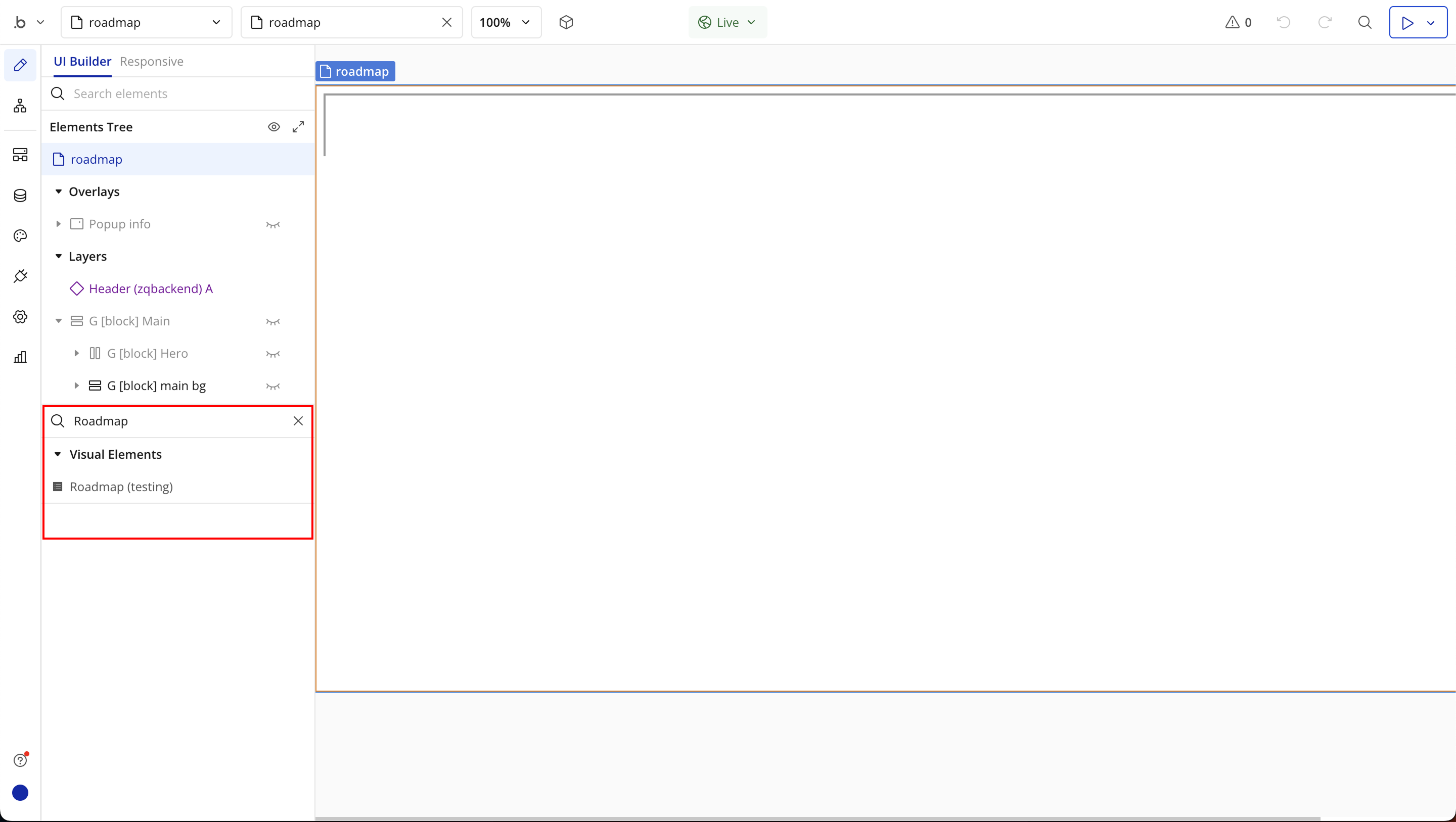
Step 2: Place the Element
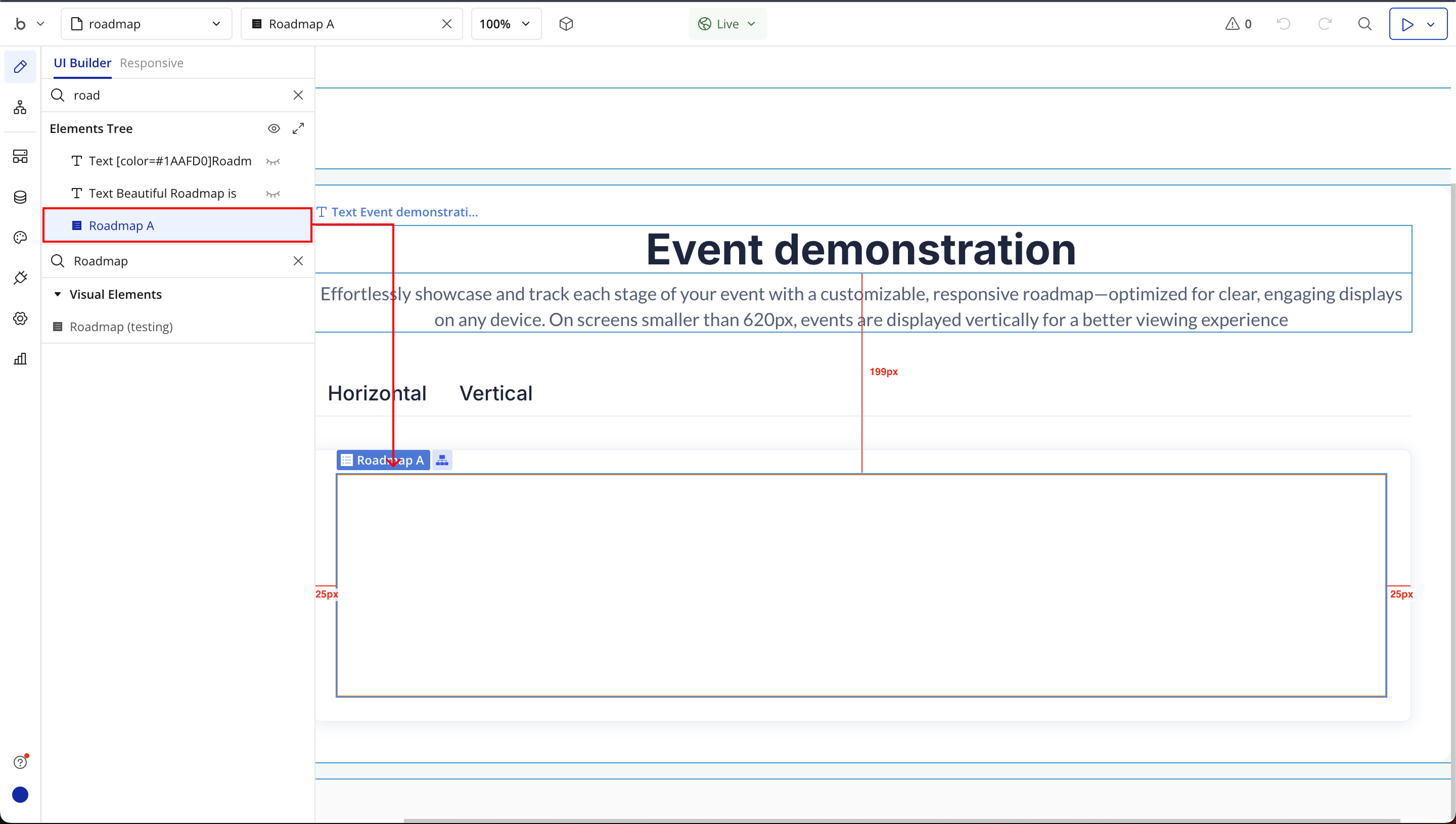
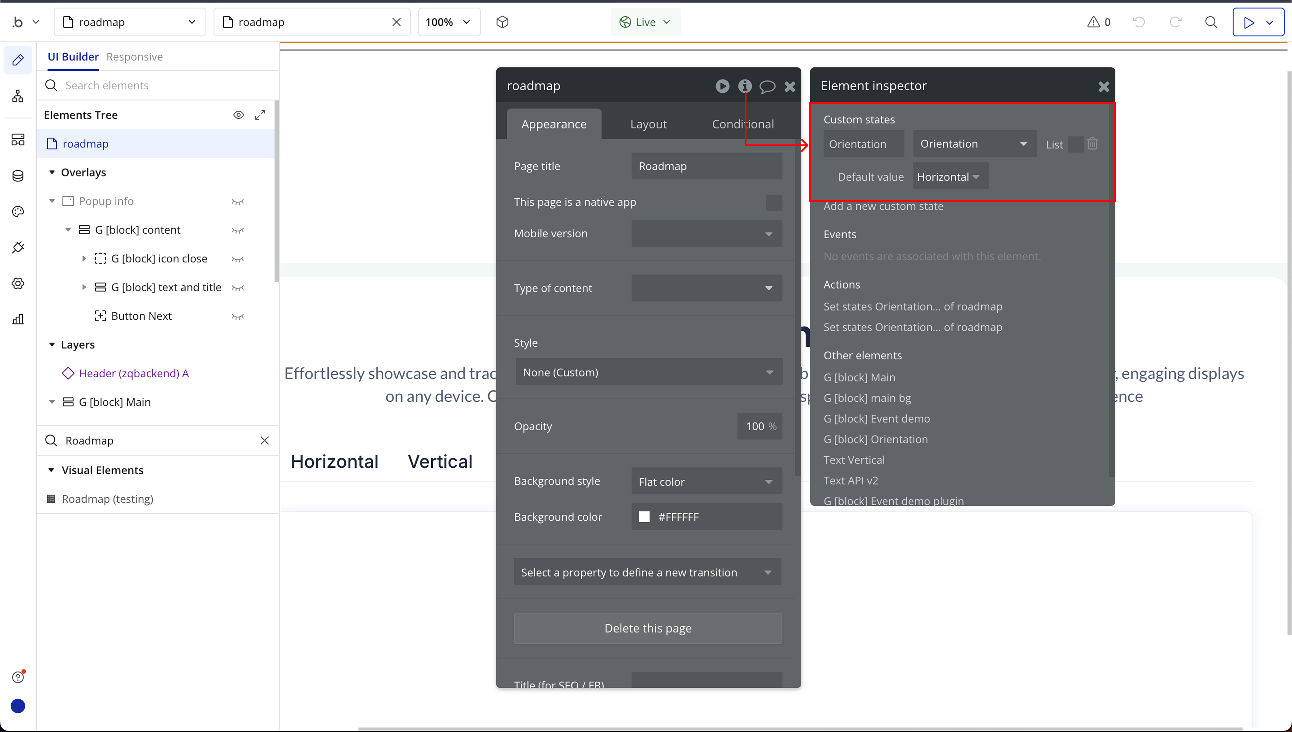
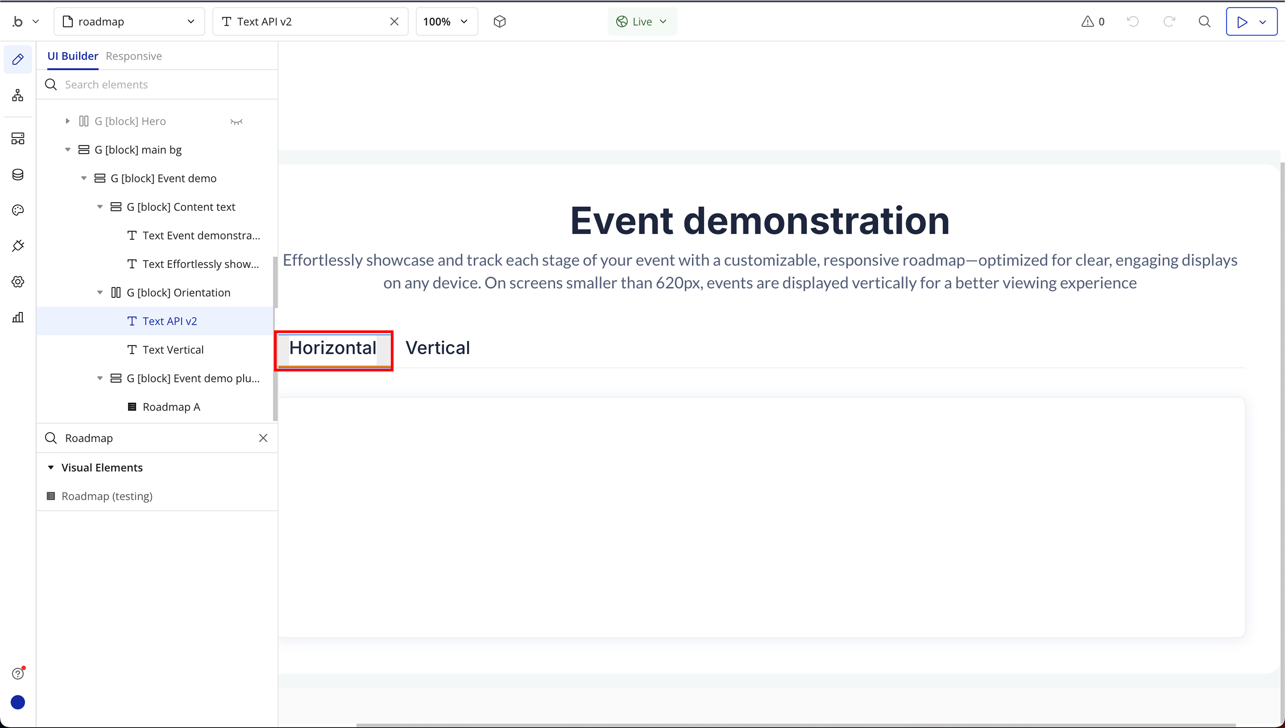
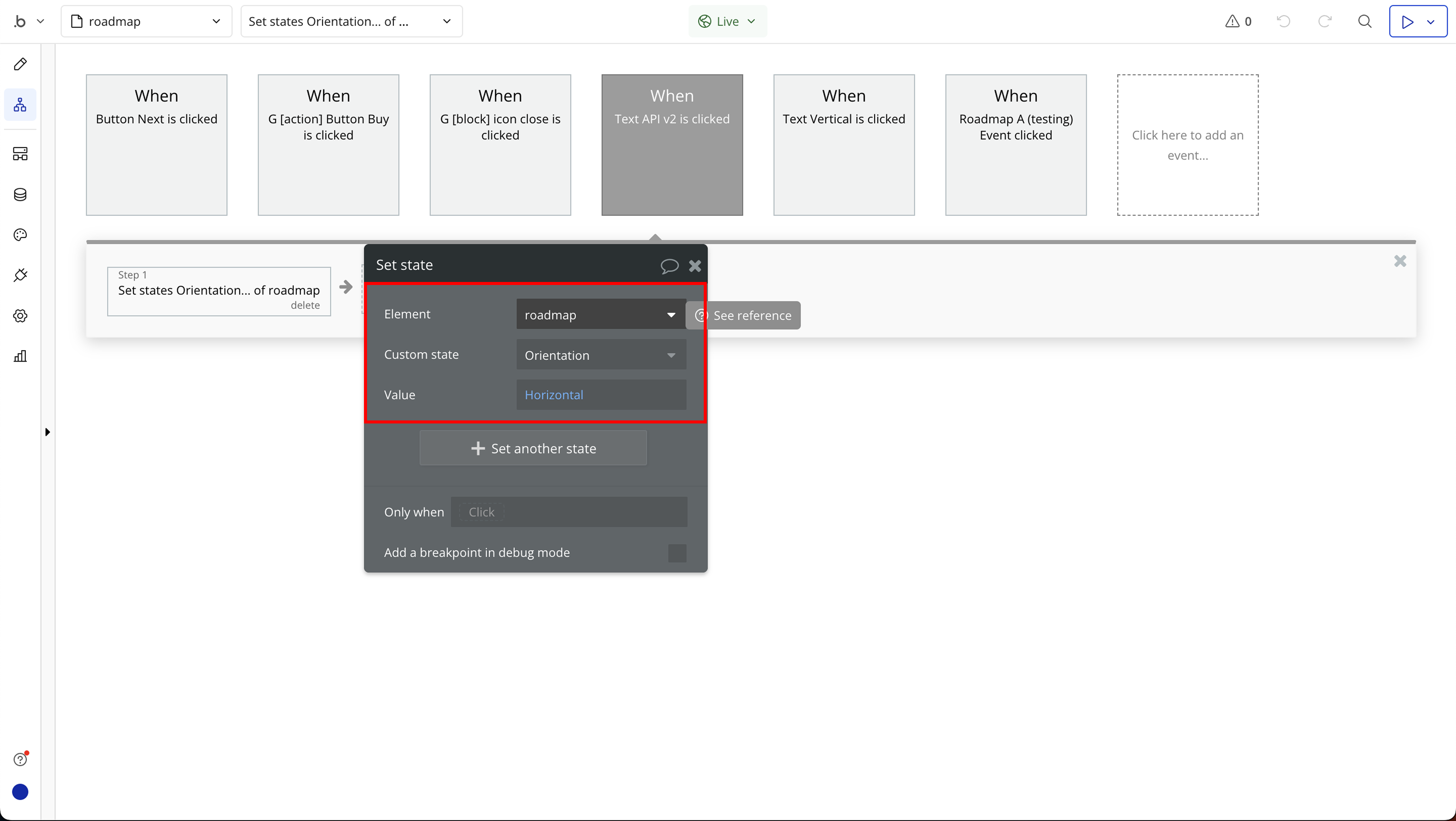
Step 3: Setting Up Orientation (Vertical/Horizontal)

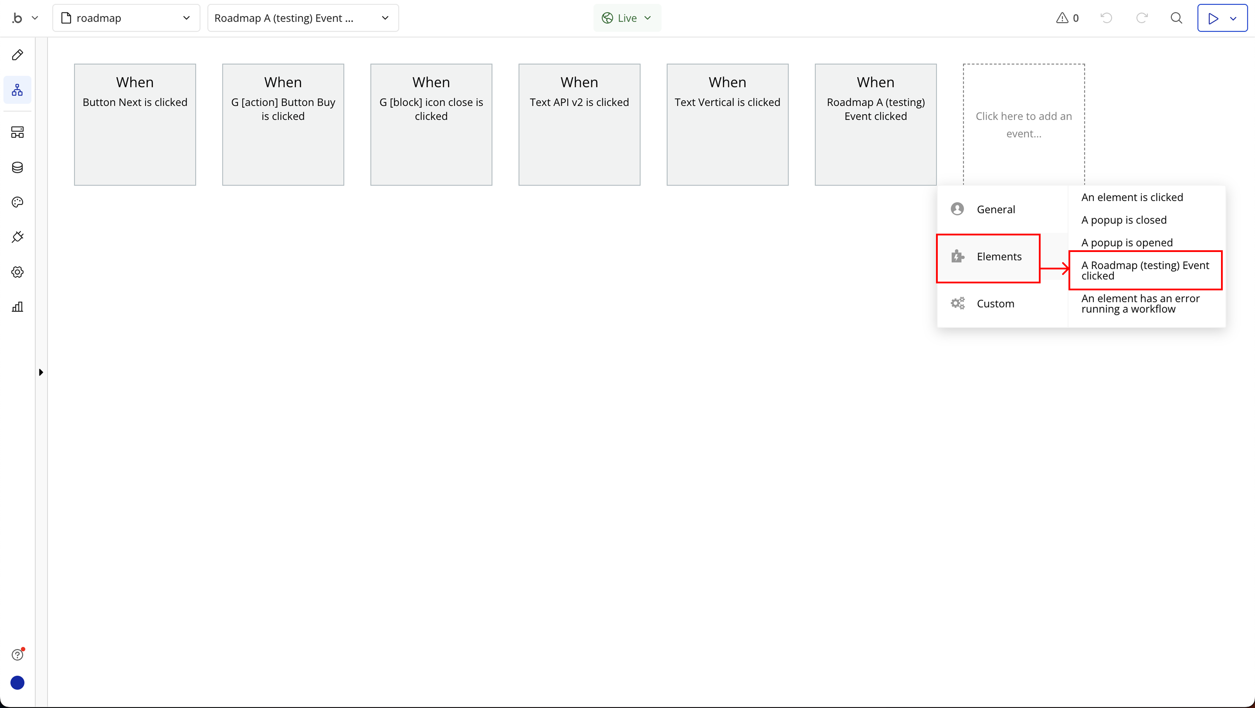
Step 4: Handling Click Events on the Roadmap
Plugin Element Properties
Roadmap
Fields:
Title | Description | Type |
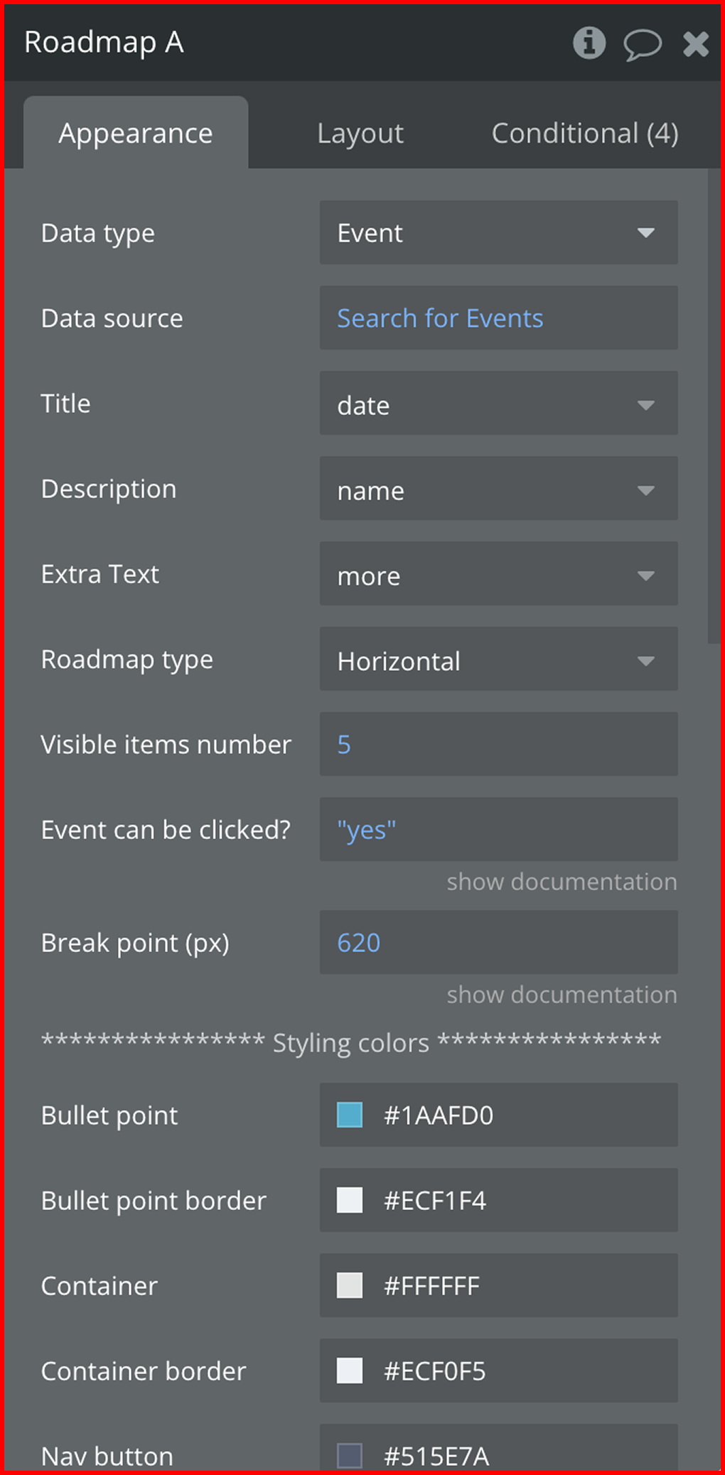
Data type | The database type that contains the roadmap items | Any thing with fields |
Data source | The actual list of items to display on the roadmap | Any thing |
Title | The field from the data type that represents the milestone’s name | Filed of Data type, represent Text, image or file |
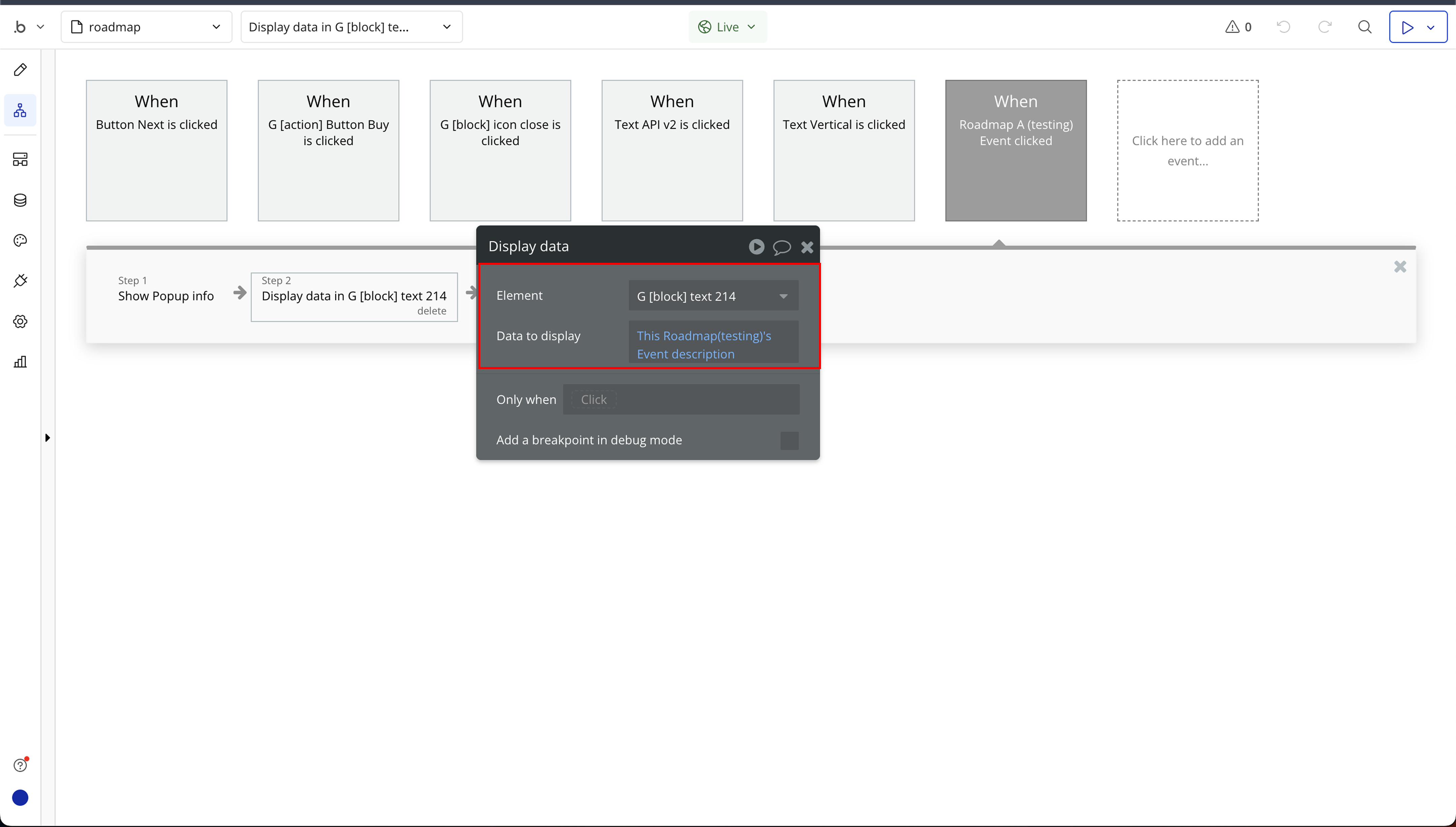
Description | The field that holds additional details about the milestone | Filed of Data type, represent Text, image or file |
Extra Text | An optional field for additional information related to each milestone | Filed of Data type, represent Text, image or file (optional) |
Roadmap type | Available options: Vertical, Horizontal | Dropdown |
Visible items number | Defines how many roadmap items should be visible at a time. | Number |
Event can be clicked? | Trigger a workflow using ‘Roadmap Event Clicked’ | Checkbox (yes/no) |
Break point (px) | Minimum width to collapse | Number |
**************** Styling colors **************** | ||
Bullet point | The color of the milestone markers (bullets). | Color |
Bullet point border | The color of the border around the milestone markers. | Color |
Container | The background color of the roadmap container. | Color |
Container border | The color of the border around the roadmap container. | Color |
Nav button | The color of the navigation arrows/buttons. | Color |
Line | The color of the line connecting the milestones. | Color |
**************** Font Styling **************** | ||
Font Color | The color of the milestone text. | Color |
Date Font Color | The color of the date text. | Color |
Title Font | Available options: Arial, Helvetica, Verdana, Times New Roman, Courier New, Roboto | Dropdown |
Title Font Weight | Available options: 100, 200, 300, 400, 500, 600, 700, 800, 900 | Dropdown |
Title Font Size | Available options: small, medium, large | Dropdown |
Description Font | Available options: Arial, Helvetica, Verdana, Times New Roman, Courier New, Roboto | Dropdown |
Description Font Size | Available options: small, medium, large | Dropdown |
Description Font Weight | Available options: 100, 200, 300, 400, 500, 600, 700, 800, 900 | Dropdown |
******* More Button Styling*********** | ||
Text Font Color | The color of the text for additional buttons | Color (optional) |
Font Weight | Available options: 100, 200, 300, 400, 500, 600, 700, 800, 900 | Dropdown (optional) |
Font Size | Available options: small, medium, large | Dropdown (optional) |
Font | Title, description, and button font customization options | Dropdown (optional) |
Exposed states
Title | Description | Type |
Event description | This event is triggered when a user clicks on a specific roadmap item. | Text |
Element Events
Title | Description |
Event clicked | Triggered when a user clicks on a specific roadmap milestone. This can be used to display event details, trigger workflows, or update progress indicators. |

Changelogs