The Slider Input Bubble Mobile Pro plugin provides a powerful and customizable solution for adding interactive slider inputs to your mobile applications built with Bubble’s mobile editor. This plugin offers three distinct slider types: Simple Slider for single-value selection, Range Slider for selecting a range between two values, and Round Slider for circular value selection.
With extensive customization options including handle styling, track colors, tooltips, animations, and orientation settings, this plugin enables seamless integration of professional slider controls into your mobile app. The plugin supports both horizontal and vertical orientations, haptic feedback (vibration), and smooth animations for an enhanced user experience.
Prerequisites
No external API keys or third-party accounts are required - everything is included in the plugin for seamless integration.
This plugin is designed specifically for the mobile version of the Bubble editor. To test the plugin on your mobile device, use the TestFlight app available at: https://testflight.apple.com/join/j73hHPR6
⚠️
Please note that the testing app is currently available for iOS only.
How to setup
Setting up the Advanced Slider Input Bubble Mobile plugin is straightforward:
Add Slider Element: Drag and drop any slider element (Simple Slider, Range Slider, or Round Slider) from the plugin to your mobile page.
Configure Values: Set the Min Value, Max Value, and Initial Value(s) according to your needs.
Customize Appearance: Adjust handle size, colors, track height, and other visual properties.
Enable Features: Toggle optional features like tooltips, vibration feedback, and animations.
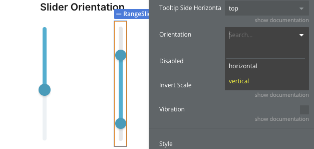
Set Orientation: Choose between horizontal or vertical orientation (for Simple and Range sliders).
Test: Preview your slider using the TestFlight app on iOS.
The plugin requires no additional configuration or external dependencies.
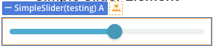
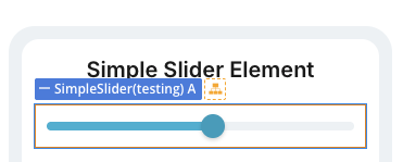
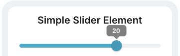
Plugin Element - Simple Slider
A single-handle slider for selecting one value within a defined range.
Fields
Title
Description
Type
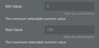
Min Value
The minimum selectable numeric value.
Number
Max Value
The maximum selectable numeric value.
Number
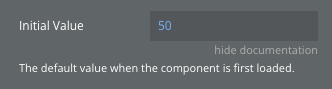
Initial Value
The default value when the component is first loaded.
Number
Step
The interval between selectable values (e.g., 1, 5, 0.5).
Number
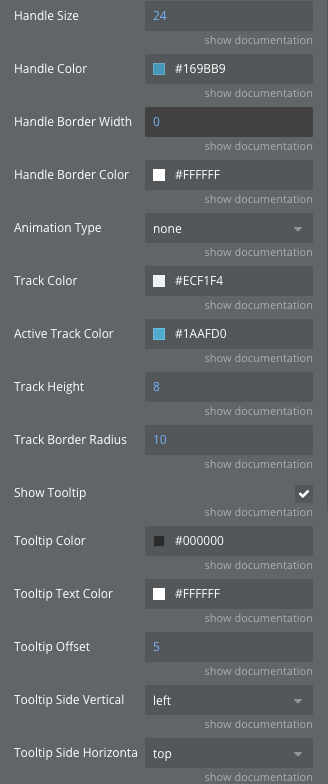
Handle Size
Diameter of the slider knob (px).
Number
Handle Color
Background color of the slider knob.
Color
Handle Border Width
Width of the knob’s stroke.
Number
Handle Border Color
Color of the knob’s stroke.
Color
Animation Type
Transition style for handle movement (spring, smooth, bounce, none).
Dropdown
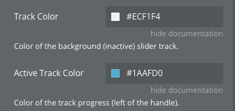
Track Color
Color of the background (inactive) slider track.
Color
Active Track Color
Color of the track progress (left of the handle).
Color
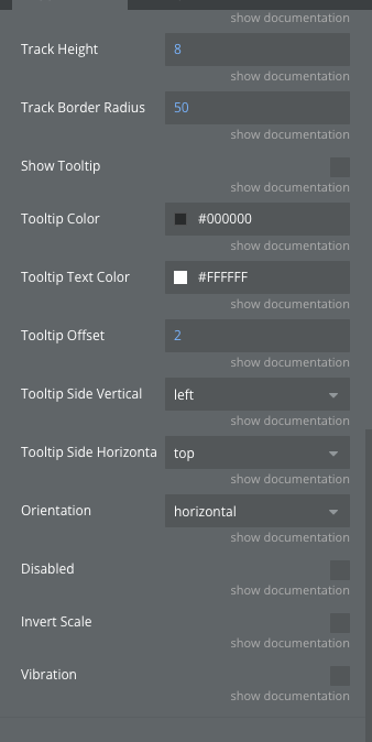
Track Height
Thickness of the horizontal slider line (px).
Number
Track Border Radius
The corner radius of the slider track, defining how rounded the track ends appear.
Number
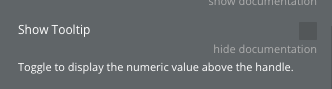
Show Tooltip
Toggle to display the numeric value above the handle.
Checkbox
Tooltip Color
Customization for tooltip color.
Color
Tooltip Text Color
Customization for tooltip text color.
Color
Tooltip Offset
Customization for tooltip offset.
Number
Tooltip Side Vertical
The location of the tooltip when the slider is vertically oriented (left, right).
Dropdown
Tooltip Side Horizontal
The location of the tooltip when the slider is horizontally oriented (top, bottom).
Dropdown
Orientation
Slider orientation (horizontal, vertical).
Dropdown
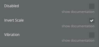
Disabled
If true, the slider becomes non-interactive.
Checkbox
Invert Scale
Inverts the slider scale (maximum and minimum values).
Checkbox
Vibration
Enables vibration when the slider moves to a new number (according to your step).
Checkbox
Exposed States
Name
Description
Type
Value
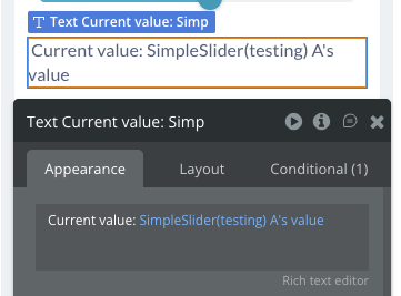
The current numeric value based on the handle’s position.
Number
Percentage
The progress of the slider expressed as a percentage (0–100%).
Number
Error
Error message.
Text
Element Events
Name
Description
Value changed
Triggered when the user finishes interacting with the slider (on release/drag end).
Element Actions
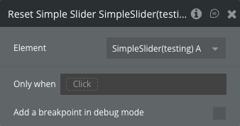
Reset Simple Slider
Returns the handle to the initial position via animation.
This action has no additional fields.
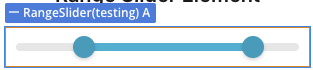
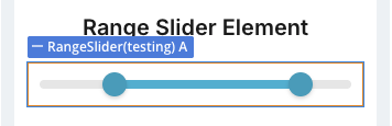
Plugin Element - Range Slider
A dual-handle slider for selecting a range of values between low and high boundaries.
Fields
Title
Description
Type
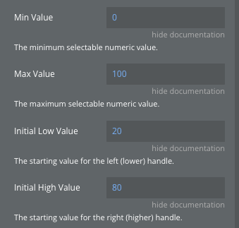
Min Value
The minimum selectable numeric value.
Number
Max Value
The maximum selectable numeric value.
Number
Initial Low Value
The starting value for the left (lower) handle.
Number
Initial High Value
The starting value for the right (higher) handle.
Number
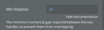
Min Distance
The minimum numerical gap required between the two handles to prevent them from overlapping.
Number
Step
The interval between selectable values (e.g., 1, 5, 0.5).
Number
Handle Size
Diameter of the slider knob (px).
Number
Handle Color
Background color of the slider knob.
Color
Handle Border Width
Width of the knob’s stroke.
Number
Handle Border Color
Color of the knob’s stroke.
Color
Animation Type
Transition style for handle movement (spring, smooth, bounce, none).
Dropdown
Track Color
Color of the background (inactive) slider track.
Color
Active Track Color
Color of the track progress (between the handles).
Color
Track Height
Thickness of the horizontal slider line (px).
Number
Track Border Radius
The corner radius of the slider track, defining how rounded the track ends appear.
Number
Show Tooltip
Toggle to display the numeric value above the handle.
Checkbox
Tooltip Color
Customization for tooltip color.
Color
Tooltip Text Color
Customization for tooltip text color.
Color
Tooltip Offset
Customization for tooltip offset.
Number
Tooltip Side Vertical
The location of the tooltip when the slider is vertically oriented (left, right).
Dropdown
Tooltip Side Horizontal
The location of the tooltip when the slider is horizontally oriented (top, bottom).
Dropdown
Orientation
Slider orientation (horizontal, vertical).
Dropdown
Disabled
If true, the slider becomes non-interactive.
Checkbox
Invert Scale
Inverts the slider scale (maximum and minimum values).
Checkbox
Vibration
Enables vibration when the slider moves to a new number (according to your step).
Checkbox
Exposed States
Name
Description
Type
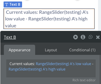
Low value
The current value of the left (minimum) handle.
Number
High value
The current value of the right (maximum) handle.
Number
Element Events
Name
Description
Value changed
Fires when the user finishes dragging either handle (on gesture end).
Element Actions
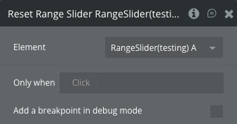
Reset Range Slider
Resets both handles back to their original positions with a smooth animation.
This action has no additional fields.
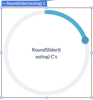
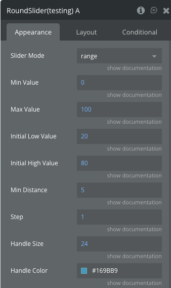
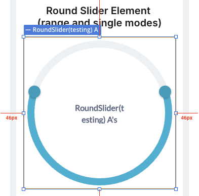
Plugin Element - Round Slider
A circular slider that supports both single-value and range selection modes.
Fields
Title
Description
Type
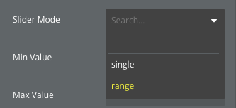
Slider Mode
Round Slider mode (single, range).
Dropdown
Min Value
The minimum selectable numeric value.
Number
Max Value
The maximum selectable numeric value.
Number
Initial Low Value
The starting value for the left (lower) handle.
Number
Initial High Value
The starting value for the right (higher) handle.
Number
Min Distance
The minimum numerical gap required between the two handles to prevent them from overlapping.
Number
Step
The interval between selectable values (e.g., 1, 5, 0.5).
Number
Handle Size
Diameter of the slider knob (px).
Number
Handle Color
Background color of the slider knob.
Color
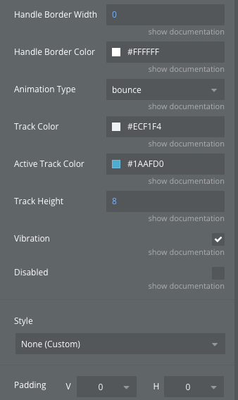
Handle Border Width
Width of the knob’s stroke.
Number
Handle Border Color
Color of the knob’s stroke.
Color
Animation Type
Transition style for handle movement (bounce, smooth, none).
Dropdown
Track Color
Color of the background (inactive) slider track.
Color
Active Track Color
Color of the track progress.
Color
Track Height
Thickness of the circular slider line (px).
Number
Vibration
Enables vibration when the slider moves to a new number (according to your step).
Checkbox
Disabled
If true, the slider becomes non-interactive.
Checkbox
Exposed States
Name
Description
Type
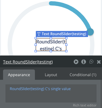
Single value
The current numeric value based on the handle’s position (single mode).
Number
Low value
The current value of the left (minimum) handle (range mode).
Number
High value
The current value of the right (maximum) handle (range mode).
Number
Error
Error message.
Text
Element Events
Name
Description
Value changed
Triggered when the user finishes interacting with the slider (on release/drag end) in single mode.
Value changed
Fires when the user finishes dragging either handle (on gesture end) in range mode.
Element Actions
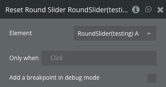
Reset Round Slider
Resets both handles back to their original positions with a smooth animation.
This action has no additional fields.
Workflow example
Here are some basic workflow examples to get you started with the Slider Input Bubble Mobile Pro plugin:
Basic Simple Slider Setup
Add a Simple Slider element to your mobile page
Set Min Value to 0 and Max Value to 100
Set Initial Value to 50
Enable “Show Tooltip” to display the current value
Use the “Value changed” event to trigger actions when the user adjusts the slider
Access the current value via the “value” exposed state
Price Range Filter with Range Slider
Add a Range Slider element to your page
Set Min Value to 0 and Max Value to 100 (for price range)
Set Initial Low Value to 20 and Initial High Value to 80
Set Min Distance to 20 to prevent handles from overlapping
Use the “Value changed” event to filter your data based on the selected range
Access “low value” and “high value” states to get the selected price range
Circular Progress with Round Slider
Add a Round Slider element to your page
Set Slider Mode to “single” for single value selection
Set Min Value to 0 and Max Value to 100
Customize Track Color and Active Track Color for visual appeal
Use the “value_changed” event to update related elements
Access “single value” state to get the current selection
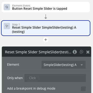
Reset Slider Values
Add a button element to your page
In the button’s workflow, add the “Reset Simple Slider” (or Range/Round) action
Select the target slider element
The slider will smoothly animate back to its initial value(s)