Demo to preview the settings
Introduction
Modern & Stable Tooltips Plugin offers a versatile and stable solution for adding customizable tooltips to your Bubble application. With its seamless integration, you can easily enhance user experience by displaying additional information on hover or click events. Customize the design, position, animation, and behavior to match your app’s style.
Usage Features:
- Fully customizable tooltip design with adjustable colors, border, radius, and padding.
- Smooth animations for tooltip appearance and disappearance.
- Multiple positioning options (e.g., top, bottom, left, right).
- Support for dynamic data through Bubble’s database.
- Customizable delay and interactive tooltips for enhanced usability.
- Compatibility with responsive designs through max-width and z-index controls.
- Ability to manage multiple tooltips with unique IDs and data sources.

How to setup
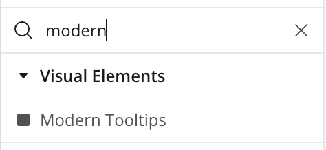
- Install Modern & Stable Tooltips (Tooltip) plugin
- Place the Modern Tooltips element on the page
Plugin Element Properties
Title | Description | Type |
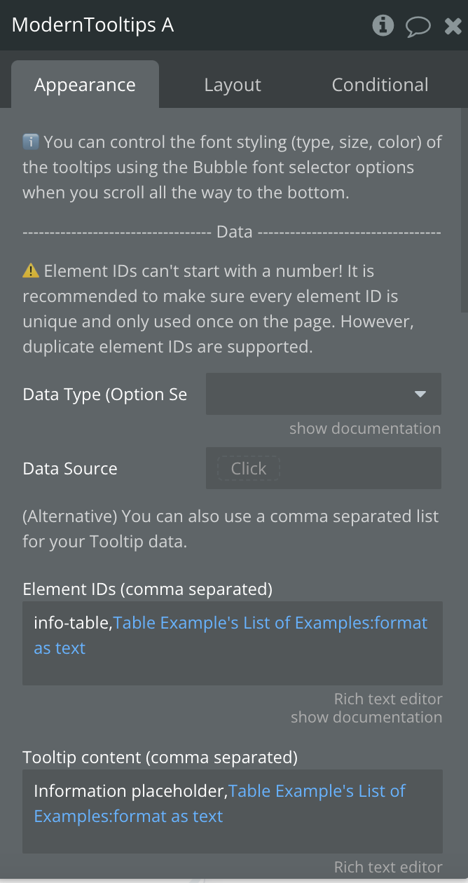
Data Source | Source of data | App type |
Element ID | ⚠️ Element IDs can't start with a number! The is the element ID of the element you want to use to display the tooltip | Text, Required |
Tooltip content | The content to display on the tooltip | Text or Image, Required |
Element IDs (comma separated) | Supply a comma separated list like: id-1,id-2,id-3 etc. | Text, Optional |
Tooltip content (comma separated) | Supply a comma separated list like: Content 1,Content 2,Content 3 etc. Make sure your texts do not contain commas | Text, Optional |
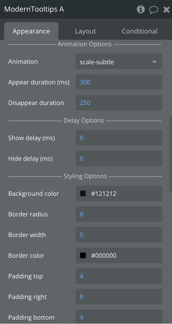
-------Animation Options ------ | ||
Animation | Animation type | Dropdown |
Appear duration (ms) | Duration of appearing | Number, Required |
Disappear duration (ms) | Duration of disappearing | Number, Required |
--------- Delay Options -------- | ||
Show delay (ms) | Time of displaying the animation | Number, Required |
Hide delay (ms) | Time of hiding the animation | Number, Required |
---------Styling Options ------- | ||
Background color | Background color | Color |
Border radius | Border radius | Number, Required |
Border width | Border width | Number, Required |
Border color | Border color | Number, Required |
Padding top | Padding in px | Number, Required |
Padding right | Padding in px | Number, Required |
Padding left | Padding in px | Number, Required |
Padding bottom | Padding in px | Number, Required |
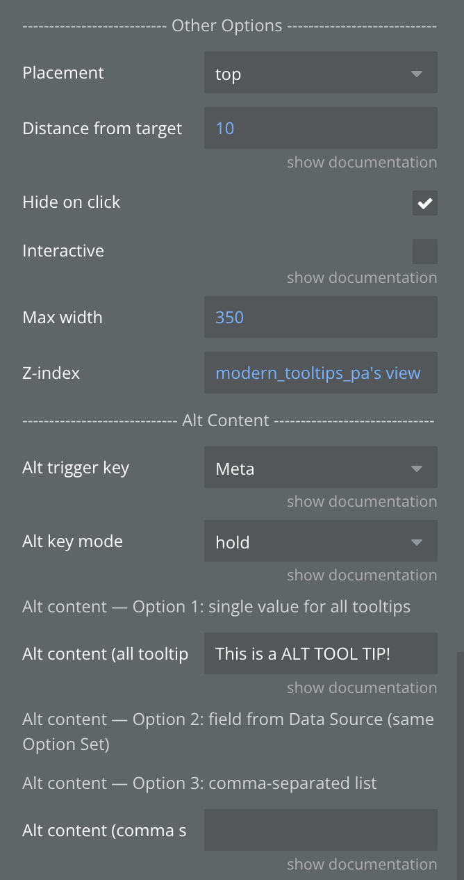
--------- Other Options -------- | ||
Placement | Placement of tooltip | Dropdown |
Distance from target | Distance from the target element in pixels | Number, Required |
Hide on click | Allows to hide the tooltip on click | Checkbox |
Interactive | Allows you to hover over and select text inside it. | Checkbox |
Max width | Max width | Number, Required |
Z-index | Z-index | Number, Required |
-----—---- Alt Content ------— | ||
Alt trigger key | Hold this key (desktop) or long-press the trigger (mobile) to show alternative content.
'None' disables this feature. | Dropdown |
Alt key mode | Hold: show alt content only while the key is pressed (or during long-press on mobile).
Switch: first key press toggles to alt content, second press toggles back. | Dropdown |
Option 1: single value for all tooltips | ||
Alt content (all tooltips) | Single alt content shown for ALL tooltips when the alt key is held. Use this if all tooltips share the same alt text. | Text |
Option 2: field from Data Source (same Option Set) | ||
Alt content field | Field from the same Data Type/Option Set used as alt tooltip content. Requires 'Data Source' to be set above. | Data as field of Data Source |
Option 3: comma-separated list | ||
Alt content (comma separated) | Alt content as a comma-separated list, matching the order of 'Element IDs (comma separated)'. E.g.: Alt 1,Alt 2,Alt 3 | Text |