
Link to the plugin page: https://zeroqode.com/plugin/1516622880147x677265933068140500
Demo to preview the plugin:
Introduction
Enhance your Bubble app UI with a slideable mobile menu that offers various customization possibilities including menu opening effects, font & background color customization, etc.
This no-code plugin provides 15 types of animation and allows you to set profile picture, links, and icons.
Please note that fade and zoom effects are only available for left and right menu types.

How to setup
- Add the Menu Element
- In the Visual Elements section, search for the Mobile Menu element.
- Drag the Mobile Menu onto the page where you want to display the menu.
- Configure the Menu Items
- In the property panel, define the menu items as needed.
- Customize colors, fonts, and other styles as necessary.
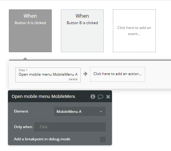
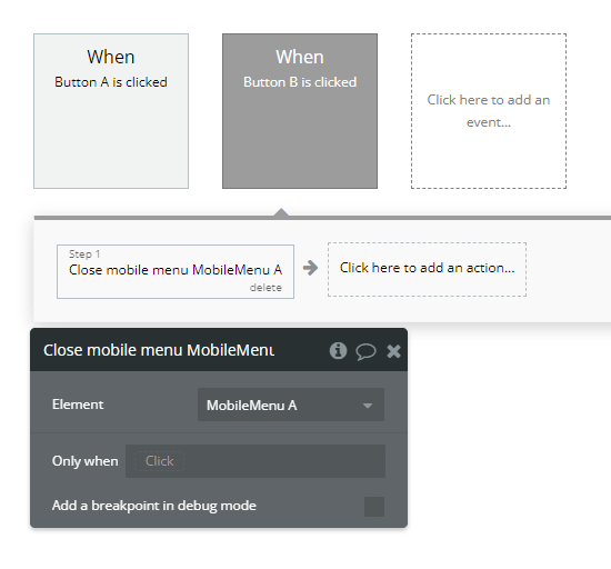
- Creating Workflows to Interact with the Menu
- Go to the Workflows tab.
- Click Add an Event → Elements → When a button is clicked.
- In the event, click Add an action:
- "Open Mobile Menu A Mobile Menu" to open the menu.
- "Close Mobile Menu A Mobile Menu" to close the menu.
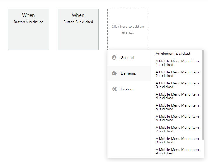
- Go to the Workflows tab.
- Click Add an Event → Elements.
- Select the event "A Mobile Menu Menu Item X Is Clicked" (replace X with the item number).
- Add the desired action (e.g., navigate to a page or display a pop-up).
Now that the menu has been added, you can set up actions to open, close, and detect clicks on menu items.
Opening and Closing the Menu
Detecting Clicks on Menu Items
If you want something to happen when a user clicks on a menu item:
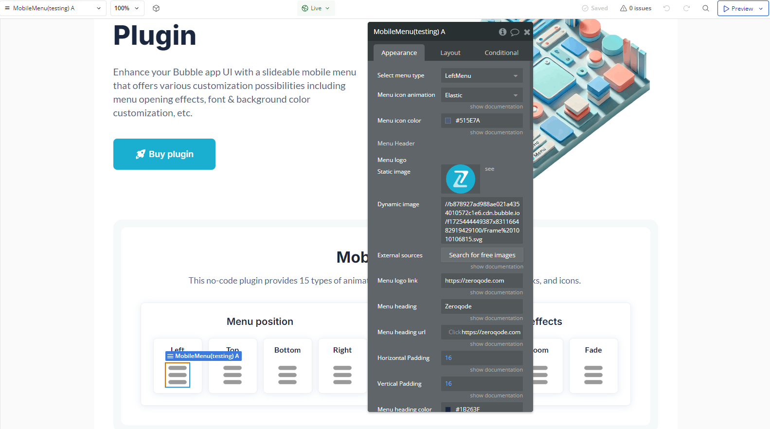
Plugin Element Properties
Mobile Menu
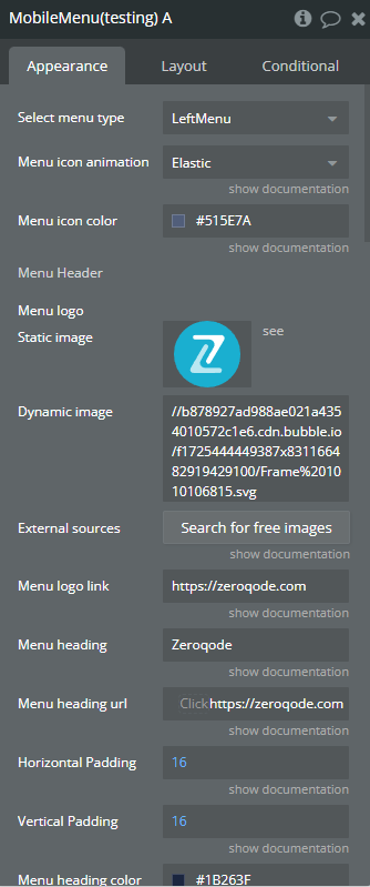
Fields:
Title | Description | Type |
Select menu type | Available options: LeftMenu, TopMenu, RightMenu, BottomMenu | Dropdown |
Menu icon animation | Animation for toggle button. Available options: Slider, Slider Right, Squeeze, Arrow, Arrow Right, Arrow Alt, Arrow Alt Right, Arrow Turn, Arrow Turn Right, Spin, Spin Right, Elastic, Elastic Right, Emphatic, Emphatic Right, Collapse, Collapse Right, Vortex, Vortex Right, Stand, Stand Right, Spring, Spring Right, Minus, 3DX, 3DX Right, 3DY, 3DY Right, 3DXY, 3DXY Right, Boring | Dropdown (optional) |
Menu icon color | The color of toggle button. | Color (optional) |
Menu Header | ||
Menu logo | The icon on the top of menu. | Image (optional) |
Menu logo link | URL for logo. | Text (optional) |
Menu heading | The menu heading title. | Text (optional) |
Menu heading url | Url for heading title. | Text (optional) |
Horizontal Padding | Add horizontal padding for title. Padding left and right. | Number |
Vertical Padding | Add vertical padding for title. Padding top and bottom. | Number |
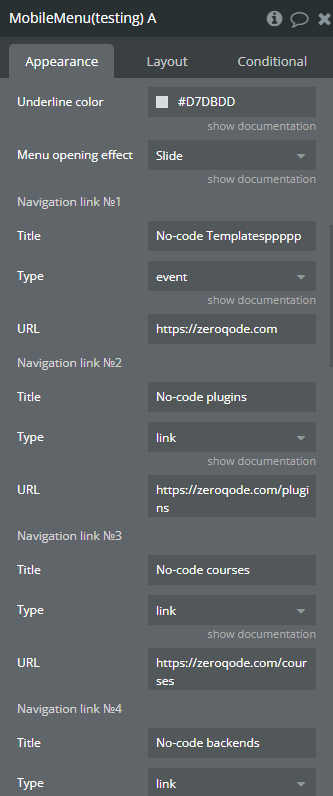
Menu heading color | The color of heading title | Color (optional) |
Underline color | Color for underline items in menu. | Color |
Menu opening effect | The effect with which the menu appears. Available options: NoEffect, Fade, Slide, Zoom | Dropdown |
Navigation link №1 | ||
Title | The text that will be displayed as the menu item. | Text (optional) |
Type | Type “Link” redirects to elements’ URL. Type “Event” triggers elements’ event. Available options: link, event | Dropdown |
URL | The destination URL if the navigation link type is set to "Link". | Text (optional) |
Navigation link №2 | ||
Title | The text that will be displayed as the menu item. | Text (optional) |
Type | Type “Link” redirects to elements’ URL. Type “Event” triggers elements’ event. Available options: link, event | Dropdown (optional) |
URL | The destination URL if the navigation link type is set to "Link". | Text (optional) |
Navigation link №3 | ||
Title | The text that will be displayed as the menu item. | Text (optional) |
Type | Type “Link” redirects to elements’ URL. Type “Event” triggers elements’ event. Available options: link, event | Dropdown (optional) |
URL | The destination URL if the navigation link type is set to "Link". | Text (optional) |
Navigation link №4 | ||
Title | The text that will be displayed as the menu item. | Text (optional) |
Type | Type “Link” redirects to elements’ URL. Type “Event” triggers elements’ event. Available options: link, event | Dropdown (optional) |
URL | The destination URL if the navigation link type is set to "Link". | Text (optional) |
Navigation link №5 | ||
Title | The text that will be displayed as the menu item. | Text (optional) |
Type | Type “Link” redirects to elements’ URL. Type “Event” triggers elements’ event. Available options: link, event | Dropdown (optional) |
URL | The destination URL if the navigation link type is set to "Link". | Text (optional) |
Navigation link №6 | ||
Title | The text that will be displayed as the menu item. | Text (optional) |
Type | Type “Link” redirects to elements’ URL. Type “Event” triggers elements’ event. Available options: link, event | Dropdown (optional) |
URL | The destination URL if the navigation link type is set to "Link". | Text (optional) |
Navigation link №7 | ||
Title | The text that will be displayed as the menu item. | Text (optional) |
Type | Type “Link” redirects to elements’ URL. Type “Event” triggers elements’ event. Available options: link, event | Dropdown (optional) |
URL | The destination URL if the navigation link type is set to "Link". | Text (optional) |
Navigation link №8 | ||
Title | The text that will be displayed as the menu item. | Text (optional) |
Type | Type “Link” redirects to elements’ URL. Type “Event” triggers elements’ event. Available options: link, event | Dropdown (optional) |
URL | The destination URL if the navigation link type is set to "Link". | Text (optional) |
Navigation link №9 | ||
Title | The text that will be displayed as the menu item. | Text (optional) |
Type | Type “Link” redirects to elements’ URL. Type “Event” triggers elements’ event. Available options: link, event | Dropdown (optional) |
URL | The destination URL if the navigation link type is set to "Link". | Text (optional) |
Navigation link №10 | ||
Title | The text that will be displayed as the menu item. | Text (optional) |
Type | Type “Link” redirects to elements’ URL. Type “Event” triggers elements’ event. Available options: link, event | Dropdown (optional) |
URL | The destination URL if the navigation link type is set to "Link". | Text (optional) |
Additional settings | ||
Hide on menu click | Hide on menu click | Checkbox (yes/no) |
Dim out the page to black when menu is opened | Visual effect on page when menu is opened | Checkbox (yes/no) |
Menu background color | The background color of the menu. | Color (optional) |
Menu title font size | The font size for the menu title. | Number (optional) |
Menu toggle button width. The aspect ratio of this button view is 1, so width and height will be equals. | ||
Toggle Button Width | Toggle menu button width and height. Value should be a number. | Number (optional) |
Paddings for menu items. You can set horizontal and vertical padding. | ||
Horizontal Padding | Add horizontal padding for items. Padding left and right. | Number (optional) |
Vertical Padding | Add vertical padding for items. Padding top and bottom. | Number (optional) |
Element Actions
- Open mobile menu - This action opens the Mobile Menu, making it visible to the user.
- Close mobile menu - This action closes the Mobile Menu, hiding it from the user.
Exposed states
Title | Description | Type |
Is menu open ? | Value “yes” when menu is opened. | Checkbox (yes/no) |
Section’s title | The title of section that was clicked. | Text |
Element Events
Title | Description |
Menu item 1 is clicked | When menu item 1 is clicked |
Menu item 2 is clicked | When menu item 2 is clicked |
Menu item 3 is clicked | When menu item 3 is clicked |
Menu item 4 is clicked | When menu item 4 is clicked |
Menu item 5 is clicked | When menu item 5 is clicked |
Menu item 6 is clicked | When menu item 6 is clicked |
Menu item 7 is clicked | When menu item 7 is clicked |
Menu item 8 is clicked | When menu item 8 is clicked |
Menu item 9 is clicked | When menu item 9 is clicked |
Menu item 10 is clicked | When menu item 10 is clicked |
Mobile Menu (Previouse)
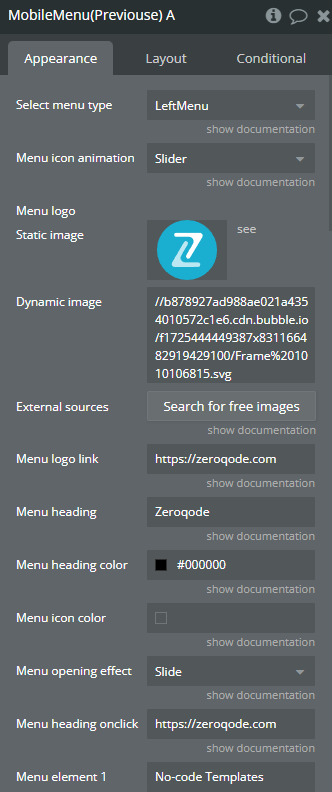
Fields:
Title | Description | Type |
Select menu type | Menu_type Available options: LeftMenu, TopMenu, RightMenu, BottomMenu | Dropdown |
Menu icon animation | Menu button Available options: Slider, Squeeze, Arrow, Alt, Turn, Spin, Elastic, Emphatic, Collapse, Vortex, Stand, Spring, Minus, 3DX, Boring | Dropdown (optional) |
Menu logo | Menu_logo | Image (optional) |
Menu logo link | Menu_logohref | Text (optional) |
Menu heading | Menuheading | Text (optional) |
Menu heading color | Menuheadingcolor | Color (optional) |
Menu icon color | Menuiconcolor | Color (optional) |
Menu opening effect | Menueffect Available options: NoEffect, Fade, Slide, Zoom | Dropdown |
Menu heading onclick url | Menuheadingurl | Text (optional) |
Menu element 1 | Element1 | Text (optional) |
Menu element 1 type | Available options: link, event | Dropdown |
Menu element 1 URL | Element1href | Text (optional) |
Menu element 2 | Element2 | Text (optional) |
Element2type | Available options: link, event | Dropdown (optional) |
Menu element 2 URL | Element2href | Text (optional) |
Menu element 3 | Element3 | Text (optional) |
Element3type | Available options: link, event | Dropdown (optional) |
Menu element 3 URL | Element3href | Text (optional) |
Menu element 4 | Element4 | Text (optional) |
Element4type | Available options: link, event | Dropdown (optional) |
Menu element 4 URL | Element4href | Text (optional) |
Menu element 5 | Element5 | Text (optional) |
Element5type | Available options: link, event | Dropdown (optional) |
Menu element 5 URL | Element5href | Text (optional) |
Menu element 6 | Element6 | Text (optional) |
Element6type | Available options: link, event | Dropdown (optional) |
Menu element 6 URL | Element6href | Text (optional) |
Menu element 7 | Element7 | Text (optional) |
Element7type | Available options: link, event | Dropdown (optional) |
Menu element 7 URL | Element7href | Text (optional) |
Menu element 8 | Element8 | Text (optional) |
Element8type | Available options: link, event | Dropdown (optional) |
Menu element 8 URL | Element8href | Text (optional) |
Menu element 9 | Element9 | Text (optional) |
Element9type | Available options: link, event | Dropdown (optional) |
Menu element 9 URL | Element9href | Text (optional) |
Menu element 10 | Element10 | Text (optional) |
Element10type | Available options: link, event | Dropdown (optional) |
Menu element 10 URL | Element10href | Text (optional) |
Hide on menu click | Hide on menu click | Checkbox (yes/no) |
Dim out the page to black when menu is opened | Menudimout | Checkbox (yes/no) |
Menu background color | Menubackcolor | Color (optional) |
Menu title font size | Menutitlefontsize | Number (optional) |
Menu toggle button width. Te aspect ratio of this button view is 1, so width and height will be equals. | ||
Toggle Button Width | Toggle menu button width and height. Value should be a number. | Number (optional) |
Paddings for menu items. You can set horizontal and vertical padding. | ||
Horizontal Padding | Add horizontal padding for items. Padding left and right. | Number (optional) |
Vertical Padding | Add vertical padding for items. Padding top and bottom. | Number (optional) |
Element Actions
- Open mobile menu - This action opens the Mobile Menu (Previous), making it visible to the user
- Close mobile menu - This action closes the Mobile Menu (Previous), hiding it from the user.
Exposed states
Title | Description | Type |
Is menu open ? | Is menu open ? | Checkbox (yes/no) |
Current section | Current section | Text |
Element Events
Title | Description |
menu item 1 is clicked | When menu item 1 is clicked |
menu item 2 is clicked | When menu item 2 is clicked |
menu item 3 is clicked | When menu item 3 is clicked |
menu item 4 is clicked | When menu item 4 is clicked |
menu item 5 is clicked | When menu item 5 is clicked |
menu item 6 is clicked | When menu item 6 is clicked |
menu item 7 is clicked | When menu item 7 is clicked |
menu item 8 is clicked | When menu item 8 is clicked |
menu item 9 is clicked | When menu item 9 is clicked |
menu item 10 is clicked | When menu item 10 is clicked |
