
Link to the plugin page:
Demo to preview the plugin:
Introduction
The Vertical Range Slider Plugin is a modern, interactive tool that allows users to effortlessly select a numerical range along a vertical axis by dragging one or more sliders. Designed for precision and ease of use, this plugin enhances data input and visualization by offering real-time updates, customizable styling, and seamless integration with Bubble applications. Whether you're setting price ranges, adjusting time intervals, or managing numeric inputs for budgets, events, or security settings, this plugin provides a flexible, intuitive, and fully responsive solution for a variety of use cases.
Key Features
Prerequisite
- Bubble Account: An active Bubble.io account is required to install and use the plugin.
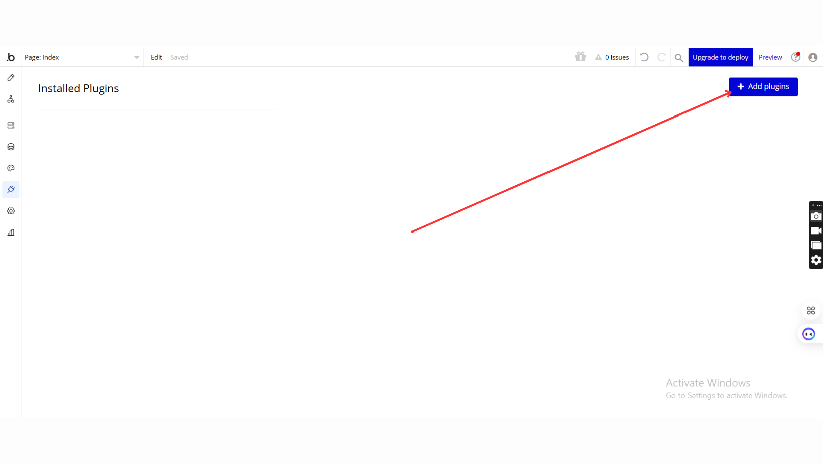
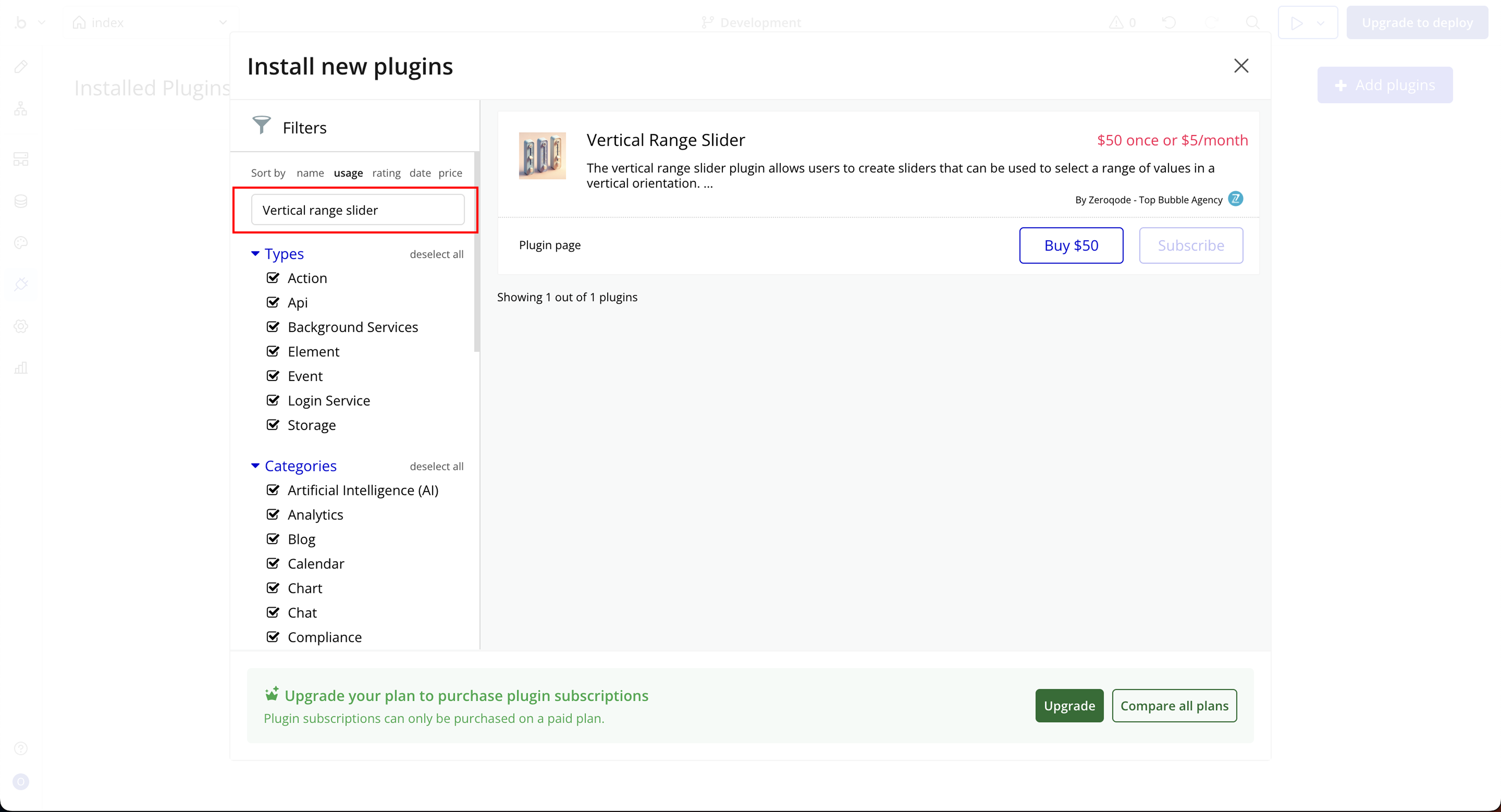
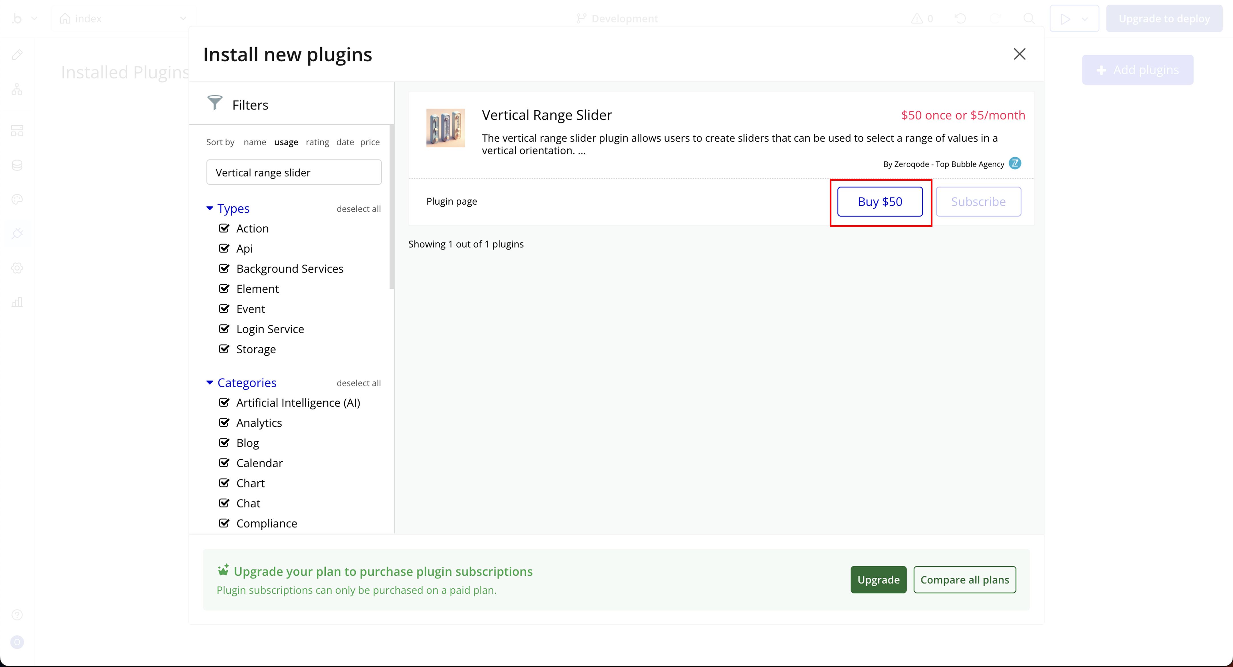
- Plugin Installation: The plugin can be installed directly from the Zeroqode Plugin Store or from the Plugins section of your Bubble Editor.
- Familiarity with Bubble Workflows: Basic knowledge of Bubble workflows is required to dynamically control progress values and actions.

How to setup
Step 1: Installation
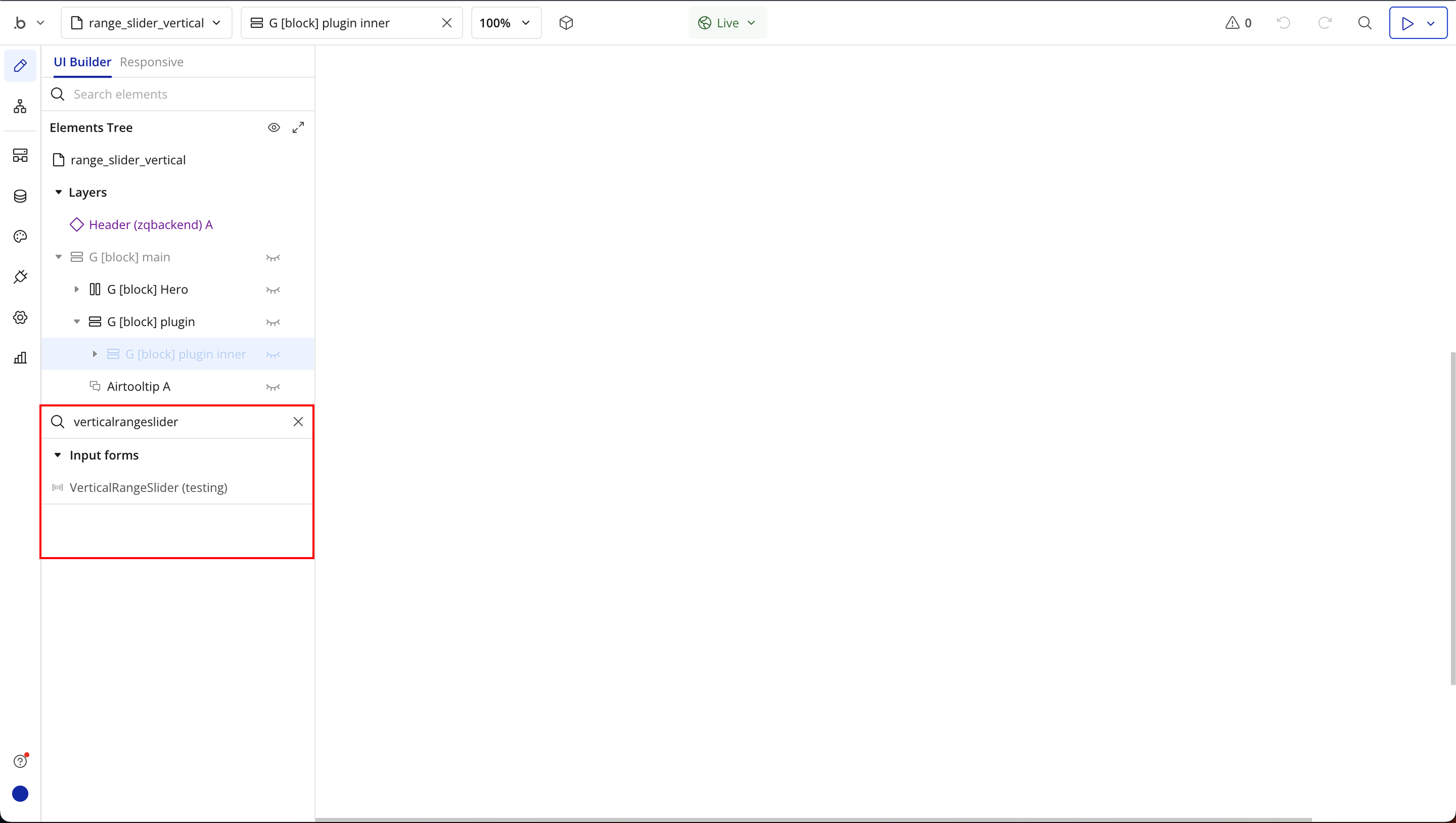
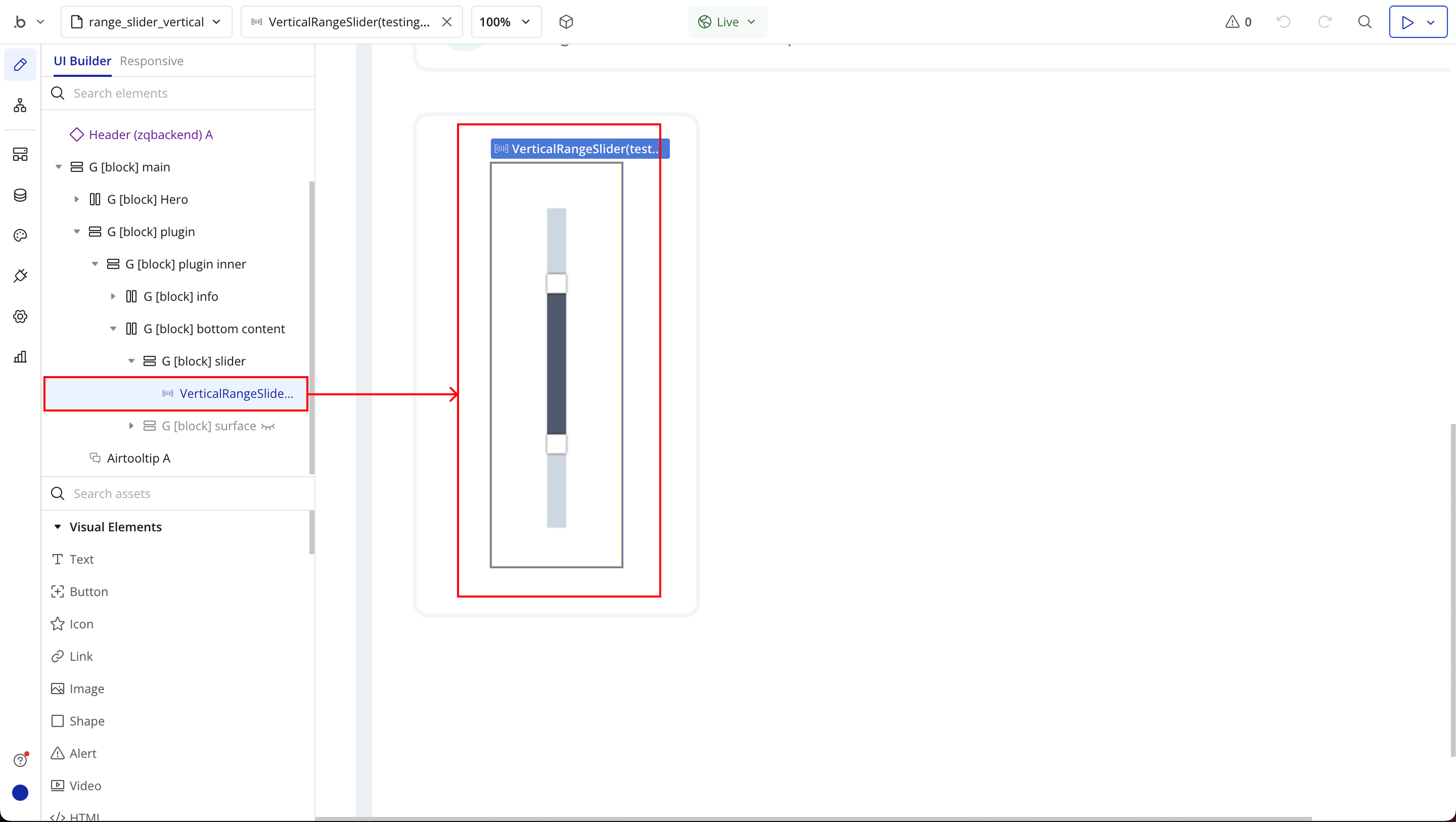
Step 2: Place the Element
Step 3: Setting Up Dynamic Controls
Step 4: Event and Action
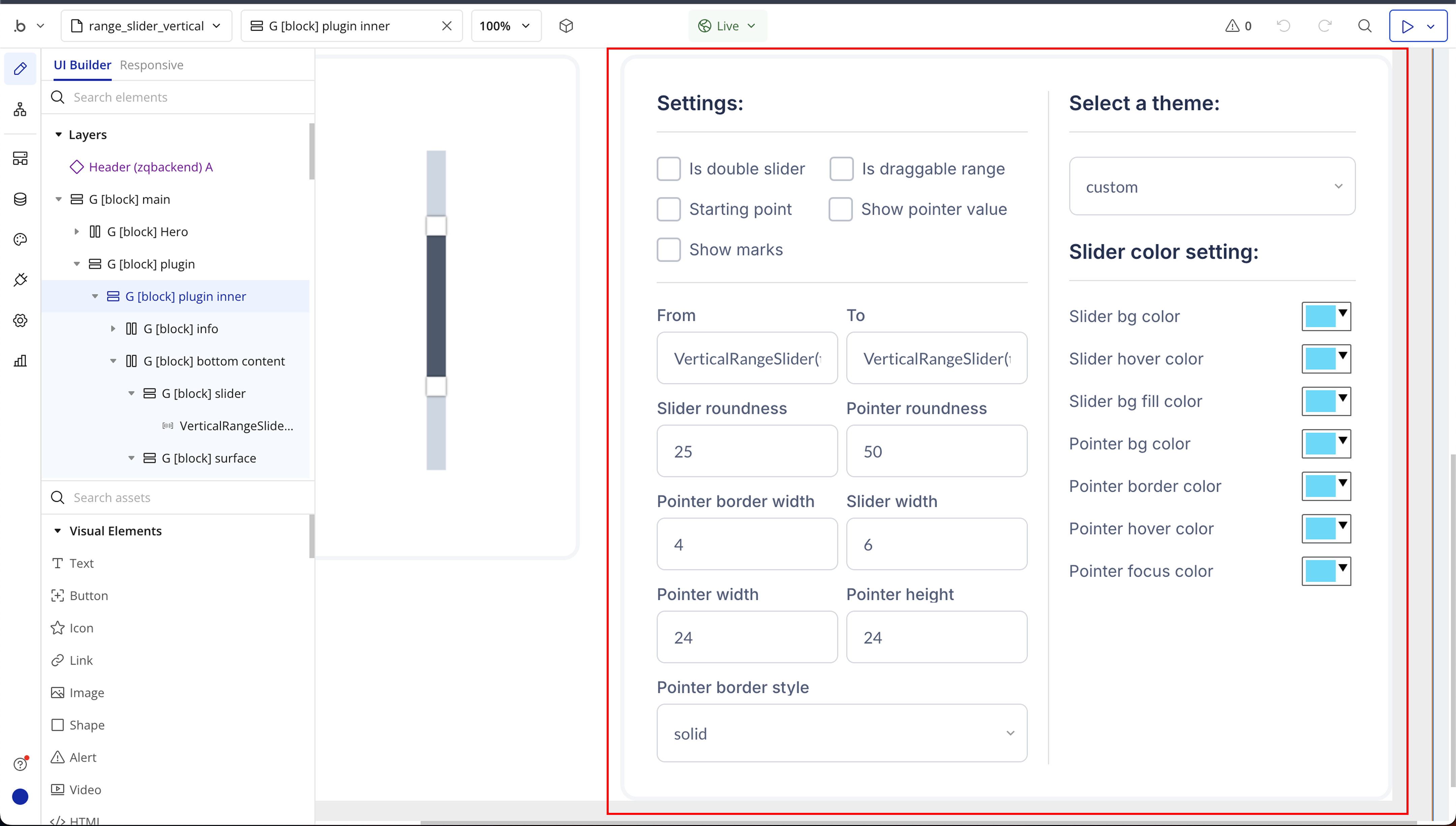
Plugin Element Properties
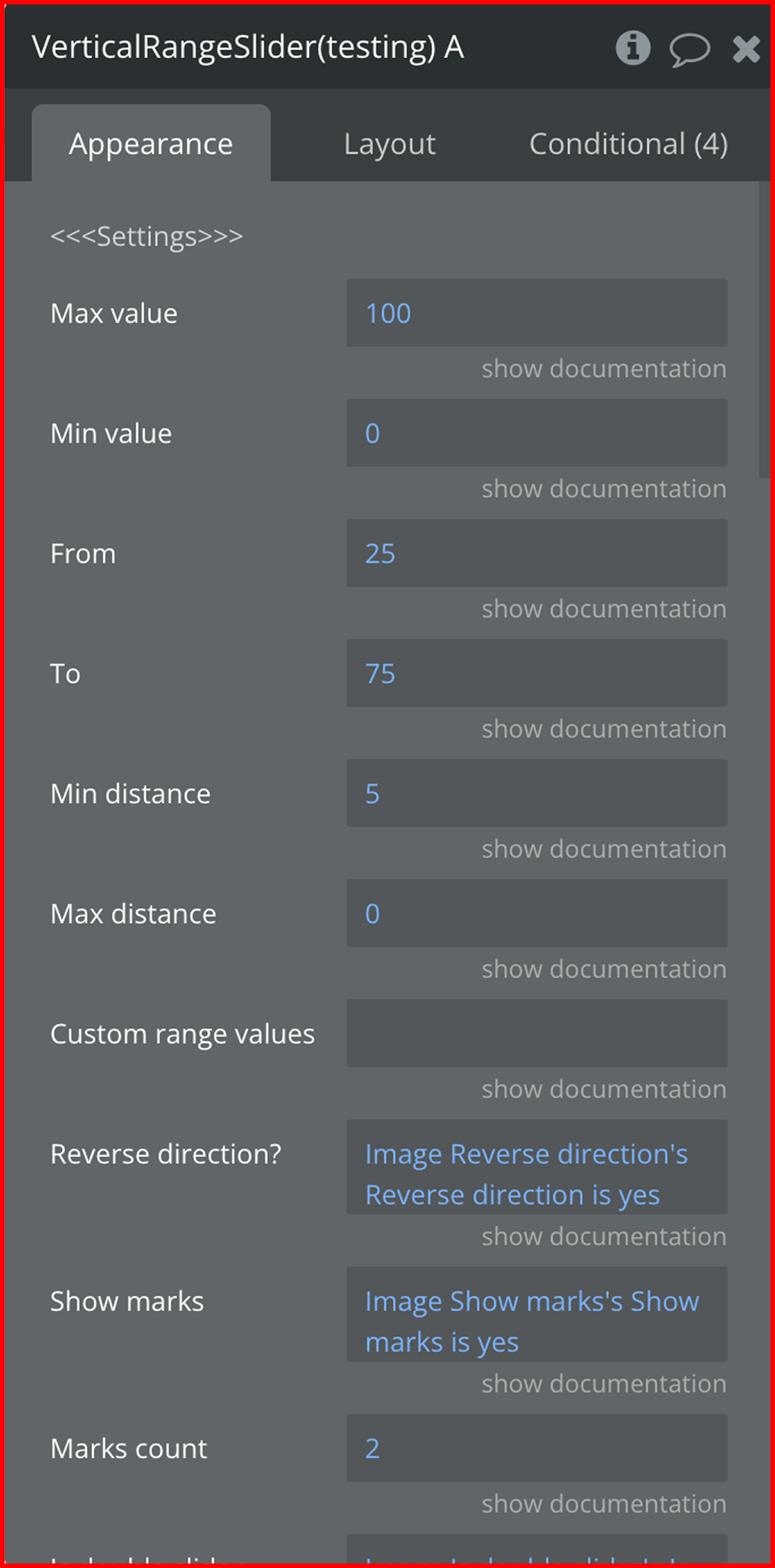
Fields:
Title | Description | Type |
General Settings | ||
Max value | The max value of the slider | Number (optional) |
Min value | The min value of the slider | Number (optional) |
From | The starting value of the first pointer | Number (optional) |
To | The starting value of the second pointer | Number (optional) |
Min distance | The lowest level a pointer can go down | Number (optional) |
Max distance | The highest level a pointer can go up | Number (optional) |
Custom range values | The values that the range can take, separated by commas. Example: 10,20,50,100 | Text (optional) |
Reverse direction | Flip the slider top to bottom | Checkbox (yes/no) |
Show marks | Shows the value labels of the line | Checkbox (yes/no) (optional) |
Marks count | The number of marks to show on the line | Number (optional) |
Is double slider | Adds / removes a second slider | Checkbox (yes/no) (optional) |
Is draggable | Is the range inbetween two sliders draggable by mouse (click + hold + drag) | Checkbox (yes/no) (optional) |
Show pointer value | Show the value each pointer is at | Checkbox (yes/no) (optional) |
Appearance Settings | ||
Theme | The theme style options | Text (optional) |
Slider line width | The width of the slider line | Number (optional) |
Pointer width | The width of the pointer | Number (optional) |
Pointer height | The height of the pointer | Number (optional) |
Pointer roundness | The roundness of the pointer | Number (optional) |
Slider roundness | The roundness of the slider’s edges | Number (optional) |
Pointer value offset | The distance of pointer value from the range line | Number (optional) |
Pointer label width | The width of the pointer label | Number (optional) |
Pointer label height | The height of the pointer label | Number (optional) |
Pointer label background color | The background color of the pointer label | Color (optional) |
Pointer label text color | The text color of the pointer label | Color (optional) |
Slider bg color | The background of the selected slider part | Color (optional) |
Slider hover color | The background of the selected slider part when hovered over | Color (optional) |
Slider bg fill | The background of the unselected slider part | Color (optional) |
Pointer bg color | The color of the pointer | Color (optional) |
Pointer hover color | The color of the pointer on hover | Color |
Pointer focus color | The color of the pointer when it’s clicked | Color |
Pointer_border_width | The width of the pointer border | Number (optional) |
Pointer_border_style | Can be “solid, dashed, dotted, double, groove, ridge” | Text (optional) |
Pointer border color | The color of the pointer’s border | Color (optional) |
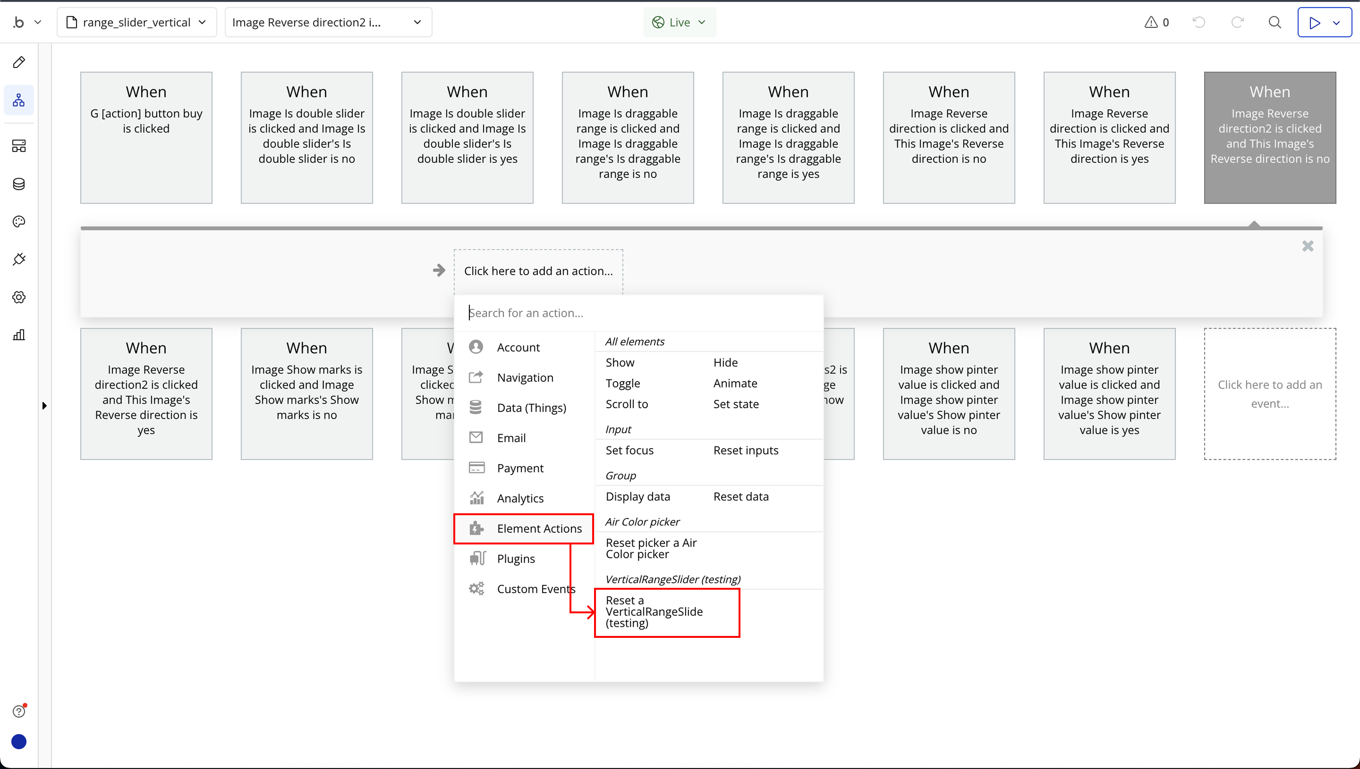
Element Actions
- Reset - Reset slider to default settings
Title | Description | Type |
From | Represents the starting value of the selected range. This defines the lower boundary of the vertical slider. | Number |
To | Represents the ending value of the selected range. This defines the upper boundary of the vertical slider. | Number |
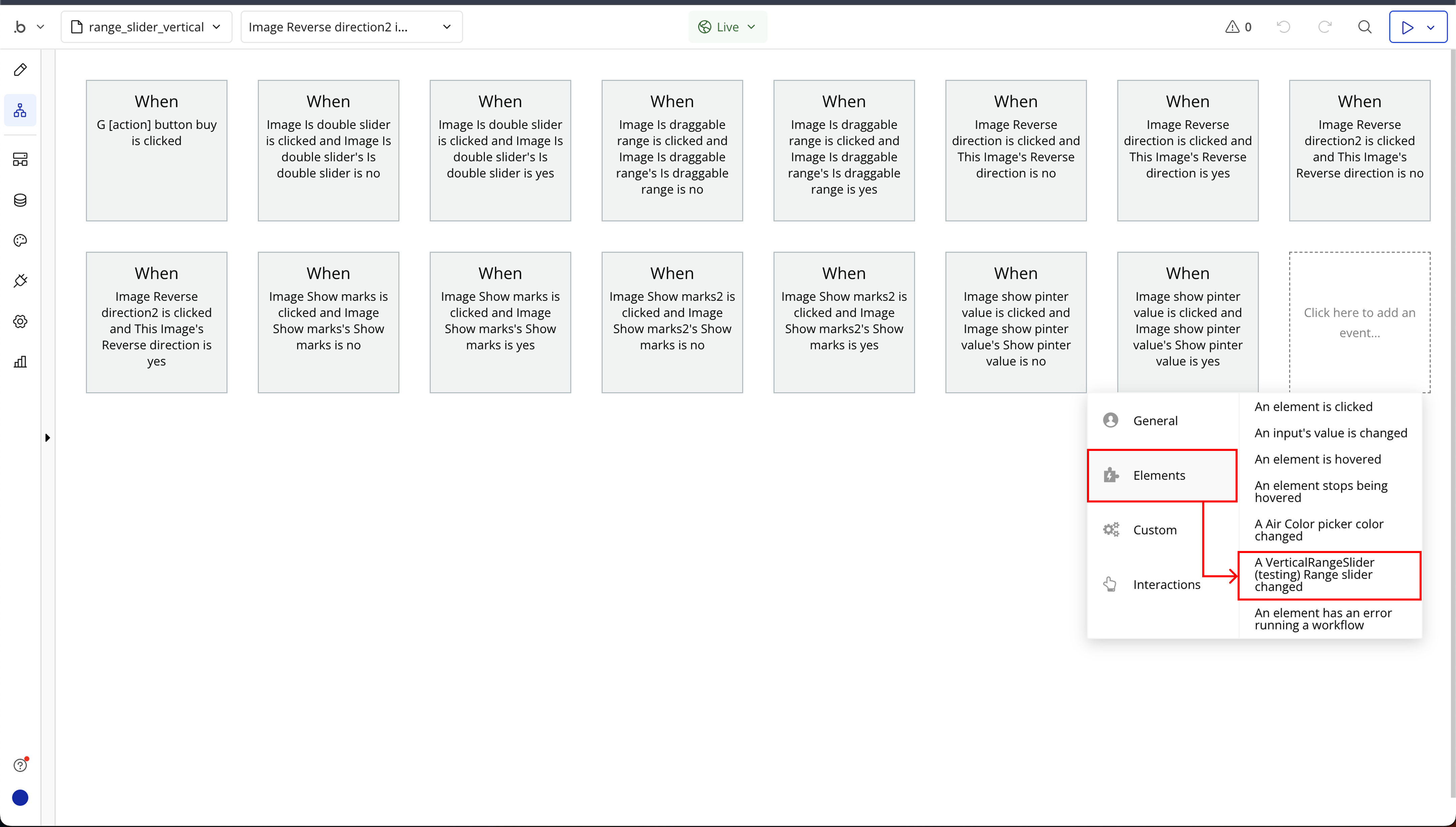
Element Events
Title | Description |
Range slider changed | Fires on every range slider update. |

Changelogs