
Demo to preview the plugin:
Introduction
Get your Bubble app this brilliant no-code plugin by Zeroqode that can effortlessly change the color of any input placeholder, including the search box, dropdown, and multi-input.
Additionally, this plugin allows you to set horizontal/vertical padding and even hide/show a dropdown arrow.

How to setup
- Enable ID Attributes
Go to the settings page in your editor. Under the General tab click on the checkbox “Expose the option to add an ID attribute to HTML elements”
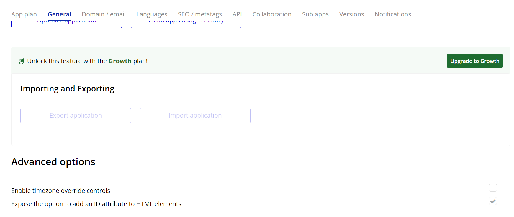
- Add the Element
In the Bubble editor, place the Customiseplaceholder element on your desired page.
- Set the Input ID
In the properties of the Customiseplaceholder element, set the Element ID to match the ID assigned to your input field.
- Customize the Properties
- Placeholder color: Choose the color for the placeholder text.
- Padding: Configure the top, bottom, right, and left padding to position the placeholder text as desired.
- Dropdown arrow: Enable or disable the dropdown arrow for inputs that require this functionality.
Adjust the following settings to personalize the placeholder:
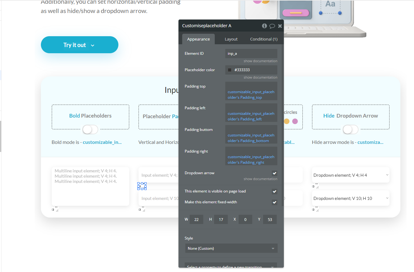
Plugin Element Properties
Custom placeholder
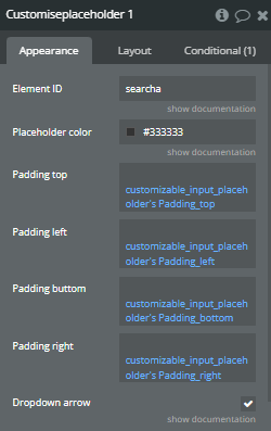
Fields:
Title | Description | Type |
Element ID | ID Attribute of the element to which the styles apply. | Text |
Placeholder color | The color of all input’s placeholder except dropdown element. | Color (optional) |
Padding top | Available options: 0, 1, 4, 10, 20 | Text (optional) |
Padding left | Available options: 0, 1, 4, 10, 20 | Text (optional) |
Padding buttom | The space between the bottom of the placeholder and the input element. | Text |
Padding right | The space between the right side of the placeholder and the input element. | Text |
Dropdown arrow | Show/hide dropdown arrow | Checkbox (yes/no) |