
Link to plugin page: https://www.framer.com/marketplace/plugins/slick-slider/
Video Demo
Introduction
Slick Slider is a powerful no-code tool designed to enhance your Framer projects with highly customizable and interactive slider components. The plugin allows users to create dynamic content carousels supporting both manual image uploads and direct integration with Framer CMS collections for seamless content management. Each slider can be extensively customized with various display modes, navigation controls, autoplay functionality, and advanced styling options, making it perfect for hero sections, product showcases, testimonials, and any application requiring engaging content presentation.
Prerequisites
No specific API keys or external accounts are needed to begin using the Slick Slider plugin. The plugin uses the React-slick library which is fully integrated, so you can get started right away without additional setup.
How to setup
- Open the plugin.
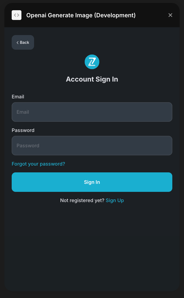
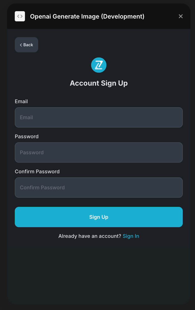
- To start using the plugin, you need to create or log in to your Zeroqode account. Select Sign In or Sign Up.
- Enter your account details.
- A subscription to all our plugins is required. Once subscribed, you will gain access to all our plugins. Enjoy a 7-day free trial before any charges apply.
- Add slider to your canvas.
- Customize your slider using the properties panel.
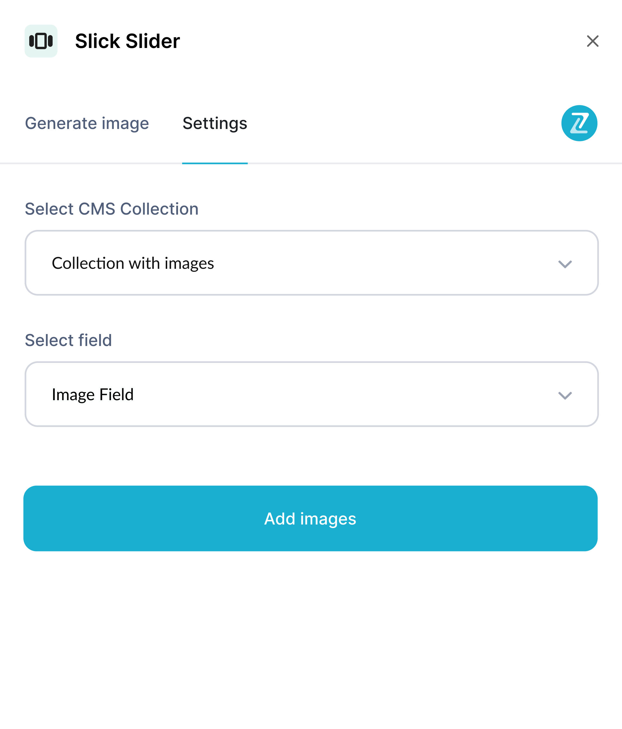
Plugin Settings
In the plugin settings, you can add your own collection of images from the CMS. Just select a collection from dropdown and select field that stores image
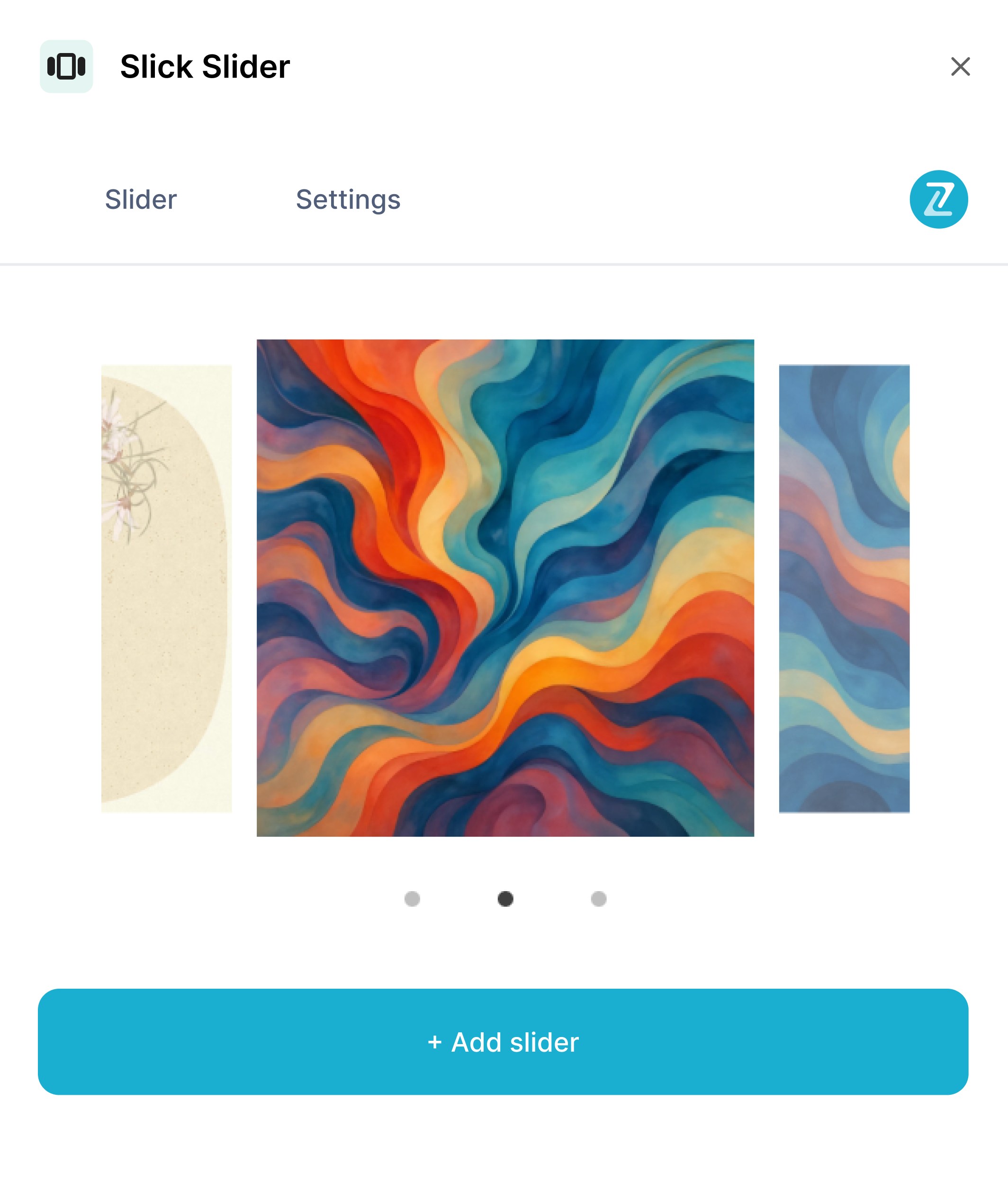
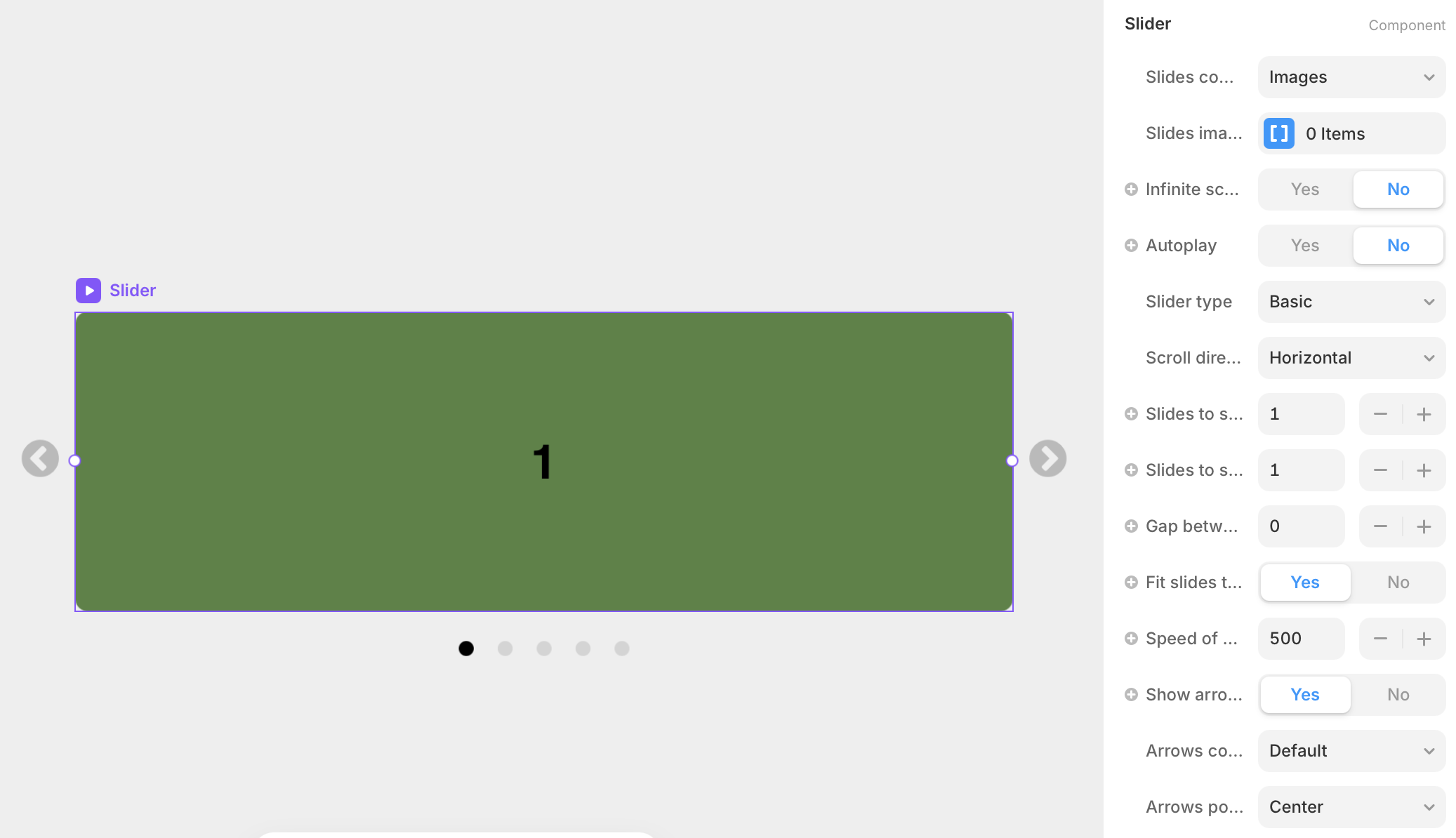
Slider Component
The plugin contains a primary component called Slider that should be added to your canvas.
It's got a lot of settings, let's go over them.
Parameters:
Title | Description | Type |
Slides content type | Choose between displaying images or custom components in slides | Enum |
Slides images | Upload multiple images to display in the slider | Array of Images |
Slides components | Add custom components to display in the slider | Array of Components |
Infinite scroll | Enable continuous looping of slides | Boolean |
Autoplay | Automatically advance slides without user interaction | Boolean |
Autoplay speed | Duration in milliseconds between automatic slide transitions | Number |
Pause on hover | Pause autoplay when user hovers over the slider | Boolean |
Slider type | Select basic slider or centered mode with focus effects | Enum |
Scroll direction | Set slide transition direction (horizontal or vertical) | Enum |
Slides height | Height of slides in pixels (for vertical scrolling) | Number |
Slides to show | Number of slides visible simultaneously | Number |
Slides to scroll | Number of slides to advance per transition | Number |
Gap between slides | Spacing between individual slides in pixels | Number |
Fit slides to one height | Scale slides to fill container height (for horizontal scrolling) | Boolean |
Speed of scroll | Animation duration for slide transitions in milliseconds | Number |
Controls indent | Distance from edge when arrows and dots share position | Number |
Controls gap | Space between arrows and dots when positioned together | Number |
Show arrows | Show or hide navigation arrow buttons | Boolean |
Arrows content type | Choose arrow style: default, custom image, or component | Enum |
Next arrow image | Custom image for the next arrow button | Image |
Prev arrow image | Custom image for the previous arrow button | Image |
Next arrow component | Custom component for the next arrow button | Component |
Prev arrow component | Custom component for the previous arrow button | Component |
Arrows position | Position arrows at top, center, bottom, left, or right | Enum |
Arrows gap | Space between arrow buttons in pixels | Number |
Arrows indent | Distance from container edge for arrow positioning | Number |
Arrows color | Color of default arrow icons | Color |
Arrows size | Size of default arrow icons in pixels | Number |
Show dots | Show or hide dot navigation indicators | Boolean |
Dots position | Position dots at top, bottom, left, or right | Enum |
Active dot color | Color of the currently active dot | Color |
Unactive dot color | Color of inactive dots | Color |
Dot size | Diameter of dot indicators in pixels | Number |
Gap between dots | Spacing between individual dots | Number |
Dot border radius | Roundness of dot corners (100% for circles) | Border Radius |
Dots indent | Distance from container edge for dot positioning | Number |
Slide border radius | Roundness of slide corners | Border Radius |