
Link to plugin page: https://www.framer.com/marketplace/plugins/table-grid/preview/
Video Demo
Introduction
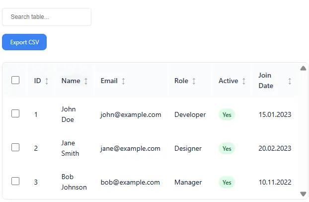
The CMS Table plugin transforms your Framer CMS data into beautiful, interactive tables. Connect any CMS collection, customize columns, enable search, sorting, pagination, and export features—all with powerful styling options and theme presets. This plugin is perfect for displaying structured data from your Framer CMS in a user-friendly, interactive format.
Prerequisites
No specific API keys or external accounts are needed to begin using the Table/Grid plugin. You must have a Framer account with CMS collections set up to use this plugin effectively.
How to setup
To start using the CMS Table plugin:
- Install the Plugin: Add the CMS Table plugin to your Framer project through the plugin panel.
- Open the plugin.
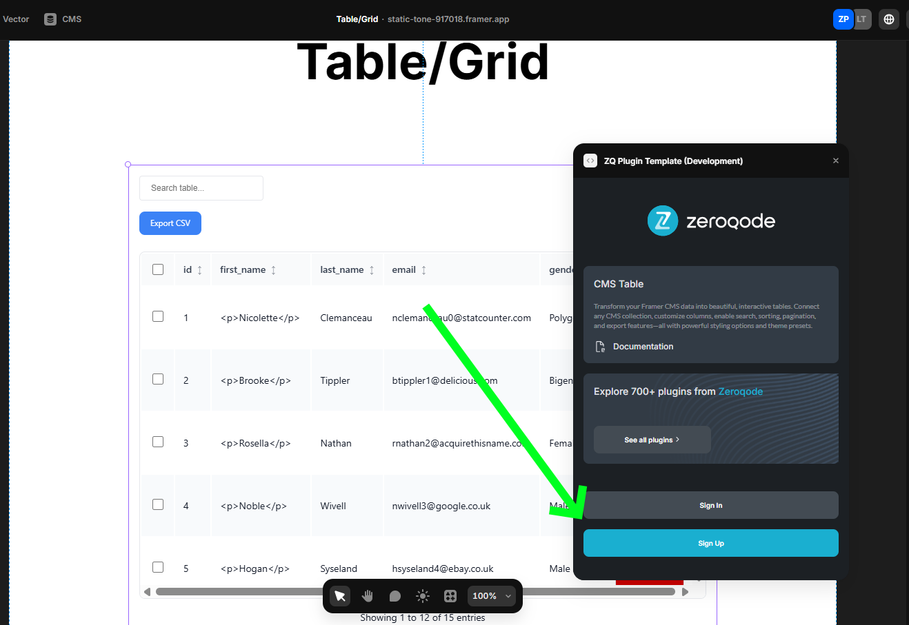
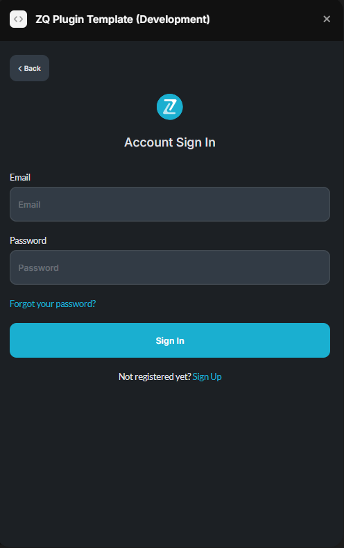
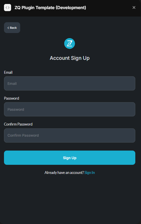
- To start using the plugin, you need to create or log in to your Zeroqode account. Select Sign In or Sign Up.
- Enter your account details.
- A subscription to all our plugins is required. Once subscribed, you will gain access to all our plugins.
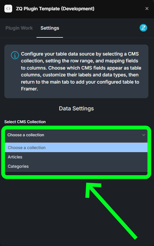
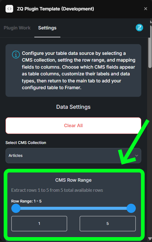
- Configure CMS Data:
- Open the plugin interface
- Navigate to the Settings tab
- Select your CMS collection from the dropdown
- Set the row range you want to display (1-1000 rows)
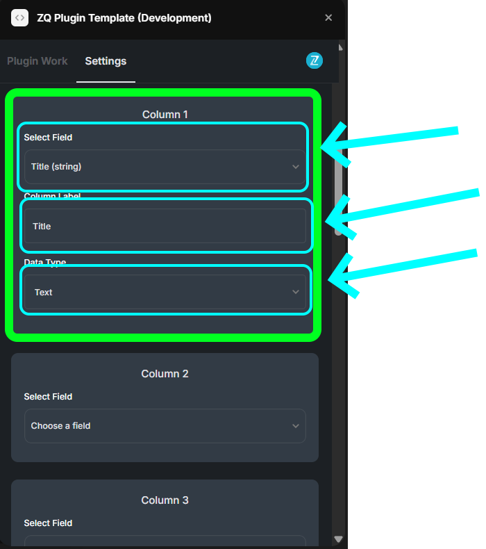
- Map Columns:
- Choose which CMS fields to display as table columns
- Customize column labels and data types
- Configure up to 15 columns per table
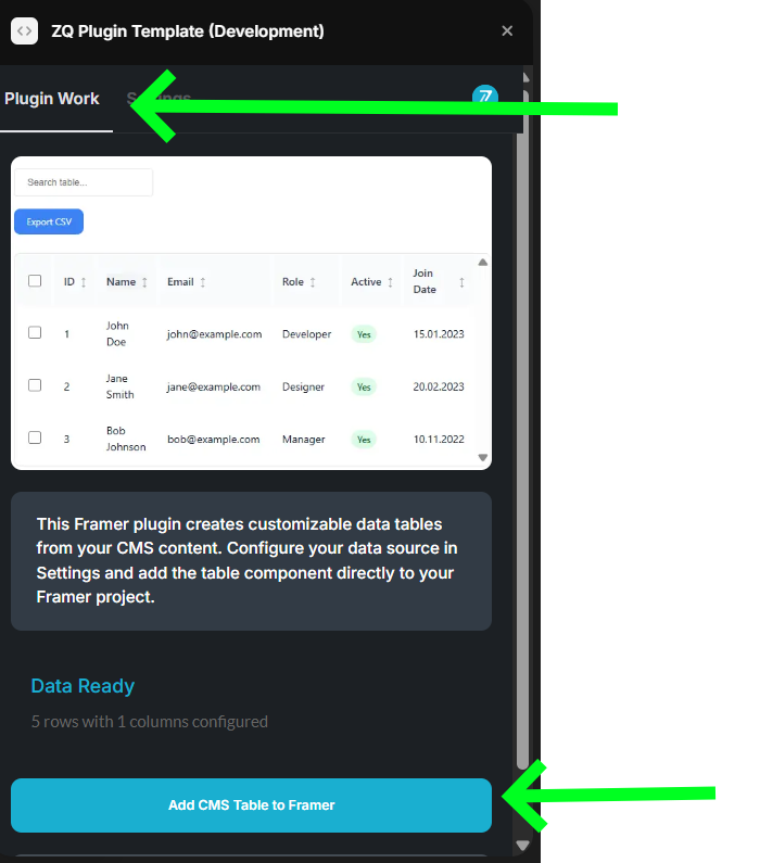
- Add Table to Framer:
- Return to the Plugin Work tab
- Click “Add CMS Table to Framer” to insert the configured table component
Plugin Element Properties
The plugin contains a Table/Grid component that should be used on a page to display your CMS data in table format.
Table/Grid Component
Data Configuration Fields:
Title | Description | Type |
Data | Array of table data with field1-field15 structure for each row | Array |
Columns Config | Configuration array for up to 15 table columns with labels, types, sorting options | Array |
Feature Toggle Fields:
Title | Description | Type |
Enable Search | Enable/disable global search functionality | Boolean |
Enable Sorting | Enable/disable column sorting by clicking headers | Boolean |
Enable Row Selection | Enable/disable row selection checkboxes | Boolean |
Enable Pagination | Enable/disable pagination controls | Boolean |
Enable Export | Enable/disable CSV export functionality | Boolean |
Fixed Headers | Keep headers visible when scrolling | Boolean |
Auto Column Width | Automatically adjust column widths | Boolean |
Page Size | Number of rows per page (5-100) | Number |
Styling Configuration Fields:
Title | Description | Type |
Theme Preset | Predefined color theme (custom, light, dark, corporate, minimal, modern, ocean, sunset, forest, royal, rose, slate, neon) | Text |
Background Color | Main background color of the table container | Color |
Border Color | Color of table borders and dividers | Color |
Border Radius | Rounded corners for the table container (0-20px) | Number |
Padding | Inner spacing around the table content (0-40px) | Number |
Header Background | Background color for table headers | Color |
Header Text | Text color for table headers | Color |
Text Color | Main text color for table cells | Color |
Primary Color | Color used for buttons, checkboxes, and accents | Color |
Row Hover Background | Background color when hovering over rows | Color |
Typography Fields:
Title | Description | Type |
Font Family | Font family for all table text | Text |
Font Size | Font size for table cells (10-24px) | Number |
Header Font Size | Font size for table headers (10-24px) | Number |
Font Weight | Font weight for table cell text (300, 400, 500, 600, 700) | Text |
Header Font Weight | Font weight for table headers (300, 400, 500, 600, 700) | Text |
Line Height | Line height multiplier for better text spacing (1-2) | Number |
Letter Spacing | Space between characters (e.g., “0px”, “1px”) | Text |
Advanced Cell Styling Fields:
Title | Description | Type |
Cell Padding | Inner spacing within table cells (4-24px) | Number |
Enable Alternate Rows | Alternate background colors for better readability | Boolean |
Alternate Row Color | Background color for alternate rows | Color |
Cell Border Style | Style of borders between table cells (none, solid, dashed, dotted) | Text |
Cell Border Color | Color of cell borders | Color |
Cell Border Width | Width of cell borders (1-5px) | Number |
Text Align | Horizontal alignment of text in table cells (left, center, right) | Text |
Header Text Align | Horizontal alignment of text in table headers (left, center, right) | Text |
Interactive State Fields:
Title | Description | Type |
Selected Row Color | Background color for selected rows | Color |
Active Row Color | Background color for active/focused rows | Color |
Focus Color | Color for focus outlines on interactive elements | Color |
Hover Transition Duration | Speed of hover animations (0ms, 150ms, 300ms, 500ms) | Text |
Layout & Spacing Fields:
Title | Description | Type |
Row Height | Row height (“auto” or specify like “60px”) | Text |
Header Height | Header height (“auto” or specify like “50px”) | Text |
Min Row Height | Minimum height for table rows (20-100px) | Number |
Max Row Height | Maximum row height (“none” or specify like “100px”) | Text |
Column Gap | Spacing between table columns (0-20px) | Number |
Shadow & Effects Fields:
Title | Description | Type |
Enable Shadow | Add a drop shadow effect to the table | Boolean |
Shadow Color | Color of the drop shadow | Color |
Shadow Blur | Blur radius of the shadow (0-20px) | Number |
Shadow Offset X | Horizontal offset of the shadow (-10 to 10px) | Number |
Shadow Offset Y | Vertical offset of the shadow (-10 to 10px) | Number |
Enable Inner Shadow | Add an inner shadow effect to the table | Boolean |
Inner Shadow Color | Color of the inner shadow | Color |
Enable Gradient | Use gradient background instead of solid color | Boolean |
Gradient Direction | Direction of the gradient (to bottom, to top, to right, to left, etc.) | Text |
Gradient Start | Starting color of the gradient | Color |
Gradient End | Ending color of the gradient | Color |