
Link to plugin page: https://www.framer.com/marketplace/plugins/timer-stopwatch/
Video Demo
Introduction
Timer & Stopwatch is a versatile no-code tool designed to enhance your Framer projects with professional timing functionality and countdown capabilities. The plugin enables users to create dynamic time-based components supporting both stopwatch and countdown timer modes with seamless switching between functionalities. Each timer can be extensively customized through an intuitive control panel featuring mode selection, precise date/time targeting, and real-time configuration updates, making it perfect for event countdowns, product launches, workout sessions, meeting timers, and any application requiring accurate time tracking and display.
How to setup
- Open the plugin.
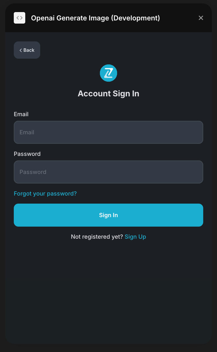
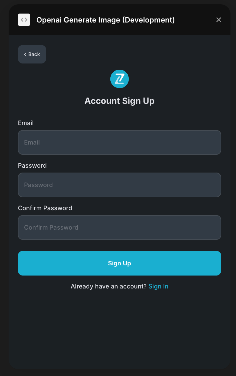
- To start using the plugin, you need to create or log in to your Zeroqode account. Select Sign In or Sign Up.
- Enter your account details.
- A subscription to all our plugins is required. Once subscribed, you will gain access to all our plugins. Enjoy a 7-day free trial before any charges apply..
- Add timer or stopwatch to your canvas.
- Customize your component using the properties panel.
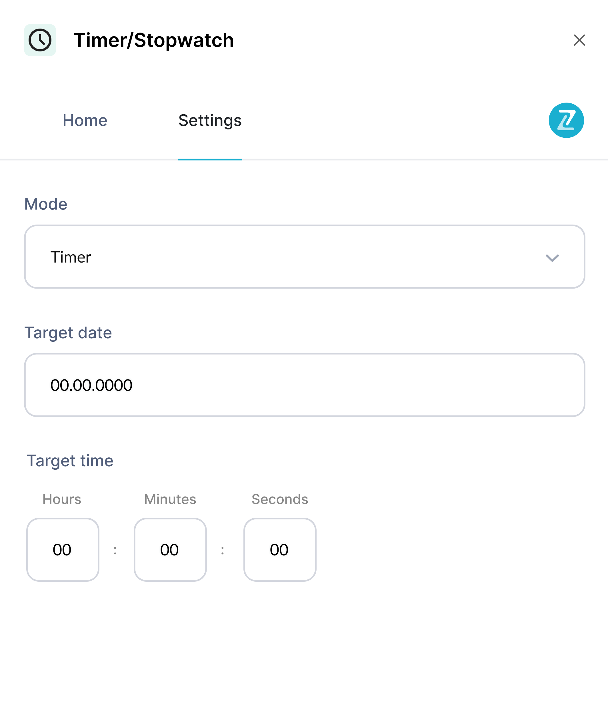
Plugin Settings
In the plugin settings, you can add your own collection of images from the CMS. Just select a collection from dropdown and select field that stores image
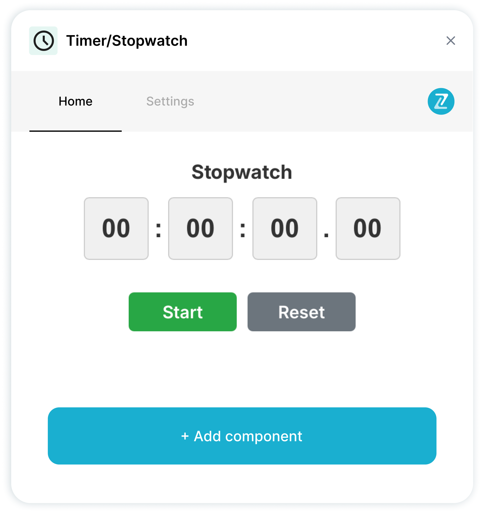
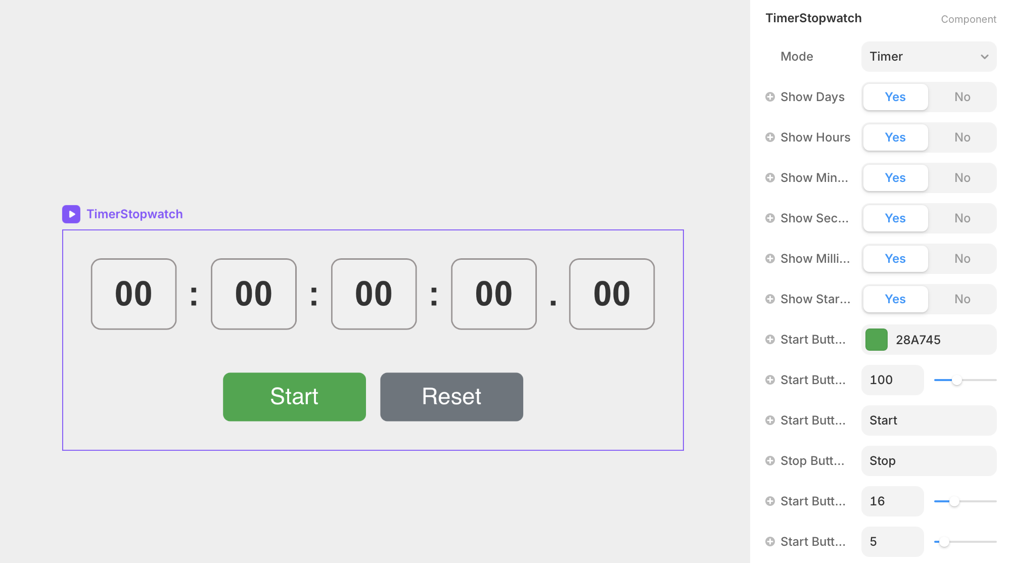
Timer/Stopwatch Component
The plugin contains a primary component called Timer/Stopwatch that should be added to your canvas.
It's got a lot of settings, let's go over them.
Parameters:
Title | Description | Type |
Mode | Switches between stopwatch (counts up from zero) and timer (counts down to target) functionality | Enum |
Show Days | Controls visibility of days counter in the time display | Boolean |
Show Hours | Controls visibility of hours counter in the time display | Boolean |
Show Minutes | Controls visibility of minutes counter in the time display | Boolean |
Show Seconds | Controls visibility of seconds counter in the time display | Boolean |
Show Milliseconds | Controls visibility of milliseconds counter in the time display | Boolean |
Show Start Button | Controls visibility of the start/stop control button | Boolean |
Start Button Color | Sets the background color for the start/stop button | Color |
Start Button Width | Defines the width of the start/stop button in pixels | Number |
Start Button Text | Customizes the text displayed on the start button | String |
Stop Button Text | Customizes the text displayed when timer is running (stop state) | String |
Start Button Text Size | Sets the font size for start/stop button text in pixels | Number |
Start Button Radius | Controls the border radius of the start/stop button | Number |
Auto Start on Load | Automatically begins timing when component loads | Boolean |
Days Block Color | Sets the background color for the days time block | Color |
Hours Block Color | Sets the background color for the hours time block | Color |
Minutes Block Color | Sets the background color for the minutes time block | Color |
Seconds Block Color | Sets the background color for the seconds time block | Color |
Milliseconds Block Color | Sets the background color for the milliseconds time block | Color |
Text Color | Sets the color of all time numbers and separators | Color |
Font Size | Controls the size of time display numbers in pixels | Number |
Font Weight | Sets the thickness/boldness of the time display text | Enum |
Font Family | Defines the typeface used for time display and buttons | String |
Block Padding | Sets internal spacing within each time display block | Number |
Block Border Radius | Controls the corner rounding of time display blocks | Number |
Block Border Width | Sets the thickness of borders around time blocks | Number |
Block Border Color | Defines the color of borders around time display blocks | Color |
Day-Hour Separator | Customizes the symbol between days and hours display | String |
Hour-Minute Separator | Customizes the symbol between hours and minutes display | String |
Minute-Second Separator | Customizes the symbol between minutes and seconds display | String |
Second-Millisecond Separator | Customizes the symbol between seconds and milliseconds display | String |
Unit-Separator Gap | Controls spacing between time numbers and separator symbols | Number |
Separator Spacing | Sets overall spacing around separator symbols | Number |
Show Reset Button | Controls visibility of the reset control button | Boolean |
Reset Button Color | Sets the background color for the reset button | Color |
Reset Button Width | Defines the width of the reset button in pixels | Number |
Reset Button Text | Customizes the text displayed on the reset button | String |
Reset Button Text Size | Sets the font size for reset button text in pixels | Number |
Reset Button Radius | Controls the border radius of the reset button | Number |
End Date | Specifies the target date for countdown timer mode | Date |
End Hours | Sets the target hour (0-23) for countdown completion | String |
End Minutes | Sets the target minute (0-59) for countdown completion | String |
End Seconds | Sets the target second (0-59) for countdown completion | String |