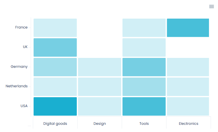
54 fully customizable chart types with advanced features for your application! This plugin is developed with the most performant and well known javascript charting libraries.
Tutorial
How to setup
Place the required elements on the page and fill in the fields. You can find a more detailed configuration of each element on the plugin demo page.
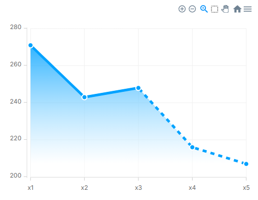
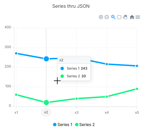
Plugin Element — Line Chart
Preview
Element fields
Title
Description
Type
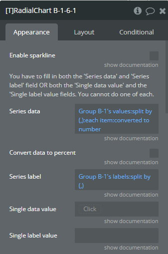
Enable sparkline
Sparkline hides all the elements of the charts other than the primary paths. Helps to visualize data in small areas line like for a graph in a sidebar or header.
Checkbox (yes/no)
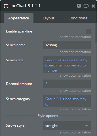
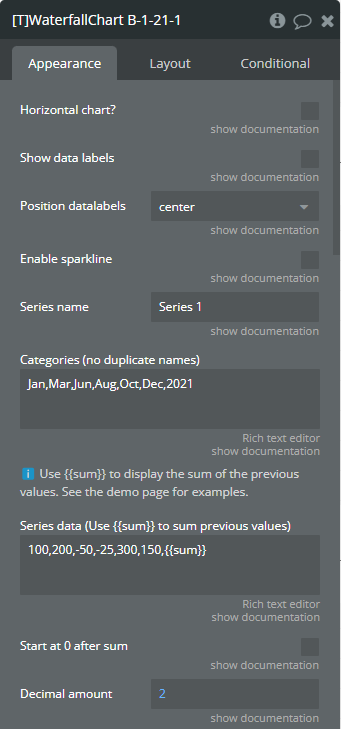
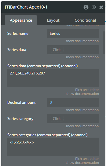
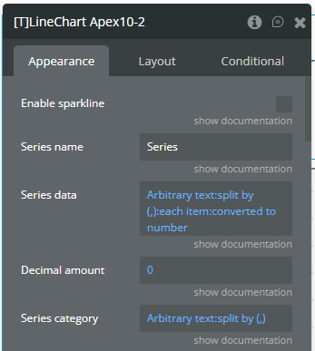
Series name
The name of the data. Will be shown in the tooltip.
Text
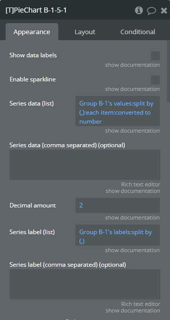
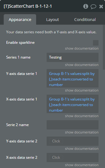
Series data
Y-axis data (list of numbers). Make sure to use the same amount of data points for the Y-axis as for the X-axis. If you are for example using a grouping for the Y-axis, make sure that you use the same grouping for the X-axis.
Number
Decimal amount
(optional) The amount of decimals on the Y-axis.
Number (optional)
Series category
X-axis data (list of texts). You can use the ‘:formatted as’ operator in Bubble to convert other datatypes to a text! Make sure to use the same amount of data points for the Y-axis as for the X-axis. If you are for example using a grouping for the Y-axis, make sure that you use the same grouping for the X-axis.
Text
Stroke style
This option defines the style of the series points connection. Available options: straight, smooth, stepline
Dropdown
Stroke width
(number) The connection line’s width of the series.
Number (optional)
Dash width
(number) If the value is more than 0 the connection points line for the serie will be dashed.
Number (optional)
Color style
This option defines how to color the connection points line. Available options: solid, gradient
Dropdown
Chart color
The color for the serie.
Text
Gradient to color
The 2nd gradient color for the serie. It will be applied if only the “gradient” option was selected from the “Color style” dropdown. Available options: light, dark
Text
Gradient type
This dropdown defines the gradient direction. This will work if only the “gradient” option was selected from the “Color style” dropdown. Available options: horizontal, vertical
Dropdown (optional)
Enable dropshadow
Draws a drop shadow for the serie.
Checkbox (yes/no)
Dropshadow color
The color of the shadow.
Color (optional)
Dropshadow blur
(number) The blur distance for shadow. Accepted values from 0 to 100.
Number (optional)
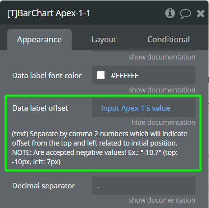
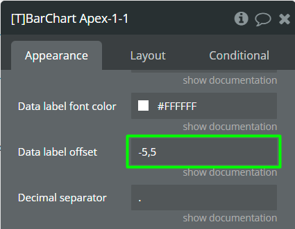
Dropshadow vertical offset
(number) The top offset for shadow in px.
Number (optional)
Dropshadow horizontal offset
(number) The left offset for shadow in px.
Number (optional)
Dropshadow opacity
(number) The opacity for shadow. Accepted values from 0 to 1.
Number (optional)
Marker shape
The shape of markers. Available options: circle, square
Dropdown
Marker radius
(number) The radius of square markers. This will work if only the “square” option were selected from the “Marker shape” dropdown.
Number
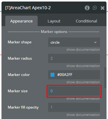
Marker size
(number) The size of markers. If the value is more than 0 then markers will be displayed on the chart. Also, all element states will be available.
Number (optional)
Marker color
The color for the serie markers.
Text
Marker fill opacity
(number) The opacity for markers. Accepted values from 0 to 1.
Number
Marker stroke color
The color for the serie markers stroke.
Text
Marker stroke width
(number) The width of markers stroke in px.
Number
Marker stroke opacity
(number) The opacity for markers stroke. Accepted values from 0 to 1.
Number
Marker stroke dash array
(number) If the value is more than 0 the markers stroke will be dashed.
Number (optional)
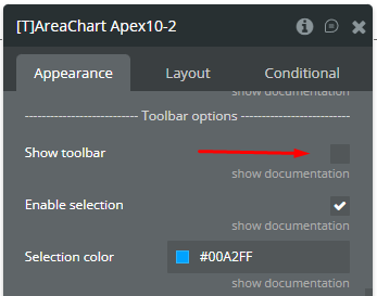
Show toolbar
This option adds a toolbar to the top-right side of the chart.
Checkbox (yes/no)
Enable selection
This option adds a selection option to the chart toolbar.
Checkbox (yes/no)
Selection color
The color for the zoom square.
Color
Selection opacity
(number) The opacity of zoom square. Accepted values from 0 to 1.
Number
Selection stroke width
(number) The width of the zoom square stroke in px.
Number
Selection stroke color
The color of the zoom square stroke.
Color
Selection stroke opacity
(number) The opacity of zoom square stroke. Accepted values from 0 to 1.
Number
Enable download
This option adds a download option to the chart toolbar.
Checkbox (yes/no)
Enable zoom
This option adds a zoom option to the chart toolbar.
Checkbox (yes/no)
Enable zoomin
This option adds a zoom-in option to the chart toolbar.
Checkbox (yes/no)
Enable zoomout
This option adds a zoom-out option to the chart toolbar.
Checkbox (yes/no)
Enable pan
This option adds a pan option to the chart toolbar.
Checkbox (yes/no)
Enable reset
This option adds a reset option to the chart toolbar.
Checkbox (yes/no)
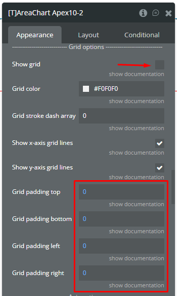
Show grid
This option allows displaying grid lines.
Checkbox (yes/no)
Grid color
The color of grid lines.
Color
Grid stroke dash array
If the value is more than 0 the grid lines will be dashed.
Text (optional)
Show x-axis grid lines
This option allows displaying vertical grid lines.
Checkbox (yes/no)
Show y-axis grid lines
This option allows displaying horizontal grid lines.
Checkbox (yes/no)
Grid padding top
(number) The top edge padding for the chart.
Number
Grid padding bottom
(number) The bottom edge padding for the chart.
Number
Grid padding left
(number) The left edge padding for the chart.
Number
Grid padding right
(number) The right edge padding for the chart.
Number
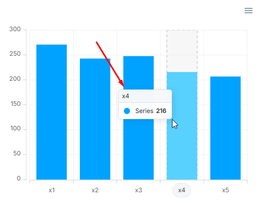
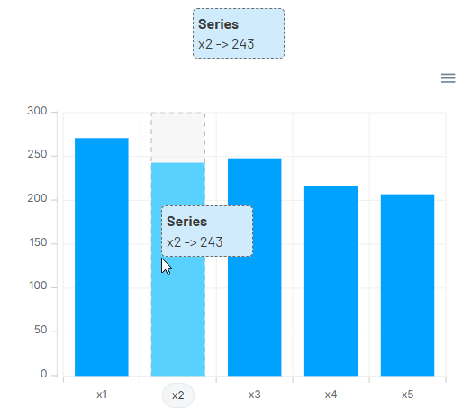
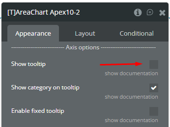
Show tooltip
This option shows a tooltip on the chart on hover.
Checkbox (yes/no)
Show category on tooltip
This option allows showing the X-axis data in the tooltip.
Checkbox (yes/no)
Enable fixed tooltip
Fixes the tooltip to the top left of the chart.
Checkbox (yes/no)
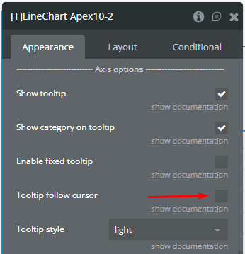
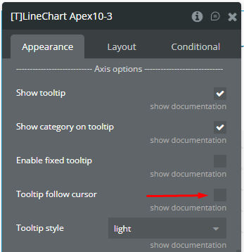
Tooltip follow cursor
Displaying the tooltip beside the cursor on hover.
Checkbox (yes/no)
Tooltip style
The tooltip theme. Available options: light, dark
Dropdown
X-axis font color
The font color for X-axis labels.
Color
X-axis font size
The font size for X-axis labels.
Number
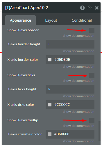
Show X-axis border
This option allows showing an X-axis border.
Checkbox (yes/no)
X-axis border height
(number) The width of the X-axis border. If the value is more than 0 the border will be displayed.
Number
X-axis border color
The color of the X-axis border.
Color
Show X-axis ticks
This option allows showing the X-axis ticks.
Checkbox (yes/no)
X-axis ticks height
(number) The size for the X-axis ticks.
Number
X-axis ticks color
The color for the X-axis ticks.
Color
Show X-axis tooltip
This option shows a tooltip on X-axis on hover.
Checkbox (yes/no)
X-axis crosshair color
The color for the crosshair line.
Color
X-axis crosshair dash array
(number) If the value is more than 0 the crosshair line will be dashed.
Number (optional)
X-axis crosshair line width
(number) The size for the crosshair. If the value is more than 0 the crosshair will be displayed.
Number
Y-axis font color
The font color for Y-axis labels.
Color
Y-axis font size
The font size for Y-axis labels.
Number
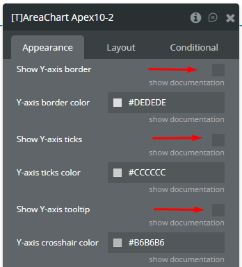
Show y-axis border
This option allows showing the Y-axis border.
Checkbox (yes/no)
Y-axis border color
The color of the Y-axis border.
Color
Show Y-axis ticks
This option allows showing the Y-axis ticks.
Checkbox (yes/no)
Y-axis ticks color
The color for the Y-axis ticks.
Color
Show Y-axis tooltip
This option shows a tooltip on Y-axis on hover.
Checkbox (yes/no)
Y-axis crosshair color
The color for the crosshair line.
Color
Y-axis crosshair dash array
(number) If the value is more than 0 the crosshair line will be dashed.
Number (optional)
Y-axis crosshair line width
(number) The size for the crosshair. If the value is more than 0 the crosshair will be displayed.
Number
Show Y-axis labels
This option allows showing the Y-axis labels.
Checkbox (yes/no)
Show X-axis labels
This option allows showing the X-axis labels.
Checkbox (yes/no)
X-axis label offset
The vertical offset of the X-axis labels.
Number
X-axis labels min height
(number) The min height for the X-axis labels when they are rotated.
Number (optional)
X-axis labels max height
(number) The max height for the X-axis labels when they are rotated.
Number
Y-axis prefix
(optional) (text) Prefix for the Y-axis label. Available options: , $, €, £, ¥, R, ₿, #
Text (optional)
Y-axis suffix
(optional) (text) Suffix for the Y-axis label. Available options: , %, ?, !, $, €, £, ¥, R, ₿, #, votes, inches, miles, meters, liters, gallons, kWhs
Text (optional)
Y-axis min value
(number) Force the Y-axis to start from a specific amount. The graph drawing beyond this number will be clipped off.
Number (optional)
Y-axis max value
(number) Force the Y-axis to stop at a specific amount. The graph drawing beyond this number will be clipped off.
Number (optional)
Tick amount X-axis
The amount of ticks to display on the X-axis.
Number (optional)
Tick amount Y-axis
The amount of ticks to display on the Y-axis.
Number (optional)
Render Y-axis on the right
Displaying the Y-axis on the right side of chart.
Checkbox (yes/no)
Reverse Y-axis
Flip the chart upside down making it inversed and draw the y-axis from bigger to smaller numbers.
Checkbox (yes/no)
Hide overlapping X-axis labels
This option allows hiding some of the X-axis labels if they overlap others.
Checkbox (yes/no)
Trim X-axis labels (if needed)
This option trims the label if it’s too long and adds “…” to its end.
Checkbox (yes/no)
Rotate X-axis labels (if needed)
This option rotates labels if they are too long.
Checkbox (yes/no)
Always rotate X-axis labels
This option rotates labels permanently.
Checkbox (yes/no)
Label rotation angle
(number) The angle for the rotation of the label. Accepted negative values.
Number
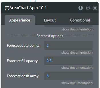
Forecast data points
(number) The number of ending data points you want to indicate as forecast or prediction values.
Number
Forecast fill opacity
(numbner) The opacity for forecast connection points line of series.
Number
Forecast dash array
(number) If the value is more than 0 the forecast connection points line will be dashed.
Number
X-axis title
(optional) (text) The title for X-axis.
Text (optional)
Y-axis title
(optional) (text) The title for Y-axis.
Text (optional)
Axis title font size
(number) The font size of titles of axes.
Number
Axis title font color
The font color of titles of axes.
Color
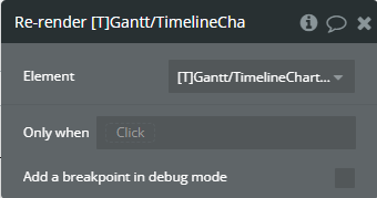
Do not refresh chart
The chart will not refresh automatically. This improves chart performance. You can manually update the chart by running the re-render workflow action.
Checkbox (yes/no)
Enable animation
This option allows animating the chart.
Checkbox (yes/no)
Animation speed
(number) This value represents the time in milliseconds allocated for animation. The more value - the more time for animation.
Number
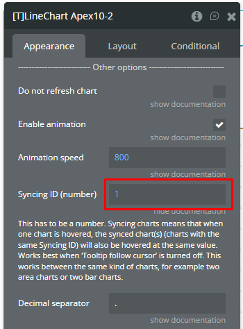
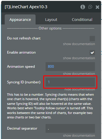
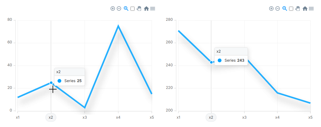
Syncing ID (number)
This has to be a number. Syncing charts means that when one chart is hovered, the synced chart(s) (charts with the same Syncing ID) will also be hovered at the same value. Works best when ’Tooltip follow cursor’ is turned off. This works between the same kind of charts, for example two area charts or two bar charts.
Number (optional)
Decimal separator
(text) The symbol that separates the decimal part of the number area.
Text
Thousand separator
(optional) (text) The symbol that separates a thousand value from the rest of the number.
Text (optional)
To enable the ‘Data point clicked’ event for Area/Line charts the following checkbox should be CHECKED. Also, the marker size should be greater than 0.
Enable events
Markers will require an intersect with the mouse pointer on hover.
Checkbox (yes/no)
Reset hover state on mouse leave
This will reset the hover values (states) when the chart isn’t being hovered. Normally this state will not be reset on mouse leave.
Checkbox (yes/no)
Enable color change on hover
Changes the chart colors on hover.
Checkbox (yes/no)
Replace null/undefined values with 0 (Y-axis)
This option allows to replacement of all “null” or “undefined” values from provided data.
Checkbox (yes/no)
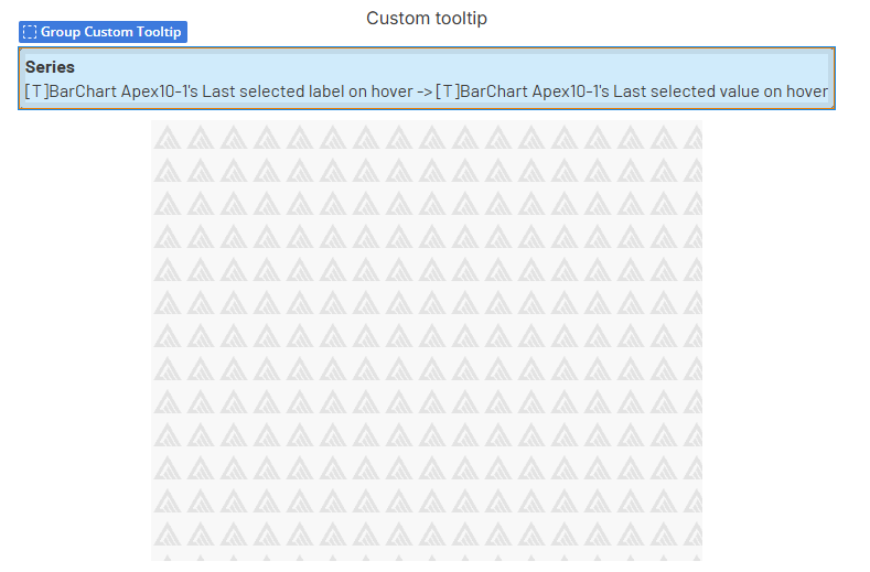
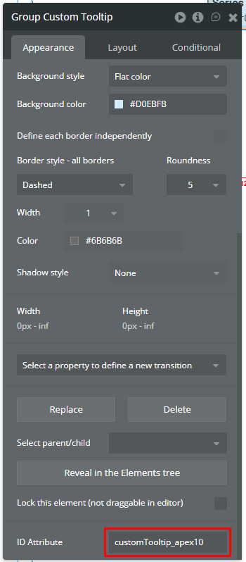
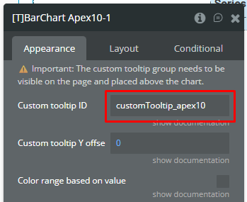
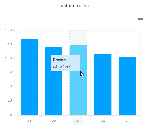
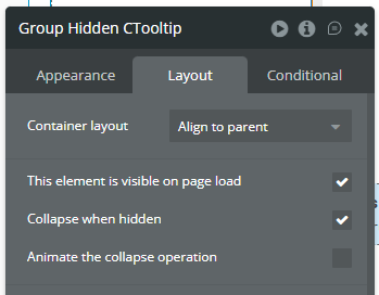
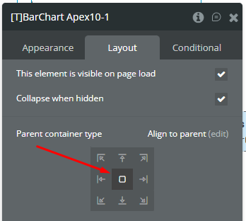
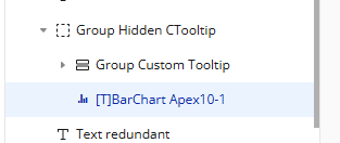
Custom tooltip ID
The element ID of a Bubble group you want to use as tooltip. You can access the hover values of the chart as element states. Make sure that the group is visible on page load.
Text (optional)
Custom tooltip Y offset
The top offset of custom tooltip in px.
Number
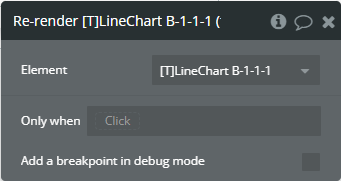
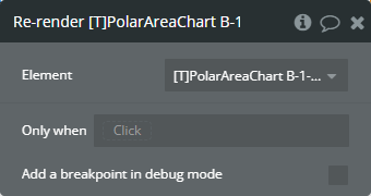
Element actions
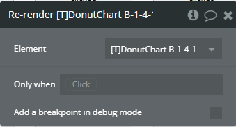
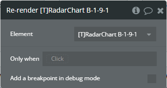
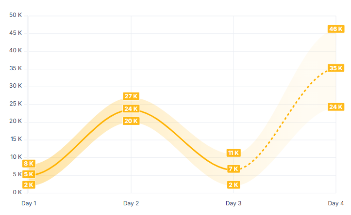
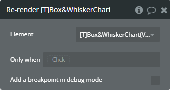
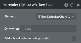
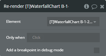
Re-render - This action is used to redraw the chart.
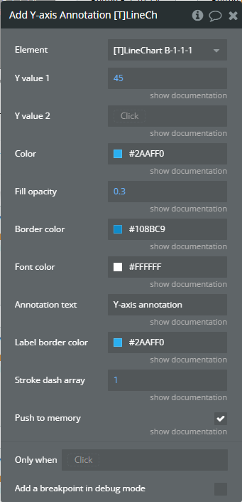
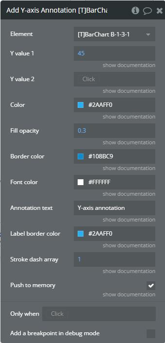
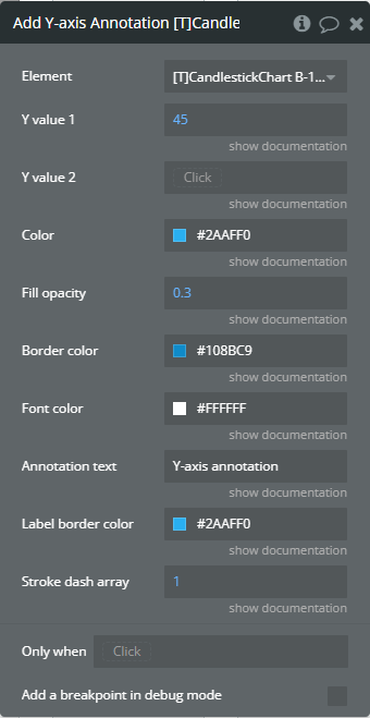
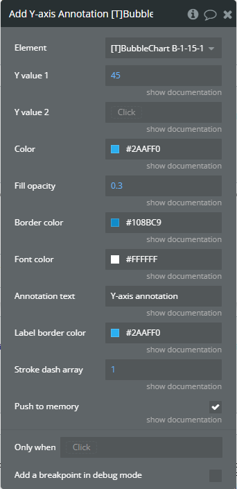
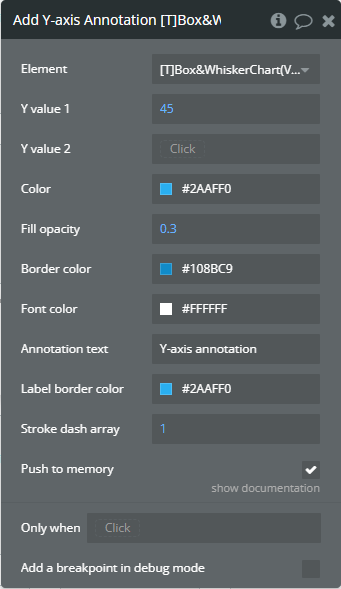
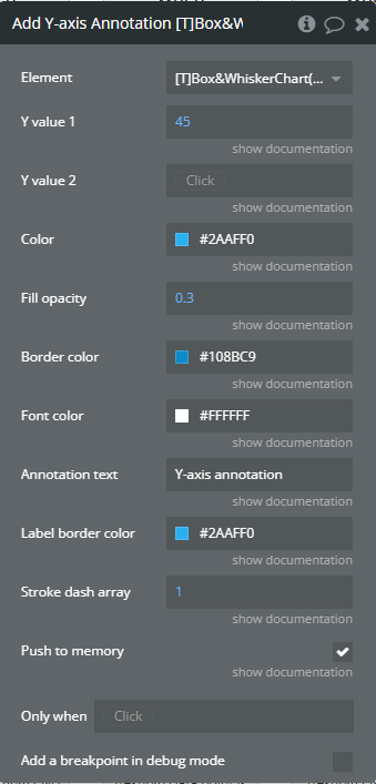
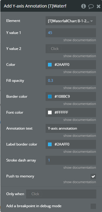
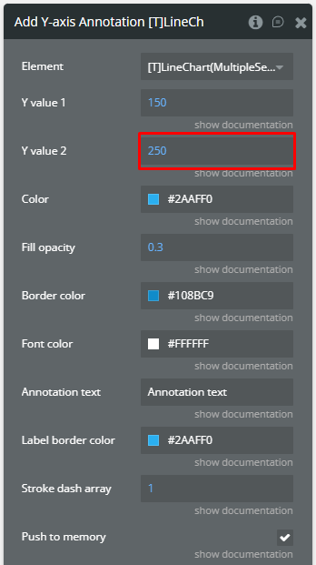
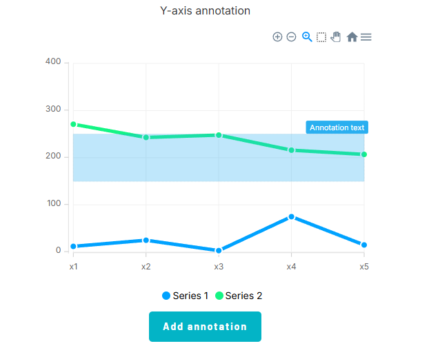
Add Y-axis Annotation - This action is used to add the Y-axis annotation on the chart.
Fields
Title
Description
Type
Y value 1
(number) The existent value from the Y-axis range.
Number
Y value 2
(number) The second existent value from the Y-axis range.
Number (optional)
Color
The color for filling the range between both provided values.
Color
Fill opacity
(number) The opacity of the range between both provided values. Accepted value from 0 to 1.
Number
Border color
The color for the label border.
Color
Font color
The color for the text from the label.
Color
Annotation text
(text) The text, which represents the annotation.
Text
Label border color
The color for the label border.
Color
Stroke dash array
(number) If the value is bigger than 0 the edges or line will be dashed.
Number
Push to memory
When enabled, it preserves the annotations in subsequent chart updates. If you don’t want it to be saved for the next updates, turn off this option.
Checkbox (yes/no)
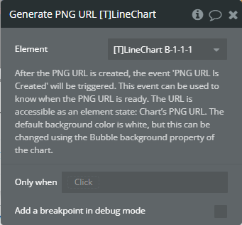
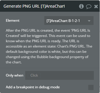
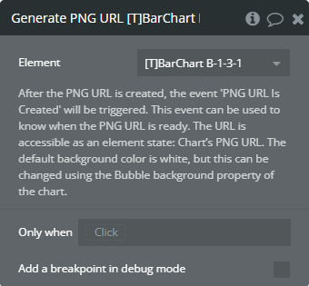
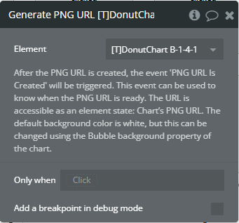
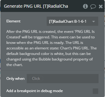
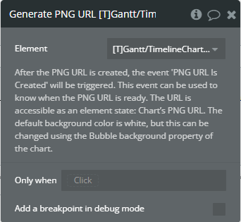
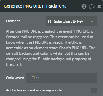
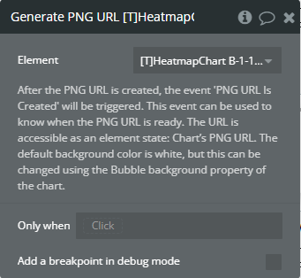
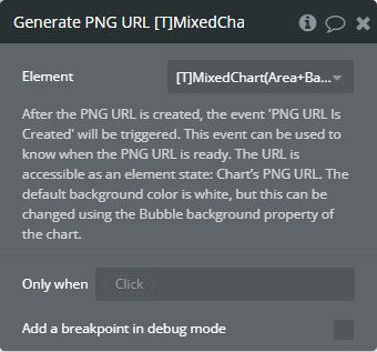
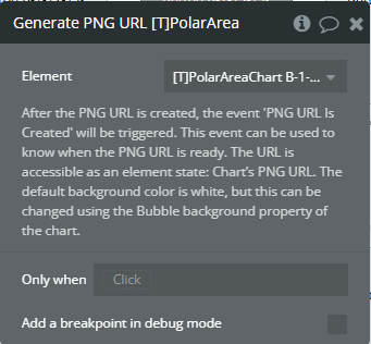
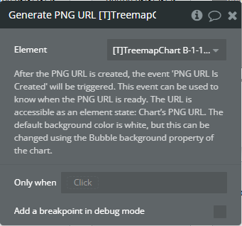
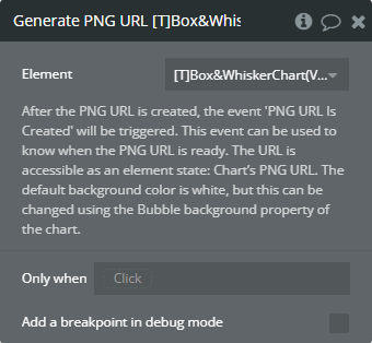
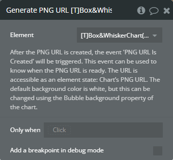
Generate PNG URL - This action is used to generate the PNG URL for the chart.
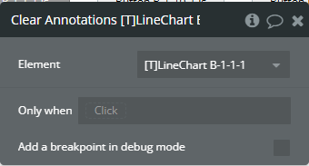
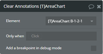
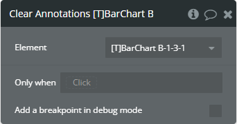
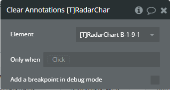
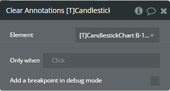
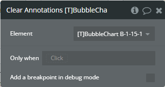
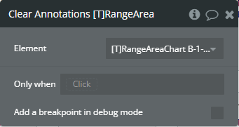
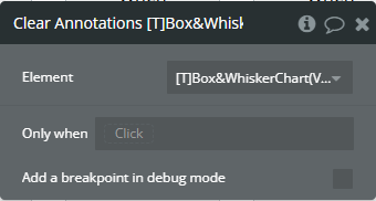
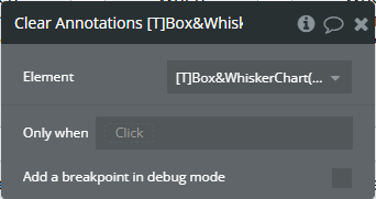
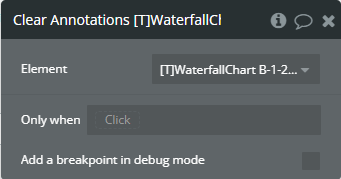
Clear Annotations - This action is used to remove all annotations from the chart.
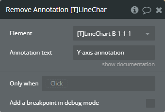
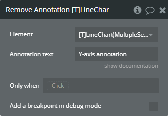
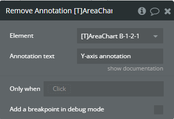
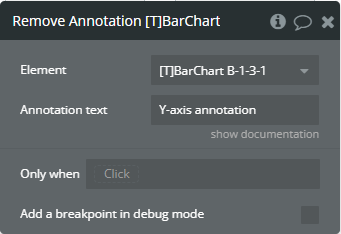
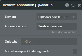
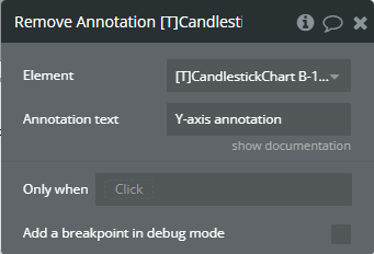
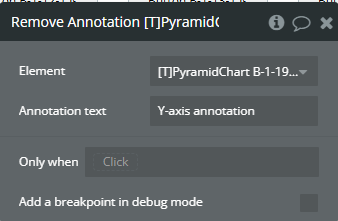
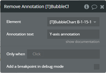
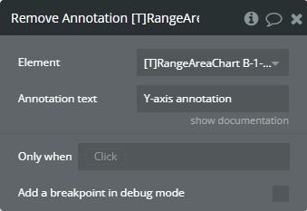
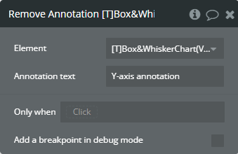
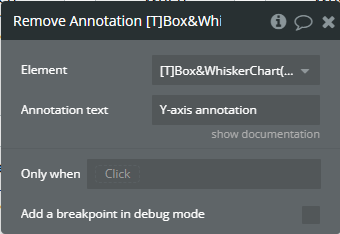
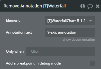
Remove Annotation - This action is used to remove an annotation from the chart.
Fields
Title
Description
Type
Annotation text
(text) The text, which represents the annotation.
Text
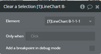
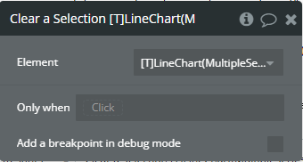
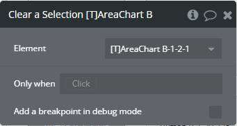
Clear a Selection - This action is used to remove a selection from the chart.
Element events
Title
Description
Data point is clicked
This event is triggered when the chart is clicked.
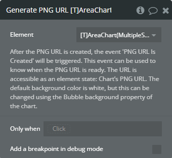
PNG URL Is Created
This event is triggered when the PNG URL is available.
Element states
Title
Description
Type
Is loaded?
(yes/no) Indicates that the chart was fully loaded.
Checkbox (yes/no)
Selected index value
(number) Returns the index of the selected value when the chart has clicked.
Number
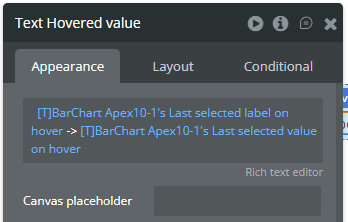
Last selected label on hover (must have events enabled or custom tooltips)
(text) Returns the last of the selected label when the chart has hovered.
Text
Last selected value on hover (must have events enabled or custom tooltips)
(number) Returns the last of the selected value when the chart has hovered.
Number
Selected label
(text) Returns the selected label when the chart has clicked.
Text
Selected value
(number) Returns the selected value when the chart has clicked.
Number
PNG URL
(text) Returns the generated PNG url after execution of the “Generate PNG URL” action.
Text
Last selected index on hover (must have events enabled or custom tooltips)
(number) Returns the index of the selected value when the chart has hovered.
Number
Selection Start Index
(number) Returns the start index of the X-axis label when the part of chart has selected.
Number
Selection End Index
(number) Returns the stop index of the X-axis label when the part of chart has selected.
Number
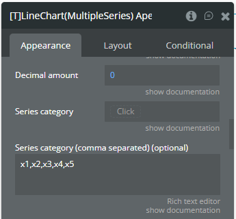
Plugin Element — Line Chart (Multiple Series)
Preview
Element fields
Title
Description
Type
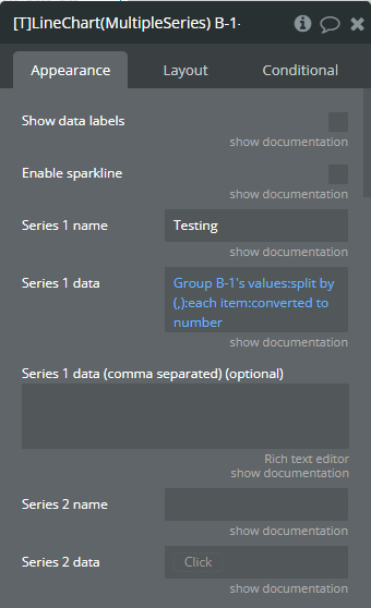
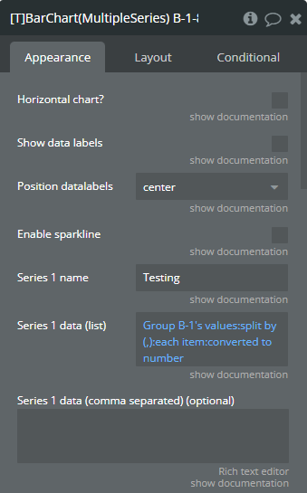
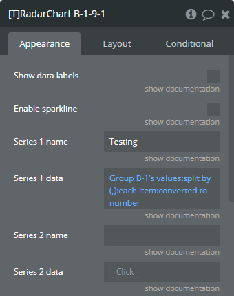
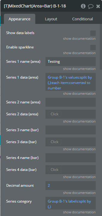
Show data labels
Shows data labels on the place of markers. Make sure to turn the makers of if you enable this option.
Checkbox (yes/no)
Enable sparkline
Sparkline hides all the elements of the charts other than the primary paths. Helps to visualize data in small areas line like for a graph in a sidebar or header.
Checkbox (yes/no)
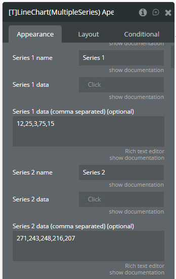
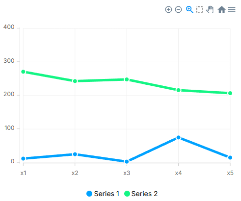
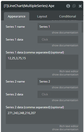
Series 1 name
The name of the 1st serie. Will be shown in the tooltip.
Text (optional)
Series 1 data
Y-axis data for serie 1 (list of numbers). Make sure to use the same amount of data points for the Y-axis as for the X-axis. If you are for example using a grouping for the Y-axis, make sure that you use the same grouping for the X-axis.
Number (optional)
Series 1 data (comma separated) (optional)
(optional) You can use this field if you want to specify a comma separated list instead of a dynamic list from the “Series 1 data” field.
Text (optional)
Series 2 name
The name of the 2nd serie. Will be shown in the tooltip.
Text (optional)
Series 2 data
Y-axis data for serie 2 (list of numbers). Make sure to use the same amount of data points for the Y-axis as for the X-axis. If you are for example using a grouping for the Y-axis, make sure that you use the same grouping for the X-axis.
Number (optional)
Series 2 data (comma separated) (optional)
(optional) You can use this field if you want to specify a comma separated list instead of a dynamic list from the “Series 2 data” field.
Text (optional)
Series 3 name
The name of the 3rd serie. Will be shown in the tooltip.
Text (optional)
Series 3 data
Y-axis data for serie 3 (list of numbers). Make sure to use the same amount of data points for the Y-axis as for the X-axis. If you are for example using a grouping for the Y-axis, make sure that you use the same grouping for the X-axis.
Number (optional)
Series 3 data (comma separated) (optional)
(optional) You can use this field if you want to specify a comma separated list instead of a dynamic list from the “Series 3 data” field.
Text (optional)
Series 4 name
The name of the 4th serie. Will be shown in the tooltip.
Text (optional)
Series 4 data
Y-axis data for serie 4 (list of numbers). Make sure to use the same amount of data points for the Y-axis as for the X-axis. If you are for example using a grouping for the Y-axis, make sure that you use the same grouping for the X-axis.
Number (optional)
Series 4 data (comma separated) (optional)
(optional) You can use this field if you want to specify a comma separated list instead of a dynamic list from the “Series 4 data” field.
Text (optional)
Series 5 name
The name of the 5th serie. Will be shown in the tooltip.
Text (optional)
Series 5 data
Y-axis data for serie 5 (list of numbers). Make sure to use the same amount of data points for the Y-axis as for the X-axis. If you are for example using a grouping for the Y-axis, make sure that you use the same grouping for the X-axis.
Number (optional)
Series 5 data (comma separated) (optional)
(optional) You can use this field if you want to specify a comma separated list instead of a dynamic list from the “Series 5 data” field.
Text (optional)
Series 6 name
The name of the 6th serie. Will be shown in the tooltip.
Text (optional)
Series 6 data
Y-axis data for serie 6 (list of numbers). Make sure to use the same amount of data points for the Y-axis as for the X-axis. If you are for example using a grouping for the Y-axis, make sure that you use the same grouping for the X-axis.
Number (optional)
Series 6 data (comma separated) (optional)
(optional) You can use this field if you want to specify a comma separated list instead of a dynamic list from the “Series 6 data” field.
Text (optional)
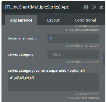
Decimal amount
(optional) The amount of decimals on the Y-axis.
Number (optional)
Series category
X-axis data (list of texts). You can use the ‘:formatted as’ operator in Bubble to convert other datatypes to a text! Make sure to use the same amount of data points for the Y-axis as for the X-axis. If you are for example using a grouping for the Y-axis, make sure that you use the same grouping for the X-axis.
Text (optional)
Series category (comma separated) (optional)
(optional) You can use this field if you want to specify a comma separated list instead of a dynamic list from the “Series category” field.
Text (optional)
Style options
Stroke style
This option defines the style of the series points connection. Available options: straight, smooth, stepline
Dropdown
Stroke width
(number) The connection line’s width of the series.
Number (optional)
Dash width
(number) If the value is more than 0 the connection points line for the serie will be dashed.
Number (optional)
Color style
This option defines how to color the connection points line. Available options: solid, gradient
Dropdown
Series 1 color
The color for the 1st serie.
Text
Series 2 color
The color for the 2nd serie.
Text
Series 3 color
The color for the 3rd serie.
Color
Series 4 color
The color for the 4th serie.
Color
Series 5 color
The color for the 5th serie.
Color
Series 6 color
The color for the 6th serie.
Color
Fill color opacity
Fill color of the chart. Value between 0 and 1. Works when color style is ‘solid’.
Number
Series 1 - Gradient to color
The 2nd gradient color for the 1st serie. It will be applied if only the “gradient” option was selected from the “Color style” dropdown. Available options: light, dark
Text
Series 2 - Gradient to color
The 2nd gradient color for the 2nd serie. It will be applied if only the “gradient” option was selected from the “Color style” dropdown.
Text
Series 3 - Gradient to color
The 2nd gradient color for the 3rd serie. It will be applied if only the “gradient” option was selected from the “Color style” dropdown.
Color
Series 4 - Gradient to color
The 2nd gradient color for the 4th serie. It will be applied if only the “gradient” option was selected from the “Color style” dropdown.
Color
Series 5 - Gradient to color
The 2nd gradient color for the 5th serie. It will be applied if only the “gradient” option was selected from the “Color style” dropdown.
Color
Series 6 - Gradient to color
The 2nd gradient color for the 6th serie. It will be applied if only the “gradient” option was selected from the “Color style” dropdown.
Color
Gradient type
This dropdown defines the gradient direction. This will work if only the “gradient” option was selected from the “Color style” dropdown. Available options: horizontal, vertical
Dropdown (optional)
Gradient opacity to
(number) The opacity for the 2nd gradient color.
Number
Gradient opacity from
(number) The opacity for the 1st gradient color.
Number
Enable dropshadow
Draws a drop shadow for the serie.
Checkbox (yes/no)
Dropshadow color
The color of the shadow.
Color (optional)
Dropshadow blur
(number) The blur distance for shadow. Accepted values from 0 to 100.
Number (optional)
Dropshadow vertical offset
(number) The top offset for shadow in px.
Number (optional)
Dropshadow horizontal offset
(number) The left offset for shadow in px.
Number (optional)
Dropshadow opacity
(number) The opacity for shadow. Accepted values from 0 to 1.
Number (optional)
Marker options
Marker shape
The shape of markers. Available options: circle, square
Dropdown
Marker radius
(number) The radius of square markers. This will work if only the “square” option were selected from the “Marker shape” dropdown.
Number
Marker size
(number) The size of markers. If the value is more than 0 then markers will be displayed on the chart. Also, all element states will be available.
Number (optional)
Series 1 - Marker color
The color for the 1st serie markers.
Text
Series 2 - Marker color
The color for the 2nd serie markers.
Text
Series 3 - Marker color
The color for the 3rd serie markers.
Color
Series 4 - Marker color
The color for the 4th serie markers.
Color
Series 5 - Marker color
The color for the 5th serie markers.
Color
Series 6 - Marker color
The color for the 6th serie markers.
Color
Marker fill opacity
(number) The opacity for markers. Accepted values from 0 to 1.
Number
Series 1 - Marker stroke color
The color for the 1st serie markers stroke.
Text
Series 2 - Marker stroke color
The color for the 2nd serie markers stroke.
Text
Series 3 - Marker stroke color
The color for the 3rd serie markers stroke.
Color
Series 4 - Marker stroke color
The color for the 4th serie markers stroke.
Color
Series 5 - Marker stroke color
The color for the 5th serie markers stroke.
Color
Series 6 - Marker stroke color
The color for the 6th serie markers stroke.
Color
Marker stroke width
(number) The width of markers stroke in px.
Number
Marker stroke opacity
(number) The opacity for markers stroke. Accepted values from 0 to 1.
Number
Marker stroke dash array
(number) If the value is more than 0 the markers stroke will be dashed.
Number (optional)
Toolbar options
Show toolbar
This option adds a toolbar to the top-right side of the chart.
Checkbox (yes/no)
Enable selection
This option adds a selection option to the chart toolbar.
Checkbox (yes/no)
Selection color
The color for the zoom square.
Color
Selection opacity
(number) The opacity of zoom square. Accepted values from 0 to 1.
Number
Selection stroke width
(number) The width of the zoom square stroke in px.
Number
Selection stroke color
The color of the zoom square stroke.
Color
Selection stroke opacity
(number) The opacity of zoom square stroke. Accepted values from 0 to 1.
Number
Enable download
This option adds a download option to the chart toolbar.
Checkbox (yes/no)
Enable zoom
This option adds a zoom option to the chart toolbar.
Checkbox (yes/no)
Enable zoomin
This option adds a zoom-in option to the chart toolbar.
Checkbox (yes/no)
Enable zoomout
This option adds a zoom-out option to the chart toolbar.
Checkbox (yes/no)
Enable pan
This option adds a pan option to the chart toolbar.
Checkbox (yes/no)
Enable reset
This option adds a reset option to the chart toolbar.
Checkbox (yes/no)
Grid options
Show grid
This option allows displaying grid lines.
Checkbox (yes/no)
Grid color
The color of grid lines.
Color
Grid stroke dash array
If the value is more than 0 the grid lines will be dashed.
Text (optional)
Show x-axis grid lines
This option allows displaying vertical grid lines.
Checkbox (yes/no)
Show y-axis grid lines
This option allows displaying horizontal grid lines.
Checkbox (yes/no)
Grid padding top
(number) The top edge padding for the chart.
Number
Grid padding bottom
(number) The bottom edge padding for the chart.
Number
Grid padding left
(number) The left edge padding for the chart.
Number
Grid padding right
(number) The right edge padding for the chart.
Number
Axis options
Show tooltip
This option shows a tooltip on the chart on hover.
Checkbox (yes/no)
Show category on tooltip
This option allows showing the X-axis data in the tooltip.
Checkbox (yes/no)
Enable fixed tooltip
Fixes the tooltip to the top left of the chart.
Checkbox (yes/no)
Tooltip follow cursor
Displaying the tooltip beside the cursor on hover.
Checkbox (yes/no)
Tooltip style
The tooltip theme. Available options: light, dark
Dropdown
X-axis font color
The font color for X-axis labels.
Color
X-axis font size
The font size for X-axis labels.
Number
Show X-axis border
This option allows showing an X-axis border.
Checkbox (yes/no)
X-axis border height
(number) The width of the X-axis border. If the value is more than 0 the border will be displayed.
Number
X-axis border color
The color of the X-axis border.
Color
Show X-axis ticks
This option allows showing the X-axis ticks.
Checkbox (yes/no)
X-axis ticks height
(number) The size for the X-axis ticks.
Number
X-axis ticks color
The color for the X-axis ticks.
Color
Show X-axis tooltip
This option shows a tooltip on X-axis on hover.
Checkbox (yes/no)
X-axis crosshair line width
(number) The size for the crosshair. If the value is more than 0 the crosshair will be displayed.
Number
X-axis crosshair color
The color for the crosshair line.
Color
X-axis crosshair dash array
(number) If the value is more than 0 the crosshair line will be dashed.
Number (optional)
Y-axis font color
The font color for Y-axis labels.
Color
Y-axis font size
The font size for Y-axis labels.
Number
Show Y-axis border
This option allows showing the Y-axis border.
Checkbox (yes/no)
Y-axis border color
The color of the Y-axis border.
Color
Show Y-axis ticks
This option allows showing the Y-axis ticks.
Checkbox (yes/no)
Y-axis ticks color
The color for the Y-axis ticks.
Color
Show Y-axis tooltip
This option shows a tooltip on Y-axis on hover.
Checkbox (yes/no)
Y-axis crosshair color
The color for the crosshair line.
Color
Y-axis crosshair dash array
(number) If the value is more than 0 the crosshair line will be dashed.
Number (optional)
Y-axis crosshair line width
(number) The size for the crosshair. If the value is more than 0 the crosshair will be displayed.
Number
Stack charts
Stack the graphs on top of each other.
Checkbox (yes/no)
Show legend
This option adds a chart legend.
Checkbox (yes/no)
Legend position
Place of the legend related to the chart. Available options: top, bottom, left, right
Dropdown
Legend horizontal align
Horizontal alignment of legend. Available options: left, center, right
Dropdown
Legend font color
The font color for the legend text.
Text
X offset legend
The left offset of legend in px.
Number
Y offset legend
The top offset of legend in px.
Number
Legend font size
The size for the legend text.
Number
Show Y-axis labels
This option allows showing the Y-axis labels.
Checkbox (yes/no)
Show X-axis labels
This option allows showing the X-axis labels.
Checkbox (yes/no)
X-axis label offset
The vertical offset of the X-axis labels.
Number
X-axis labels min height
(number) The min height for the X-axis labels when they are rotated.
Number (optional)
X-axis labels max height
(number) The max height for the X-axis labels when they are rotated.
Number
Y-axis prefix
(optional) (text) Prefix for the Y-axis label. Available options: , $, €, £, ¥, R, ₿, #
Text (optional)
Y-axis suffix
(optional) (text) Suffix for the Y-axis label. Available options: , %, ?, !, $, €, £, ¥, R, ₿, #, votes, inches, miles, meters, liters, gallons, kWhs
Text (optional)
Y-axis min value
(number) Force the Y-axis to start from a specific amount. The graph drawing beyond this number will be clipped off.
Number (optional)
Y-axis max value
(number) Force the Y-axis to stop at a specific amount. The graph drawing beyond this number will be clipped off.
Number (optional)
Tick amount X-axis
The amount of ticks to display on the X-axis.
Number (optional)
Tick amount Y-axis
The amount of ticks to display on the Y-axis.
Number (optional)
Render Y-axis on the right
Displaying the Y-axis on the right side of chart.
Checkbox (yes/no)
Reverse Y-axis
Flip the chart upside down making it inversed and draw the y-axis from bigger to smaller numbers.
Checkbox (yes/no)
Hide overlapping X-axis labels
This option allows hiding some of the X-axis labels if they overlap others.
Checkbox (yes/no)
Trim X-axis labels (if needed)
This option trims the label if it’s too long and adds “…” to its end.
Checkbox (yes/no)
Rotate X-axis labels (if needed)
This option rotates labels if they are too long.
Checkbox (yes/no)
Always rotate X-axis labels
This option rotates labels permanently.
Checkbox (yes/no)
Label rotation angle
(number) The angle for the rotation of the label. Accepted negative values.
Number
Forecast options
Forecast data points
(number) The number of ending data points you want to indicate as forecast or prediction values.
Number
Forecast fill opacity
(numbner) The opacity for forecast connection points line of series.
Number
Forecast dash array
(number) If the value is more than 0 the forecast connection points line will be dashed.
Number
Axis titles
Y-axis title
(optional) (text) The title for Y-axis.
Text (optional)
X-axis title
(optional) (text) The title for X-axis.
Text (optional)
2nd Y-axis title
(optional) (text) The title for the 2nd Y-axis.
Text (optional)
Axis title font size
(number) The font size of titles of axes.
Number
Axis title font color
The font color of titles of axes.
Color
Other options
Do not refresh chart
The chart will not refresh automatically. This improves chart performance. You can manually update the chart by running the re-render workflow action.
Checkbox (yes/no)
Auto format large numbers
This will truncate large numbers and format them as 1.2k, 3.2m etc.
Checkbox (yes/no)
Enable animation
This option allows animating the chart.
Checkbox (yes/no)
Animation speed
(number) This value represents the time in milliseconds allocated for animation. The more value - the more time for animation.
Number
Animation delay
(number) This value represents the waiting time in milliseconds before animation.
Number
Syncing ID
This has to be a number. Syncing charts means that when one chart is hovered, the synced chart(s) (charts with the same Syncing ID) will also be hovered at the same value. Works best when ’Tooltip follow cursor’ is turned off. This works between the same kind of charts, for example two area charts or two bar charts.
Number (optional)
Data label font size
Font size for all data labels.
Number
Decimal separator
(text) The symbol that separates the decimal part of the number area.
Text
Thousand separator
(optional) (text) The symbol that separates a thousand value from the rest of the number.
Text (optional)
Enable events
Markers will require an intersect with the mouse pointer on hover.
Checkbox (yes/no)
Reset hover state on mouse leave
This will reset the hover values (states) when the chart isn’t being hovered. Normally this state will not be reset on mouse leave.
Checkbox (yes/no)
Enable color change on hover
Changes the chart colors on hover.
Checkbox (yes/no)
Replace null/undefined values with 0 (Y-axis)
This option allows to replacement of all “null” or “undefined” values from provided data.
Checkbox (yes/no)
Replace 0 with null (Y-axis)
This option allows to replacement of all 0 values from provided data.
Checkbox (yes/no)
Replace null/undefined with previous
This option allows to replacement of all “null” or “undefined” values from provided data.
Checkbox (yes/no)
Show cumulative data
Displays the cumulative sum of series data labels when the chart is stacked.
Checkbox (yes/no)
Custom Tooltip ID
The element ID of a Bubble group you want to use as tooltip. You can access the hover values of the chart as element states. Make sure that the group is visible on page load.
Text (optional)
Custom tooltip Y offset
The top offset of custom tooltip in px.
Number
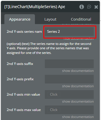
2nd Y-axis series name
(optional) (text) The series name to assign for the second Y-axis. Please provide one of the series names that was assigned for one of the series.
Text (optional)
2nd Y-axis suffix
(optional) (text) Suffix for the 2nd Y-axis label.
Text (optional)
2nd Y-axis prefix
(optional) (text) Prefix for the 2nd Y-axis label.
Text (optional)
2nd Y-axis min value
Force the 2nd Y-axis to start from a specific amount (number). The graph drawing beyond this number will be clipped off.
Number (optional)
2nd Y-axis max value
Force the 2nd Y-axis to stop at a specific amount (number). The graph drawing beyond this number will be clipped off.
Number (optional)
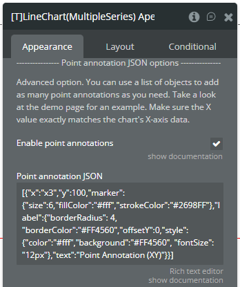
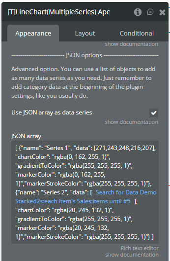
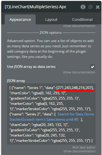
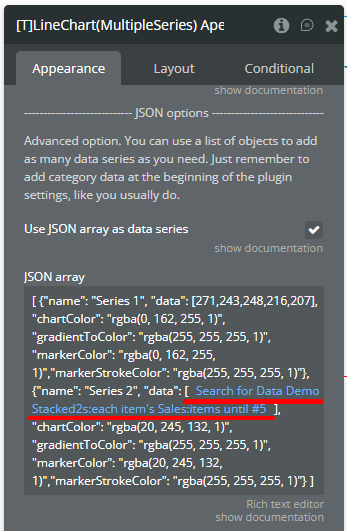
JSON options
Advanced option. You can use a list of objects to add as many data series as you need. Just remember to add category data at the beginning of the plugin settings, like you usually do.
Use JSON array as data series
Enables series insertion thru the JSON format.
Checkbox (yes/no)
JSON array
(optional) Adds more series to the chart. Must follow the JSON example in a precise way, any issue in it may cause errors.
Text (optional)
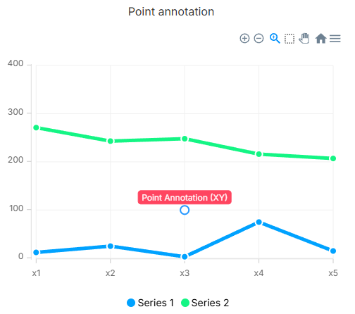
Enable point annotations
Enables point annotation insertion thru the JSON format.
Checkbox (yes/no)
Point annotation JSON
Adds the point annotations to the chart. Must follow the JSON example in a precise way, any issue in it may cause errors.
Text
Auto-color by direction
Auto-color series by direction
Automatically colors each series based on its direction. When enabled, series that are rising will be colored with the "Rising color" and series that are falling will be colored with the "Falling color".
The direction is determined by comparing the last value of the series against a threshold.
If no threshold is set, the first value of the series is used as the threshold — meaning each series is compared against itself (did it go up or down?).
If a threshold value is provided, all series are compared against that fixed number — series ending above it are colored as rising, series ending below it are colored as falling.
Note: this overrides the individual series colors.
Checkbox (yes/no)
Color threshold value
(optional) (number) The threshold value used to determine the color direction when "Auto-color by direction" is enabled.
If left empty, each series compares its last value against its own first value.
If set, all series compare their last value against this fixed number — useful for KPI-style charts where you want to highlight which series met a target and which did not.
Number (optional)
Rising color
Color for lines going above the threshold (rising).
Color
Falling color
Color for lines going below the threshold (falling).
Color
Element actions
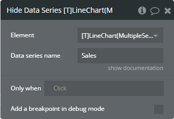
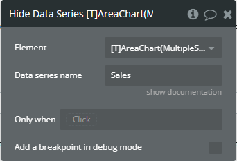
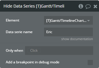
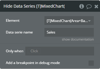
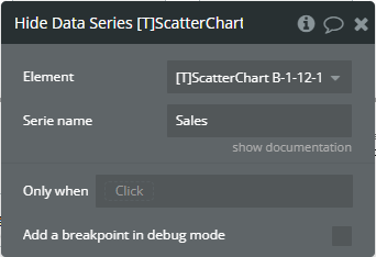
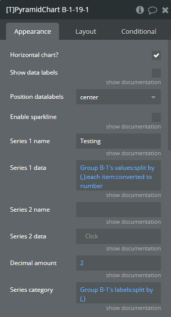
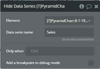
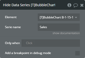
Hide Data Series - This will hide a data series (not deleting it).
Fields
Title
Description
Type
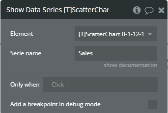
Data series name
This is the name of the data series you want to hide.
Text
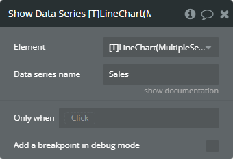
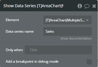
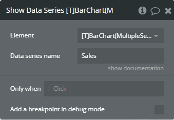
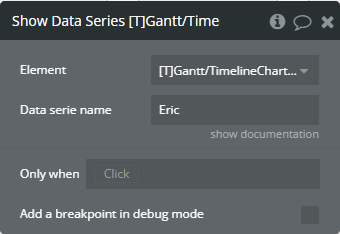
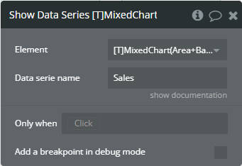
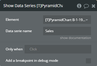
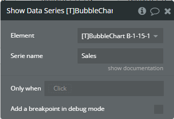
Show Data Series - This will allow you to show a hidden series programmatically.
Title
Description
Type
Data series name
This is the name of the data series you want to show.
Text
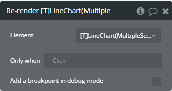
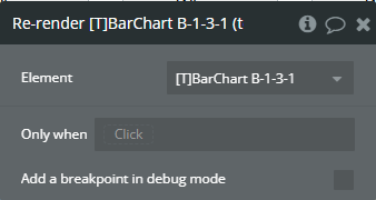
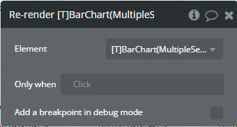
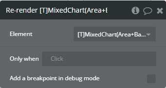
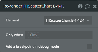
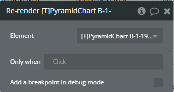
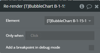
Re-render - This action is used to redraw the chart.
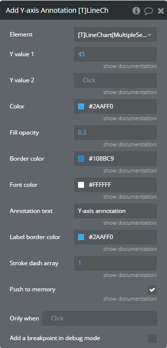
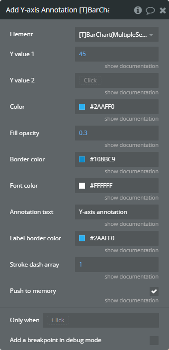
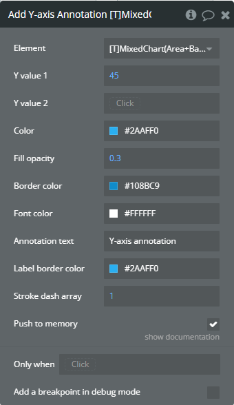
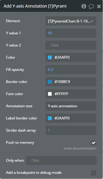
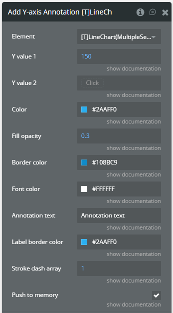
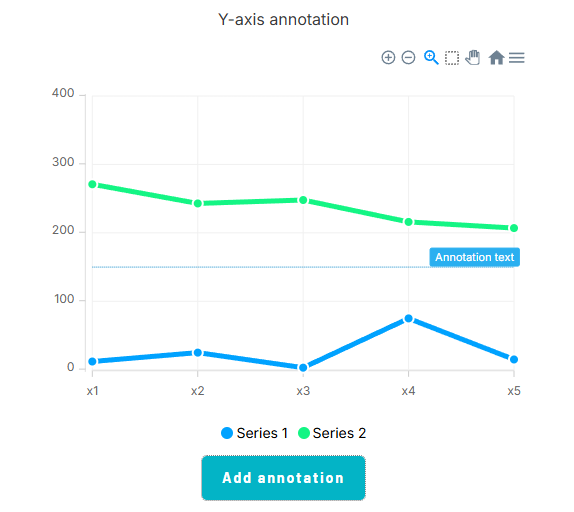
Add Y-axis Annotation - This action is used to add the Y-axis annotation on the chart.
Fields
Title
Description
Type
Y value 1
(number) The existent value from the Y-axis range.
Number
Y value 2
(number) The second existent value from the Y-axis range.
Number (optional)
Color
The color for filling the range between both provided values.
Color
Fill opacity
(number) The opacity of the range between both provided values. Accepted value from 0 to 1.
Number
Border color
The color for the label border.
Color
Font color
The color for the text from the label.
Color
Annotation text
(text) The text, which represents the annotation.
Text
Label border color
The color for the label border.
Color
Stroke dash array
(number) If the value is bigger than 0 the edges or line will be dashed.
Number
Push to memory
When enabled, it preserves the annotations in subsequent chart updates. If you don’t want it to be saved for the next updates, turn off this option.
Checkbox (yes/no)
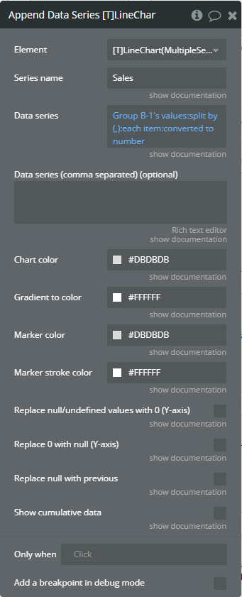
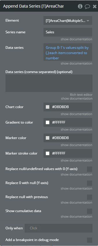
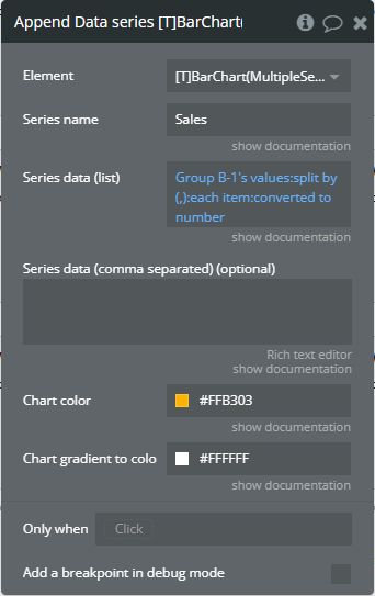
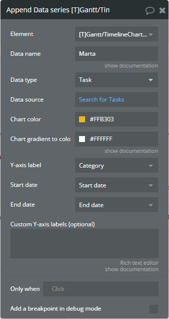
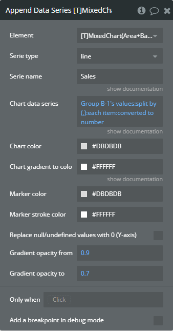
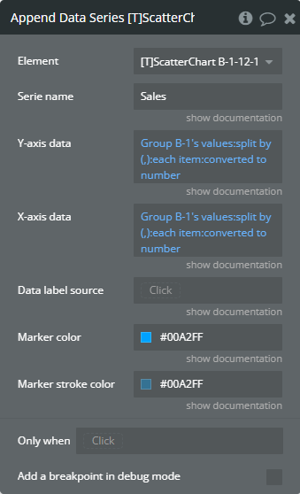
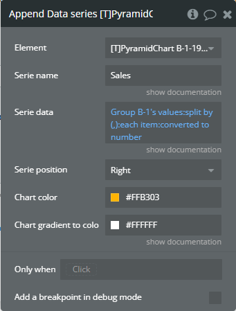
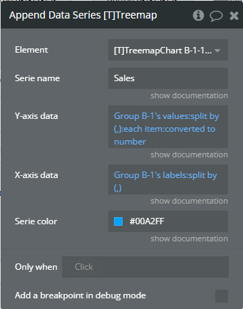
Append Data Series - This will append (add) an extra data series to your chart.
Fields
Title
Description
Type
Series name
Name of the new data series.
Text
Data series
Y-axis data for the new chart (list of numbers).
Number (optional)
Data series (comma separated) (optional)
(optional) You can use this field if you want to specify a comma separated list instead of a dynamic list from the “Data series” field.
Text (optional)
Chart color
The color for the new serie.
Color
Gradient to color
The 2nd gradient color for the new serie. It will be applied if only the “gradient” option was selected from the “Color style” dropdown.
Color
Marker color
The color for the new serie markers.
Color
Marker stroke color
The color for the new serie markers stroke.
Color
Replace null/undefined values with 0 (Y-axis)
This option allows to replacement of all “null” or “undefined” values from provided data.
Checkbox (yes/no)
Replace 0 with null (Y-axis)
This option allows to replacement of all 0 values from provided data.
Checkbox (yes/no)
Replace null with previous
This option allows to replacement of all “null” or “undefined” values from provided data.
Checkbox (yes/no)
Show cumulative data
Displays the cumulative sum of series data labels when the chart is stacked.
Checkbox (yes/no)
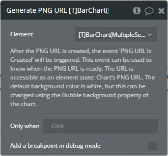
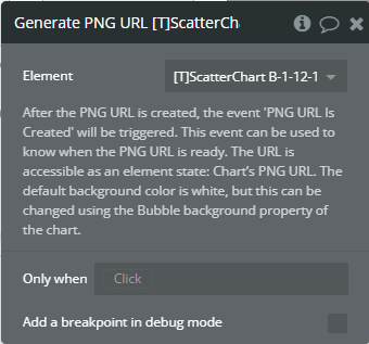
Generate PNG URL - This action is used to generate the PNG URL for the chart.
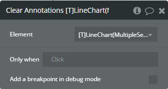
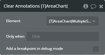
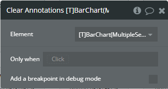
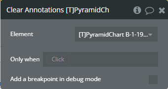
Clear Annotations - This action is used to remove all annotations from the chart.
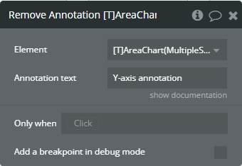
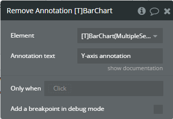
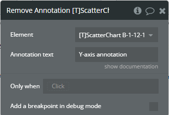
Remove Annotation - This action is used to remove an annotation from the chart.
Fields
Title
Description
Type
Annotation text
(text) The text, which represents the annotation.
Text
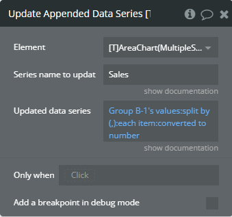
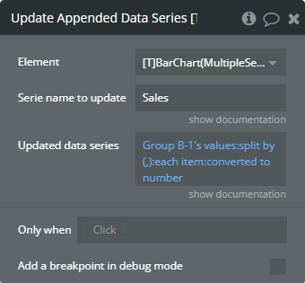
Update Appended Data Series - This action is used to update a data series of existent serie from the chart.
Fields
Title
Description
Type
Series name to update
The name of the appended data series you want to update.
Text
Updated data series
The data of the appended data series you want to update.
Number
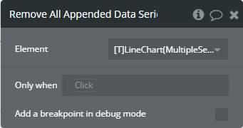
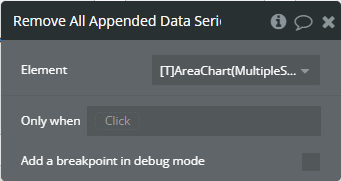
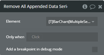
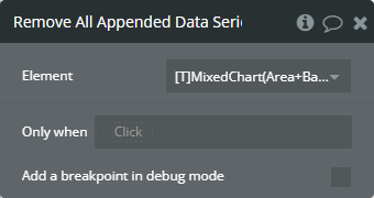
Remove All Appended Data Series - This action is used to remove all appended data series from the chart.
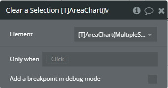
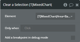
Clear a Selection - This action is used to remove a selection from the chart.
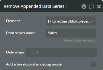
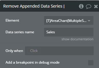
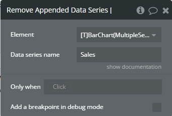
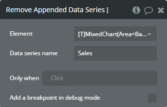
Remove Appended Data Series - This action is used to remove an appended data series from the chart.
Fields
Title
Description
Type
Data series name
This is the name of the data series you want to remove.
Text
Element events
Title
Description
Data point is clicked
This event is triggered when the chart is clicked.
PNG URL Is Created
This event is triggered when the PNG URL is available.
Element states
Title
Description
Type
Selected label
(text) Returns the selected label when the chart has clicked.
Text
Selected value
(number) Returns the selected value when the chart has clicked.
Number
Is loaded?
(yes/no) Indicates that the chart was fully loaded.
Checkbox (yes/no)
Selected index value
(number) Returns the index of the selected value when the chart has clicked.
Number
Last selected label on hover (must have events enabled or custom tooltips)
(text) Returns the last of the selected value when the chart has hovered.
Text
Last selected value on hover (must have events enabled or custom tooltips)
(number) Returns the last of the selected value when the chart has hovered.
Number
PNG URL
(text) Returns the generated PNG url after execution of the “Generate PNG URL” action.
Text
Last selected index on hover (must have events enabled or custom tooltips)
(number) Returns the index of the selected value when the chart has hovered.
Number
Last selected color code on hover (must have events enabled or custom tooltips)
(text) Returns the last of the selected value color when the chart has hovered.
Text
Last selected series name on hover (must have events enabled or custom tooltips)
(text) Returns the series name of the selected value when the chart has hovered.
Text
Data series 1
(list of numbers) Returns the 1st series data.
Number
Data series 2
(list of numbers) Returns the 2nd series data.
Number
Data series 3
(list of numbers) Returns the 3rd series data.
Number
Data series 4
(list of numbers) Returns the 4th series data.
Number
Data series 5
(list of numbers) Returns the 5th series data.
Number
Data series 6
(list of numbers) Returns the 6th series data.
Number
Selection Start Index
(number) Returns the start index of the X-axis label when the part of chart has selected.
Number
Selection End Index
(number) Returns the stop index of the X-axis label when the part of chart has selected.
Number
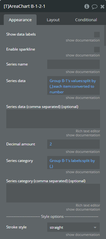
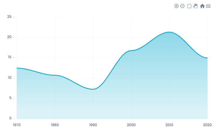
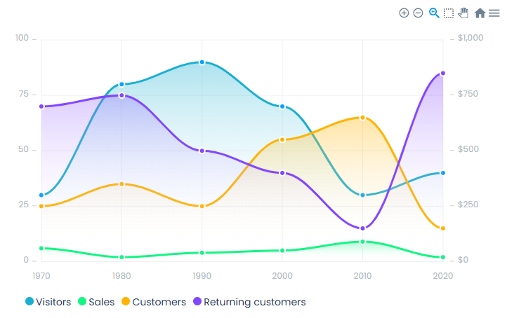
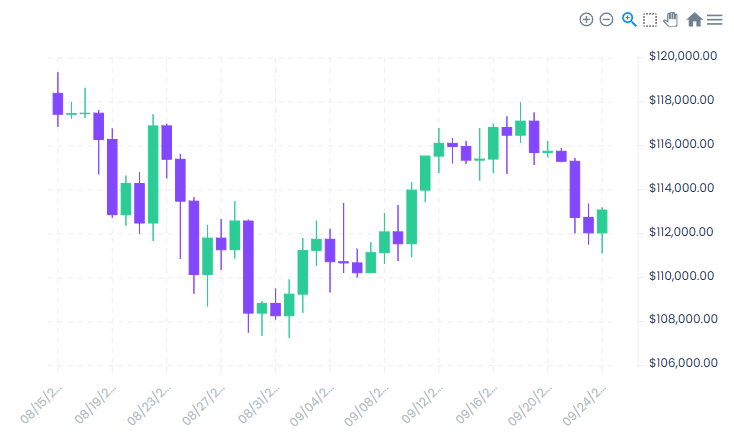
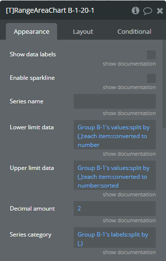
Plugin Element — Area Chart
Preview
Element fields
Title
Description
Type
Show data labels
Shows data labels on the place of markers. Make sure to turn the makers of if you enable this option.
Checkbox (yes/no)
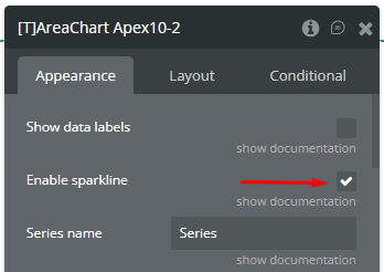
Enable sparkline
Sparkline hides all the elements of the charts other than the primary paths. Helps to visualize data in small areas line like for a graph in a sidebar or header.
Checkbox (yes/no)
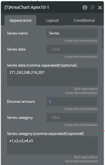
Series name
The name of the data. Will be shown in the tooltip.
Text
Series data
Y-axis data (list of numbers). Make sure to use the same amount of data points for the Y-axis as for the X-axis. If you are for example using a grouping for the Y-axis, make sure that you use the same grouping for the X-axis.
Number (optional)
Series data (comma separated) (optional)
(optional) You can use this field if you want to specify a comma separated list instead of a dynamic list from the “Series data” field.
Text (optional)
Decimal amount
(optional) The amount of decimals on the Y-axis.
Number (optional)
Series category
X-axis data (list of texts). You can use the ‘:formatted as’ operator in Bubble to convert other datatypes to a text! Make sure to use the same amount of data points for the Y-axis as for the X-axis. If you are for example using a grouping for the Y-axis, make sure that you use the same grouping for the X-axis.
Text (optional)
Series category (comma separated) (optional)
(optional) You can use this field if you want to specify a comma separated list instead of a dynamic list from the “Series category” field.
Text (optional)
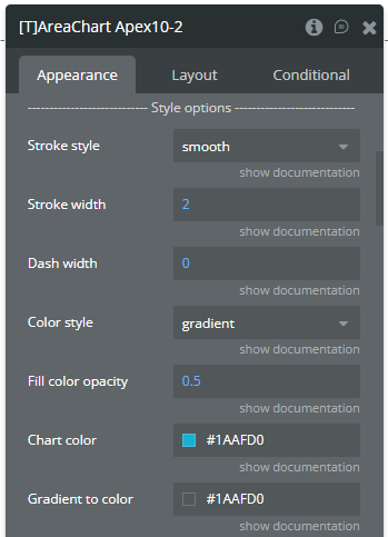
Stroke style
This option defines the style of the series points connection. Available options: straight, smooth, stepline
Dropdown
Stroke width
(number) The connection line’s width of the series.
Number (optional)
Dash width
(number) If the value is more than 0 the connection points line for the serie will be dashed.
Number (optional)
Color style
This option defines how to color the connection points line. Available options: solid, gradient
Dropdown
Fill color opacity
Fill color of the chart. Value between 0 and 1. Works when color style is ‘solid’.
Number
Chart color
The color for the serie.
Text
Gradient to color
The 2nd gradient color for the serie. It will be applied if only the “gradient” option was selected from the “Color style” dropdown. Available options: light, dark
Text
Gradient type
This dropdown defines the gradient direction. This will work if only the “gradient” option was selected from the “Color style” dropdown. Available options: horizontal, vertical
Dropdown (optional)
Gradient opacity from
(number) The opacity for the 1st gradient color.
Number
Gradient opacity to
(number) The opacity for the 2nd gradient color.
Number
Enable dropshadow
Draws a drop shadow for the serie.
Checkbox (yes/no)
Dropshadow color
The color of the shadow.
Color (optional)
Dropshadow blur
(number) The blur distance for shadow. Accepted values from 0 to 100.
Number (optional)
Dropshadow vertical offset
(number) The top offset for shadow in px.
Number (optional)
Dropshadow horizontal offset
(number) The left offset for shadow in px.
Number (optional)
Dropshadow opacity
(number) The opacity for shadow. Accepted values from 0 to 1.
Number (optional)
Marker shape
The shape of markers. Available options: circle, square
Dropdown
Marker radius
(number) The radius of square markers. This will work if only the “square” option were selected from the “Marker shape” dropdown.
Number
Marker color
The color for the serie markers.
Text
Marker size
(number) The size of markers. If the value is more than 0 then markers will be displayed on the chart. Also, all element states will be available.
Number (optional)
Marker fill opacity
(number) The opacity for markers. Accepted values from 0 to 1.
Number
Marker stroke color
The color for the serie markers stroke.
Text
Marker stroke width
(number) The width of markers stroke in px.
Number
Marker stroke opacity
(number) The opacity for markers stroke. Accepted values from 0 to 1.
Number
Marker stroke dash array
(number) If the value is more than 0 the markers stroke will be dashed.
Number (optional)
Show toolbar
This option adds a toolbar to the top-right side of the chart.
Checkbox (yes/no)
Enable selection
This option adds a selection option to the chart toolbar.
Checkbox (yes/no)
Selection color
The color for the zoom square.
Color
Selection opacity
(number) The opacity of zoom square. Accepted values from 0 to 1.
Number
Selection stroke width
(number) The width of the zoom square stroke in px.
Number
Selection stroke color
The color of the zoom square stroke.
Color
Selection stroke opacity
(number) The opacity of zoom square stroke. Accepted values from 0 to 1.
Number
Enable download
This option adds a download option to the chart toolbar.
Checkbox (yes/no)
Enable zoom
This option adds a zoom option to the chart toolbar.
Checkbox (yes/no)
Enable zoomin
This option adds a zoom-in option to the chart toolbar.
Checkbox (yes/no)
Enable zoomout
This option adds a zoom-out option to the chart toolbar.
Checkbox (yes/no)
Enable pan
This option adds a pan option to the chart toolbar.
Checkbox (yes/no)
Enable reset
This option adds a reset option to the chart toolbar.
Checkbox (yes/no)
Show grid
This option allows displaying grid lines.
Checkbox (yes/no)
Grid color
The color of grid lines.
Color
Grid stroke dash array
If the value is more than 0 the grid lines will be dashed.
Text (optional)
Show x-axis grid lines
This option allows displaying vertical grid lines.
Checkbox (yes/no)
Show y-axis grid lines
This option allows displaying horizontal grid lines.
Checkbox (yes/no)
Grid padding top
(number) The top edge padding for the chart.
Number
Grid padding bottom
(number) The bottom edge padding for the chart.
Number
Grid padding left
(number) The left edge padding for the chart.
Number
Grid padding right
(number) The right edge padding for the chart.
Number
Show tooltip
This option shows a tooltip on the chart on hover.
Checkbox (yes/no)
Show category on tooltip
This option allows showing the X-axis data in the tooltip.
Checkbox (yes/no)
Enable fixed tooltip
Fixes the tooltip to the top left of the chart.
Checkbox (yes/no)
Tooltip follow cursor
Displaying the tooltip beside the cursor on hover.
Checkbox (yes/no)
Tooltip style
The tooltip theme. Available options: light, dark
Dropdown
X-axis font color
The font color for X-axis labels.
Color
X-axis font size
The font size for X-axis labels.
Number
Show X-axis border
This option allows showing an X-axis border.
Checkbox (yes/no)
X-axis border height
(number) The width of the X-axis border. If the value is more than 0 the border will be displayed.
Number
X-axis border color
The color of the X-axis border.
Color
Show X-axis ticks
This option allows showing the X-axis ticks.
Checkbox (yes/no)
X-axis ticks height
(number) The size for the X-axis ticks.
Number
X-axis ticks color
The color for the X-axis ticks.
Color
Show X-axis tooltip
This option shows a tooltip on X-axis on hover.
Checkbox (yes/no)
X-axis crosshair color
The color for the crosshair line.
Color
X-axis crosshair dash array
(number) If the value is more than 0 the crosshair line will be dashed.
Number (optional)
X-axis crosshair line width
(number) The size for the crosshair. If the value is more than 0 the crosshair will be displayed.
Number
Y-axis font color
The font color for Y-axis labels.
Color
Y-axis font size
The font size for Y-axis labels.
Number
Show Y-axis border
This option allows showing the Y-axis border.
Checkbox (yes/no)
Y-axis border color
The color of the Y-axis border.
Color
Show Y-axis ticks
This option allows showing the Y-axis ticks.
Checkbox (yes/no)
Y-axis ticks color
The color for the Y-axis ticks.
Color
Show Y-axis tooltip
This option shows a tooltip on Y-axis on hover.
Checkbox (yes/no)
Y-axis crosshair color
The color for the crosshair line.
Color
Y-axis crosshair dash array
(number) If the value is more than 0 the crosshair line will be dashed.
Number (optional)
Y-axis crosshair line width
(number) The size for the crosshair. If the value is more than 0 the crosshair will be displayed.
Number
Show Y-axis labels
This option allows showing the Y-axis labels.
Checkbox (yes/no)
Show X-axis labels
This option allows showing the X-axis labels.
Checkbox (yes/no)
X-axis label offset
The vertical offset of the X-axis labels.
Number
X-axis labels min height
(number) The min height for the X-axis labels when they are rotated.
Number (optional)
X-axis labels max height
(number) The max height for the X-axis labels when they are rotated.
Number
Y-axis prefix
(optional) (text) Prefix for the Y-axis label. Available options: , $, €, £, ¥, R, ₿, #
Text (optional)
Y-axis suffix
(optional) (text) Suffix for the Y-axis label. Available options: , %, ?, !, $, €, £, ¥, R, ₿, #, votes, inches, miles, meters, liters, gallons, kWhs
Text (optional)
Y-axis min value
(number) Force the Y-axis to start from a specific amount. The graph drawing beyond this number will be clipped off.
Number (optional)
Y-axis max value
(number) Force the Y-axis to stop at a specific amount. The graph drawing beyond this number will be clipped off.
Number (optional)
Tick amount X-axis
The amount of ticks to display on the X-axis.
Number (optional)
Tick amount Y-axis
The amount of ticks to display on the Y-axis.
Number (optional)
Render Y-axis on the right
Displaying the Y-axis on the right side of chart.
Checkbox (yes/no)
Reverse Y-axis
Flip the chart upside down making it inversed and draw the y-axis from bigger to smaller numbers.
Checkbox (yes/no)
Hide overlapping X-axis labels
This option allows hiding some of the X-axis labels if they overlap others.
Checkbox (yes/no)
Trim X-axis labels (if needed)
This option trims the label if it’s too long and adds “…” to its end.
Checkbox (yes/no)
Rotate X-axis labels (if needed)
This option rotates labels if they are too long.
Checkbox (yes/no)
Always rotate X-axis labels
This option rotates labels permanently.
Checkbox (yes/no)
Label rotation angle
(number) The angle for the rotation of the label. Accepted negative values.
Number
Forecast data points
(number) The number of ending data points you want to indicate as forecast or prediction values.
Number
Forecast fill opacity
(numbner) The opacity for forecast connection points line of series.
Number
Forecast dash array
(number) If the value is more than 0 the forecast connection points line will be dashed.
Number
X-axis title
(optional) (text) The title for X-axis.
Text (optional)
Y-axis title
(optional) (text) The title for Y-axis.
Text (optional)
Axis title font size
(number) The font size of titles of axes.
Number
Axis title font color
The font color of titles of axes.
Color
Do not refresh chart
The chart will not refresh automatically. This improves chart performance. You can manually update the chart by running the re-render workflow action.
Checkbox (yes/no)
Auto format large numbers
This will truncate large numbers and format them as 1.2k, 3.2m etc.
Checkbox (yes/no)
Enable animation
This option allows animating the chart.
Checkbox (yes/no)
Animation speed
(number) This value represents the time in milliseconds allocated for animation. The more value - the more time for animation.
Number
Syncing ID (number)
This has to be a number. Syncing charts means that when one chart is hovered, the synced chart(s) (charts with the same Syncing ID) will also be hovered at the same value. Works best when ’Tooltip follow cursor’ is turned off. This works between the same kind of charts, for example two area charts or two bar charts.
Number (optional)
Data label font size
Font size for all data labels.
Number
Decimal separator
(text) The symbol that separates the decimal part of the number area.
Text
Thousand separator
(optional) (text) The symbol that separates a thousand value from the rest of the number.
Text (optional)
To enable the ‘Data point clicked’ event for Area/Line charts the following checkbox should be CHECKED. Also, the marker size should be greater than 0.
Enable events
Markers will require an intersect with the mouse pointer on hover.
Checkbox (yes/no)
Reset hover state on mouse leave
This will reset the hover values (states) when the chart isn’t being hovered. Normally this state will not be reset on mouse leave.
Checkbox (yes/no)
Enable color change on hover
Changes the chart colors on hover.
Checkbox (yes/no)
Replace null/undefined values with 0 (Y-axis)
This option allows to replacement of all “null” or “undefined” values from provided data.
Checkbox (yes/no)
Custom tooltip ID
The element ID of a Bubble group you want to use as tooltip. You can access the hover values of the chart as element states. Make sure that the group is visible on page load.
Text (optional)
Custom tooltip Y offset
The top offset of custom tooltip in px.
Number
Element actions
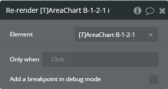
Re-render - This action is used to redraw the chart.
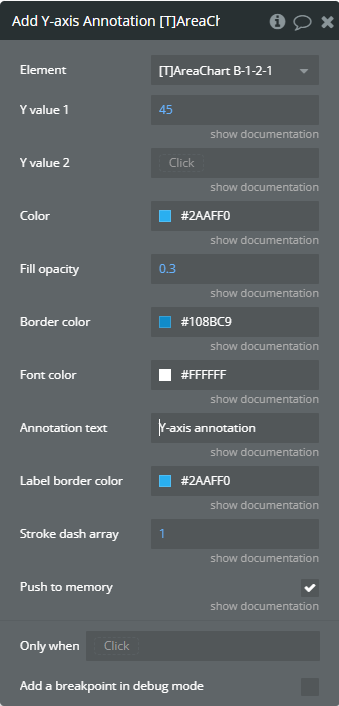
Add Y-axis Annotation - This action is used to add the Y-axis annotation on the chart.
Fields
Title
Description
Type
Y value 1
(number) The existent value from the Y-axis range.
Number
Y value 2
(number) The second existent value from the Y-axis range.
Number (optional)
Color
The color for filling the range between both provided values.
Color
Fill opacity
(number) The opacity of the range between both provided values. Accepted value from 0 to 1.
Number
Border color
The color for the label border.
Color
Font color
The color for the text from the label.
Color
Annotation text
(text) The text, which represents the annotation.
Text
Label border color
The color for the label border.
Color
Stroke dash array
(number) If the value is bigger than 0 the edges or line will be dashed.
Number
Push to memory
When enabled, it preserves the annotations in subsequent chart updates. If you don’t want it to be saved for the next updates, turn off this option.
Checkbox (yes/no)
Generate PNG URL - This action is used to generate the PNG URL for the chart.
Clear Annotations - This action is used to remove all annotations from the chart.
Remove Annotation - This action is used to remove an annotation from the chart.
Fields
Title
Description
Type
Annotation text
(text) The text, which represents the annotation.
Text
Clear a Selection - This action is used to remove a selection from the chart.
Element events
Title
Description
Data point is clicked
This event is triggered when the chart is clicked.
PNG URL Is Created
This event is triggered when the PNG URL is available.
Element states
Title
Description
Type
Selected label
(text) Returns the selected label when the chart has clicked.
Text
Selected value
(number) Returns the selected value when the chart has clicked.
Number
Is loaded?
(yes/no) Indicates that the chart was fully loaded.
Checkbox (yes/no)
Selected index value
(number) Returns the index of the selected value when the chart has clicked.
Number
Last selected label on hover (must have events enabled or custom tooltips)
(text) Returns the last of the selected value when the chart has hovered.
Text
Last selected value on hover (must have events enabled or custom tooltips)
(number) Returns the last of the selected value when the chart has hovered.
Number
PNG URL
(text) Returns the generated PNG url after execution of the “Generate PNG URL” action.
Text
Last selected index on hover (must have events enabled or custom tooltips)
(number) Returns the index of the selected value when the chart has hovered.
Number
Selection Start Index
(number) Returns the start index of the X-axis label when the part of chart has selected.
Number
Selection End Index
(number) Returns the stop index of the X-axis label when the part of chart has selected.
Number
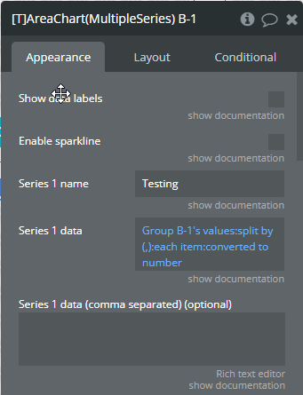
Plugin Element — Area Chart (Multiple Series)
Preview
Element fields
Title
Description
Type
Show data labels
Shows data labels on the place of markers. Make sure to turn the makers of if you enable this option.
Checkbox (yes/no)
Enable sparkline
Sparkline hides all the elements of the charts other than the primary paths. Helps to visualize data in small areas line like for a graph in a sidebar or header.
Checkbox (yes/no)
Series 1 name
The name of the 1st serie. Will be shown in the tooltip.
Text (optional)
Series 1 data
Y-axis data for serie 1 (list of numbers). Make sure to use the same amount of data points for the Y-axis as for the X-axis. If you are for example using a grouping for the Y-axis, make sure that you use the same grouping for the X-axis.
Number (optional)
Series 1 data (comma separated) (optional)
(optional) You can use this field if you want to specify a comma separated list instead of a dynamic list from the “Series 1 data” field.
Text (optional)
Series 2 name
The name of the 2nd serie. Will be shown in the tooltip.
Text (optional)
Series 2 data
Y-axis data for serie 2 (list of numbers). Make sure to use the same amount of data points for the Y-axis as for the X-axis. If you are for example using a grouping for the Y-axis, make sure that you use the same grouping for the X-axis.
Number (optional)
Series 2 data (comma separated) (optional)
(optional) You can use this field if you want to specify a comma separated list instead of a dynamic list from the “Series 2 data” field.
Text (optional)
Series 3 name
The name of the 3rd serie. Will be shown in the tooltip.
Text (optional)
Series 3 data
Y-axis data for serie 3 (list of numbers). Make sure to use the same amount of data points for the Y-axis as for the X-axis. If you are for example using a grouping for the Y-axis, make sure that you use the same grouping for the X-axis.
Number (optional)
Series 3 data (comma separated) (optional)
(optional) You can use this field if you want to specify a comma separated list instead of a dynamic list from the “Series 3 data” field.
Text (optional)
Series 4 name
The name of the 4th serie. Will be shown in the tooltip.
Text (optional)
Series 4 data
Y-axis data for serie 4 (list of numbers). Make sure to use the same amount of data points for the Y-axis as for the X-axis. If you are for example using a grouping for the Y-axis, make sure that you use the same grouping for the X-axis.
Number (optional)
Series 4 data (comma separated) (optional)
(optional) You can use this field if you want to specify a comma separated list instead of a dynamic list from the “Series 4 data” field.
Text (optional)
Series 5 name
The name of the 5th serie. Will be shown in the tooltip.
Text (optional)
Series 5 data
Y-axis data for serie 5 (list of numbers). Make sure to use the same amount of data points for the Y-axis as for the X-axis. If you are for example using a grouping for the Y-axis, make sure that you use the same grouping for the X-axis.
Number (optional)
Series 5 data (comma separated) (optional)
(optional) You can use this field if you want to specify a comma separated list instead of a dynamic list from the “Series 5 data” field.
Text (optional)
Series 6 name
The name of the 6th serie. Will be shown in the tooltip.
Text (optional)
Series 6 data
Y-axis data for serie 6 (list of numbers). Make sure to use the same amount of data points for the Y-axis as for the X-axis. If you are for example using a grouping for the Y-axis, make sure that you use the same grouping for the X-axis.
Number (optional)
Series 6 data (comma separated) (optional)
(optional) You can use this field if you want to specify a comma separated list instead of a dynamic list from the “Series 6 data” field.
Text (optional)
Decimal amount
The number of digits of the decimal part.
Number (optional)
Series category
X-axis data (list of texts). You can use the ‘:formatted as’ operator in Bubble to convert other datatypes to a text! Make sure to use the same amount of data points for the Y-axis as for the X-axis. If you are for example using a grouping for the Y-axis, make sure that you use the same grouping for the X-axis.
Text (optional)
Series category (comma separated) (optional)
(optional) You can use this field if you want to specify a comma separated list instead of a dynamic list from the “Series category” field.
Text (optional)
Stroke style
This option defines the style of the series points connection. Available options: straight, smooth, stepline
Dropdown
Stroke width
(number) The connection line’s width of the series.
Number (optional)
Dash width
(number) If the value is more than 0 the connection points line for the serie will be dashed.
Number (optional)
Color style
This option defines how to color the connection points line. Available options: solid, gradient
Dropdown
Series 1 color
The color for the 1st serie.
Text
Series 2 color
The color for the 2nd serie.
Text
Series 3 color
The color for the 3rd serie.
Color
Series 4 color
The color for the 4th serie.
Color
Series 5 color
The color for the 5th serie.
Color
Series 6 color
The color for the 6th serie.
Color
Fill color opacity
Fill color of the chart. Value between 0 and 1. Works when color style is ‘solid’.
Number
Series 1 - Gradient to color
The 2nd gradient color for the 1st serie. It will be applied if only the “gradient” option was selected from the “Color style” dropdown. Available options: light, dark
Text
Series 2 - Gradient to color
The 2nd gradient color for the 2nd serie. It will be applied if only the “gradient” option was selected from the “Color style” dropdown.
Text
Series 3 - Gradient to color
The 2nd gradient color for the 3rd serie. It will be applied if only the “gradient” option was selected from the “Color style” dropdown.
Color
Series 4 - Gradient to color
The 2nd gradient color for the 4th serie. It will be applied if only the “gradient” option was selected from the “Color style” dropdown.
Color
Series 5 - Gradient to color
The 2nd gradient color for the 5th serie. It will be applied if only the “gradient” option was selected from the “Color style” dropdown.
Color
Series 6 - Gradient to color
The 2nd gradient color for the 6th serie. It will be applied if only the “gradient” option was selected from the “Color style” dropdown.
Color
Gradient type
This dropdown defines the gradient direction. This will work if only the “gradient” option was selected from the “Color style” dropdown. Available options: horizontal, vertical
Dropdown (optional)
Gradient opacity to
(number) The opacity for the 2nd gradient color.
Number
Gradient opacity from
(number) The opacity for the 1st gradient color.
Number
Enable dropshadow
Draws a drop shadow for the serie.
Checkbox (yes/no)
Dropshadow color
The color of the shadow.
Color (optional)
Dropshadow blur
(number) The blur distance for shadow. Accepted values from 0 to 100.
Number (optional)
Dropshadow vertical offset
(number) The top offset for shadow in px.
Number (optional)
Dropshadow horizontal offset
(number) The left offset for shadow in px.
Number (optional)
Dropshadow opacity
(number) The opacity for shadow. Accepted values from 0 to 1.
Number (optional)
Marker shape
The shape of markers. Available options: circle, square
Dropdown
Marker radius
(number) The radius of square markers. This will work if only the “square” option were selected from the “Marker shape” dropdown.
Number
Marker size
(number) The size of markers. If the value is more than 0 then markers will be displayed on the chart. Also, all element states will be available.
Number (optional)
Series 1 - Marker color
The color for the 1st serie markers.
Text
Series 2 - Marker color
The color for the 2nd serie markers.
Text
Series 3 - Marker color
The color for the 3rd serie markers.
Color
Series 4 - Marker color
The color for the 4th serie markers.
Color
Series 5 - Marker color
The color for the 5th serie markers.
Color
Series 6 - Marker color
The color for the 6th serie markers.
Color
Marker fill opacity
(number) The opacity for markers. Accepted values from 0 to 1.
Number
Series 1 - Marker stroke color
The color for the 1st serie markers stroke.
Text
Series 2 - Marker stroke color
The color for the 2nd serie markers stroke.
Text
Series 3 - Marker stroke color
The color for the 3rd serie markers stroke.
Color
Series 4 - Marker stroke color
The color for the 4th serie markers stroke.
Color
Series 5 - Marker stroke color
The color for the 5th serie markers stroke.
Color
Series 6 - Marker stroke color
The color for the 6th serie markers stroke.
Color
Marker stroke width
(number) The width of markers stroke in px.
Number
Marker stroke opacity
(number) The opacity for markers stroke. Accepted values from 0 to 1.
Number
Marker stroke dash array
(number) If the value is more than 0 the markers stroke will be dashed.
Number (optional)
Show toolbar
This option adds a toolbar to the top-right side of the chart.
Checkbox (yes/no)
Enable selection
This option adds a selection option to the chart toolbar.
Checkbox (yes/no)
Selection color
The color for the zoom square.
Color
Selection opacity
(number) The opacity of zoom square. Accepted values from 0 to 1.
Number
Selection stroke width
(number) The width of the zoom square stroke in px.
Number
Selection stroke color
The color of the zoom square stroke.
Color
Selection stroke opacity
(number) The opacity of zoom square stroke. Accepted values from 0 to 1.
Number
Enable download
This option adds a download option to the chart toolbar.
Checkbox (yes/no)
Enable zoom
This option adds a zoom option to the chart toolbar.
Checkbox (yes/no)
Enable zoomin
This option adds a zoom-in option to the chart toolbar.
Checkbox (yes/no)
Enable zoomout
This option adds a zoom-out option to the chart toolbar.
Checkbox (yes/no)
Enable pan
This option adds a pan option to the chart toolbar.
Checkbox (yes/no)
Enable reset
This option adds a reset option to the chart toolbar.
Checkbox (yes/no)
Show grid
This option allows displaying grid lines.
Checkbox (yes/no)
Grid color
The color of grid lines.
Color
Grid stroke dash array
If the value is more than 0 the grid lines will be dashed.
Text (optional)
Show x-axis grid lines
This option allows displaying vertical grid lines.
Checkbox (yes/no)
Show y-axis grid lines
This option allows displaying horizontal grid lines.
Checkbox (yes/no)
Grid padding top
(number) The top edge padding for the chart.
Number
Grid padding bottom
(number) The bottom edge padding for the chart.
Number
Grid padding left
(number) The left edge padding for the chart.
Number
Grid padding right
(number) The right edge padding for the chart.
Number
Show tooltip
This option shows a tooltip on the chart on hover.
Checkbox (yes/no)
Show category on tooltip
This option allows showing the X-axis data in the tooltip.
Checkbox (yes/no)
Enable fixed tooltip
Fixes the tooltip to the top left of the chart.
Checkbox (yes/no)
Tooltip follow cursor
Displaying the tooltip beside the cursor on hover.
Checkbox (yes/no)
Tooltip style
The tooltip theme. Available options: light, dark
Dropdown
X-axis font color
The font color for X-axis labels.
Color
X-axis font size
The font size for X-axis labels.
Number
Show X-axis border
This option allows showing an X-axis border.
Checkbox (yes/no)
X-axis border height
(number) The width of the X-axis border. If the value is more than 0 the border will be displayed.
Number
X-axis border color
The color of the X-axis border.
Color
Show X-axis ticks
This option allows showing the X-axis ticks.
Checkbox (yes/no)
X-axis ticks height
(number) The size for the X-axis ticks.
Number
X-axis ticks color
The color for the X-axis ticks.
Color
Show X-axis tooltip
This option shows a tooltip on X-axis on hover.
Checkbox (yes/no)
X-axis crosshair line width
(number) The size for the crosshair. If the value is more than 0 the crosshair will be displayed.
Number
X-axis crosshair color
The color for the crosshair line.
Color
X-axis crosshair dash array
(number) If the value is more than 0 the crosshair line will be dashed.
Number (optional)
Y-axis font color
The font color for Y-axis labels.
Color
Y-axis font size
The font size for Y-axis labels.
Number
Show Y-axis border
This option allows showing the Y-axis border.
Checkbox (yes/no)
Y-axis border color
The color of the Y-axis border.
Color
Show Y-axis ticks
This option allows showing the Y-axis ticks.
Checkbox (yes/no)
Y-axis ticks color
The color for the Y-axis ticks.
Color
Show Y-axis tooltip
This option shows a tooltip on Y-axis on hover.
Checkbox (yes/no)
Y-axis crosshair color
The color for the crosshair line.
Color
Y-axis crosshair dash array
(number) If the value is more than 0 the crosshair line will be dashed.
Number (optional)
Y-axis crosshair line width
(number) The size for the crosshair. If the value is more than 0 the crosshair will be displayed.
Number
Stack charts
Stack the graphs on top of each other.
Checkbox (yes/no)
Show legend
This option adds a chart legend.
Checkbox (yes/no)
Legend position
Place of the legend related to the chart. Available options: top, bottom, left, right
Dropdown
Legend horizontal align
Horizontal alignment of legend. Available options: left, center, right
Dropdown
Legend font color
The font color for the legend text.
Text
X offset legend
The left offset of legend in px.
Number
Y offset legend
The top offset of legend in px.
Number
Legend font size
The size for the legend text.
Number
Show Y-axis labels
This option allows showing the Y-axis labels.
Checkbox (yes/no)
Show X-axis labels
This option allows showing the X-axis labels.
Checkbox (yes/no)
X-axis label offset
The vertical offset of the X-axis labels.
Number
X-axis labels min height
(number) The min height for the X-axis labels when they are rotated.
Number (optional)
X-axis labels max height
(number) The max height for the X-axis labels when they are rotated.
Number
Y-axis prefix
Prefix for the Y-axis labels.
Text (optional)
Y-axis suffix
Suffix for the Y-axis labels. NOTE: Carefully use this field if field "Auto format large numbers" is enabled!
Text (optional)
Y-axis min value
(number) Force the Y-axis to start from a specific amount. The graph drawing beyond this number will be clipped off.
Number (optional)
Y-axis max value
(number) Force the Y-axis to stop at a specific amount. The graph drawing beyond this number will be clipped off.
Number (optional)
Tick amount X-axis
The amount of ticks to display on the X-axis.
Number (optional)
Tick amount Y-axis
The amount of ticks to display on the Y-axis.
Number (optional)
Render Y-axis on the right
Displaying the Y-axis on the right side of chart.
Checkbox (yes/no)
Reverse Y-axis
Flip the chart upside down making it inversed and draw the y-axis from bigger to smaller numbers.
Checkbox (yes/no)
Hide overlapping X-axis labels
This option allows hiding some of the X-axis labels if they overlap others.
Checkbox (yes/no)
Trim X-axis labels (if needed)
This option trims the label if it’s too long and adds “…” to its end.
Checkbox (yes/no)
Rotate X-axis labels (if needed)
This option rotates labels if they are too long.
Checkbox (yes/no)
Always rotate X-axis labels
This option rotates labels permanently.
Checkbox (yes/no)
Label rotation angle
(number) The angle for the rotation of the label. Accepted negative values.
Number
Forecast data points
(number) The number of ending data points you want to indicate as forecast or prediction values.
Number
Forecast fill opacity
(numbner) The opacity for forecast connection points line of series.
Number
Forecast dash array
(number) If the value is more than 0 the forecast connection points line will be dashed.
Number
X-axis title
(optional) (text) The title for X-axis.
Text (optional)
Y-axis title
(optional) (text) The title for Y-axis.
Text (optional)
2nd Y-axis title
(optional) (text) The title for the 2nd Y-axis.
Text (optional)
Axis title font size
(number) The font size of titles of axes.
Number
Axis title font color
The font color of titles of axes.
Color
Do not refresh chart
The chart will not refresh automatically. This improves chart performance. You can manually update the chart by running the re-render workflow action.
Checkbox (yes/no)
Auto format large numbers
This will truncate large numbers and format them as 1.2k, 3.2m etc. NOTE: If checked, carefully use fields "Y-axis suffix" & "2nd Y-axis suffix"!
Checkbox (yes/no)
Enable animation
This option allows animating the chart.
Checkbox (yes/no)
Animation speed
(number) This value represents the time in milliseconds allocated for animation. The more value - the more time for animation.
Number
Animation delay
(number) This value represents the waiting time in milliseconds before animation.
Number
Syncing ID
This has to be a number. Syncing charts means that when one chart is hovered, the synced chart(s) (charts with the same Syncing ID) will also be hovered at the same value. Works best when ’Tooltip follow cursor’ is turned off. This works between the same kind of charts, for example two area charts or two bar charts.
Number (optional)
Data label font size
Font size for all data labels.
Number
Decimal separator
(text) The symbol that separates the decimal part of the number area.
Text
Thousand separator
(optional) (text) The symbol that separates a thousand value from the rest of the number.
Text (optional)
Enable events
Markers will require an intersect with the mouse pointer on hover.
Checkbox (yes/no)
Reset hover state on mouse leave
This will reset the hover values (states) when the chart isn’t being hovered. Normally this state will not be reset on mouse leave.
Checkbox (yes/no)
Enable color change on hover
Changes the chart colors on hover.
Checkbox (yes/no)
Replace null/undefined values with 0 (Y-axis)
This option allows to replacement of all “null” or “undefined” values from provided data.
Checkbox (yes/no)
Replace 0 with null (Y-axis)
This option allows to replacement of all 0 values from provided data.
Checkbox (yes/no)
Replace null/undefined with previous
This option allows to replacement of all “null” or “undefined” values from provided data.
Checkbox (yes/no)
Show cumulative data
Displays the cumulative sum of series data labels when the chart is stacked.
Checkbox (yes/no)
Custom Tooltip ID
The element ID of a Bubble group you want to use as tooltip. You can access the hover values of the chart as element states. Make sure that the group is visible on page load.
Text (optional)
Custom tooltip Y offset
The top offset of custom tooltip in px.
Number
2nd Y-axis series name
(optional) (text) The series name to assign for the second Y-axis. Please provide one of the series names that was assigned for one of the series.
Text (optional)
2nd Y-axis suffix
Suffix for the 2nd Y-axis labels. NOTE: Carefully use this field if field "Auto format large numbers" is enabled!
Text (optional)
2nd Y-axis prefix
Prefix for the 2nd Y-axis labels.
Text (optional)
2nd Y-axis min value
Force the 2nd Y-axis to start from a specific amount (number). The graph drawing beyond this number will be clipped off.
Number (optional)
2nd Y-axis max value
Force the 2nd Y-axis to stop at a specific amount (number). The graph drawing beyond this number will be clipped off.
Number (optional)
Use JSON array as data series
Enables series insertion thru the JSON format.
Checkbox (yes/no)
JSON array
(optional) Adds more series to the chart. Must follow the JSON example in a precise way, any issue in it may cause errors.
Text (optional)
Enable point annotations
Enables point annotation insertion thru the JSON format.
Checkbox (yes/no)
Point annotation JSON
Adds the point annotations to the chart. Must follow the JSON example in a precise way, any issue in it may cause errors.
Text
Element actions
Append Data Series - This will append (add) an extra data series to your chart.
Fields
Title
Description
Type
Series name
Name of the new data series.
Text
Data series
Y-axis data for the new chart (list of numbers).
Number (optional)
Data series (comma separated) (optional)
(optional) You can use this field if you want to specify a comma separated list instead of a dynamic list from the “Data series” field.
Text (optional)
Chart color
The color for the new serie.
Color
Gradient to color
The 2nd gradient color for the new serie. It will be applied if only the “gradient” option was selected from the “Color style” dropdown.
Color
Marker color
The color for the new serie markers.
Color
Marker stroke color
The color for the new serie markers stroke.
Color
Replace null/undefined values with 0 (Y-axis)
This option allows to replacement of all “null” or “undefined” values from provided data.
Checkbox (yes/no)
Replace 0 with null (Y-axis)
This option allows to replacement of all 0 values from provided data.
Checkbox (yes/no)
Replace null with previous
This option allows to replacement of all “null” or “undefined” values from provided data.
Checkbox (yes/no)
Show cumulative data
Displays the cumulative sum of series data labels when the chart is stacked.
Checkbox (yes/no)
Hide Data Series - This will hide a data series (not deleting it).
Fields
Title
Description
Type
Data series name
This is the name of the data series you want to hide.
Text
Show Data Series - This will allow you to show a hidden series programmatically.
Fields
Title
Description
Type
Data series name
This is the name of the data series you want to show.
Text
Update Appended Data Series - This action is used to update a data series of existent serie from the chart.
Fields
Title
Description
Type
Series name to update
The name of the appended data series you want to update.
Text
Updated data series
The data of the appended data series you want to update.
Number
Re-render - This action is used to redraw the chart.
Add Y-axis Annotation - This action is used to add the Y-axis annotation on the chart.
Fields
Title
Description
Type
Y value 1
(number) The existent value from the Y-axis range.
Number
Y value 2
(number) The second existent value from the Y-axis range.
Number (optional)
Color
The color for filling the range between both provided values.
Color
Fill opacity
(number) The opacity of the range between both provided values. Accepted value from 0 to 1.
Number
Border color
The color for the label border.
Color
Font color
The color for the text from the label.
Color
Annotation text
(text) The text, which represents the annotation.
Text
Label border color
The color for the label border.
Color
Stroke dash array
(number) If the value is bigger than 0 the edges or line will be dashed.
Number
Push to memory
When enabled, it preserves the annotations in subsequent chart updates. If you don’t want it to be saved for the next updates, turn off this option.
Checkbox (yes/no)
Generate PNG URL - This action is used to generate the PNG URL for the chart.
Clear Annotations - This action is used to remove all annotations from the chart.
Remove Annotation - This action is used to remove an annotation from the chart.
Fields
Title
Description
Type
Annotation text
(text) The text, which represents the annotation.
Text
Remove All Appended Data Series - This action is used to remove all appended data series from the chart.
Clear a Selection - This action is used to remove a selection from the chart.
Remove Appended Data Series - This action is used to remove an appended data series from the chart.
Fields
Title
Description
Type
Data series name
This is the name of the data series you want to remove.
Text
Element events
Title
Description
Data point is clicked
This event is triggered when the chart is clicked.
PNG URL Is Created
This event is triggered when the PNG URL is available.
Element states
Title
Description
Type
Selected label
(text) Returns the selected label when the chart has clicked.
Text
Selected value
(number) Returns the selected value when the chart has clicked.
Number
Is loaded?
(yes/no) Indicates that the chart was fully loaded.
Checkbox (yes/no)
Selected index value
(number) Returns the index of the selected value when the chart has clicked.
Number
Last selected label on hover (must have events enabled or custom tooltips)
(text) Returns the last of the selected value when the chart has hovered.
Text
Last selected value on hover (must have events enabled or custom tooltips)
(number) Returns the last of the selected value when the chart has hovered.
Number
PNG URL
(text) Returns the generated PNG url after execution of the “Generate PNG URL” action.
Text
Last selected index on hover (must have events enabled or custom tooltips)
(number) Returns the index of the selected value when the chart has hovered.
Number
Last selected color code on hover (must have events enabled or custom tooltips)
(text) Returns the last of the selected value color when the chart has hovered.
Text
Last selected series name on hover (must have events enabled or custom tooltips)
(number) Returns the series name of the selected value when the chart has hovered.
Text
Data series 1
(list of numbers) Returns the 1st series data.
Number
Data series 2
(list of numbers) Returns the 2nd series data.
Number
Data series 3
(list of numbers) Returns the 3rd series data.
Number
Data series 4
(list of numbers) Returns the 4th series data.
Number
Data series 5
(list of numbers) Returns the 5th series data.
Number
Data series 6
(list of numbers) Returns the 6th series data.
Number
Selection Start Index
(number) Returns the start index of the X-axis label when the part of chart has selected.
Number
Selection End Index
(number) Returns the stop index of the X-axis label when the part of chart has selected.
Number
Plugin Element — Bar Chart
Preview
Element fields
Title
Description
Type
Horizontal chart?
This option allows for creating a horizontal bar chart. NOTE: doesn’t support crosshairs!
Checkbox (yes/no)
Show data labels
Shows data labels on the place of markers. Make sure to turn the makers of if you enable this option.
Checkbox (yes/no)
Position datalabels
The position of the label on the bar. Available options: top, center, bottom
Dropdown
Enable sparkline
Sparkline hides all the elements of the charts other than the primary paths. Helps to visualize data in small areas line like for a graph in a sidebar or header.
Checkbox (yes/no)
Series name
The name of the data. Will be shown in the tooltip.
Text
Series data
Y-axis data (list of numbers). Make sure to use the same amount of data points for the Y-axis as for the X-axis. If you are for example using a grouping for the Y-axis, make sure that you use the same grouping for the X-axis.
Number (optional)
Series data (comma separated) (optional)
(optional) You can use this field if you want to specify a comma separated list instead of a dynamic list from the “Series data” field.
Text (optional)
Decimal amount
(optional) The amount of decimals on the Y-axis.
Number (optional)
Series category
X-axis data (list of texts). You can use the ‘:formatted as’ operator in Bubble to convert other datatypes to a text! Make sure to use the same amount of data points for the Y-axis as for the X-axis. If you are for example using a grouping for the Y-axis, make sure that you use the same grouping for the X-axis.
Text (optional)
Series categories (comma separated) (optional)
(optional) You can use this field if you want to specify a comma separated list instead of a dynamic list from the “Series category” field.
Text (optional)
Stroke width
(number) The connection line’s width of the series.
Number (optional)
Dash width
(number) If the value is more than 0 the connection points line for the serie will be dashed.
Number (optional)
Color style
This option defines how to color the connection points line. Available options: solid, gradient
Dropdown
Chart color
The color for the serie.
Text
Color list
Supply a comma separated list of (hex) colors to give each individual bar a different color. For example: #00A2FF, #666666, #CCCCCC
Text (optional)
Fill color opacity
Fill color of the chart. Value between 0 and 1. Works when color style is ‘solid’.
Number
Gradient to color
The 2nd gradient color for the serie. It will be applied if only the “gradient” option was selected from the “Color style” dropdown. Available options: light, dark
Text
Gradient type
This dropdown defines the gradient direction. This will work if only the “gradient” option was selected from the “Color style” dropdown. Available options: horizontal, vertical
Dropdown (optional)
Enable dropshadow
Draws a drop shadow for the serie.
Checkbox (yes/no)
Dropshadow color
The color of the shadow.
Color (optional)
Dropshadow blur
(number) The blur distance for shadow. Accepted values from 0 to 100.
Number (optional)
Dropshadow vertical offset
(number) The top offset for shadow in px.
Number (optional)
Dropshadow horizontal offset
(number) The left offset for shadow in px.
Number (optional)
Dropshadow opacity
(number) The opacity for shadow. Accepted values from 0 to 1.
Number (optional)
Show toolbar
This option adds a toolbar to the top-right side of the chart.
Checkbox (yes/no)
Enable download
This option adds a download option to the chart toolbar.
Checkbox (yes/no)
Show grid
This option allows displaying grid lines.
Checkbox (yes/no)
Grid color
The color of grid lines.
Color
Grid stroke dash array
If the value is more than 0 the grid lines will be dashed.
Text (optional)
Show x-axis grid lines
This option allows displaying vertical grid lines.
Checkbox (yes/no)
Show y-axis grid lines
This option allows displaying horizontal grid lines.
Checkbox (yes/no)
Grid padding top
(number) The top edge padding for the chart.
Number
Grid padding bottom
(number) The bottom edge padding for the chart.
Number
Grid padding left
(number) The left edge padding for the chart.
Number
Grid padding right
(number) The right edge padding for the chart.
Number
Show tooltip
This option shows a tooltip on the chart on hover.
Checkbox (yes/no)
Show category on tooltip
This option allows showing the X-axis data in the tooltip.
Checkbox (yes/no)
Enable fixed tooltip
Fixes the tooltip to the top left of the chart.
Checkbox (yes/no)
Tooltip style
The tooltip theme. Available options: light, dark
Dropdown
X-axis font color
The font color for X-axis labels.
Color
X-axis font size
The font size for X-axis labels.
Number
Show x-axis border
This option allows showing an X-axis border.
Checkbox (yes/no)
X-axis border height
(number) The width of the X-axis border. If the value is more than 0 the border will be displayed.
Number
X-axis border color
The color of the X-axis border.
Color
Show X-axis ticks
This option allows showing the X-axis ticks.
Checkbox (yes/no)
X-axis ticks height
(number) The size for the X-axis ticks.
Number
X-axis ticks color
The color for the X-axis ticks.
Color
Show X-axis tooltip
This option shows a tooltip on X-axis on hover.
Checkbox (yes/no)
X-axis crosshair line width
(number) The size for the crosshair. If the value is more than 0 the crosshair will be displayed.
Number
X-axis crosshair color
The color for the crosshair line.
Color
X-axis crosshair dash array
(number) If the value is more than 0 the crosshair line will be dashed.
Number (optional)
Crosshair background color
The color for the crosshair background line.
Color
Y-axis font color
The font color for Y-axis labels.
Color
Y-axis font size
The font size for Y-axis labels.
Number
Show Y-axis border
This option allows showing the Y-axis border.
Checkbox (yes/no)
Y-axis border color
The color of the Y-axis border.
Color
Show Y-axis ticks
This option allows showing the Y-axis ticks.
Checkbox (yes/no)
Y-axis ticks color
The color for the Y-axis ticks.
Color
Show y-axis tooltip
This option shows a tooltip on Y-axis on hover.
Checkbox (yes/no)
Y-axis crosshair color
The color for the crosshair line.
Color
Y-axis crosshair dash array
(number) If the value is more than 0 the crosshair line will be dashed.
Number (optional)
Y-axis crosshair line width
(number) The size for the crosshair. If the value is more than 0 the crosshair will be displayed.
Number
Show Y-axis labels
This option allows showing the Y-axis labels.
Checkbox (yes/no)
Show X-axis labels
This option allows showing the X-axis labels.
Checkbox (yes/no)
X-axis label offset
The vertical offset of the X-axis labels.
Number
X-axis labels min height
(number) The min height for the X-axis labels when they are rotated.
Number (optional)
X-axis labels max height
(number) The max height for the X-axis labels when they are rotated.
Number
Y-axis prefix
(optional) (text) Prefix for the Y-axis label. Available options: , $, €, £, ¥, R, ₿, #
Text (optional)
Y-axis suffix
(optional) (text) Suffix for the Y-axis label. Available options: , %, ?, !, $, €, £, ¥, R, ₿, #, votes, inches, miles, meters, liters, gallons, kWhs
Text (optional)
Y-axis min value
(number) Force the Y-axis to start from a specific amount. The graph drawing beyond this number will be clipped off.
Number (optional)
Y-axis max value
(number) Force the Y-axis to stop at a specific amount. The graph drawing beyond this number will be clipped off.
Number (optional)
Tick amount X-axis
The amount of ticks to display on the X-axis.
Number (optional)
Tick amount Y-axis
The amount of ticks to display on the Y-axis.
Number (optional)
Render Y-axis on the right
Displaying the Y-axis on the right side of chart.
Checkbox (yes/no)
Reverse Y-axis
Flip the chart upside down making it inversed and draw the y-axis from bigger to smaller numbers.
Checkbox (yes/no)
Hide overlapping X-axis labels
This option allows hiding some of the X-axis labels if they overlap others.
Checkbox (yes/no)
Trim X-axis labels (if needed)
This option trims the label if it’s too long and adds “…” to its end.
Checkbox (yes/no)
Rotate X-axis labels (if needed)
This option rotates labels if they are too long.
Checkbox (yes/no)
Always rotate X-axis labels
This option rotates labels permanently.
Checkbox (yes/no)
Label rotation angle
(number) The angle for the rotation of the label. Accepted negative values.
Number
X-axis title
(optional) (text) The title for X-axis.
Text (optional)
Y-axis title
(optional) (text) The title for Y-axis.
Text (optional)
Axis title font size
(number) The font size of titles of axes.
Number
Axis title font color
The font color of titles of axes.
Color
Do not refresh chart
The chart will not refresh automatically. This improves chart performance. You can manually update the chart by running the re-render workflow action.
Checkbox (yes/no)
Auto format large numbers
This will truncate large numbers and format them as 1.2k, 3.2m etc.
Checkbox (yes/no)
Border radius (pixels)
Sets rounded corners around the bars/columns. Do not use values above 10.
Number
Border radius position
Whether to apply border radius. “around” - both ends, “end” - single end. Available options: around, end
Dropdown
Hide legend
When using a list of custom colors, you can hide the legend using this checkbox.
Checkbox (yes/no)
Column width
(number) The size of the bar in percentages relates to two adjacent grid lines. Accepted value from 0 to 100.
Number
Bar height
(number) The size of the bar in percentages relates to two adjacent grid lines. Accepted value from 0 to 100. NOTE: for horizontal bar.
Number
Enable animation
This option allows animating the chart.
Checkbox (yes/no)
Animation speed
(number) This value represents the time in milliseconds allocated for animation. The more value - the more time for animation.
Number
Hide data labels for 0 / empty values
This option allows the dige of all 0 or “empty” data labels.
Checkbox (yes/no)
Data label font size
Font size for all data labels.
Number
Data label font color
Font color for all data labels.
Color
Data label offset
Separate by comma 2 numbers which will indicate offset from the top and left related to initial position. NOTE: Are accepted negative values! Ex.: "-10,7" (top: -10px, left: 7px)
Text
Decimal separator
(text) The symbol that separates the decimal part of the number area.
Text
Thousand separator
(optional) (text) The symbol that separates a thousand value from the rest of the number. Available options: , .
Text (optional)
Reset hover state on mouse leave
This will reset the hover values (states) when the chart isn’t being hovered. Normally this state will not be reset on mouse leave.
Checkbox (yes/no)
Hover color
The color theme of chart on hover. Available options: none, lighten, darken
Dropdown
Active color
The color theme of chart on click. Available options: none, lighten, darken
Dropdown
Enable color change on hover
Changes the chart colors on hover.
Checkbox (yes/no)
Custom tooltip ID
The element ID of a Bubble group you want to use as tooltip. You can access the hover values of the chart as element states. Make sure that the group is visible on page load.
Text (optional)
Custom tooltip Y offset
The top offset of custom tooltip in px.
Number
Color range based on value
Enables the bars color based on the values.
Checkbox (yes/no)
Color range start color
The start color of range.
Color
Color range end color
The end color of range.
Color
Element actions
Re-render - This action is used to redraw the chart.
Add Y-axis Annotation - This action is used to add the Y-axis annotation on the chart.
Fields
Title
Description
Type
Y value 1
(number) The existent value from the Y-axis range.
Number
Y value 2
(number) The second existent value from the Y-axis range.
Number (optional)
Color
The color for filling the range between both provided values.
Color
Fill opacity
(number) The opacity of the range between both provided values. Accepted value from 0 to 1.
Number
Border color
The color for the label border.
Color
Font color
The color for the text from the label.
Color
Annotation text
(text) The text, which represents the annotation.
Text
Label border color
The color for the label border.
Color
Stroke dash array
(number) If the value is bigger than 0 the edges or line will be dashed.
Number
Push to memory
When enabled, it preserves the annotations in subsequent chart updates. If you don’t want it to be saved for the next updates, turn off this option.
Checkbox (yes/no)
Generate PNG URL - This action is used to generate the PNG URL for the chart.
Clear Annotations - This action is used to remove all annotations from the chart.
Remove Annotation - This action is used to remove an annotation from the chart.
Fields
Title
Description
Type
Annotation text
(text) The text, which represents the annotation.
Text
Element events
Title
Description
Data point is clicked
This event is triggered when the chart is clicked.
PNG URL Is Created
This event is triggered when the PNG URL is available.
Element states
Title
Description
Type
Selected_label
(text) Returns the selected label when the chart has clicked.
Text
Selected value
(number) Returns the selected value when the chart has clicked.
Number
Is loaded
(yes/no) Indicates that the chart was fully loaded.
Checkbox (yes/no)
Selected index value
(number) Returns the index of the selected value when the chart has clicked.
Number
Last selected label on hover
(text) Returns the last of the selected value when the chart has hovered.
Text
Last selected value on hover
(number) Returns the last of the selected value when the chart has hovered.
Number
PNG URL
(text) Returns the generated PNG url after execution of the “Generate PNG URL” action.
Text
Last selected index on hover
(number) Returns the index of the selected value when the chart has hovered.
Number
Plugin Element — Bar Chart (Multiple Series)
Preview
Element fields
Title
Description
Type
Horizontal chart?
This option allows for creating a horizontal bar chart. NOTE: doesn’t support crosshairs!
Checkbox (yes/no)
Show data labels
Shows data labels on the place of markers. Make sure to turn the makers of if you enable this option.
Checkbox (yes/no)
Position datalabels
The position of the label on the bar. Available options: top, center, bottom
Dropdown
Enable sparkline
Sparkline hides all the elements of the charts other than the primary paths. Helps to visualize data in small areas line like for a graph in a sidebar or header.
Checkbox (yes/no)
Series 1 name
The name of the 1st serie. Will be shown in the tooltip.
Text (optional)
Series 1 data (list)
Y-axis data for serie 1 (list of numbers). Make sure to use the same amount of data points for the Y-axis as for the X-axis. If you are for example using a grouping for the Y-axis, make sure that you use the same grouping for the X-axis.
Number (optional)
Series 1 data (comma separated) (optional)
(optional) You can use this field if you want to specify a comma separated list instead of a dynamic list from the “Series 1 data (list)” field.
Text (optional)
Series 2 name
The name of the 2nd serie. Will be shown in the tooltip.
Text (optional)
Series 2 data (list)
Y-axis data for serie 2 (list of numbers). Make sure to use the same amount of data points for the Y-axis as for the X-axis. If you are for example using a grouping for the Y-axis, make sure that you use the same grouping for the X-axis.
Number (optional)
Series 2 data (comma separated) (optional)
(optional) You can use this field if you want to specify a comma separated list instead of a dynamic list from the “Series 2 data (list)” field.
Text (optional)
Series 3 name
The name of the 3rd serie. Will be shown in the tooltip.
Text (optional)
Series 3 data (list)
Y-axis data for serie 3 (list of numbers). Make sure to use the same amount of data points for the Y-axis as for the X-axis. If you are for example using a grouping for the Y-axis, make sure that you use the same grouping for the X-axis.
Number (optional)
Series 3 data (comma separated) (optional)
(optional) You can use this field if you want to specify a comma separated list instead of a dynamic list from the “Series 3 data (list)” field.
Text (optional)
Series 4 name
The name of the 4th serie. Will be shown in the tooltip.
Text (optional)
Series 4 data (list)
Y-axis data for serie 4 (list of numbers). Make sure to use the same amount of data points for the Y-axis as for the X-axis. If you are for example using a grouping for the Y-axis, make sure that you use the same grouping for the X-axis.
Number (optional)
Series 4 data (comma separated) (optional)
(optional) You can use this field if you want to specify a comma separated list instead of a dynamic list from the “Series 4 data (list)” field.
Text (optional)
Decimal amount
(optional) The amount of decimals on the Y-axis.
Number (optional)
Series category
X-axis data (list of texts). You can use the ‘:formatted as’ operator in Bubble to convert other datatypes to a text! Make sure to use the same amount of data points for the Y-axis as for the X-axis. If you are for example using a grouping for the Y-axis, make sure that you use the same grouping for the X-axis.
Text (optional)
Series categories (comma separated) (optional)
(optional) You can use this field if you want to specify a comma separated list instead of a dynamic list from the “Series category” field.
Text (optional)
Stroke width
(number) The stroke width of the bar.
Number (optional)
Use transparent stroke color
If enabled it makes the strokes transparent. Great for when you want to have a ‘gap’ between the bars.
Checkbox (yes/no)
Dash width
(number) If the value is more than 0 the stroke will be dashed.
Number (optional)
Color style
This option defines how to color the bars. Available options: solid, gradient
Dropdown
Series 1 color
The color for the 1st serie.
Text
Series 2 color
The color for the 2nd serie.
Text
Series 3 color
The color for the 3rd serie.
Color
Series 4 color
The color for the 4th serie.
Color
Fill color opacity
Fill color of the chart. Value between 0 and 1. Works when color style is ‘solid’.
Number
Series 1- Gradient to color
The 2nd gradient color for the 1st serie. It will be applied if only the “gradient” option was selected from the “Color style” dropdown. Available options: light, dark
Text
Series 2 - Gradient to color
The 2nd gradient color for the 2nd serie. It will be applied if only the “gradient” option was selected from the “Color style” dropdown.
Text
Series 3 - Gradient to color
The 2nd gradient color for the 3rd serie. It will be applied if only the “gradient” option was selected from the “Color style” dropdown.
Color
Series 4 - Gradient to color
The 2nd gradient color for the 4th serie. It will be applied if only the “gradient” option was selected from the “Color style” dropdown.
Color
Gradient type
This dropdown defines the gradient direction. This will work if only the “gradient” option was selected from the “Color style” dropdown. Available options: horizontal, vertical
Dropdown (optional)
Enable dropshadow
Draws a drop shadow for the serie.
Checkbox (yes/no)
Dropshadow color
The color of the shadow.
Color (optional)
Dropshadow blur
(number) The blur distance for shadow. Accepted values from 0 to 100.
Number (optional)
Dropshadow vertical offset
(number) The top offset for shadow in px.
Number (optional)
Dropshadow horizontal offset
(number) The left offset for shadow in px.
Number (optional)
Dropshadow opacity
(number) The opacity for shadow. Accepted values from 0 to 1.
Number (optional)
Show toolbar
This option adds a toolbar to the top-right side of the chart.
Checkbox (yes/no)
Enable download
This option adds a download option to the chart toolbar.
Checkbox (yes/no)
Show grid
This option allows displaying grid lines.
Checkbox (yes/no)
Grid color
The color of grid lines.
Color
Grid stroke dash array
If the value is more than 0 the grid lines will be dashed.
Text (optional)
Show x-axis grid lines
This option allows displaying vertical grid lines.
Checkbox (yes/no)
Show y-axis grid lines
This option allows displaying horizontal grid lines.
Checkbox (yes/no)
Grid padding top
(number) The top edge padding for the chart.
Number
Grid padding bottom
(number) The bottom edge padding for the chart.
Number
Grid padding left
(number) The left edge padding for the chart.
Number
Grid padding right
(number) The right edge padding for the chart.
Number
Show tooltip
This option shows a tooltip on the chart on hover.
Checkbox (yes/no)
Show category on tooltip
This option allows showing the X-axis data in the tooltip.
Checkbox (yes/no)
Reverse series order on tooltip
Allows to inverse the display order of series on the tooltip. NOTE: It is helpful when the "Stack columns" field is checked!
Checkbox (yes/no)
Enable fixed tooltip
Fixes the tooltip to the top left of the chart.
Checkbox (yes/no)
Tooltip style
The tooltip theme. Available options: light, dark
Dropdown
X-axis font color
The font color for X-axis labels.
Color
X-axis font size
The font size for X-axis labels.
Number
Show X-axis border
This option allows showing an X-axis border.
Checkbox (yes/no)
X-axis border height
(number) The width of the X-axis border. If the value is more than 0 the border will be displayed.
Number
X-axis border color
The color of the X-axis border.
Color
Show X-axis ticks
This option allows showing the X-axis ticks.
Checkbox (yes/no)
X-axis ticks height
(number) The size for the X-axis ticks.
Number
X-axis ticks color
The color for the X-axis ticks.
Color
Show X-axis tooltip
This option shows a tooltip on X-axis on hover.
Checkbox (yes/no)
X-axis crosshair color
The color for the crosshair line.
Color
X-axis crosshair line width
(number) The size for the crosshair. If the value is more than 0 the crosshair will be displayed.
Number
X-axis crosshair dash array
(number) If the value is more than 0 the crosshair line will be dashed.
Number (optional)
Crosshair background color
The color for the crosshair background line.
Color
Y-axis font color
The font color for Y-axis labels.
Color
Y-axis font size
The font size for Y-axis labels.
Number
Show Y-axis ticks
This option allows showing the Y-axis ticks.
Checkbox (yes/no)
Y-axis ticks color
The color for the Y-axis ticks.
Color
Show Y-axis border
This option allows showing the Y-axis border.
Checkbox (yes/no)
Y-axis border color
The color of the Y-axis border.
Color
Show Y-axis tooltip
This option shows a tooltip on Y-axis on hover.
Checkbox (yes/no)
Y-axis crosshair color
The color for the crosshair line.
Color
Y-axis crosshair dash array
(number) If the value is more than 0 the crosshair line will be dashed.
Number (optional)
Y-axis crosshair line width
(number) The size for the crosshair. If the value is more than 0 the crosshair will be displayed.
Number
Stack columns
Stack the two columns on top of each other.
Checkbox (yes/no)
Stretch stack to 100%
This will stretch the stacked chart to 100% height. You have to check the ‘Stack columns’ option for this to work. The values on the data labels will be replaced by percentages.
Checkbox (yes/no)
Column width
(number) The size of the bar in percentages relates to two adjacent grid lines. Accepted value from 0 to 100.
Number
Bar height
(number) The size of the bar in percentages relates to two adjacent grid lines. Accepted value from 0 to 100. NOTE: for horizontal bar.
Number
Show legend
This option adds a chart legend.
Checkbox (yes/no)
Legend position
Place of the legend related to the chart. Available options: top, bottom, left, right
Dropdown
Legend horizontal align
Horizontal alignment of legend. Available options: left, center, right
Dropdown
Legend font color
The font color for the legend text.
Text
X offset legend
The left offset of legend in px.
Number
Y offset legend
The top offset of legend in px.
Number
Legend font size
The size for the legend text.
Number
Show Y-axis labels
This option allows showing the Y-axis labels.
Checkbox (yes/no)
Y-axis label align
The label alignment on the Y-axis. Available options: left, center, right.
Dropdown
Show X-axis labels
This option allows showing the X-axis labels.
Checkbox (yes/no)
X-axis label offset
The vertical offset of the X-axis labels.
Number
X-axis labels min height
(number) The min height for the X-axis labels when they are rotated.
Number (optional)
X-axis labels max height
(number) The max height for the X-axis labels when they are rotated.
Number
Y-axis prefix
(optional) (text) Prefix for the Y-axis label. Available options: , $, €, £, ¥, R, ₿, #
Text (optional)
Y-axis suffix
(optional) (text) Suffix for the Y-axis label. Available options: , %, ?, !, $, €, £, ¥, R, ₿, #, votes, inches, miles, meters, liters, gallons, kWhs
Text (optional)
Y axis min value
(number) Force the Y-axis to start from a specific amount. The graph drawing beyond this number will be clipped off.
Number (optional)
Y axis max value
(number) Force the Y-axis to stop at a specific amount. The graph drawing beyond this number will be clipped off.
Number (optional)
Tick amount X-axis
The amount of ticks to display on the X-axis.
Number (optional)
Tick amount Y-axis
The amount of ticks to display on the Y-axis.
Number (optional)
Render Y-axis on the right
Displaying the Y-axis on the right side of chart.
Checkbox (yes/no)
Reverse Y-axis
Flip the chart upside down making it inversed and draw the y-axis from bigger to smaller numbers.
Checkbox (yes/no)
Hide overlapping X-axis labels
This option allows hiding some of the X-axis labels if they overlap others.
Checkbox (yes/no)
Trim X-axis labels (if needed)
This option trims the label if it’s too long and adds “…” to its end.
Checkbox (yes/no)
Rotate X-axis labels (if needed)
This option rotates labels if they are too long.
Checkbox (yes/no)
Always rotate X-axis labels
This option rotates labels permanently.
Checkbox (yes/no)
Label rotation angle
(number) The angle for the rotation of the label. Accepted negative values.
Number
X-axis title
(optional) (text) The title for X-axis.
Text (optional)
Y-axis title
(optional) (text) The title for Y-axis.
Text (optional)
2nd Y-axis title
(optional) (text) The title for the 2nd Y-axis.
Text (optional)
Axis title font size
(number) The font size of titles of axes.
Number
Axis title font color
The font color of titles of axes.
Color
Do not refresh chart
The chart will not refresh automatically. This improves chart performance. You can manually update the chart by running the re-render workflow action.
Checkbox (yes/no)
Auto format large numbers
This will truncate large numbers and format them as 1.2k, 3.2m etc.
Checkbox (yes/no)
Border radius (pixels)
Sets rounded corners around the bars/columns. Do not use values above 10.
Number
Border radius position
Whether to apply border radius. “around” - both ends, “end” - single end. Available options: around, end
Dropdown
Border radius stacked
Border radius when stacked. Available options: all, last
Dropdown
Enable animation
This option allows animating the chart.
Checkbox (yes/no)
Animation speed
(number) This value represents the time in milliseconds allocated for animation. The more value - the more time for animation.
Number
Hide data labels for 0 / empty values
This option allows the dige of all 0 or “empty” data labels.
Checkbox (yes/no)
Data label font size
Font size for all data labels.
Number
Data label font color
Font color for all data labels.
Color
Data label offset
Separate by comma 2 numbers which will indicate offset from the top and left related to initial position. NOTE: Are accepted negative values! Ex.: "-10,7" (top: -10px, left: 7px)
Text
Decimal separator
(text) The symbol that separates the decimal part of the number area.
Text
Thousand separator
(optional) (text) The symbol that separates a thousand value from the rest of the number.
Text (optional)
Reset hover state on mouse leave
This will reset the hover values (states) when the chart isn’t being hovered. Normally this state will not be reset on mouse leave.
Checkbox (yes/no)
Enable color change on hover
Changes the chart colors on hover.
Checkbox (yes/no)
Custom Tooltip ID
The element ID of a Bubble group you want to use as tooltip. You can access the hover values of the chart as element states. Make sure that the group is visible on page load.
Text (optional)
Custom tooltip Y offset
The top offset of custom tooltip in px.
Number
2nd Y-axis series name
(optional) (text) The series name to assign for the second Y-axis. Please provide one of the series names that was assigned for one of the series.
Text (optional)
2nd Y-axis prefix
(optional) (text) Prefix for the 2nd Y-axis label.
Text (optional)
2nd Y-axis suffix
(optional) (text) Suffix for the 2nd Y-axis label.
Text (optional)
2nd Y-axis min value
Force the 2nd Y-axis to start from a specific amount (number). The graph drawing beyond this number will be clipped off.
Number (optional)
2nd Y-axis max value
Force the 2nd Y-axis to stop at a specific amount (number). The graph drawing beyond this number will be clipped off.
Number (optional)
2nd Y-axis label align
The label alignment on the 2nd Y-axis. Available options: left, center, right.
Dropdown
Use JSON array as data series
Enables series insertion thru the JSON format.
Checkbox (yes/no) (optional)
JSON array
(optional) Adds more series to the chart. Must follow the JSON example in a precise way, any issue in it may cause errors.
Text (optional)
Enable point annotations
Enables point annotation insertion thru the JSON format.
Checkbox (yes/no)
Point annotation JSON
Adds the point annotations to the chart. Must follow the JSON example in a precise way, any issue in it may cause errors.
Text
Element actions
Hide Data Series - This will hide a data series (not deleting it).
Fields
Title
Description
Type
Data serie name
This is the name of the data series you want to hide.
Text
Show Data Series - This will allow you to show a hidden series programmatically.
Fields
Title
Description
Type
Data series name
This is the name of the data series you want to show.
Text
Append Data series - This will append (add) an extra data series to your chart.
Fields
Title
Description
Type
Series name
Name of the new data series.
Text
Series data (list)
Y-axis data for the new chart (list of numbers).
Number (optional)
Series data (comma separated) (optional)
(optional) You can use this field if you want to specify a comma separated list instead of a dynamic list from the “Series data (list)” field.
Text (optional)
Chart color
The color for the new serie.
Color
Chart gradient to color
The 2nd gradient color for the new serie. It will be applied if only the “gradient” option was selected from the “Color style” dropdown.
Color
Re-render - This action is used to redraw the chart.
Update Appended Data Series - This action is used to update a data series of existent serie from the chart.
Fields
Title
Description
Type
Serie name to update
The name of the appended data series you want to update.
Text
Updated data series
The data of the appended data series you want to update.
Number
Add Y-axis Annotation - This action is used to add the Y-axis annotation on the chart.
Fields
Title
Description
Type
Y value 1
(number) The existent value from the Y-axis range.
Number
Y value 2
(number) The second existent value from the Y-axis range.
Number (optional)
Color
The color for filling the range between both provided values.
Color
Fill opacity
(number) The opacity of the range between both provided values. Accepted value from 0 to 1.
Number
Border color
The color for the label border.
Color
Font color
The color for the text from the label.
Color
Annotation text
(text) The text, which represents the annotation.
Text
Label border color
The color for the label border.
Color
Stroke dash array
(number) If the value is bigger than 0 the edges or line will be dashed.
Number
Push to memory
When enabled, it preserves the annotations in subsequent chart updates. If you don’t want it to be saved for the next updates, turn off this option.
Checkbox (yes/no)
Generate PNG URL - This action is used to generate the PNG URL for the chart.
Clear Annotations - This action is used to remove all annotations from the chart.
Remove Annotation - This action is used to remove an annotation from the chart.
Fields
Title
Description
Type
Annotation text
(text) The text, which represents the annotation.
Text
Remove All Appended Data Series - This action is used to remove all appended data series from the chart.
Remove Appended Data Series - This action is used to remove an appended data series from the chart.
Fields
Title
Description
Type
Data series name
This is the name of the data series you want to remove.
Text
Element events
Title
Description
Data point is clicked
This event is triggered when the chart is clicked.
PNG URL Is Created
This event is triggered when the PNG URL is available.
Element states
Title
Description
Type
Selected label
(text) Returns the selected label when the chart has clicked.
Text
Selected value
(number) Returns the selected value when the chart has clicked.
Number
Is loaded?
(yes/no) Indicates that the chart was fully loaded.
Checkbox (yes/no)
Selected index value
(number) Returns the index of the selected value when the chart has clicked.
Number
Last selected label on hover
(text) Returns the last of the selected value when the chart has hovered.
Text
Last selected value on hover
(number) Returns the last of the selected value when the chart has hovered.
Number
PNG URL
(text) Returns the generated PNG url after execution of the “Generate PNG URL” action.
Text
Last selected index on hover
(number) Returns the index of the selected value when the chart has hovered.
Number
Last selected color code on hover
(text) Returns the last of the selected value color when the chart has hovered.
Text
Last selected series name on hover
(number) Returns the series name of the selected value when the chart has hovered.
Text
Plugin Element — Donut Chart
Preview
Element fields
Title
Description
Type
Show data labels
Show or hide data labels on the chart.
Checkbox (yes/no)
Enable sparkline
Sparkline hides all the elements of the charts other than the primary paths. Helps to visualize data in small areas line like for a graph in a sidebar or header.
Checkbox (yes/no)
Series data (list)
Chart data (list of numbers). Make sure to use the same amount of data points for the Y-axis as for the X-axis. If you are for example using a grouping for the Y-axis, make sure that you use the same grouping for the X-axis.
Number (optional)
Series data (comma separated) (optional)
(optional) You can use this field if you want to specify a comma separated list instead of a dynamic list from the “Series data (list)” field.
Text (optional)
Decimal amount
(optional) The amount of decimals on the Y-axis.
Number (optional)
Series label (list)
Label data (text that will be displayed in the legend). Must be a list of texts. You can use the ‘:formatted as’ operator in Bubble to convert other datatypes to a text! Make sure to use the same amount of data points for the Y-axis as for the X-axis. If you are for example using a grouping for the Y-axis, make sure that you use the same grouping for the X-axis.
Text (optional)
Series label (comma separated) (optional)
(optional) You can use this field if you want to specify a comma separated list instead of a dynamic list from the “Series label (list)” field.
Text (optional)
Stroke color
The color for stroke.
Color
Stroke width
(number) The stroke width of the cell.
Number (optional)
Color style
This option defines how to color the chart. Available options: solid
Dropdown
Chart color 1
The color for the 1st cell.
Text
Chart color 2
The color for the 2nd cell.
Color
Chart color 3
The color for the 3rd cell.
Color
Chart color 4
The color for the 4th cell.
Color
Chart color 5
The color for the 5th cell.
Color
Color list
A list of colors separated by a comma to replace the colors from the color inputs above.
Text (optional)
Fill color opacity
Fill color of the chart. Value between 0 and 1. Works when color style is ‘solid’.
Number
Inner donut size
(number) The donut size in percentages relative to the total pie area. Accepted value from 10 to 90.
Number
Enable dropshadow
Draws a drop shadow for the serie.
Checkbox (yes/no)
Dropshadow color
The color of the shadow.
Color (optional)
Dropshadow blur
(number) The blur distance for shadow. Accepted values from 0 to 100.
Number (optional)
Dropshadow vertical offset
(number) The top offset for shadow in px.
Number (optional)
Dropshadow horizontal offset
(number) The left offset for shadow in px.
Number (optional)
Dropshadow opacity
(number) The opacity for shadow. Accepted values from 0 to 1.
Number (optional)
Show toolbar
This option adds a toolbar to the top-right side of the chart.
Checkbox (yes/no)
Enable download
This option adds a download option to the chart toolbar.
Checkbox (yes/no)
Grid padding top
(number) The top edge padding for the chart.
Number
Grid padding bottom
(number) The bottom edge padding for the chart.
Number
Grid padding left
(number) The left edge padding for the chart.
Number
Grid padding right
(number) The right edge padding for the chart.
Number
Show tooltip
This option shows a tooltip on the chart on hover.
Checkbox (yes/no)
Tooltip style
The tooltip theme. Available options: light, dark
Dropdown
Show legend
This option adds a chart legend.
Checkbox (yes/no)
Legend position
Place of the legend related to the chart. Available options: top, bottom, left, right
Dropdown
Legend font size
The size for the legend text.
Number
Legend text Y offset
The top offset of legend in px.
Number
Data label prefix
Will be displayed on the tooltip. Available options: , $, €, £, ¥, R, ₿, #
Text (optional)
Data label suffix
Will be displayed on the tooltip. Available options: , %, ?, !, $, €, £, ¥, R, ₿, #, votes, inches, miles, meters, liters, gallons, kWhs
Text (optional)
Do not refresh chart
The chart will not refresh automatically. This improves chart performance. You can manually update the chart by running the re-render workflow action.
Checkbox (yes/no)
Auto format large numbers
This will truncate large numbers and format them as 1.2k, 3.2m etc.
Checkbox (yes/no)
Data label offset
Offset for all data labels.
Number
Enable animation
This option allows animating the chart.
Checkbox (yes/no)
Animation speed
(number) This value represents the time in milliseconds allocated for animation. The more value - the more time for animation.
Number
Data label font size
Font size for all data labels.
Number
Data label font color
Font color for all data labels.
Color
Display value instead of percentage on data label
Displays the value instead of the percentage on the data label.
Checkbox (yes/no)
Decimal separator
(text) The symbol that separates the decimal part of the number area.
Text
Thousand separator
(optional) (text) The symbol that separates a thousand value from the rest of the number.
Text (optional)
Start angle
Value between 0 and 360 (can be negative). Make sure the difference between your start angle and end angle is 360 (degrees) if you want a circulair chart.
Number (optional)
End angle
Value between 0 and 360 (can be negative). Make sure the difference between your start angle and end angle is 360 (degrees) if you want a circulair chart.
Number (optional)
Reset hover state on mouse leave
This will reset the hover values (states) when the chart isn’t being hovered. Normally this state will not be reset on mouse leave.
Checkbox (yes/no)
Enable monochrome mode
This will use the specified monochrome color and change the shade to a lighter one for every data point.
Checkbox (yes/no)
Monochrome color
The color that will be used as monochrome color.
Color
Enable color change on hover
Changes the chart colors on hover.
Checkbox (yes/no)
⚠️ Important: The custom tooltip group needs to be visible on the page and placed above the chart.
Custom Tooltip ID
The element ID of a Bubble group you want to use as tooltip. You can access the hover values of the chart as element states. Make sure that the group is visible on page load.
Text (optional)
Custom tooltip Y offset
The top offset of custom tooltip in px.
Number
Show labels
This option allows displaying the slice label on the center of the donut when it has hovered.
Checkbox (yes/no)
Show name
This option allows displaying the slice label on the center of the donut when it has hovered.
Checkbox (yes/no)
Name font size
The font size of the slice label.
Number
Value font size
The font size of the slice value.
Number
Value offset Y
The top offset of the slice value.
Number
Value color
The font color of the slice value.
Color
Show total
This option allows displaying the total value on the center of the donut.
Checkbox (yes/no)
Total font size
The font size of “Total” caption.
Number
Total color
The font color of “Total” caption.
Color
Total caption
The text of “Total” caption.
Text
Element actions
Re-render - This action is used to redraw the chart.
Generate PNG URL - This action is used to generate the PNG URL for the chart.
Element events
Title
Description
Data point is clicked
Triggers when a value on the chart is clicked. The values will be returned in the element state, like ‘Chart’s selected value’
PNG URL Is Created
This event is triggered when the PNG URL is available.
Element states
Title
Description
Type
Selected label
(text) Returns the selected label when the chart has clicked.
Text
Selected value
(number) Returns the selected value when the chart has clicked.
Number
Isloaded
(yes/no) Indicates that the chart was fully loaded.
Checkbox (yes/no)
Selected index value
(number) Returns the index of the selected value when the chart has clicked.
Number
Last selected value on hover
(number) Returns the last of the selected value when the chart has hovered.
Number
Last selected label on hover
(text) Returns the last of the selected value when the chart has hovered.
Text
PNG URL
(text) Returns the generated PNG url after execution of the “Generate PNG URL” action.
Text
Last selected index on hover
(number) Returns the index of the selected value when the chart has hovered.
Number
Last selected color code on hover (ignores monochrome mode)
(text) Returns the last of the selected value color when the chart has hovered.
Text
Plugin Element — Pie Chart
Preview
Element fields
Title
Description
Type
Show data labels
Show or hide data labels on the chart.
Checkbox (yes/no)
Enable sparkline
Sparkline hides all the elements of the charts other than the primary paths. Helps to visualize data in small areas line like for a graph in a sidebar or header.
Checkbox (yes/no)
Series data (list)
Chart data (list of numbers). Make sure to use the same amount of data points for the Y-axis as for the X-axis. If you are for example using a grouping for the Y-axis, make sure that you use the same grouping for the X-axis.
Number (optional)
Series data (comma separated) (optional)
(optional) You can use this field if you want to specify a comma separated list instead of a dynamic list from the “Series data (list)” field.
Text (optional)
Decimal amount
(optional) The amount of decimals on the Y-axis.
Number (optional)
Series label (list)
Label data (text that will be displayed in the legend). You can use the ‘:formatted as’ operator in Bubble to convert other datatypes to a text! Make sure to use the same amount of data points for the Y-axis as for the X-axis. If you are for example using a grouping for the Y-axis, make sure that you use the same grouping for the X-axis.
Text (optional)
Series label (comma separated) (optional)
(optional) You can use this field if you want to specify a comma separated list instead of a dynamic list from the “Series label (list)” field.
Text (optional)
Stroke color
The color for stroke.
Color
Stroke width
(number) The stroke width of the cell.
Number (optional)
Color style
This option defines how to color the chart. Available options: solid
Dropdown
Chart color 1
The color for the 1st cell.
Text
Chart color 2
The color for the 2nd cell.
Color
Chart color 3
The color for the 3rd cell.
Color
Chart color 4
The color for the 4th cell.
Color
Chart color 5
The color for the 5th cell.
Color
Color list
A list of colors separated by a comma to replace the colors from the color inputs above.
Text (optional)
Fill color opacity
Fill color of the chart. Value between 0 and 1. Works when color style is ‘solid’.
Number
Enable dropshadow
Draws a drop shadow for the serie.
Checkbox (yes/no)
Dropshadow color
The color of the shadow.
Color (optional)
Dropshadow blur
(number) The blur distance for shadow. Accepted values from 0 to 100.
Number (optional)
Dropshadow vertical offset
(number) The top offset for shadow in px.
Number (optional)
Dropshadow horizontal offset
(number) The left offset for shadow in px.
Number (optional)
Dropshadow opacity
(number) The opacity for shadow. Accepted values from 0 to 1.
Number (optional)
Show toolbar
This option adds a toolbar to the top-right side of the chart.
Checkbox (yes/no)
Enable download
This option adds a download option to the chart toolbar.
Checkbox (yes/no)
Grid padding top
(number) The top edge padding for the chart.
Number
Grid padding bottom
(number) The bottom edge padding for the chart.
Number
Grid padding left
(number) The left edge padding for the chart.
Number
Grid padding right
(number) The right edge padding for the chart.
Number
Show tooltip
This option shows a tooltip on the chart on hover.
Checkbox (yes/no)
Tooltip style
The tooltip theme. Available options: light, dark
Dropdown
Show legend
This option adds a chart legend.
Checkbox (yes/no)
Legend position
Place of the legend related to the chart. Available options: top, bottom, left, right
Dropdown
Legend font size
The size for the legend text.
Number
Legend text Y offset
The top offset of legend in px.
Number
Data label prefix
Will be displayed on the tooltip. Available options: , $, €, £, ¥, R, ₿, #
Text (optional)
Data label suffix
Will be displayed on the tooltip. Available options: , %, ?, !, $, €, £, ¥, R, ₿, #, votes, inches, miles, meters, liters, gallons, kWhs
Text (optional)
Do not refresh chart
The chart will not refresh automatically. This improves chart performance. You can manually update the chart by running the re-render workflow action.
Checkbox (yes/no)
Auto format large numbers
This will truncate large numbers and format them as 1.2k, 3.2m etc.
Checkbox (yes/no)
Data label offset
Offset for all data labels.
Number
Enable animation
This option allows animating the chart.
Checkbox (yes/no)
Animation speed
(number) This value represents the time in milliseconds allocated for animation. The more value - the more time for animation.
Number
Data label font size
Font size for all data labels.
Number
Data label font color
Font color for all data labels.
Color
Display value instead of percentage on data label
Displays the value instead of the percentage on the data label.
Checkbox (yes/no)
Decimal separator
(text) The symbol that separates the decimal part of the number area.
Text
Thousand separator
(optional) (text) The symbol that separates a thousand value from the rest of the number.
Text (optional)
Start angle
Value between 0 and 360 (can be negative). Make sure the difference between your start angle and end angle is 360 (degrees) if you want a circulair chart.
Number (optional)
End angle
Value between 0 and 360 (can be negative). Make sure the difference between your start angle and end angle is 360 (degrees) if you want a circulair chart.
Number (optional)
Reset hover state on mouse leave
This will reset the hover values (states) when the chart isn’t being hovered. Normally this state will not be reset on mouse leave.
Checkbox (yes/no)
Enable monochrome mode
This will use the specified monochrome color and change the shade to a lighter one for every data point.
Checkbox (yes/no)
Monochrome color
The color that will be used as monochrome color.
Color
Enable color change on hover
Changes the chart colors on hover.
Checkbox (yes/no)
⚠️ Important: The custom tooltip group needs to be visible on the page and placed above the chart.
Custom tooltip ID
The element ID of a Bubble group you want to use as tooltip. You can access the hover values of the chart as element states. Make sure that the group is visible on page load.
Text (optional)
Custom tooltip Y offset
The top offset of custom tooltip in px.
Number
Element actions
Re-render - This action is used to redraw the chart.
Generate PNG URL - This action is used to generate the PNG URL for the chart.
Element events
Title
Description
PNG URL Is Created
This event is triggered when the PNG URL is available.
Data point is clicked
This event is triggered when the chart is clicked.
Element states
Title
Description
Type
Selected label
(text) Returns the selected label when the chart has clicked.
Text
Selected value
(number) Returns the selected value when the chart has clicked.
Number
Is loaded?
(yes/no) Indicates that the chart was fully loaded.
Checkbox (yes/no)
Selected index value
(number) Returns the index of the selected value when the chart has clicked.
Number
Last selected label hover
(text) Returns the last of the selected value when the chart has hovered.
Text
Last selected value hover
(number) Returns the last of the selected value when the chart has hovered.
Number
PNG URL
(text) Returns the generated PNG url after execution of the “Generate PNG URL” action.
Text
Last selected index on hover
(number) Returns the index of the selected value when the chart has hovered.
Number
Last selected color code on hover (ignores monochrome mode)
(text) Returns the last of the selected value color when the chart has hovered.
Text
Plugin Element — Radial Chart
Preview
Element fields
Title
Description
Type
Enable sparkline
Sparkline hides all the elements of the charts other than the primary paths. Helps to visualize data in small areas line like for a graph in a sidebar or header.
Checkbox (yes/no)
Series data
Chart data (list of numbers - amount between 0 and 100). This amount will be formatted as a percentage. Make sure to use the same amount of data points for the Y-axis as for the X-axis. If you are for example using a grouping for the Y-axis, make sure that you use the same grouping for the X-axis.
Number (optional)
Convert data to percent
Normally this chart accepts values between 0 and 100 (percentages). If your data doesn’t fall between this range you can check this option. This will automatically convert your data to percent values.
Checkbox (yes/no)
Series label
Label data (text that will be displayed in the legend and on hover). Must be a list of texts. You can use the ‘:formatted as’ operator in Bubble to convert other datatypes to a text! Make sure to use the same amount of data points for the Y-axis as for the X-axis. If you are for example using a grouping for the Y-axis, make sure that you use the same grouping for the X-axis.
Text (optional)
Single data value
If you want to use a single value you can use this field. This will override the ‘Series data’ field.
Number (optional)
Single label value
If you use a single data value, you can specify a single label value here.
Text (optional)
Dash width
(number) If the value is more than 0 the connection points line for the serie will be dashed.
Number (optional)
Chart color 1
The color for the 1st cell.
Text
Chart color 2
The color for the 2nd cell.
Color
Chart color 3
The color for the 3rd cell.
Color
Chart color 4
The color for the 4th cell.
Color
Fill color opacity
Fill color of the chart. Value between 0 and 1. Works when color style is ‘solid’.
Number
Track background color
The background color for the track.
Color
Enable dropshadow
Draws a drop shadow for the serie.
Checkbox (yes/no)
Dropshadow color
The color of the shadow.
Color (optional)
Dropshadow blur
(number) The blur distance for shadow. Accepted values from 0 to 100.
Number (optional)
Dropshadow vertical offset
(number) The top offset for shadow in px.
Number (optional)
Dropshadow horizontal offset
(number) The left offset for shadow in px.
Number (optional)
Dropshadow opacity
(number) The opacity for shadow. Accepted values from 0 to 1.
Number (optional)
Show toolbar
This option adds a toolbar to the top-right side of the chart.
Checkbox (yes/no)
Enable download
This option adds a download option to the chart toolbar.
Checkbox (yes/no)
Y axis offset
Y-axis offset of the chart.
Number (optional)
Grid padding top
(number) The top edge padding for the chart.
Number
Grid padding bottom
(number) The bottom edge padding for the chart.
Number
Grid padding left
(number) The left edge padding for the chart.
Number
Grid padding right
(number) The right edge padding for the chart.
Number
Show legend
This option adds a chart legend.
Checkbox (yes/no)
Legend position
Place of the legend related to the chart. Available options: top, bottom, left, right
Dropdown
Do not refresh chart
The chart will not refresh automatically. This improves chart performance. You can manually update the chart by running the re-render workflow action.
Checkbox (yes/no)
Line cap
The displaying the starting and ending points of stroke. “butt” - ends the stroke with a 90-degree angle, “round” - ends the path-stroke with a radius that smooths out the start and end points. Available options: butt, round
Dropdown
Start angle
Value between 0 and 360 (can be negative). Make sure the difference between your start angle and end angle is 360 (degrees) if you want a circulair chart.
Number (optional)
End angle
Value between 0 and 360 (can be negative). Make sure the difference between your start angle and end angle is 360 (degrees) if you want a circulair chart.
Number
Hollow size
(number) The inner space in percentages relative to the total available size of the chart. Accepted value from 10 to 90.
Number
Show name
This option allows displaying the slice label on the center of the donut when it has hovered.
Checkbox (yes/no)
Name offset
This is the Y-offset of the ‘name’ label of the chart. Make sure to enable ‘show name’ first.
Number
Font size name
The font size of the slice label.
Number
Show value
This option allows displaying the slice value on the center of the pie when it has hovered.
Checkbox (yes/no)
Value offset
The top offset of the slice value.
Number
Font size value
The font size of the slice value.
Number
Value font color
The font color of the slice value.
Color
Enable animation
This option allows animating the chart.
Checkbox (yes/no)
Animation speed
(number) This value represents the time in milliseconds allocated for animation. The more value - the more time for animation.
Number
Enable monochrome mode
This will use the specified monochrome color and change the shade to a lighter one for every data point.
Checkbox (yes/no)
Monochrome color
The color that will be used as monochrome color.
Color
Reset hover state on mouse leave
This will reset the hover values (states) when the chart isn’t being hovered. Normally this state will not be reset on mouse leave.
Checkbox (yes/no)
Enable color change on hover
Changes the chart colors on hover.
Checkbox (yes/no)
Element actions
Re-render - This action is used to redraw the chart.
Generate PNG URL - This action is used to generate the PNG URL for the chart.
Element events
Title
Description
Data point is clicked
This event is triggered when the chart is clicked.
PNG URL Is Created
This event is triggered when the PNG URL is available.
Element states
Title
Description
Type
Selected label
(text) Returns the selected label when the chart has clicked.
Text
Selected value
(number) Returns the selected value when the chart has clicked.
Number
Is loaded?
(yes/no) Indicates that the chart was fully loaded.
Checkbox (yes/no)
Selected index value
(number) Returns the index of the selected value when the chart has clicked.
Number
Last selected label on hover
(text) Returns the last of the selected value when the chart has hovered.
Text
Last selected value on hover
(number) Returns the last of the selected value when the chart has hovered.
Number
PNG URL
(text) Returns the generated PNG url after execution of the “Generate PNG URL” action.
Text
Plugin Element — Gantt/Timeline Chart
Preview
Element fields
Title
Description
Type
Show data labels
Show or hide data labels on the chart.
Checkbox (yes/no)
Position datalabels
The position of the label on the bar. Available options: top, center, bottom
Dropdown
Enable sparkline
Sparkline hides all the elements of the charts other than the primary paths. Helps to visualize data in small areas line like for a graph in a sidebar or header.
Checkbox (yes/no)
Data name 1
The name of the 1st serie. Will be shown in the tooltip.
Text (optional)
Data type 1
The data type with "category", "start date" and "end date" characteristics.
App Type (optional)
Data source 1
(list of objects) List of objects that contain all necessary information. The type of objects should be the same as selected in the "Data type 1" field.
Item reperesenting Data type 1 (optional)
Y-axis label 1
Objects field that represents the category.
Filed of Data type 1, represent Text, image or file (optional)
Start date 1
Objects field that represents the start date.
Filed of Data type 1, represent Date
End date 1
Objects field that represents the end date.
Filed of Data type 1, represent Date
Custom Y-axis labels 1 (optional)
Comma separated Y-axis labels for data series 1. IMPORTANT: The number of label items need to be the same as the data source otherwise the labels will NOT match up.
Text (optional)
Data name 2
The name of the 2nd serie. Will be shown in the tooltip.
Text (optional)
Data type 2
The data type with "category", "start date" and "end date" characteristics.
App Type (optional)
Data source 2
(list of objects) List of objects that contain all necessary information. The type of objects should be the same as selected in the "Data type 2" field.
Item reperesenting Data type 2 (optional)
Y-axis label 2
Objects field that represents the category.
Filed of Data type 2, represent Text, image or file (optional)
Start date 2
Objects field that represents the start date.
Filed of Data type 2, represent Date
End date 2
Objects field that represents the end date.
Filed of Data type 2, represent Date
Custom Y-axis labels 2 (optional)
Comma separated Y-axis labels for data series 2. IMPORTANT: The number of label items need to be the same as the data source otherwise the labels will NOT match up.
Text (optional)
Data name 3
The name of the 3rd serie. Will be shown in the tooltip.
Text (optional)
Data type 3
The data type with "category", "start date" and "end date" characteristics.
App Type (optional)
Data source 3
(list of objects) List of objects that contain all necessary information. The type of objects should be the same as selected in the "Data type 3" field.
Item reperesenting Data type 3 (optional)
Y-axis label 3
Objects field that represents the category.
Filed of Data type 3, represent Text, image or file (optional)
Start date 3
Objects field that represents the start date.
Filed of Data type 3, represent Date
End date 3
Objects field that represents the end date.
Filed of Data type 3, represent Date
Custom Y-axis labels 3 (optional)
Comma separated Y-axis labels for data series 3. IMPORTANT: The number of label items need to be the same as the data source otherwise the labels will NOT match up.
Text (optional)
Data type 4
The data type with "category", "start date" and "end date" characteristics.
App Type (optional)
Data name 4
The name of the 4th serie. Will be shown in the tooltip.
Text (optional)
Data source 4
(list of objects) List of objects that contain all necessary information. The type of objects should be the same as selected in the "Data type 4" field.
Item reperesenting Data type 4 (optional)
Y-axis label 4
Objects field that represents the category.
Filed of Data type 4, represent Text, image or file (optional)
Start date 4
Objects field that represents the start date.
Filed of Data type 4, represent Date
End date 4
Objects field that represents the end date.
Filed of Data type 4, represent Date
Custom Y-axis labels 4 (optional)
Comma separated Y-axis labels for data series 4. IMPORTANT: The number of label items need to be the same as the data source otherwise the labels will NOT match up.
Text (optional)
Stroke width
(number) The stroke width of the bar.
Number (optional)
Dash width
(number) If the value is more than 0 the stroke will be dashed.
Number (optional)
Color style
This option defines how to color the bars. Available options: solid, gradient
Dropdown
Data series 1 color
The color for the 1st serie.
Text
Data series 2 color
The color for the 2nd serie.
Text
Data series 3 color
The color for the 3rd serie.
Color
Data series 4 color
The color for the 4th serie.
Color
Fill color opacity
Fill color of the chart. Value between 0 and 1. Works when color style is 'solid'.
Number
Chart 1- Gradient to color
The 2nd gradient color for the 1st serie. It will be applied if only the “gradient” option was selected from the “Color style” dropdown.
Text
Chart 2 - Gradient to color
The 2nd gradient color for the 2nd serie. It will be applied if only the “gradient” option was selected from the “Color style” dropdown.
Text
Chart 3 - gradient to color
The 2nd gradient color for the 3rd serie. It will be applied if only the “gradient” option was selected from the “Color style” dropdown.
Color
Chart 4 - gradient to color
The 2nd gradient color for the 4th serie. It will be applied if only the “gradient” option was selected from the “Color style” dropdown.
Color
Gradient type
This dropdown defines the gradient direction. This will work if only the “gradient” option was selected from the “Color style” dropdown. Available options: horizontal, vertical
Dropdown (optional)
Enable dropshadow
Draws a drop shadow for the serie.
Checkbox (yes/no)
Dropshadow color
The color of the shadow.
Color (optional)
Dropshadow blur
(number) The blur distance for shadow. Accepted values from 0 to 100.
Number (optional)
Dropshadow vertical offset
(number) The top offset for shadow in px.
Number (optional)
Dropshadow horizontal offset
(number) The left offset for shadow in px.
Number (optional)
Dropshadow opacity
(number) The opacity for shadow. Accepted values from 0 to 1.
Number (optional)
Show toolbar
This option adds a toolbar to the top-right side of the chart.
Checkbox (yes/no)
Enable download
This option adds a download option to the chart toolbar.
Checkbox (yes/no)
Enable zoom
This option adds a zoom option to the chart toolbar.
Checkbox (yes/no)
Enable zoomin
This option adds a zoom-in option to the chart toolbar.
Checkbox (yes/no)
Enable zoomout
This option adds a zoom-out option to the chart toolbar.
Checkbox (yes/no)
Enable pan
This option adds a pan option to the chart toolbar.
Checkbox (yes/no)
Enable reset
This option adds a reset option to the chart toolbar.
Checkbox (yes/no)
Show grid
This option allows displaying grid lines.
Checkbox (yes/no)
Grid color
The color of grid lines.
Color
Grid stroke dash array
If the value is more than 0 the grid lines will be dashed.
Text (optional)
Show x-axis grid lines
This option allows displaying vertical grid lines.
Checkbox (yes/no)
Show y-axis grid lines
This option allows displaying horizontal grid lines.
Checkbox (yes/no)
Grid padding top
(number) The top edge padding for the chart.
Number
Grid padding bottom
(number) The bottom edge padding for the chart.
Number
Grid padding left
(number) The left edge padding for the chart.
Number
Grid padding right
(number) The right edge padding for the chart.
Number
Show tooltip
This option shows a tooltip on the chart on hover.
Checkbox (yes/no)
Show category on tooltip
This option allows showing the X-axis data in the tooltip.
Checkbox (yes/no)
Enable fixed tooltip
Fixes the tooltip to the top left of the chart.
Checkbox (yes/no)
Tooltip style
The tooltip theme. Available options: light, dark
Dropdown
X-axis font color
The font color for X-axis labels.
Color
X-axis font size
The font size for X-axis labels.
Number
Show X-axis border
This option allows showing an X-axis border.
Checkbox (yes/no)
X-axis border height
(number) The width of the X-axis border. If the value is more than 0 the border will be displayed.
Number
X-axis border color
The color of the X-axis border.
Color
Show X-axis ticks
This option allows showing the X-axis ticks.
Checkbox (yes/no)
X-axis ticks height
(number) The size for the X-axis ticks.
Number
X-axis ticks color
The color for the X-axis ticks.
Color
Y-axis font color
The font color for Y-axis labels.
Color
Y-axis font size
The font size for Y-axis labels.
Number
Show Y-axis ticks
This option allows showing the Y-axis ticks.
Checkbox (yes/no)
Y-axis ticks color
The color for the Y-axis ticks.
Color
Show Y-axis border
This option allows showing the Y-axis border.
Checkbox (yes/no)
Y-axis border color
The color of the Y-axis border.
Color
Bar height
(number) The size of the bar in percentages relates to two adjacent grid lines. Accepted value from 0 to 100.
Number
Show legend
This option adds a chart legend.
Checkbox (yes/no)
Legend position
Place of the legend related to the chart. Available options: top, bottom, left, right
Dropdown
Legend horizontal align
Horizontal alignment of legend. Available options: center, left, right
Dropdown
Legend font color
The font color for the legend text.
Text
X offset legend
The left offset of legend in px.
Number
Y offset legend
The top offset of legend in px.
Number
Legend font size
The size for the legend text.
Number
Show Y-axis labels
This option allows showing the Y-axis labels.
Checkbox (yes/no)
Show X-axis labels
This option allows showing the X-axis labels.
Checkbox (yes/no)
X-axis label offset
The vertical offset of the X-axis labels.
Number
Y-axis labels max width
(number) The max height for the X-axis labels when they are rotated.
Number
Do not refresh chart
The chart will not refresh automatically. This improves chart performance. You can manually update the chart by running the re-render workflow action.
Checkbox (yes/no)
Display dates in user timezone
If unchecked, the dates will be displayed in UTC timezone.
Checkbox (yes/no)
Group rows?
Enables the grouping of categories.
Checkbox (yes/no)
Border radius
Sets rounded corners around the bars/columns. Do not use values above 10.
Number
Enable animation
This option allows animating the chart.
Checkbox (yes/no)
Animation speed
(number) This value represents the time in milliseconds allocated for animation. The more value - the more time for animation.
Number
Data label font size
Font size for all data labels.
Number
Reset hover state on mouse leave
This will reset the hover values (states) when the chart isn't being hovered. Normally this state will not be reset on mouse leave.
Checkbox (yes/no)
Enable color change on hover
Changes the chart colors on hover.
Checkbox (yes/no)
Custom Tooltip ID
The element ID of a Bubble group you want to use as tooltip. You can access the hover values of the chart as element states. Make sure that the group is visible on page load.
Text (optional)
Custom tooltip Y offset
The top offset of custom tooltip in px.
Number
Show current date annotation
Adds an annotation to the page that indicates the current time.
Checkbox (yes/no)
Annotation color
The color for filling the range between both provided values.
Color
Annotation text (optional)
(text) The text, which represents the annotation.
Text
Annotation text color
The color for the text from the label.
Color
Annotation orientation
The orientation for the label. Available options: horizontal, vertical
Dropdown
X-Axis Zoom Start Date
This will set the zoom of the Gantt chart to your specified start date.
Date (optional)
X-Axis Zoom End Date
This will set the zoom of the Gantt chart to your specified end date.
Date (optional)
Use JSON array as data series
Enables series insertion thru the JSON format.
Checkbox (yes/no)
JSON array
(optional) Adds more series to the chart. Must follow the JSON example in a precise way, any issue in it may cause errors.
Text (optional)
Months
The long names of months.
Text
Short months
The short names of months.
Text
Days
The long names of days.
Text
Short days
The short names of days.
Text
“Days” label
Customized label for "Days" notation.
Text
“Day” label
Customized label for "Day" notation.
Text
Element actions
Zoom - This action is used to zoom the square of the chart.
Fields
Title
Description
Type
Start date
(date) The start date for zoomed square.
Date
End date
(date) The end date for zoomed square.
Date
Re-render - This action is used to redraw the chart.
Generate PNG URL - This action is used to generate the PNG URL for the chart.
Hide Data Series - This will hide a data series (not deleting it).
Fields
Title
Description
Type
Data serie name
This is the name of the data series you want to hide.
Text
Show Data Series - This will allow you to show a hidden series programmatically.
Fields
Title
Description
Type
Data serie name
This is the name of the data series you want to show.
Text
Append Data series - This will append (add) an extra data series to your chart.
Fields
Title
Description
Type
Data name
Name of the new data series.
Text
Data type
The data type with "category", "start date" and "end date" characteristics.
App Type
Data source
(list of objects) List of objects that contain all necessary information. The type of objects should be the same as selected in the "Data type" field.
Item reperesenting Data type
Chart color
The color for the new serie.
Color
Chart gradient to color
The 2nd gradient color for the new serie. It will be applied if only the “gradient” option was selected from the “Color style” dropdown.
Color
Y-axis label
Objects field that represents the category.
Filed of Data type, represent Text, image or file (optional)
Start date
Objects field that represents the start date.
Filed of Data type, represent Date
End date
Objects field that represents the end date.
Filed of Data type, represent Date
Custom Y-axis labels (optional)
Comma separated Y-axis labels for the data series. IMPORTANT: The number of label items need to be the same as the data source otherwise the labels will NOT match up.
Text (optional)
Element events
Title
Description
Data point is clicked
This event is triggered when the chart is clicked.
PNG URL Is Created
This event is triggered when the PNG URL is available.
Element states
Title
Description
Type
Selected Y-axis label
(text) Returns the selected Y-axis label when the chart has clicked.
Text
Selected end date
(date) Returns the selected end date of value when the chart has clicked.
Date
Is loaded?
(yes/no) Indicates that the chart was fully loaded.
Checkbox (yes/no)
Selected index value
(number) Returns the index of the selected value when the chart has clicked.
Number
Last selected Y-axis label on hover
(text) Returns the last of the selected Y-axis label when the chart has hovered.
Text
Last selected end date on hover
(date) Returns the selected end date of value when the chart has hovered.
Date
PNG URL
(text) Returns the generated PNG url after execution of the "Generate PNG URL" action.
Text
Last selected index on hover
(number) Returns the index of the selected value when the chart has hovered.
Number
Last selected color code on hover
(text) Returns the last of the selected value color when the chart has hovered.
Text
Last selected series name on hover
(text) Returns the series name of the selected value when the chart has hovered.
Text
Selected series name
(text) Returns the series name of the selected value when the chart has hovered.
Text
Plugin Element — Radar Chart
Preview
Element fields
Title
Description
Type
Show data labels
Show or hide data labels on the chart.
Checkbox (yes/no)
Enable sparkline
Sparkline hides all the elements of the charts other than the primary paths. Helps to visualize data in small areas line like for a graph in a sidebar or header.
Checkbox (yes/no)
Series 1 name
The name of the 1st serie. Will be shown in the tooltip.
Text
Series 1 data
Y-axis data for serie 1 (list of numbers). Make sure to use the same amount of data points for the Y-axis as for the X-axis. If you are for example using a grouping for the Y-axis, make sure that you use the same grouping for the X-axis.
Number
Series 2 name
The name of the 2nd serie. Will be shown in the tooltip.
Text (optional)
Series 2 data
Y-axis data for serie 2 (list of numbers). Make sure to use the same amount of data points for the Y-axis as for the X-axis. If you are for example using a grouping for the Y-axis, make sure that you use the same grouping for the X-axis.
Number (optional)
Series 3 name
The name of the 3rd serie. Will be shown in the tooltip.
Text (optional)
Series 3 data
Y-axis data for serie 3 (list of numbers). Make sure to use the same amount of data points for the Y-axis as for the X-axis. If you are for example using a grouping for the Y-axis, make sure that you use the same grouping for the X-axis.
Number (optional)
Series 4 name
The name of the 4th serie. Will be shown in the tooltip.
Text (optional)
Serie 4 data
Y-axis data for serie 4 (list of numbers). Make sure to use the same amount of data points for the Y-axis as for the X-axis. If you are for example using a grouping for the Y-axis, make sure that you use the same grouping for the X-axis.
Number (optional)
Decimal amount
(optional) The amount of decimals on the Y-axis.
Number (optional)
Series category
X-axis data (list of texts). You can use the ‘:formatted as’ operator in Bubble to convert other datatypes to a text! Make sure to use the same amount of data points for the Y-axis as for the X-axis. If you are for example using a grouping for the Y-axis, make sure that you use the same grouping for the X-axis.
Text
Stroke width
(number) The connection line’s width of the series.
Number (optional)
Dash width
(number) If the value is more than 0 the connection points line for the serie will be dashed.
Number (optional)
Color style
This option defines how to color the connection points line. Available options: solid, gradient
Dropdown
Series 1 color
The color for the 1st serie.
Text
Series 2 color
The color for the 2nd serie.
Color
Series 3 color
The color for the 3rd serie.
Color
Series 4 color
The color for the 4th serie.
Color
Fill color opacity
Fill color of the chart. Value between 0 and 1. Works when color style is ‘solid’.
Number
Series 1 - Gradient to color
The 2nd gradient color for the 1st serie. It will be applied if only the “gradient” option was selected from the “Color style” dropdown. Available options: light, dark
Text
Series 2 - Gradient to color
The 2nd gradient color for the 2nd serie. It will be applied if only the “gradient” option was selected from the “Color style” dropdown.
Color
Series 3 - Gradient to color
The 2nd gradient color for the 3rd serie. It will be applied if only the “gradient” option was selected from the “Color style” dropdown.
Color
Series 4 - Gradient to color
The 2nd gradient color for the 4th serie. It will be applied if only the “gradient” option was selected from the “Color style” dropdown.
Color
Gradient type
This dropdown defines the gradient direction. This will work if only the “gradient” option was selected from the “Color style” dropdown. Available options: horizontal, vertical
Dropdown (optional)
Polygon color 1
The first color polygon space between lines.
Color
Polygon color 2
The second color polygon space between lines.
Color
Polygon stroke color
The color for the lines of the background polygon.
Color
Enable dropshadow
Draws a drop shadow for the serie.
Checkbox (yes/no)
Dropshadow color
The color of the shadow.
Color (optional)
Dropshadow blur
(number) The blur distance for shadow. Accepted values from 0 to 100.
Number (optional)
Dropshadow vertical offset
(number) The top offset for shadow in px.
Number (optional)
Dropshadow horizontal offset
(number) The left offset for shadow in px.
Number (optional)
Dropshadow opacity
(number) The opacity for shadow. Accepted values from 0 to 1.
Number (optional)
Chart 1 - Marker color
The color for the 1st serie markers.
Color
Chart 2 - Marker color
The color for the 2nd serie markers.
Color
Chart 3 - Marker color
The color for the 3rd serie markers.
Color
Chart 4 - marker color
The color for the 4th serie markers.
Color
Marker color opacity
(number) The opacity for markers. Accepted values from 0 to 1.
Number
Chart 1 - Marker stroke color
The color for the 1st serie markers stroke.
Color
Chart 2 - Marker stroke color
The color for the 2nd serie markers stroke.
Color
Chart 3 - Marker stroke color
The color for the 3rd serie markers stroke.
Color
Chart 4 - Marker stroke color
The color for the 4th serie markers stroke.
Color
Marker size
(number) The size of markers. If the value is more than 0 then markers will be displayed on the chart. Also, all element states will be available.
Number
Marker stroke width
(number) The width of markers stroke in px.
Number
Marker stroke opacity
(number) The opacity for markers stroke. Accepted values from 0 to 1.
Number
Show toolbar
This option adds a toolbar to the top-right side of the chart.
Checkbox (yes/no)
Show grid
This option allows displaying grid lines.
Checkbox (yes/no)
Grid color
The color of grid lines.
Color
Grid stroke dash array
If the value is more than 0 the grid lines will be dashed.
Text (optional)
Grid padding top
(number) The top edge padding for the chart.
Number
Grid padding bottom
(number) The bottom edge padding for the chart.
Number
Grid padding left
(number) The left edge padding for the chart.
Number
Grid padding right
(number) The right edge padding for the chart.
Number
Show tooltip
This option shows a tooltip on the chart on hover.
Checkbox (yes/no)
Show category on tooltip
This option allows showing the X-axis data in the tooltip.
Checkbox (yes/no)
Tooltip style
The tooltip theme. Available options: light, dark
Dropdown
X-axis font color
The font color for X-axis labels.
Color
X-axis font size
The font size for X-axis labels.
Number
Y-axis font color
The font color for Y-axis labels.
Color
Y-axis font size
The font size for Y-axis labels.
Number
Show x-axis labels
This option allows showing the X-axis labels.
Checkbox (yes/no)
X-axis labels max height
(number) The max height for the X-axis labels when they are rotated.
Number
Show y-axis labels
This option allows showing the Y-axis labels.
Checkbox (yes/no)
Y-axis prefix
(optional) (text) Prefix for the Y-axis label. Available options: , $, €, £, ¥, R, ₿, #
Text (optional)
Y-axis suffix
(optional) (text) Suffix for the Y-axis label. Available options: , %, ?, !, $, €, £, ¥, R, ₿, #, votes, inches, miles, meters, liters, gallons, kWhs
Text (optional)
Show legend
This option adds a chart legend.
Checkbox (yes/no)
Legend position
Place of the legend related to the chart. Available options: top, right, left, bottom
Dropdown
Legend horizontal align
Horizontal alignment of legend. Available options: left, center, right
Dropdown
Legend font color
The font color for the legend text.
Color
X offset legend
The left offset of legend in px.
Number
Y offset legend
The top offset of legend in px.
Number
Legend font size
The size for the legend text.
Number
Y-axis min value
(number) Force the Y-axis to start from a specific amount. The graph drawing beyond this number will be clipped off.
Number (optional)
Y-axis max value
(number) Force the Y-axis to stop at a specific amount. The graph drawing beyond this number will be clipped off.
Number (optional)
Tick amount X-axis
The amount of ticks to display on the X-axis.
Number (optional)
Tick amount Y-axis
The amount of ticks to display on the Y-axis.
Number (optional)
Do not refresh chart
The chart will not refresh automatically. This improves chart performance. You can manually update the chart by running the re-render workflow action.
Checkbox (yes/no)
Enable animation
This option allows animating the chart.
Checkbox (yes/no)
Animation speed
(number) This value represents the time in milliseconds allocated for animation. The more value - the more time for animation.
Number
Data label font size
Font size for all data labels.
Number
Decimal separator
(text) The symbol that separates the decimal part of the number area.
Text
Thousand separator
(optional) (text) The symbol that separates a thousand value from the rest of the number.
Text (optional)
Element actions
Re-render - This action is used to redraw the chart.
Add Y-axis Annotation - This action is used to add the Y-axis annotation on the chart.
Fields
Title
Description
Type
Y value 1
(number) The existent value from the Y-axis range.
Number
Y value 2
(number) The second existent value from the Y-axis range.
Number (optional)
Color
The color for filling the range between both provided values.
Color
Fill opacity
(number) The opacity of the range between both provided values. Accepted value from 0 to 1.
Number
Border color
The color for the label border.
Color
Font color
The color for the text from the label.
Color
Annotation text
(text) The text, which represents the annotation.
Text
Label border color
The color for the label border.
Color
Stroke dash array
(number) If the value is bigger than 0 the edges or line will be dashed.
Number
Push to memory
When enabled, it preserves the annotations in subsequent chart updates. If you don’t want it to be saved for the next updates, turn off this option.
Checkbox (yes/no)
Generate PNG URL - This action is used to generate the PNG URL for the chart.
Clear Annotations - This action is used to remove all annotations from the chart.
Remove Annotation - This action is used to remove an annotation from the chart.
Fields
Title
Description
Type
Annotation text
(text) The text, which represents the annotation.
Text
Append data series - This action is used to add new series.
Fields
Title
Description
Type
Serie name
(text) Name for the added serie.
Text
Serie data
(list of numbers) These values represent Y-axis data for the added serie.
Number
Serie color
The color for the added serie.
Color
Gradient to color
The 2nd gradient color for the added serie. It will be applied if only the “gradient” option was selected from the “Color style” dropdown from the element.
Color
Marker color
The color for the added serie markers.
Color
Marker stroke color
The color for the added serie markers stroke.
Color
Element events
Title
Description
PNG URL Is Created
This event is triggered when the PNG URL is available.
Element states
Title
Description
Type
Is loaded?
(yes/no) Indicates that the chart was fully loaded.
Checkbox (yes/no)
PNG URL
(text) Returns the generated PNG url after execution of the “Generate PNG URL” action.
Text
Plugin Element — Heatmap Chart
Preview
Element fields
Title
Description
Type
Show data labels
Show or hide data labels on the chart.
Checkbox (yes/no)
Enable sparkline
Sparkline hides all the elements of the charts other than the primary paths. Helps to visualize data in small areas line like for a graph in a sidebar or header.
Checkbox (yes/no)
Data type
Select the data type you want to use for this heatmap.
App Type
Your data
For example, ‘do a search for dataType’. NOTE: this dataType must be the same dataType as specified above.
Item reperesenting Data type
X-axis label data
Data for on the X-axis labels. Must be a text.
Filed of Data type, represent Text, image or file
Y-axis label data
Data for on the Y-axis labels. Must be a text.
Filed of Data type, represent Text, image or file
X-axis label order
Comma-separated list specifying the order of labels on the X-axis. NOTE: Labels will appear in the given order. Any labels not listed will be placed at the end. Additional, unrecognized labels will be ignored.
text (optional)
Y-axis label order
Comma-separated list specifying the order of labels on the Y-axis. NOTE: Labels will appear in the given order. Any labels not listed will be placed at the end. Additional, unrecognized labels will be ignored.
text (optional)
Optional values
This is only used if you want to sum or use the average of a number field. This will replace the native count. Leave empty if you don’t need it.
Filed of Data type, represent Number (optional)
Calculate value
Choose how to calculate the optional values. Only applies if you have chosen an option value. Available options: sum, avg
Dropdown
Decimal amount
(optional) The amount of decimals on the Y-axis.
Number (optional)
Chart color
The color for the serie.
Text
Show stroke
Enables displaying of the stroke of cells.
Checkbox (yes/no)
Stroke color
The color for stroke.
Color
Stroke width
(number) The stroke width of the cell. Available options: 0, 1, 2, 3, 4, 5
Dropdown
Radius
The border radius of cells.
Number
Show toolbar
This option adds a toolbar to the top-right side of the chart.
Checkbox (yes/no)
Grid padding top
(number) The top edge padding for the chart.
Number
Grid padding bottom
(number) The bottom edge padding for the chart.
Number
Grid padding left
(number) The left edge padding for the chart.
Number
Grid padding right
(number) The right edge padding for the chart.
Number
Show tooltip
This option shows a tooltip on the chart on hover.
Checkbox (yes/no)
Show category on tooltip
This option allows showing the X-axis data in the tooltip.
Checkbox (yes/no)
Tooltip style
The tooltip theme. Available options: light, dark
Dropdown
X-axis font color
The font color for X-axis labels.
Color
X-axis font size
The font size for X-axis labels.
Number
Y-axis font color
The font color for Y-axis labels.
Color
Y-axis font size
The font size for Y-axis labels.
Number
Show x-axis labels
This option allows showing the X-axis labels.
Checkbox (yes/no)
Show x-axis border
This option allows showing an X-axis border.
Checkbox (yes/no)
X-axis border color
The color of the X-axis border.
Color
X-axis border height
(number) The width of the X-axis border. If the value is more than 0 the border will be displayed.
Number
Show x-axis ticks
This option allows showing the X-axis ticks.
Checkbox (yes/no)
X-axis ticks color
The color for the X-axis ticks.
Color
X-axis ticks height
(number) The size for the X-axis ticks.
Number
Show y-axis labels
This option allows showing the Y-axis labels.
Checkbox (yes/no)
Show y-axis border
This option allows showing the Y-axis border.
Checkbox (yes/no)
X-axis label offset
The vertical offset of the X-axis labels.
Number
Y-axis border color
The color of the Y-axis border.
Color
Show Y-axis ticks
This option allows showing the Y-axis ticks.
Checkbox (yes/no)
Y-axis ticks color
The color for the Y-axis ticks.
Color
Y-axis ticks height
(number) The size for the Y-axis ticks.
Number
Label prefix
Will be displayed on the tooltip. Available options: , $, €, £, ¥, R, ₿, #
Text (optional)
Label suffix
Will be displayed on the tooltip. Available options: , %, ?, !, $, €, £, ¥, R, ₿, #, votes, inches, miles, meters, liters, gallons, kWhs
Text (optional)
X-axis labels max height
(number) The max height for the X-axis labels when they are rotated.
Number
Hide overlapping X-axis labels
This option allows hiding some of the X-axis labels if they overlap others.
Checkbox (yes/no)
Trim X-axis labels (if needed)
This option trims the label if it’s too long and adds “…” to its end.
Checkbox (yes/no)
Rotate X-axis labels (if needed)
This option rotates labels if they are too long.
Checkbox (yes/no)
Always rotate X-axis labels
This option rotates labels permanently.
Checkbox (yes/no)
Label rotation angle
(number) The angle for the rotation of the label. Accepted negative values.
Number
Do not refresh chart
The chart will not refresh automatically. This improves chart performance. You can manually update the chart by running the re-render workflow action.
Checkbox (yes/no)
Enable animation
This option allows animating the chart.
Checkbox (yes/no)
Animation speed
(number) This value represents the time in milliseconds allocated for animation. The more value - the more time for animation.
Number
Data label font size
Font size for all data labels.
Number
Data label color
Font color for all data labels.
Color
Decimal separator
(text) The symbol that separates the decimal part of the number area.
Text
Thousand separator
(optional) (text) The symbol that separates a thousand value from the rest of the number.
Text (optional)
Reset hover state on mouse leave
This will reset the hover values (states) when the chart isn’t being hovered. Normally this state will not be reset on mouse leave.
Checkbox (yes/no)
Enable color change on hover
Changes the chart colors on hover.
Checkbox (yes/no)
Custom tooltip ID
The element ID of a Bubble group you want to use as tooltip. You can access the hover values of the chart as element states. Make sure that the group is visible on page load.
Text (optional)
Custom tooltip Y offset
The top offset of custom tooltip in px.
Number
Reverse negative shade
This option allows reversing the shades for negatives but keeps the positive shades as it is now.
Checkbox (yes/no)
Enable color range
Enables the cells color based on the values.
Checkbox (yes/no)
Color range 1
The color for the first range of values.
Color
From value 1
The start value of the first range.
Number
To value 1
The end value of the first range.
Number
Color range 2
The color for the second range of values.
Color
From value 2
The start value of the second range.
Number
To value 2
The end value of the second range.
Number
Element actions
Re-render - This action is used to redraw the chart.
Generate PNG URL - This action is used to generate the PNG URL for the chart.
Element events
Title
Description
Data point is clicked
This event is triggered when the chart is clicked.
PNG URL Is Created
This event is triggered when the PNG URL is available.
Element states
Title
Description
Type
Selected x-axis label
(text) Returns the selected X-axis label when the chart has clicked.
Text
Selected y-axis label
(text) Returns the selected Y-axis label when the chart has clicked.
Text
Selected value
(number) Returns the selected value when the chart has clicked.
Number
Is loaded?
(yes/no) Indicates that the chart was fully loaded.
Checkbox (yes/no)
Selected index value
(number) Returns the index of the selected value when the chart has clicked.
Number
Last selected x-axis label on hover
(text) Returns the last of the selected X-axis label when the chart has hovered.
Text
Last selected value on hover
(number) Returns the last of the selected value when the chart has hovered.
Number
Last selected y-axis label on hover
(text) Returns the last of the selected Y-axis label when the chart has hovered.
Text
PNG URL
(text) Returns the generated PNG url after execution of the “Generate PNG URL” action.
Text
Last selected index on hover
(number) Returns the index of the selected value when the chart has hovered.
Number
Plugin Element — Candlestick Chart
Preview
Element fields
Title
Description
Type
Enable sparkline
Sparkline hides all the elements of the charts other than the primary paths. Helps to visualize data in small areas line like for a graph in a sidebar or header.
Checkbox (yes/no)
Time series (UNIX)
Accepts list of UNIX timestamps (numbers). You can extract the UNIX timestamp from a list of dates using the ‘:extract’ operator in Bubble. You can format the UNIX data below.
Number
Open series
(list of numbers) These values represent the open Y-axis data for the series.
Number
High series
(list of numbers) These values represent the high Y-axis data for the series.
Number
Low series
(list of numbers) These values represent the low Y-axis data for the series.
Number
Close series
(list of numbers) These values represent the close Y-axis data for the series.
Number
Locale
The date will be formatted based on the locale. Examples of locales are: en (english, USA), fr (french), nl (dutch), en-ca (english, canada) etc.
Text (optional)
UNIX Date formatter
Some examples (note: date formatting differs between locales): MMMM D YYYY h:mm:ss a results in April 28th 2020, 7:51:27 pm. LLLL = Tuesday, April 28, 2020 7:52 PM. L = 04/28/2020. LTS = 7:54:50 PM. Available options: MMMM D YYYY h:mm:ss a, MMMM D YYYY, MMMM D, D, h:mm:ss a, h:mm a, llll, LLLL, lll, LLL, ll, LL, l, L, LTS, LT
Dropdown
Decimal amount
(optional) The amount of decimals on the Y-axis.
Number (optional)
Wick color
This option allows coloring the wick with the same color as the bar.
Color
Wick width
(number) The stroke width of the candlestick.
Number (optional)
Wick dash width
(number) If the value is more than 0 the stroke will be dashed.
Number (optional)
Color style
This option defines how to color the chart. Available options: solid, gradient
Dropdown
Chart color upward
The color for upward values of the candlestick series.
Text
Chart color downward
The color for downward values of the candlestick series.
Color
Use fill color for wick
This option allows coloring the wick with the same color as the bar.
Checkbox (yes/no)
Gradient to color
The 2nd gradient color for the candlestick series. It will be applied if only the “gradient” option was selected from the “Color style” dropdown. Available options: light, dark
Text
Gradient type
This dropdown defines the gradient direction. This will work if only the “gradient” option was selected from the “Color style” dropdown. Available options: horizontal, vertical
Dropdown (optional)
Enable dropshadow
Draws a drop shadow for the serie.
Checkbox (yes/no)
Dropshadow color
The color of the shadow.
Color (optional)
Dropshadow blur
(number) The blur distance for shadow. Accepted values from 0 to 100.
Number (optional)
Dropshadow vertical offset
(number) The top offset for shadow in px.
Number (optional)
Dropshadow horizontal offset
(number) The left offset for shadow in px.
Number (optional)
Dropshadow opacity
(number) The opacity for shadow. Accepted values from 0 to 1.
Number (optional)
Show toolbar
This option adds a toolbar to the top-right side of the chart.
Checkbox (yes/no)
Enable selection
This option adds a selection option to the chart toolbar.
Checkbox (yes/no)
Selection color
The color for the zoom square.
Color
Selection opacity
(number) The opacity of zoom square. Accepted values from 0 to 1.
Number
Selection stroke width
(number) The width of the zoom square stroke in px.
Number
Selection stroke color
The color of the zoom square stroke.
Color
Selection stroke opacity
(number) The opacity of zoom square stroke. Accepted values from 0 to 1.
Number
Enable download
This option adds a download option to the chart toolbar.
Checkbox (yes/no)
Enable zoom
This option adds a zoom option to the chart toolbar.
Checkbox (yes/no)
Enable zoomin
This option adds a zoom-in option to the chart toolbar.
Checkbox (yes/no)
Enable zoomout
This option adds a zoom-out option to the chart toolbar.
Checkbox (yes/no)
Enable pan
This option adds a pan option to the chart toolbar.
Checkbox (yes/no)
Enable reset
This option adds a reset option to the chart toolbar.
Checkbox (yes/no)
Show grid
This option allows displaying grid lines.
Checkbox (yes/no)
Grid color
The color of grid lines.
Color
Grid stroke dash array
If the value is more than 0 the grid lines will be dashed.
Text (optional)
Show x-axis grid lines
This option allows displaying vertical grid lines.
Checkbox (yes/no)
Show y-axis grid lines
This option allows displaying horizontal grid lines.
Checkbox (yes/no)
Grid padding top
(number) The top edge padding for the chart.
Number
Grid padding bottom
(number) The bottom edge padding for the chart.
Number
Grid padding left
(number) The left edge padding for the chart.
Number
Grid padding right
(number) The right edge padding for the chart.
Number
Show tooltip
This option shows a tooltip on the chart on hover.
Checkbox (yes/no)
Enable fixed tooltip
Fixes the tooltip to the top left of the chart.
Checkbox (yes/no)
Tooltip style
The tooltip theme. Available options: light, dark
Dropdown
X-axis font color
The font color for X-axis labels.
Color
X-axis font size
The font size for X-axis labels.
Number
Show x-axis border
This option allows showing an X-axis border.
Checkbox (yes/no)
X-axis border height
(number) The width of the X-axis border. If the value is more than 0 the border will be displayed.
Number
X-axis border color
The color of the X-axis border.
Color
Show x-axis ticks
This option allows showing the X-axis ticks.
Checkbox (yes/no)
X-axis ticks height
(number) The size for the X-axis ticks.
Number
X-axis ticks color
The color for the X-axis ticks.
Color
Y-axis font color
The font color for Y-axis labels.
Color
Y-axis font size
The font size for Y-axis labels.
Number
Show y-axis border
This option allows showing the Y-axis border.
Checkbox (yes/no)
Y-axis border color
The color of the Y-axis border.
Color
Show y-axis ticks
This option allows showing the Y-axis ticks.
Checkbox (yes/no)
Y-axis ticks color
The color for the Y-axis ticks.
Color
Show x-axis tooltip
This option shows a tooltip on X-axis on hover.
Checkbox (yes/no)
X-axis crosshair color
The color for the crosshair line.
Color
X-axis crosshair dash array
(number) If the value is more than 0 the crosshair line will be dashed.
Number (optional)
X-axis crosshair line width
(number) The size for the crosshair. If the value is more than 0 the crosshair will be displayed.
Number
Show y-axis tooltip
This option shows a tooltip on Y-axis on hover.
Checkbox (yes/no)
Y-axis crosshair color
The color for the crosshair line.
Color
Y-axis crosshair dash array
(number) If the value is more than 0 the crosshair line will be dashed.
Number (optional)
Y-axis crosshair line width
(number) The size for the crosshair. If the value is more than 0 the crosshair will be displayed.
Number
Show Y-axis labels
This option allows showing the Y-axis labels.
Checkbox (yes/no)
Show X-axis labels
This option allows showing the X-axis labels.
Checkbox (yes/no)
X-axis label offset
The vertical offset of the X-axis labels.
Number
X-axis labels max height
(number) The max height for the X-axis labels when they are rotated.
Number
Y-axis prefix
(optional) (text) Prefix for the Y-axis label. Available options: , $, €, £, ¥, R, ₿, #
Text (optional)
Y-axis suffix
(optional) (text) Suffix for the Y-axis label. Available options: , %, ?, !, $, €, £, ¥, R, ₿, #, votes, inches, miles, meters, liters, gallons, kWhs
Text (optional)
X-axis min value
Timestamp in UNIX. Force the X-axis to start from a specific amount (number, UNIX timestamp). The graph drawing beyond this number will be clipped off.
Number (optional)
X-axis max value
Timestamp in UNIX. Force the X-axis to stop at a specific amount (number, UNIX timestamp). The graph drawing beyond this number will be clipped off.
Number (optional)
Y-axis min value
(number) Force the Y-axis to start from a specific amount. The graph drawing beyond this number will be clipped off.
Number (optional)
Y-axis max value
(number) Force the Y-axis to stop at a specific amount. The graph drawing beyond this number will be clipped off.
Number (optional)
Render Y-axis on the right
Displaying the Y-axis on the right side of chart.
Checkbox (yes/no)
X-axis data seperation
If ‘category’ all values will show on the X-axis, while ‘datetime’ only shows a couple values (this is great if you have a chart with a lot of values). Available options: category, datetime, numeric
Dropdown
Do not refresh chart
The chart will not refresh automatically. This improves chart performance. You can manually update the chart by running the re-render workflow action.
Checkbox (yes/no)
Enable animation
This option allows animating the chart.
Checkbox (yes/no)
Animation speed
(number) This value represents the time in milliseconds allocated for animation. The more value - the more time for animation.
Number
Decimal separator
(text) The symbol that separates the decimal part of the number area.
Text
Thousand separator
(optional) (text) The symbol that separates a thousand value from the rest of the number.
Text (optional)
Reset hover state on mouse leave
This will reset the hover values (states) when the chart isn’t being hovered. Normally this state will not be reset on mouse leave.
Checkbox (yes/no)
Custom tooltip ID
The element ID of a Bubble group you want to use as tooltip. You can access the hover values of the chart as element states. Make sure that the group is visible on page load.
Text (optional)
Custom tooltip Y offset
The top offset of custom tooltip in px.
Number
Element actions
Re-render - This action is used to redraw the chart.
Add Y-axis Annotation - This action is used to add the Y-axis annotation on the chart.
Fields
Title
Description
Type
Y value 1
(number) The existent value from the Y-axis range.
Number
Y value 2
(number) The second existent value from the Y-axis range.
Number (optional)
Color
The color for filling the range between both provided values.
Color
Fill opacity
(number) The opacity of the range between both provided values. Accepted value from 0 to 1.
Number
Border color
The color for the label border.
Color
Font color
The color for the text from the label.
Color
Annotation text
(text) The text, which represents the annotation.
Text
Label border color
The color for the label border.
Color
Stroke dash array
(number) If the value is bigger than 0 the edges or line will be dashed.
Number
Generate PNG URL - This action is used to generate the PNG URL for the chart.
Clear Annotations - This action is used to remove all annotations from the chart.
Remove Annotation - This action is used to remove an annotation from the chart.
Fields
Title
Description
Type
Annotation text
(text) The text, which represents the annotation.
Text
Element events
Title
Description
PNG URL Is Created
This event is triggered when the PNG URL is available.
Data point is clicked
This event is triggered when the chart is clicked.
Element states
Title
Description
Type
Selected timestamp (date)
Returns the timestamp that gets clicked (date).
Date
Selected open value
Returns the open value that gets clicked (number).
Number
Selected high value
Returns the high value that gets clicked (number).
Number
Selected low value
Returns the low value that gets clicked (number).
Number
Selected close value
Returns the close value that gets clicked (number).
Number
Is loaded?
(yes/no) Indicates that the chart was fully loaded.
Checkbox (yes/no)
Selected index value
(number) Returns the index of the selected value when the chart has clicked.
Number
Last selected timestamp (date) on hover
Returns the timestamp that gets hovered (date).
Date
Last selected open value on hover
Returns the open value that gets hovered (number).
Number
Last selected high value on hover
Returns the high value that gets hovered (number).
Number
Last selected low value on hover
Returns the low value that gets hovered (number).
Number
Last selected close value on hover
Returns the close value that gets hovered (number).
Number
PNG URL
(text) Returns the generated PNG url after execution of the “Generate PNG URL” action.
Text
Last selected index on hover
(number) Returns the index of the selected value when the chart has hovered.
Number
Plugin Element — Mixed Chart (Area + Bar)
Preview
Use “Convert area to line” field of this element to choose between Line and Area type of chart.
Element fields
Title
Description
Type
Show data labels
Show or hide data labels on the chart.
Checkbox (yes/no)
Enable sparkline
Sparkline hides all the elements of the charts other than the primary paths. Helps to visualize data in small areas line like for a graph in a sidebar or header.
Checkbox (yes/no)
Series 1 name (area)
The name of the 1st serie. Will be shown in the tooltip.
Text
Series 1 data (area)
Y-axis data for serie 1 (list of numbers). Make sure to use the same amount of data points for the Y-axis as for the X-axis. If you are for example using a grouping for the Y-axis, make sure that you use the same grouping for the X-axis.
Number
Series 2 name (area)
The name of the 2nd serie. Will be shown in the tooltip.
Text (optional)
Series 2 data (area)
Y-axis data for serie 2 (list of numbers). Make sure to use the same amount of data points for the Y-axis as for the X-axis. If you are for example using a grouping for the Y-axis, make sure that you use the same grouping for the X-axis.
Number (optional)
Series 3 name (bar)
The name of the 3rd serie. Will be shown in the tooltip.
Text (optional)
Series 3 data (bar)
Y-axis data for serie 3 (list of numbers). Make sure to use the same amount of data points for the Y-axis as for the X-axis. If you are for example using a grouping for the Y-axis, make sure that you use the same grouping for the X-axis.
Number (optional)
Series 4 name (bar)
The name of the 4th serie. Will be shown in the tooltip.
Text (optional)
Series 4 data (bar)
Y-axis data for serie 4 (list of numbers). Make sure to use the same amount of data points for the Y-axis as for the X-axis. If you are for example using a grouping for the Y-axis, make sure that you use the same grouping for the X-axis.
Number (optional)
Decimal amount
(optional) The amount of decimals on the Y-axis.
Number (optional)
Series category
X-axis data (list of texts). You can use the ':formatted as' operator in Bubble to convert other datatypes to a text! Make sure to use the same amount of data points for the Y-axis as for the X-axis. If you are for example using a grouping for the Y-axis, make sure that you use the same grouping for the X-axis.
Text
Stroke style
This option defines the style of the series points connection. Available options: straight, smooth, stepline
Dropdown
Stroke width
(number) The connection line's width of the series.
Number (optional)
Dash width
(number) If the value is more than 0 the connection points line for the serie will be dashed.
Number (optional)
Color style
This option defines how to color the connection points line.
Dropdown
Series 1 color
The color for the 1st serie.
Text
Series 2 color
The color for the 2nd serie.
Text
Series 3 color
The color for the 3rd serie.
Color
Series 4 color
The color for the 4th serie.
Color
Fill color opacity
Fill color of the chart. Value between 0 and 1. Works when color style is 'solid'.
Number
Series 1 - Gradient to color
The 2nd gradient color for the 1st serie. It will be applied if only the “gradient” option was selected from the “Color style” dropdown.
Text
Series 2 - Gradient to color
The 2nd gradient color for the 2nd serie. It will be applied if only the “gradient” option was selected from the “Color style” dropdown.
Text
Gradient type
This dropdown defines the gradient direction. This will work if only the “gradient” option was selected from the “Color style” dropdown. Available options: horizontal, vertical
Dropdown (optional)
Gradient opacity from
(number) The opacity for the 1st gradient color.
Number
Gradient opacity to
(number) The opacity for the 2nd gradient color.
Number
Enable dropshadow
Draws a drop shadow for the serie.
Checkbox (yes/no)
Dropshadow color
The color of the shadow.
Color (optional)
Dropshadow blur
(number) The blur distance for shadow. Accepted values from 0 to 100.
Number (optional)
Dropshadow vertical offset
(number) The top offset for shadow in px.
Number (optional)
Dropshadow horizontal offset
(number) The left offset for shadow in px.
Number (optional)
Dropshadow opacity
(number) The opacity for shadow. Accepted values from 0 to 1.
Number (optional)
Marker shape
The shape of markers. Available options: circle, square
Dropdown
Marker radius
(number) The radius of square markers. This will work if only the “square” option were selected from the “Marker shape” dropdown.
Number
Marker size
(number) The size of markers. If the value is more than 0 then markers will be displayed on the chart. Also, all element states will be available.
Number (optional)
Series 1 - Marker color
The color for the 1st serie markers.
Text
Series 2 - Marker color
The color for the 2nd serie markers.
Text
Marker fill opacity
(number) The opacity for markers. Accepted values from 0 to 1.
Number
Series 1 - Marker stroke color
The color for the 1st serie markers stroke.
Text
Series 2 - Marker stroke color
The color for the 2nd serie markers stroke.
Text
Marker stroke width
(number) The width of markers stroke in px.
Number
Marker stroke opacity
(number) The opacity for markers stroke. Accepted values from 0 to 1.
Number
Marker stroke dash array
(number) If the value is more than 0 the markers stroke will be dashed.
Number (optional)
Show toolbar
This option adds a toolbar to the top-right side of the chart.
Checkbox (yes/no)
Enable selection
This option adds a selection option to the chart toolbar.
Checkbox (yes/no)
Selection color
The color for the zoom square.
Color
Selection opacity
(number) The opacity of zoom square. Accepted values from 0 to 1.
Number
Selection stroke width
(number) The width of the zoom square stroke in px.
Number
Selection stroke color
The color of the zoom square stroke.
Color
Selection stroke opacity
(number) The opacity of zoom square stroke. Accepted values from 0 to 1.
Number
Enable download
This option adds a download option to the chart toolbar.
Checkbox (yes/no)
Enable zoom
This option adds a zoom option to the chart toolbar.
Checkbox (yes/no)
Enable zoomin
This option adds a zoom-in option to the chart toolbar.
Checkbox (yes/no)
Enable zoomout
This option adds a zoom-out option to the chart toolbar.
Checkbox (yes/no)
Enable pan
This option adds a pan option to the chart toolbar.
Checkbox (yes/no)
Enable reset
This option adds a reset option to the chart toolbar.
Checkbox (yes/no)
Show grid
This option allows displaying grid lines.
Checkbox (yes/no)
Grid color
The color of grid lines.
Color
Grid stroke dash array
If the value is more than 0 the grid lines will be dashed.
Text (optional)
Show x-axis grid lines
This option allows displaying vertical grid lines.
Checkbox (yes/no)
Show y-axis grid lines
This option allows displaying horizontal grid lines.
Checkbox (yes/no)
Grid padding top
(number) The top edge padding for the chart.
Number
Grid padding bottom
(number) The bottom edge padding for the chart.
Number
Grid padding left
(number) The left edge padding for the chart.
Number
Grid padding right
(number) The right edge padding for the chart.
Number
Show tooltip
This option shows a tooltip on the chart on hover.
Checkbox (yes/no)
Show category on tooltip
This option allows showing the X-axis data in the tooltip.
Checkbox (yes/no)
Enable fixed tooltip
Fixes the tooltip to the top left of the chart.
Checkbox (yes/no)
Tooltip follow cursor
Displaying the tooltip beside the cursor on hover.
Checkbox (yes/no)
Tooltip style
The tooltip theme. Available options: light, dark
Dropdown
X-axis font color
The font color for X-axis labels.
Color
X-axis font size
The font size for X-axis labels.
Number
Show X-axis border
This option allows showing an X-axis border.
Checkbox (yes/no)
X-axis border height
(number) The width of the X-axis border. If the value is more than 0 the border will be displayed.
Number
X-axis border color
The color of the X-axis border.
Color
Show X-axis ticks
This option allows showing the X-axis ticks.
Checkbox (yes/no)
X-axis ticks height
(number) The size for the X-axis ticks.
Number
X-axis ticks color
The color for the X-axis ticks.
Color
Show X-axis tooltip
This option shows a tooltip on X-axis on hover.
Checkbox (yes/no)
X-axis crosshair color
The color for the crosshair line.
Color
X-axis crosshair line width
(number) The size for the crosshair. If the value is more than 0 the crosshair will be displayed.
Number
X-axis crosshair dash array
(number) If the value is more than 0 the crosshair line will be dashed.
Number (optional)
Y-axis font color
The font color for Y-axis labels.
Color
Y-axis font size
The font size for Y-axis labels.
Number
Show Y-axis border
This option allows showing the Y-axis border.
Checkbox (yes/no)
Y-axis border color
The color of the Y-axis border.
Color
Show Y-axis ticks
This option allows showing the Y-axis ticks.
Checkbox (yes/no)
Y-axis ticks color
The color for the Y-axis ticks.
Color
Show Y-axis tooltip
This option shows a tooltip on Y-axis on hover.
Checkbox (yes/no)
Y-axis crosshair color
The color for the crosshair line.
Color
Y-axis crosshair dash array
(number) If the value is more than 0 the crosshair line will be dashed.
Number (optional)
Y-axis crosshair line width
(number) The size for the crosshair. If the value is more than 0 the crosshair will be displayed.
Number
Stack charts
Stack the graphs on top of each other.
Checkbox (yes/no)
Show legend
This option adds a chart legend.
Checkbox (yes/no)
Legend position
Place of the legend related to the chart. Available options: top, bottom, left, right
Dropdown
Legend horizontal align
Horizontal alignment of legend. Available options: left, center, right
Dropdown
Legend font color
The font color for the legend text.
Text
X offset legend
The left offset of legend in px.
Number
Y offset legend
The top offset of legend in px.
Number
Legend font size
The size for the legend text.
Number
Show Y-axis labels
This option allows showing the Y-axis labels.
Checkbox (yes/no)
Show X-axis labels
This option allows showing the X-axis labels.
Checkbox (yes/no)
X-axis label offset
The vertical offset of the X-axis labels.
Number
X-axis labels max height
(number) The max height for the X-axis labels when they are rotated.
Number
Y-axis prefix
(optional) (text) Prefix for the Y-axis label. Available options: , $, €, £, ¥, R, ₿, #
Text (optional)
Y-axis suffix
(optional) (text) Suffix for the Y-axis label. Available options: , %, ?, !, $, €, £, ¥, R, ₿, #, votes, inches, miles, meters, liters, gallons, kWhs
Text (optional)
Y-axis min value
(number) Force the Y-axis to start from a specific amount. The graph drawing beyond this number will be clipped off.
Number (optional)
Y-axis max value
(number) Force the Y-axis to stop at a specific amount. The graph drawing beyond this number will be clipped off.
Number (optional)
Tick amount Y-axis
The amount of ticks to display on the Y-axis.
Number (optional)
Tick amount X-axis
The amount of ticks to display on the X-axis.
Number (optional)
Render Y-axis on the right
Displaying the Y-axis on the right side of chart.
Checkbox (yes/no)
Reverse Y-axis
Flip the chart upside down making it inversed and draw the y-axis from bigger to smaller numbers.
Checkbox (yes/no)
Hide overlapping X-axis labels
This option allows hiding some of the X-axis labels if they overlap others.
Checkbox (yes/no)
Trim X-axis labels (if needed)
This option trims the label if it’s too long and adds “...” to its end.
Checkbox (yes/no)
Rotate X-axis labels (if needed)
This option rotates labels if they are too long.
Checkbox (yes/no)
Always rotate X-axis labels
This option rotates labels permanently.
Checkbox (yes/no)
Label rotation angle
(number) The angle for the rotation of the label. Accepted negative values.
Number
X-axis title
(optional) (text) The title for X-axis.
Text (optional)
Y-axis title
(optional) (text) The title for Y-axis.
Text (optional)
2nd Y-axis title
(optional) (text) The title for the 2nd Y-axis.
Text (optional)
Axis title font size
(number) The font size of titles of axes.
Number
Axis title font color
The font color of titles of axes.
Color
Do not refresh chart
The chart will not refresh automatically. This improves chart performance. You can manually update the chart by running the re-render workflow action.
Checkbox (yes/no)
Auto format large numbers
This will truncate large numbers and format them as 1.2k, 3.2m etc.
Checkbox (yes/no)
Column width
(number) The size of the bar in percentages relates to two adjacent grid lines. Accepted value from 0 to 100.
Number
Convert area to line
Converts area series into line series.
Checkbox (yes/no)
Enable animation
This option allows animating the chart.
Checkbox (yes/no)
Animation speed
(number) This value represents the time in milliseconds allocated for animation. The more value - the more time for animation.
Number
Animation delay
(number) This value represents the waiting time in milliseconds before animation.
Number
Syncing ID
This has to be a number. Syncing charts means that when one chart is hovered, the synced chart(s) (charts with the same Syncing ID) will also be hovered at the same value. Works best when ’Tooltip follow cursor’ is turned off. This works between the same kind of charts, for example two area charts or two bar charts.
Number (optional)
Data label font size
Font size for all data labels.
Number
Decimal separator
(text) The symbol that separates the decimal part of the number area.
Text
Thousand separator
(optional) (text) The symbol that separates a thousand value from the rest of the number.
Text (optional)
Enable events
Markers will require an intersect with the mouse pointer on hover.
Checkbox (yes/no)
Reset hover state on mouse leave
This will reset the hover values (states) when the chart isn't being hovered. Normally this state will not be reset on mouse leave.
Checkbox (yes/no)
Enable color change on hover
Changes the chart colors on hover.
Checkbox (yes/no)
Replace null/undefined values with 0 (Y-axis)
This option allows to replacement of all "null" or "undefined" values from provided data.
Checkbox (yes/no)
Custom Tooltip ID
The element ID of a Bubble group you want to use as tooltip. You can access the hover values of the chart as element states. Make sure that the group is visible on page load.
Text (optional)
Custom tooltip Y offset
The top offset of custom tooltip in px.
Number
2nd Y-axis series name
(optional) (text) The series name to assign for the second Y-axis. Please provide one of the series names that was assigned for one of the series.
Text (optional)
2nd Y-axis prefix
(optional) (text) Prefix for the 2nd Y-axis label.
Text (optional)
2nd Y-axis suffix
(optional) (text) Suffix for the 2nd Y-axis label.
Text (optional)
Element actions
Hide Data Series - This will hide a data series (not deleting it).
Fields
Title
Description
Type
Data serie name
This is the name of the data series you want to hide.
Text
Show Data Series - This will allow you to show a hidden series programmatically.
Fields
Title
Description
Type
Data serie name
This is the name of the data series you want to show.
Text
Re-render - This action is used to redraw the chart.
Add Y-axis Annotation - This action is used to add the Y-axis annotation on the chart.
Fields
Title
Description
Type
Y value 1
(number) The existent value from the Y-axis range.
Number
Y value 2
(number) The second existent value from the Y-axis range.
Number (optional)
Color
The color for filling the range between both provided values.
Color
Fill opacity
(number) The opacity of the range between both provided values. Accepted value from 0 to 1.
Number
Border color
The color for the label border.
Color
Font color
The color for the text from the label.
Color
Annotation text
(text) The text, which represents the annotation.
Text
Label border color
The color for the label border.
Color
Stroke dash array
(number) If the value is bigger than 0 the edges or line will be dashed.
Number
Push to memory
When enabled, it preserves the annotations in subsequent chart updates. If you don’t want it to be saved for the next updates, turn off this option.
Checkbox (yes/no)
Generate PNG URL - This action is used to generate the PNG URL for the chart.
Clear Annotations - This action is used to remove all annotations from the chart.
Append Data Series - This will append (add) an extra data series to your chart.
Fields
Title
Description
Type
Serie type
The type of chart for the new series. Available options: area, bar, line
Dropdown
Serie name
Name of the new data series.
Text
Chart data series
Y-axis data for the new chart (list of numbers).
Number
Chart color
The color for the new serie.
Color
Chart gradient to color
The 2nd gradient color for the new serie. It will be applied if only the “gradient” option was selected from the “Color style” dropdown.
Color
Marker color
The color for the new serie markers.
Color
Marker stroke color
The color for the new serie markers stroke.
Color
Replace null/undefined values with 0 (Y-axis)
This option allows to replacement of all "null" or "undefined" values from provided data.
Checkbox (yes/no)
Gradient opacity from
(number) The opacity for the 1st gradient color.
Number
Gradient opacity to
(number) The opacity for the 2nd gradient color.
Number
Remove Annotation - This action is used to remove an annotation from the chart.
Fields
Title
Description
Type
Annotation text
(text) The text, which represents the annotation.
Text
Clear a Selection - This action is used to remove a selection from the chart.
Remove Appended Data Series - This action is used to remove an appended data series from the chart.
Fields
Title
Description
Type
Data series name
This is the name of the data series you want to remove.
Text
Remove All Appended Data Series - This action is used to remove all appended data series from the chart.
Element events
Title
Description
Data point is clicked
This event is triggered when the chart is clicked.
PNG URL Is Created
This event is triggered when the PNG URL is available.
Element states
Title
Description
Type
Selected label
(text) Returns the selected label when the chart has clicked.
Text
Selected value
(number) Returns the selected value when the chart has clicked.
Number
Is loaded?
(yes/no) Indicates that the chart was fully loaded.
Checkbox (yes/no)
Selected index value
(number) Returns the index of the selected value when the chart has clicked.
Number
Last selected label on hover (must have events enabled or custom tooltips)
(text) Returns the last of the selected value when the chart has hovered.
Text
Last selected value on hover (must have events enabled or custom tooltips)
(number) Returns the last of the selected value when the chart has hovered.
Number
PNG URL
(text) Returns the generated PNG url after execution of the "Generate PNG URL" action.
Text
Last selected index on hover (must have events enabled or custom tooltips)
(number) Returns the index of the selected value when the chart has hovered.
Number
Last selected color code on hover (must have events enabled or custom tooltips)
(text) Returns the last of the selected value color when the chart has hovered.
Text
Last selected series name on hover (must have events enabled or custom tooltips)
(text) Returns the series name of the selected value when the chart has hovered.
Text
Selection Start Index
(number) Returns the start index of the X-axis label when the part of chart has selected.
Number
Selection End Index
(number) Returns the stop index of the X-axis label when the part of chart has selected.
Number
Data series 1
(list of numbers) Returns the 1st series data.
Number
Data series 2
(list of numbers) Returns the 2nd series data.
Number
Data series 3
(list of numbers) Returns the 3rd series data.
Number
Data series 4
(list of numbers) Returns the 4th series data.
Number
Plugin Element — Simple List Calculations
Element fields
Title
Description
Type
Data source
The first list for mathematical calculations.
Number
Calculation type
This dropdown defines all allowed operations. Available options: Multiplication, Division, Addition, Subtraction
Dropdown
Calculation amount
The number for calculations between 'Data source's values.
Number (optional)
Calculation from list
The second list is for mathematical calculations.
Number (optional)
Calculation type
This dropdown defines all allowed operations. Available options: Multiplication, Division, Addition, Subtraction
Text
Calculation amount
The number for calculations between 'Data source's values.
Number (optional)
Calculation from list
The second list is for mathematical calculations.
Number (optional)
Calculation type
This dropdown defines all allowed operations. Available options: Multiplication, Division, Addition, Subtraction
Dropdown
Calculation amount
The number for calculations between 'Data source's values.
Number (optional)
Calculation from list
The second list is for mathematical calculations.
Number (optional)
Calculation type
This dropdown defines all allowed operations. Available options: Multiplication, Division, Addition, Subtraction
Dropdown
Calculation amount
The number for calculations between 'Data source's values.
Number (optional)
Calculation from list
The second list is for mathematical calculations.
Number (optional)
Interval
The amount of interval.
Number
Interval text suffix
The suffix for created interval.
Text (optional)
Min value
The min value of interval.
Number (optional)
Element states
Title
Description
Type
Result
(list of numbers) Returns the result of calculations.
Number
Grouped data (count)
(list of numbers) Returns the result of calculations as counted group.
Number
Grouped interval (text)
(list of texts) Returns the result of calculations as counted group.
Text
Grouped data (sum)
(list of numbers) Returns the result of calculations as summed group.
Number
Plugin Element — Scatter Chart
Preview
Element fields
Title
Description
Type
Your data series need both a Y-axis and X-axis value.
Enable sparkline
Sparkline hides all the elements of the charts other than the primary paths. Helps to visualize data in small areas line like for a graph in a sidebar or header.
Checkbox (yes/no)
Series 1 name
The name of the 1st serie. Will be shown in the tooltip.
Text
Y-axis data serie 1
Y-axis data for serie 1 (list of numbers). Make sure to use the same amount of data points for the Y-axis as for the X-axis. If you are for example using a grouping for the Y-axis, make sure that you use the same grouping for the X-axis.
Number
X-axis data serie 1
X-axis data for serie 1 (list of numbers). Make sure to use the same amount of data points for the Y-axis as for the X-axis. If you are for example using a grouping for the Y-axis, make sure that you use the same grouping for the X-axis.
Number
Serie 2 name
The name of the 2nd serie. Will be shown in the tooltip.
Text (optional)
Y-axis data serie 2
Y-axis data for serie 2 (list of numbers). Make sure to use the same amount of data points for the Y-axis as for the X-axis. If you are for example using a grouping for the Y-axis, make sure that you use the same grouping for the X-axis.
Number (optional)
X-axis data serie 2
X-axis data for serie 2 (list of numbers). Make sure to use the same amount of data points for the Y-axis as for the X-axis. If you are for example using a grouping for the Y-axis, make sure that you use the same grouping for the X-axis.
Number (optional)
Serie 3 name
The name of the 3rd serie. Will be shown in the tooltip. Available options: light, dark
Text (optional)
Y-axis data serie 3
Y-axis data for serie 3 (list of numbers). Make sure to use the same amount of data points for the Y-axis as for the X-axis. If you are for example using a grouping for the Y-axis, make sure that you use the same grouping for the X-axis.
Number (optional)
X-axis data serie 3
X-axis data for serie 3 (list of numbers). Make sure to use the same amount of data points for the Y-axis as for the X-axis. If you are for example using a grouping for the Y-axis, make sure that you use the same grouping for the X-axis.
Number (optional)
Serie 4 name
The name of the 4th serie. Will be shown in the tooltip.
Text (optional)
Y-axis data serie 4
Y-axis data for serie 4 (list of numbers). Make sure to use the same amount of data points for the Y-axis as for the X-axis. If you are for example using a grouping for the Y-axis, make sure that you use the same grouping for the X-axis.
Number (optional)
X-axis data serie 4
X-axis data for serie 4 (list of numbers). Make sure to use the same amount of data points for the Y-axis as for the X-axis. If you are for example using a grouping for the Y-axis, make sure that you use the same grouping for the X-axis.
Number (optional)
Serie 5 name
The name of the 5th serie. Will be shown in the tooltip.
Text (optional)
Y-axis data serie 5
Y-axis data for serie 5 (list of numbers). Make sure to use the same amount of data points for the Y-axis as for the X-axis. If you are for example using a grouping for the Y-axis, make sure that you use the same grouping for the X-axis.
Number (optional)
X-axis data serie 5
X-axis data for serie 5 (list of numbers). Make sure to use the same amount of data points for the Y-axis as for the X-axis. If you are for example using a grouping for the Y-axis, make sure that you use the same grouping for the X-axis.
Number (optional)
Decimal amount X
The amount of decimals on the X-axis.
Number
Decimal amount Y
The amount of decimals on the Y-axis.
Number (optional)
—————————- Style options —————————-
Enable dropshadow
Draws a drop shadow for the serie.
Checkbox (yes/no)
Dropshadow color
The color of the shadow.
Color (optional)
Dropshadow blur
(number) The blur distance for shadow. Accepted values from 0 to 100.
Number (optional)
Dropshadow vertical offset
(number) The top offset for shadow in px.
Number (optional)
Dropshadow horizontal offset
(number) The left offset for shadow in px.
Number (optional)
Dropshadow opacity
(number) The opacity for shadow. Accepted values from 0 to 1.
Number (optional)
————————— Marker options ————————–
Marker size
(number) The size of markers. If the value is more than 0 then markers will be displayed on the chart. Also, all element states will be available.
Number
Marker color 1
The color for the 1st serie markers.
Text
Marker color 2
The color for the 2nd serie markers.
Color
Marker color 3
The color for the 3rd serie markers.
Color
Marker color 4
The color for the 4th serie markers.
Color
Marker color 5
The color for the 5th serie markers.
Color
Marker fill opacity
(number) The opacity for markers. Accepted values from 0 to 1.
Number
Marker stroke color 1
The color for the 1st serie markers stroke.
Text
Marker stroke color 2
The color for the 2nd serie markers stroke.
Color
Marker stroke color 3
The color for the 3rd serie markers stroke.
Color
Marker stroke color 4
The color for the 4th serie markers stroke.
Color
Marker stroke color 5
The color for the 5th serie markers stroke.
Color
Marker stroke width
(number) The width of markers stroke in px.
Number
Marker stroke opacity
(number) The opacity for markers stroke. Accepted values from 0 to 1.
Number
Marker stroke dash array
(number) If the value is more than 0 the markers stroke will be dashed.
Number (optional)
————————— Toolbar options ————————–
Show toolbar
This option adds a toolbar to the top-right side of the chart.
Checkbox (yes/no)
Enable selection
This option adds a selection option to the chart toolbar.
Checkbox (yes/no)
Selection color
The color for the zoom square.
Color
Selection opacity
(number) The opacity of zoom square. Accepted values from 0 to 1.
Number
Selection stroke width
(number) The width of the zoom square stroke in px.
Number
Selection stroke color
The color of the zoom square stroke.
Color
Selection stroke opacity
(number) The opacity of zoom square stroke. Accepted values from 0 to 1.
Number
Enable download
This option adds a download option to the chart toolbar.
Checkbox (yes/no)
Enable zoom
This option adds a zoom option to the chart toolbar.
Checkbox (yes/no)
Enable zoomin
This option adds a zoom-in option to the chart toolbar.
Checkbox (yes/no)
Enable zoomout
This option adds a zoom-out option to the chart toolbar.
Checkbox (yes/no)
Enable pan
This option adds a zoom-out option to the chart toolbar.
Checkbox (yes/no)
Enable reset
This option adds a reset option to the chart toolbar.
Checkbox (yes/no)
—————————- Grid options —————————–
Show grid
This option allows displaying grid lines.
Checkbox (yes/no)
Grid color
The color of grid lines.
Color
Grid stroke dash array
If the value is more than 0 the grid lines will be dashed.
Text (optional)
Show y-axis grid lines
This option allows displaying horizontal grid lines.
Checkbox (yes/no)
Show x-axis grid lines
This option allows displaying vertical grid lines.
Checkbox (yes/no)
Grid padding top
(number) The top edge padding for the chart.
Number
Grid padding bottom
(number) The bottom edge padding for the chart.
Number
Grid padding left
(number) The left edge padding for the chart.
Number
Grid padding right
(number) The right edge padding for the chart.
Number
—————————- Axis options —————————–
Show tooltip
This option shows a tooltip on the chart on hover.
Checkbox (yes/no)
Show category on tooltip
This option allows showing the X-axis data in the tooltip.
Checkbox (yes/no)
Tooltip follow cursor
Displaying the tooltip beside the cursor on hover.
Checkbox (yes/no)
Tooltip style
The tooltip theme. Available options: light, dark
Dropdown
X-axis font color
The font color for X-axis labels.
Color
X-axis font size
The font size for X-axis labels.
Number
Show X-axis border
This option allows showing an X-axis border.
Checkbox (yes/no)
X-axis border height
(number) The width of the X-axis border. If the value is more than 0 the border will be displayed.
Number
X-axis border color
The color of the X-axis border.
Color
Show X-axis ticks
This option allows showing the X-axis ticks.
Checkbox (yes/no)
X-axis ticks height
(number) The size for the X-axis ticks.
Number
X-axis ticks color
The color for the X-axis ticks.
Color
Show X-axis tooltip
This option shows a tooltip on X-axis on hover.
Checkbox (yes/no)
X-axis crosshair color
The color for the crosshair line.
Color
X-axis crosshair dash array
(number) If the value is more than 0 the crosshair line will be dashed.
Number (optional)
X-axis crosshair line width
(number) The size for the crosshair. If the value is more than 0 the crosshair will be displayed.
Number
Y-axis font color
The font color for Y-axis labels.
Color
Y-axis font size
The font size for Y-axis labels.
Number
Show Y-axis border
This option allows showing the Y-axis border.
Checkbox (yes/no)
Y-axis border color
The color of the Y-axis border.
Color
Show Y-axis ticks
This option allows showing the Y-axis ticks.
Checkbox (yes/no)
Y-axis ticks color
The color for the Y-axis ticks.
Color
Show Y-axis tooltip
This option shows a tooltip on Y-axis on hover.
Checkbox (yes/no)
Y-axis crosshair color
The color for the crosshair line.
Color
Y-axis crosshair dash array
(number) If the value is more than 0 the crosshair line will be dashed.
Number (optional)
Y-axis crosshair line width
(number) The size for the crosshair. If the value is more than 0 the crosshair will be displayed.
Number
Show legend
This option adds a chart legend.
Checkbox (yes/no)
Legend position
Place of the legend related to the chart. Available options: top, right, bottom, left
Dropdown
Legend horizontal align
Horizontal alignment of legend. Available options: left, center, right
Dropdown
Legend font color
The font color for the legend text.
Color
X offset legend
The left offset of legend in px.
Number
Y offset legend
The top offset of legend in px.
Number
Legend font size
The size for the legend text.
Number
Show Y-axis labels
This option allows showing the Y-axis labels.
Checkbox (yes/no)
Show X-axis labels
This option allows showing the X-axis labels.
Checkbox (yes/no)
X-axis label offset
The vertical offset of the X-axis labels.
Number
X-axis labels max height
(number) The max height for the X-axis labels when they are rotated.
Number
Y-axis prefix
(optional) (text) Prefix for the Y-axis label.
Text (optional)
Y-axis suffix
(optional) (text) Suffix for the Y-axis label.
Text (optional)
X-axis prefix
(optional) (text) Prefix for the X-axis label.
Text (optional)
X-axis suffix
(optional) (text) Suffix for the X-axis label.
Text (optional)
Y-axis min value
(number) Force the Y-axis to start from a specific amount. The graph drawing beyond this number will be clipped off.
Number (optional)
Y-axis max value
(number) Force the Y-axis to stop at a specific amount. The graph drawing beyond this number will be clipped off.
Number (optional)
X-axis min value
Force the X-axis to start from a specific amount (number). The graph drawing beyond this number will be clipped off.
Number (optional)
X-axis max value
Force the X-axis to stop at a specific amount (number). The graph drawing beyond this number will be clipped off.
Number (optional)
Tick amount X-axis
The amount of ticks to display on the X-axis.
Number (optional)
Tick amount Y-axis
The amount of ticks to display on the Y-axis.
Number (optional)
Render Y-axis on the right
Displaying the Y-axis on the right side of chart.
Checkbox (yes/no)
Reverse Y-axis
Flip the chart upside down making it inversed and draw the y-axis from bigger to smaller numbers.
Checkbox (yes/no)
——————————- Axis titles ——————————-
X-axis title
(optional) (text) The title for X-axis.
Text (optional)
Y-axis title
(optional) (text) The title for Y-axis.
Text (optional)
Axis title font size
(number) The font size of titles of axes.
Number
Axis title font color
The font color of titles of axes.
Color
————————— Other options —————————-
Do not refresh chart
The chart will not refresh automatically. This improves chart performance. You can manually update the chart by running the re-render workflow action.
Checkbox (yes/no)
Data label source 1
List of text. Every value from this list will be displayed on the associated data point of series 1 in the chart.
Text (optional)
Data label source 2
List of text. Every value from this list will be displayed on the associated data point of series 2 in the chart.
Text (optional)
Data label source 3
List of text. Every value from this list will be displayed on the associated data point of series 3 in the chart.
Text (optional)
Data label source 4
List of text. Every value from this list will be displayed on the associated data point of series 4 in the chart.
Text (optional)
Data label source 5
List of text. Every value from this list will be displayed on the associated data point of series 5 in the chart.
Text (optional)
Data label Y offset
Offset for all data labels.
Number
Enable animation
This option allows animating the chart.
Checkbox (yes/no)
Animation speed
(number) This value represents the time in milliseconds allocated for animation. The more value - the more time for animation.
Number
Decimal separator
(text) The symbol that separates the decimal part of the number area.
Text
Thousand separator
(optional) (text) The symbol that separates a thousand value from the rest of the number.
Text (optional)
Reset hover state on mouse leave
This will reset the hover values (states) when the chart isn’t being hovered. Normally this state will not be reset on mouse leave.
Checkbox (yes/no)
Enable color change on hover
Changes the chart colors on hover.
Checkbox (yes/no)
⚠️ Important: The custom tooltip group needs to be visible on the page and placed above the chart.
Custom tooltip ID
The element ID of a Bubble group you want to use as tooltip. You can access the hover values of the chart as element states. Make sure that the group is visible on page load.
Text (optional)
Custom tooltip Y offset
The top offset of custom tooltip in px.
Number
Element actions
Re-render - This action is used to redraw the chart.
Append Data Series - This will append (add) an extra data series to your chart.
Fields
Title
Description
Type
Serie name
Name of the new data series.
Text
Y-axis data
Y-axis data for new serie (list of numbers). Make sure to use the same amount of data points for the Y-axis as for the X-axis. If you are for example using a grouping for the Y-axis, make sure that you use the same grouping for the X-axis.
Number
X-axis data
X-axis data for new serie (list of numbers). Make sure to use the same amount of data points for the Y-axis as for the X-axis. If you are for example using a grouping for the Y-axis, make sure that you use the same grouping for the X-axis.
Number
Data label source
List of text. Every value from this list will be displayed on the associated data point in the chart.
Text (optional)
Marker color
The color for the new serie markers.
Color
Marker stroke color
The color for the new serie markers stroke.
Color
Show Data Series - This will allow you to show a hidden series programmatically.
Fields
Title
Description
Type
Serie name
This is the name of the data series you want to show.
Text
Hide Data Series - This will hide a data series (not deleting it).
Fields
Title
Description
Type
Serie name
This is the name of the data series you want to hide.
Text
Add Y-axis Annotation - This action is used to add the Y-axis annotation on the chart.
Fields
Title
Description
Type
Y value 1
(number) The existent value from the Y-axis range.
Number
Y value 2
(number) The second existent value from the Y-axis range.
Number (optional)
Color
The color for filling the range between both provided values.
Color
Fill opacity
(number) The opacity of the range between both provided values. Accepted value from 0 to 1.
Number
Border color
The color for the label border.
Color
Font color
The color for the text from the label.
Color
Annotation text
(text) The text, which represents the annotation.
Text
Label border color
The color for the label border.
Color
Stroke dash array
(number) If the value is bigger than 0 the edges or line will be dashed.
Number
Push to memory
When enabled, it preserves the annotations in subsequent chart updates. If you don’t want it to be saved for the next updates, turn off this option.
Checkbox (yes/no)
Generate PNG URL - This action is used to generate the PNG URL for the chart.
Clear Annotations - This action is used to remove all annotations from the chart.
Remove Annotation - This action is used to remove an annotation from the chart.
Fields
Title
Description
Type
Annotation text
(text) The text, which represents the annotation.
Text
Element events
Title
Description
Data point is clicked
This event is triggered when the chart is clicked.
PNG URL Is Created
This event is triggered when the PNG URL is available.
Element states
Title
Description
Type
Selected label
(number) Returns the selected label when the chart has clicked.
Number
Selected value
(number) Returns the selected value when the chart has clicked.
Number
Is loaded?
(yes/no) Indicates that the chart was fully loaded.
Checkbox (yes/no)
Selected index value
(number) Returns the index of the selected value when the chart has clicked.
Number
Last selected label on hover
(number) Returns the last of the selected value when the chart has hovered.
Number
Last selected value on hover
(number) Returns the last of the selected value when the chart has hovered.
Number
PNG URL
(text) Returns the generated PNG url after execution of the “Generate PNG URL” action.
Text
Last selected index on hover
(number) Returns the index of the selected value when the chart has hovered.
Number
Last selected color code on hover
(text) Returns the last of the selected value color when the chart has hovered.
Text
Last selected series name on hover
(number) Returns the series name of the selected value when the chart has hovered.
Text
Plugin Element — Pyramid Chart
Preview
Element fields
Title
Description
Type
Horizontal chart?
This option allows for creating a horizontal bar chart. NOTE: doesn't support crosshairs!
Text (optional)
Show data labels
Shows data labels on the place of markers. Make sure to turn the makers of if you enable this option.
Checkbox (yes/no)
Position datalabels
The position of the label on the bar. Available options: top, center, bottom
Dropdown
Enable sparkline
Sparkline hides all the elements of the charts other than the primary paths. Helps to visualize data in small areas line like for a graph in a sidebar or header.
Checkbox (yes/no)
Series 1 name
The name of the 1st serie. Will be shown in the tooltip.
Text
Series 1 data
Y-axis data for serie 1 (list of numbers). Make sure to use the same amount of data points for the Y-axis as for the X-axis. If you are for example using a grouping for the Y-axis, make sure that you use the same grouping for the X-axis.
Number
Series 2 name
The name of the 2nd serie. Will be shown in the tooltip.
Text (optional)
Series 2 data
Y-axis data for serie 2 (list of numbers). Make sure to use the same amount of data points for the Y-axis as for the X-axis. If you are for example using a grouping for the Y-axis, make sure that you use the same grouping for the X-axis.
Number (optional)
Decimal amount
(optional) The amount of decimals on the Y-axis.
Number (optional)
Series category
X-axis data (list of texts). You can use the ':formatted as' operator in Bubble to convert other datatypes to a text! Make sure to use the same amount of data points for the Y-axis as for the X-axis. If you are for example using a grouping for the Y-axis, make sure that you use the same grouping for the X-axis.
Text
Stroke width
(number) The stroke width of the bar.
Number (optional)
Dash width
(number) If the value is more than 0 the stroke will be dashed.
Number (optional)
Color style
This option defines how to color the bars. Available options: solid, gradient
Dropdown
Series 1 color
The color for the 1st serie.
Text
Series 2 color
The color for the 2nd serie.
Text
Fill color opacity
Fill color of the chart. Value between 0 and 1. Works when color style is 'solid'.
Number
Series 1- Gradient to color
The 2nd gradient color for the 1st serie. It will be applied if only the “gradient” option was selected from the “Color style” dropdown.
Text
Series 2 - Gradient to color
The 2nd gradient color for the 2nd serie. It will be applied if only the “gradient” option was selected from the “Color style” dropdown.
Text
Gradient type
This dropdown defines the gradient direction. This will work if only the “gradient” option was selected from the “Color style” dropdown. Available options: horizontal, vertical
Dropdown (optional)
Enable dropshadow
Draws a drop shadow for the serie.
Checkbox (yes/no)
Dropshadow color
The color of the shadow.
Color (optional)
Dropshadow blur
(number) The blur distance for shadow. Accepted values from 0 to 100.
Number (optional)
Dropshadow vertical offset
(number) The top offset for shadow in px.
Number (optional)
Dropshadow horizontal offset
(number) The left offset for shadow in px.
Number (optional)
Dropshadow opacity
(number) The opacity for shadow. Accepted values from 0 to 1.
Number (optional)
Show toolbar
This option adds a toolbar to the top-right side of the chart.
Checkbox (yes/no)
Enable download
This option adds a download option to the chart toolbar.
Checkbox (yes/no)
Show grid
This option allows displaying grid lines.
Checkbox (yes/no)
Grid color
The color of grid lines.
Color
Grid stroke dash array
If the value is more than 0 the grid lines will be dashed.
Text (optional)
Show x-axis grid lines
This option allows displaying vertical grid lines.
Checkbox (yes/no)
Show y-axis grid lines
This option allows displaying horizontal grid lines.
Checkbox (yes/no)
Grid padding top
(number) The top edge padding for the chart.
Number
Grid padding bottom
(number) The bottom edge padding for the chart.
Number
Grid padding left
(number) The left edge padding for the chart.
Number
Grid padding right
(number) The right edge padding for the chart.
Number
Show tooltip
This option shows a tooltip on the chart on hover.
Checkbox (yes/no)
Show category on tooltip
This option allows showing the X-axis data in the tooltip.
Checkbox (yes/no)
Enable fixed tooltip
Fixes the tooltip to the top left of the chart.
Checkbox (yes/no)
Tooltip style
The tooltip theme.The tooltip theme. Available options: light, dark
Dropdown
X-axis font color
The font color for X-axis labels.
Color
X-axis font size
The font size for X-axis labels.
Number
Show X-axis border
This option allows showing an X-axis border.
Checkbox (yes/no)
X-axis border height
(number) The width of the X-axis border. If the value is more than 0 the border will be displayed.
Number
X-axis border color
The color of the X-axis border.
Color
Show X-axis ticks
This option allows showing the X-axis ticks.
Checkbox (yes/no)
X-axis ticks height
(number) The size for the X-axis ticks.
Number
X-axis ticks color
The color for the X-axis ticks.
Color
Show X-axis tooltip
This option shows a tooltip on X-axis on hover.
Checkbox (yes/no)
X-axis crosshair color
The color for the crosshair line.
Color
X-axis crosshair line width
(number) The size for the crosshair. If the value is more than 0 the crosshair will be displayed.
Number
X-axis crosshair dash array
(number) If the value is more than 0 the crosshair line will be dashed.
Number (optional)
Crosshair background color
The color for the crosshair background line.
Color
Y-axis font color
The font color for Y-axis labels.
Color
Y-axis font size
The font size for Y-axis labels.
Number
Show Y-axis ticks
This option allows showing the Y-axis ticks.
Checkbox (yes/no)
Y-axis ticks color
The color for the Y-axis ticks.
Color
Show Y-axis border
This option allows showing the Y-axis border.
Checkbox (yes/no)
Y-axis border color
The color of the Y-axis border.
Color
Show y-axis tooltip
This option shows a tooltip on Y-axis on hover.
Checkbox (yes/no)
Y-axis crosshair color
The color for the crosshair line.
Color
Y-axis crosshair dash array
(number) If the value is more than 0 the crosshair line will be dashed.
Number (optional)
Y-axis crosshair line width
(number) The size for the crosshair. If the value is more than 0 the crosshair will be displayed.
Number
Column width
(number) The size of the bar in percentages relates to two adjacent grid lines. Accepted value from 0 to 100.
Number
Bar height
(number) The size of the bar in percentages relates to two adjacent grid lines. Accepted value from 0 to 100. NOTE: for horizontal bar.
Number
Show legend
This option adds a chart legend.
Checkbox (yes/no)
Legend position
Place of the legend related to the chart. Available options: top, bottom, left, right
Dropdown
Legend horizontal align
Horizontal alignment of legend. Available options: left, center, right
Dropdown
Legend font color
The font color for the legend text.
Text
X offset legend
The left offset of legend in px.
Number
Y offset legend
The top offset of legend in px.
Number
Legend font size
The size for the legend text.
Number
Show Y-axis labels
This option allows showing the Y-axis labels.
Checkbox (yes/no)
Show X-axis labels
This option allows showing the X-axis labels.
Checkbox (yes/no)
X-axis label offset
The vertical offset of the X-axis labels.
Number
X-axis labels max height
(number) The max height for the X-axis labels when they are rotated.
Number
Tick amount X-axis
The amount of ticks to display on the X-axis.
Number (optional)
Y-axis prefix
(optional) (text) Prefix for the Y-axis label. Available options: , $, €, £, ¥, R, ₿, #
Text (optional)
Y-axis suffix
(optional) (text) Suffix for the Y-axis label. Available options: , %, ?, !, $, €, £, ¥, R, ₿, #, votes, inches, miles, meters, liters, gallons, kWhs
Text (optional)
Y axis min value
(number) Force the Y-axis to start from a specific amount. The graph drawing beyond this number will be clipped off.
Number (optional)
Y axis max value
(number) Force the Y-axis to stop at a specific amount. The graph drawing beyond this number will be clipped off.
Number (optional)
Tick amount Y-axis
The amount of ticks to display on the Y-axis.
Number (optional)
Reverse Y-axis
Flip the chart upside down making it inversed and draw the y-axis from bigger to smaller numbers.
Checkbox (yes/no)
Do not refresh chart
The chart will not refresh automatically. This improves chart performance. You can manually update the chart by running the re-render workflow action.
Checkbox (yes/no)
Enable animation
This option allows animating the chart.
Checkbox (yes/no)
Animation speed
(number) This value represents the time in milliseconds allocated for animation. The more value - the more time for animation.
Number
Hide data labels for 0 / empty values
This option allows the dige of all 0 or "empty" data labels.
Checkbox (yes/no)
Data label font color
Font color for all data labels.
Color
Data label font size
Font size for all data labels.
Number
Decimal separator
(text) The symbol that separates the decimal part of the number area.
Text
Thousand separator
(optional) (text) The symbol that separates a thousand value from the rest of the number.
Text (optional)
Reset hover state on mouse leave
This will reset the hover values (states) when the chart isn't being hovered. Normally this state will not be reset on mouse leave.
Checkbox (yes/no)
Enable color change on hover
Changes the chart colors on hover.
Checkbox (yes/no)
Custom Tooltip ID
The element ID of a Bubble group you want to use as tooltip. You can access the hover values of the chart as element states. Make sure that the group is visible on page load.
Text (optional)
Custom tooltip Y offset
The top offset of custom tooltip in px.
Number
Element actions
Hide Data Series - This will hide a data series (not deleting it).
Fields
Title
Description
Type
Data serie name
This is the name of the data series you want to hide.
Text
Show Data Series - This will allow you to show a hidden series programmatically.
Fields
Title
Description
Type
Data serie name
This is the name of the data series you want to show.
Text
Append Data series - This will append (add) an extra data series to your chart.
Fields
Title
Description
Type
Serie name
Name of the new data series.
Text
Serie data
Y-axis data for the new chart (list of numbers).
Number
Serie position
The serie position related to the chart. Available options: Left, Right
Dropdown
Chart color
The color for the new serie.
Color
Chart gradient to color
The 2nd gradient color for the new serie. It will be applied if only the “gradient” option was selected from the “Color style” dropdown.
Color
Re-render - This action is used to redraw the chart.
Add Y-axis Annotation - This action is used to add the Y-axis annotation on the chart.
Fields
Title
Description
Type
Y value 1
(number) The existent value from the Y-axis range.
Number
Y value 2
(number) The second existent value from the Y-axis range.
Number (optional)
Color
The color for filling the range between both provided values.
Color
Fill opacity
(number) The opacity of the range between both provided values. Accepted value from 0 to 1.
Number
Border color
The color for the label border.
Color
Font color
The color for the text from the label.
Color
Annotation text
(text) The text, which represents the annotation.
Text
Label border color
The color for the label border.
Color
Stroke dash array
(number) If the value is bigger than 0 the edges or line will be dashed.
Number
Push to memory
When enabled, it preserves the annotations in subsequent chart updates. If you don’t want it to be saved for the next updates, turn off this option.
Checkbox (yes/no)
Generate PNG URL - This action is used to generate the PNG URL for the chart.
Clear Annotations - This action is used to remove all annotations from the chart.
Remove Annotation - This action is used to remove an annotation from the chart.
Fields
Title
Description
Type
Annotation text
(text) The text, which represents the annotation.
Text
Element events
Title
Description
Data point is clicked
This event is triggered when the chart is clicked.
PNG URL Is Created
This event is triggered when the PNG URL is available.
Element states
Title
Description
Type
Selected label
(text) Returns the selected label when the chart has clicked.
Text
Selected value
(number) Returns the selected value when the chart has clicked.
Number
Is loaded?
(yes/no) Indicates that the chart was fully loaded.
Checkbox (yes/no)
Selected index value
(number) Returns the index of the selected value when the chart has clicked.
Number
Last selected label on hover
(text) Returns the last of the selected value when the chart has hovered.
Text
Last selected value on hover
(number) Returns the last of the selected value when the chart has hovered.
Number
PNG URL
(text) Returns the generated PNG url after execution of the "Generate PNG URL" action.
Text
Last selected index on hover
(number) Returns the index of the selected value when the chart has hovered.
Number
Last selected color code on hover
(text) Returns the last of the selected value color when the chart has hovered.
Text
Last selected series name on hover
(text) Returns the series name of the selected value when the chart has hovered.
Text
Plugin Element — Polar Area Chart
Preview
Element fields
Title
Description
Type
Show data labels
Show or hide data labels on the chart.
Checkbox (yes/no)
Enable sparkline
Sparkline hides all the elements of the charts other than the primary paths. Helps to visualize data in small areas line like for a graph in a sidebar or header.
Checkbox (yes/no)
Series data
Chart data (list of numbers). Make sure to use the same amount of data points for the Y-axis as for the X-axis. If you are for example using a grouping for the Y-axis, make sure that you use the same grouping for the X-axis.
Number (optional)
Series data (comma separated) (optional)
(optional) You can use this field if you want to specify a comma separated list instead of a dynamic list from the “Series data” field.
Text (optional)
Decimal amount
(optional) The amount of decimals on the Y-axis.
Number (optional)
Series label
Label data (text that will be displayed in the legend). You can use the ‘:formatted as’ operator in Bubble to convert other datatypes to a text! Make sure to use the same amount of data points for the Y-axis as for the X-axis. If you are for example using a grouping for the Y-axis, make sure that you use the same grouping for the X-axis.
Text (optional)
Series label (comma separated) (optional)
(optional) You can use this field if you want to specify a comma separated list instead of a dynamic list from the “Series label” field.
Text (optional)
Stroke color
The color for stroke.
Color
Stroke width
(number) The stroke width of the cell.
Number (optional)
Chart color 2
The color for the 2nd cell.
Color
Chart color 1
The color for the 1st cell.
Text
Chart color 3
The color for the 3rd cell.
Color
Chart color 4
The color for the 4th cell.
Color
Chart color 5
The color for the 5th cell.
Color
Color list
A list of colors separated by a comma to replace the colors from the color inputs above.
Text (optional)
Fill color opacity
Fill color of the chart. Value between 0 and 1. Works when color style is ‘solid’.
Number
Enable dropshadow
Draws a drop shadow for the serie.
Checkbox (yes/no)
Dropshadow color
The color of the shadow.
Color (optional)
Dropshadow blur
(number) The blur distance for shadow. Accepted values from 0 to 100.
Number (optional)
Dropshadow vertical offset
(number) The top offset for shadow in px.
Number (optional)
Dropshadow horizontal offset
(number) The left offset for shadow in px.
Number (optional)
Dropshadow opacity
(number) The opacity for shadow. Accepted values from 0 to 1.
Number (optional)
Show toolbar
This option adds a toolbar to the top-right side of the chart.
Checkbox (yes/no)
Enable download
This option adds a download option to the chart toolbar.
Checkbox (yes/no)
Grid padding top
(number) The top edge padding for the chart.
Number
Grid padding bottom
(number) The bottom edge padding for the chart.
Number
Grid padding left
(number) The left edge padding for the chart.
Number
Grid padding right
(number) The right edge padding for the chart.
Number
Show tooltip
This option shows a tooltip on the chart on hover.
Checkbox (yes/no)
Tooltip style
The tooltip theme. Available options: light, dark
Dropdown
Show legend
This option adds a chart legend.
Checkbox (yes/no)
Legend position
Place of the legend related to the chart. Available options: top, down, left, right
Dropdown
Legend text Y offset
The top offset of legend in px.
Number
Legend font size
The size for the legend text.
Number
Data label prefix
Will be displayed on the tooltip. Available options: , $, €, £, ¥, R, ₿, #
Text (optional)
Data label suffix
Will be displayed on the tooltip. Available options: , %, ?, !, $, €, £, ¥, R, ₿, #, votes, inches, miles, meters, liters, gallons, kWhs
Text (optional)
Show y-axis labels
This option allows showing the Y-axis labels.
Checkbox (yes/no)
Y-axis font size
The font size for Y-axis labels.
Number
Y-axis max value
(number) Force the Y-axis to stop at a specific amount. The graph drawing beyond this number will be clipped off.
Number (optional)
Do not refresh chart
The chart will not refresh automatically. This improves chart performance. You can manually update the chart by running the re-render workflow action.
Checkbox (yes/no)
Auto format large numbers
This will truncate large numbers and format them as 1.2k, 3.2m etc.
Checkbox (yes/no)
Enable animation
This option allows animating the chart.
Checkbox (yes/no)
Animation speed
(number) This value represents the time in milliseconds allocated for animation. The more value - the more time for animation.
Number
Data label font size
Font size for all data labels.
Number
Data label font color
Font color for all data labels.
Color
Display value instead of percentage on data label
Displays the value instead of the percentage on the data label.
Checkbox (yes/no)
Decimal separator
(text) The symbol that separates the decimal part of the number area.
Text
Thousand separator
(optional) (text) The symbol that separates a thousand value from the rest of the number.
Text (optional)
Start angle
Value between 0 and 360 (can be negative). Make sure the difference between your start angle and end angle is 360 (degrees) if you want a circulair chart.
Number (optional)
End angle
Value between 0 and 360 (can be negative). Make sure the difference between your start angle and end angle is 360 (degrees) if you want a circulair chart.
Number (optional)
BG rings stroke color
Background rings stroke color.
Color
BG rings stroke width
Background rings stroke width.
Number
Enable monochrome mode
This will use the specified monochrome color and change the shade to a lighter one for every data point.
Checkbox (yes/no)
Monochrome color
The color that will be used as monochrome color.
Color
Reset hover state on mouse leave
This will reset the hover values (states) when the chart isn’t being hovered. Normally this state will not be reset on mouse leave.
Checkbox (yes/no)
Enable color change on hover
Changes the chart colors on hover.
Checkbox (yes/no)
Custom tooltip ID
The element ID of a Bubble group you want to use as tooltip. You can access the hover values of the chart as element states. Make sure that the group is visible on page load.
Text (optional)
Custom tooltip Y offset
The top offset of custom tooltip in px.
Number
Element actions
Re-render - This action is used to redraw the chart.
Generate PNG URL - This action is used to generate the PNG URL for the chart.
Element events
Title
Description
Data point is clicked
This event is triggered when the chart is clicked.
PNG URL Is Created
This event is triggered when the PNG URL is available.
Element states
Title
Description
Type
Selected label
(text) Returns the selected label when the chart has clicked.
Text
Selected value
(number) Returns the selected value when the chart has clicked.
Number
Is loaded?
(yes/no) Indicates that the chart was fully loaded.
Checkbox (yes/no)
Selected index value
(number) Returns the index of the selected value when the chart has clicked.
Number
Last selected label hover
(text) Returns the last of the selected value when the chart has hovered.
Text
Last selected value hover
(number) Returns the last of the selected value when the chart has hovered.
Number
PNG URL
(text) Returns the generated PNG url after execution of the “Generate PNG URL” action.
Text
Last selected value hover
(number) Returns the index of the selected value when the chart has hovered.
Number
Last selected color code on hover (ignores monochrome mode)
(text) Returns the last of the selected value color when the chart has hovered.
Text
Plugin Element — Treemap Chart
Preview
Element fields
Title
Description
Type
Enable sparkline
Sparkline hides all the elements of the charts other than the primary paths. Helps to visualize data in small areas line like for a graph in a sidebar or header.
Checkbox (yes/no)
Series 1 name
The name of the 1st serie. Will be shown in the tooltip.
Text
Y-axis data serie 1
Y-axis data for serie 1 (list of numbers). Make sure to use the same amount of data points for the Y-axis as for the X-axis. If you are for example using a grouping for the Y-axis, make sure that you use the same grouping for the X-axis.
Number
X-axis data serie 1
X-axis data for serie 1 (list of texts). Make sure to use the same amount of data points for the Y-axis as for the X-axis. If you are for example using a grouping for the Y-axis, make sure that you use the same grouping for the X-axis.
Text
Serie 2 name
The name of the 2nd serie. Will be shown in the tooltip.
Text (optional)
Y-axis data serie 2
Y-axis data for serie 2 (list of numbers). Make sure to use the same amount of data points for the Y-axis as for the X-axis. If you are for example using a grouping for the Y-axis, make sure that you use the same grouping for the X-axis.
Number (optional)
X-axis data serie 2
X-axis data for serie 2 (list of texts). Make sure to use the same amount of data points for the Y-axis as for the X-axis. If you are for example using a grouping for the Y-axis, make sure that you use the same grouping for the X-axis.
Text (optional)
Serie 3 name
The name of the 3rd serie. Will be shown in the tooltip. Available options: light, dark
Text (optional)
Y-axis data serie 3
Y-axis data for serie 3 (list of numbers). Make sure to use the same amount of data points for the Y-axis as for the X-axis. If you are for example using a grouping for the Y-axis, make sure that you use the same grouping for the X-axis.
Number (optional)
X-axis data serie 3
X-axis data for serie 3 (list of texts). Make sure to use the same amount of data points for the Y-axis as for the X-axis. If you are for example using a grouping for the Y-axis, make sure that you use the same grouping for the X-axis.
Text (optional)
Serie 4 name
The name of the 4th serie. Will be shown in the tooltip.
Text (optional)
Y-axis data serie 4
Y-axis data for serie 4 (list of numbers). Make sure to use the same amount of data points for the Y-axis as for the X-axis. If you are for example using a grouping for the Y-axis, make sure that you use the same grouping for the X-axis.
Number (optional)
X-axis data serie 4
X-axis data for serie 4 (list of texts). Make sure to use the same amount of data points for the Y-axis as for the X-axis. If you are for example using a grouping for the Y-axis, make sure that you use the same grouping for the X-axis.
Text (optional)
Serie 5 name
The name of the 5th serie. Will be shown in the tooltip.
Text (optional)
Y-axis data serie 5
Y-axis data for serie 5 (list of numbers). Make sure to use the same amount of data points for the Y-axis as for the X-axis. If you are for example using a grouping for the Y-axis, make sure that you use the same grouping for the X-axis.
Number (optional)
X-axis data serie 5
X-axis data for serie 5 (list of texts). Make sure to use the same amount of data points for the Y-axis as for the X-axis. If you are for example using a grouping for the Y-axis, make sure that you use the same grouping for the X-axis.
Text (optional)
Decimal amount
(optional) The amount of decimals on the Y-axis.
Number (optional)
Enable dropshadow
Draws a drop shadow for the serie.
Checkbox (yes/no)
Dropshadow color
The color of the shadow.
Color (optional)
Dropshadow blur
(number) The blur distance for shadow. Accepted values from 0 to 100.
Number (optional)
Dropshadow vertical offset
(number) The top offset for shadow in px.
Number (optional)
Dropshadow horizontal offset
(number) The left offset for shadow in px.
Number (optional)
Dropshadow opacity
(number) The opacity for shadow. Accepted values from 0 to 1.
Number (optional)
Series 1 color
The color for the 1st serie.
Text
Series 2 color
If you want tThe color for the 2nd serie.o use dynamic colors, make sure to use RGBA colors instead of HEX colors.
Color
Series 3 color
The color for the 3rd serie.
Color
Series 4 color
The color for the 4th serie.
Color
Series 5 color
The color for the 5th serie.
Color
Distributed Color List (Optional)
Comma separated HEX (e.g.: #CCCCCC,#EBEBEB) color list. Every color in this list will be used for one data point. When this input is not empty we will use these colors instead of the other colors specified.
Text (optional)
Stroke color
The color for stroke.
Text
Stroke width
(number) The stroke width of the cell.
Number
Show toolbar
This option adds a toolbar to the top-right side of the chart.
Checkbox (yes/no)
Enable download
This option adds a download option to the chart toolbar.
Checkbox (yes/no)
Grid padding top
(number) The top edge padding for the chart.
Number
Grid padding bottom
(number) The bottom edge padding for the chart.
Number
Grid padding left
(number) The left edge padding for the chart.
Number
Grid padding right
(number) The right edge padding for the chart.
Number
Show tooltip
This option shows a tooltip on the chart on hover.
Checkbox (yes/no)
Show serie name on tooltip
This option allows showing the X-axis data in the tooltip.
Checkbox (yes/no)
Tooltip style
The tooltip theme. Available options: light, dark
Dropdown
Show legend
This option adds a chart legend.
Checkbox (yes/no)
Legend position
Place of the legend related to the chart. Available options: top, right, bottom, left
Dropdown
Legend horizontal align
Horizontal alignment of legend. Available options: left, center, right
Dropdown
Legend font color
The font color for the legend text.
Color
X offset legend
The left offset of legend in px.
Number
Y offset legend
The top offset of legend in px.
Number
Legend font size
The size for the legend text.
Number
Y-axis prefix
(optional) (text) Prefix for the Y-axis label.
Text (optional)
Y-axis suffix
(optional) (text) Suffix for the Y-axis label.
Text (optional)
Do not refresh chart
The chart will not refresh automatically. This improves chart performance. You can manually update the chart by running the re-render workflow action.
Checkbox (yes/no)
Border radius
The border radius of cells.
Number
Reverse negative shades
This option allows reversing the shades for negatives but keeps the positive shades as it is now.
Checkbox (yes/no)
Show data labels
Shows data labels on the place of markers. Make sure to turn the makers of if you enable this option.
Checkbox (yes/no)
Display value on data label
Displays the series value belong to series label.
Checkbox (yes/no)
Data label font size
Font size for all data labels.
Number
Data label font weight
Font weight for all data labels. Available options: 100, 200, 300, 400, 500, 600, 700, 800, 900
Dropdown
Data label Y offset
Offset for all data labels.
Number
Data label color
Font color for all data labels.
Color
Enable animation
This option allows animating the chart.
Checkbox (yes/no)
Animation speed
(number) This value represents the time in milliseconds allocated for animation. The more value - the more time for animation.
Number
Decimal separator
(text) The symbol that separates the decimal part of the number area.
Text
Thousand separator
(optional) (text) The symbol that separates a thousand value from the rest of the number.
Text (optional)
Reset hover state on mouse leave
This will reset the hover values (states) when the chart isn’t being hovered. Normally this state will not be reset on mouse leave.
Checkbox (yes/no)
Enable color change on hover
Changes the chart colors on hover.
Checkbox (yes/no)
Custom tooltip ID
The element ID of a Bubble group you want to use as tooltip. You can access the hover values of the chart as element states. Make sure that the group is visible on page load.
Text (optional)
Custom tooltip Y offset
The top offset of custom tooltip in px.
Number
Enable color range
Enables the cells color based on the values.
Checkbox (yes/no)
Color range 1
The color for the first range of values.
Color
From value 1
The start value of the first range.
Number
To value 1
The end value of the first range.
Number
Color range 2
The color for the second range of values.
Color
From value 2
The start value of the second range.
Number
To value 2
The end value of the second range.
Number
Element actions
Re-render - This action is used to redraw the chart.
Append Data Series - This will append (add) an extra data series to your chart.
Fields
Title
Description
Type
Serie name
Name of the new data series.
Text
Y-axis data
Y-axis data for new serie (list of numbers). Make sure to use the same amount of data points for the Y-axis as for the X-axis. If you are for example using a grouping for the Y-axis, make sure that you use the same grouping for the X-axis.
Number
X-axis data
X-axis data for new serie (list of numbers). Make sure to use the same amount of data points for the Y-axis as for the X-axis. If you are for example using a grouping for the Y-axis, make sure that you use the same grouping for the X-axis.
Text
Serie color
The color for the new serie.
Color
Generate PNG URL - This action is used to generate the PNG URL for the chart.
Element states
Title
Description
Type
Is loaded?
(yes/no) Indicates that the chart was fully loaded.
Checkbox (yes/no)
PNG URL
(text) Returns the generated PNG url after execution of the “Generate PNG URL” action.
Text
Last selected index hover
(number) Returns the index of the selected value when the chart has hovered.
Number
Last selected series name hover (for custom tooltip)
(number) Returns the series name of the selected value when the chart has hovered.
Text
Last selected x-axis data hover (for custom tooltip)
(text) Returns the last of the selected X-axis label when the chart has hovered.
Text
Last selected y-axis data hover (for custom tooltip)
(text) Returns the last of the selected Y-axis label when the chart has hovered.
Number
Clicked index
(number) Returns the index of data value when the chart is clicked.
Number
Clicked series name
(text) Returns the series name when the chart is clicked.
Text
Clicked X-axis value
(text) Returns the X-axis label when the chart is clicked.
Text
Clicked Y-axis value
(number) Returns the Y-axis label when the chart is clicked.
Number
Element events
Title
Description
PNG URL Is Created
This event is triggered when the PNG URL is available.
Data point is clicked
This event is triggered when the chart is clicked.
Plugin Element — Funnel Chart (1 Dimension)
Preview
Element fields
Title
Description
Type
Labels
This is the title for the steps in your funnel, add your data labels here separated by a comma (e.g. Website visits,Sign-ups,Confirmed email,Customers).
Text
Values
Add numerical values separated by comma (e.g 1000,700,300,100).
Text
Funnel direction
The orientation for the chart. Available options: vertical, horizontal
Dropdown
Gradient colors
Colors for your funnel in hex formate separated by comma (e.g #0083FF,#52AAFB,#80C1FE).
Text
Step line color
The color for the separation lines.
Color
Value font Color
The color for provided values is displayed on the chart.
Color
Value font weight
The weight for provided values is displayed on the chart. Available options: 100, 200, 300, 400, 500, 600, 700, 800
Dropdown
Value font size
The size for provided values is displayed on the chart. Available options: 18, 19, 20, 21, 22, 23, 24, 25, 26, 27, 28
Dropdown
Label font color
The color for provided labels is displayed on the chart.
Color
Label font weight
The weight for provided labels is displayed on the chart. Available options: 100, 200, 300, 400, 500, 600, 700, 800
Text
Label font size
The size for provided labels is displayed on the chart. Available options: 12, 13, 14, 15, 16, 17, 18
Dropdown
Show Percentage
This option allows to representation of provided values in percentages on the chart.
Checkbox (yes/no)
Percentage font Color
The color for percentages on the chart.
Color
Percentage font weight
The weight for percentages on the chart. Available options: 100, 200, 300, 400, 500, 600, 700, 800
Dropdown
Percentage font size
The size for percentages on the chart. Available options: 12, 13, 14, 15, 16, 17, 18, 19, 20
Dropdown
Element states
Title
Description
Type
Is loaded?
(yes/no) Indicates that the chart was fully loaded.
Checkbox (yes/no)
Plugin Element — Funnel Chart (2 Dimensions)
Preview
Element fields
Title
Description
Type
Main labels
This is the title for the steps in your funnel, add your data labels here separated by a comma (e.g. Website visits,Sign-ups,Confirmed email,Customers).
Text
Value name 1
The title of the sublabel.
Text
Values 1
Add numerical values separated by comma (e.g 1000,700,300,100).
Text
Values 1 gradient colors
Colors for your funnel in hex format separated by comma (e.g #0083FF,#52AAFB,#80C1FE).
Text
Value name 2
The title of the sublabel.
Text (optional)
Values 2
Add numerical values separated by comma (e.g 1000,700,300,100).
Text (optional)
Values 2 gradient colors
Colors for your funnel in hex format separated by comma (e.g #0083FF,#52AAFB,#80C1FE).
Text
Value name 3
The title of the sublabel.
Text (optional)
Values 3
Add numerical values separated by comma (e.g 1000,700,300,100).
Text (optional)
Values 3 gradient colors
Colors for your funnel in hex format separated by comma (e.g #0083FF,#52AAFB,#80C1FE).
Text
Value name 4
The title of the sublabel.
Text (optional)
Values 4
Add numerical values separated by comma (e.g 1000,700,300,100).
Text (optional)
Values 4 gradient colors
Colors for your funnel in hex format separated by comma (e.g #0083FF,#52AAFB,#80C1FE).
Text
Value name 5
The title of the sublabel.
Text (optional)
Values 5
Add numerical values separated by comma (e.g 1000,700,300,100).
Text (optional)
Values 5 gradient colors
Colors for your funnel in hex format separated by comma (e.g #0083FF,#52AAFB,#80C1FE).
Text
Funnel direction
The orientation for the chart. Available options: vertical, horizontal
Dropdown
Step line color
The color for the separation lines.
Color
Value font Color
The color for provided values is displayed on the chart.
Color
Value font weight
The weight for provided values is displayed on the chart. Available options: 100, 200, 300, 400, 500, 600, 700, 800
Dropdown
Value font size
(number) The size for provided values is displayed on the chart. Available options: 18, 19, 20, 21, 22, 23, 24, 25, 26, 27, 28
Dropdown
Label font color
The color for provided labels is displayed on the chart.
Color
Label font weight
The weight for provided labels is displayed on the chart. Available options: 100, 200, 300, 400, 500, 600, 700, 800
Text
Label font size
The size for provided labels is displayed on the chart. Available options: 12, 13, 14, 15, 16, 17, 18
Dropdown
Show Percentage
This option allows to representation of provided values in percentages on the chart.
Checkbox (yes/no)
Percentage font Color
The color for percentages on the chart.
Color
Percentage font weight
The weight for percentages on the chart. Available options: 100, 200, 300, 400, 500, 600, 700, 800
Dropdown
Percentage font size
The size for percentages on the chart. Available options: 12, 13, 14, 15, 16, 17, 18, 19, 20
Dropdown
Tooltip background color
The color for the tooltip background.
Color
Tooltip percentage color
The color for sub-labels.
Color
Tooltip title color
The color for the tooltip title.
Color
Legend font color
The font color for the legend text.
Color
Legend font size
The size for the legend text.
Number
Legend font weight
The weight for the legend text. Available options: 100, 200, 300, 400, 500, 600, 700, 800
Dropdown
Element states
Title
Description
Type
Is loaded?
(yes/no) Indicates that the chart was fully loaded.
Checkbox (yes/no)
Plugin Element — Bubble Chart
Preview
Element fields
Title
Description
Type
Enable sparkline
Sparkline hides all the elements of the charts other than the primary paths. Helps to visualize data in small areas line like for a graph in a sidebar or header.
Checkbox (yes/no)
Series 1 name
The name of the 1st serie. Will be shown in the tooltip.
Text
Y-axis data serie 1
Y-axis data for serie 1 (list of numbers). Make sure to use the same amount of data points for the Y-axis as for the X-axis. If you are for example using a grouping for the Y-axis, make sure that you use the same grouping for the X-axis.
Number
X-axis data serie 1
X-axis data for serie 1 (list of numbers). Make sure to use the same amount of data points for the Y-axis as for the X-axis. If you are for example using a grouping for the Y-axis, make sure that you use the same grouping for the X-axis.
Number
Radius data serie 1
Z-axis data for serie 1 (list of numbers). Make sure to use the same amount of data points for the Y-axis as for the X-axis and Z-axis. If you are for example using a grouping for the Y-axis, make sure that you use the same grouping for the X-axis and Z-axis.
Number
Serie 2 name
The name of the 2nd serie. Will be shown in the tooltip.
Text (optional)
Y-axis data serie 2
Y-axis data for serie 2 (list of numbers). Make sure to use the same amount of data points for the Y-axis as for the X-axis. If you are for example using a grouping for the Y-axis, make sure that you use the same grouping for the X-axis.
Number (optional)
X-axis data serie 2
X-axis data for serie 2 (list of numbers). Make sure to use the same amount of data points for the Y-axis as for the X-axis. If you are for example using a grouping for the Y-axis, make sure that you use the same grouping for the X-axis.
Number (optional)
Radius data serie 2
Z-axis data for serie 2 (list of numbers). Make sure to use the same amount of data points for the Y-axis as for the X-axis and Z-axis. If you are for example using a grouping for the Y-axis, make sure that you use the same grouping for the X-axis and Z-axis.
Number (optional)
Serie 3 name
The name of the 3rd serie. Will be shown in the tooltip. Available options: light, dark
Text (optional)
Y-axis data serie 3
Y-axis data for serie 3 (list of numbers). Make sure to use the same amount of data points for the Y-axis as for the X-axis. If you are for example using a grouping for the Y-axis, make sure that you use the same grouping for the X-axis.
Number (optional)
X-axis data serie 3
X-axis data for serie 3 (list of numbers). Make sure to use the same amount of data points for the Y-axis as for the X-axis. If you are for example using a grouping for the Y-axis, make sure that you use the same grouping for the X-axis.
Number (optional)
Radius data serie 3
Z-axis data for serie 3 (list of numbers). Make sure to use the same amount of data points for the Y-axis as for the X-axis and Z-axis. If you are for example using a grouping for the Y-axis, make sure that you use the same grouping for the X-axis and Z-axis.
Number (optional)
Serie 4 name
The name of the 4th serie. Will be shown in the tooltip.
Text (optional)
Y-axis data serie 4
Y-axis data for serie 4 (list of numbers). Make sure to use the same amount of data points for the Y-axis as for the X-axis. If you are for example using a grouping for the Y-axis, make sure that you use the same grouping for the X-axis.
Number (optional)
X-axis data serie 4
X-axis data for serie 4 (list of numbers). Make sure to use the same amount of data points for the Y-axis as for the X-axis. If you are for example using a grouping for the Y-axis, make sure that you use the same grouping for the X-axis.
Number (optional)
Radius data serie 4
Z-axis data for serie 4 (list of numbers). Make sure to use the same amount of data points for the Y-axis as for the X-axis and Z-axis. If you are for example using a grouping for the Y-axis, make sure that you use the same grouping for the X-axis and Z-axis.
Number (optional)
Serie 5 name
The name of the 5th serie. Will be shown in the tooltip.
Text (optional)
Y-axis data serie 5
Y-axis data for serie 5 (list of numbers). Make sure to use the same amount of data points for the Y-axis as for the X-axis. If you are for example using a grouping for the Y-axis, make sure that you use the same grouping for the X-axis.
Number (optional)
X-axis data serie 5
X-axis data for serie 5 (list of numbers). Make sure to use the same amount of data points for the Y-axis as for the X-axis. If you are for example using a grouping for the Y-axis, make sure that you use the same grouping for the X-axis.
Number (optional)
Radius data serie 5
Z-axis data for serie 5 (list of numbers). Make sure to use the same amount of data points for the Y-axis as for the X-axis and Z-axis. If you are for example using a grouping for the Y-axis, make sure that you use the same grouping for the X-axis and Z-axis.
Number (optional)
Decimal amount X
The amount of decimals on the X-axis.
Number
Decimal amount Y
The amount of decimals on the Y-axis.
Number (optional)
Decimal amount Z
The amount of decimals on the Z-axis.
Number
Enable dropshadow
Draws a drop shadow for the serie.
Checkbox (yes/no)
Dropshadow color
The color of the shadow.
Color (optional)
Dropshadow blur
(number) The blur distance for shadow. Accepted values from 0 to 100.
Number (optional)
Dropshadow vertical offset
(number) The top offset for shadow in px.
Number (optional)
Dropshadow horizontal offset
(number) The left offset for shadow in px.
Number (optional)
Dropshadow opacity
(number) The opacity for shadow. Accepted values from 0 to 1.
Number (optional)
Minimum marker size
The minimum size for the bubble. If provided radius data is smaller, the size will be forced to this value.
Number
Maximum marker size
The maximum size for the bubble. If provided radius data is greater, the size will be forced to this value.
Number
Marker color 1
The color for the 1st serie markers.
Text
Marker color 2
The color for the 2nd serie markers.
Color
Marker color 3
The color for the 3rd serie markers.
Color
Marker color 4
The color for the 4th serie markers.
Color
Marker color 5
The color for the 5th serie markers.
Color
Marker fill opacity
(number) The opacity for markers. Accepted values from 0 to 1.
Number
Marker stroke color 1
The color for the 1st serie markers stroke.
Text
Marker stroke color 2
The color for the 2nd serie markers stroke.
Color
Marker stroke color 3
The color for the 3rd serie markers stroke.
Color
Marker stroke color 4
The color for the 4th serie markers stroke.
Color
Marker stroke color 5
The color for the 5th serie markers stroke.
Color
Marker stroke width
(number) The width of markers stroke in px.
Number
Marker stroke opacity
(number) The opacity for markers stroke. Accepted values from 0 to 1.
Number
Marker stroke dash array
(number) If the value is more than 0 the markers stroke will be dashed.
Number (optional)
Show toolbar
This option adds a toolbar to the top-right side of the chart.
Checkbox (yes/no)
Enable selection
This option adds a selection option to the chart toolbar.
Checkbox (yes/no)
Selection color
The color for the zoom square.
Color
Selection opacity
(number) The opacity of zoom square. Accepted values from 0 to 1.
Number
Selection stroke width
(number) The width of the zoom square stroke in px.
Number
Selection stroke color
The color of the zoom square stroke.
Color
Selection stroke opacity
(number) The opacity of zoom square stroke. Accepted values from 0 to 1.
Number
Enable download
This option adds a download option to the chart toolbar.
Checkbox (yes/no)
Enable zoom
This option adds a zoom option to the chart toolbar.
Checkbox (yes/no)
Enable zoomin
This option adds a zoom-in option to the chart toolbar.
Checkbox (yes/no)
Enable zoomout
This option adds a zoom-out option to the chart toolbar.
Checkbox (yes/no)
Enable pan
This option adds a pan option to the chart toolbar.
Checkbox (yes/no)
Enable reset
This option adds a reset option to the chart toolbar.
Checkbox (yes/no)
Show grid
This option allows displaying grid lines.
Checkbox (yes/no)
Grid color
The color of grid lines.
Color
Grid stroke dash array
If the value is more than 0 the grid lines will be dashed.
Text (optional)
Show y-axis grid lines
This option allows displaying horizontal grid lines.
Checkbox (yes/no)
Show x-axis grid lines
This option allows displaying vertical grid lines.
Checkbox (yes/no)
Grid padding top
(number) The top edge padding for the chart.
Number
Grid padding bottom
(number) The bottom edge padding for the chart.
Number
Grid padding left
(number) The left edge padding for the chart.
Number
Grid padding right
(number) The right edge padding for the chart.
Number
Show tooltip
This option shows a tooltip on the chart on hover.
Checkbox (yes/no)
Show category on tooltip
This option allows showing the X-axis data in the tooltip.
Checkbox (yes/no)
Tooltip follow cursor
Displaying the tooltip beside the cursor on hover.
Checkbox (yes/no)
Tooltip style
The tooltip theme. Available options: light, dark
Dropdown
X-axis font color
The font color for X-axis labels.
Color
X-axis font size
The font size for X-axis labels.
Number
Show X-axis border
This option allows showing an X-axis border.
Checkbox (yes/no)
X-axis border height
(number) The width of the X-axis border. If the value is more than 0 the border will be displayed.
Number
X-axis border color
The color of the X-axis border.
Color
Show X-axis ticks
This option allows showing the X-axis ticks.
Checkbox (yes/no)
X-axis ticks height
(number) The size for the X-axis ticks.
Number
X-axis ticks color
The color for the X-axis ticks.
Color
Show X-axis tooltip
This option shows a tooltip on X-axis on hover.
Checkbox (yes/no)
X-axis crosshair color
The color for the crosshair line.
Color
X-axis crosshair dash array
(number) If the value is more than 0 the crosshair line will be dashed.
Number (optional)
X-axis crosshair line width
(number) The size for the crosshair. If the value is more than 0 the crosshair will be displayed.
Number
Y-axis font color
The font color for Y-axis labels.
Color
Y-axis font size
The font size for Y-axis labels.
Number
Show Y-axis border
This option allows showing the Y-axis border.
Checkbox (yes/no)
Y-axis border color
The color of the Y-axis border.
Color
Show Y-axis ticks
This option allows showing the Y-axis ticks.
Checkbox (yes/no)
Y-axis ticks color
The color for the Y-axis ticks.
Color
Show Y-axis tooltip
This option shows a tooltip on Y-axis on hover.
Checkbox (yes/no)
Y-axis crosshair color
The color for the crosshair line.
Color
Y-axis crosshair dash array
(number) If the value is more than 0 the crosshair line will be dashed.
Number (optional)
Y-axis crosshair line width
(number) The size for the crosshair. If the value is more than 0 the crosshair will be displayed.
Number
Show legend
This option adds a chart legend.
Checkbox (yes/no)
Legend position
Place of the legend related to the chart. Available options: top, right, bottom, left
Dropdown
Legend horizontal align
Horizontal alignment of legend. Available options: left, center, right
Dropdown
Legend font color
The font color for the legend text.
Color
X offset legend
The left offset of legend in px.
Number
Y offset legend
The top offset of legend in px.
Number
Legend font size
The size for the legend text.
Number
Show Y-axis labels
This option allows showing the Y-axis labels.
Checkbox (yes/no)
Show X-axis labels
This option allows showing the X-axis labels.
Checkbox (yes/no)
X-axis label offset
The vertical offset of the X-axis labels.
Number
X-axis labels max height
(number) The max height for the X-axis labels when they are rotated.
Number
Y-axis prefix
(optional) (text) Prefix for the Y-axis label.
Text (optional)
Y-axis suffix
(optional) (text) Suffix for the Y-axis label.
Text (optional)
X-axis prefix
(optional) (text) Prefix for the X-axis label.
Text (optional)
X-axis suffix
(optional) (text) Suffix for the X-axis label.
Text (optional)
Z-axis prefix
(optional) (text) Prefix for the Z-axis label.
Text (optional)
Z-axis suffix
(optional) (text) Suffix for the Z-axis label.
Text (optional)
Y-axis min value
(number) Force the Y-axis to start from a specific amount. The graph drawing beyond this number will be clipped off.
Number (optional)
Y-axis max value
(number) Force the Y-axis to stop at a specific amount. The graph drawing beyond this number will be clipped off.
Number (optional)
X-axis min value
Force the X-axis to start from a specific amount (number). The graph drawing beyond this number will be clipped off.
Number (optional)
X-axis max value
Force the X-axis to stop at a specific amount (number). The graph drawing beyond this number will be clipped off.
Number (optional)
Tick amount X-axis
The amount of ticks to display on the X-axis.
Number (optional)
Tick amount Y-axis
The amount of ticks to display on the Y-axis.
Number (optional)
Render Y-axis on the right
Displaying the Y-axis on the right side of chart.
Checkbox (yes/no)
Reverse Y-axis
Flip the chart upside down making it inversed and draw the y-axis from bigger to smaller numbers.
Checkbox (yes/no)
X-axis title
(optional) (text) The title for X-axis.
Text (optional)
Y-axis title
(optional) (text) The title for Y-axis.
Text (optional)
Axis title font size
(number) The font size of titles of axes.
Number
Axis title font color
The font color of titles of axes.
Color
Do not refresh chart
The chart will not refresh automatically. This improves chart performance. You can manually update the chart by running the re-render workflow action.
Checkbox (yes/no)
Data label source 1
List of text. Every value from this list will be displayed on the associated data point of series 1 in the chart.
Text (optional)
Data label source 2
List of text. Every value from this list will be displayed on the associated data point of series 2 in the chart.
Text (optional)
Data label source 3
List of text. Every value from this list will be displayed on the associated data point of series 3 in the chart.
Text (optional)
Data label source 4
List of text. Every value from this list will be displayed on the associated data point of series 4 in the chart.
Text (optional)
Data label source 5
List of text. Every value from this list will be displayed on the associated data point of series 5 in the chart.
Text (optional)
Data label Y offset
Offset for all data labels.
Number
Enable animation
This option allows animating the chart.
Checkbox (yes/no)
Animation speed
(number) This value represents the time in milliseconds allocated for animation. The more value - the more time for animation.
Number
Decimal separator
(text) The symbol that separates the decimal part of the number area.
Text
Thousand separator
(optional) (text) The symbol that separates a thousand value from the rest of the number.
Text (optional)
Reset hover state on mouse leave
This will reset the hover values (states) when the chart isn’t being hovered. Normally this state will not be reset on mouse leave.
Checkbox (yes/no)
Enable color change on hover
Changes the chart colors on hover.
Checkbox (yes/no)
Custom tooltip ID
The element ID of a Bubble group you want to use as tooltip. You can access the hover values of the chart as element states. Make sure that the group is visible on page load.
Text (optional)
Custom tooltip Y offset
The top offset of custom tooltip in px.
Number
Z-axis tooltip title
(text) The customizable text for bubble size data.
Text
Element actions
Generate PNG URL - This action is used to generate the PNG URL for the chart.
Re-render - This action is used to redraw the chart.
Append Data Series - This will append (add) an extra data series to your chart.
Fields
Title
Description
Type
Serie name
Name of the new data series.
Text
Y-axis data
Y-axis data for new serie (list of numbers). Make sure to use the same amount of data points for the Y-axis as for the X-axis. If you are for example using a grouping for the Y-axis, make sure that you use the same grouping for the X-axis.
Number
X-axis data
X-axis data for new serie (list of numbers). Make sure to use the same amount of data points for the Y-axis as for the X-axis. If you are for example using a grouping for the Y-axis, make sure that you use the same grouping for the X-axis.
Number
Radius data (Z-axis)
Z-axis data for new serie (list of numbers). Make sure to use the same amount of data points for the Y-axis as for the X-axis and Z-axis. If you are for example using a grouping for the Y-axis, make sure that you use the same grouping for the X-axis and Z-axis.
Number
Data label source
List of text. Every value from this list will be displayed on the associated data point in the chart.
Text (optional)
Marker color
The color for the new serie markers.
Color
Marker stroke color
The color for the new serie markers stroke.
Color
Show Data Series - This will allow you to show a hidden series programmatically.
Fields
Title
Description
Type
Serie name
This is the name of the data series you want to show.
Text
Hide Data Series - This will hide a data series (not deleting it).
Fields
Title
Description
Type
Serie name
This is the name of the data series you want to hide.
Text
Add Y-axis Annotation - This action is used to add the Y-axis annotation on the chart.
Fields
Title
Description
Type
Y value 1
(number) The existent value from the Y-axis range.
Number
Y value 2
(number) The second existent value from the Y-axis range.
Number (optional)
Color
The color for filling the range between both provided values.
Color
Fill opacity
(number) The opacity of the range between both provided values. Accepted value from 0 to 1.
Number
Border color
The color for the label border.
Color
Font color
The color for the text from the label.
Color
Annotation text
(text) The text, which represents the annotation.
Text
Label border color
The color for the label border.
Color
Stroke dash array
(number) If the value is bigger than 0 the edges or line will be dashed.
Number
Push to memory
When enabled, it preserves the annotations in subsequent chart updates. If you don’t want it to be saved for the next updates, turn off this option.
Checkbox (yes/no)
Clear Annotations - This action is used to remove all annotations from the chart.
Remove Annotation - This action is used to remove an annotation from the chart.
Fields
Title
Description
Type
Annotation text
(text) The text, which represents the annotation.
Text
Element events
Title
Description
Data point is clicked
This event is triggered when the chart is clicked.
PNG URL Is Created
This event is triggered when the PNG URL is available.
Element states
Title
Description
Type
Selected label
(text) Returns the selected label when the chart has clicked.
Number
Selected value
(number) Returns the selected value when the chart has clicked.
Number
Is loaded?
(yes/no) Indicates that the chart was fully loaded.
Checkbox (yes/no)
Selected index value
(number) Returns the index of the selected value when the chart has clicked.
Number
Last selected label on hover
(number) Returns the last of the selected value when the chart has hovered.
Number
Last selected value on hover
(number) Returns the last of the selected value when the chart has hovered.
Number
PNG URL
(text) Returns the generated PNG url after execution of the “Generate PNG URL” action.
Text
Last selected index on hover
(number) Returns the index of the selected value when the chart has hovered.
Number
Last selected color code on hover
(text) Returns the last of the selected value color when the chart has hovered.
Text
Last selected series name on hover
(text) Returns the series name of the selected value when the chart has hovered.
Text
Last selected series radius on hover
(number) Returns the radius of the selected value when the chart has hovered.
Number
Selected radius value
(number) Returns the radius of the selected value when the chart has clicked.
Number
Last selected data label on hover
(text) Returns the last of the selected value when the chart has hovered.
Text
Selected data label
(text) Returns the selected label when the chart has clicked.
Text
Plugin Element — Range Area Chart
Preview
Element fields
Title
Description
Type
Show data labels
Shows data labels on the place of markers. Make sure to turn the makers of if you enable this option.
Checkbox (yes/no)
Enable sparkline
Sparkline hides all the elements of the charts other than the primary paths. Helps to visualize data in small areas line like for a graph in a sidebar or header.
Checkbox (yes/no)
Series name
The name of the data. Will be shown in the tooltip.
Text
Lower limit data
Y-axis data (list of numbers). Make sure to use the same amount of data points for the Y-axis as for the X-axis. If you are for example using a grouping for the Y-axis, make sure that you use the same grouping for the X-axis.
Number
Upper limit data
Y-axis data (list of numbers). Make sure to use the same amount of data points for the Y-axis as for the X-axis. If you are for example using a grouping for the Y-axis, make sure that you use the same grouping for the X-axis.
Number
Decimal amount
(optional) The amount of decimals on the Y-axis.
Number (optional)
Series category
X-axis data (list of texts). You can use the ‘:formatted as’ operator in Bubble to convert other datatypes to a text! Make sure to use the same amount of data points for the Y-axis as for the X-axis. If you are for example using a grouping for the Y-axis, make sure that you use the same grouping for the X-axis.
Text
Stroke style
This option defines the style of the series points connection. Available options: straight, smooth, stepline
Dropdown
Stroke width
(number) The connection line’s width of the series.
Number (optional)
Dash width
(number) If the value is more than 0 the connection points line for the serie will be dashed.
Number (optional)
Color style
This option defines how to color the connection points line. Available options: solid, gradient
Dropdown
Line fill color opacity
Fill color of the chart. Value between 0 and 1. Works when color style is ‘solid’.
Number
Chart color
The color for the serie.
Text
Area color opacity
Fill color of the chart. Value between 0 and 1. Works when color style is ‘solid’.
Number
Gradient to color
The 2nd gradient color for the serie. It will be applied if only the “gradient” option was selected from the “Color style” dropdown. Available options: light, dark
Text
Gradient type
This dropdown defines the gradient direction. This will work if only the “gradient” option was selected from the “Color style” dropdown. Available options: horizontal, vertical
Dropdown (optional)
Gradient opacity from
(number) The opacity for the 1st gradient color.
Number
Gradient opacity to
(number) The opacity for the 2nd gradient color.
Number
Enable dropshadow
Draws a drop shadow for the serie.
Checkbox (yes/no)
Dropshadow color
The color of the shadow.
Color (optional)
Dropshadow blur
(number) The blur distance for shadow. Accepted values from 0 to 100.
Number (optional)
Dropshadow vertical offset
(number) The top offset for shadow in px.
Number (optional)
Dropshadow horizontal offset
(number) The left offset for shadow in px.
Number (optional)
Dropshadow opacity
(number) The opacity for shadow. Accepted values from 0 to 1.
Number (optional)
Show toolbar
This option adds a toolbar to the top-right side of the chart.
Checkbox (yes/no)
Enable selection
This option adds a selection option to the chart toolbar.
Checkbox (yes/no)
Selection color
The color for the zoom square.
Color
Selection opacity
(number) The opacity of zoom square. Accepted values from 0 to 1.
Number
Selection stroke width
(number) The width of the zoom square stroke in px.
Number
Selection stroke color
The color of the zoom square stroke.
Color
Selection stroke opacity
(number) The opacity of zoom square stroke. Accepted values from 0 to 1.
Number
Enable download
This option adds a download option to the chart toolbar.
Checkbox (yes/no)
Enable zoom
This option adds a zoom option to the chart toolbar.
Checkbox (yes/no)
Enable zoomin
This option adds a zoom-in option to the chart toolbar.
Checkbox (yes/no)
Enable zoomout
This option adds a zoom-out option to the chart toolbar.
Checkbox (yes/no)
Enable pan
This option adds a pan option to the chart toolbar.
Checkbox (yes/no)
Enable reset
This option adds a reset option to the chart toolbar.
Checkbox (yes/no)
Show grid
This option allows displaying grid lines.
Checkbox (yes/no)
Grid color
The color of grid lines.
Color
Grid stroke dash array
If the value is more than 0 the grid lines will be dashed.
Text (optional)
Show x-axis grid lines
This option allows displaying vertical grid lines.
Checkbox (yes/no)
Show y-axis grid lines
This option allows displaying horizontal grid lines.
Checkbox (yes/no)
Grid padding top
(number) The top edge padding for the chart.
Number
Grid padding bottom
(number) The bottom edge padding for the chart.
Number
Grid padding left
(number) The left edge padding for the chart.
Number
Grid padding right
(number) The right edge padding for the chart.
Number
Show tooltip
This option shows a tooltip on the chart on hover.
Checkbox (yes/no)
Show category on tooltip
This option allows showing the X-axis data in the tooltip.
Checkbox (yes/no)
Enable fixed tooltip
Fixes the tooltip to the top left of the chart.
Checkbox (yes/no)
Tooltip follow cursor
Displaying the tooltip beside the cursor on hover.
Checkbox (yes/no)
Tooltip style
The tooltip theme. Available options: light, dark
Dropdown
X-axis font color
The font color for X-axis labels.
Color
X-axis font size
The font size for X-axis labels.
Number
Show X-axis border
This option allows showing an X-axis border.
Checkbox (yes/no)
X-axis border height
(number) The width of the X-axis border. If the value is more than 0 the border will be displayed.
Number
X-axis border color
The color of the X-axis border.
Color
Show X-axis ticks
This option allows showing the X-axis ticks.
Checkbox (yes/no)
X-axis ticks height
(number) The size for the X-axis ticks.
Number
X-axis ticks color
The color for the X-axis ticks.
Color
Show X-axis tooltip
This option shows a tooltip on X-axis on hover.
Checkbox (yes/no)
X-axis crosshair color
The color for the crosshair line.
Color
X-axis crosshair dash array
(number) If the value is more than 0 the crosshair line will be dashed.
Number (optional)
X-axis crosshair line width
(number) The size for the crosshair. If the value is more than 0 the crosshair will be displayed.
Number
Y-axis font color
The font color for Y-axis labels.
Color
Y-axis font size
The font size for Y-axis labels.
Number
Show Y-axis border
This option allows showing the Y-axis border.
Checkbox (yes/no)
Y-axis border color
The color of the Y-axis border.
Color
Show Y-axis ticks
This option allows showing the Y-axis ticks.
Checkbox (yes/no)
Y-axis ticks color
The color for the Y-axis ticks.
Color
Show Y-axis tooltip
This option shows a tooltip on Y-axis on hover.
Checkbox (yes/no)
Y-axis crosshair color
The color for the crosshair line.
Color
Y-axis crosshair dash array
(number) If the value is more than 0 the crosshair line will be dashed.
Number (optional)
Y-axis crosshair line width
(number) The size for the crosshair. If the value is more than 0 the crosshair will be displayed.
Number
Show Y-axis labels
This option allows showing the Y-axis labels.
Checkbox (yes/no)
Show X-axis labels
This option allows showing the X-axis labels.
Checkbox (yes/no)
X-axis label offset
The vertical offset of the X-axis labels.
Number
X-axis labels min height
(number) The min height for the X-axis labels when they are rotated.
Number (optional)
X-axis labels max height
(number) The max height for the X-axis labels when they are rotated.
Number
Y-axis prefix
(optional) (text) Prefix for the Y-axis label. Available options: , $, €, £, ¥, R, ₿, #
Text (optional)
Y-axis suffix
(optional) (text) Suffix for the Y-axis label. Available options: , %, ?, !, $, €, £, ¥, R, ₿, #, votes, inches, miles, meters, liters, gallons, kWhs
Text (optional)
Y-axis min value
(number) Force the Y-axis to start from a specific amount. The graph drawing beyond this number will be clipped off.
Number (optional)
Y-axis max value
(number) Force the Y-axis to stop at a specific amount. The graph drawing beyond this number will be clipped off.
Number (optional)
Tick amount X-axis
The amount of ticks to display on the X-axis.
Number (optional)
Tick amount Y-axis
The amount of ticks to display on the Y-axis.
Number (optional)
Reverse Y-axis
Flip the chart upside down making it inversed and draw the y-axis from bigger to smaller numbers.
Checkbox (yes/no)
Trim X-axis labels
This option trims the label if it’s too long and adds “…” to its end.
Checkbox (yes/no)
Forecast data points
(number) The number of ending data points you want to indicate as forecast or prediction values.
Number
Forecast fill opacity
(numbner) The opacity for forecast connection points line of series.
Number
Forecast dash array
(number) If the value is more than 0 the forecast connection points line will be dashed.
Number
Do not refresh chart
The chart will not refresh automatically. This improves chart performance. You can manually update the chart by running the re-render workflow action.
Checkbox (yes/no)
Show median series
Enables the median line on the chart based on the upper and lower limits.
Checkbox (yes/no)
Median series title
The title of median line.
Text
Enable animation
This option allows animating the chart.
Checkbox (yes/no)
Animation speed
(number) This value represents the time in milliseconds allocated for animation. The more value - the more time for animation.
Number
Syncing ID (number)
This has to be a number. Syncing charts means that when one chart is hovered, the synced chart(s) (charts with the same Syncing ID) will also be hovered at the same value. Works best when ’Tooltip follow cursor’ is turned off. This works between the same kind of charts, for example two area charts or two bar charts.
Number (optional)
Data label font size
Font size for all data labels.
Number
Decimal separator
(text) The symbol that separates the decimal part of the number area.
Text
Thousand separator
(optional) (text) The symbol that separates a thousand value from the rest of the number.
Text (optional)
Reset hover state on mouse leave
This will reset the hover values (states) when the chart isn’t being hovered. Normally this state will not be reset on mouse leave.
Checkbox (yes/no)
Enable color change on hover
Changes the chart colors on hover.
Checkbox (yes/no)
Custom tooltip ID
The element ID of a Bubble group you want to use as tooltip. You can access the hover values of the chart as element states. Make sure that the group is visible on page load.
Text (optional)
Custom tooltip Y offset
The top offset of custom tooltip in px.
Number
Element actions
Re-render - This action is used to redraw the chart.
Add Y-axis Annotation - This action is used to add the Y-axis annotation on the chart.
Fields
Title
Description
Type
Y value 1
(number) The existent value from the Y-axis range.
Number
Y value 2
(number) The second existent value from the Y-axis range.
Number (optional)
Color
The color for filling the range between both provided values.
Color
Fill opacity
(number) The opacity of the range between both provided values. Accepted value from 0 to 1.
Number
Border color
The color for the label border.
Color
Font color
The color for the text from the label.
Color
Annotation text
(text) The text, which represents the annotation.
Text
Label border color
The color for the label border.
Color
Stroke dash array
(number) If the value is bigger than 0 the edges or line will be dashed.
Number
Push to memory
When enabled, it preserves the annotations in subsequent chart updates. If you don’t want it to be saved for the next updates, turn off this option.
Checkbox (yes/no)
Generate PNG URL - This action is used to generate the PNG URL for the chart.
Clear Annotations - This action is used to remove all annotations from the chart.
Remove Annotation - This action is used to remove an annotation from the chart.
Fields
Title
Description
Type
Annotation text
(text) The text, which represents the annotation.
Text
Element events
Title
Description
PNG URL Is Created
This event is triggered when the PNG URL is available.
Element states
Title
Description
Type
Is loaded?
(yes/no) Indicates that the chart was fully loaded.
Checkbox (yes/no)
Last selected label on hover
(text) Returns the last of the selected value when the chart has hovered.
Text
Last selected lower value on hover
(number) Returns the last lower value when the chart has hovered.
Number
PNG URL
(text) Returns the generated PNG url after execution of the “Generate PNG URL” action.
Text
Last selected index on hover
(number) Returns the index of the selected value when the chart has hovered.
Number
Last selected upper value on hover
(number) Returns the last upper value when the chart has hovered.
Number
Last selected median value on hover
(number) Returns the last median value when the chart has hovered.
Number
Plugin Element — Box & Whisker Chart (Vertical)
Preview
Element fields
Title
Description
Type
Enable sparkline
Sparkline hides all the elements of the charts other than the primary paths. Helps to visualize data in small areas line like for a graph in a sidebar or header.
Checkbox (yes/no)
X-axis series
(list of texts) Values represent the X-axis data for all series.
Text
Minimum series
(list of numbers) These values represent the minimum Y-axis data for the boxplot series.
Number
Q1 series
(list of numbers) These values represent the Q1 Y-axis data for the boxplot series.
Number
Median series
(list of numbers) These values represent the median Y-axis data for the boxplot series.
Number
Q3 series
(list of numbers) These values represent the Q3 Y-axis data for the boxplot series.
Number
Maximum series
(list of numbers) These values represent the maximum Y-axis data for boxplot series.
Number
Decimal amount
(optional) The amount of decimals on the Y-axis.
Number (optional)
Wick color
This option allows coloring the wick with the same color as the bar.
Color
Wick width
(number) The stroke width of the candlestick.
Number (optional)
Wick dash width
(number) If the value is more than 0 the stroke will be dashed.
Number (optional)
Color style
This option defines how to color the bars. Available options: solid, gradient
Dropdown
Chart color upward
The color for upward values of the candlestick series.
Text
Chart color downward
The color for downward values of the candlestick series.
Color
Gradient to color
The 2nd gradient color for the candlestick series. It will be applied if only the “gradient” option was selected from the “Color style” dropdown.
Text
Gradient type
This dropdown defines the gradient direction. This will work if only the “gradient” option was selected from the “Color style” dropdown. Available options: horizontal, vertical
Dropdown (optional)
Enable dropshadow
Draws a drop shadow for the serie.
Checkbox (yes/no)
Dropshadow color
The color of the shadow.
Color (optional)
Dropshadow blur
(number) The blur distance for shadow. Accepted values from 0 to 100.
Number (optional)
Dropshadow vertical offset
(number) The top offset for shadow in px.
Number (optional)
Dropshadow horizontal offset
(number) The left offset for shadow in px.
Number (optional)
Dropshadow opacity
(number) The opacity for shadow. Accepted values from 0 to 1.
Number (optional)
Show toolbar
This option adds a toolbar to the top-right side of the chart.
Checkbox (yes/no)
Enable selection
This option adds a selection option to the chart toolbar.
Checkbox (yes/no)
Selection color
The color for the zoom square.
Color
Selection opacity
(number) The opacity of zoom square. Accepted values from 0 to 1.
Number
Selection stroke width
(number) The width of the zoom square stroke in px.
Number
Selection stroke color
The color of the zoom square stroke.
Color
Selection stroke opacity
(number) The opacity of zoom square stroke. Accepted values from 0 to 1.
Number
Enable download
This option adds a download option to the chart toolbar.
Checkbox (yes/no)
Enable zoom
This option adds a zoom option to the chart toolbar.
Checkbox (yes/no)
Enable zoomin
This option adds a zoom-in option to the chart toolbar.
Checkbox (yes/no)
Enable zoomout
This option adds a zoom-out option to the chart toolbar.
Checkbox (yes/no)
Enable pan
This option adds a pan option to the chart toolbar.
Checkbox (yes/no)
Enable reset
This option adds a reset option to the chart toolbar.
Checkbox (yes/no)
Show grid
This option allows displaying grid lines.
Checkbox (yes/no)
Grid color
The color of grid lines.
Color
Grid stroke dash array
If the value is more than 0 the grid lines will be dashed.
Text (optional)
Show x-axis grid lines
This option allows displaying vertical grid lines.
Checkbox (yes/no)
Show y-axis grid lines
This option allows displaying horizontal grid lines.
Checkbox (yes/no)
Grid padding top
(number) The top edge padding for the chart.
Number
Grid padding bottom
(number) The bottom edge padding for the chart.
Number
Grid padding left
(number) The left edge padding for the chart.
Number
Grid padding right
(number) The right edge padding for the chart.
Number
Show tooltip
This option shows a tooltip on the chart on hover.
Checkbox (yes/no)
Tooltip follow cursor
Displaying the tooltip beside the cursor on hover.
Checkbox (yes/no)
Enable fixed tooltip
Fixes the tooltip to the top left of the chart.
Checkbox (yes/no)
Tooltip style
The tooltip theme. Available options: light, dark
Dropdown
X-axis font color
The font color for X-axis labels.
Color
X-axis font size
The font size for X-axis labels.
Number
Show X-axis border
This option allows showing an X-axis border.
Checkbox (yes/no)
X-axis border height
(number) The width of the X-axis border. If the value is more than 0 the border will be displayed.
Number
X-axis border color
The color of the X-axis border.
Color
Show X-axis ticks
This option allows showing the X-axis ticks.
Checkbox (yes/no)
X-axis ticks height
(number) The size for the X-axis ticks.
Number
X-axis ticks color
The color for the X-axis ticks.
Color
Show X-axis tooltip
This option shows a tooltip on X-axis on hover.
Checkbox (yes/no)
X-axis crosshair line width
(number) The size for the crosshair. If the value is more than 0 the crosshair will be displayed.
Number
X-axis crosshair dash array
(number) If the value is more than 0 the crosshair line will be dashed.
Number (optional)
X-axis crosshair color
The color for the crosshair line.
Color
Y-axis font color
The font color for Y-axis labels.
Color
Y-axis font size
The font size for Y-axis labels.
Number
Show Y-axis border
This option allows showing the Y-axis border.
Checkbox (yes/no)
Y-axis border color
The color of the Y-axis border.
Color
Show Y-axis ticks
This option allows showing the Y-axis ticks.
Checkbox (yes/no)
Y-axis ticks color
The color for the Y-axis ticks.
Color
Show y-axis tooltip
This option shows a tooltip on Y-axis on hover.
Checkbox (yes/no)
Y-axis crosshair color
The color for the crosshair line.
Color
Y-axis crosshair dash array
(number) If the value is more than 0 the crosshair line will be dashed.
Number (optional)
Y-axis crosshair line width
(number) The size for the crosshair. If the value is more than 0 the crosshair will be displayed.
Number
Show Y-axis labels
This option allows showing the Y-axis labels.
Checkbox (yes/no)
Show X-axis labels
This option allows showing the X-axis labels.
Checkbox (yes/no)
X-axis label offset
The vertical offset of the X-axis labels.
Number
X-axis labels max height
(number) The max height for the X-axis labels when they are rotated.
Number
Y-axis prefix
(optional) (text) Prefix for the Y-axis label. Available options: , $, €, £, ¥, R, ₿, #
Text (optional)
Y-axis suffix
(optional) (text) Suffix for the Y-axis label. Available options: , %, ?, !, $, €, £, ¥, R, ₿, #, votes, inches, miles, meters, liters, gallons, kWhs
Text (optional)
Y-axis min value
(number) Force the Y-axis to start from a specific amount. The graph drawing beyond this number will be clipped off.
Number (optional)
Y-axis max value
(number) Force the Y-axis to stop at a specific amount. The graph drawing beyond this number will be clipped off.
Number (optional)
Render Y-axis on the right
Displaying the Y-axis on the right side of chart.
Checkbox (yes/no)
Do not refresh chart
The chart will not refresh automatically. This improves chart performance. You can manually update the chart by running the re-render workflow action.
Checkbox (yes/no)
Enable animation
This option allows animating the chart.
Checkbox (yes/no)
Animation speed
(number) This value represents the time in milliseconds allocated for animation. The more value - the more time for animation.
Number
Decimal separator
(text) The symbol that separates the decimal part of the number area.
Text
Thousand separator
(optional) (text) The symbol that separates a thousand value from the rest of the number.
Text (optional)
Reset hover state on mouse leave
This will reset the hover values (states) when the chart isn't being hovered. Normally this state will not be reset on mouse leave.
Checkbox (yes/no)
Custom tooltip ID
The element ID of a Bubble group you want to use as tooltip. You can access the hover values of the chart as element states. Make sure that the group is visible on page load.
Text (optional)
Custom tooltip Y offset
The top offset of custom tooltip in px.
Number
Element actions
Re-render - This action is used to redraw the chart.
Add Y-axis Annotation - This action is used to add the Y-axis annotation on the chart.
Fields
Title
Description
Type
Y value 1
(number) The existent value from the Y-axis range.
Number
Y value 2
(number) The second existent value from the Y-axis range.
Number (optional)
Color
The color for filling the range between both provided values.
Color
Fill opacity
(number) The opacity of the range between both provided values. Accepted value from 0 to 1.
Number
Border color
The color for the label border.
Color
Font color
The color for the text from the label.
Color
Annotation text
(text) The text, which represents the annotation.
Text
Label border color
The color for the label border.
Color
Stroke dash array
(number) If the value is bigger than 0 the edges or line will be dashed.
Number
Push to memory
When enabled, it preserves the annotations in subsequent chart updates. If you don’t want it to be saved for the next updates, turn off this option.
Checkbox (yes/no)
Generate PNG URL - This action is used to generate the PNG URL for the chart.
Clear Annotations - This action is used to remove all annotations from the chart.
Remove Annotation - This action is used to remove an annotation from the chart.
Fields
Title
Description
Type
Annotation text
(text) The text, which represents the annotation.
Text
Element events
Title
Description
Data point is clicked
This event is triggered when the chart is clicked.
PNG URL Is Created
This event is triggered when the PNG URL is available.
Element states
Title
Description
Type
Selected X-axis
(text) Returns the selected X-axis label when the chart has clicked.
Text
Selected minimum value
(number) Returns the minimum value of clicked boxplot item.
Number
Selected Q1 value
(number) Returns the Q1 value of clicked boxplot item.
Number
Selected median value
(number) Returns the median value of clicked boxplot item.
Number
Selected Q3 value
(number) Returns the Q3 value of clicked boxplot item.
Number
Is loaded?
(yes/no) Indicates that the chart was fully loaded.
Checkbox (yes/no)
Selected index value
(number) Returns the index of the selected value when the chart has clicked.
Number
Last selected X-axis on hover
(text) Returns the last of the selected X-axis label when the chart has hovered.
Text
Last selected minimum value on hover
(number) Returns the minimum value of hovered boxplot item.
Number
Last selected Q1 value on hover
(number) Returns the Q1 value of hovered boxplot item.
Number
Last selected median value on hover
(number) Returns the median value of hovered boxplot item.
Number
Last selected Q3 value on hover
(number) Returns the Q3 value of hovered boxplot item.
Number
PNG URL
(text) Returns the generated PNG url after execution of the "Generate PNG URL" action.
Text
Last selected index on hover
(number) Returns the index of the selected value when the chart has hovered.
Number
Last selected maximum value on hover
(number) Returns the maximum value of hovered boxplot item.
Number
Selected max value
(number) Returns the maximum value of clicked boxplot item.
Number
Plugin Element — Box & Whisker Chart (Horizontal)
Preview
Element fields
Title
Description
Type
Enable sparkline
Sparkline hides all the elements of the charts other than the primary paths. Helps to visualize data in small areas line like for a graph in a sidebar or header.
Checkbox (yes/no)
X-axis series
(list of texts) Values represent the X-axis data for all series.
Text
Minimum series
(list of numbers) These values represent the minimum Y-axis data for the boxplot series.
Number
Q1 series
(list of numbers) These values represent the Q1 Y-axis data for the boxplot series.
Number
Median series
(list of numbers) These values represent the median Y-axis data for the boxplot series.
Number
Q3 series
(list of numbers) These values represent the Q3 Y-axis data for the boxplot series.
Number
Maximum series
(list of numbers) These values represent the maximum Y-axis data for boxplot series.
Number
Decimal amount
(optional) The amount of decimals on the Y-axis.
Number (optional)
Wick color
This option allows coloring the wick with the same color as the bar.
Color
Wick width
(number) The stroke width of the candlestick.
Number (optional)
Wick dash width
(number) If the value is more than 0 the stroke will be dashed.
Number (optional)
Color style
This option defines how to color the chart. Available options: solid, gradient
Dropdown
Chart color upward
The color for upward values of the candlestick series.
Text
Chart color downward
The color for downward values of the candlestick series.
Color
Gradient to color
The 2nd gradient color for the candlestick series. It will be applied if only the “gradient” option was selected from the “Color style” dropdown. Available options: light, dark
Text
Gradient type
This dropdown defines the gradient direction. This will work if only the “gradient” option was selected from the “Color style” dropdown. Available options: horizontal, vertical
Dropdown (optional)
Enable dropshadow
Draws a drop shadow for the serie.
Checkbox (yes/no)
Dropshadow color
The color of the shadow.
Color (optional)
Dropshadow blur
(number) The blur distance for shadow. Accepted values from 0 to 100.
Number (optional)
Dropshadow vertical offset
(number) The top offset for shadow in px.
Number (optional)
Dropshadow horizontal offset
(number) The left offset for shadow in px.
Number (optional)
Dropshadow opacity
(number) The opacity for shadow. Accepted values from 0 to 1.
Number (optional)
Show toolbar
This option adds a toolbar to the top-right side of the chart.
Checkbox (yes/no)
Enable selection
This option adds a selection option to the chart toolbar.
Checkbox (yes/no)
Selection color
The color for the zoom square.
Color
Selection opacity
(number) The opacity of zoom square. Accepted values from 0 to 1.
Number
Selection stroke width
(number) The width of the zoom square stroke in px.
Number
Selection stroke color
The color of the zoom square stroke.
Color
Selection stroke opacity
(number) The opacity of zoom square stroke. Accepted values from 0 to 1.
Number
Enable download
This option adds a download option to the chart toolbar.
Checkbox (yes/no)
Enable zoom
This option adds a zoom option to the chart toolbar.
Checkbox (yes/no)
Enable zoomin
This option adds a zoom-in option to the chart toolbar.
Checkbox (yes/no)
Enable zoomout
This option adds a zoom-out option to the chart toolbar.
Checkbox (yes/no)
Enable pan
This option adds a pan option to the chart toolbar.
Checkbox (yes/no)
Enable reset
This option adds a reset option to the chart toolbar.
Checkbox (yes/no)
Show grid
This option allows displaying grid lines.
Checkbox (yes/no)
Grid color
The color of grid lines.
Color
Grid stroke dash array
If the value is more than 0 the grid lines will be dashed.
Text (optional)
Show x-axis grid lines
This option allows displaying vertical grid lines.
Checkbox (yes/no)
Show y-axis grid lines
This option allows displaying horizontal grid lines.
Checkbox (yes/no)
Grid padding top
(number) The top edge padding for the chart.
Number
Grid padding bottom
(number) The bottom edge padding for the chart.
Number
Grid padding left
(number) The left edge padding for the chart.
Number
Grid padding right
(number) The right edge padding for the chart.
Number
Show tooltip
This option shows a tooltip on the chart on hover.
Checkbox (yes/no)
Tooltip follow cursor
Displaying the tooltip beside the cursor on hover.
Checkbox (yes/no)
Enable fixed tooltip
Fixes the tooltip to the top left of the chart.
Checkbox (yes/no)
Tooltip style
The tooltip theme. Available options: light, dark
Dropdown
X-axis font color
The font color for X-axis labels.
Color
X-axis font size
The font size for X-axis labels.
Number
Show X-axis border
This option allows showing an X-axis border.
Checkbox (yes/no)
X-axis border height
(number) The width of the X-axis border. If the value is more than 0 the border will be displayed.
Number
X-axis border color
The color of the X-axis border.
Color
Show X-axis ticks
This option allows showing the X-axis ticks.
Checkbox (yes/no)
X-axis ticks height
(number) The size for the X-axis ticks.
Number
X-axis ticks color
The color for the X-axis ticks.
Color
Show X-axis tooltip
This option shows a tooltip on X-axis on hover.
Checkbox (yes/no)
X-axis crosshair dash array
(number) If the value is more than 0 the crosshair line will be dashed.
Number (optional)
X-axis crosshair line width
(number) The size for the crosshair. If the value is more than 0 the crosshair will be displayed.
Number
X-axis crosshair color
The color for the crosshair line.
Color
Y-axis font color
The font color for Y-axis labels.
Color
Y-axis font size
The font size for Y-axis labels.
Number
Show Y-axis border
This option allows showing the Y-axis border.
Checkbox (yes/no)
Y-axis border color
The color of the Y-axis border.
Color
Show Y-axis ticks
This option allows showing the Y-axis ticks.
Checkbox (yes/no)
Y-axis ticks color
The color for the Y-axis ticks.
Color
Show Y-axis tooltip
This option shows a tooltip on Y-axis on hover.
Checkbox (yes/no)
Y-axis crosshair color
The color for the crosshair line.
Color
Y-axis crosshair dash array
(number) If the value is more than 0 the crosshair line will be dashed.
Number (optional)
Y-axis crosshair line width
(number) The size for the crosshair. If the value is more than 0 the crosshair will be displayed.
Number
Show Y-axis labels
This option allows showing the Y-axis labels.
Checkbox (yes/no)
Show X-axis labels
This option allows showing the X-axis labels.
Checkbox (yes/no)
X-axis label offset
The vertical offset of the X-axis labels.
Number
X-axis labels max height
(number) The max height for the X-axis labels when they are rotated.
Number
Y-axis prefix
(optional) (text) Prefix for the Y-axis label. Available options: , $, €, £, ¥, R, ₿, #
Text (optional)
Y-axis suffix
(optional) (text) Suffix for the Y-axis label. Available options: , %, ?, !, $, €, £, ¥, R, ₿, #, votes, inches, miles, meters, liters, gallons, kWhs
Text (optional)
Y-axis min value
(number) Force the Y-axis to start from a specific amount. The graph drawing beyond this number will be clipped off.
Number (optional)
Y-axis max value
(number) Force the Y-axis to stop at a specific amount. The graph drawing beyond this number will be clipped off.
Number (optional)
Render Y-axis on the right
Displaying the Y-axis on the right side of chart.
Checkbox (yes/no)
Do not refresh chart
The chart will not refresh automatically. This improves chart performance. You can manually update the chart by running the re-render workflow action.
Checkbox (yes/no)
Bar height
(number) The size of the bar in percentages relates to two adjacent grid lines. Accepted value from 0 to 100.
Number
Enable animation
This option allows animating the chart.
Checkbox (yes/no)
Animation speed
(number) This value represents the time in milliseconds allocated for animation. The more value - the more time for animation.
Number
Decimal separator
(text) The symbol that separates the decimal part of the number area.
Text
Thousand separator
(optional) (text) The symbol that separates a thousand value from the rest of the number.
Text (optional)
Reset hover state on mouse leave
This will reset the hover values (states) when the chart isn’t being hovered. Normally this state will not be reset on mouse leave.
Checkbox (yes/no)
Custom tooltip ID
The element ID of a Bubble group you want to use as tooltip. You can access the hover values of the chart as element states. Make sure that the group is visible on page load.
Text (optional)
Custom tooltip Y offset
The top offset of custom tooltip in px.
Number
Element actions
Re-render - This action is used to redraw the chart.
Add Y-axis Annotation - This action is used to add the Y-axis annotation on the chart.
Fields
Title
Description
Type
Y value 1
(number) The existent value from the Y-axis range.
Number
Y value 2
(number) The second existent value from the Y-axis range.
Number (optional)
Color
The color for filling the range between both provided values.
Color
Fill opacity
(number) The opacity of the range between both provided values. Accepted value from 0 to 1.
Number
Border color
The color for the label border.
Color
Font color
The color for the text from the label.
Color
Annotation text
(text) The text, which represents the annotation.
Text
Label border color
The color for the label border.
Color
Stroke dash array
(number) If the value is bigger than 0 the edges or line will be dashed.
Number
Push to memory
When enabled, it preserves the annotations in subsequent chart updates. If you don’t want it to be saved for the next updates, turn off this option.
Checkbox (yes/no)
Generate PNG URL - This action is used to generate the PNG URL for the chart.
Clear Annotations - This action is used to remove all annotations from the chart.
Remove Annotation - This action is used to remove an annotation from the chart.
Fields
Title
Description
Type
Annotation text
(text) The text, which represents the annotation.
Text
Element events
Title
Description
Data point is clicked
This event is triggered when the chart is clicked.
PNG URL Is Created
This event is triggered when the PNG URL is available.
Element states
Title
Description
Type
Selected X-axis
(text) Returns the selected X-axis label when the chart has clicked.
Text
Selected minimum value
(number) Returns the minimum value of clicked boxplot item.
Number
Selected Q1 value
(number) Returns the Q1 value of clicked boxplot item.
Number
Selected median value
(number) Returns the median value of clicked boxplot item.
Number
Selected Q3 value
(number) Returns the Q3 value of clicked boxplot item.
Number
Is loaded?
(yes/no) Indicates that the chart was fully loaded.
Checkbox (yes/no)
Selected index value
(number) Returns the index of the selected value when the chart has clicked.
Number
Last selected X-axis on hover
(text) Returns the last of the selected X-axis label when the chart has hovered.
Text
Last selected minimum value on hover
(number) Returns the minimum value of hovered boxplot item.
Number
Last selected Q1 value on hover
(number) Returns the Q1 value of hovered boxplot item.
Number
Last selected median value on hover
(number) Returns the median value of hovered boxplot item.
Number
Last selected Q3 value on hover
(number) Returns the Q3 value of hovered boxplot item.
Number
PNG URL
(text) Returns the generated PNG url after execution of the “Generate PNG URL” action.
Text
Last selected index on hover
(number) Returns the index of the selected value when the chart has hovered.
Number
Last selected maximum value on hover
(number) Returns the maximum value of hovered boxplot item.
Number
Selected max value
(number) Returns the maximum value of clicked boxplot item.
Number
Plugin Element — Waterfall Chart
Preview
Element fields
Title
Description
Type
Horizontal chart?
This option allows for creating a horizontal bar chart. NOTE: doesn’t support crosshairs!
Checkbox (yes/no)
Show data labels
Show or hide data labels on the chart.
Checkbox (yes/no)
Position datalabels
The position of the label on the bar. Available options: top, center, bottom
Dropdown
Enable sparkline
Sparkline hides all the elements of the charts other than the primary paths. Helps to visualize data in small areas line like for a graph in a sidebar or header.
Checkbox (yes/no)
Series name
The name of the data. Will be shown in the tooltip.
Text (optional)
Categories (no duplicate names)
Name of the categories separated by a comma. No duplicate names.
Text
Series data (Use {{sum}} to sum previous values)
Y-axis data (list of numbers) separated by a comma. Use {{sum}} to display the sum of the previous values. Make sure to use the same amount of data points for the Y-axis as for the X-axis. If you are for example using a grouping for the Y-axis, make sure that you use the same grouping for the X-axis.
Text
Start at 0 after sum
The following bar after {{sum}} parameter will have value 0.
Checkbox (yes/no)
Decimal amount
(optional) The amount of decimals on the Y-axis.
Number (optional)
Stroke width
(number) The stroke width of the bar.
Number (optional)
Dash width
(number) If the value is more than 0 the stroke will be dashed.
Number (optional)
Color style
This option defines how to color the bars. Available options: solid, gradient
Dropdown
Chart color
The color for the serie.
Text
Fill color opacity
Fill color of the chart. Value between 0 and 1. Works when color style is ‘solid’.
Number
Chart - Gradient to color
The 2nd gradient color for the serie. It will be applied if only the “gradient” option was selected from the “Color style” dropdown. Available options: light, dark
Text
Gradient type
This dropdown defines the gradient direction. This will work if only the “gradient” option was selected from the “Color style” dropdown. Available options: horizontal, vertical
Dropdown (optional)
Color negative values differently
Color negative values differently.
Checkbox (yes/no)
Negative - Chart color
Color for the bars representing a negative value.
Color
Negative - Gradient to color
The 2nd gradient color for the serie. It will be applied if only the “gradient” option was selected from the “Color style” dropdown.
Color
Color list
Supply a comma separated list of (hex) colors to give each individual bar a different color. For example: #00A2FF, #666666, #CCCCCC.
Text (optional)
Enable dropshadow
Draws a drop shadow for the serie.
Checkbox (yes/no)
Dropshadow color
The color of the shadow.
Color (optional)
Dropshadow blur
(number) The blur distance for shadow. Accepted values from 0 to 100.
Number (optional)
Dropshadow vertical offset
(number) The top offset for shadow in px.
Number (optional)
Dropshadow horizontal offset
(number) The left offset for shadow in px.
Number (optional)
Dropshadow opacity
(number) The opacity for shadow. Accepted values from 0 to 1.
Number (optional)
Show toolbar
This option adds a toolbar to the top-right side of the chart.
Checkbox (yes/no)
Enable download
This option adds a download option to the chart toolbar.
Checkbox (yes/no)
Show grid
This option allows displaying grid lines.
Checkbox (yes/no)
Grid color
The color of grid lines.
Color
Grid stroke dash array
If the value is more than 0 the grid lines will be dashed.
Text (optional)
Show x-axis grid lines
This option allows displaying vertical grid lines.
Checkbox (yes/no)
Show y-axis grid lines
This option allows displaying horizontal grid lines.
Checkbox (yes/no)
Grid padding top
(number) The top edge padding for the chart.
Number
Grid padding bottom
(number) The bottom edge padding for the chart.
Number
Grid padding left
(number) The left edge padding for the chart.
Number
Grid padding right
(number) The right edge padding for the chart.
Number
Show tooltip
This option shows a tooltip on the chart on hover.
Checkbox (yes/no)
Show category on tooltip
This option allows showing the X-axis data in the tooltip.
Checkbox (yes/no)
Enable fixed tooltip
Fixes the tooltip to the top left of the chart.
Checkbox (yes/no)
Tooltip style
The tooltip theme. Available options: light, dark
Dropdown
X-axis font color
The font color for X-axis labels.
Color
X-axis font size
The font size for X-axis labels.
Number
Show X-axis border
This option allows showing an X-axis border.
Checkbox (yes/no)
X-axis border height
(number) The width of the X-axis border. If the value is more than 0 the border will be displayed.
Number
X-axis border color
The color of the X-axis border.
Color
Show X-axis ticks
This option allows showing the X-axis ticks.
Checkbox (yes/no)
X-axis ticks height
(number) The size for the X-axis ticks.
Number
X-axis ticks color
The color for the X-axis ticks.
Color
Show X-axis tooltip
This option shows a tooltip on X-axis on hover.
Checkbox (yes/no)
X-axis crosshair color
The color for the crosshair line.
Color
X-axis crosshair line width
(number) The size for the crosshair. If the value is more than 0 the crosshair will be displayed.
Number
X-axis crosshair dash array
(number) If the value is more than 0 the crosshair line will be dashed.
Number (optional)
Crosshair background color
The color for the crosshair background line.
Color
Y-axis font color
The font color for Y-axis labels.
Color
Y-axis font size
The font size for Y-axis labels.
Number
Show Y-axis ticks
This option allows showing the Y-axis ticks.
Checkbox (yes/no)
Y-axis ticks color
The color for the Y-axis ticks.
Color
Show Y-axis border
This option allows showing the Y-axis border.
Checkbox (yes/no)
Y-axis border color
The color of the Y-axis border.
Color
Show Y-axis tooltip
This option shows a tooltip on Y-axis on hover.
Checkbox (yes/no)
Y-axis crosshair color
The color for the crosshair line.
Color
Y-axis crosshair dash array
(number) If the value is more than 0 the crosshair line will be dashed.
Number (optional)
Y-axis crosshair line width
(number) The size for the crosshair. If the value is more than 0 the crosshair will be displayed.
Number
Column width
(number) The size of the bar in percentages relates to two adjacent grid lines. Accepted value from 0 to 100.
Number
Bar height
(number) The size of the bar in percentages relates to two adjacent grid lines. Accepted value from 0 to 100. NOTE: for horizontal bar.
Number
Border radius
Sets rounded corners around the bars/columns. Do not use values above 10.
Number
Show legend
This option adds a chart legend.
Checkbox (yes/no)
Legend position
Place of the legend related to the chart. Available options: top, bottom, left, right
Dropdown
Legend horizontal align
Horizontal alignment of legend. Available options: left, center, right
Dropdown
Legend font color
The font color for the legend text.
Text
X offset legend
The left offset of legend in px.
Number
Y offset legend
The top offset of legend in px.
Number
Legend font size
The size for the legend text.
Number
Show Y-axis labels
This option allows showing the Y-axis labels.
Checkbox (yes/no)
Show X-axis labels
This option allows showing the X-axis labels.
Checkbox (yes/no)
X-axis label offset
The vertical offset of the X-axis labels.
Number
X-axis labels min height
(number) The min height for the X-axis labels when they are rotated.
Number (optional)
X-axis labels max height
(number) The max height for the X-axis labels when they are rotated.
Number
Y-axis prefix
(optional) (text) Prefix for the Y-axis label. Available options: , $, €, £, ¥, R, ₿, #
Text (optional)
Y-axis suffix
(optional) (text) Suffix for the Y-axis label. Available options: , %, ?, !, $, €, £, ¥, R, ₿, #, votes, inches, miles, meters, liters, gallons, kWhs
Text (optional)
Y axis min value
(number) Force the Y-axis to start from a specific amount. The graph drawing beyond this number will be clipped off.
Number (optional)
Y axis max value
(number) Force the Y-axis to stop at a specific amount. The graph drawing beyond this number will be clipped off.
Number (optional)
Tick amount X-axis
The amount of ticks to display on the X-axis.
Number (optional)
Tick amount Y-axis
The amount of ticks to display on the Y-axis.
Number (optional)
Reverse Y-axis
Flip the chart upside down making it inversed and draw the y-axis from bigger to smaller numbers.
Checkbox (yes/no)
Hide overlapping X-axis labels
This option allows hiding some of the X-axis labels if they overlap others.
Checkbox (yes/no)
Trim X-axis labels (if needed)
This option trims the label if it’s too long and adds “…” to its end.
Checkbox (yes/no)
Rotate X-axis labels (if needed)
This option rotates labels if they are too long.
Checkbox (yes/no)
Always rotate X-axis labels
This option rotates labels permanently.
Checkbox (yes/no)
Label rotation angle
(number) The angle for the rotation of the label. Accepted negative values.
Number
Do not refresh chart
The chart will not refresh automatically. This improves chart performance. You can manually update the chart by running the re-render workflow action.
Checkbox (yes/no)
Auto format large numbers
This will truncate large numbers and format them as 1.2k, 3.2m etc.
Checkbox (yes/no)
Enable animation
This option allows animating the chart.
Checkbox (yes/no)
Animation speed
(number) This value represents the time in milliseconds allocated for animation. The more value - the more time for animation.
Number
Data label font size
Font size for all data labels.
Number
Data label font color
Font color for all data labels.
Color
Decimal separator
(text) The symbol that separates the decimal part of the number area.
Text
Thousand separator
(optional) (text) The symbol that separates a thousand value from the rest of the number.
Text (optional)
Reset hover state on mouse leave
This will reset the hover values (states) when the chart isn’t being hovered. Normally this state will not be reset on mouse leave.
Checkbox (yes/no)
Enable color change on hover
Changes the chart colors on hover.
Checkbox (yes/no)
Custom Tooltip ID
The element ID of a Bubble group you want to use as tooltip. You can access the hover values of the chart as element states. Make sure that the group is visible on page load.
Text (optional)
Custom tooltip Y offset
The top offset of custom tooltip in px.
Number
Element actions
Generate PNG URL - This action is used to generate the PNG URL for the chart.
Clear Annotations - This action is used to remove all annotations from the chart.
Remove Annotation - This action is used to remove an annotation from the chart.
Fields
Title
Description
Type
Annotation text
(text) The text, which represents the annotation.
Text
Re-render - This action is used to redraw the chart.
Add Y-axis Annotation - This action is used to add the Y-axis annotation on the chart.
Fields
Title
Description
Type
Y value 1
(number) The existent value from the Y-axis range.
Number
Y value 2
(number) The second existent value from the Y-axis range.
Number (optional)
Color
The color for filling the range between both provided values.
Color
Fill opacity
(number) The opacity of the range between both provided values. Accepted value from 0 to 1.
Number
Border color
The color for the label border.
Color
Font color
The color for the text from the label.
Color
Annotation text
(text) The text, which represents the annotation.
Text
Label border color
The color for the label border.
Color
Stroke dash array
(number) If the value is bigger than 0 the edges or line will be dashed.
Number
Push to memory
When enabled, it preserves the annotations in subsequent chart updates. If you don’t want it to be saved for the next updates, turn off this option.
Checkbox (yes/no)
Element events
Title
Description
Data point is clicked
This event is triggered when the chart is clicked.
PNG URL Is Created
This event is triggered when the PNG URL is available.
Element states
Title
Description
Type
Selected label
(text) Returns the selected label when the chart has clicked.
Text
Selected value
(number) Returns the selected value when the chart has clicked.
Number
Is loaded?
(yes/no) Indicates that the chart was fully loaded.
Checkbox (yes/no)
Selected index value
(number) Returns the index of the selected value when the chart has clicked.
Number
Last selected label on hover
(text) Returns the last of the selected value when the chart has hovered.
Text
Last selected value on hover
(number) Returns the last of the selected value when the chart has hovered.
Number
PNG URL
(text) Returns the generated PNG url after execution of the “Generate PNG URL” action.
Text
Last selected index on hover
(number) Returns the index of the selected value when the chart has hovered.
Number
Plugin Element — Sankey Chart
Preview
Element fields
Title
Description
Type
Data type
The data type with “name”, “target” and “value” characteristics.
App Type
Data source
(list of objects) List of objects that contain all necessary information. The type of objects should be the same as selected in the “Data type” field.
Item reperesenting Data type
Name
Objects field that represents the name.
Filed of Data type, represent Text, image or file
Target
Objects field that represents the target.
Filed of Data type, represent Text, image or file
Value (optional)
Objects field that represents the value. ℹ️ If you do not supply a value, the plugin will group your data by ‘Target’ and ‘Name’ and calculate the count automatically.
Filed of Data type, represent Number (optional)
Decimal amount
(number) The number of digits of the decimal part.
Number
Draggable
This option allows adding chart node interaction.
Checkbox (yes/no)
Show decal pattern
This option allows setting style for the decal pattern.
Checkbox (yes/no)
Line color
The color for the path that links the nodes.
Color
Line opacity
(number) The opacity for the path that links the nodes. Accepted values from 0 to 1.
Number
Orientation
The orientation for the chart. Available options: horizontal, vertical
Dropdown
Color 1
The 1st color of the chart.
Color
Color 2
The 2nd color of the chart.
Color
Color 3
The 3rd color of the chart.
Color
Color 4
The 4th color of the chart.
Color
Color 5
The 5th color of the chart.
Color
Color 6
The 6th color of the chart.
Color
Color 7
The 7th color of the chart.
Color
Color 8
The 8th color of the chart.
Color
Color 9
The 9th color of the chart.
Color
Dynamic color list (separated by comma)
(optional) List of color codes separated by a comma.
Text (optional)
Padding left (%)
(number) The padding from the left.
Number
Padding right (%)
(number) The padding from the right.
Number
Padding top (%)
(number) The padding from the top.
Number
Padding bottom (%)
(number) The padding from the bottom.
Number
Show tooltip
This option shows a tooltip on the chart on hover. Charts points are not detectable without this feature, so some states will not get their values when it is disabled.
Checkbox (yes/no)
Tooltip font color
The color for the tooltip text.
Color
Tooltip font size
(number) The size for the tooltip text.
Number
Tooltip BG color
The color for the tooltip background.
Color
Tooltip padding
Tooltip padding separated by comma: up, right, down, left.
Text
Show labels
This option allows displaying the slice label.
Checkbox (yes/no)
Label position
The position of the label on the bar. Available options: top, left, right, bottom, inside, insideLeft, insideRight, insideTop, insideBottom, insideTopLeft, insideBottomLeft, insideTopRight, insideBottomRight
Dropdown
Label font color
Font color for all data labels.
Color
Label font size
Font size for all data labels.
Number
Label font weight
Font weight for all data labels. Available options: 100, 200, 300, 400, 500, 600, 700, 800, 900
Dropdown
Do not refresh chart
The chart will not refresh automatically. This improves chart performance. You can manually update the chart by running the re-render workflow action.
Checkbox (yes/no)
Reset hover state on mouse leave
This will reset the hover values (states) when the chart isn’t being hovered. Normally this state will not be reset on mouse leave.
Checkbox (yes/no)
Enable animation
This option allows animating the chart.
Checkbox (yes/no)
Disable color change on hover
Changes the chart colors on hover.
Checkbox (yes/no)
Value prefix
Prefix for the provided data.
Text (optional)
Value suffix
Suffix for the provided data.
Text (optional)
Element actions
Re-render - This action is used to redraw the chart.
Element events
Title
Description
Data point is clicked
This event is triggered when the chart is clicked.
Element states
Title
Description
Type
Clicked_source
(text) Returns the source node name when the chart is clicked.
Text
Clicked value
(number) Returns the value when the chart is clicked.
Number
Clicked target
(text) Returns the target node name when the chart is clicked.
Text
Clicked name
(text) Returns the series name when the chart is clicked.
Text
Is loaded
(yes/no) Indicates that the chart was fully loaded.
Checkbox (yes/no)
Last selected source on hover
(text) Returns the source node name when the chart has hovered.
Text
Last selected value on hover
(number) Returns the value when the chart has hovered.
Number
Last selected target on hover
(text) Returns the target node name when the chart has hovered.
Text
Last selected name on hover
(text) Returns the series name when the chart is hovered.
Text
Plugin Element — World / Geo Map Chart
Preview
Element fields
Title
Description
Type
List of Countries/Regions
Comma separated Country / Region data (Texts). A country name as a text (for example, England), or an uppercase ISO-3166-1 alpha-2 code or its English text equivalent (for example, GB or United Kingdom). An uppercase ISO-3166-2 region code name or its English text equivalent (for example, US-NJ or New Jersey). A metropolitan area code. These are three-digit metro codes used to designate various regions; US codes only supported. Note that these are not the same as telephone area codes.
Text
Series name
The name of the data series for on the tooltip.
Text (optional)
List of Data
Comma separated Data (Numbers). Make this list has the same size as the List of Countries as they need to match up and vice versa.
Text
Region
Countries outside of the region will not be colored. For example, when selecting ‘Americas’ countries in Europe will not be colored. Available options: World, United States, US Alabama, US Alaska, US Arizona, US Arkansas, US California, US Colorado, US Connecticut, US Delaware, US Florida, US Georgia, US Hawaii, US Idaho, US Illinois, US Indiana, US Iowa, US Kansas, US Kentucky, US Louisiana, US Maine, US Maryland, US Massachusetts, US Michigan, US Minnesota, US Mississippi, US Missouri, US Montana, US Nebraska, US Nevada, US New Hampshire, US New Jersey, US New Mexico, US New York, US North Carolina, US North Dakota, US Ohio, US Oklahoma, US Oregon, US Pennsylvania, US Rhode Island, US South Carolina, US South Dakota, US Tennessee, US Texas, US Utah, US Vermont, US Virginia, US Washington, US West Virginia, US Wisconsin, US Wyoming, Africa, Northern Africa, Western Africa, Middle Africa, Eastern Africa, Southern Africa, Europe, Northern Europe, Western Europe, Eastern Europe, Southern Europe, Americas, Northern America, Caribbean, Central America, South America, Asia, Central Asia, Eastern Asia, Southern Asia, South-Eastern Asia, Western Asia, Oceania, Australia and New Zealand, Melanesia, Micronesia, Polynesia
Dropdown
Resolution
‘countries’ - Supported for all regions, except for US state regions. ‘provinces’ - Supported only for country regions and US state regions. Not supported for all countries; please test a country to see whether this option is supported. ‘metros’ - Supported for the US country region and US state regions only. Available options: countries, provinces, metros
Dropdown
(HEX) Colors Scale Range
A list of HEX colors used for the chart.
Text
Default color
The default color for the countries.
Color
Country border color
The color for the country border.
Color
Min value (optional)
If present, specifies a minimum value for chart color data. Color data values of this value and lower will be rendered as the first color in the Colors range.
Number (optional)
Max value (optional)
If present, specifies a maximum value for chart color data. Color data values of this value and higher will be rendered as the last color in the Colors range.
Number (optional)
Values Scale (optional)
Comma separated numbers. Needs to be same length as Color Scale Range! If present, controls how values are associated with colors. Each value is associated with the corresponding color in the Colors array. These values apply to the chart color data. Coloring is done according to a gradient of the values specified here. Not specifying a value for this option is equivalent to specifying Min value and Max value.
Text (optional)
Hide legend
Disables the chart legend.
Checkbox (yes/no)
Legend text stroke color
The stroke color of legend labels.
Color
Hide tooltip
Disables the tooltip chart.
Checkbox (yes/no)
Background color
The background color of the tooltip chart.
Color
Title background color
The background color of chart title.
Color
Border color
The border color of tooltip chart.
Color
Font color
The font color of tooltip chart.
Color
Decimal amount
(optional) The amount of decimals on the Y-axis.
Number
Prefix
Will be displayed on the tooltip.
Text (optional)
Suffix
Will be displayed on the tooltip.
Text (optional)
Do not refresh
The chart will not refresh automatically. This improves chart performance. You can manually update the chart by running the re-render workflow action.
Checkbox (yes/no)
Element actions
Re-Render - This action is used to redraw the chart.
Element events
Title
Description
Country with data is clicked
This event is triggered when a country from the chart is clicked.
Element states
Title
Description
Type
Is loaded
(yes/no) Indicates that the chart was fully loaded.
Checkbox (yes/no)
Clicked index
(number) Returns the index of data value when the chart is clicked.
Number
Clicked country value
(text) Returns the country name when the chart is clicked.
Text
Clicked data value
(number) Returns the country value when the chart is clicked.
Number
Helpful details
Comma separated offset
Some of the element’s fields that indicate offset accept the 2 comma separated numbers. The first number indicates the “top” offset, and the second number indicates the “left” offset.
☝
Additionally, these fields accept negative values!
Example:
From the above image “(-5,5)”, the top offset is “-5px”, and the left offset is “5px”.
The “-5px” top offset means that the element will be positioned at 5px “above” than the initial position.
A positive value will positionate element at 5px “below” than the initial position.
The “5px” left offset means that the element will be positioned at 5px “left” than the initial position.
A nevative value will positionate element at 5px “right” than the initial position.
JSON object for JSON options section
Some of plugin elements support series insertion through the JSON format.
ℹ️
Plugin elements that support series insertion through the JSON format:
Area Chart (Multiple Series)
Bar Chart (Multiple Series)
Line Chart (Multiple Series)
☝
The JSON array field of element should fully match the below syntax!
Defines the value on the X-axis. NOTE: The value should match with the values from the X-axis!
text
y
Defines the values on the Y-axis. NOTE: The value should match with the visibile range of the Y-axis!
number
marker.size
Defines the size of marker in px.
number
marker.fillColor
Defines the fill color of circle.
Color
marker.strokeColor
Defines the stroke color of circle.
Color
label.borderRadius
Defines the border radius of label.
number
label.borderColor
Defines the border color of label.
Color
label.offsetY
Defines the top offset of label. NOTE: Accepts negative values.
number
label.style.color
Defines the font color of text label.
Color
label.style.background
Defines the background color of label.
Color
label.style.fontSize
Defines the font size of text label.
text
label.text
Defines the text label.
text
Workflow examples
Using of the 2nd Y-axis
Some of elements of plugin have possibility to set the 2nd Y-axis. Here is a simple example to show how to set it.
☝
To use the 2nd Y-axis feature, the plugin element should has at least 2 series!
On the page, a Line Chart (Multiple Series) element is placed with the following setup.
There are set 2 series.
The categories according to data count.
Based on above setup, the chart will look as well.
To enable the 2nd Y-axis, the 2nd Y-axis series name field is set with the name of the 2nd series.
Now, the chart looks a little bit different because the 2nd Y-axis is destinated only for values of Series 2 series.
Optionally, can be customized the prefix and suffix values for 2nd Y-axis labels, fields 2nd Y-axis prefix and 2nd Y-axis suffix, minimum and maximum values for axis, fields 2nd Y-axis min value and 2nd Y-axis max value, and title, field 2nd Y-axis title.
☝
The “Y-axis …” fields are customizable values for both Y-axis!
ℹ️
Another plugin elements that support the 2nd Y-axis feature:
Area Chart (Multiple Series)
Bar Chart (Multiple Series)
Mixed Chart (Area + Bar)
Creating of forecast chart
A simple example to create a chart with prediction.
On the page, an Area Chart element is placed with the following data setup.
Bellow, the Forecast options section has the following setup.
ℹ️
The Forecast data points field indicates how many points at the last will be considered as prediction points.
On the preview, the chart looks as well.
ℹ️
Dashed size is defined by the Forecast dash array field.
ℹ️
Another plugin elements that support the forecast feature:
Line Chart
Area Chart (Multiple Series)
Range Area Chart
Line Chart (Multiple Series)
Using of custom tooltip
The plugin supports replacing of default tooltip with the customized one.
On the page, a Bar Chart element is placed with the following data setup.
The default tooltip looks as well.
Above chart, a Group element is placed to design the own tooltip.
⚠️
The custom tooltip element should be placed before chart element and should be visible!
Inside of Group, a Text element is placed to show values from states Last selected label on hover and Last selected value on hover.
For designed Group was assigned an ID Attribute.
The ID Attribute value from Group element is set up for Custom tooltip ID field of Bar Chart element.
Now, the default tooltip was replaced with the own tooltip.
As recommendation, the Group for custom tooltip can be hidden under the chart.
The Group Custom Tooltip and the Bar Chart elements were grouped into a Group with Align to parent layout.
Both elements are positioned in the center of parent container.
⚠️
The custom tooltip should be before chart!
Additionally, for the Bar Chart element is set a Flat color as background.
ℹ️
Another plugin elements that support the custom tooltip feature:
Line Chart
Area Chart
Donut Chart
Pie Chart
Area Chart (Multiple Series)
Bar Chart (Multiple Series)
Heatmap Chart
Candlestick Chart
Scatter Chart
Polar Area Chart
Treemap Chart
Bubble Chart
Box & Whisker Chart (Vertical)
Gantt/Timeline Chart
Mixed Chart (Area + Bar)
Pyramid Chart
Range Area Chart
Waterfall Chart
Box & Whisker Chart (Horizontal)
Line Chart (Multiple Series)
Custom animated loader
Something need to indicate the loading of data. Animated loader is the best way to do this!
On the page, a Line Chart element is placed with the following data setup.
Beside with plugin element, it is placed an Icon element with the following setup.
The Icon element has a Conditional that hide icon when chart is loaded.
ℹ️
The Is loaded? state indicates that element was loaded and is ready to interact with!
Additionally, both elements are grouped into a Group with Align to parent layout.
Both elements into Group are positioned in the center of parent container.
While data is loaded the loading Icon is displayed.
After finish of load, the chart is displayed.
Adding Y-axis annotation
Plugin elements also support Y-axis annotations.
On the page, a Line Chart (Multiple Series) element is placed with the following setup.
There are set 2 series.
The categories according to data count.
Bellow, a Button element is placed for annotation adding.
When the Button is clicked, then the Add Y-axis Annotation action is called with the following setup.
On preview, the annotation will be added at value 150 on Y-axis.
Optionally, to create a ranged annotation, the Y value 2 field is filled with a value.
On preview, it looks as well.
ℹ️
Another plugin elements that support the Y-axis annotation feature:
Line Chart
Area Chart
Bar Chart
Area Chart (Multiple Series)
Bar Chart (Multiple Series)
Radar Chart
Candlestick Chart
Scatter Chart
Bubble Chart
Box & Whisker Chart (Vertical)
Mixed Chart (Area + Bar)
Pyramid Chart
Range Area Chart
Waterfall Chart
Box & Whisker Chart (Horizontal)
Adding point annotation
Plugin elements also support point annotations.
On the page, a Line Chart (Multiple Series) element is placed with the following setup.
There are set 2 series.
The categories according to data count.
Bellow, the Point annotation JSON options section has the following setup.
⚠️
The attributes of objects from Point annotation JSON field should fully match! Check more details here.
On preview, the point annotation will be added at intersection of points x3 and 100.
ℹ️
Another plugin elements that support the point annotation feature:
Area Chart (Multiple Series)
Bar Chart (Multiple Series)
Charts for compact view
A simple example that will help to create a chart for small areas.
On the page, an Area Chart element is placed with the following data setup.
The Enable sparkline field is enabled.
Some style customizations are applied.
The markers are disabled by setting 0 for Marker size field.
The toolbar is also disabled.
The grid lines and padding for chart are removed.
Tooltip is disabled.
X-axis border, ticks and tooltip are disabled.
Y-axis border, ticks and tooltip are disabled.
Finally, the size of element is set 200x150.
As result, on preview, is obtained a small chart without extra components.
Appending series thru JSON
This insert method of series allows to:
draw unlimited count of series in chart.
combine static data with dynamic data.
dynamically update series data.
On the page, a Line Chart (Multiple Series) element is placed with the following category data setup.
Bellow, the JSON options section has the following setup.
⚠️
The attributes of objects from JSON array field should fully match! Check more details here.
The Series 1 has static values.
The Series 2 has dynamic values from the database.
The chart on preview.
ℹ️
Another plugin elements that support the JSON insertion feature:
Area Chart (Multiple Series)
Bar Chart (Multiple Series)
Using of synchronized charts
Two charts can be synchronized to react both on hover effect.
On the page, two Line Chart elements are placed with the following data setup.
Both elements have the same value for the Syncing ID field.
Based on Syncing ID field’s documentation, the Tooltip follow cursor field is disabled for both elements.
On preview, hover over one chart will trigger hover effect on the 2nd chart with the same category position.
ℹ️
Another plugin elements that support the synced feature:
Area Chart
Area Chart (Multiple Series)
Mixed Chart (Area + Bar)
Range Area Chart
Line Chart (Multiple Series)
Changelogs
Update 29.04.26 - Version 6.166.0
Line Chart (Multiple Series) - Added "Auto-color by direction".
Update 06.03.26 - Version 6.165.0
Bubble Plugin Page Update (Category) .
Update 02.02.26 - Version 6.164.0
Fixed "Auto format large numbers" field in all the elements.
Update 01.12.25 - Version 6.163.0
Bubble Plugin Page Update (Description).
Update 01.12.25 - Version 6.162.0
Bubble Plugin Page Update (Description).
Update 30.10.25 - Version 6.161.0
Introduced Mixed Line + Scatter element.
Update 21.10.25 - Version 6.160.0
Bubble Plugin Page Update (Description).
Update 29.09.25 - Version 6.159.0
Fixed states returning on custom tooltip using [Bar Chart].
Added the 'Tick amount X-axis' field for both the bar chart & the bar chart multiple bars!.
Update 07.10.22 - Version 6.57.1
Fixes.
Update 16.09.22 - Version 6.57.0
Added a feature that allows you to add a list of texts that will be used as data labels for the Bubble & Scatter chart!.
Update 13.09.22 - Version 6.56.1
Improvements.
Update 05.09.22 - Version 6.56.0
Updated to the latest version of ApexCharts.js.
Update 05.09.22 - Version 6.55.0
Updated the Area Chart Multiple Lines to support up to 6 series!.
Update 30.08.22 - Version 6.54.0
Added the option to X-axis and Y-axis titles to the Area chart (multiple line) and the Mixed chart.
Update 24.08.22 - Version 6.53.0
Added the ability create an annotation on the Gantt chart for the current time.
Update 16.08.22 - Version 6.52.1
Improvements for the X-axis labels for the Mixed Chart.
Update 09.08.22 - Version 6.52.0
Fixed the rotating and overlapping labels bug.
Update 08.08.22 - Version 6.51.1
Improvements.
Update 15.06.22 - Version 6.51.0
Fully compatible with the new responsive engine!.
Update 12.04.22 - Version 6.50.2
Improvements.
Update 12.04.22 - Version 6.50.1
Bug fix for the pyramid chart.
Update 28.03.22 - Version 6.50.0
Added the feature to supply a list of (hex) colors to give every individual bar of the bar chart a different color!.
Update 22.02.22 - Version 6.49.0
Added the 'Column width' property to the Mixed Bar/Area chart.
Update 14.02.22 - Version 6.48.0
Big update: Added the 'Do not refresh' feature for all charts & greatly improved the re-render workflow action!.
Update 12.02.22 - Version 6.47.1
Improvements.
Update 11.02.22 - Version 6.47.0
Added the 'End angle' parameter for the donut chart.
Update 11.02.22 - Version 6.46.0
Added the 'X-axis label min height' parameter for the Line, Area and Bar charts.
Update 11.02.22 - Version 6.45.0
Added the 'Trim' parameter for the Line, Area and Bar charts.
Update 10.02.22 - Version 6.44.0
Added a 'Zoom' workflow action to zoom in and out of the Gantt/Timeline chart.
Update 08.02.22 - Version 6.43.0
Bug fixes for Y-axis and X-axis tick amount for the mixed chart.
Update 13.01.22 - Version 6.42.1
Fixed a bug caused by the 6.41.0 update.
Update 13.01.22 - Version 6.42.0
Fixed a bug for the Area chat max label height .
Update 07.01.22 - Version 6.41.0
Fixed an issue with the tick amount on the Y-axis for multi area charts.
Update 22.08.21 - Version 6.40.0
Improved the 2nd Y-axis feature.
Update 22.08.21 - Version 6.39.0
Improved the way the plugin handles empty category values.
Update 08.08.21 - Version 6.38.0
Greatly improved the chart PNG export quality.
Update 05.08.21 - Version 6.37.0
Added the ability to change the data label font color for the bar charts.
Update 05.08.21 - Version 6.36.2
Fixed a bug that caused the inner size of the donut chart not to update .
Update 03.08.21 - Version 6.36.1
Minor improvements.
Update 02.08.21 - Version 6.36.0
Added the feature to select data points to use as forecast values.
Update 14.07.21 - Version 6.35.0
Added the 'Update appended data series' workflow action for the bar chart - multiple bars.
Update 01.07.21 - Version 6.34.1
Improvements for the 6.34.0 update.
Update 01.07.21 - Version 6.34.0
Added the 'Show value on data label' and 'Data label Y offset' fields for the Treemap chart.
Update 17.06.21 - Version 6.33.0
Added the ability to specify the data label font color of the Treemap chart.
Update 17.06.21 - Version 6.32.0
Added the 'Reverse negative shade' feature for the Treemap chart.
Update 16.06.21 - Version 6.31.0
Added the ability to change the data label font color for the Heatmap.
Update 06.06.21 - Version 6.30.0
Added the 'convert area to line' option for the mixed chart.
Update 04.06.21 - Version 6.29.1
Improvements for the 6.29.0 update.
Update 04.06.21 - Version 6.29.0
Added labels for the donut chart. Added the option to change the data label font color for the Pie and Donut charts. .
Update 29.05.21 - Version 6.28.0
Added the feature to replace null/undefined values with the previous value for the Area Chart - Multiple Lines.
Update 28.05.21 - Version 6.27.0
Fixed a bug where missing X-axis values caused unexpected behavior .
Update 27.05.21 - Version 6.26.0
Added the option to display cumulative data for the 'Area chart - multiple lines'.
Update 26.05.21 - Version 6.25.1
Improvements for the custom tooltip and append workflow action for the Area Chart - Multiple Lines.
Update 22.05.21 - Version 6.25.0
Added the Pyramid Chart!.
Update 20.05.21 - Version 6.24.1
Added a custom interval grouping feature to the Simple List Calculation element + improvements for the 6.24.0 update..
Update 19.05.21 - Version 6.24.0
Added the 'Simple List Calculation' element to make calculations on a list before you show it on the charts!.
Update 18.05.21 - Version 6.23.0
Added a feature to update the data for an appended data series for the Area chart - multiple lines.
Update 17.05.21 - Version 6.22.0
Added the option to specify the legend text Y offset for Donut and Pie charts.
Update 16.05.21 - Version 6.21.0
Added the option to specify the legend font size for pie and donut charts.
Update 12.05.21 - Version 6.20.0
Added the option to replace 0's with null values for the 'Area chart - Multiple lines' chart.
Update 08.05.21 - Version 6.19.0
Added the option to specify the data label offset for Pie and Donut charts..
Update 04.05.21 - Version 6.18.0
Added the option to specify the tick amount for the Y-axis. Fixed a bug regarding max Y-axis values..
Update 29.04.21 - Version 6.17.1
Improvements for the 6.17.0 update.
Update 29.04.21 - Version 6.17.0
Added the 'Mixed Chart - Area + Bar'.
Update 18.04.21 - Version 6.16.1
Minor improvements.
Update 18.04.21 - Version 6.16.0
Fixed a bug that caused the Treemap chart not to render when data was updated.
Update 13.04.21 - Version 6.15.0
The Y-axis will now better handle decimal values automatically .
Update 07.04.21 - Version 6.14.0
Added support for reverse Y-axis.
Update 28.03.21 - Version 6.13.0
Added the ability to specify the amount of ticks on the X-axis.
Update 14.03.21 - Version 6.12.1
Improvements for the 6.12.0 update.
Update 14.03.21 - Version 6.12.0
Added the Gantt/Timeline chart!.
Update 07.03.21 - Version 6.11.0
1 - Added the Box & Whisker Chart! 2 - Radial charts now have the ‘sparkline’ property & much more!.
Update 23.02.21 - Version 6.10.0
Added a way to enable/disable the 'Reverse negative shade' and added more stroke width options for the heatmap.
Update 19.02.21 - Version 6.9.0
Added the option to specify custom pre- and suffixes for the second Y-axis.
Update 06.02.21 - Version 6.8.0
Added the 'Remove' and 'Clear' Annotations workflow actions..
Update 02.02.21 - Version 6.7.0
Improvements for the 6.6.0 update.
Update 02.02.21 - Version 6.6.0
You can now specify a series name to be placed on a second Y-axis for the Area and Bar chart multiple series.
Update 27.01.21 - Version 6.5.0
Added the option to specify the X-axis label height (default 120px).
Update 22.01.21 - Version 6.4.0
Fixed a bug where the legend disappears when using empty data arrays.
Update 16.01.21 - Version 6.3.1
Improvements for the legend position regarding the pie/donut chart..
Update 14.01.21 - Version 6.3.0
Hex colours are now supported when using dynamic colours (from a database) + minor improvements..
Update 10.01.21 - Version 6.2.0
Added the 'X offset', 'Y offset' and 'legend font size' properties for all charts with legends..
Update 05.01.21 - Version 6.1.1
Minor improvements.
Update 04.01.21 - Version 6.1.0
Events don't have to be enabled anymore for custom tooltips (line & area charts)..
Update 04.01.21 - Version 6.0.0
Added the Bubble chart!.
Update 22.12.20 - Version 5.7.1
Improvements for the treemap chart .
Update 17.12.20 - Version 5.7.0
Improved label width for long texts. Added min and Max X-axis properties for the candlestick chart. Custom tooltips!.
Update 05.12.20 - Version 5.6.0
Added the option to specify the vertical offset for the X-axis labels.
Update 01.12.20 - Version 5.5.1
Improvements for the Y-axis offset (radial chart)..
Update 30.11.20 - Version 5.5.0
Added the option to replace null/undefined values with 0 for the Line, Area and Area - multiple lines chart..
Update 29.11.20 - Version 5.4.1
Minor improvement for the 5.4.0 update.
Update 28.11.20 - Version 5.4.0
Changed the prefix and suffix dropdowns with text inputs..
Update 25.11.20 - Version 5.3.0
Added a way to turn off the change of color on hover. Minor improvements..
Update 22.11.20 - Version 5.2.0
Every chart now has an associated workflow action to get the PNG url of the chart!.
Update 08.11.20 - Version 5.1.1
Small improvements for the 5.1.0 update.
Update 08.11.20 - Version 5.1.0
Added annotation support for the Line, Area, Area - multiple lines, Bar, Bar - multiple lines, Scatter, Radar and Candle.
Update 27.10.20 - Version 5.0.0
Added 2 new charts (polar area & treemap), added a new monochrome mode for selected charts and more....
Update 23.09.20 - Version 4.11.0
Added the ability to specify min/max values for the X and Y axis of the Scatter chart.
Update 08.09.20 - Version 4.10.0
All the charts (except radar) will return the value of the data point that is hovered as a state..
Update 30.08.20 - Version 4.9.0
Fixed a bug regarding the 'hide Y-axis labels' option for line charts.
Update 13.08.20 - Version 4.8.0
1 - Append unlimited more data series to the scatter chart. 2 - Hide / show workflow actions for scatter chart..
Update 31.07.20 - Version 4.7.0
1 - Multi series charts now only require 1 data series (instead of 2)! 2 - Added the stack 100% option for bar charts.
Update 23.07.20 - Version 4.6.0
1 - Added the ‘Name offset’ and ‘Value offset’ for the radial chart. 2 - Added separators for the chart properties.
Update 09.07.20 - Version 4.5.0
1 - The radar chart now supports up to 4 data series! 2 - Legends are now supported with radar charts.
Update 23.06.20 - Version 4.4.0
The scatter chart now only needs 1 data serie..
Update 11.06.20 - Version 4.3.0
Added the ‘Bar width’, ‘Bar height’ (for horizontal bar charts) and the ‘Starting shape’ property for the single and multiple bar charts..
Update 01.06.20 - Version 4.2.0
1 - Added the option to specify a minimum and maximum value for the Y-axis.
Update 25.05.20 - Version 4.1.0
1 - Events return index number. 2 - ’Start angle’ property add for pie and donut. 3 - Rands (R) currency added to prefixes and suffixes. 4 - Upgraded to the latest version of Apexcharts..
Update 19.05.20 - Version 4.0.0
1 - New chart: Scatter. 2 - Add up to 4 data series for multiple line / bar chart. 3 - Hide the X-axis and Y-axis labels separately. 4 - Added a re-render workflow action. 5 - Bug fixes..
Update 05.05.20 - Version 3.1.0
1 - All charts now have an ‘Is loaded?’ state. 2 - You can now add unlimited more data series to the Bar chart 2 bars! 3 - Added the option ‘Show category on tooltip’, ‘Enable fixed tooltip’ and to place data labels at the top of bar charts . 4 - The list with suffixes now also contains currencies. 5 - Added more marker style options for the Radar chart..
Update 01.05.20 - Version 3.0.0
1 - Added the Candlestick chart! 2 - The Radial chart has two extra fields for single values. 3 - Bug fixes for horizontal bar charts. 4 - Added custom thousands separators. 5 - You can now change the inner donut size. 6 - 6 - Added an extra color field for donut and pie charts..
Update 27.04.20 - Version 2.1.0
1 - Events added for all charts (except Radar)! 2 - Unique ID no longer required. 3 - Thousands have comma as separator. 4 - Added more suffix options. 5 - Improved the dropshadow on the tooltips. 6 - Charts handle data from API calls much better..
Update 24.04.20 - Version 2.0.0
1 - New charts added (Heatmap & Radar). 2 - Multiple workflow actions added for certain charts. 3 - Plugin handles searching for large amounts of data much better. 4 - Added ‘fill color opacity’ field for bar charts. 5 - The ‘hideDuplicates’ property is now turned off for the x-axis. 6 - Multiple minor bug fixes..
Update 10.04.20 - Version 1.7.0
Charts with empty/null values will not cause errors anymore..
Update 06.04.20 - Version 1.6.0
1 - You can now change all the charts properties dynamically in the condition editor! 2 - Donut and Pie charts will now have % symbol as suffix on their data labels..
Update 31.03.20 - Version 1.5.0
1 - Data labels will have the same amount of decimals as on the Y-axis/tooltip. 2 - Added a field to alter the data label font size. 3 - Added the option to add a prefix and/or suffix to Y-axis/tooltip/data label..
Update 29.03.20 - Version 1.4.0
Fixed the issue that charts sometimes didn't draw when upgrading to the 1.3.0 version.
Update 29.03.20 - Version 1.3.0
1 - BREAKING: Replaced the remaining color fields by native Bubble color pickers. NOTE: Your color fields may be overwritten by the default value! 2 - Added stroke color fields for donut/pie chart. 3 - Option to sync charts. 4 - Ability to choose the amount of decimals on Y-axis..
Update 24.03.20 - Version 1.2.0
Added the option to change the animation speed of the chart (+ the option to disable the animation).
Update 22.03.20 - Version 1.1.0
Added a field to change the crosshair background color for the bar charts.