Link to plugin page: https://zeroqode.com/plugin/myalerts-1550378942563x344628844035833860
Demo to preview the settings
Introduction
Get the best no-code tool to send toast messages in your Bubble app! The myAlerts plugis is friendly with native mobile apps, and responsive in all platforms.The most customizable, easy-to-use and advanced toast plugin in the store.
How to setup
- If you don’t have a workflow, create one. If you have one, very well.
- Add an action in your workflow. You can search “Toast” for view all available toasts.
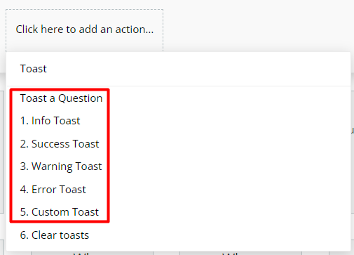
- Choose one of this, “Toast a Question”, “Info Toast”, “Success Toast”, “Warning Toast”, “Error Toast” or “Custom Toast”. It will open a pop-up.
- Complete toast options that you want.
Plugin Element Actions
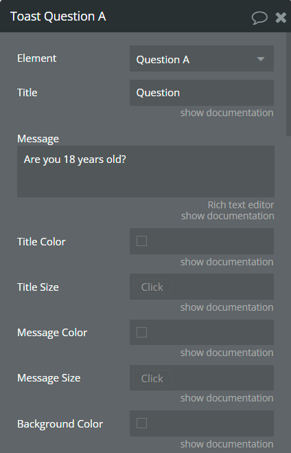
- Toast - this action should use for creating Question Toast.
Fields:
Title | Description | Type |
Title | Title for question toast. | string |
Message | Message for question toast. | string |
Title Color | Customize color for title toast. | Color (optional) |
Title Size | Customize the size for the title toast. | number (optional) |
Message Color | Customize color for message toast. | Color (optional) |
Message Size | Customize the size for the message toast. | number (optional) |
Background Color | Customize toast color. | Color (optional) |
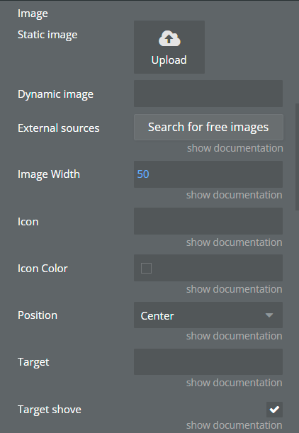
Image | Add an image for toast. | image (optional) |
Image Width | If the image was added set the width for this. | number (optional) |
Icon | May choose an icon for toast. E.g. Icomoon, Fontawesome. | string (optional) |
Icon Color | Customize icon color. | Color (optional) |
Position | Position of the toast when it appears. Top Right, Top Center, Top Left, Center, Bottom Right, Bottom Center, or Bottom Left. | Dropdown |
Target | If you want to bind toast to any specific element write the element id here. | string (optional) |
Target shove | Shove element space when appears. | Checkbox |
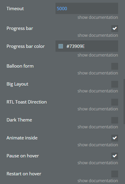
Timeout | Time in milliseconds for close toast itself. | number |
Progress bar | Show the progress bar on the toast. | Checkbox |
Progress bar color | Customize the color of the progress bar. | Color (optional) |
Balloon form | Add message form to the toast. | Checkbox |
Big Layout | Select a bigger layout than the default. | Checkbox |
RTL Toast Direction | Switch to Right To Left direction. | Checkbox |
Dark Theme | Choose a dark theme. | Checkbox |
Animate inside | Play animation inside toast content when it appears. | Checkbox |
Pause on hover | Pause the toast timer when is hoovered. | Checkbox |
Restart on hover | Reset the toast timer when is hoovered. | Checkbox |
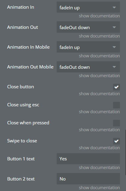
Animation In | Animation when toast appears in. Available values: bounceIn left, bounce right, bounceIn up, bounce down, fadeIn, fadeIn down, fadeIn up, fadeIn left, fadeIn right, flipInX | Dropdown |
Animation Out | Animation when toast disappears. Available values: fadeOut, fadeOut down, fadeOut up, fadeOut left, fadeOut right, flipOutX | Dropdown |
Animation In Mobile | Animation when toast appears on mobile devices. Available values: bounceIn left, bounce right, bounceIn up, bounce down, fadeIn, fadeIn down, fadeIn up, fadeIn left, fadeIn right, flipInX | Dropdown |
Animation Out Mobile | Animation when toast disappears in mobile devices. Available values: fadeOut, fadeOut down, fadeOut up, fadeOut left, fadeOut right, flipOutX | Dropdown |
Close button | Show the close button in the toast. | Checkbox |
Close using esc | Close toast using the ESC key. | Checkbox |
Close when pressed | Close the toast when clicking on it. | Checkbox |
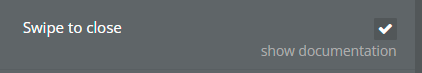
Swipe to close | Close toast using swipe action. | Checkbox |
Button 1 text | Button 1 answer caption. This text will appear on the toast. | string |
Button 2 text | Button 2 answer caption. This text will appear on the toast. | string |
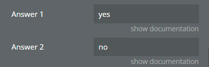
Answer 1 | Button 1 answer value. This text will return after the user's choice. | string |
Answer 2 | Button 2 answer value. This text will return after the user's choice. | string |
- Clear - this action should use for removing Question Toast states.
Element States
Title | Decription | Type |
Answer | This value will be returned after the user choice. | string |
Plugin Actions List
- Info Toaster
- Success Toast
- Warning Toast
- Error Toast
- Custom Toast
- Clear Toasts
PLUGIN ACTIONS DETAILED
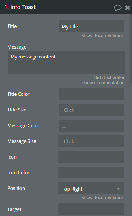
- Info Toast - This action should be used to create an info toast.
Fields:
Title | Description | Type |
Title | Set a title for info toast. | string |
Message | Set a message for info toast. | string |
Title Color | Customize color for title toast. | Color (optional) |
Title Size | Customize the size for the title toast. | number (optional) |
Message Color | Customize color for message toast. | Color (optional) |
Message Size | Customize the size for the message toast. | number (optional) |
Icon | May choose an icon for toast. E.g. Icomoon, Fontawesome. | string (optional) |
Icon Color | Customize icon color. | Color (optional) |
Position | Position of the toast when it appears. Top Right, Top Center, Top Left, Center, Bottom Right, Bottom Center, or Bottom Left. | Dropdown |
Target | If you want to bind toast to any specific element write the element id here. | string (optional) |
Target shove | Shove element space when appears. | Checkbox |
Timeout | Time in milliseconds for close toast itself. | number |
Progress bar | Show the progress bar on the toast. | Checkbox |
Progress bar color | Customize the color of the progress bar. | Color (optional) |
Balloon form | Add message form to the toast. | Checkbox |
Big Layout | Select a bigger layout than the default. | Checkbox |
RTL Toast Direction | Switch to Right To Left direction. | Checkbox |
Dark Theme | Choose a dark theme. | Checkbox |
Animate inside | Play animation inside toast content when it appears. | Checkbox |
Pause on hover | Pause the toast timer when is hoovered. | Checkbox |
Restart on hover | Reset the toast timer when is hoovered. | Checkbox |
Animation In | Animation when toast appears in. Available values: bounceIn left, bounce right, bounceIn up, bounce down, fadeIn, fadeIn down, fadeIn up, fadeIn left, fadeIn right, flipInX | Dropdown |
Animation Out | Animation when toast disappears. Available values: fadeOut, fadeOut down, fadeOut up, fadeOut left, fadeOut right, flipOutX | Dropdown |
Animation In Mobile | Animation when toast appears on mobile devices. Available values: bounceIn left, bounce right, bounceIn up, bounce down, fadeIn, fadeIn down, fadeIn up, fadeIn left, fadeIn right, flipInX | Dropdown |
Animation Out Mobile | Animation when toast disappears in mobile devices. Available values: fadeOut, fadeOut down, fadeOut up, fadeOut left, fadeOut right, flipOutX | Dropdown |
Close button | Show the close button on the toast. | Checkbox |
Close using esc | Close toast using ESC key. | Checkbox |
Close when pressed | Close the toast when clicking on it. | Checkbox |
Swipe to close | Close toast using swipe action. | Checkbox |
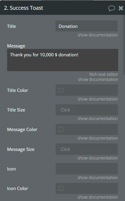
- Success Toast - This action should be used to create a success toast.
Fields:
Title | Description | Type |
Title | Set a title for the success toast. | string |
Message | Set a message for success toast. | string |
Title Color | Customize color for title toast. | Color (optional) |
Title Size | Customize the size for the title toast. | number (optional) |
Message Color | Customize color for message toast. | Color (optional) |
Message Size | Customize the size for the message toast. | number (optional) |
Icon | May choose an icon for toast. E.g. Icomoon, Fontawesome. | string (optional) |
Icon Color | Customize icon color. | Color (optional) |
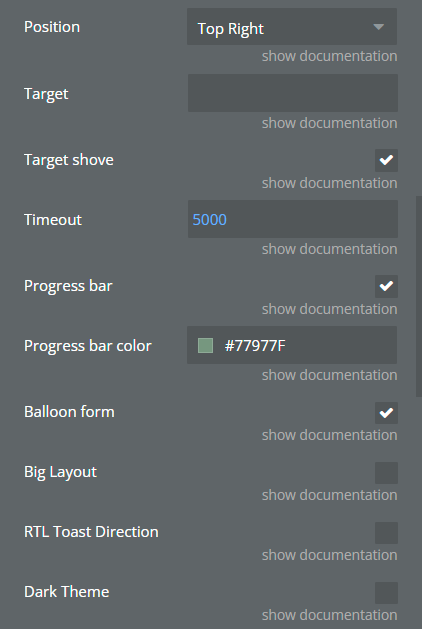
Position | Position of the toast when it appears. Top Right, Top Center, Top Left, Center, Bottom Right, Bottom Center, or Bottom Left. | Dropdown |
Target | If you want to bind toast to any specific element write the element id here. | string (optional) |
Target shove | Shove element space when appears. | Checkbox |
Timeout | Time in milliseconds for close toast itself. | number |
Progress bar | Show the progress bar on the toast. | Checkbox |
Progress bar color | Customize the color of the progress bar. | Color (optional) |
Balloon form | Add message form to the toast. | Checkbox |
Big Layout | Select a bigger layout than the default. | Checkbox |
RTL Toast Direction | Switch to Right To Left direction. | Checkbox |
Dark Theme | Choose a dark theme. | Checkbox |
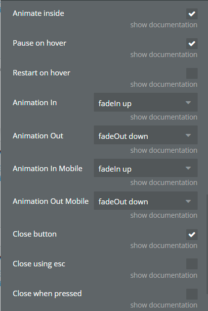
Animate inside | Play animation inside toast content when it appears. | Checkbox |
Pause on hover | Pause the toast timer when is hoovered. | Checkbox |
Restart on hover | Reset the toast timer when is hoovered. | Checkbox |
Animation In | Animation when toast appears in. Available values: bounceIn left, bounce right, bounceIn up, bounce down, fadeIn, fadeIn down, fadeIn up, fadeIn left, fadeIn right, flipInX | Dropdown |
Animation Out | Animation when toast disappears. Available values: fadeOut, fadeOut down, fadeOut up, fadeOut left, fadeOut right, flipOutX | Dropdown |
Animation In Mobile | Animation when toast appears on mobile devices. Available values: bounceIn left, bounce right, bounceIn up, bounce down, fadeIn, fadeIn down, fadeIn up, fadeIn left, fadeIn right, flipInX | Dropdown |
Animation Out Mobile | Animation when toast disappears in mobile devices. Available values: fadeOut, fadeOut down, fadeOut up, fadeOut left, fadeOut right, flipOutX | Dropdown |
Close button | Show the close button in the toast. | Checkbox |
Close using esc | Close toast using ESC key. | Checkbox |
Close when pressed | Close the toast when clicking on it. | Checkbox |
Swipe to close | Close toast using swipe action. | Checkbox |
- Warning Toast - This action should be used to create a warning toast.
Fields:
Title | Description | Type |
Title | Set a title for the warning toast. | string |
Message | Set a message for a warning toast. | string |
Title Color | Customize color for title toast. | Color (optional) |
Title Size | Customize the size for the title toast. | number (optional) |
Message Color | Customize color for message toast. | Color (optional) |
Message Size | Customize the size for the message toast. | number (optional) |
Icon | May choose an icon for toast. E.g. Icomoon, Fontawesome. | string (optional) |
Icon Color | Customize icon color. | Color (optional) |
Position | Position of the toast when it appears. Top Right, Top Center, Top Left, Center, Bottom Right, Bottom Center, or Bottom Left. | Dropdown |
Target | If you want to bind toast to any specific element write the element id here. | string (optional) |
Target shove | Shove element space when appears. | Checkbox |
Timeout | Time in milliseconds for close toast itself. | number |
Progress bar | Show the progress bar in the toast. | Checkbox |
Progress bar color | Customize the color of the progress bar. | Color (optional) |
Balloon form | Add message form to the toast. | Checkbox |
Big Layout | Select a bigger layout than the default. | Checkbox |
RTL Toast Direction | Switch to Right To Left direction. | Checkbox |
Dark Theme | Choose a dark theme. | Checkbox |
Animate inside | Play animation inside toast content when it appears. | Checkbox |
Pause on hover | Pause the toast timer when is hoovered. | Checkbox |
Restart on hover | Reset the toast timer when is hoovered. | Checkbox |
Animation In | Animation when toast appears in. Available values: bounceIn left, bounce right, bounceIn up, bounce down, fadeIn, fadeIn down, fadeIn up, fadeIn left, fadeIn right, flipInX | Dropdown |
Animation Out | Animation when toast disappears. Available values: fadeOut, fadeOut down, fadeOut up, fadeOut left, fadeOut right, flipOutX | Dropdown |
Animation In Mobile | Animation when toast appears in mobile devices. Available values: bounceIn left, bounce right, bounceIn up, bounce down, fadeIn, fadeIn down, fadeIn up, fadeIn left, fadeIn right, flipInX | Dropdown |
Animation Out Mobile | Animation when toast disappears in mobile devices. Available values: fadeOut, fadeOut down, fadeOut up, fadeOut left, fadeOut right, flipOutX | Dropdown |
Close button | Show the close button in the toast. | Checkbox |
Close using esc | Close toast using ESC key. | Checkbox |
Close when pressed | Close the toast when clicking on it. | Checkbox |
Swipe to close | Close toast using swipe action. | Checkbox |
- Error Toast - This action should be used to create an error toast.
Fields:
Title | Description | Type |
Title | Set a title for the error toast. | string |
Message | Set a message for error toast. | string |
Title Color | Customize color for title toast. | Color (optional) |
Title Size | Customize the size for the title toast. | number (optional) |
Message Color | Customize color for message toast. | Color (optional) |
Message Size | Customize the size for the message toast. | number (optional) |
Icon | May choose an icon for toast. E.g. Icomoon, Fontawesome. | string (optional) |
Icon Color | Customize icon color. | Color (optional) |
Position | Position of the toast when it appears. Top Right, Top Center, Top Left, Center, Bottom Right, Bottom Center, or Bottom Left. | Dropdown |
Target | If you want to bind toast to any specific element write the element id here. | string (optional) |
Target shove | Shove element space when appears. | Checkbox |
Timeout | Time in milliseconds for close toast itself. | number |
Progress bar | Show the progress bar on the toast. | Checkbox |
Progress bar color | Customize the color of the progress bar. | Color (optional) |
Balloon form | Add message form to the toast. | Checkbox |
Big Layout | Select a bigger layout than the default. | Checkbox |
RTL Toast Direction | Switch to Right To Left direction. | Checkbox |
Dark Theme | Choose a dark theme. | Checkbox |
Animate inside | Play animation inside toast content when it appears. | Checkbox |
Pause on hover | Pause the toast timer when is hoovered. | Checkbox |
Restart on hover | Reset the toast timer when is hoovered. | Checkbox |
Animation In | Animation when toast appears in. Available values: bounceIn left, bounce right, bounceIn up, bounce down, fadeIn, fadeIn down, fadeIn up, fadeIn left, fadeIn right, flipInX | Dropdown |
Animation Out | Animation when toast disappears. Available values: fadeOut, fadeOut down, fadeOut up, fadeOut left, fadeOut right, flipOutX | Dropdown |
Animation In Mobile | Animation when toast appears on mobile devices. Available values: bounceIn left, bounce right, bounceIn up, bounce down, fadeIn, fadeIn down, fadeIn up, fadeIn left, fadeIn right, flipInX | Dropdown |
Animation Out Mobile | Animation when toast disappears in mobile devices. Available values: fadeOut, fadeOut down, fadeOut up, fadeOut left, fadeOut right, flipOutX | Dropdown |
Close button | Show the close button on the toast. | Checkbox |
Close using esc | Close toast using ESC key. | Checkbox |
Close when pressed | Close the toast when clicking on it. | Checkbox |
Swipe to close | Close toast using swipe action. | Checkbox |
- Custom Toast - This action should be used to create a custom toast.
Fields:
Title | Description | Type |
Title | Set a title for custom toast. | string |
Message | Set a message for custom toast. | string |
Title Color | Customize color for title toast. | Color (optional) |
Title Size | Customize the size for the title toast. | number (optional) |
Message Color | Customize color for message toast. | Color (optional) |
Message Size | Customize the size for the message toast. | number (optional) |
Background Color | Customize toast color. | Color (optional) |
Image | Add an image for toast. | image (optional) |
Image Width | If the image was added set the width for this. | number (optional) |
Icon | May choose an icon for toast. E.g. Icomoon, Fontawesome. | string (optional) |
Icon Color | Customize icon color. | Color (optional) |
Position | Position of the toast when it appears. Top Right, Top Center, Top Left, Center, Bottom Right, Bottom Center, or Bottom Left. | Dropdown |
Target | If you want to bind toast to any specific element write the element id here. | string (optional) |
Target shove | Shove element space when appears. | Checkbox |
Timeout | Time in milliseconds for close toast itself. | number |
Progress bar | Show the progress bar on the toast. | Checkbox |
Progress bar color | Customize the color of the progress bar. | Color (optional) |
Balloon form | Add message form to the toast. | Checkbox |
Big Layout | Select a bigger layout than the default. | Checkbox |
RTL Toast Direction | Switch to Right To Left direction. | Checkbox |
Dark Theme | Choose a dark theme. | Checkbox |
Animate inside | Play animation inside toast content when it appears. | Checkbox |
Pause on hover | Pause the toast timer when is hoovered. | Checkbox |
Restart on hover | Reset the toast timer when is hoovered. | Checkbox |
Animation In | Animation when toast appears in. Available values: bounceIn left, bounce right, bounceIn up, bounce down, fadeIn, fadeIn down, fadeIn up, fadeIn left, fadeIn right, flipInX | Dropdown |
Animation Out | Animation when toast disappears. Available values: fadeOut, fadeOut down, fadeOut up, fadeOut left, fadeOut right, flipOutX | Dropdown |
Animation In Mobile | Animation when toast appears in mobile devices. Available values: bounceIn left, bounce right, bounceIn up, bounce down, fadeIn, fadeIn down, fadeIn up, fadeIn left, fadeIn right, flipInX | Dropdown |
Animation Out Mobile | Animation when toast disappears in mobile devices. Available values: fadeOut, fadeOut down, fadeOut up, fadeOut left, fadeOut right, flipOutX | Dropdown |
Close button | Show the close button in the toast. | Checkbox |
Close using esc | Close toast using ESC key. | Checkbox |
Close when pressed | Close the toast when clicking on it. | Checkbox |
Swipe to close | Close toast using swipe action. | Checkbox |
- Clear Toasts - This action should be used to clear toasts.
Workflow example
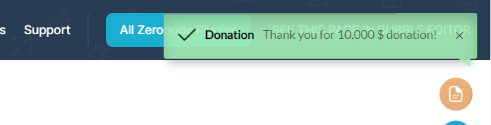
Add Success Toast
In this workflow, it is represented how to create a success toast using the Success Toast action.
- In the workflow, Success Toast will appear when Example 1 button will be clicked.
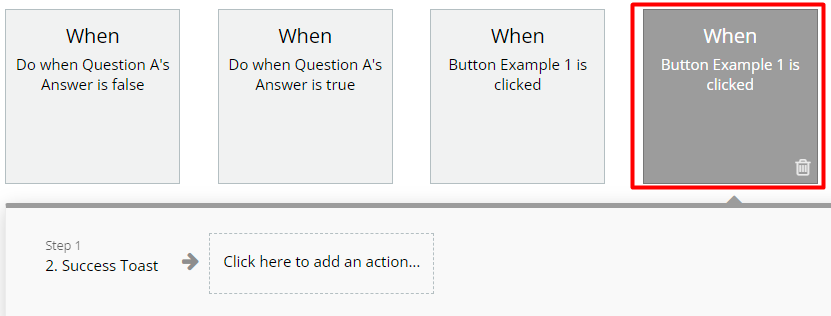
- Below, it is presented options for Success Toast action.
How it looks on the page
The toast appeared in the top right position on the page.
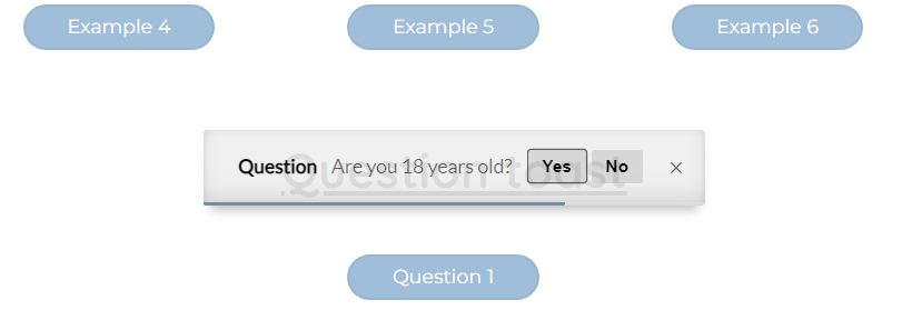
Add Question Toast
In this workflow, it is represented how to create a question toast using the Toast Question action.
- A Question plugin element is placed on the page.
- In the workflow, c will appear when the Question 1 button will be clicked.
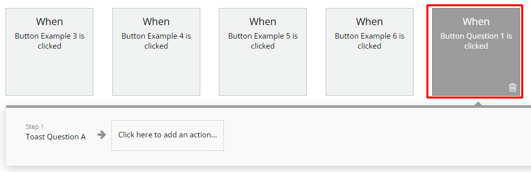
- Below, it is presented options for Toast Question action.
How it looks on the page
The toast appeared in the center position on the page.