Demo to preview the plugin
Introduction
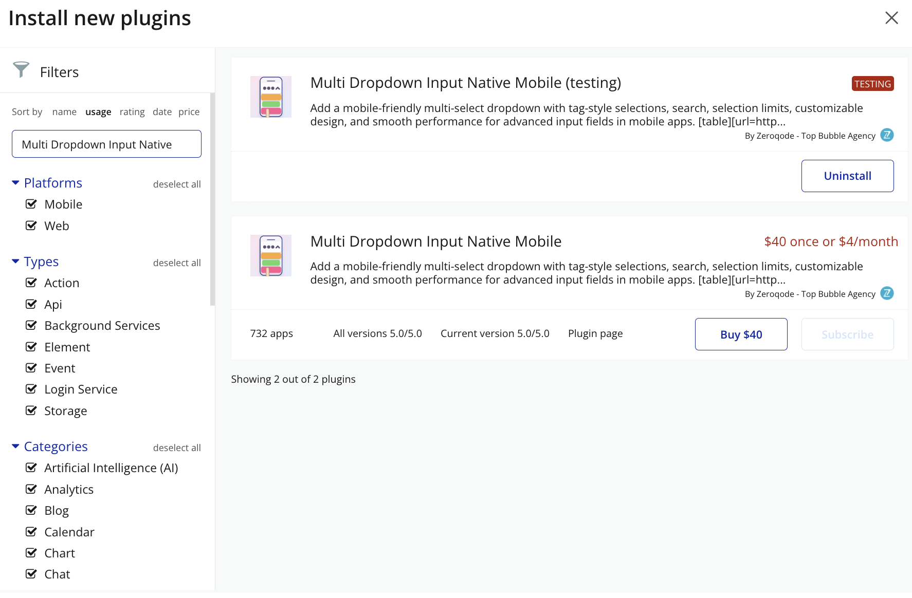
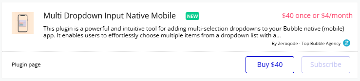
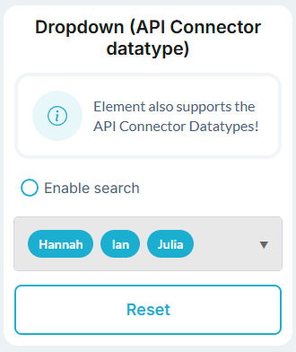
The Multi Dropdown Input Native Mobile plugin provides a powerful and customizable multi-select dropdown component specifically designed for mobile applications in Bubble. This plugin allows users to select multiple items from a dropdown list with an intuitive interface that displays selected items as tags. The component supports both simple data types (text, numbers) and complex data types (custom data types, API data) with flexible configuration options including search functionality, selection limits, and visual customization.
Prerequisites
This plugin is designed specifically for the mobile version of the Bubble editor. To test the plugin on your mobile device, use the TestFlight app available at: https://testflight.apple.com/join/EcFCzJ32
Please note that the testing app is currently available for iOS only.

How to setup
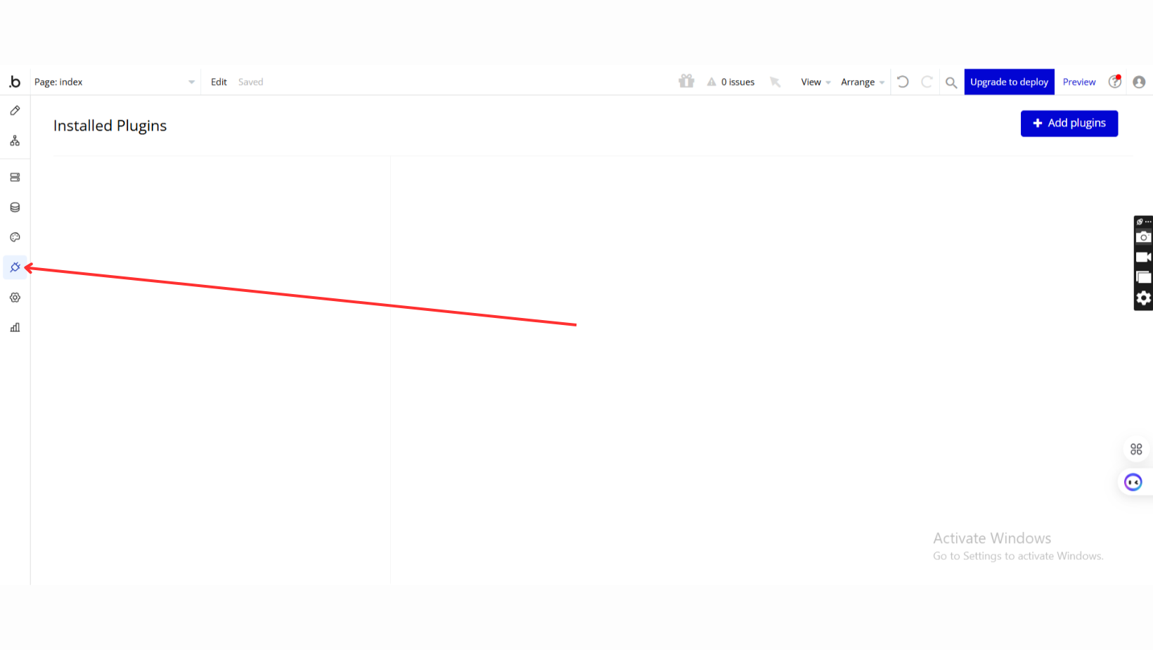
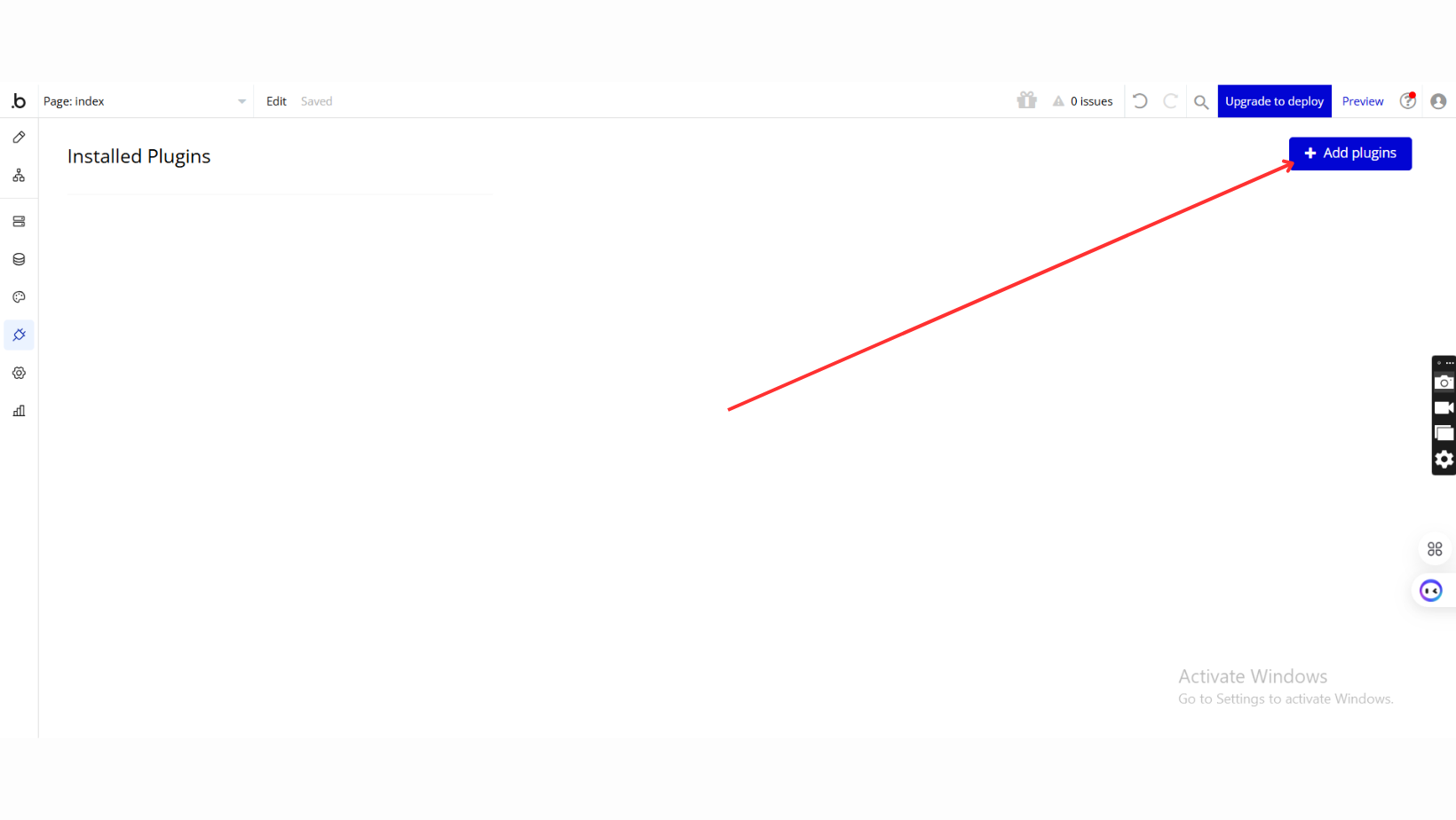
Step 1 – Install the Plugin
Step 2 – Add the Plugin Element to Your Page
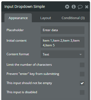
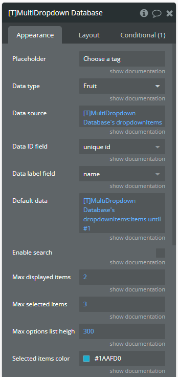
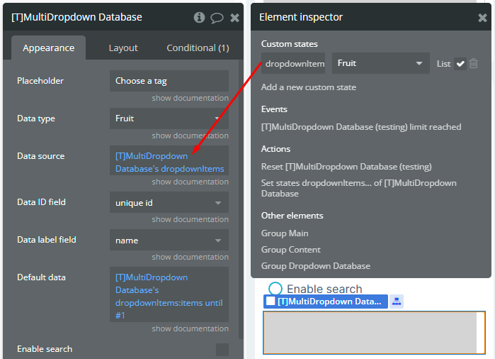
Step 3 – Configure Properties
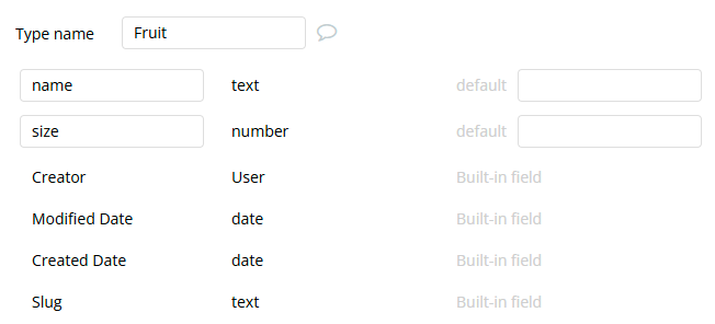
Plugin Element - Multi Dropdown
The plugin contains a Multi Dropdown input form that should be used on mobile pages.
Fields
Element actions
Exposed states
Element Events
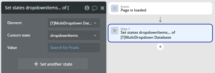
Workflow example
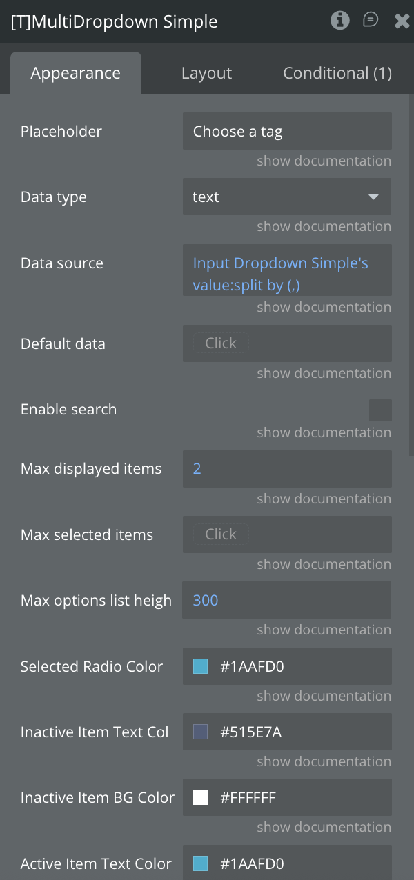
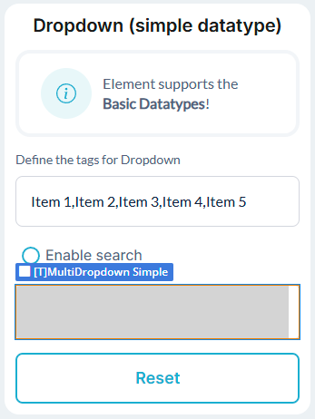
Using of basic datatype
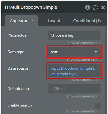
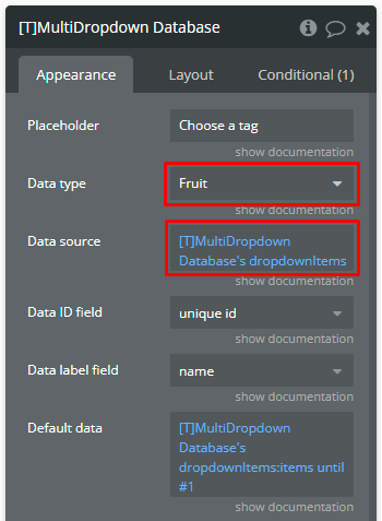
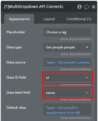
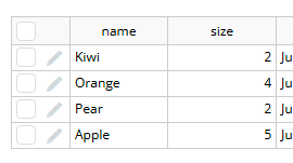
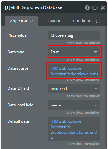
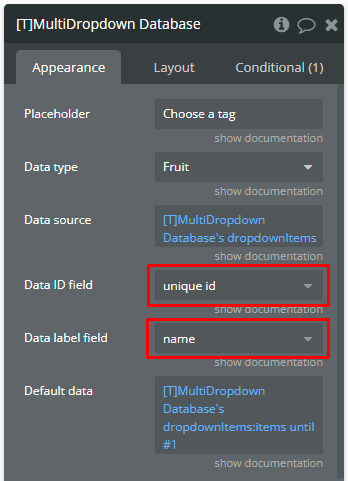
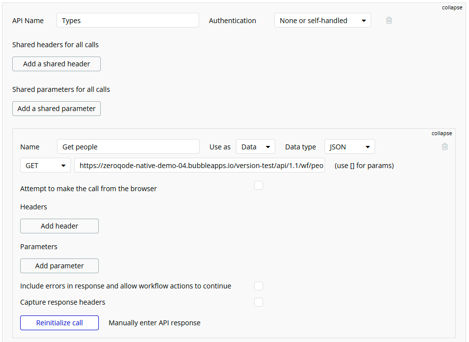
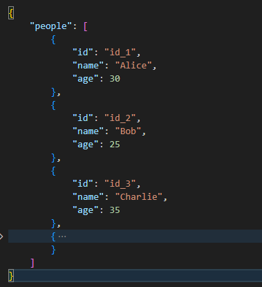
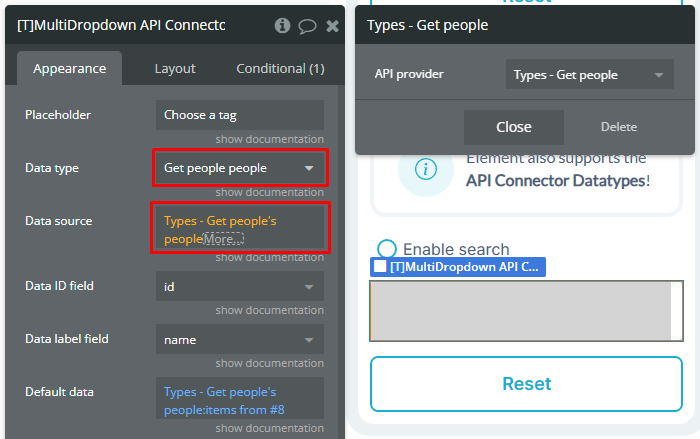
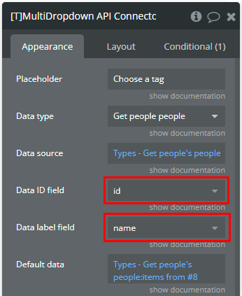
Using of complex datatype
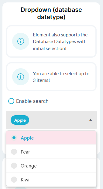
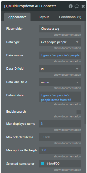
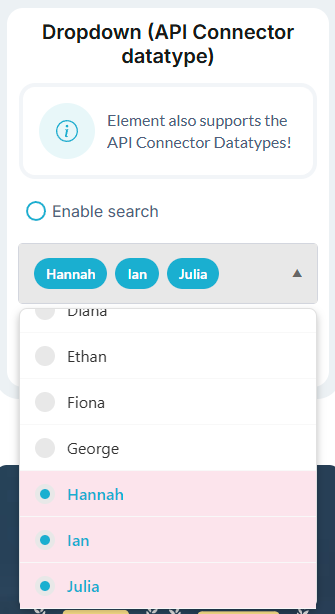
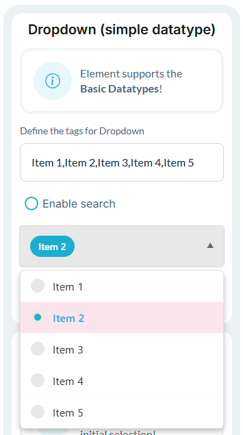
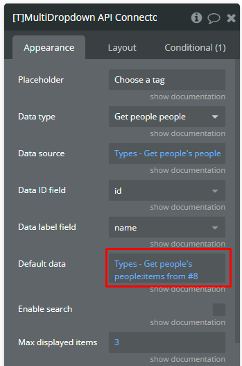
Initial selected items
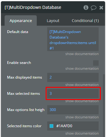
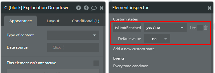
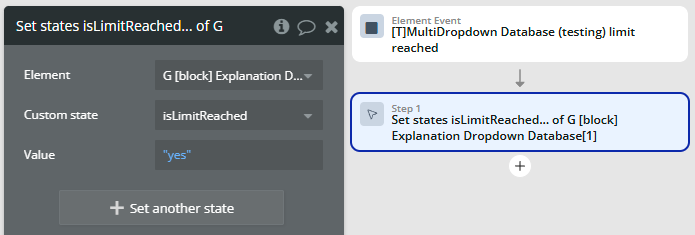
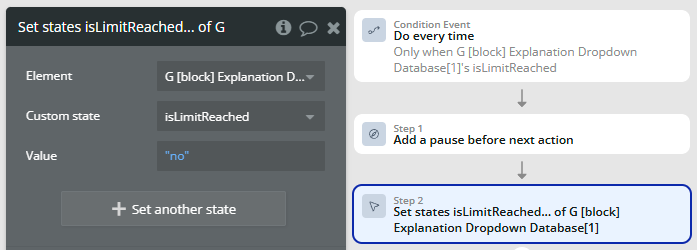
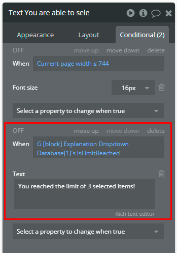
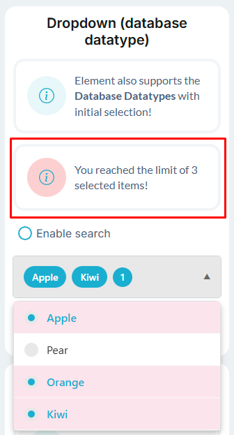
Limit the selection