
Link to the plugin page: https://zeroqode.com/plugin/1538732397082x262724476753149950
Demo to preview the plugin:
Introduction
Are you looking for a plugin that allows image annotation? Grab this Image Annotation plugin that enables interactive addition of markers with text and provides many other features.
It also supports the following features:
- Adding a dynamic image as a background that covers the full width and height of the visual element on the page.
Zooming in/out on the background image.
Dragging is allowed when zoomed in (optimized for touch screens).
Reading coordinates (X and Y) in both pixels and percentages on mouse movements over the visual element (exposed states).
Reading coordinate data from the Bubble App Type as markers on the visual element canvas.
Clicking a marker on the visual element canvas triggers the event ‘marker_is_clicked’ and reads the current data cell (marker) from the Bubble database.
Clicking the background on the visual element canvas triggers the event ‘background_is_clicked’, which allows initiating Bubble actions.

How to setup
- Adding the Element to the Page:
- Look for the Img_annot_canvas element in the list of available elements.
- Drag and drop the element onto your page.
- Adjust its size and position as needed.
- Setting Up the Workflow
- Go to the Workflows tab.
- Click "When A Img_annot_canvas Image Is Clicked".
- Add the action "Create Pin A Img_annot_canvas".
- Configure the parameters:
- X and Y: Position of the marker (use the values from the image click event).
- Text (optional): Information to be displayed on the marker.
- Create a button called "Enable Editing".
- In the workflow, add the action "Allow Position Editing A Img_annot_canvas" to enable editing.
- To disable editing, add another button and use the action "Prohibit Position Editing A Img_annot_canvas".
- Go to the events and add "When A Img_annot_canvas Marker_was_clicked".
- Set up the necessary actions, such as displaying a pop-up or showing marker details.
- In the workflow, add the action "Save Image A Img_annot_canvas".
- Set it up to save the image in a database or display it in another element.
- Use "Create Image From Element And Save".
- Specify the ID of the element you want to capture.
The plugin works with events and actions that allow you to add and interact with markers (pins) on an image.
Creating a Pin (Marker)
To allow users to add markers to the image:
Enabling or Disabling Position Editing
To allow users to move the markers:
Detecting a Marker Click
If you want to capture when a user clicks on a marker:
Saving the Annotated Image
To export the image with the added markers:
If you want to generate an image from a specific element on the page:
Plugin Element Properties
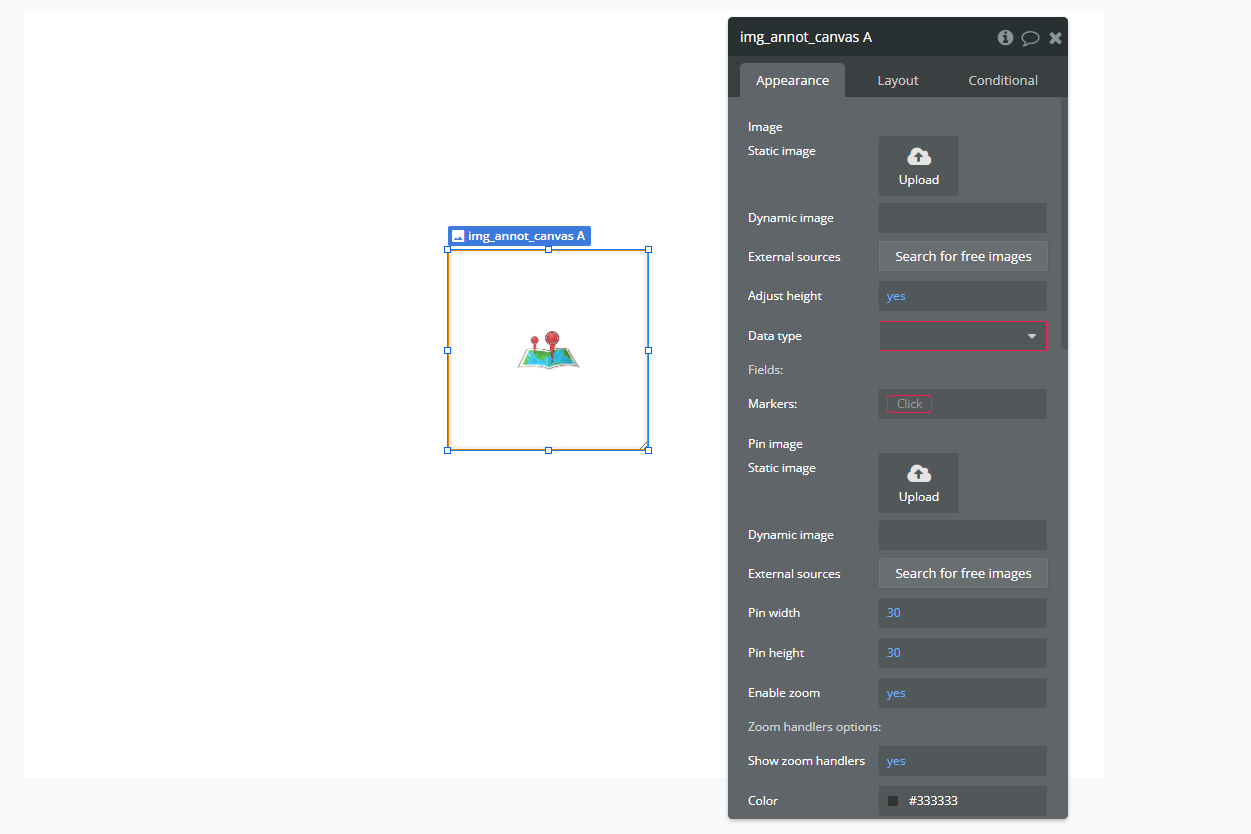
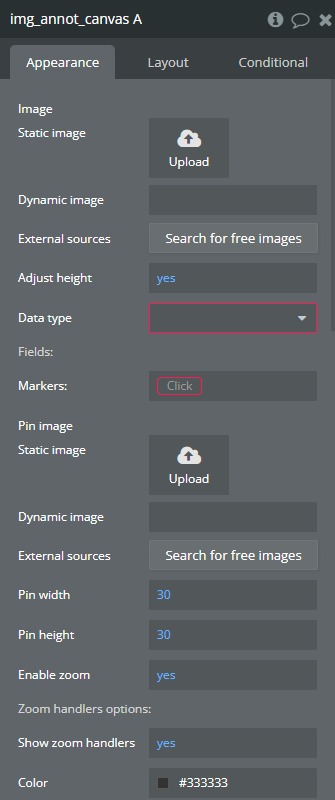
img_annot_canvas
Fields:
Title | Description | Type |
Image | The image that will be used as the base for annotations. | Image |
Adjust height | Automatically adjusts the height of the canvas to match the image's aspect ratio. | Checkbox (yes/no) |
Data type | Defines the data type that will be used for the annotation markers. | App Type |
Fields: | ||
ID | Unique identifier for each marker, represented as text, image, or file. | Filed of Data type, represent Text, image or file |
Text | The text associated with each marker, which can be used for displaying labels or descriptions. | Filed of Data type, represent Text, image or file |
Top | The Y-axis position of the marker relative to the image. | Filed of Data type, represent Number |
Left | The X-axis position of the marker relative to the image. | Filed of Data type, represent Number |
Markers: | A list of markers that will be displayed on the canvas. | Item reperesenting Data type |
Pin image | The image used for the marker (e.g., a custom icon or a predefined pin). | Image |
Pin width | The width of the marker pin (optional). | Number (optional) |
Pin height | The height of the marker pin (optional). | Number (optional) |
Icon | A field that can store a custom icon for each marker, represented as text, image, or file. | Filed of Data type, represent Text, image or file |
Enable zoom | Allows users to zoom in and out of the image annotation canvas. | Checkbox (yes/no) (optional) |
Zoom handlers options: | ||
Show zoom handlers | Displays zoom control buttons (e.g., zoom in, zoom out) on the canvas. | Checkbox (yes/no) (optional) |
Color | The color of the zoom control buttons. | Color (optional) |
Background color | The background color of the zoom control buttons. | Color (optional) |
Opacity | The opacity level of the zoom control buttons. | Number (optional) |
Size | The size of the zoom control buttons. | Number (optional) |
Markers text settings: | ||
Font shadow color | The color of the text shadow for marker labels. | Color (optional) |
Font family | The font type used for marker labels. | Text (optional) |
Font color | The color of the marker label text. | Color (optional) |
Font size | The size of the marker label text. | Number (optional) |
Marker text width(px) | The maximum width of the marker label text block in pixels. | Number (optional) |
Background color | The background color of the marker label text. | Color (optional) |
Opacity | The opacity of the marker label text background. | Number (optional) |
Marker Text Padding | Left, top, right, bottom | Text |
Marker Text Border Radius | Left, top, right, bottom | Text |
Marker Text Position | Positioning the text block relative to the marker Available options: Left, Top, Right, Bottom | Dropdown |
Marker Text Offset | Top and left offset for text labels. Accept negative values. Depends on the ‘Marker Text Position’ field. | Text |
Collapse Marker Text | Hides the marker label text unless the user interacts with the marker. | Checkbox (yes/no) |
Element Actions
- Create pin - Creates a new marker (pin) on the annotation canvas at the specified position.
Title | Description | Type |
Text | The text or label associated with the newly created pin. | Text |
Top (%) | The Y-axis position of the pin relative to the image, in percentage. | Number |
Left (%) | The X-axis position of the pin relative to the image, in percentage. | Number |
Icon | The icon or image used for the pin marker. | Text |
- Allow position editing - Enables users to move existing pins (markers) on the annotation canvas.
- Prohibit position editing - Disables movement of markers on the annotation canvas.
- save image - Saves the current state of the annotated image, including all markers.
Title | Description | Type |
Id | The unique identifier of the image being saved. | Text |
Temp_id_img | A temporary ID assigned to the saved image. | Text |
Scale | The resolution scale factor for saving the image. | Text |
ShouldDownload | Whether to automatically download the saved image. | Checkbox (yes/no) |
Exposed states
Title | Description | Type |
Mouse_x_percent | The X-coordinate of the mouse cursor relative to the image, in percentage. | Number |
Mouse_y_percent | The Y-coordinate of the mouse cursor relative to the image, in percentage. | Number |
Mouse_x | The absolute X-coordinate of the mouse cursor on the canvas. | Number |
Mouse_y | The absolute Y-coordinate of the mouse cursor on the canvas. | Number |
Current_marker_text | The text content of the currently selected marker. | Text |
Current_marker_id | The unique identifier of the currently selected marker. | Text |
Current_marker_left | The X-position of the currently selected marker. | Number |
Current_marker_top | The Y-position of the currently selected marker. | Number |
Current_marker | The full data object of the currently selected marker. | Undefined |
Id | The unique identifier of the image being displayed. | Text |
New_position_left | The new X-position of a moved marker. | Number |
New_position_top | The new Y-position of a moved marker. | Number |
Img_url | The URL of the currently displayed image. | Text |
Element Events
Title | Description |
Image is clicked | Triggered when the user clicks anywhere on the annotation canvas. |
marker_was_clicked | Triggered when the user clicks on a marker (pin) within the canvas. |
position_was_changed | Triggered when a marker is moved to a new position. |
Plugin Actions
- Create image from Element and save
This action allows you to capture an element on the page as an image, save it, and optionally display it in an image element or download it. This is useful for capturing annotated images, generating previews, or saving custom visuals created within the app.
Title | Description | Type |
Element’s ID | The ID of the element to capture as an image. | Text |
Img Element ID | ID of Img element to display generated screenshot | Text |
Scale | Resolution and size of the generated screenshot | Number |
Download? | Check to download on save | Checkbox (yes/no) |
