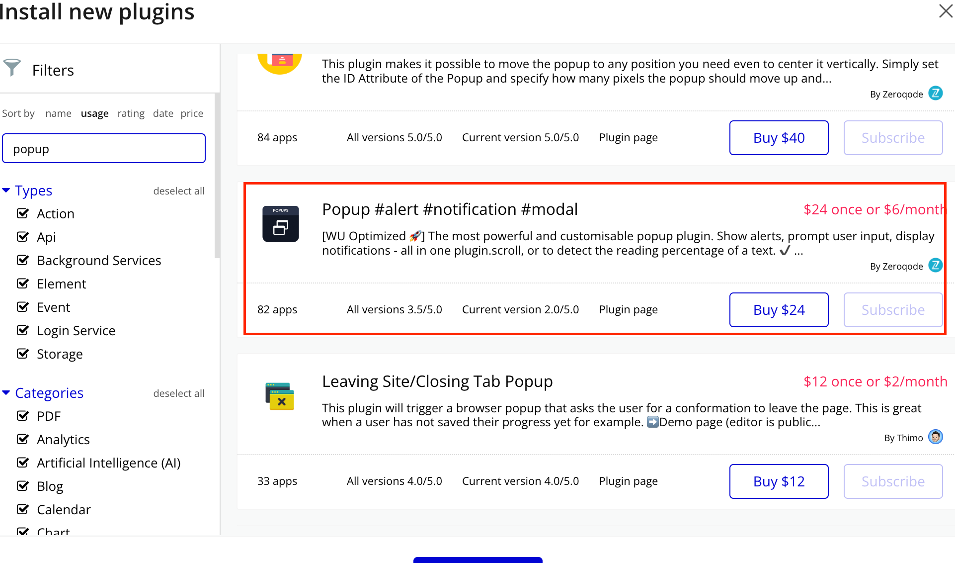
Empower users to deliver timely alerts and notifications within your Bubble application seamlessly. This versatile plugin offers a range of modal popup options, enabling you to create customizable alerts and notifications tailored to your app's needs.
With the Popup #alert #notification #modal Plugin, you can effortlessly engage users with important messages, prompts, or confirmations directly within your app's interface. Whether it's notifying users of new updates, confirming actions, or displaying critical information, this plugin provides a sleek and responsive solution for enhancing user experience.
Customize the appearance and behavior of your popups with ease, including options for styling, animation effects, and user interactions. From simple informational alerts to interactive modals, the plugin offers flexibility to adapt to various use cases and design preferences.
Utilize the Popup #alert #notification #modal Plugin to streamline user interactions and improve communication within your Bubble app. Enhance engagement, guide user actions, and provide a seamless experience with dynamic popup notifications tailored to your application's requirements.
How to setup
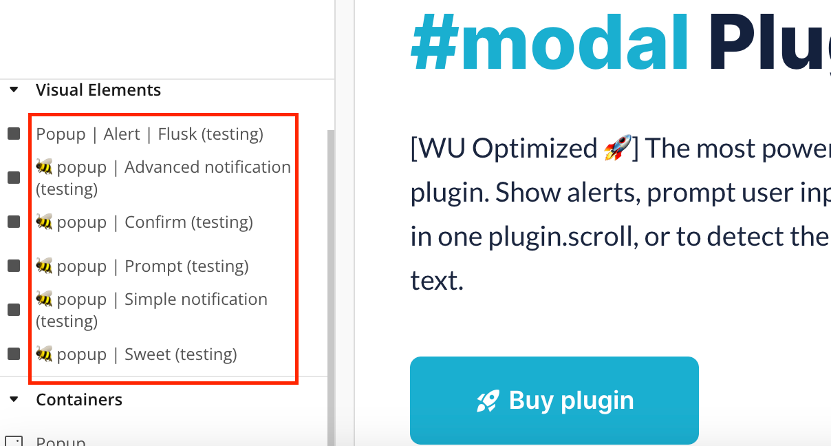
Install plugin Popup #alert #notification #modal
Place the Popup elements on the page
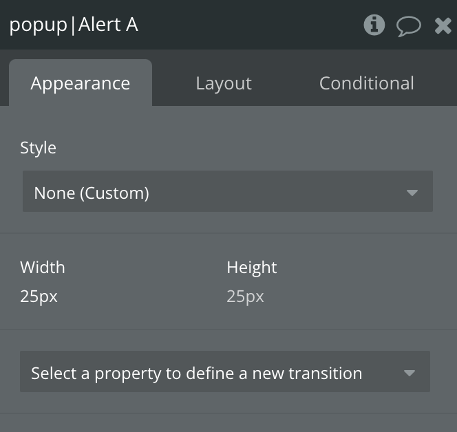
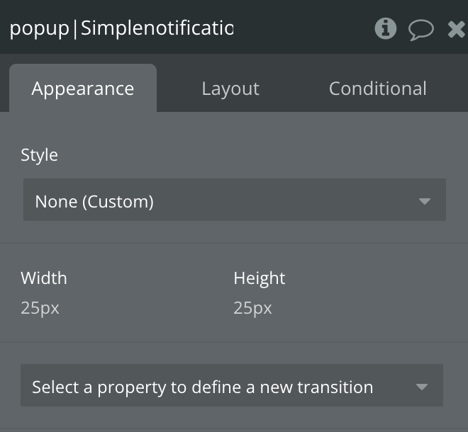
Plugin Element Properties
Element actions
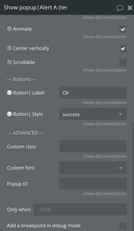
1) Show popup| Alert
Display the Alert Popup
Title
Description
Type
🏷️ Title
Adds a header to the dialog and places this text. (✔️ Support BB code)
Text, Optional
🏷️ Message
Text displayed in the dialog. (✔️ Support BB code)
Text, Required
🏷️ HTML
HTML to display in the dialog. Will override the message field.
Text, Optional
🎨 Theme
Theme color of popup
Dropdown
⚙️ Size
Size of popoup
Dropdown
⚙️ Close button
Whether the dialog should have a close button (x) or not.
Checkbox
⚙️ Allow dismissed
Allows the user to dismiss the dialog by hitting ESC or clicking the background.
Checkbox
⚙️ Animate
Animate the dialog in and out.
Checkbox
⚙️ Center vertically
Position the popup in the center
Checkbox
⚙️ Scrollable
Make the popup scrollable
Checkbox
⚪ Button| Label
Text displayed in the button. (✔️ Support BB code)
Text, Required
⚪ Button| Style
Theme of the button.
Dropdown
Custom class
An additional class to apply to the dialog wrapper.
Text, Optional
Custom font
Additional class to apply custom fonts
Dropdown, Optional
Popup ID
An optional ID to be returned in the element state whenever an event is fired. Useful when triggering multiple popups from the same element and easily retrieve the corresponding data.
Text, Optional
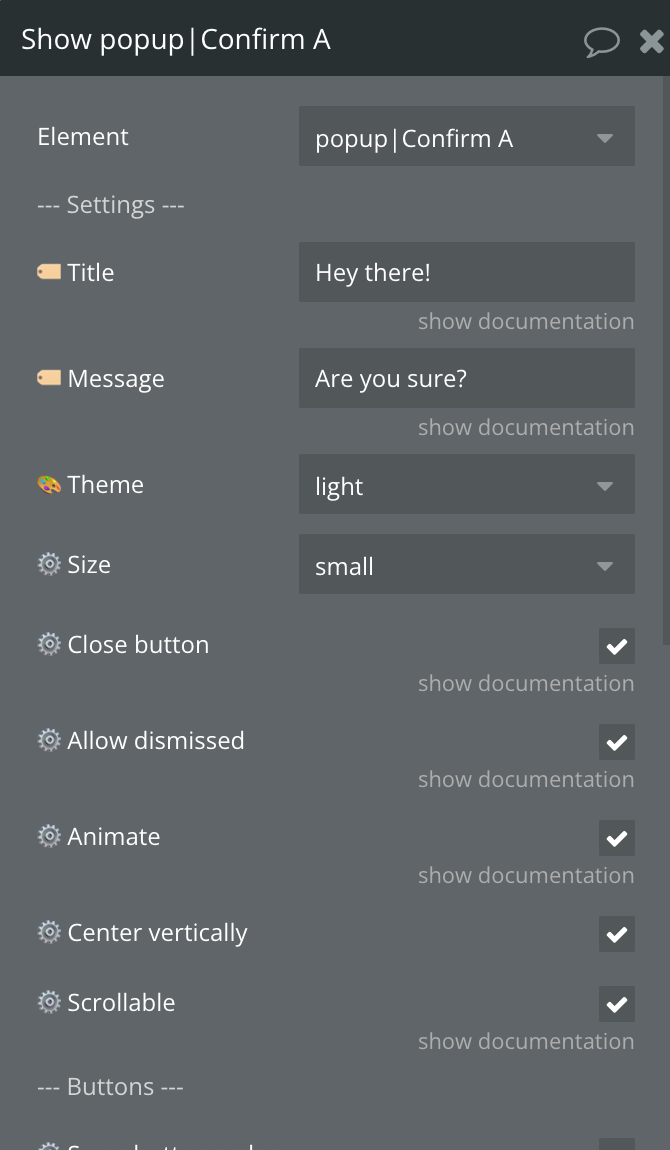
2) Show popup| Confirm
Display the Confirm Popup
Title
Description
Type
🏷️ Title
Adds a header to the dialog and places this text. (✔️ Support BB code)
Text, Optional
🏷️ Message
Text displayed in the dialog. (✔️ Support BB code)
Text, Required
🎨 Theme
Theme color of popup
Dropdown
⚙️ Size
Size of popoup
Dropdown
⚙️ Close button
Whether the dialog should have a close button (x) or not.
Checkbox
⚙️ Allow dismissed
Allows the user to dismiss the dialog by hitting ESC or clicking the background.
Checkbox
⚙️ Animate
Animate the dialog in and out.
Checkbox
⚙️ Center vertically
Position the popup in the center
Checkbox
⚙️ Scrollable
Make the popup scrollable
Checkbox
⚙️ Swap button order
Flips the order in which the buttons are rendered, from cancel/confirm to confirm/cancel.
Checkbox
🟢 Button 1 | Label
Text displayed in the button. (✔️ Support BB code)
Text, Required
🟢 Button 1 | Style
Theme of the button.
Dropdown, Required
🔴 Button 2| Label
Text displayed in the button. (✔️ Support BB code)
Text, Required
🔴 Button 2| Style
Theme of the button.
Dropdown, Required
Custom class
An additional class to apply to the dialog wrapper.
Text, Optional
Custom font
Additional class to apply custom fonts
Dropdown
Popup ID
An optional ID to be returned in the element state whenever an event is fired. Useful when triggering multiple popups from the same element and easily retrieve the corresponding data.
Text, Optional
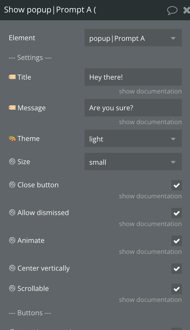
3) Show popup| Prompt
Display the Prompt Popup
Title
Description
Type
🏷️ Title
Adds a header to the dialog and places this text. (✔️ Support BB code)
Text, Optional
🏷️ Message
Text displayed in the dialog. (✔️ Support BB code)
Text, Required
🎨 Theme
Theme color of popup
Dropdown
⚙️ Size
Size of popoup
Dropdown
⚙️ Close button
Whether the dialog should have a close button (x) or not.
Checkbox
⚙️ Allow dismissed
Allows the user to dismiss the dialog by hitting ESC or clicking the background.
Checkbox
⚙️ Animate
Animate the dialog in and out.
Checkbox
⚙️ Center vertically
Position the popup in the center
Checkbox
⚙️ Scrollable
Make the popup scrollable
Checkbox
⚙️ Swap button order
Flips the order in which the buttons are rendered, from cancel/confirm to confirm/cancel.
Checkbox
🟢 Button 1 | Label
Text displayed in the button. (✔️ Support BB code)
Text, Required
🟢 Button 1 | Style
Theme of the button.
Dropdown, Required
🔴 Button 2| Label
Text displayed in the button. (✔️ Support BB code)
Text, Required
🔴 Button 2| Style
Theme of the button.
Dropdown, Required
⚙️ Prompt type
Changes the type of input generated for the prompt dialog.
Dropdown, Required
⚙️ Required
Defines if the input must not be empty for the prompt to complete.
Checkbox
🟨 TEXT INPUT
⚙️ Placeholder
Set the placeholder option to provide a small amount of "helper" text within a text-based input.
Text, Optional
⚙️ Default value
Set the default value of the input.
Text, Optional
⚙️ Pattern
Required formatting of the input. Not compatible with the multi-line input. If you selected "custom", you'll also need to fill the field below.
Dropdown, Required
⚙️ Custom pattern
Set the custom formatting to require the input value to follow a specific format. Select the "custom" formatting option from the field above and the prompt will not close if the input value fails pattern validation. Must be regex formatted, example: "https?://.+”
Text, Optional
⚙️ Maximum length
(Number) Set the max length to limit the number of characters entered into a text-based input. (✔️ Compatible with the following input types: text, textarea, email, and password)
Number, Optional
⚙️ Enable multiline
Check this to transform the text input into a multi-line text input.
Checkbox
⚙️ Multiline rows
Set the number of rows when using the multiline input type. If omitted, the multiline input will render with the browser's default number of rows.
Number, Optional
🟧 NUMBER INPUT
⚙️ Placeholder
Set the placeholder option to provide a small amount of "helper" text within a number-based input. This option is not compatible with all browsers.
Text, Optional
⚙️ Default value
Set the default value of the input.
Number, Optional
⚙️ Min. value
Set the minimum value to be entered in the input.
Number, Optional
⚙️ Max. value
Set the maximum value to be entered in the input.
Number, Optional
🟫 DATE / TIME
⚙️ Placeholder
Set the placeholder option to provide a small amount of "helper" text within a number-based input. This option is not compatible with all browsers.
Text, Optional
⚙️ Input type
The type of the value to be entered, can be a date or a time.
Dropdown, Required
⚙️ Date default value
Set the default value of the input.
Date, Optional
⚙️ Min. date
Set the minimum date to be entered in the input.
Date, Optional
⚙️ Max. date
Set the maximum date to be entered in the input.
Date, Optional
⚙️ Time default value
Set the default value of the input. Must be formatted as "HH:MM”
Text, Optional
⚙️ Min. time
Set the minimum time to be entered in the input. Must be formatted as "HH:MM”
Text, Optional
⚙️ Max. time
Set the maximum time to be entered in the input. Must be formatted as "HH:MM”
Text, Optional
🟩 Dropdown / Radio / Checkbox
⚙️ Input type
Type of Input(Dropdown, Checkbox, Radio)
Dropdown, Required
⚙️ Option list | Display / Caption
The list of options to populate the dropdown.
Text, Optional
⚙️ Option list | IDs
The value returned by the plugin when an option is selected. (✔️ Optional - if not provided, the option caption will be returned)
Text, Optional
⚙️ Default value | ID
The default value of the dropdown. Must be the ID of the option if the list of IDs is provided.
Text, Optional
🟦 RANGE
⚙️ Default value
Set the default value of the input. Must be between 0 and 100.
Number, Optional
⚙️ Min. value
Set the minimum value to be entered in the input. Must be between 0 and 100.
Number, Optional
⚙️ Max. value
Set the maximum value to be entered in the input. Must be between 0 and 100.
Number, Optional
⚙️ Step
Set the value that will go on step when changing range input
Number, Optional
ADVANCED
Custom class
An additional class to apply to the dialog wrapper.
Text, Optional
Custom font
Additional class to apply custom fonts
Dropdown, Optional
Popup ID
An optional ID to be returned in the element state whenever an event is fired. Useful when triggering multiple popups from the same element and easily retrieve the corresponding data.
Text, Optional
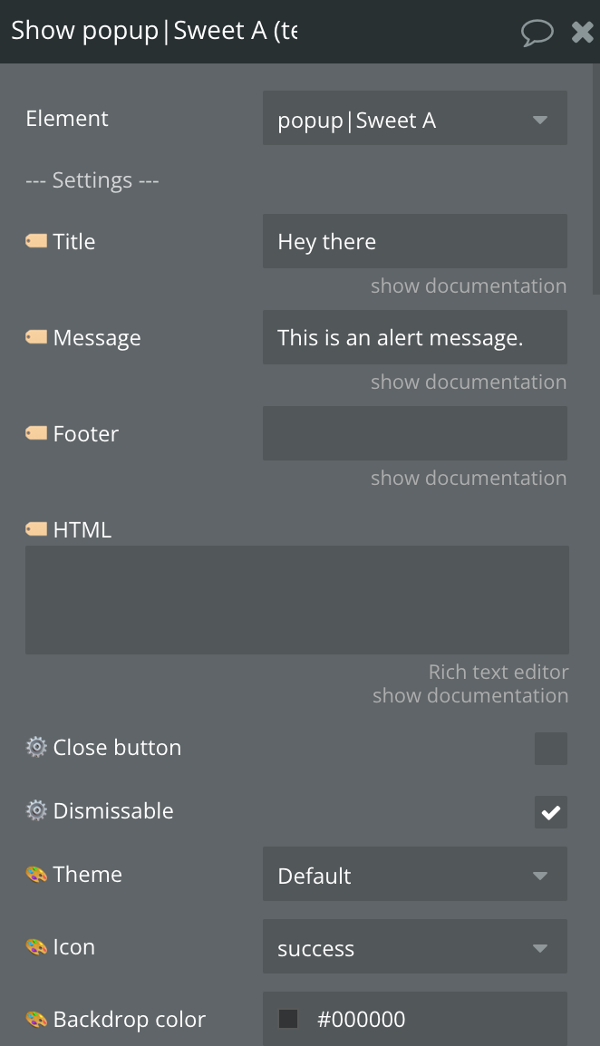
4) Show popup| Sweet
Display the Sweet Popup
Title
Description
Type
🏷️ Title
Adds a header to the dialog and places this text. (✔️ Support BB code)
Text, Optional
🏷️ Message
Text displayed in the dialog. (✔️ Support BB code)
Text, Required
🏷️ Footer
Adds a footer to the dialog and places this text. (✔️ Support BB code)
Text, Optional
🏷️ HTML
HTML to render inside the popup. If message and html parameters are provided in the same time, html will be used.
Text, Optional
⚙️ Close button
Whether the dialog should have a close button (x) or not.
Checkbox
⚙️ Dismissable
Allows the user to dismiss the dialog by hitting ESC or clicking the background.
Checkbox
🎨 Theme
Theme color of popup
Dropdown, Required
🎨 Icon
Icon image
Dropdown, Required
🎨 Backdrop color
Color of backdrop
Color, Required
⚙️ Custom icon color
Custom icon color
Color, Optional
⚙️ Custom background
Custom background
Color, Optional
⚙️ Custom text color
Custom text color
Color, Optional
⚙️ Position
Popup window position.
Dropdown, Required
⚙️ Fullscreen
Enables Fullscreen
Checbox
⚙️ Timer duration (ms)
The duration of the timer after which the popup will be closed. In miliseconds.
Number, Optional
⚙️ Timer
Allows the user to dismiss the dialog by hitting ESC or clicking the background.
Checbox
⚙️ Timer progress bar
If set to true, the timer will have a progress bar at the bottom of a popup.
Checbox
⚙️ Animation (show)
Type of animation to apply when popup shows
Dropdown, Optional
⚙️ Animation (hide)
Type of animation to apply when popup hides
Dropdown, Optional
⚙️ Custom width
Popup window width, including paddings. Can be in any CSS unit (px, em/rem, %).
Text, Optional
🎨 Custom image
Add a customized icon or image for the popup.
Image, Optional
⚙️ Image width
If image is set, you can specify image width. Can be in any CSS unit (px, em/rem, %).
Text, Optional
⚙️ Image height
If image is set, you can specify image height. Can be in any CSS unit (px, em/rem, %).
Text, Optional
⚙️ Enable steps
Enables More Popup with more steps
Checkbox
⚙️ Steps labels
Label of steps
Text, Optional
⚙️ Current step
Sets the default step number
Number, Optional
🟢 Enable button 1
Enables the first button
Checkbox
🟢 Button 1| Label
Text displayed in the button. (✔️ Support BB code)
Text, Required
🟢 Button 1| Style
Theme of the button.
Dropdown, Required
🟢 Button 1| Color
Color of the button, only work if you selected the "custom" style above.
Color, Optional
🔴 Enable button 2
Enables the second button
Checkbox
🔴 Button 2| Label
Text displayed in the button. (✔️ Support BB code)
Text, Optilnal
🔴 Button 2| Style
Theme of the button.
Dropdown, Required
🔴 Button 2| Color
Color of the button, only work if you selected the "custom" style above.
Color, Optional
🔵 Enable button 3
Enables the second button
Checkbox
🔵 Button 3| Label
Text displayed in the button. (✔️ Support BB code)
Text, Optilnal
🔵 Button 3| Style
Theme of the button.
Dropdown, Required
🔵 Button 3| Color
Color of the button, only work if you selected the "custom" style above.
An optional ID to be returned in the element state whenever an event is fired. Useful when triggering multiple popups from the same element and easily retrieve the corresponding data.
Text, Optional
5) Hide current| Sweet
Hides the Sweet Popup
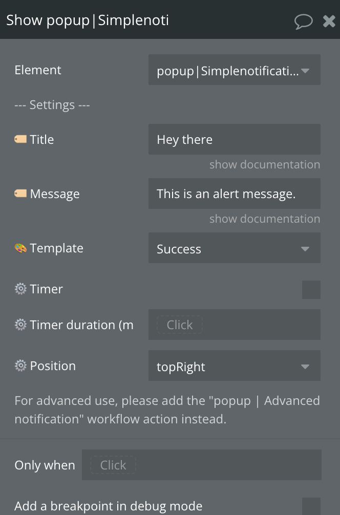
6) Show popup| Simple notification
Display the Simple notification Popup
Title
Description
Type
🏷️ Title
Adds a header to the dialog and places this text. (✔️ Support BB code)
Text, Optional
🏷️ Message
Text displayed in the dialog. (✔️ Support BB code)
Text, Required
🎨 Template
Can be Success, Warning, Error, Information, Question
Dropdown, Required
⚙️ Timer
Enables timer
Checkbox
⚙️ Timer duration (ms)
Timer duration
Number, Optional
⚙️ Position
For advanced use, please add the "popup | Advanced notification" workflow action instead.
Dropdown, Required
7) Hide All| Simple notification
Hides the Simple notification Popup
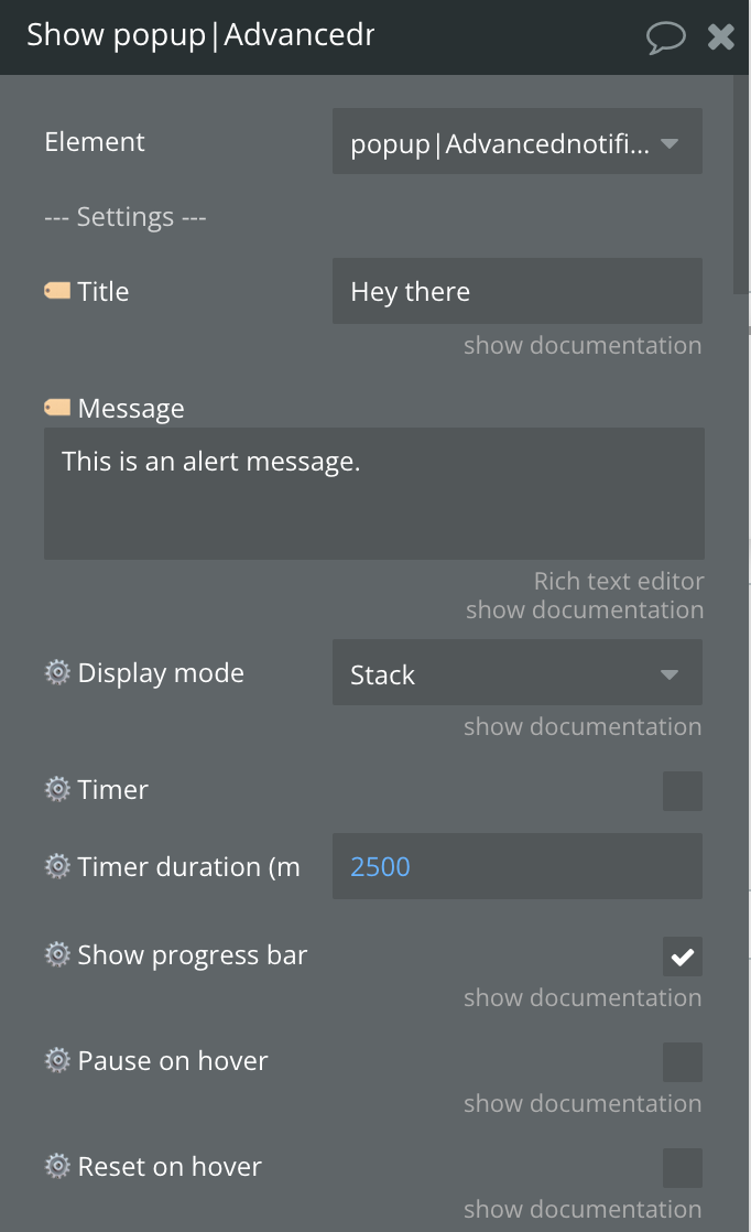
8) Show popup| Advanced notification
Display the Advanced notification Popup
Title
Description
Type
🏷️ Title
Adds a header to the dialog and places this text. (✔️ Support BB code)
Text, Optional
🏷️ Message
Text displayed in the dialog. (✔️ Support BB code)
Text, Required
⚙️ Display mode
Stack is the default behaviour. "Unique" will only display the notification once and not show if another notification is already displayed. "Replace" will close any existing notification.
Dropdown, Required
⚙️ Timer
Enables timer
Checkbox
⚙️ Timer duration (ms)
Timer duration
Number, Optional
⚙️ Show progress bar
Show a progress bar when the timer is enabled.
Dropdown, Required
⚙️ Pause on hover
Pause the toast timeout while the cursor is on it.
Checkbox
⚙️ Reset on hover
Reset the toast timeout while the cursor is on it.
Checkbox
⚙️ Close on click
Allows to close toast clicking on it.
Checkbox
⚙️ Show "close" button
Show "x" close button
Checkbox
⚙️ Allow drag
Allow the notification to be dragged out
Checkbox
⚙️ Preset icon
Use any of the icons from the preset.
Dropdown, Optional
⚙️ Other icon
Please visit Fontawesome website to find the desired icon code
Text, Optional
⚙️ Custom icon
Custom Icon image
Image, Optional
⚙️ Image
Image
Image, Optional
⚙️ Image width
Width of the image in px
Number, Optional
🎨 Preset template
Can be Success, Warning, Error, Information, Question
Dropdown, Optional
🎨 Preset theme
Theme of the preset
Dropdown, Optional
🎨 Preset color
Color of preset
Color, Optional
⚙️ Position
Position of popup
Dropdown, Required
⚙️ Layout
Layout of the notification. Choose "Small" to display the title and message on the same line level.
Dropdown, Required
⚙️ Background color
Background color
Color, Optional
⚙️ Progress bar color
Progress bar color
Color, Optional
⚙️ Icon color
Icon color
Color, Optional
⚙️ Title color
Title color
Color, Optional
⚙️ Title size
Title size
Number, Optional
⚙️ Title line height
Title line height
Number, Optional
⚙️ Message color
Message color
Color, Optional
⚙️ Message size
Message size
Number, Optional
⚙️ Message line height
Message line height
Number, Optional
⚙️ Show overlay
Display an overlay layer on the page.
Checkbox
⚙️ Overlay color
Overlay color
Color, Optional
⚙️ Allow overlay closing
Display an overlay layer on the page when closing
Checkbox
⚙️ Max width
Maximum width of the notification in px.
Number, Optional
⚙️ Custom class
The class that will be applied to the toast. It may be used as a reference.
Text, Optional
⚙️ Animate inside
Enable animations of elements in the toast.
Checkbox
⚙️ Transition In
Default notification open animation.
Dropdown, Optional
⚙️ Transition out
Default notification close animation.
Dropdown, Optional
⚙️ Transition In Mobile
Default notification open animation on mobile.
Dropdown, Optional
⚙️ Transition Out Mobile
Default notification close animation on mobile.
Dropdown, Optional
🟢 Activate | Button 1
Enables the first button
Checkbox
🟢 Label | Button 1
Text displayed in the button. (✔️ Support BB code)
Text, Optional
🔴 Activate | Button 2
Enables the second button
Checkbox
🔴 Label | Button 2
Text displayed in the button. (✔️ Support BB code)
Text, Optional
🔵 Activate | Button 3
Enables the third button
Checkbox
🔵 Label | Button 3
Text displayed in the button. (✔️ Support BB code)
Text, Optional
🟫 Activate | Input
Enables the input
Checkbox
🟫 Type | Input
Can be text, password, number, color, date, time
Dropdown, Optional
🟫 Focus | Input
If enable, the input will be auto-focused when the notification appears.
Checkbox
Popup ID
An optional ID to be returned in the element state whenever an event is fired. Useful when triggering multiple popups from the same element and easily retrieve the corresponding data.
Text, Optional
9) Hide All| Advanced notification
Hides the Advanced notification Popup
10) Clear/Hide all notifications
Hides all notification popups from page
Exposed states
Title
Description
Type
Confirm Popup ID
Id of Confirm Popup ID
Text
Prompt Entered value (🟨 Text input)
Prompt Text Input Value
Text
Prompt Entered value (🟧 Number input)
Prompt Number Input Value
Number
Prompt Entered value (🟦 Range)
Prompt Range Input Value
Text
Prompt Selected option ID (🟩 Dropdown / Radio / Checkbox)
Prompt Id of selected option, can be Dropdown, Radio or Checkbox
Text
Prompt Selected date (🟫 Date / Time)
Prompt Selected date
Date
Prompt Selected time - hours (🟫 Date / Time)
Prompt Selected time hours
Number
Prompt Selected time - minutes (🟫 Date / Time)
Prompt Selected time minutes
Number
Prompt Popup ID
Prompt Popup ID
Text
Sweet Popup ID
Sweet Popup ID
Text
Advanced notification Entered value (🟨 Text input)
Advanced notification Text Input Value
Text
Advanced notification Entered value (🟧 Number input)
Advanced notification Number Input Value
Number
Advanced notification Entered value (🟩 Color)
Advanced notification Color Value
Text
Advanced notification Entered value (🟫 Date)
Advanced notification Selected date
Number
Advanced notification Entered value (🟫 Time)
Advanced notification Selected time
Text
Advanced notification Popup ID
Text
Element events
Title
Description
A Popup | Alert is Dismissed
Triggers when Alert Popup is dismissed
A Popup | Confirm is Confirmed
Triggers when Confirm Popup is confirmed
A Popup | Confirm is Refused / Dismissed
Triggers when Confirm Popup is dismissed
A Popup | Prompt Has A Value Entered
Triggers when a value is entered in Prompt Popup
A Popup | Prompt is Refused / Dismissed
Triggers when Prompt popup is dismissed
A Popup | Sweet is Dismissed
Triggers when Sweet Popup is dismissed
A Popup | Sweet Button 1 is Clicked
Triggers when Sweet Button 3 is Clicked
A Popup | Sweet Button 2 is Clicked
Triggers when Sweet Button 3 is Clicked
A Popup | Sweet Button 3 is Clicked
Triggers when Sweet Button 3 is Clicked
A Popup | Advanced Notification Input's Value Has Changed
Triggers when Advanced Notification Input value changed
A Popup | Advanced Notification is Dismissed
Triggers when Advanced Notification Popup is Dismissed
A Popup | Advanced Notification Has Expired
Triggers when Advanced Notification Popup Has Expired
A Popup | Advanced Notification Button 1 is Clicked
Triggers when Advanced Notification Button 1 is Clicked
A Popup | Advanced Notification Button 2 is Clicked
Triggers when Advanced Notification Button 2 is Clicked
A Popup | Advanced Notification Button 3 is Clicked
Triggers when Advanced Notification Button 3 is Clicked