
Demo to preview the plugin:
Introduction
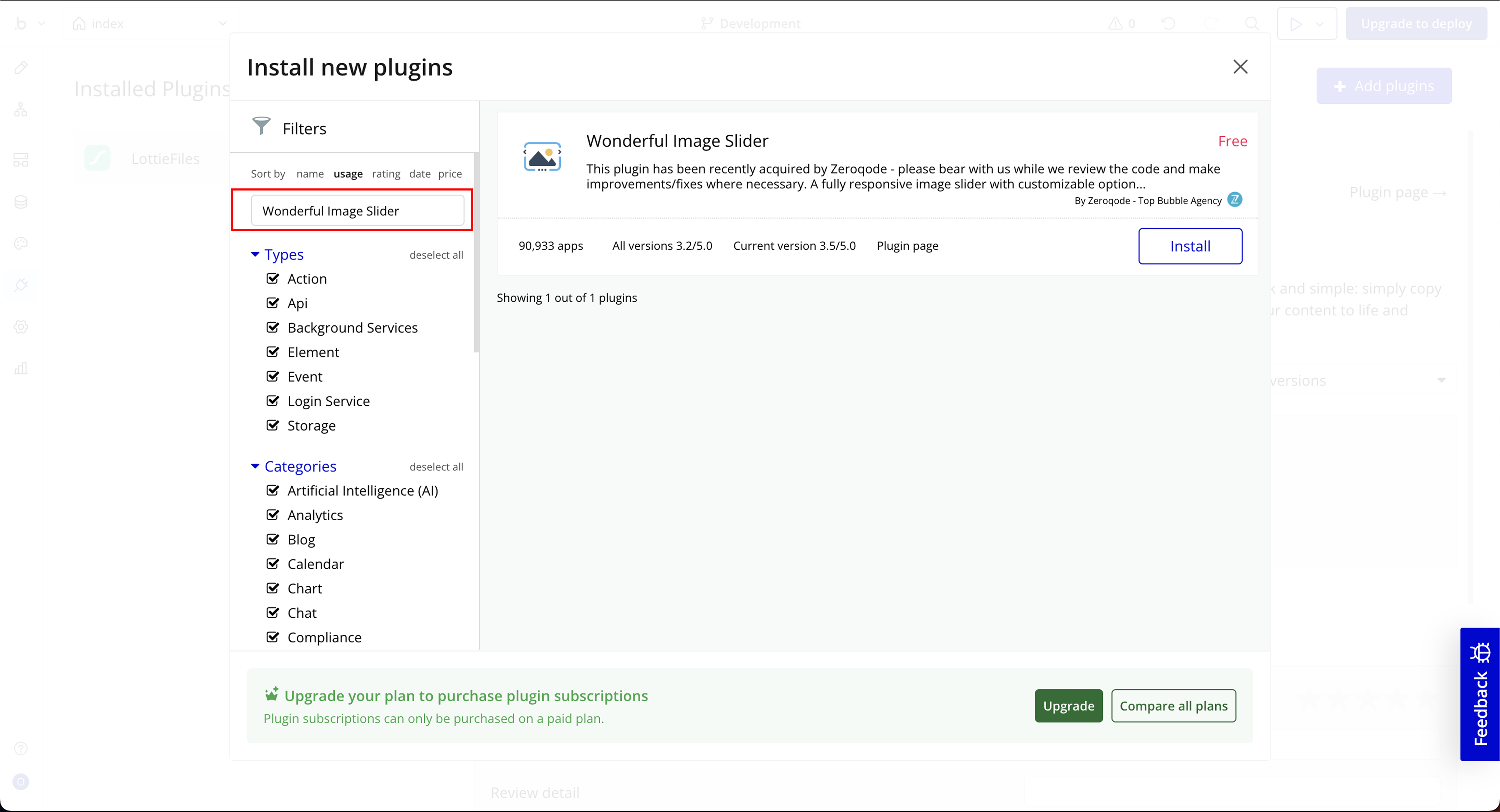
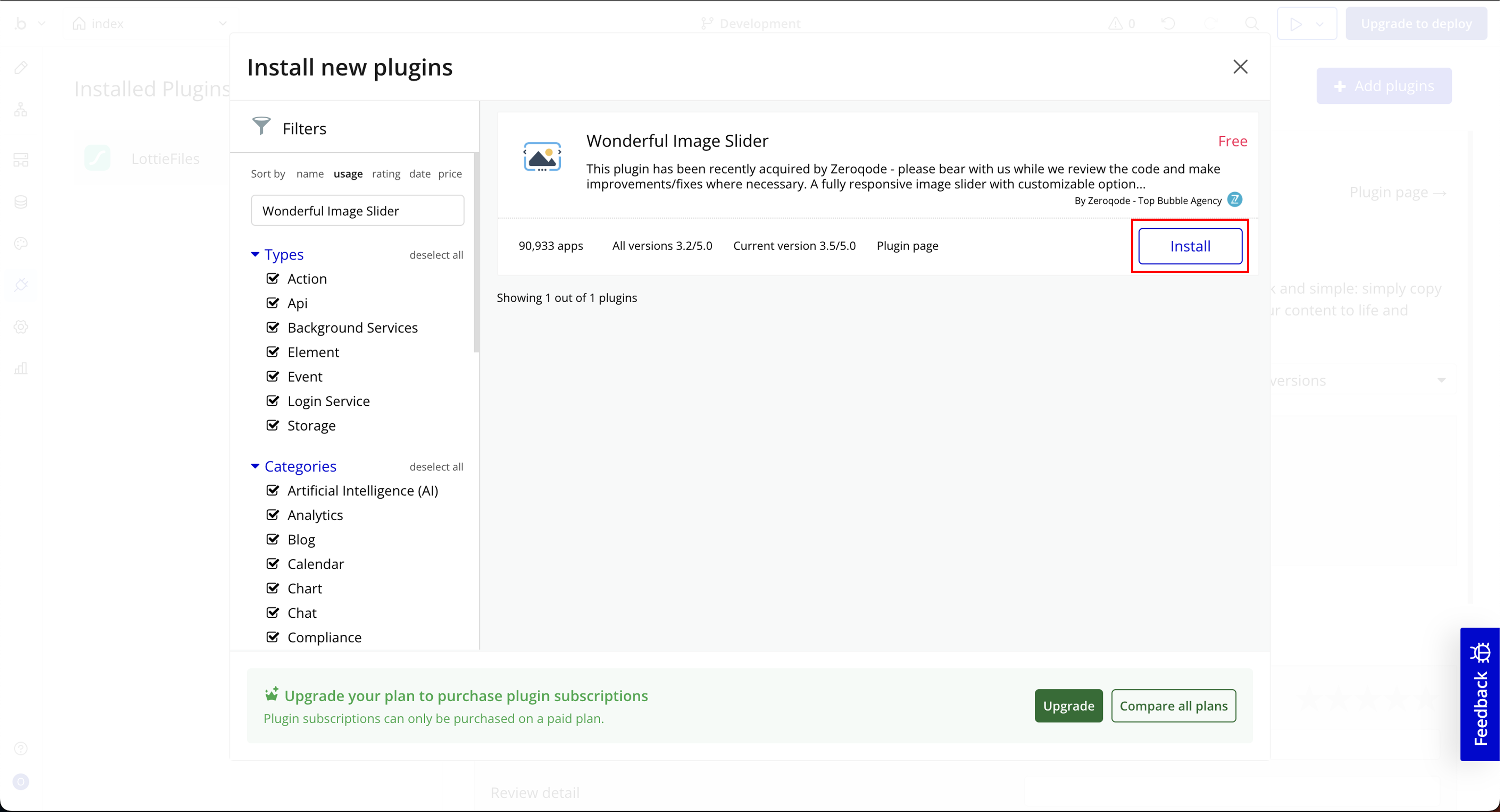
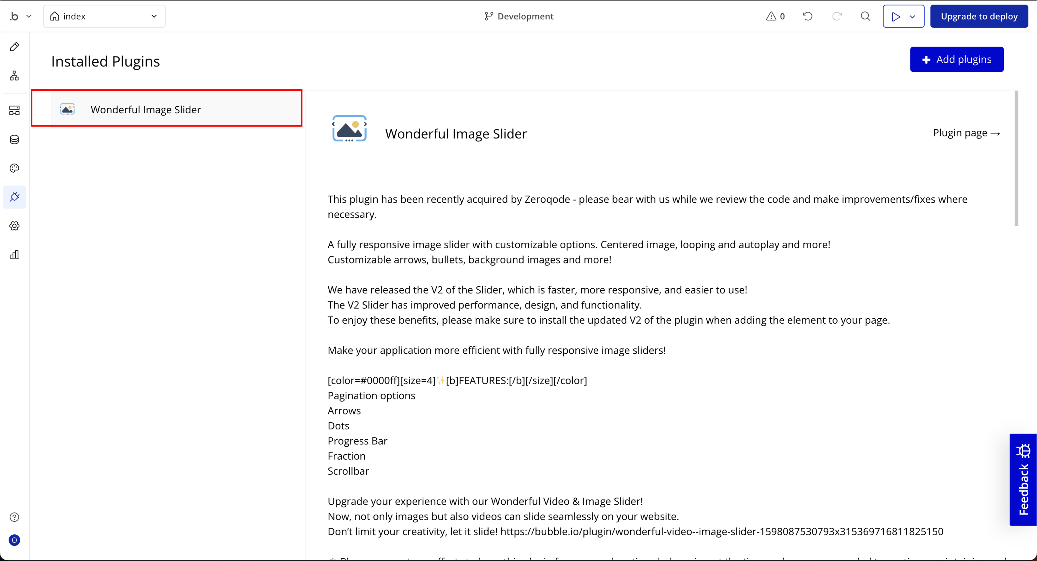
The Wonderful Image Slider plugin enables you to create sleek, responsive sliders in your Bubble app. Ideal for product showcases, image galleries, or banners, the plugin offers various UI customizations such as pagination, effects, arrows, autoplay, and more.
Version 2 Highlights:
- Faster performance
- Easier setup
- Enhanced customization
Key Features
Prerequisites
- A Bubble app where you want to implement an image slider.
- Images or content to be displayed in the slider.
- Installed V2 of the plugin for better performance.

How to setup
Step 1: Installation
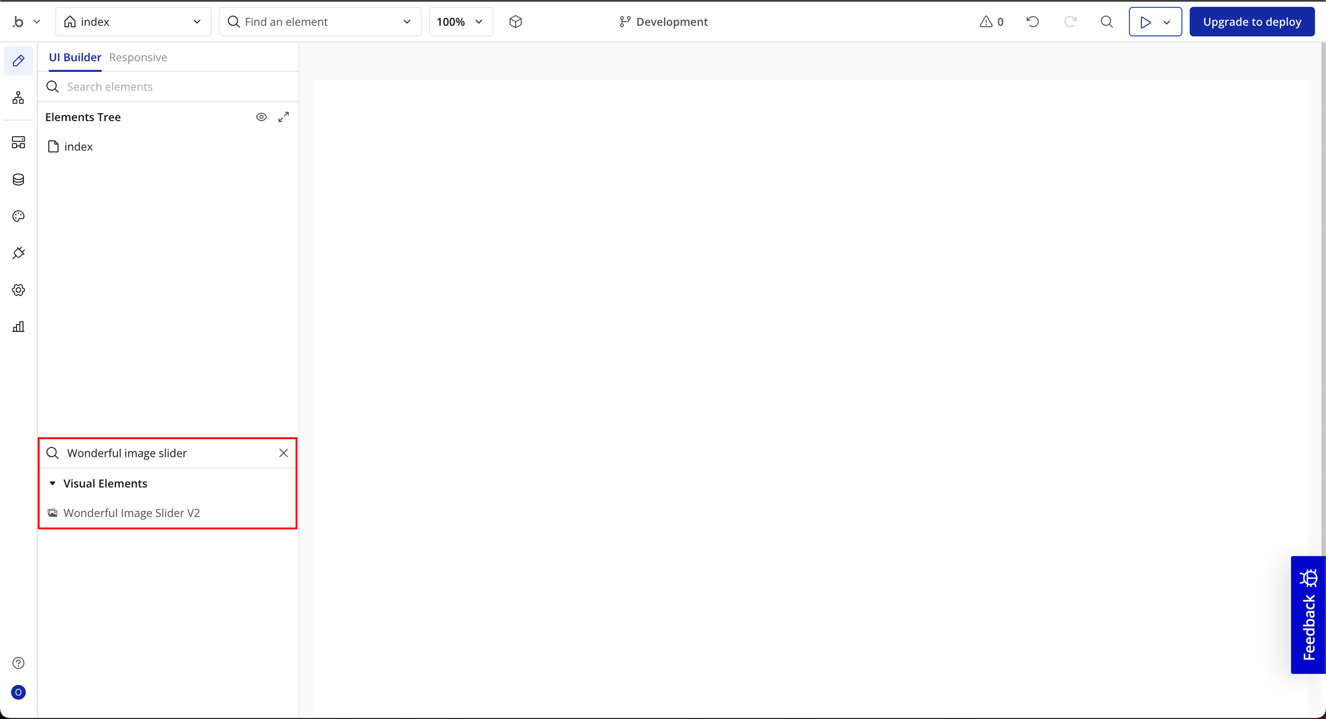
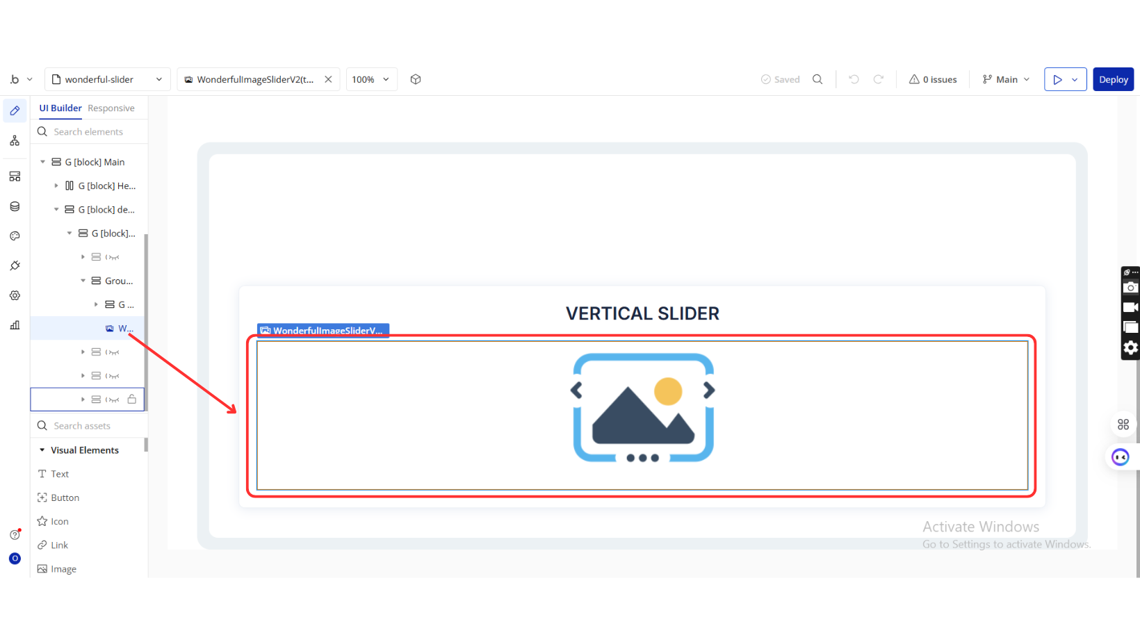
Step 2: Place the Element
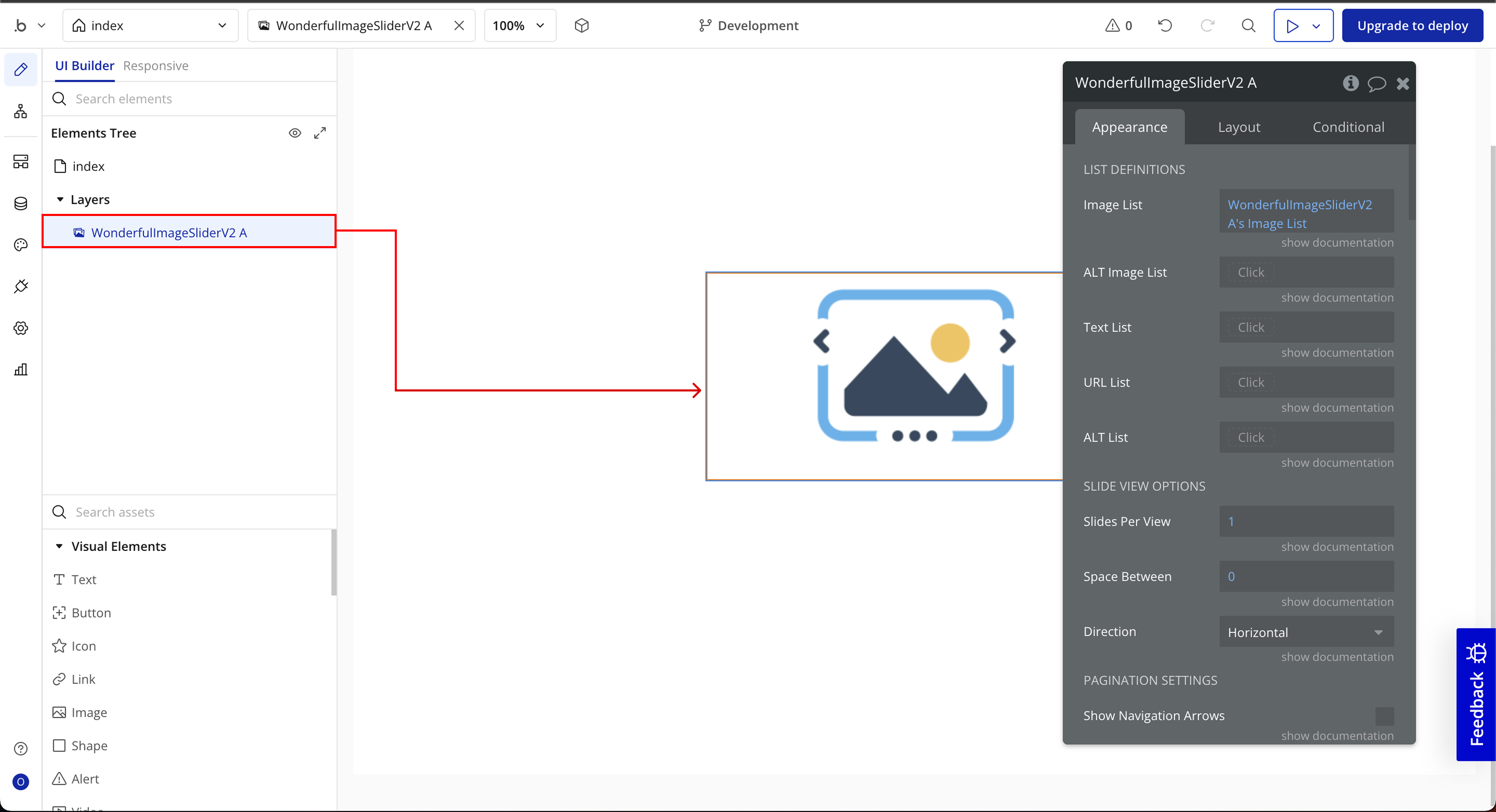
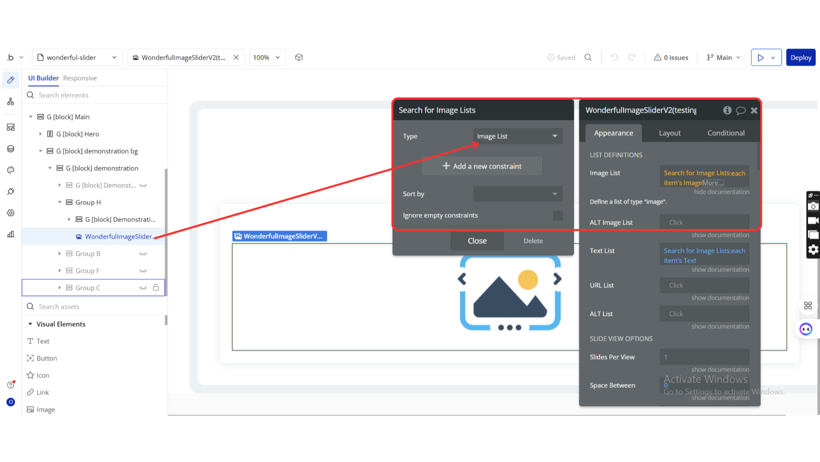
Step 3: Configure Plugin Element
Step 4: Configure Events
Plugin Element Properties
Wonderful Image Slider V2
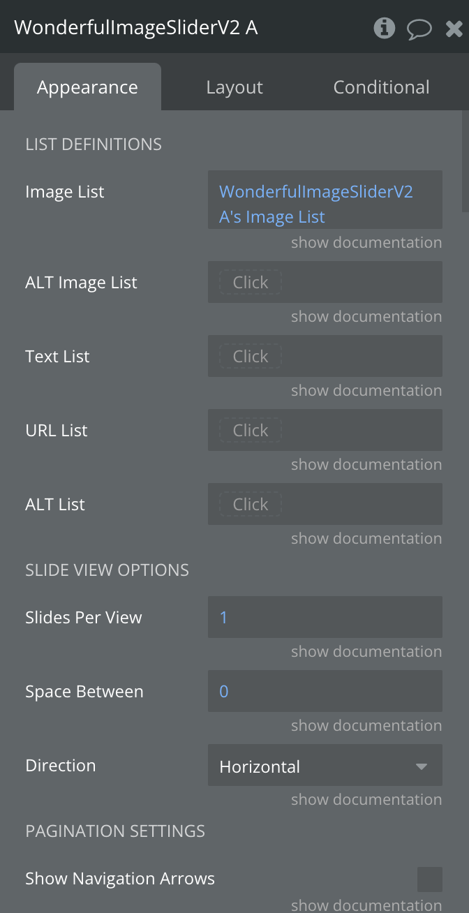
LIST DEFINITIONS
Title | Description | Type |
Image List | Define a list of type “image”. | Image |
ALT Image List | Define a list of type “image” as an alternative. | Image (optional) |
Text List | Define a text list for slide captions. | Text (optional) |
URL List | Define a list of links for click actions on slide text. | Text (optional) |
ALT List | Alt text to display if an image fails to load. | Text (optional) |
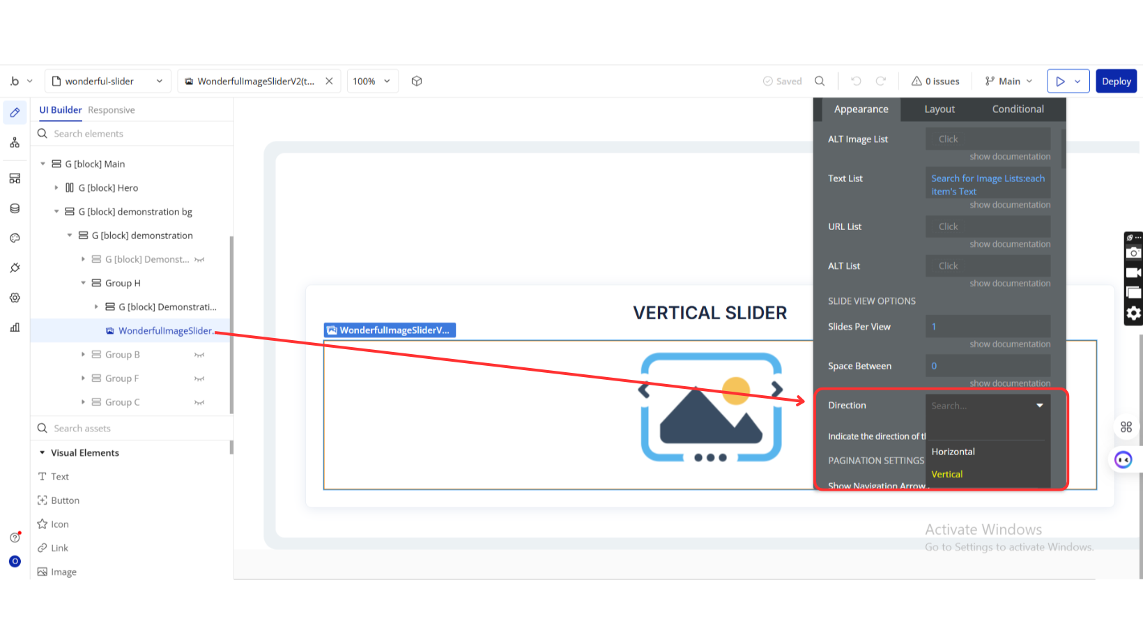
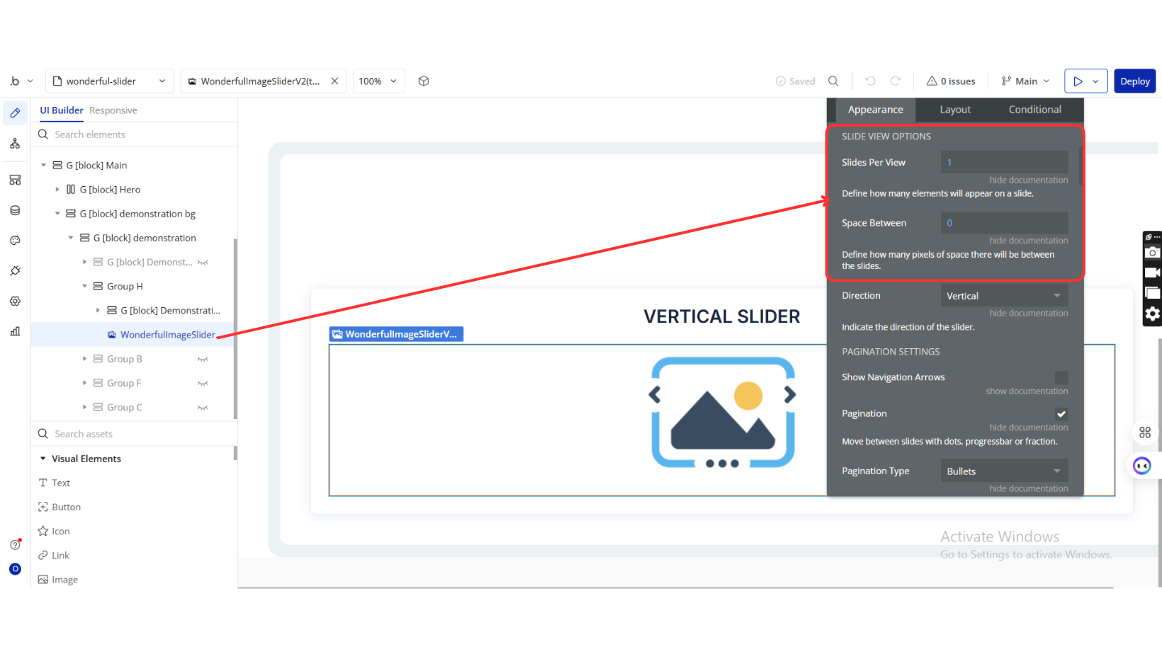
SLIDE VIEW OPTIONS
Title | Description | Type |
Slides Per View | Number of elements visible per slide. | Number |
Space Between | Space (in pixels) between slides. | Number (optional) |
Direction | Slide direction: Horizontal or Vertical. | Dropdown (optional) |
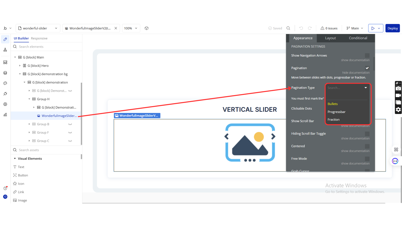
PAGINATION SETTINGS
Title | Description | Type |
Show Navigation Arrows | Enable navigation arrows. | Checkbox |
Pagination | Enable dots/progress bar/fraction-based pagination. | Checkbox |
Pagination Type | Choose pagination type: Bullets, Progress bar, Fraction. Requires Pagination = Yes. | Dropdown (optional) |
Clickable Dots | Make pagination bullets clickable. | Checkbox |
Show Scroll Bar | Enable scrollbar below the slider. | Checkbox |
Hiding Scroll Bar Toggle | Hide scrollbar unless interacting with it. | Checkbox |
Centered | Center align visible slides. | Checkbox |
Free Mode | Allows non-aligned slide positioning. | Checkbox |
Grab Cursor | Cursor changes to “grab” on hover. | Checkbox |
Loop | Loop back to the first slide after the last one. | Checkbox |
Autoplay (ms) | Set autoplay duration in milliseconds (0 disables autoplay). | Number (optional) |
Swipe Speed (ms) | Duration of transition between slides (in ms). | Number (optional) |
Lazy Loading | Load slide images only when needed. | Checkbox |
Effect | Transition effect: slide, fade, cube, coverflow, flip. | Dropdown |
Disable Autoplay on Hover | Pause autoplay when mouse hovers over slide. | Checkbox |
Disable Autoplay On Interaction | Pause autoplay after any interaction. | Checkbox |
Switching With Keyboard | Enable arrow key slide navigation. | Checkbox |
Switching With Mouse Wheel | Enable mouse wheel slide switching. | Checkbox |
Zoom | Enable pinch/double-tap image zooming. | Checkbox |
CSS CUSTOMIZATIONS
Title | Description | Type |
Object Fit | Image fit behavior: fill, none, contain, cover, scale-down. | Dropdown (optional) |
Image Width (%) | Image width as a percentage of slide. | Number |
Image Height (%) | Image height as a percentage of slide. | Number |
Image Top Margin (%) | Top margin of image (percentage). | Number |
Image Border Width | Thickness of image border. | Number (optional) |
Image Border Color | Color of image border. | Color (optional) |
Image Border Style | Border style: none, solid, dotted, dashed, etc. | Dropdown (optional) |
Image Border Radius | Radius for each image corner (TL, TR, BR, BL). | Text (optional) |
Image Background | Background color of the slide. | Text (optional) |
Text Top (%) | Top Y position of slide text (percentage). | Number (optional) |
Text Left (%) | Left X position of slide text (percentage). | Number (optional) |
Text Background | Background color for slide text. | Color (optional) |
Text Shadow Specifications | Format: Horizontal Offset - Vertical Offset - Blur Radius. | Text (optional) |
Text Shadow Color | Color of text shadow. | Color (optional) |
Arrows Color | Color of navigation arrows. | Color (optional) |
Arrows Shadow Specification | Format: Horizontal Offset - Vertical Offset - Blur Radius. | Text (optional) |
Arrows Shadow Color | Shadow color of arrows. | Color (optional) |
Arrows Size (px) | Size of navigation arrows (default: 44px). | Number (optional) |
Arrow Wrapper Size | Size of arrow wrapper container. | Number (optional) |
Arrows Background | Background color for navigation arrows. | Color (optional) |
Arrows Border Radius | Border radius for arrow buttons. | Number (optional) |
Bullets Color | Color of active pagination bullets. | Color (optional) |
Dots Inactive Color | Color of inactive pagination dots. | Color (optional) |
Bullets Shadow Specification | Format: Horizontal Offset - Vertical Offset - Blur Radius. | Text (optional) |
Bullets Shadow Color | Shadow color of bullets. | Color (optional) |
IMGIX PARAMETERS
Title | Description | Type |
Use Imgix Parameters | Enable usage of Imgix image transformation parameters. | Checkbox (optional) |
Width | Set image width. Defaults to editor size if blank. | Number (optional) |
Height | Set image height. Defaults to editor size if blank. | Number (optional) |
DPR | Set device pixel ratio. Docs | Number (optional) |
Fit | Resize method: max, clamp, clip, crop, fill, none. Docs | Dropdown (optional) |
Manual Quality | Disable auto compression and set quality manually. | Checkbox (optional) |
Quality | Set manual image quality. | Number (optional) |
Compress | Enable Imgix compression. | Checkbox (optional) |
Enhance | Apply image enhancements for vibrancy. | Checkbox (optional) |
Format | Enable auto format detection. | Checkbox (optional) |
Red-eye | Remove red-eye from detected faces. | Checkbox (optional) |
Element Actions
Slide To
Lets you jump straight to a specific slide by its index.
Title | Description | Type |
Index | Enter the slide number you want to go to (starting from 0). | Number |
Next Slide
Moves to the slide that comes right after the one currently being viewed.
No additional input is required.
Previous Slide
Takes you back to the slide just before the current one.
No additional input is required.
Zoom
Adjusts how zoomed-in the current slide appears.
Title | Description | Type |
Scale | Set the zoom level — for example, 1 is normal size, 2 is double zoom. | Number |
Update Render
Refreshes the slider. Use this if you’ve made changes and want them to show up right away.
No additional input is required.
Exposed States
Title | Description | Type |
Active Index | Index of the currently visible/active slide. | Number |
Clicked Index | Index of the last clicked slide. | Number |
Double Clicked Index | Index of the last double-clicked slide. | Number |
Image List | The full list of images displayed in the slider. | Text |
Clicked Index Image | URL of the image on the last clicked slide. | Text |
Double Clicked Index Image | URL of the image on the last double-clicked slide. | Text |
Loading | Indicates whether the slider is still loading. | Checkbox (yes/no) |
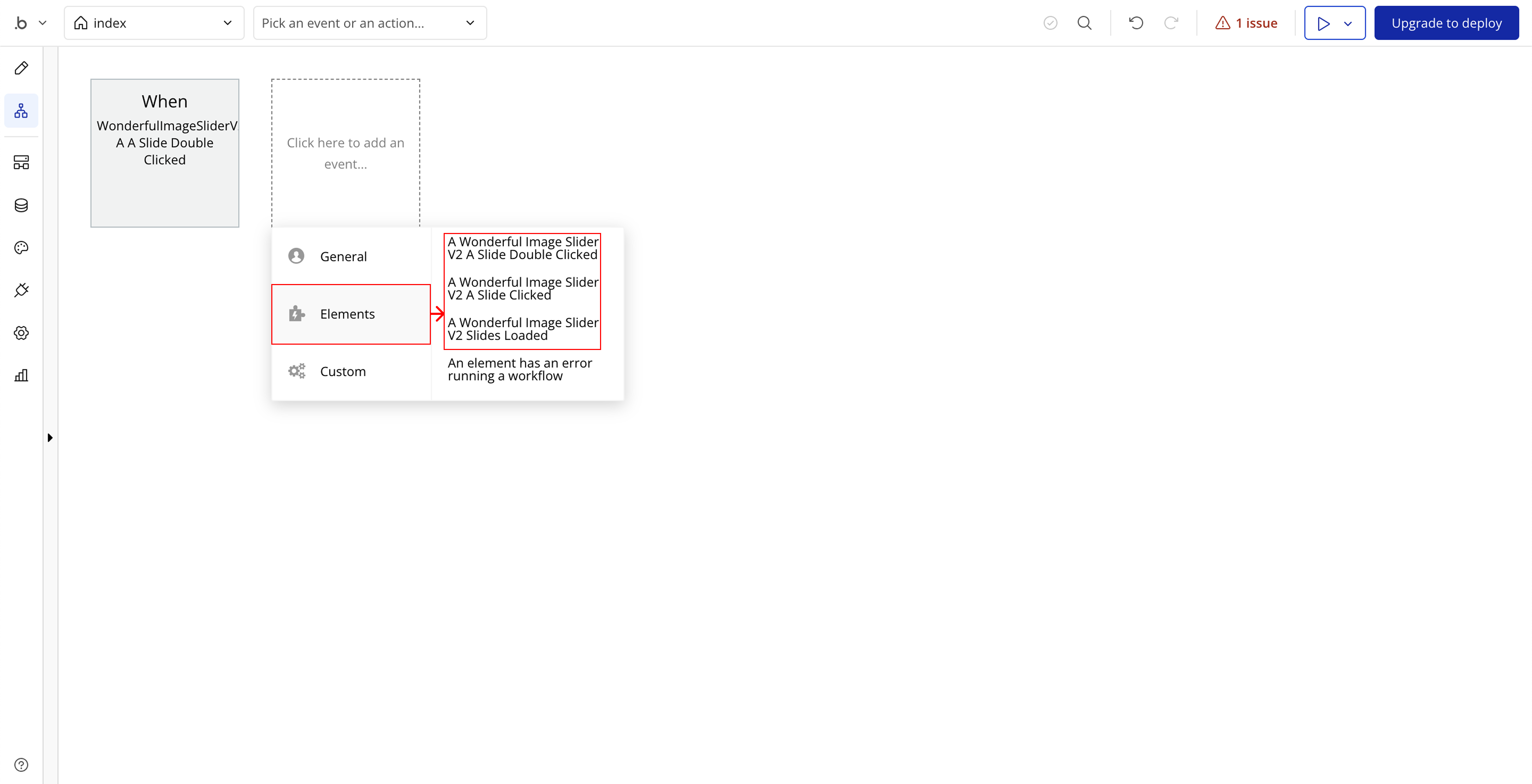
Element Events
Event | Description |
A Slide Double Clicked | Triggered when a user double-clicks on a slide. Useful for custom actions like zooming or opening a modal. |
A Slide Clicked | Triggered when a user single-clicks on a slide. Can be used for image previews or selection. |
Slides Loaded | Triggered when all images in the slider have fully loaded and the slider is ready for interaction. |
