Demo to preview the plugin:
Introduction
This Plugin allows you to add up to 5 different "on Hover" effects for your Button elements, allowing you to craft a more interactive and user-friendly app.
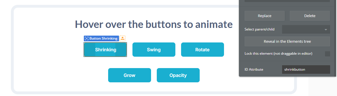
The following 5 animation effects are included:
- Shrink on hover
- Grow on hover
- Swing on hover
- Opacity change on hover
- Rotate on hover

How to setup
- Enable ID Attributes
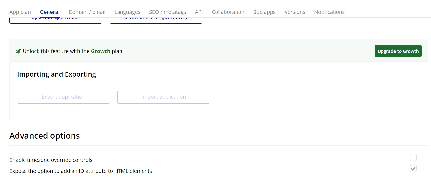
Go to the settings page in your editor. Under the General tab click on the checkbox “Expose the option to add an ID attribute to HTML elements”
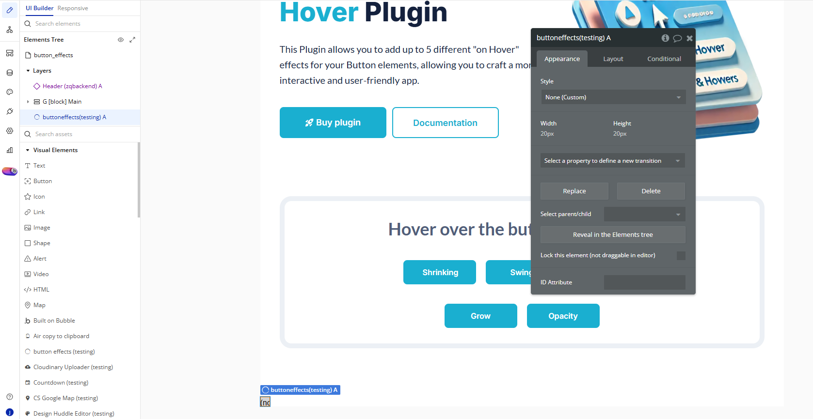
- Add the Plugin Element “Button Effects”
- From the elements panel, drag the element named Button Effects to the page.
- Add a Button to Your Page
- Drag a standard Bubble Button element onto your page.
- In the button’s properties, you simply have to add one of the following ID Attributes to the button you want to apply the effect on:
shrinkbutton– applies a shrinking effect on hoverswingbutton– applies a swinging effectgrowbutton– makes the button grow slightlyopacitybutton– fades the opacity on hoverrotatebutton– rotates the button on hover
Plugin Element Properties
Button effects