Better Native Tooltip

Demo to preview the settings

Introduction

Plugin designed to elevate the tooltip experience within your Bubble application. It extends the standard tooltip functionality offered by Bubble by providing additional customization options and advanced features, allowing you to create highly interactive and visually appealing tooltips with ease.
Image without caption

How to setup

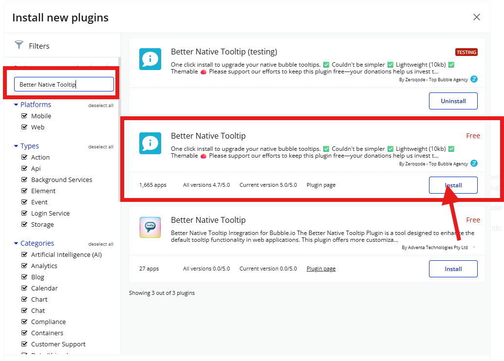
Just install the plugin, it works by default.
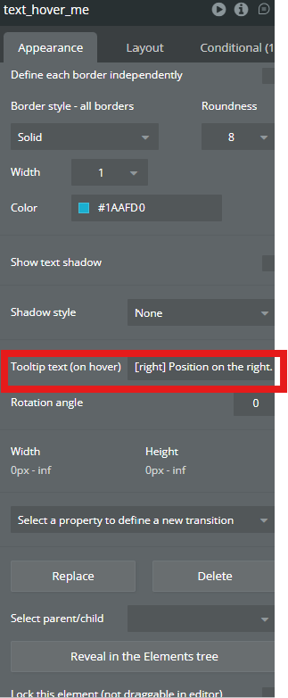
Many native bubble elements have a built-in β€œTooltip” property like below, just fill it with your text.
Image without caption
This plugin renders a nicer looking tooltip instead of the native one only by installing it.

Optionally you can change some properties of the tooltip:

Position

The placement of the tooltip of the element.
βœ…
Note! Make sure to put the position first, and other properties after in what order you want.
Values: right, left, bottom, top.
Image without caption

Animation

By default plugin adds animation to tooltips, so the only value you can take is the one that turns it off. Value: no-animation.
Image without caption

Arrow

By default plugin adds arrow to tooltips, so the only value you can take is the one that turns it off. Value: no-arrow.
Image without caption

Offset

This parameter sets the distance vertically and horizontally between the tooltip's anchor element and the tooltip itself. Requires 2 numbers, you set them with a space between them like this: 10 20. Usually which value sets vertically or horizontally depend on the set position property. For a better understanding you study how does offset work. Value ex: 10 15.
Image without caption

Theme

The plugin ships with 4 themes for the tooltips
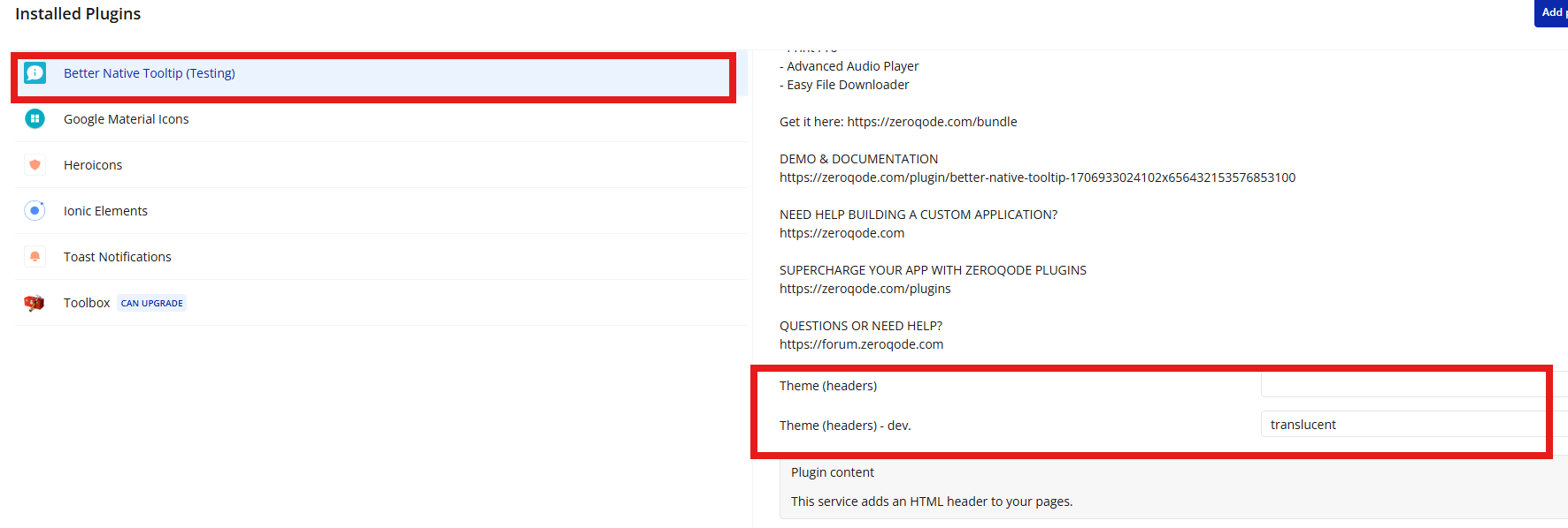
Easily switch the theme by putting one of those in the plugin settings. Values: light, light-border, material, translucent.
Image without caption

Changelogs