Demo to preview the settings
Introduction
Effortlessly integrate a sleek, modern color picker into your Bubble app with the Simple Modern Color Picker plugin. This plugin provides a clean, user-friendly color selection tool that enhances any design interface, making color customization intuitive and engaging for users.
With Simple Modern Color Picker, you can allow users to choose and apply colors seamlessly across your app's elements, perfect for tasks like setting background colors, customizing charts, or personalizing themes. The plugin is fully customizable to match your app's style, ensuring it fits naturally within your user experience.
This versatile tool is ideal for any app requiring color selection, streamlining user interaction and adding a polished look to your design.

How to setup
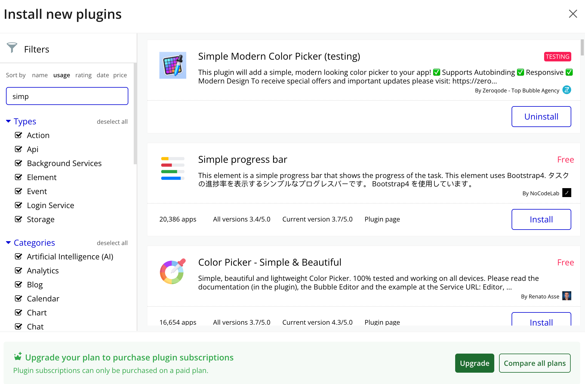
- Install Simple Modern Color Picker plugin

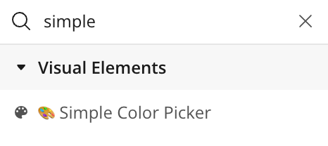
- Place the Simple Color Picker on the page

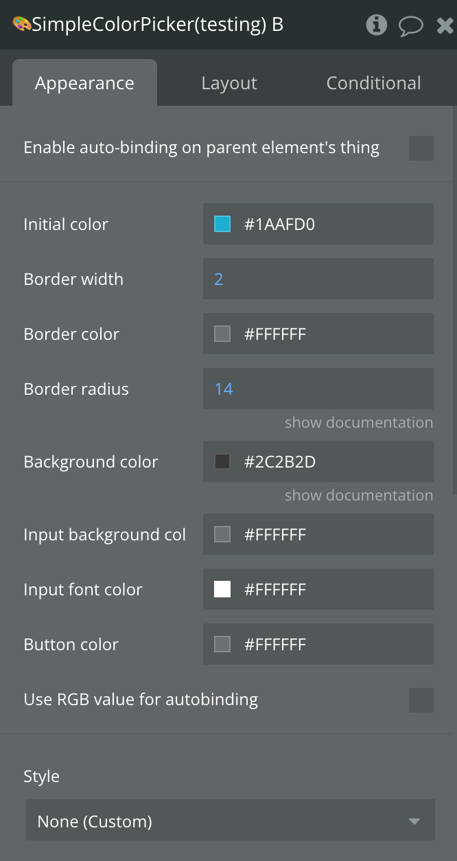
Plugin Element Properties

Title | Description | Type |
Initial color | Initial color in the picker | Color |
Border width | Border width | Number, Required |
Border color | Border color | Color |
Border radius | Border radius in pixels | Number, Required |
Background color | Background color of the floating color picker group | Color |
Input background color | Input background color | Color |
Input font color | Color of text | Color |
Button color | Color of the button picker | Color |
Use RGB value for autobinding | Will enable the option to use autobinding and RGb | Checkbox |
Plugin Element States
Title | Description | Type |
Value (hex) | Indicates the Hex color | Text |
Value (RGB) | Indicates the RGB color | Text |
Element events
Title | Description |
Value Changed | Triggers when the value of the picker changes |
Plugin Element Actions
1) Set color

