Plugin Information
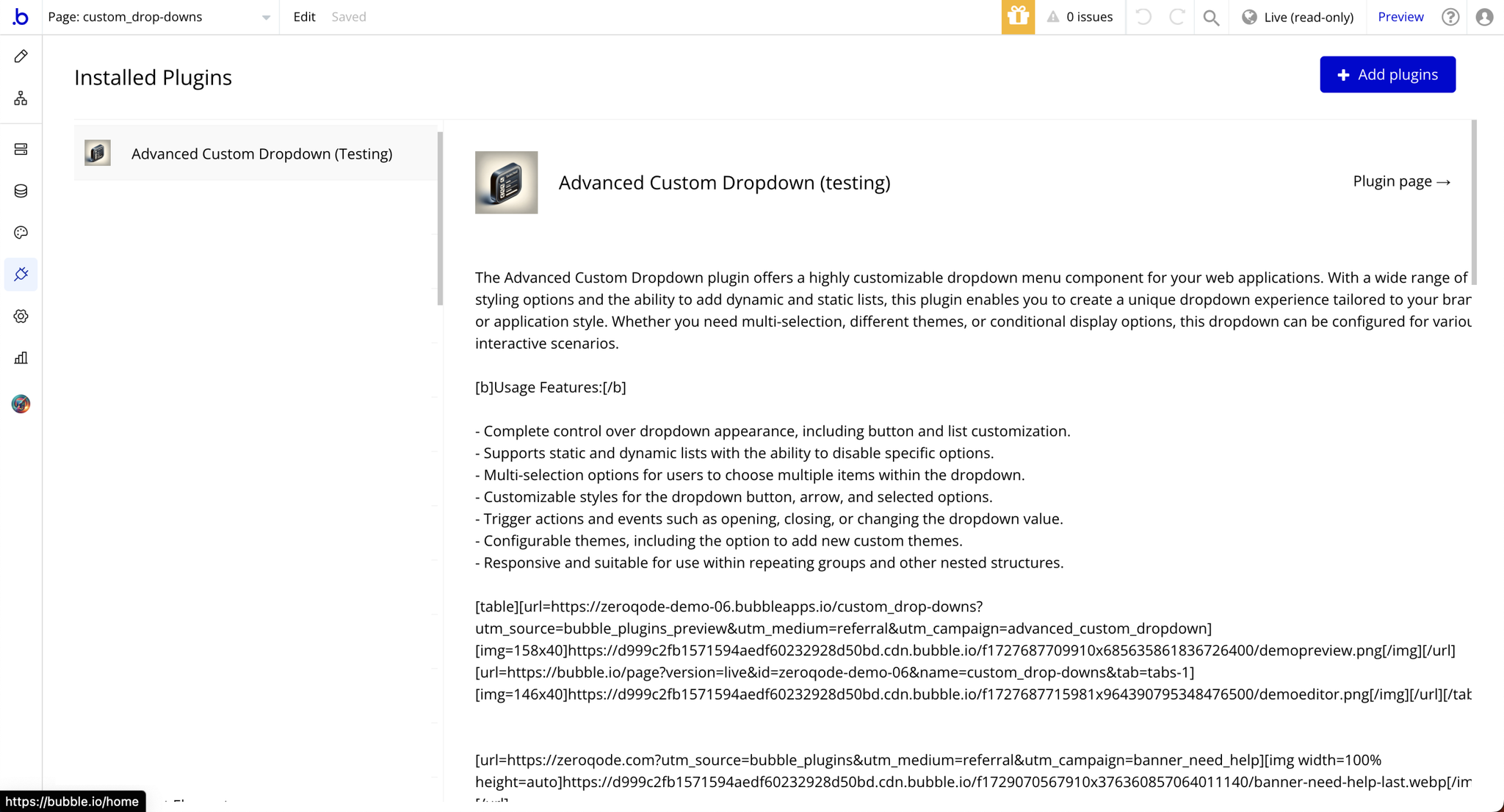
Link to the plugin page: https://zeroqode.com/plugin/1519019655194x735710721990983700
Demo to preview the plugin:
Introduction
The Advanced Custom Dropdown plugin provides a fully customizable dropdown menu component for your web applications. It is designed to offer flexibility and versatility, allowing you to create dropdown menus that align perfectly with your brand and application style. Whether you're building a simple form or a complex interface with dynamic interactions, this plugin is packed with features to enhance usability and aesthetics.
Key Features
Prerequisites
To use the Advanced Custom Dropdown Plugin for Bubble by Zeroqode, ensure the following:
- You must have an active Bubble account.
- The plugin should be installed from the Zeroqode Plugin Marketplace or added directly from the plugin page.
- Familiarity with Bubble Workflows: Basic knowledge of Bubble workflows and element properties will help you set up and customize the dropdown effectively.
- Prepared Data Source (Optional): If you plan to use dynamic lists, ensure your data source is configured and ready to populate the dropdown.
- Custom Design Assets (Optional): If you want to apply custom themes or styles, have your design specifications (e.g., colors, icons) ready for customization.

How to setup
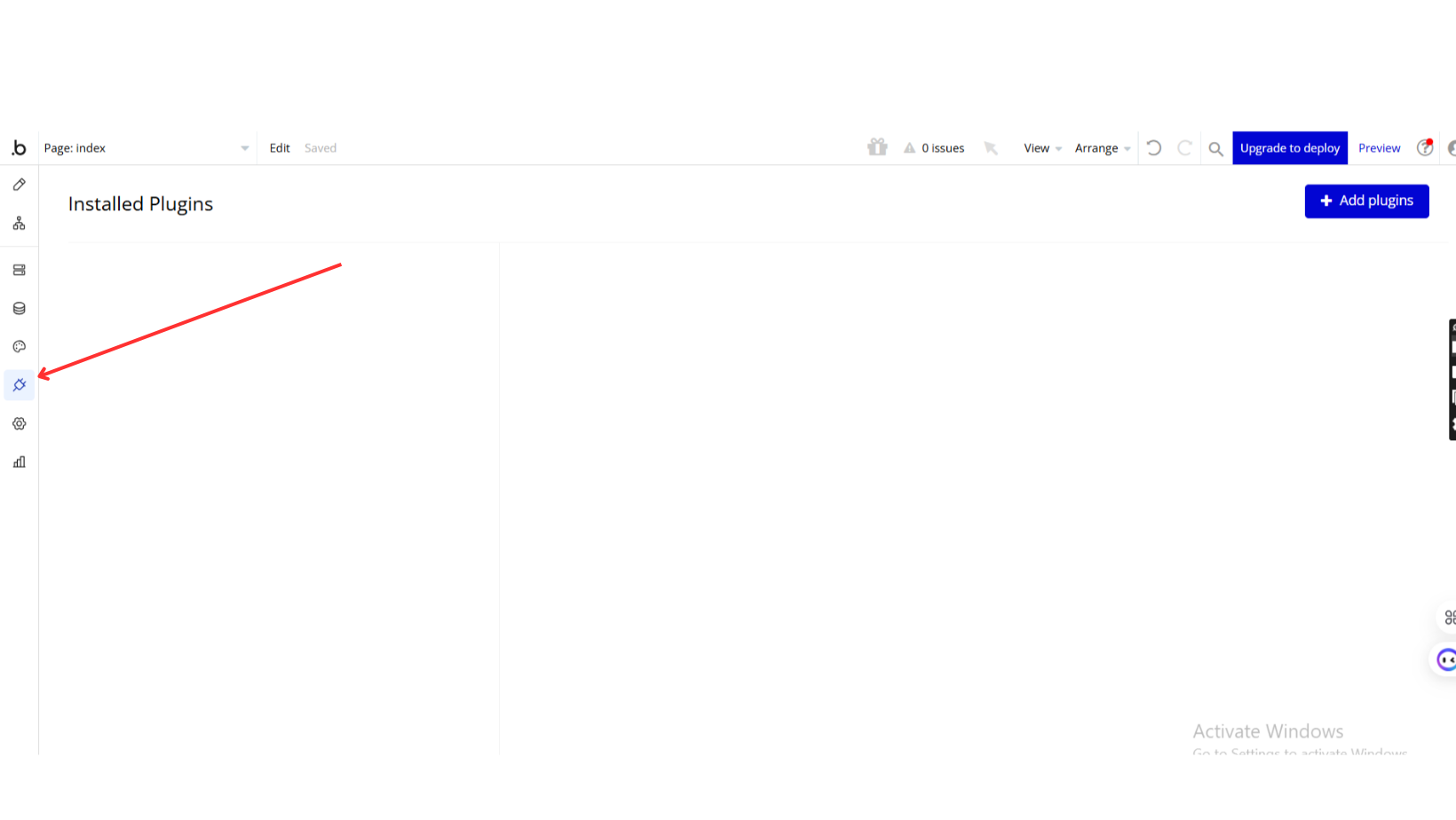
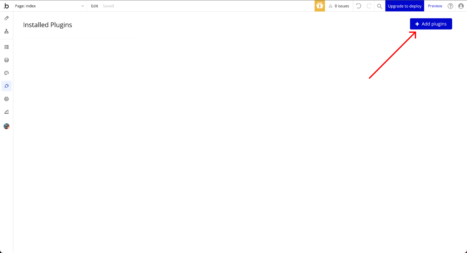
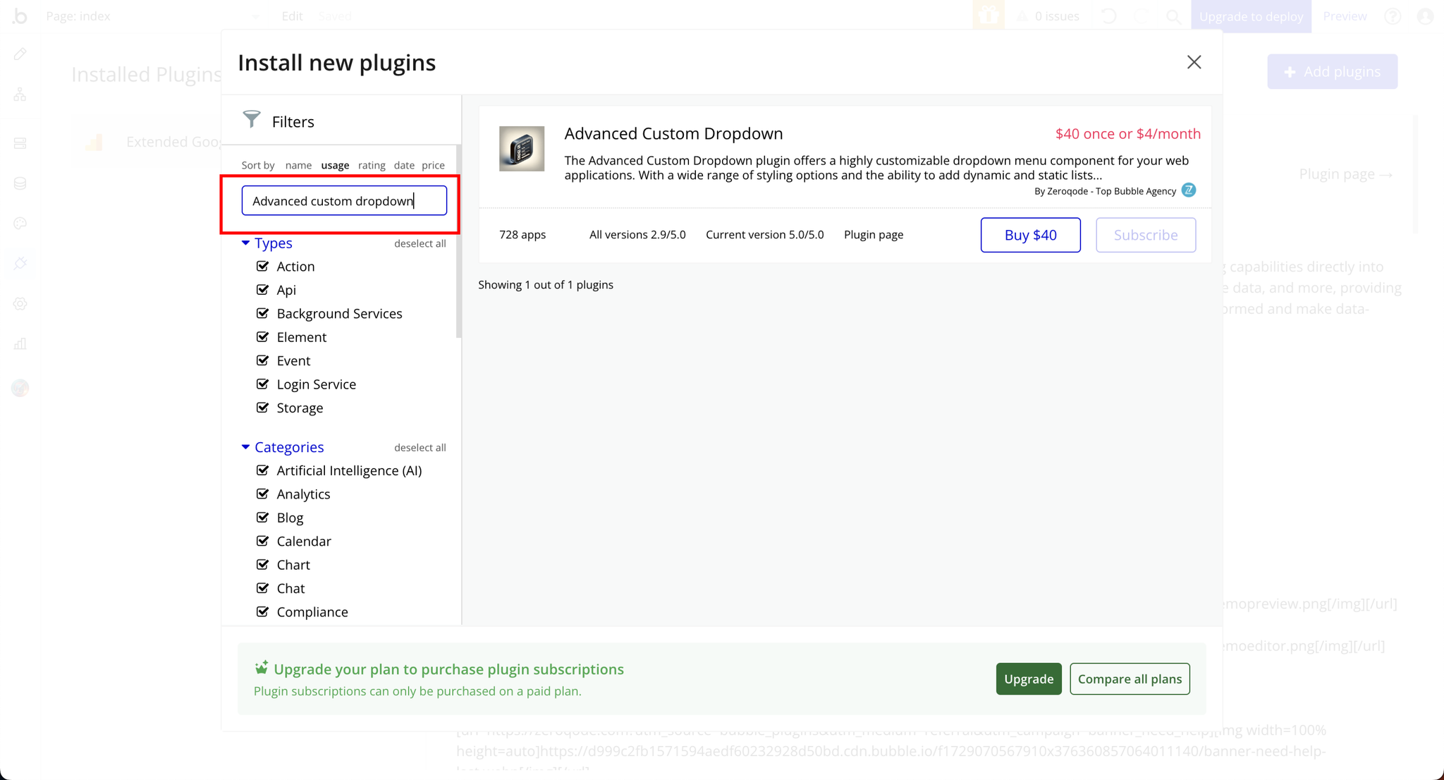
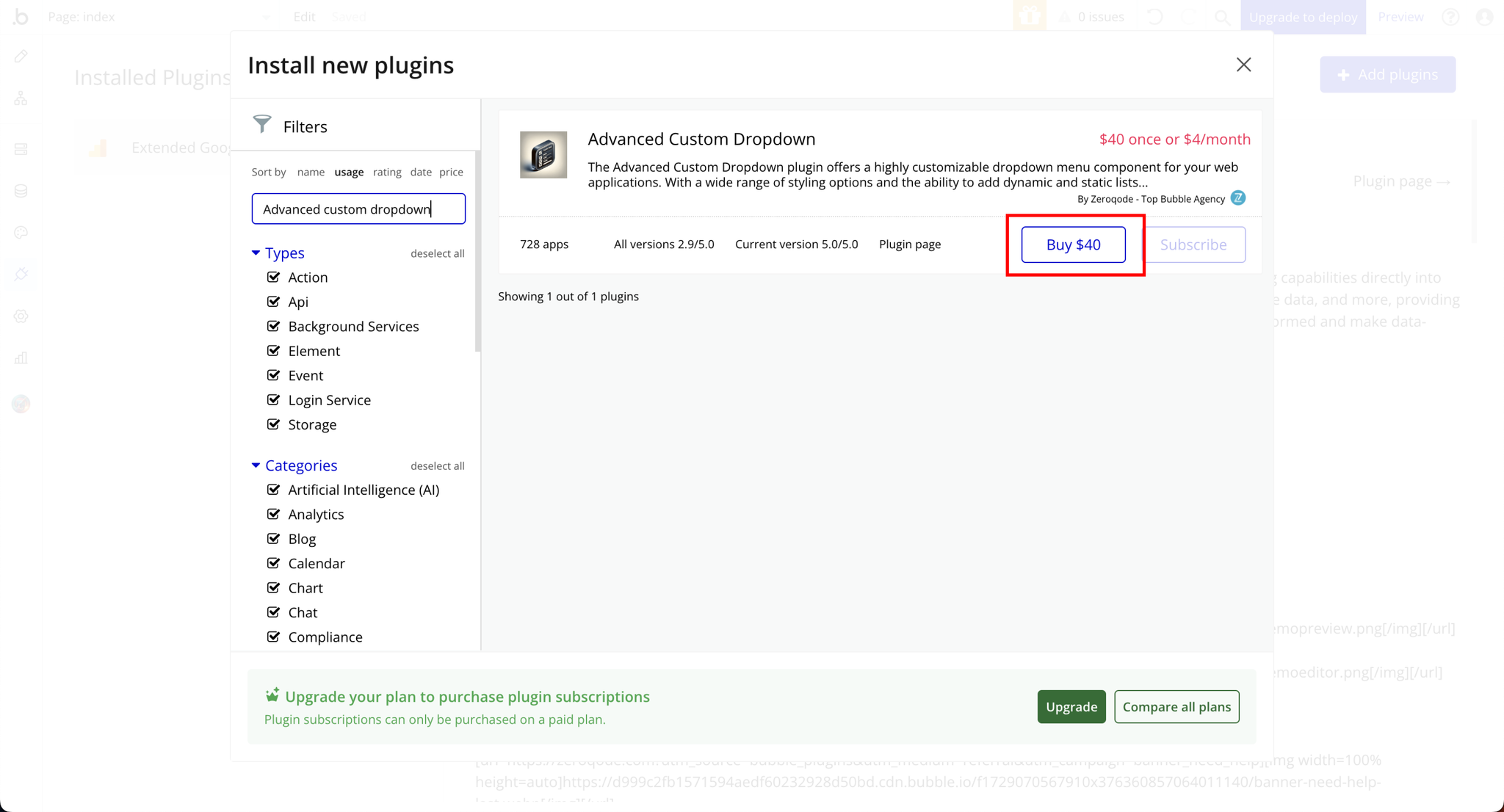
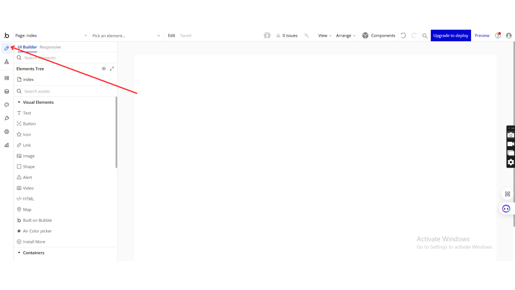
Step 1: Install the Plugin
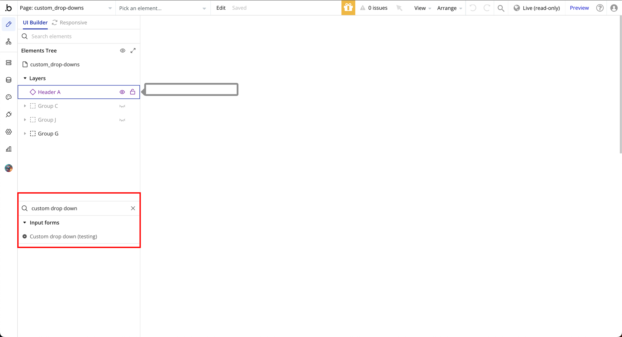
Step 2: Add Advanced Custom Dropdown to Your App
Plugin Element Properties
Custom dropdown

Fields:
Title | Description | Type |
Themes | Themes Available options: default, flat-dark-blue, flat-light-blue, flat-marsala, flat-radiant-orchid, flat-red, modern, modern-v2, plus, square | Dropdown |
Allow theme customization | Allow theme customization | Checkbox (yes/no) |
Show drop down list on hover | Open menu on hover | Checkbox (yes/no) |
Placeholder | Placeholder | Text (optional) |
Default value | State value on load | Text (optional) |
Separate entries with Enter or comma. Both static and dynamic lists are supported. You can even have a few dynamic lists separated with Enter or comma to form one combined list of choices. Add –disable after the option to disable it. | ||
Options | Choices | Text |
DROPDOWN BUTTON SETTINGS ————————— | ||
Button’s Background color : | ||
Choose your color | Primary color | Color (optional) |
Button’s Border color : | ||
Choose your color | Secondary color | Color (optional) |
Button’s Roundness : | ||
Set your roundness | Roundness (0px - 100px) | Number (optional) |
Selected option color : | ||
Choose your color | Label color | Color (optional) |
Selected option left indent (px) : | ||
Set your indent | Label indent | Number (optional) |
Button’s arrow width (px) : | ||
Set your width | Arrow button width (px) | Number (optional) |
Button’s arrow position from right (px) : | ||
Set your position | Arrow button position | Number (optional) |
Button’s arrow background color : | ||
Choose your color | Button background | Color (optional) |
Button’s arrow color : | ||
Choose your color | Arrow color, doesn’t work for plus them. | Color (optional) |
Button’s border width (px) : | ||
Set your width | Border width (0px - 10px) | Number (optional) |
Button’s arrow roundness (px) : | ||
Set your roundness | Arrow button roundness | Number (optional) |
DROPDOWN LIST SETTINGS | (optional) | |
Option’s font color | ||
Choose your color | Option s color | Color (optional) | | | Main background color : | | | Choose your color | Options background color | Color (optional) | | | Option’s on hover background color : | | | Choose your color | Option color on hover | Color (optional) | | | Selected option background color : | | | Choose your color | Selected element color | Color (optional) | | | Lists border color : | |
Choose your color | Box list s border color | Color (optional) | | | Lists border width : | |
Set your width | Box list s border | Number (optional) | | | Option’s height (px) | | | Set your height | Padding | Number | | Option Font Size | TODO: Fill in description | Number (optional) | | | Custom list’s height (px) | | | Set your height | Dropdown lists height | Number (optional) |
Add empty option | Checking this yes would allow empty options to be included in the dropdowns | Checkbox (yes/no) |
Disabled text color | Colors used to indicate element is inactive, unavailable, or not currently interactable. | Color (optional) |
The element is in repeating group | When checked it means that the element is part of a dynamic list structure or list of items | Checkbox (yes/no) |
Element height | Element height. | Number |
Padding top | Padding-top property sets the top space (in pixels) of the element’s border to the placeholder. | Number |
Padding left | The padding-left property sets the left space (in pixels) of the element to the placeholder. | Number |
MULTISELECT OPTIONS——————————————- | ||
Allow Multiple Selection | When checked it enables users to select more than one option at a time from the list | Checkbox (yes/no) |
Color of cross | The cross refers to the "x" button (also called a close or clear icon) in the dropdown. This button allows users to deselect or clear a selected option. You can choose the color you prefer | Color (optional) |
Cross size | The cross refers to the "x" button (also called a close or clear icon) in the dropdown. This button allows users to deselect or clear a selected option. Its size determines how prominent and easy it is for users to interact wit | Number (optional) |
Cross weight | The thickness or boldness of the "x" button | Number (optional) |
Cross margin | The spacing around the "x" button | Number (optional) |
Border width | The thickness of the border around "x" | Number (optional) |
Background color | The color that fills the area behind the "x" button | Color |
Item padding | The space between the content of an item | Text (optional) |
Border style | Available options: dotted, dashed, solid, double, groove, ridge, inset, outset | Dropdown (optional) |
Border color | The color of the line that outlines the cross | Color (optional) |
Border radius | The roundness of the corners of the cross | Number (optional) |
Element Actions
- Add option to dropdown menu - Add option to dropdown menu
Title | Description | Type |
Option | Option | Text |
- Refresh DropDown - Refresh dropdown list
- Open dropdown list - Open dropdown list
- Close dropdown list - Close dropdown list
Exposed states
Title | Description | Type |
Selected option | Selected option | Text |
Options | All Options | Text |
Element Events
Title | Description |
On value change | On value change |
On open | On dropdown menu open |
On close | On dropdown menu close |
Before open | Before dropdown menu open |
Before close | Before dropdown menu close |


