Demo to preview the settings
Introduction
Introduce an innovative way to secure user confirmations in your Bubble app with the Sweet Confirm #holdpressbutton Plugin. This unique plugin revolutionizes the confirmation process by implementing a hold-and-press mechanism, offering a tactile and interactive alternative to traditional confirmation dialogs. It's designed to minimize accidental confirmations, ensuring that users are making deliberate choices within your application.
The plugin features customizable hold durations and visual indicators, enhancing the user experience by providing clear feedback during the confirmation process. As users press and hold the button, a visual cue displays progress, ensuring the action is intentional. Upon reaching the specified duration, the plugin can trigger workflows, integrating seamlessly with your application's logic.
By incorporating the Sweet Confirm #holdpressbutton Plugin, you elevate user engagement and interaction within your Bubble app. It not only adds an extra layer of security to confirmations but also enriches the user interface with an intuitive and interactive element, making digital interactions more deliberate and meaningful.

How to setup
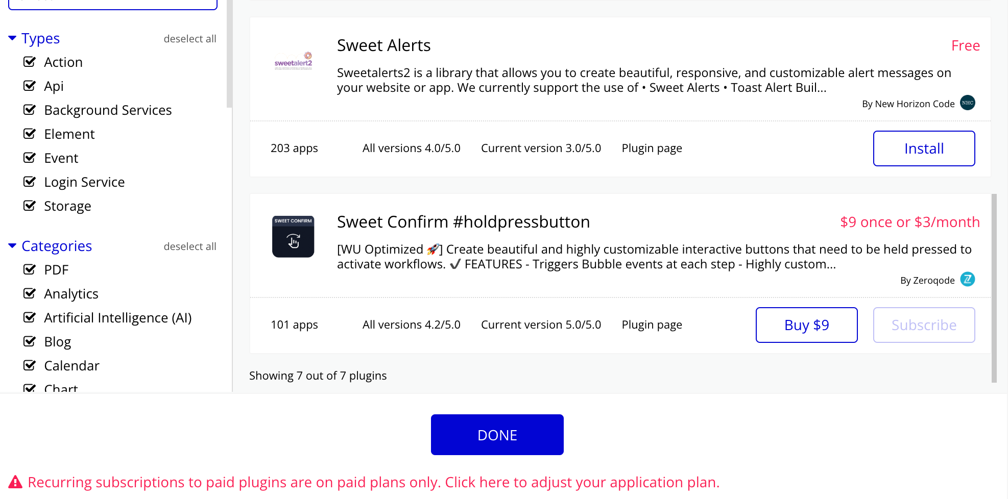
- Install plugin Sweet Confirm #holdpressbutton

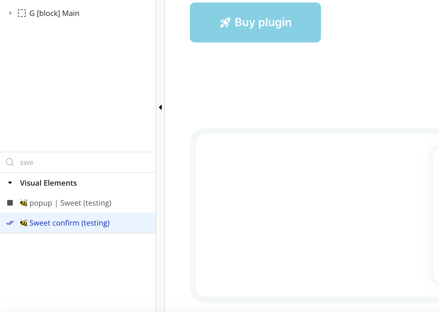
- Place the Sweet confirm element on the page

Plugin Element Properties


Title | Description | Type |
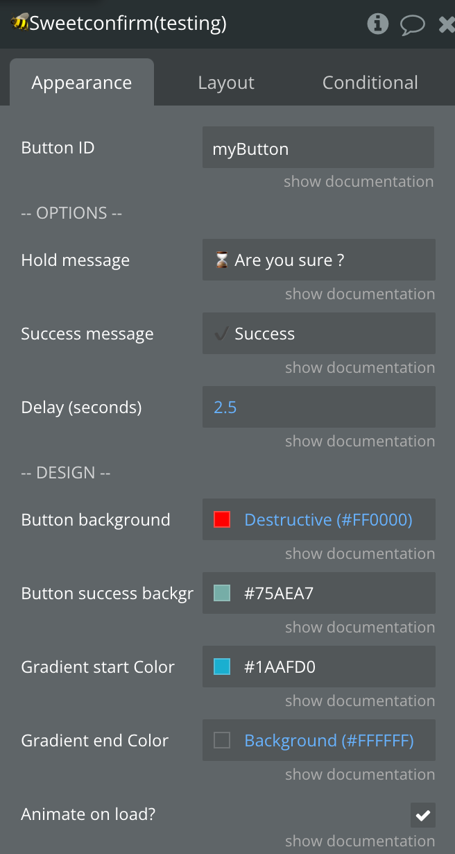
Button ID | The HTML ID of the button you want to enable sweet confirm on. Read documentation for more information. | Text, Required |
Hold message | Message during holding mouse/key button on element | Text, Required |
Success message | Message after holding complete | Text, Required |
Delay (seconds) | The holding time required to trigger the workflow. | Number, Required |
Button background | Background color for initial state, usually equal to the "gradient from" color | Color, Required |
Button success background | Background color for success state | Color, Required |
Gradient start Color | Background end color for holding state | Color, Required |
Gradient end Color | Background start color for holding state, usually equal to the "background" color | Color, Required |
Animate on load? | Enabled initial transition when page is loaded | Checkbox |
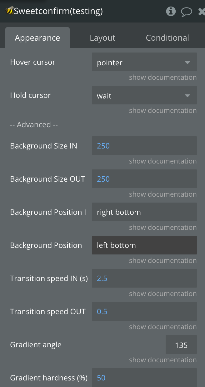
Hover cursor | Button hover cursor | Dropdown |
Hold cursor | Button cursor when being held | |
Background Size IN | Size of start background color in percentage; for better effect must be greater than 100% | Number, Required |
Background Size OUT | Size of end background color in percentage | Number, Required |
Background Position IN | Background position for init animation | Text, Required |
Background Position OUT | Background position for end animation | Text, Required |
Transition speed IN (s) | A transition speed in seconds | Number, Required |
Transition speed OUT (s) | A transition speed in seconds | Number, Required |
Gradient angle | Angle of the gradient line's starting point | Number, Required |
Gradient hardness (%) | Hardness of the gradient | Number, Required |
Element actions
1) Reset
Element events
Title | Description |
A Sweet Confirm Button Is Clicked | Triggers when a button is clicked |
A Sweet Confirm User Stopped Holding | Triggers when a button stopped being held |
A Sweet Confirm User Start Holding | Triggers when a button started being held |

