
Demo to preview the plugin:
Introduction
Bring a touch of elegance and clarity to your app’s loading moments with this Simple loading spinner, Material Design inspired spinner. Designed for flexibility and ease of use, the spinner lets you customize its look and feel to match your app’s style no coding required.
Adjust the size with just a few tweaks to the radius and stroke width, pick any color that fits your brand, and set your preferred animation speed for smooth, polished motion. You can even place multiple spinners on a single page to visually represent loading activity across different sections of your app.
Perfect for keeping users engaged while content loads, this spinner combines simplicity, modern design, and full customization in one lightweight element.
Prerequisites
Before using the Material Design Spinner element, make sure the following are in place:
- Plugin Installed: The spinner element must be added to your Bubble app from the plugin library.
- Page Setup: You have at least one page or reusable element where the spinner will be placed.
- Design Mode Access: You can open the Bubble editor’s Design tab to drag and configure the spinner element.
- Optional Styling Knowledge: Basic understanding of Bubble styling (e.g., using color pickers and layout adjustments) will help you fine-tune the spinner’s appearance.

How to setup
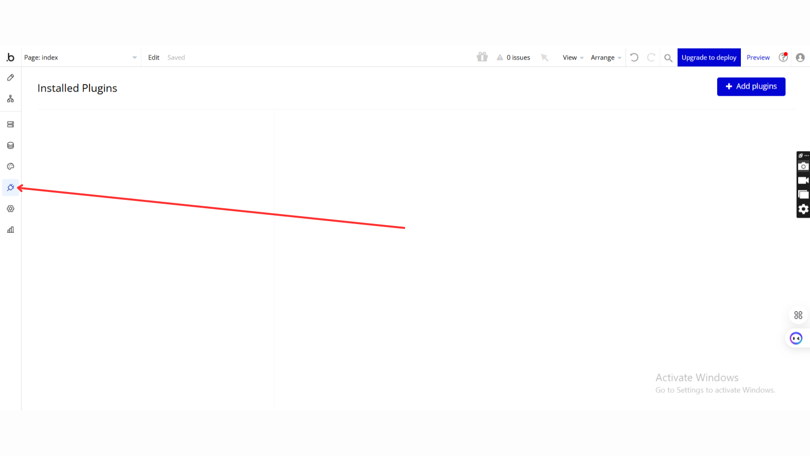
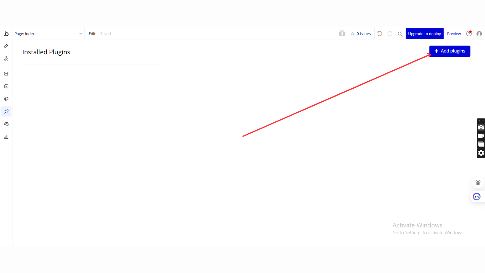
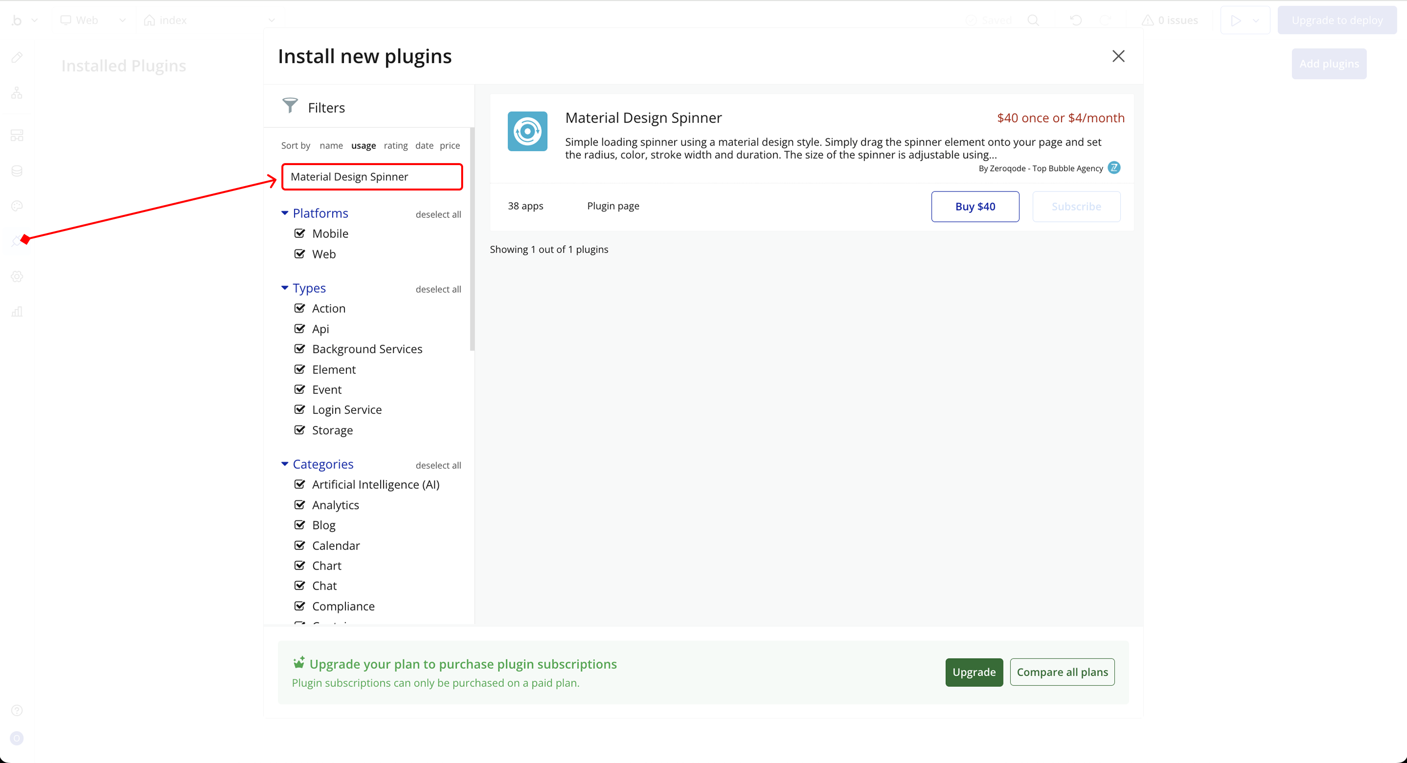
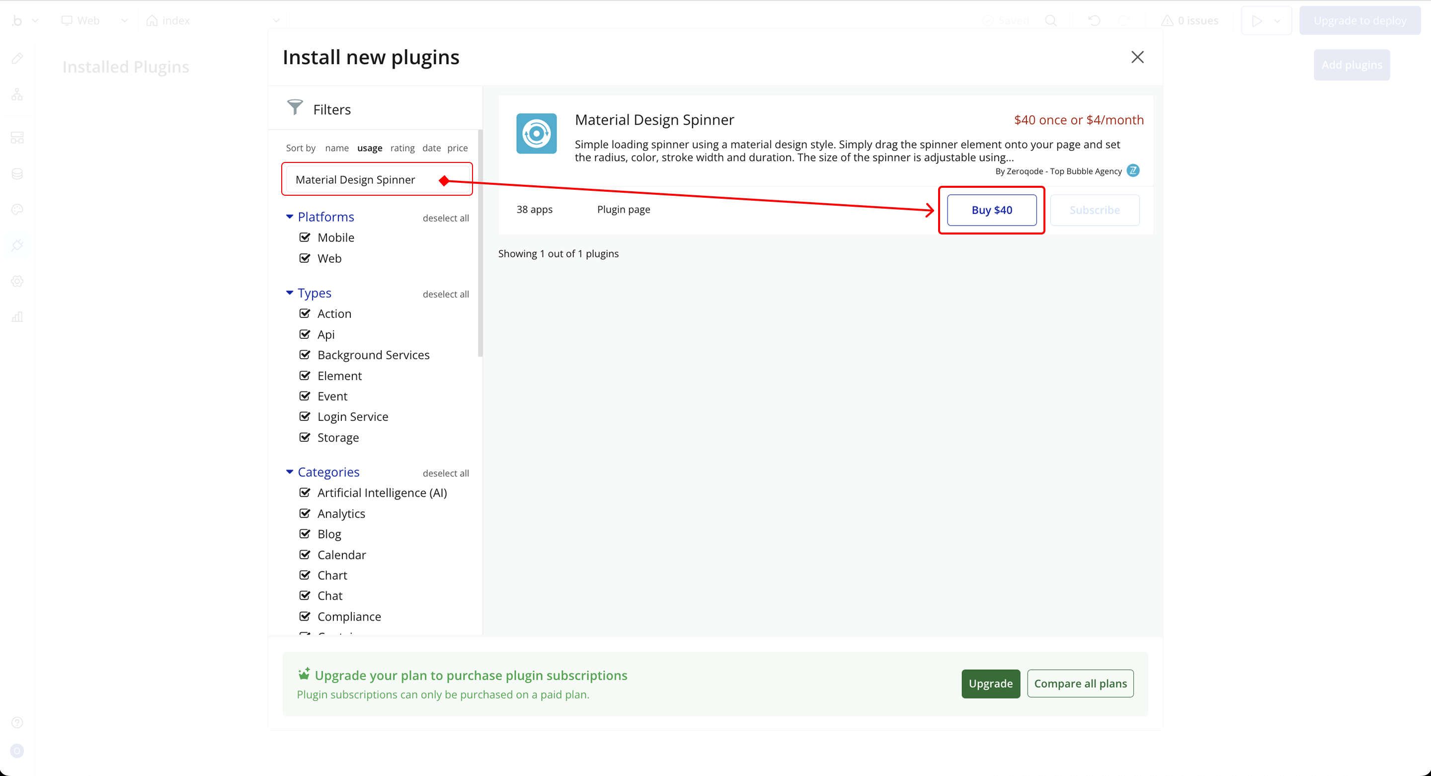
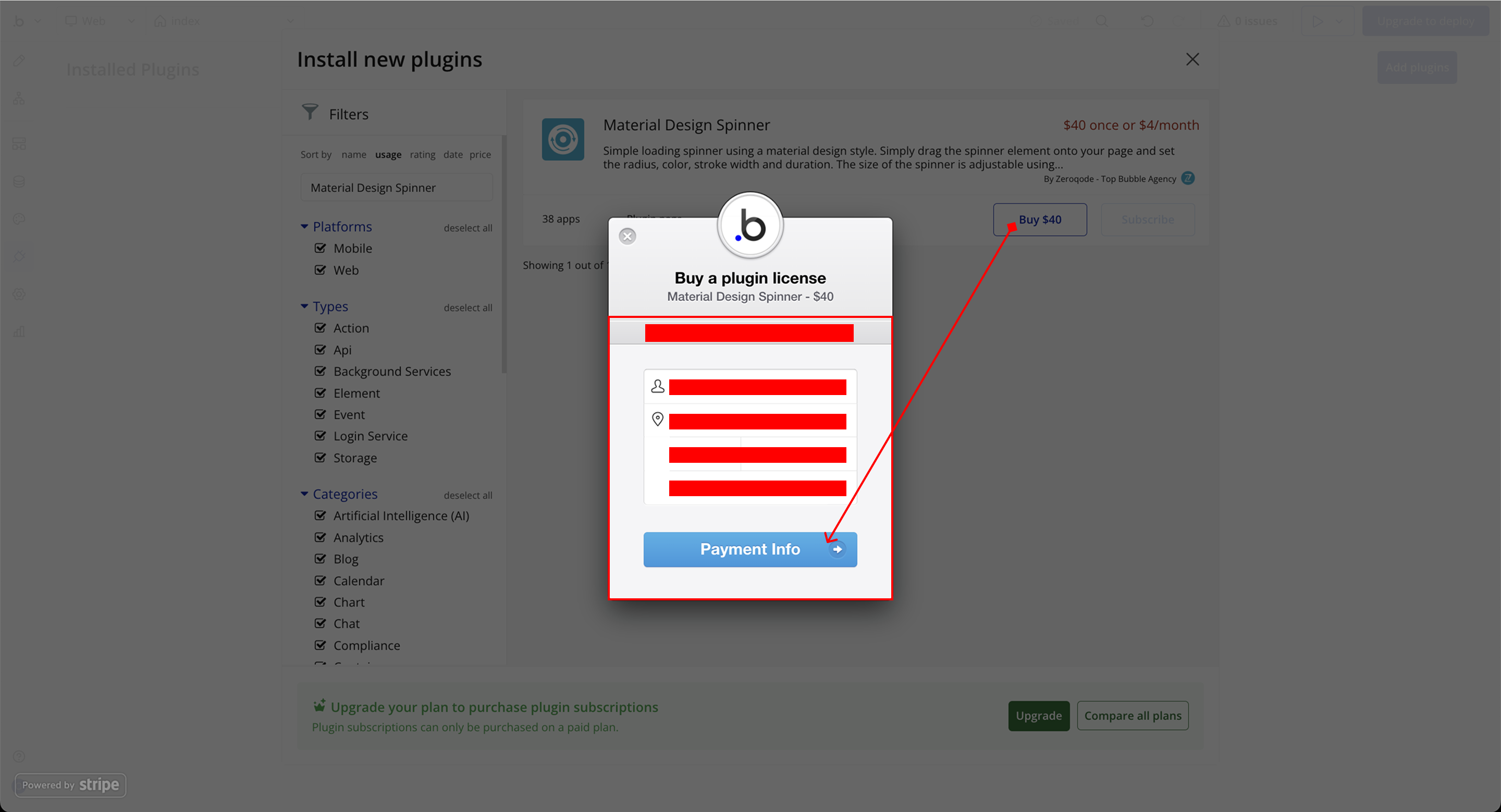
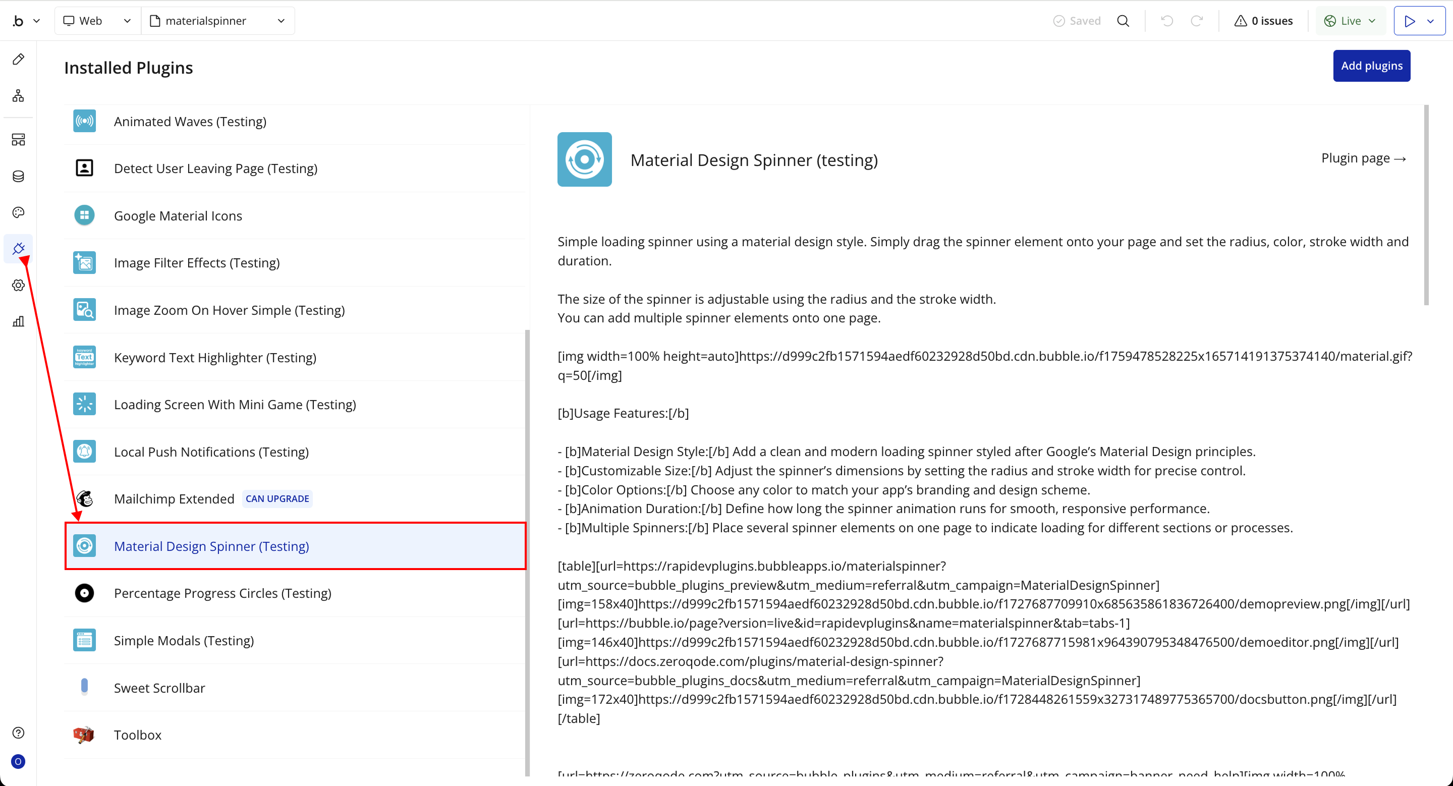
Step 1 – Install the Plugin
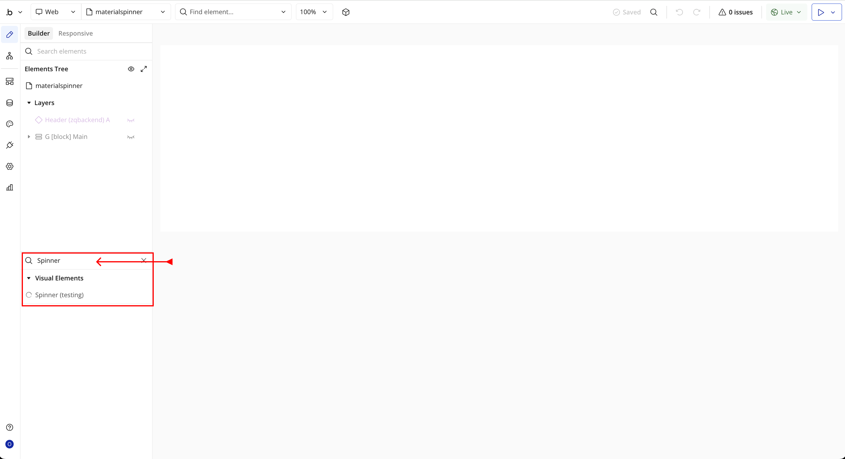
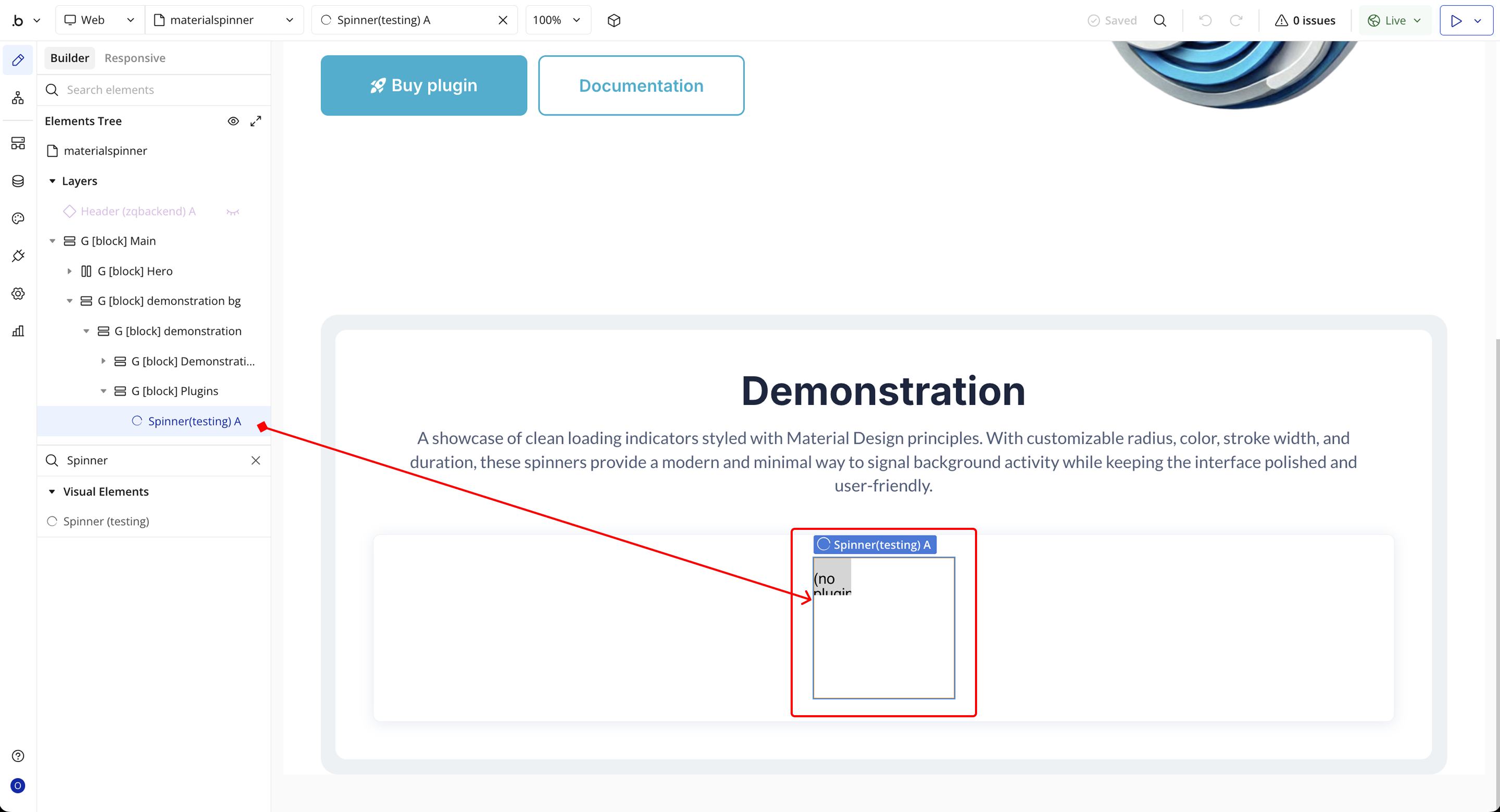
Step 2 – Add the Plugin Element to Your Page
Step 3 – Configure Properties
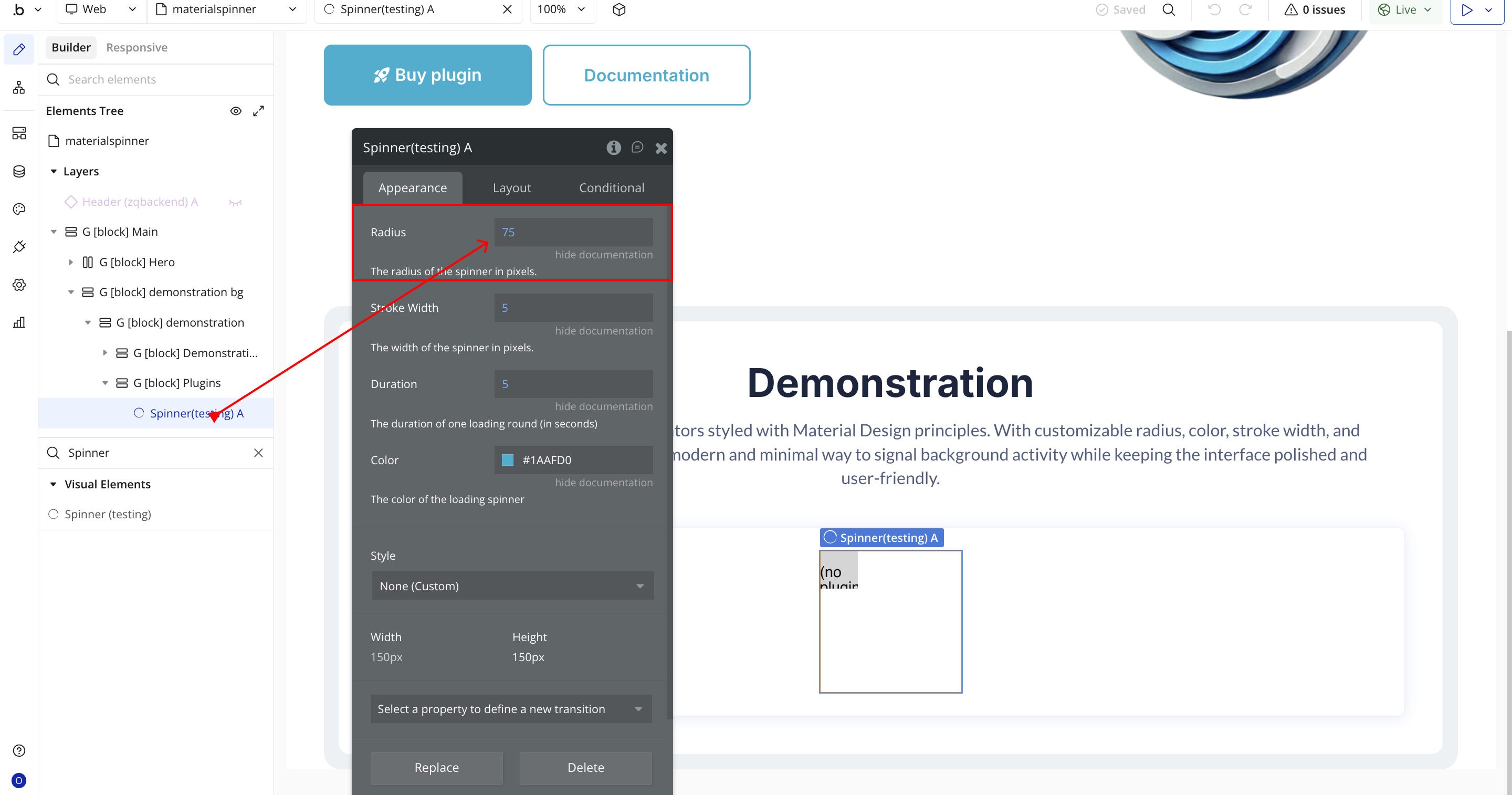
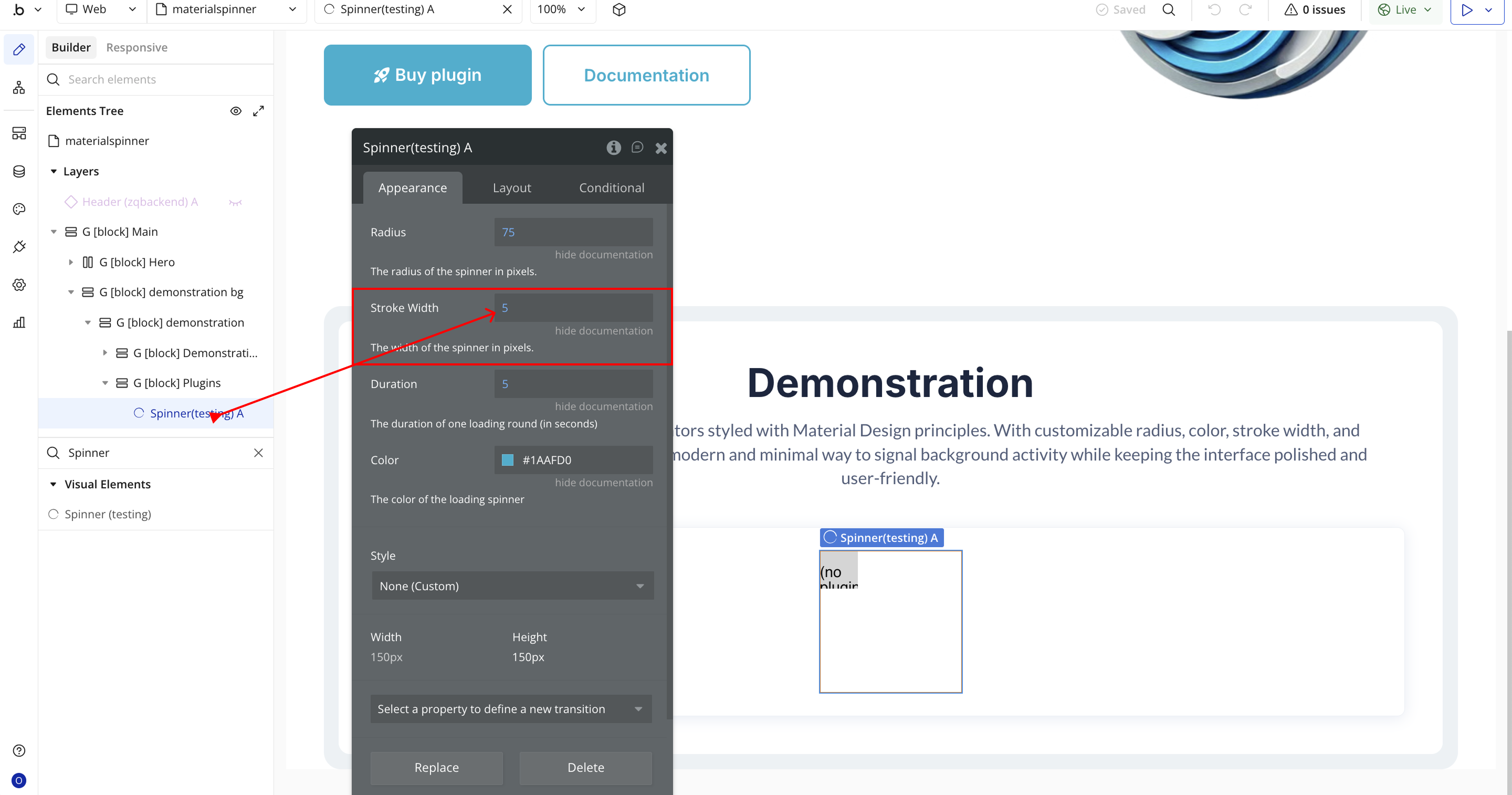

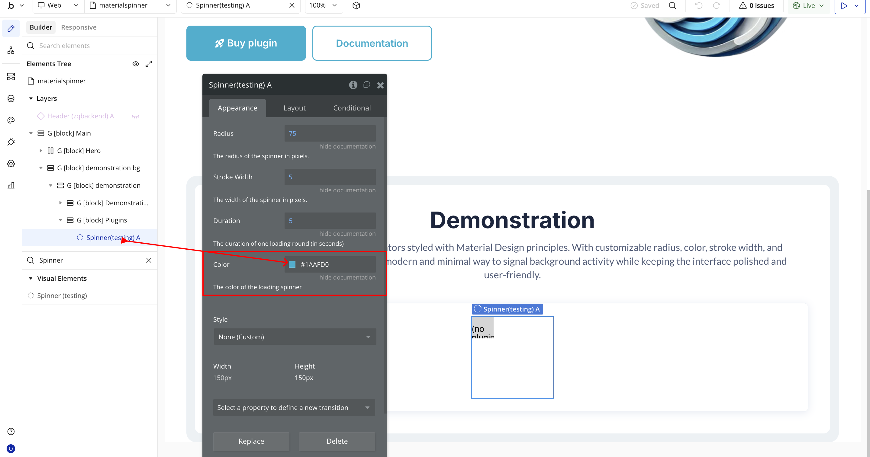
Plugin Element Properties - Spinner
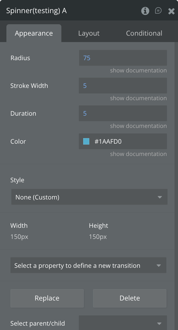
Fields:
Title | Description | Type |
Radius | Sets the size of the spinner’s circular shape, measured in pixels. | Number |
Stroke Width | Adjusts how thick or thin the spinner’s ring appears, measured in pixels. | Number |
Duration | Defines how long it takes for the spinner to complete one full rotation, in seconds. | Number |
Color | Lets you choose the spinner’s color. You can pick from the color palette or enter a HEX code. | Color |
