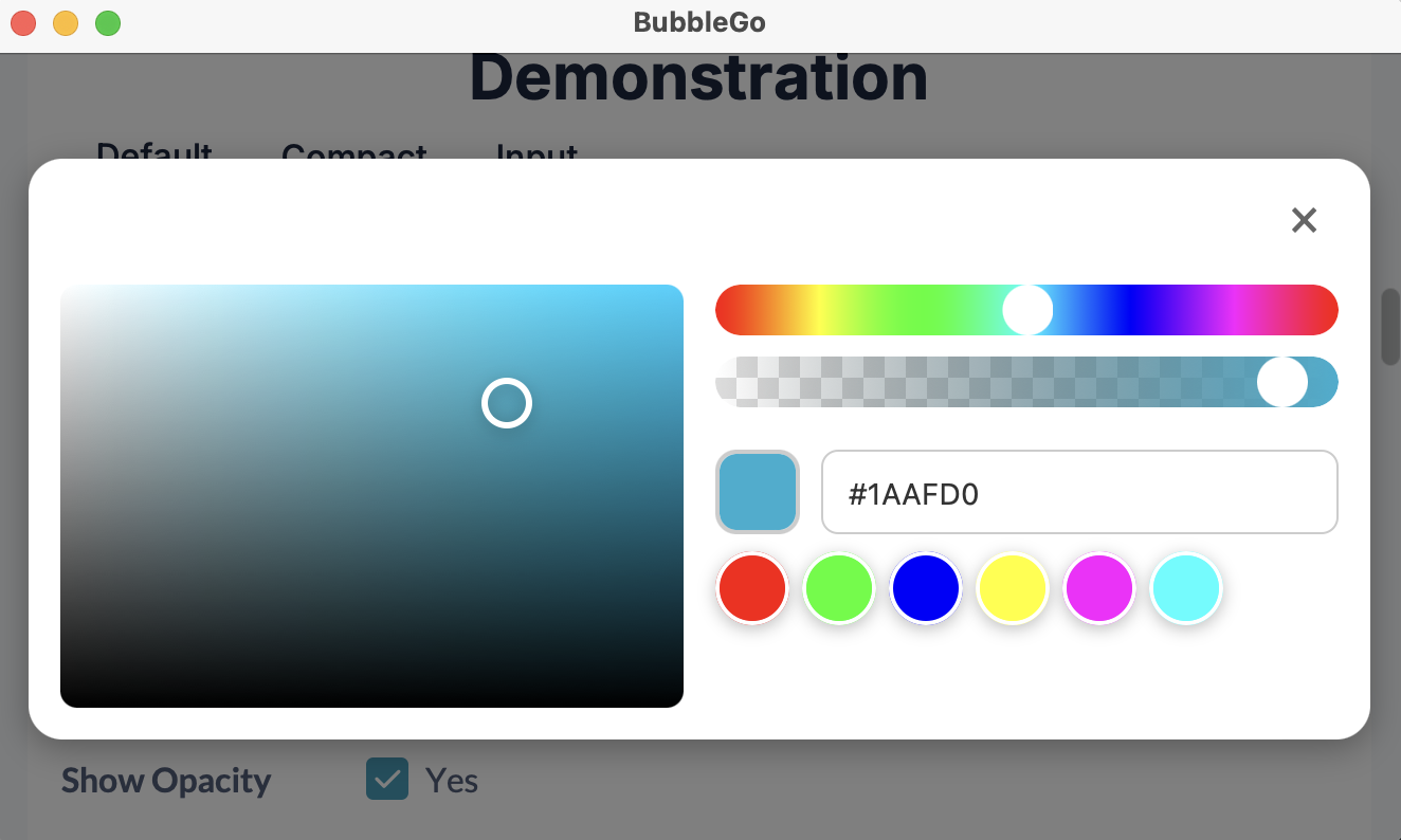
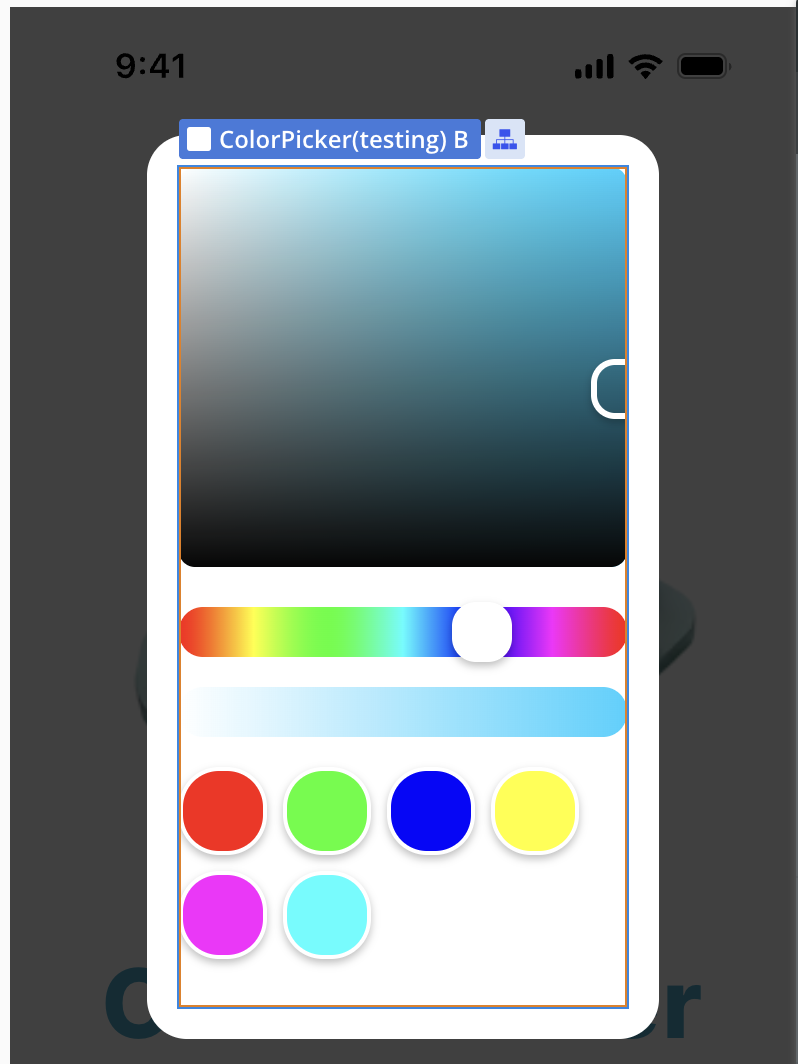
The Color Picker For Bubble Mobile plugin provides a comprehensive and intuitive color selection interface specifically designed for mobile applications built with Bubble’s mobile editor. This plugin enables users to select colors through an interactive interface that includes a main color panel, hue slider, opacity control, and predefined color swatches.
The plugin features smooth gesture-based interactions, real-time color updates, and supports various color formats including HEX, RGB, and HSL. It’s perfect for applications that require color customization, design tools, or any interface where users need to select colors on mobile devices.
Prerequisites
This plugin is designed specifically for the mobile version of the Bubble editor. To test the plugin on your mobile device, use the TestFlight app available at: https://testflight.apple.com/join/kW1puGu7
⚠️
Please note that the testing app is currently available for iOS only.
How to setup
Setting up the Color Picker For Bubble Mobile plugin is straightforward:
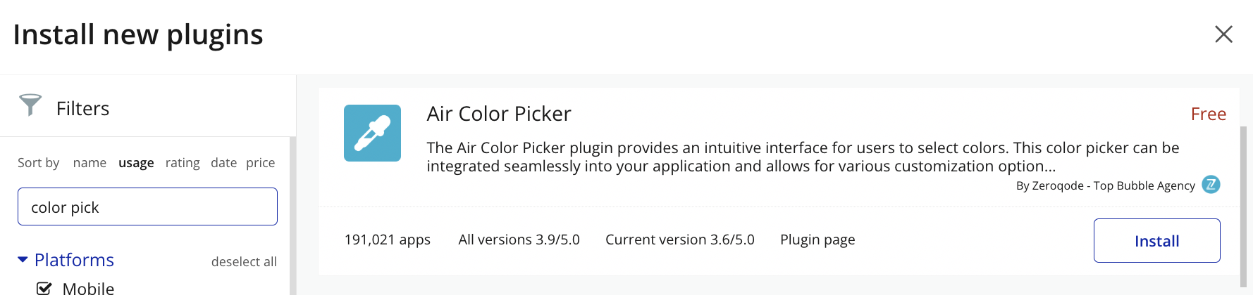
Step 1: Install the plugin from the Bubble plugin marketplace
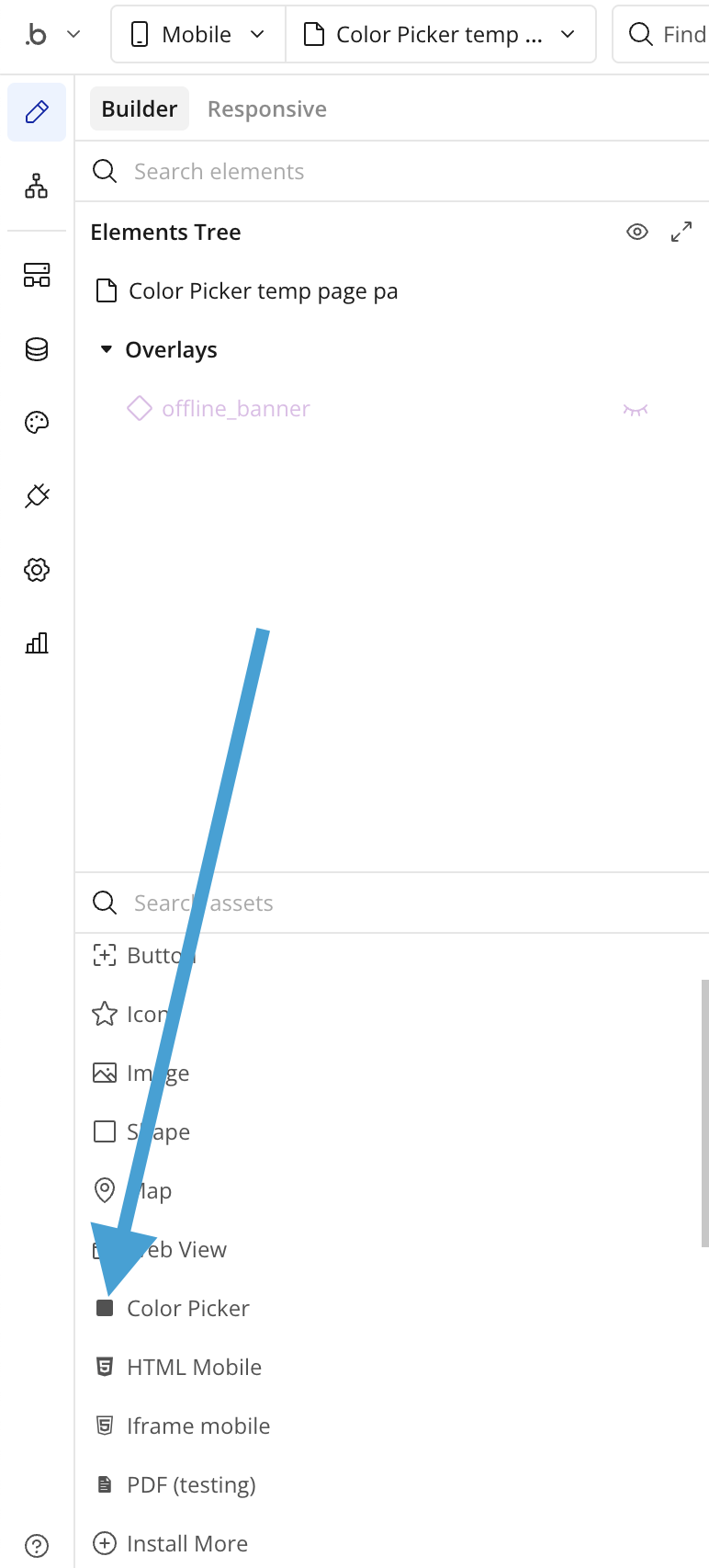
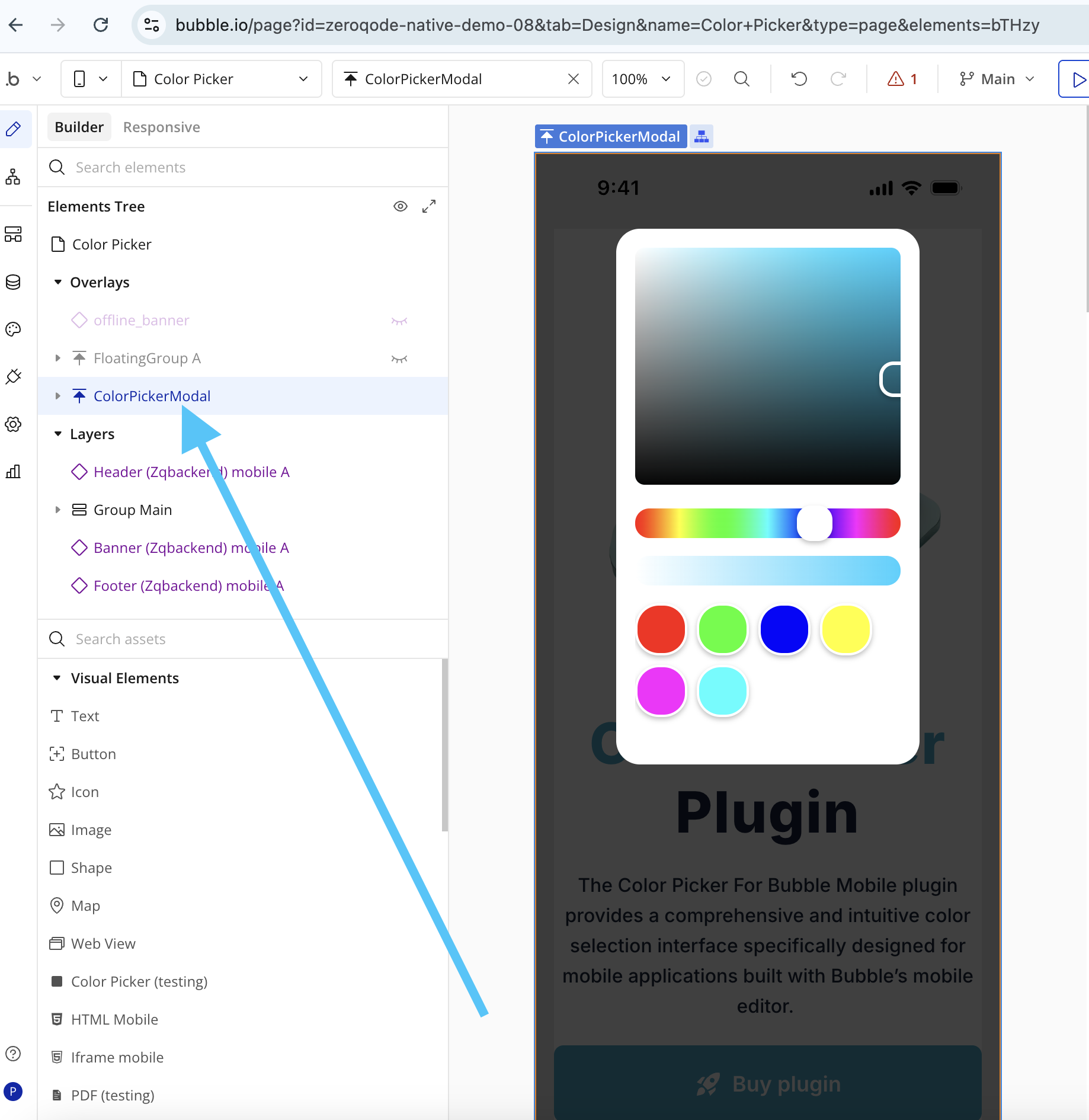
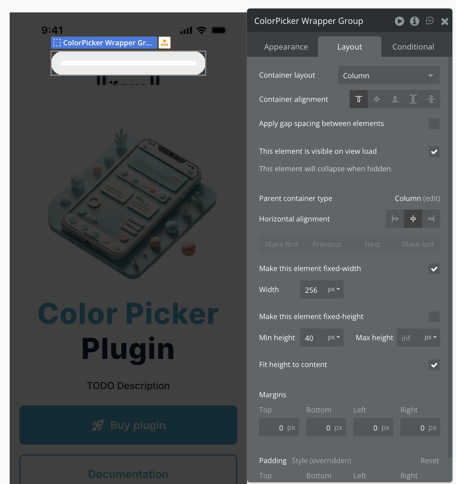
Step 2: Add the Color Picker element to your mobile app page by dragging it from the visual elements section
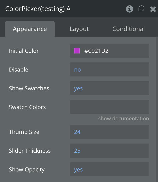
Step 3: Configure initial settings such as initial color, thumb size, and which components to show
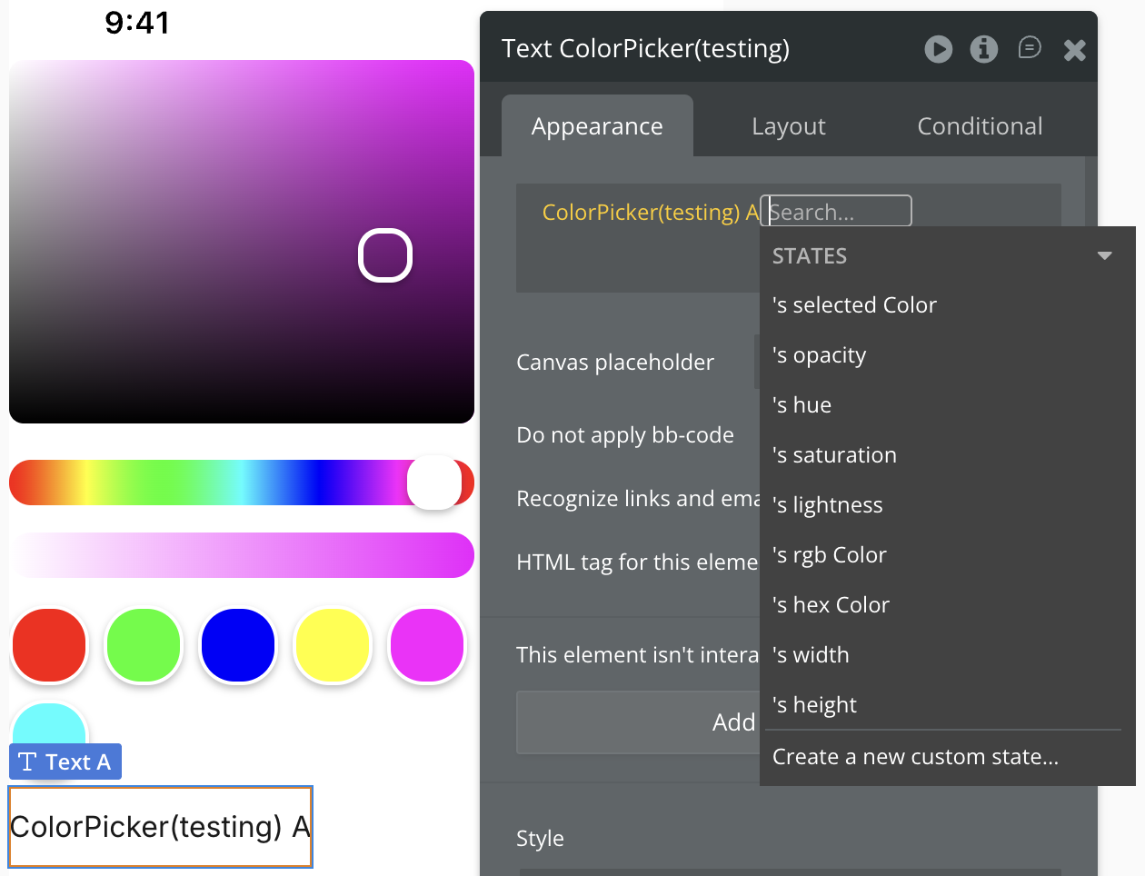
Step 4: Access color values through the exposed states (selected Color, rgb Color, hex Color, etc.)
Step 5: Test on mobile device using Bubble’s mobile preview or deployed app
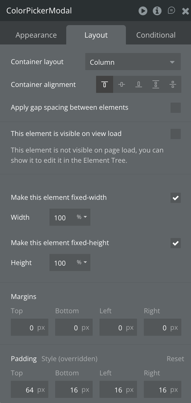
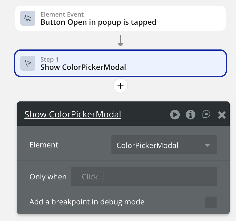
Popup for compact view
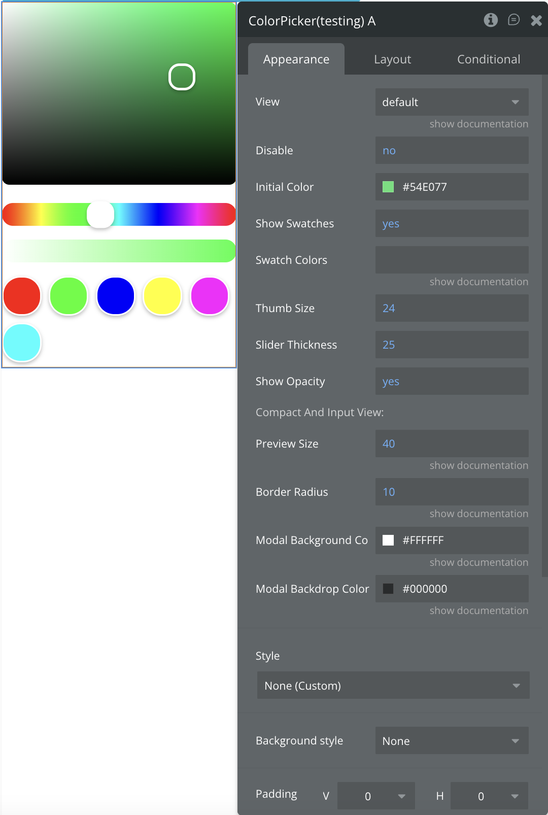
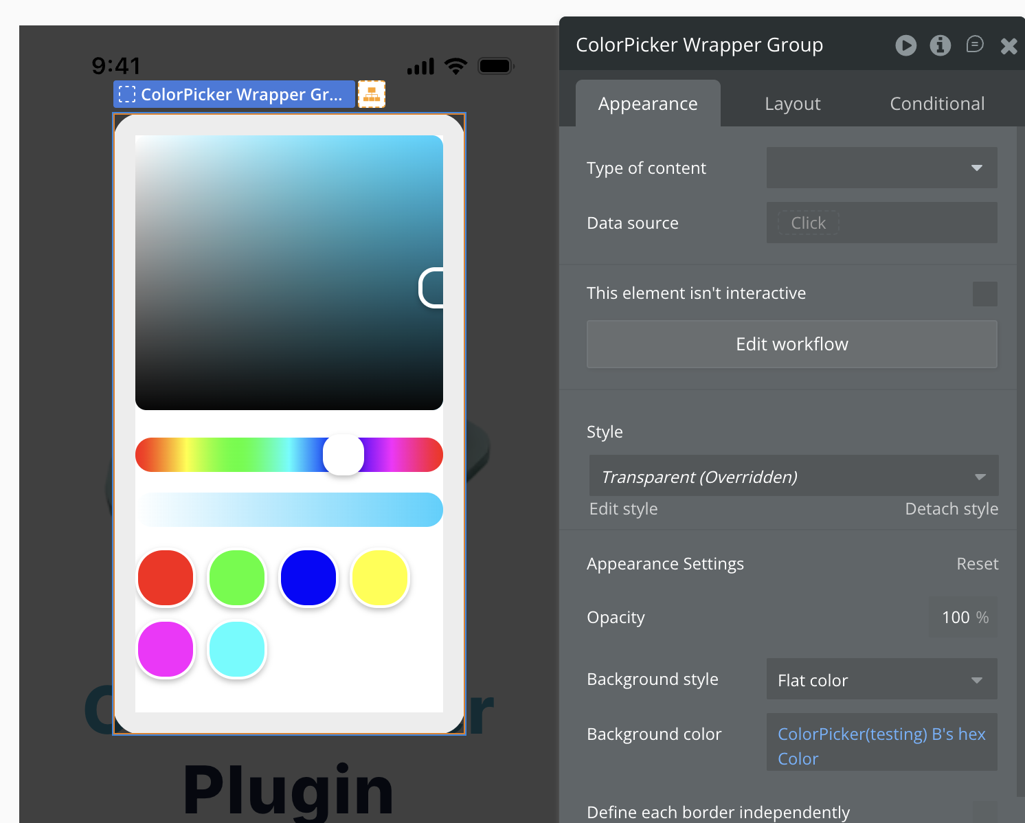
Plugin Element - Color Picker
Fields
Title
Description
Type
View
Choose between default full view or compact preview button
Dropdown
Initial Color
Sets the initial color displayed when the picker loads
Color
Disable
Disables user interaction with the color picker
Boolean
Show Swatches
Controls whether predefined color swatches are visible
Boolean
Swatch Colors
Comma-separated HEX color values for predefined swatches (e.g., #FF0000,#00FF00,#0000FF)
Text
Thumb Size
Size of the draggable thumb/handle elements in pixels
Number
Slider Thickness
Thickness of the hue and opacity sliders in pixels
Number
Show Opacity
Controls whether the opacity/alpha slider is visible
Boolean
Compact And Input View
Preview Size
Size of the color preview box
Number
Border Radius
Border radius for the preview box
Number
Modal Background Color
Background color for the modal window
Color
Modal Backdrop Color
Backdrop color for the modal
Color
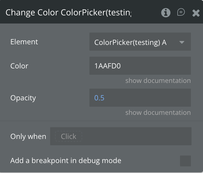
Element Actions
Change Color
Programmatically changes the selected color and opacity of the color picker.
Fields:
Title
Description
Type
Color
HEX color value with or without the “#” symbol and without opacity
Text
Opacity
Opacity value between 0 (transparent) and 1 (opaque)
Number
Exposed states
Name
Description
Type
selectedColor
The currently selected color in HEX format
Text
opacity
The current opacity/alpha value (0-1)
Number
hue
The current hue value in degrees (0-360)
Number
saturation
The current saturation value (0-1)
Number
lightness
The current lightness value (0-1)
Number
rgb Color
The current color in RGBA format including opacity
Text
hex Color
The current color in HEXA format including alpha channel
Text
Element Events
Name
Description
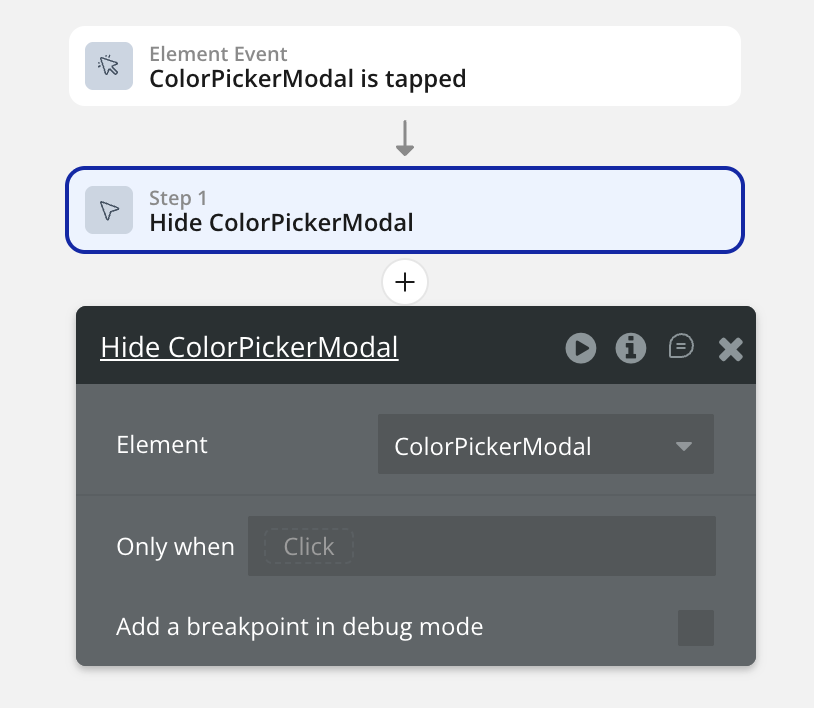
Color Changed
Triggered whenever the user changes the color through any interaction (panel, sliders, or swatches)
Workflow example
Here are some basic workflow examples to get you started with the Color Picker For Bubble Mobile plugin:
Basic Color Selection Workflow
Add the Color Picker element to your mobile page
Set the initial color using the “Initial Color” property
Create a workflow that triggers on “Color Changed” event
Use the “selected Color” state to get the chosen color
Apply the selected color to other elements or save it to your database