
✅
Link to the plugin page: https://zeroqode.com/plugin/charts-for-bubble-mobile-1743422416736x503435475852947300
Demo to preview the plugin:
✅
Introduction
Charts Native is a lightweight and versatile charting plugin for Bubble applications. It allows you to easily create and customize various chart types including line, bar, and pie charts. With a simple JSON data structure, you can visualize your data with minimal setup. The plugin is designed to be responsive and works well in various screen sizes, making it perfect for both desktop and mobile applications.
Prerequisites
No external API accounts or services are required for this plugin. The plugin works natively within your Bubble application with no additional dependencies.
This plugin is designed specifically for the mobile version of the Bubble editor. To test the plugin on your mobile device, use the TestFlight app available at: https://testflight.apple.com/join/4fXUggud
⚠️
Please note that the testing app is currently available for iOS only.

How to setup
Setting up Charts for Bubble Mobile is straightforward as it does not require any external API keys or configurations:
- Install the Charts for Bubble Mobile plugin from the Bubble plugin marketplace.
- Add the desired chart element to your page from the Elements panel.
- Configure the chart properties in the Property Editor panel.
- Supply your data in JSON format and customize the appearance as needed.
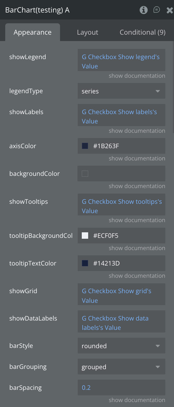
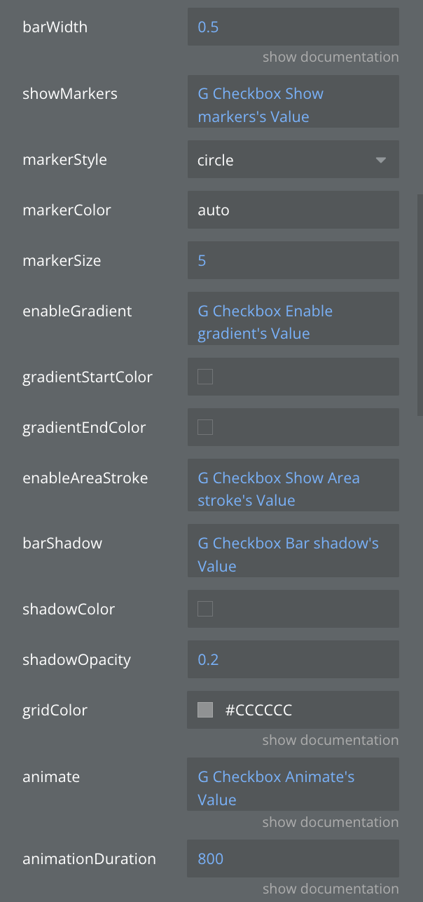
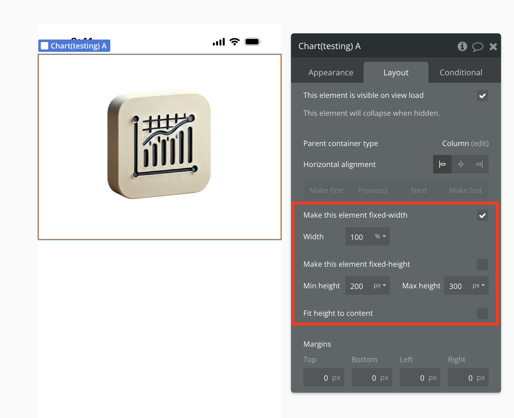
Plugin Element Properties
The plugin contains different main visual elements that should be used on mobile pages.
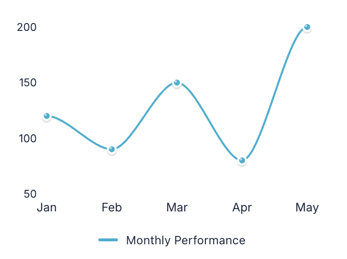
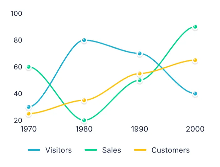
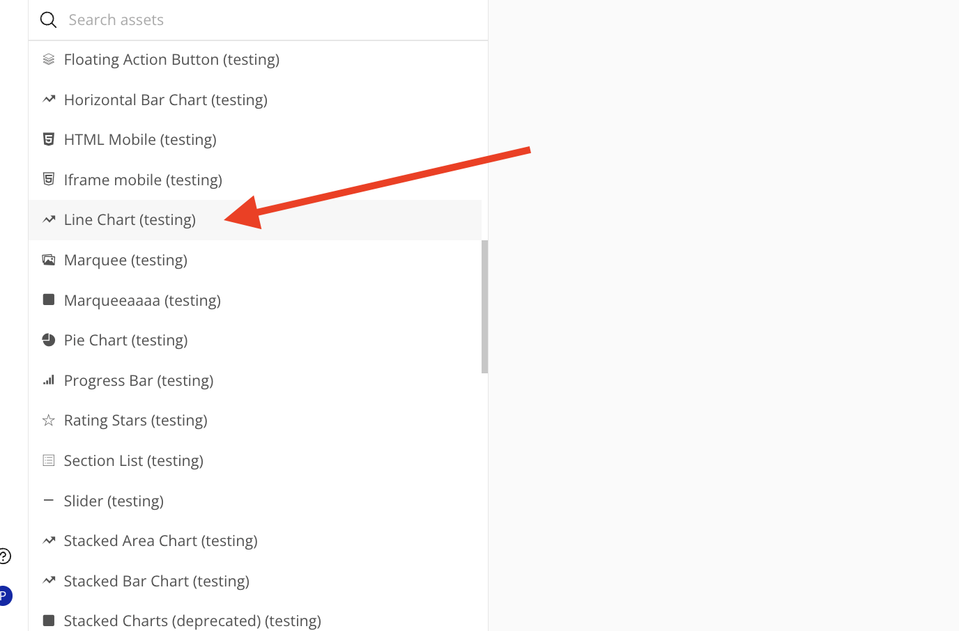
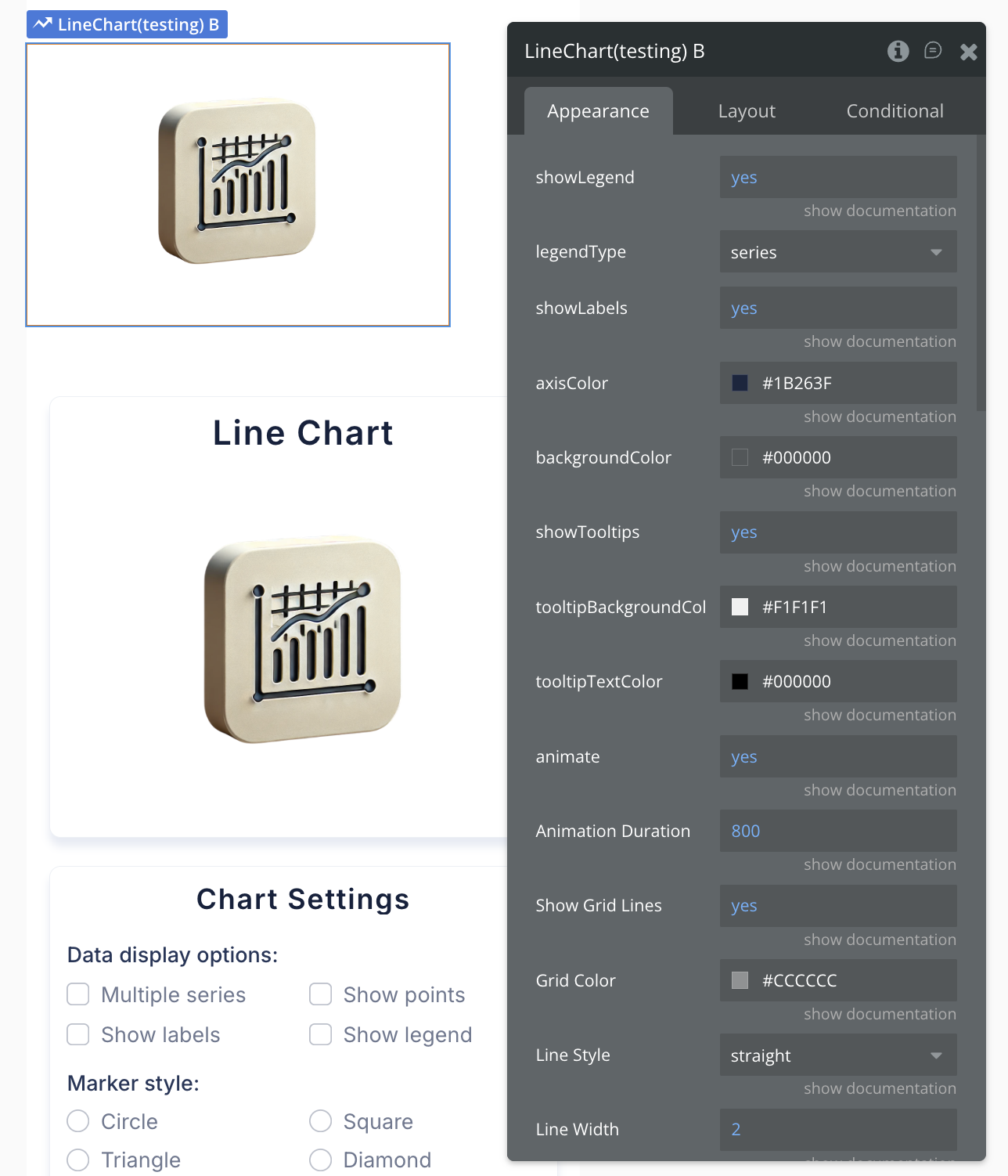
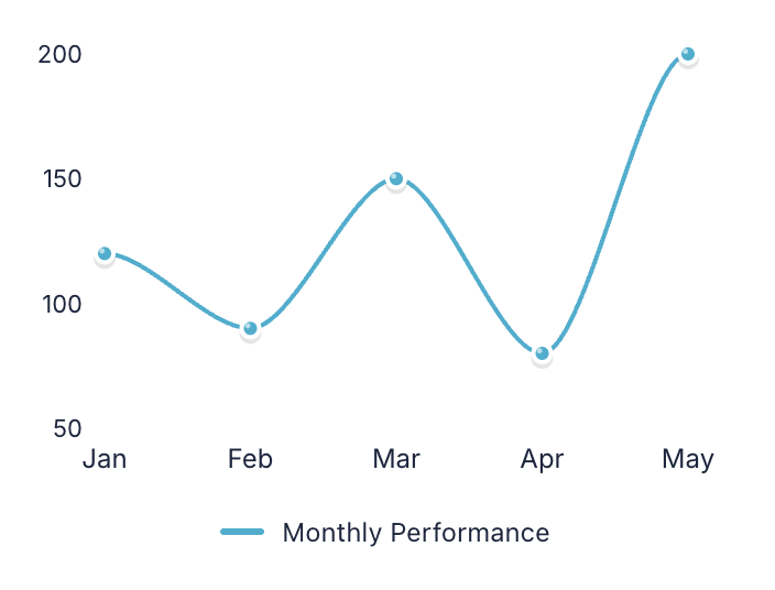
Line Chart
Perfect for displaying trends and changes over time with connected data points. Ideal for tracking metrics like sales growth, temperature variations, or stock prices across different periods.
Single series
Multiple series
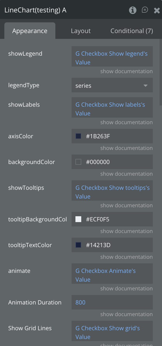
Fields:
Title | Description | Type |
Data JSON | JSON string containing the data to be visualized in the chart | Text |
Animation Duration (ms) | Duration of chart animations in milliseconds | Number |
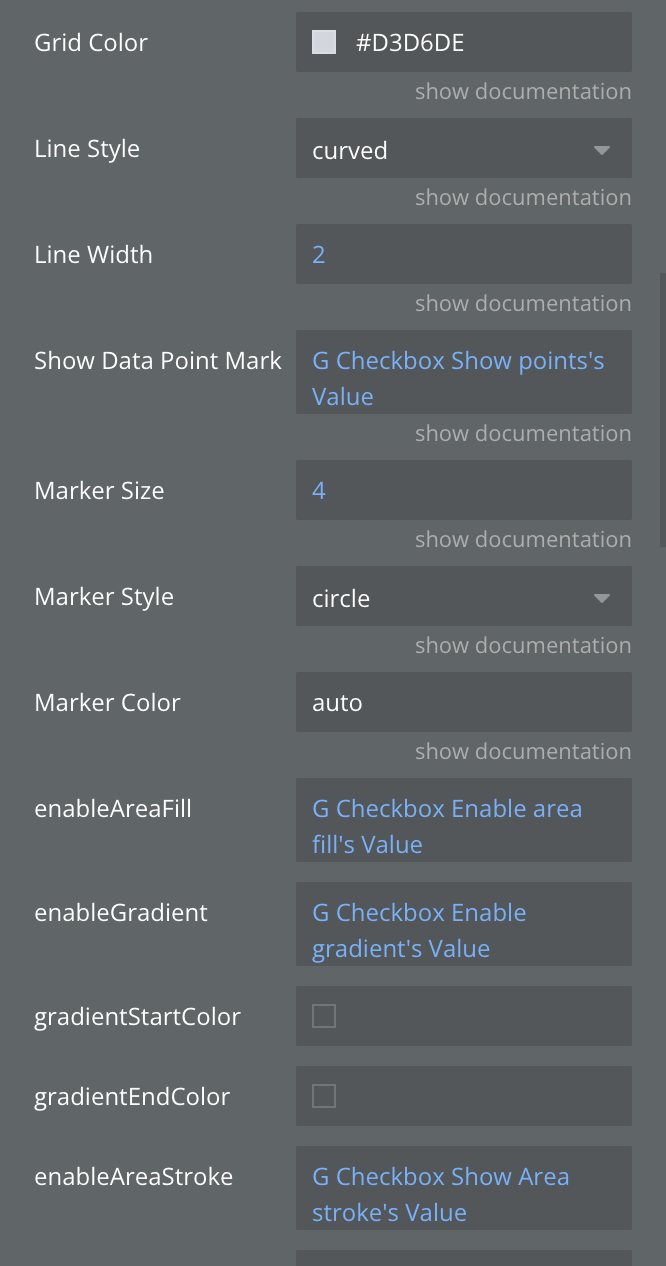
Grid Color | Color of the grid lines | Text |
Line Style | Style of the line: straight, curved, or stepped | Dropdown |
Line Width | Width of the line in pixels | Number |
Marker Color | Color of markers (auto uses line color) | Text |
Marker Size | Size of data point markers in pixels | Number |
Marker Style | Style of data point markers | Dropdown |
Show Data Point Markers | Whether to show markers at data points | Boolean |
Show Grid Lines | Whether to show grid lines on the chart | Boolean |
animate | Enables or disables chart animations | Boolean |
areaFillOpacity | areaFillOpacity | Number |
axisColor | Sets the color of the chart axes (for line and bar charts) | Text |
backgroundColor | Sets the background color of the chart area | Text |
enableAreaFill | Fill the area under the line with color | Boolean |
enableAreaStroke | Add border line around filled areas | Boolean |
enableGradient | Apply gradient color effects to chart elements | Boolean |
gradientEndColor | Ending color for gradient effect | Text |
gradientStartColor | Starting color for gradient effect | Text |
legendType | Legend display mode: by areas, series, bars, or segments | Dropdown |
show Data Labels | Display numeric values on or near chart elements | Boolean |
showLabels | Toggles the visibility of data labels on the chart | Boolean |
showLegend | Toggles the visibility of the chart legend | Boolean |
showTooltips | Enable interactive tooltips on hover/tap over data points | Boolean |
tooltipBackgroundColor | Background color of tooltips | Color |
tooltipTextColor | Text color of tooltipsv | Color |
States:
Name | Description | Type |
currentData | Current chart data in JSON format | Text |
Error | Error message if chart fails to render | Text |
Selected label | Label of the selected chart item | Text |
Selected value | Value of the selected chart item | Number |
tooltip Visible | Whether tooltip is currently visible | Boolean |
tooltipData | Data of the currently displayed tooltip | Text |
animationState | animationState | Text |
currentMarkerStyle | currentMarkerStyle | Text |
currentMarkerColor | currentMarkerColor | Text |
Events:
Name | Description |
Item Selected | Triggered when a user taps/clicks on a chart item |
onTooltipShow | Triggered when a tooltip becomes visible |
onTooltipHide | Triggered when a tooltip is hidden |
animation_completed | animation_completed |
series_selected | series_selected |
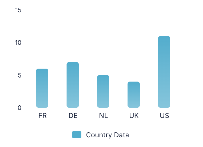
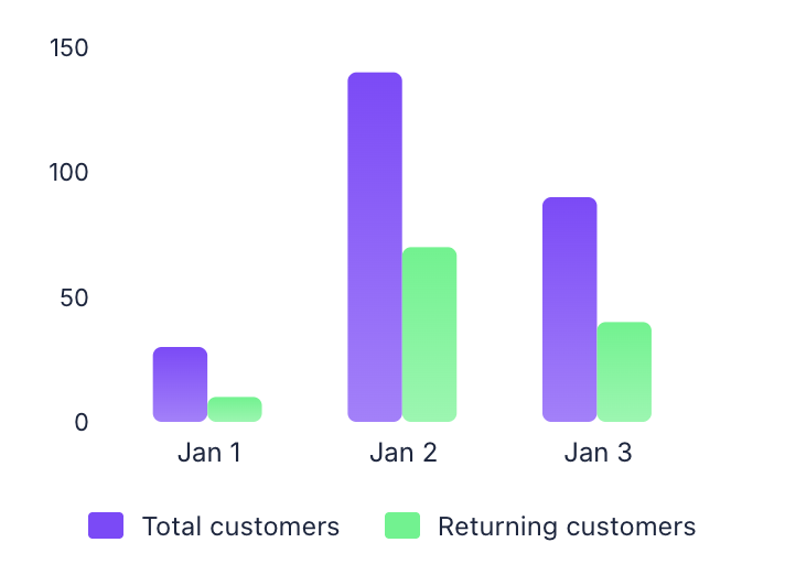
Bar Chart
Displays data using vertical rectangular bars to compare values across different categories. Great for comparing sales by product, survey results, or performance metrics between departments.
Single series
Multiple series
Fields:
Title | Description | Type |
Data JSON | JSON string containing the data to be visualized in the chart | Text |
animate | Enable smooth animations when chart loads or updates | Boolean |
animationDuration | Animation duration in milliseconds (e.g., 800ms) | Number |
animationType | Animation style when chart appears: grow, fade, slide, or rotate | Dropdown |
axisColor | Customize the color of X and Y axes | Text |
backgroundColor | Set the background color for the entire chart area | Text |
barGrouping | How multiple bars are arranged: grouped side-by-side or stacked | Dropdown |
barShadow | Add shadow effect to bars for depth | Boolean |
barSpacing | Space between bars as a ratio (0.0 = no space, 1.0 = max space) | Number |
barStyle | Visual style of bars: rounded corners, square, or gradient | Dropdown |
barWidth | Width of individual bars as a ratio (0.0 to 1.0) | Number |
enableAreaStroke | Add border line around filled areas | Boolean |
enableGradient | Apply gradient color effects to chart elements | Boolean |
gradientEndColor | Ending color for gradient effect | Text |
gradientStartColor | Starting color for gradient effect | Text |
gridColor | Color of the background grid lines | Text |
legendType | Legend display mode: by areas, series, bars, or segments | Dropdown |
markerColor | Color of data point markers (use "auto" to match line color) | Text |
markerSize | Size of data point markers in pixels | Number |
markerStyle | Shape of markers: circle, square, triangle, or diamond | Dropdown |
shadowColor | Color of the shadow effect | Text |
shadowOpacity | Transparency of shadow (0.0 = invisible, 1.0 = solid) | Number |
showDataLabels | Display numeric values on or near chart elements | Boolean |
showGrid | Display grid lines for better data reading | Boolean |
showLabels | Show or hide data point labels on the chart | Boolean |
showLegend | Enable or disable the chart legend display | Boolean |
showMarkers | Show circular markers at each data point | Boolean |
showTooltips | Enable interactive tooltips on hover/tap over data points | Boolean |
tooltipBackgroundColor | Background color for tooltip popup | Color |
tooltipTextColor | Text color inside the tooltip | Color |
States:
Name | Description | Type |
currentType | Current chart type being displayed | Text |
currentData | Current chart data in JSON format | Text |
Error | Error message if chart fails to render | Text |
Selected label | Label of the selected chart item | Text |
Selected value | Value of the selected chart item | Number |
tooltip Visible | Whether tooltip is currently visible | Boolean |
tooltipData | Data of the currently displayed tooltip | Text |
currentBarStyle | Current bar style being used | Text |
animationState | Current animation state | Text |
currentGrouping | Current grouping mode | Text |
selectedSeries | Currently selected series | Text |
hoveredBar | Currently hovered bar information | Text |
Events:
Name | Description |
Item Selected | Triggered when a user taps/clicks on a chart item |
onTooltipShow | Triggered when a tooltip becomes visible |
onTooltipHide | Triggered when a tooltip is hidden |
Animation Completed | Triggered when chart animation completes |
Chart Complete | Triggered when chart rendering is complete |
series_selected | Triggered when a series is selected |
bar_hover | Triggered when hovering over a bar |
bar_leave | Triggered when leaving a bar |
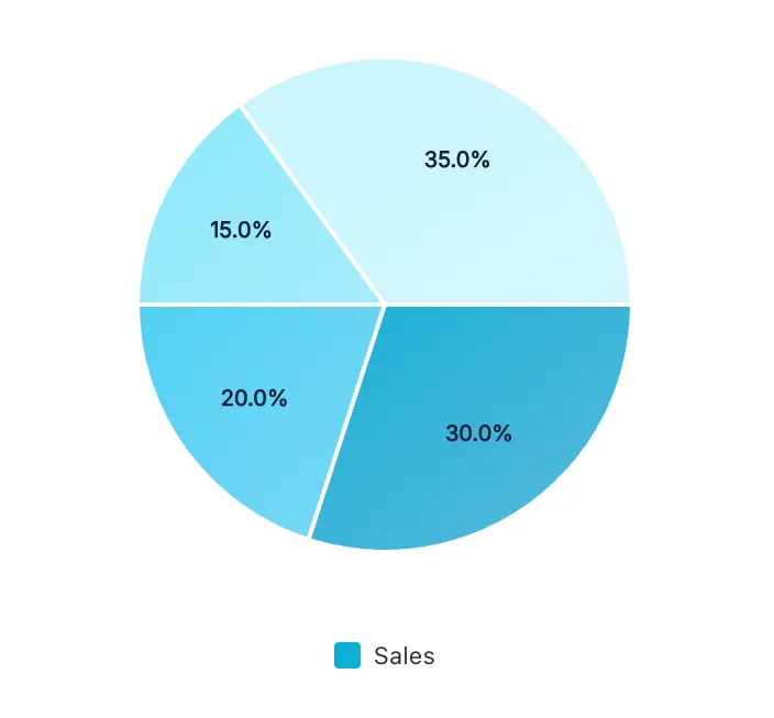
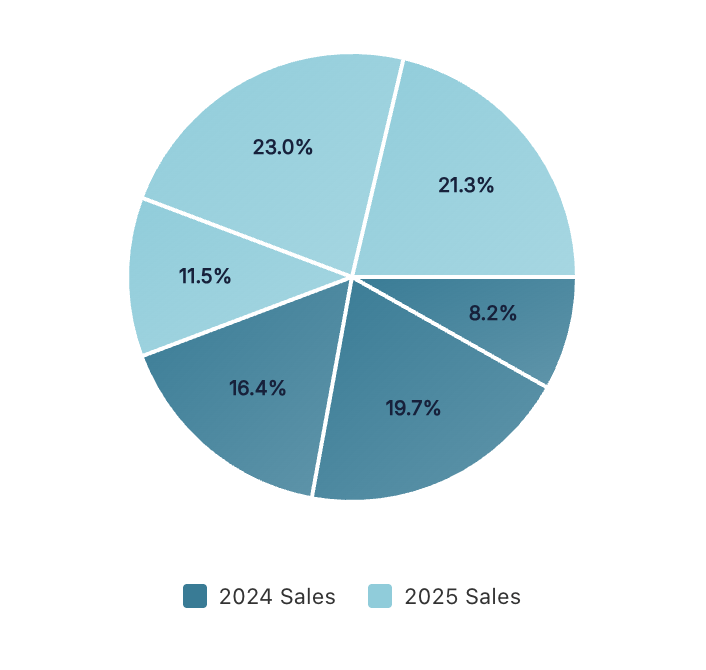
Pie Chart
Represents data as slices of a circular chart, showing the proportional relationship of parts to a whole. Best suited for displaying market share, budget allocation, or percentage distributions with a limited number of categories.
Single series
Multiple series
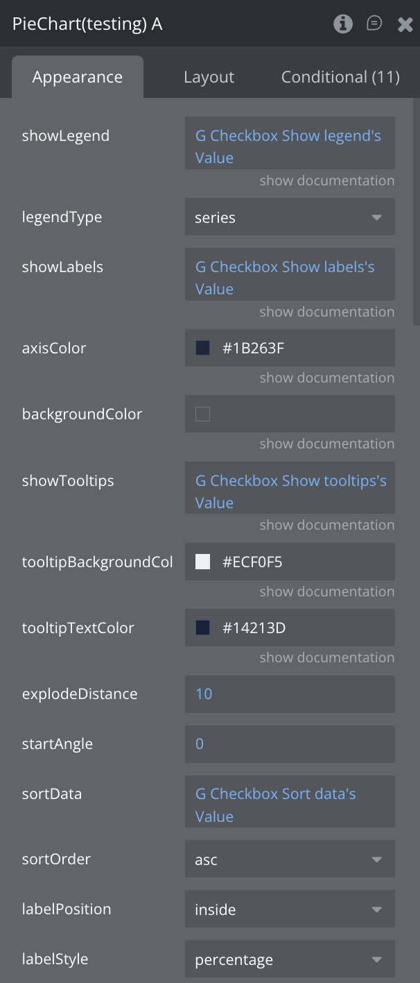
Fields:
Title | Description | Type |
Data JSON | JSON string containing the data to be visualized in the chart | Text |
animate | Enable smooth animations when chart loads or updates | Boolean |
animationDuration | Animation duration in milliseconds (e.g., 800ms) | Number |
animationType | Animation style when chart appears: grow, fade, slide, or rotate | Dropdown |
axisColor | Customize the color of X and Y axes | Text |
backgroundColor | Set the background color for the entire chart area | Text |
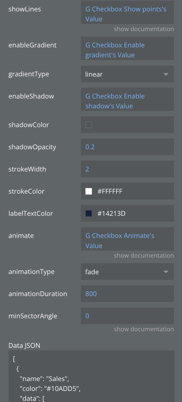
enableGradient | Apply gradient color effects to chart elements | Boolean |
enableShadow | Add shadow effects to chart elements | Boolean |
explodeDistance | Distance segments move outward when selected (pie/donut charts) | Number |
gradientType | Gradient pattern: linear (straight) or radial (circular) | Dropdown |
labelPosition | Where labels appear: inside segments, outside, or on edge | Dropdown |
labelStyle | Label content: show percentage, value, both, or label name only | Dropdown |
labelTextColor | labelTextColor | Color |
legendType | Legend display mode: by areas, series, bars, or segments | Dropdown |
minSectorAngle | Minimum angle for small pie segments in degrees (prevents tiny slices) | Number |
shadowColor | Color of the shadow effect | Text |
shadowOpacity | Transparency of shadow (0.0 = invisible, 1.0 = solid) | Number |
showLabels | Show or hide data point labels on the chart | Boolean |
showLegend | Enable or disable the chart legend display | Boolean |
showLines | Display connecting lines between labels and segments | Boolean |
showTooltips | Enable interactive tooltips on hover/tap over data points | Boolean |
sortData | Automatically sort data by value | Boolean |
sortOrder | Sort direction: ascending (low to high) or descending (high to low) | Text |
startAngle | Starting rotation angle of the chart in degrees (0-360) | Number |
strokeColor | Color of stroke/border lines | Text |
strokeWidth | Width of stroke/border lines in pixels | Number |
tooltipBackgroundColor | Background color for tooltip popup | Color |
tooltipTextColor | Text color inside the tooltip | Color |
States:
Name | Description | Type |
currentType | Current chart type being displayed | Text |
currentData | Current chart data in JSON format | Text |
error | Error message if chart fails to render | Text |
selected_label | Label of the selected chart item | Text |
selected_value | Value of the selected chart item | Number |
tooltipVisible | Whether tooltip is currently visible | Boolean |
tooltipData | Data of the currently displayed tooltip | Text |
selectedSector | Currently selected sector | Text |
animationState | Current animation state | Text |
currentChartStyle | Current chart style | Text |
hoveredSector | Currently hovered sector | Text |
totalValue | Total value of all pie segments | Number |
Events:
Name | Description |
Item Selected | Triggered when a user taps/clicks on a chart item |
onTooltipShow | Triggered when a tooltip becomes visible |
onTooltipHide | Triggered when a tooltip is hidden |
Animation Completed | Triggered when chart animation completes |
Sector Hover | Triggered when hovering over a sector |
Sector Leave | Triggered when leaving a sector |
Chart Complete | Triggered when chart rendering is complete |
Sector Exploded | Triggered when a sector is exploded |
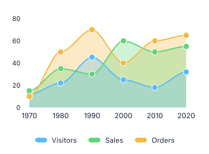
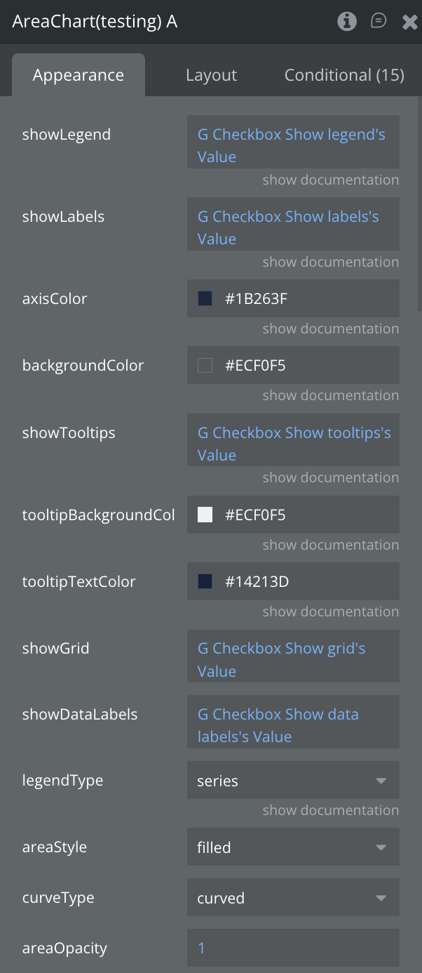
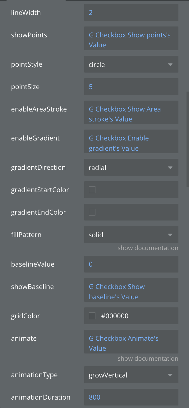
Area Chart
Similar to line charts but with the area below the line filled with color to emphasize magnitude. Excellent for showing cumulative totals over time, such as revenue accumulation or resource consumption.
Single series
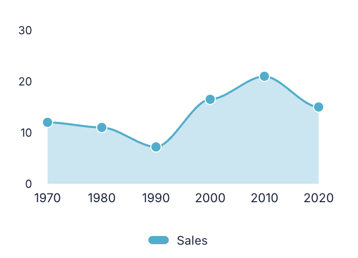
Multiple series
Fields:
Title | Description | Type |
Data JSON | JSON string containing the data to be visualized in the chart | Text |
animate | Enable smooth animations when chart loads or updates | Boolean |
animationDuration | Animation duration in milliseconds (e.g., 800ms) | Number |
animationType | Animation style when chart appears: grow, fade, slide, or rotate | Dropdown |
areaOpacity | Transparency of area fills (0.0 = transparent, 1.0 = solid) | Number |
areaStyle | Area visualization: filled, stacked, overlapped, or streamgraph | Dropdown |
axisColor | Customize the color of X and Y axes | Text |
backgroundColor | Set the background color for the entire chart area | Text |
baselineValue | Y-axis value where area fill starts from | Number |
curveType | Line curve style: linear (straight), curved (smooth), or stepped | Dropdown |
enableAreaStroke | Add border line around filled areas | Boolean |
enableGradient | Apply gradient color effects to chart elements | Boolean |
fillPattern | Pattern for area fill: solid color, dots, lines, or cross-hatch | Dropdown |
gradientDirection | Direction of gradient: vertical, horizontal, or radial | Dropdown |
gradientEndColor | Ending color for gradient effect | Text |
gradientStartColor | Starting color for gradient effect | Text |
gridColor | Color of the background grid lines | Text |
legendType | Legend display mode: by areas, series, bars, or segments | Dropdown |
lineWidth | Thickness of the line in pixels | Number |
pointSize | Size of point markers in pixels | Number |
pointStyle | Shape of point markers: circle, square, triangle, or diamond | Dropdown |
showBaseline | Display horizontal baseline reference line | Boolean |
showDataLabels | Display numeric values on or near chart elements | Boolean |
showGrid | Display grid lines for better data reading | Boolean |
showLabels | Show or hide data point labels on the chart | Boolean |
showLegend | Enable or disable the chart legend display | Boolean |
showPoints | Display markers at each data point on lines | Boolean |
showTooltips | Enable interactive tooltips on hover/tap over data points | Boolean |
tooltipBackgroundColor | Background color for tooltip popup | Color |
tooltipTextColor | Text color inside the tooltip | Color |
States:
Name | Description | Type |
currentData | Current chart data in JSON format | Text |
error | Error message if chart fails to render | Text |
selected_label | Label of the selected chart item | Text |
selected_value | Value of the selected chart item | Number |
tooltipVisible | Whether tooltip is currently visible | Boolean |
tooltipData | Data of the currently displayed tooltip | Text |
selectedSeries | Currently selected series | Text |
animationState | Current animation state | Text |
currentAreaStyle | Current area style | Text |
currentCurveType | Current curve type | Text |
hoveredPoint | Currently hovered point information | Text |
Events:
Name | Description |
Item Selected | Triggered when a user taps/clicks on a chart item |
onTooltipShow | Triggered when a tooltip becomes visible |
onTooltipHide | Triggered when a tooltip is hidden |
animation_completed | Triggered when chart animation completes |
series_selected | Triggered when a series is selected |
point_hover | Triggered when hovering over a point |
point_leave | Triggered when leaving a point |
chart_complete | Triggered when chart rendering is complete |
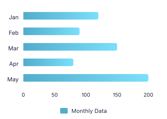
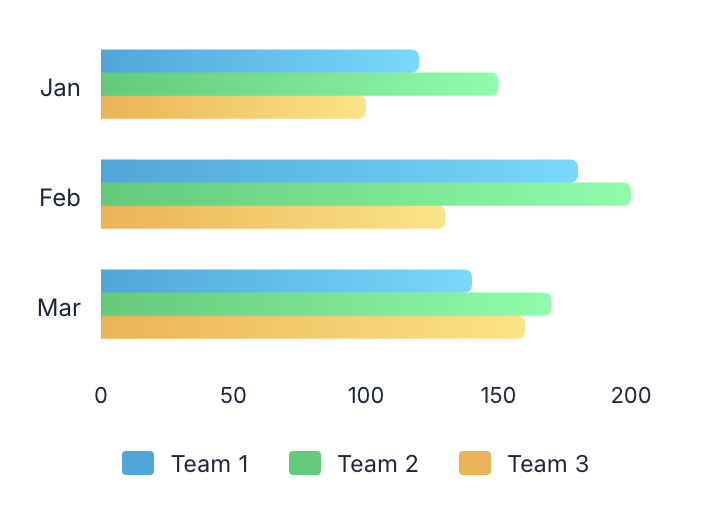
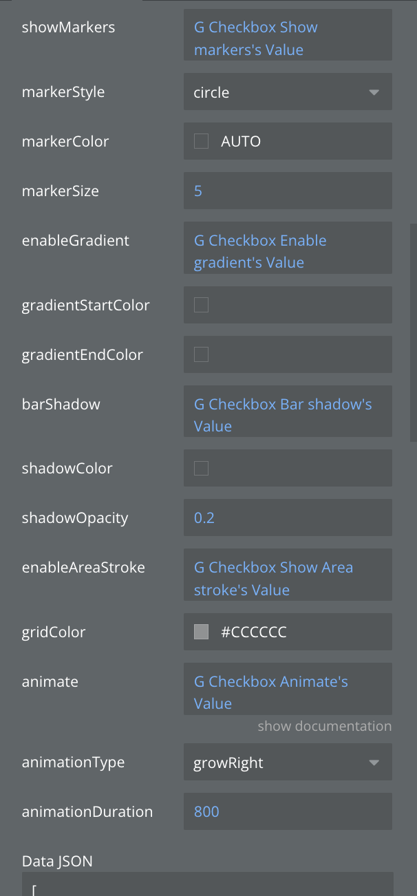
Horizontal Bar Chart
Displays data using horizontal rectangular bars extending from left to right. Particularly useful when category labels are long or when comparing many items, such as country populations or product rankings.
Single series
Multiple series
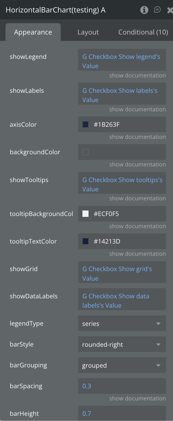
Fields:
Title | Description | Type |
Data JSON | JSON string containing the data to be visualized in the chart | Text |
animate | Enable smooth animations when chart loads or updates | Boolean |
animationDuration | Animation duration in milliseconds (e.g., 800ms) | Number |
animationType | Animation style when chart appears: grow, fade, slide, or rotate | Dropdown |
axisColor | Customize the color of X and Y axes | Text |
backgroundColor | Set the background color for the entire chart area | Text |
barGrouping | How multiple bars are arranged: grouped side-by-side or stacked | Dropdown |
barHeight | Height of individual bars as a ratio (0.0 to 1.0) | Number |
barShadow | Add shadow effect to bars for depth | Boolean |
barSpacing | Space between bars as a ratio (0.0 = no space, 1.0 = max space) | Number |
barStyle | Visual style of bars: rounded corners, square, or gradient | Text |
enableAreaStroke | Add border line around filled areas | Boolean |
enableGradient | Apply gradient color effects to chart elements | Boolean |
gradientEndColor | Ending color for gradient effect | Text |
gradientStartColor | Starting color for gradient effect | Text |
gridColor | Color of the background grid lines | Text |
legendType | Legend display mode: by areas, series, bars, or segments | Dropdown |
markerColor | Color of data point markers (use "auto" to match line color) | Text |
markerSize | Size of data point markers in pixels | Number |
markerStyle | Shape of markers: circle, square, triangle, or diamond | Dropdown |
shadowColor | Color of the shadow effect | Text |
shadowOpacity | Transparency of shadow (0.0 = invisible, 1.0 = solid) | Number |
showDataLabels | Display numeric values on or near chart elements | Boolean |
showGrid | Display grid lines for better data reading | Boolean |
showLabels | Show or hide data point labels on the chart | Boolean |
showLegend | Enable or disable the chart legend display | Boolean |
showMarkers | Show circular markers at each data point | Boolean |
showTooltips | Enable interactive tooltips on hover/tap over data points | Boolean |
tooltipBackgroundColor | Background color for tooltip popup | Color |
tooltipTextColor | Text color inside the tooltip | Color |
States:
Name | Description | Type |
currentType | Current chart type being displayed | Text |
currentData | Current chart data in JSON format | Text |
error | Error message if chart fails to render | Text |
selected_label | Label of the selected chart item | Text |
selected_value | Value of the selected chart item | Number |
tooltipVisible | Whether tooltip is currently visible | Boolean |
tooltipData | Data of the currently displayed tooltip | Text |
selectedSeries | Currently selected series | Text |
animationState | Current animation state | Text |
currentBarStyle | Current bar style | Text |
currentGrouping | Current grouping mode | Text |
hoveredBar | Currently hovered bar information | Boolean |
Events:
Name | Description |
Item Selected | Triggered when a user taps/clicks on a chart item |
onTooltipShow | Triggered when a tooltip becomes visible |
onTooltipHide | Triggered when a tooltip is hidden |
Animation Completed | Triggered when chart animation completes |
Series Selected | Triggered when a series is selected |
Bar Hover | Triggered when hovering over a bar |
Bar Leave | Triggered when leaving a bar |
Chart Complete | Triggered when chart rendering is complete |
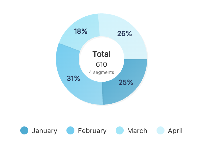
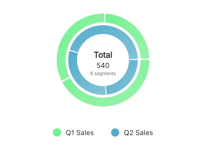
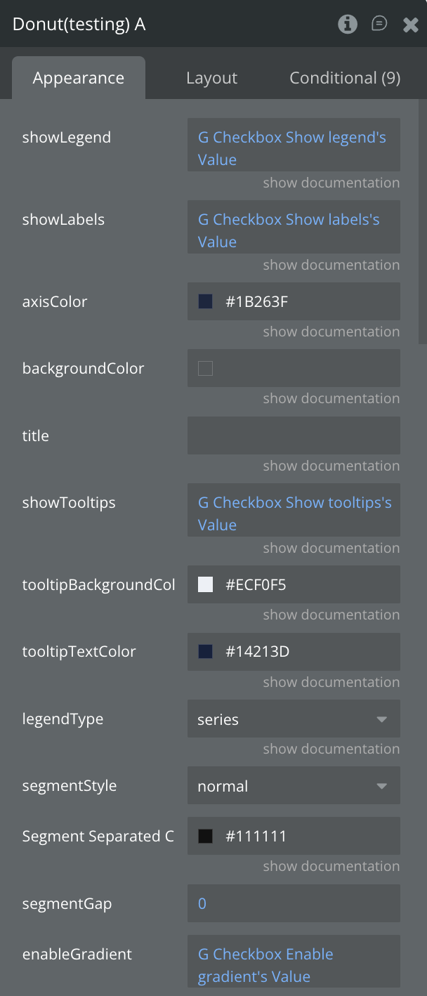
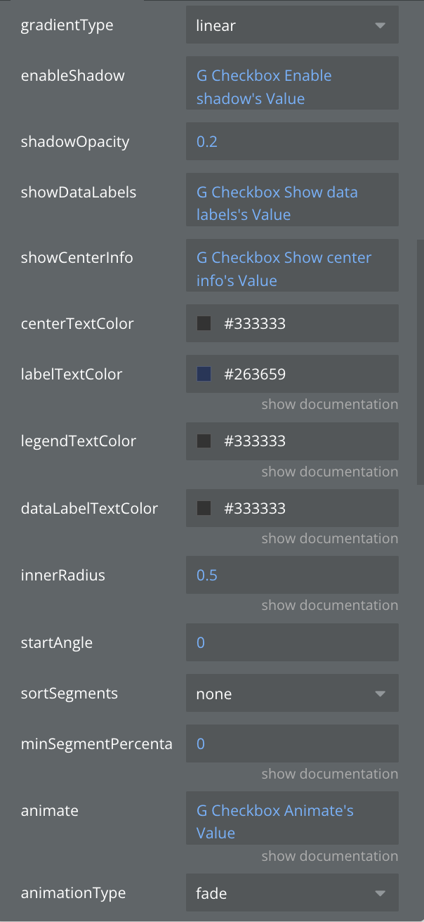
Donut Chart
A pie chart with a hollow center, providing space for additional information or totals. Perfect for displaying composition data while maintaining a modern, clean aesthetic with the ability to show key metrics in the center.
Single series
Multiple series
Fields:
Title | Description | Type |
Data JSON | JSON string containing the data to be visualized in the chart | Text |
Segment Separated Color | color outline, when segmentStyle - separated | Color |
animate | Enable smooth animations when chart loads or updates | Boolean |
animationDuration | Animation duration in milliseconds (e.g., 800ms) | Number |
animationType | Animation style when chart appears: grow, fade, slide, or rotate | Dropdown |
axisColor | Customize the color of X and Y axes | Text |
backgroundColor | Set the background color for the entire chart area | Text |
centerTextColor | Color of text displayed in donut center | Text |
dataLabelTextColor | you can set your own color or the color will be taken from the general color | Color |
enableGradient | Apply gradient color effects to chart elements | Boolean |
enableShadow | Add shadow effects to chart elements | Boolean |
gradientType | Gradient pattern: linear (straight) or radial (circular) | Dropdown |
innerRadius | Inner circle size of donut as ratio (0.0 = pie, 0.5 = medium, 0.8 = thin ring) | Number |
labelTextColor | Color for percentage labels on segments | Color |
legendTextColor | Color for legend text | Color |
legendType | Legend display mode: by areas, series, bars, or segments | Dropdown |
minSegmentPercentage | Minimum percentage required to display a segment | Number |
segmentGap | Space between donut segments in pixels | Number |
segmentStyle | Donut segment appearance: normal, rounded edges, or separated | Dropdown |
shadowOpacity | Transparency of shadow (0.0 = invisible, 1.0 = solid) | Number |
showCenterInfo | Display information in the center of donut chart | Boolean |
showDataLabels | Display numeric values on or near chart elements | Boolean |
showLabels | Show or hide data point labels on the chart | Boolean |
showLegend | Enable or disable the chart legend display | Boolean |
showTooltips | Enable interactive tooltips on hover/tap over data points | Boolean |
sortSegments | Sort segments: none, ascending, or descending by value | Dropdown |
startAngle | Starting rotation angle of the chart in degrees (0-360) | Number |
title | Chart title text displayed at the top | Text |
tooltipBackgroundColor | Background color for tooltip popup | Color |
tooltipTextColor | Text color inside the tooltip | Color |
States:
Name | Description | Type |
currentType | Current chart type being displayed | Text |
currentData | Current chart data in JSON format | Text |
error | Error message if chart fails to render | Text |
selected_label | Label of the selected chart item | Text |
selected_value | Value of the selected chart item | Number |
tooltipVisible | Whether tooltip is currently visible | Boolean |
tooltipData | Data of the currently displayed tooltip | Text |
animationState | Current animation state | Text |
selected_series | Currently selected series | Text |
currentSegmentStyle | Current segment style | Text |
selectedSeriesIndex | Index of selected series | Number |
centerData | Data displayed in center | Text |
hoveredSegmentIndex | Index of hovered segment | Number |
totalValue | Total value of all segments | Number |
visibleSegmentsCount | Count of visible segments | Number |
Events:
Name | Description |
Item Selected | Triggered when a user taps/clicks on a chart item |
onTooltipShow | Triggered when a tooltip becomes visible |
onTooltipHide | Triggered when a tooltip is hidden |
Animation Completed | Triggered when chart animation completes |
Series Selected | Triggered when a series is selected |
Center Pressed | Triggered when center area is pressed |
Segment Double Tap | Triggered when a segment is double tapped |
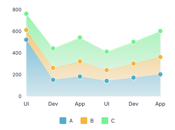
Stacked Area Chart
Shows multiple data series stacked on top of each other to display cumulative values over time. Ideal for visualizing how different components contribute to a total, such as revenue by product category or traffic sources.
Fields:
Title | Description | Type |
Data JSON | Stacked chart data in JSON format with series and labels.
Example JSON:
[{"label": "January","series": [{"label": "Desktop","value": 120,"color": "#2196F3"},{"label": "Mobile","value": 90,"color": "#FF5722"}]},{"label": "February","series": [{"label": "Desktop","value": 150,"color": "#2196F3"},{"label": "Mobile","value": 110,"color": "#FF5722"}]},{"label": "March","series": [{"label": "Desktop","value": 180,"color": "#2196F3"},{"label": "Mobile","value": 140,"color": "#FF5722"}]}] | Text |
animate | Enable smooth animations when chart loads or updates | Boolean |
animationDuration | Animation duration in milliseconds (e.g., 800ms) | Number |
animationType | Animation style when chart appears: grow, fade, slide, or rotate | Dropdown |
areaStyle | Area visualization: filled, stacked, overlapped, or streamgraph | Dropdown |
axisColor | Customize the color of X and Y axes | Text |
backgroundColor | Set the background color for the entire chart area | Text |
dataLabelColor | dataLabelColor | Color |
enableAreaStroke | Add border line around filled areas | Boolean |
enableGradient | Apply gradient color effects to chart elements | Boolean |
enableShadow | Add shadow effects to chart elements | Boolean |
gradientDirection | Direction of gradient: vertical, horizontal, or radial | Dropdown |
legendType | Legend display mode: by areas, series, bars, or segments | Dropdown |
markerSize | Size of data point markers in pixels | Number |
shadowOpacity | Transparency of shadow (0.0 = invisible, 1.0 = solid) | Number |
showDataLabels | Display numeric values on or near chart elements | Boolean |
showGrid | Display grid lines for better data reading | Boolean |
showLabels | Show or hide data point labels on the chart | Boolean |
showLegend | Enable or disable the chart legend display | Boolean |
showMarkers | Show circular markers at each data point | Boolean |
showStackLabels | Display total values for each stack | Boolean |
showTooltips | Enable interactive tooltips on hover/tap over data points | Boolean |
stackLabelColor | stackLabelColor | Color |
stackingMode | Stacking calculation: normal (absolute values) or percent (relative %) | Dropdown |
strokeWidth | Width of stroke/border lines in pixels | Number |
tooltipBackgroundColor | Background color for tooltip popup | Color |
tooltipTextColor | Text color inside the tooltip | Color |
States:
Name | Description | Type |
currentType | Current chart type being displayed | Text |
currentData | Current chart data in JSON format | Text |
error | Error message if chart fails to render | Text |
selected_label | Label of the selected chart item | Text |
selected_value | Value of the selected chart item | Number |
tooltipVisible | Whether tooltip is currently visible | Boolean |
tooltipData | Data of the currently displayed tooltip | Text |
animationState | Current animation state | Text |
currentStackingMode | Current stacking mode | Text |
selectedDatasetIndex | Index of selected dataset | Number |
stackTotals | Total values for each stack | Text |
hoveredAreaIndex | Index of hovered area | Number |
maxStackValue | Maximum stack value | Number |
visibleSeriesCount | Count of visible series | Number |
Events:
Name | Description |
Item Selected | Triggered when a user taps/clicks on a chart item |
onTooltipShow | Triggered when a tooltip becomes visible |
onTooltipHide | Triggered when a tooltip is hidden |
animation_completed | Triggered when chart animation completes |
dataset_selected | Triggered when a dataset is selected |
stack_selected | Triggered when a stack is selected |
area_double_tap | Triggered when an area is double tapped |
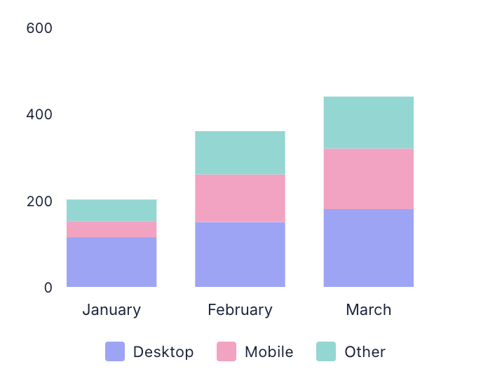
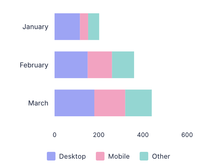
Stacked Bar Chart
Displays multiple data series stacked within bars to show both individual and total values. Excellent for comparing total quantities across categories while showing the composition of each total, like sales by region and product type.
Vertical
Horizontal
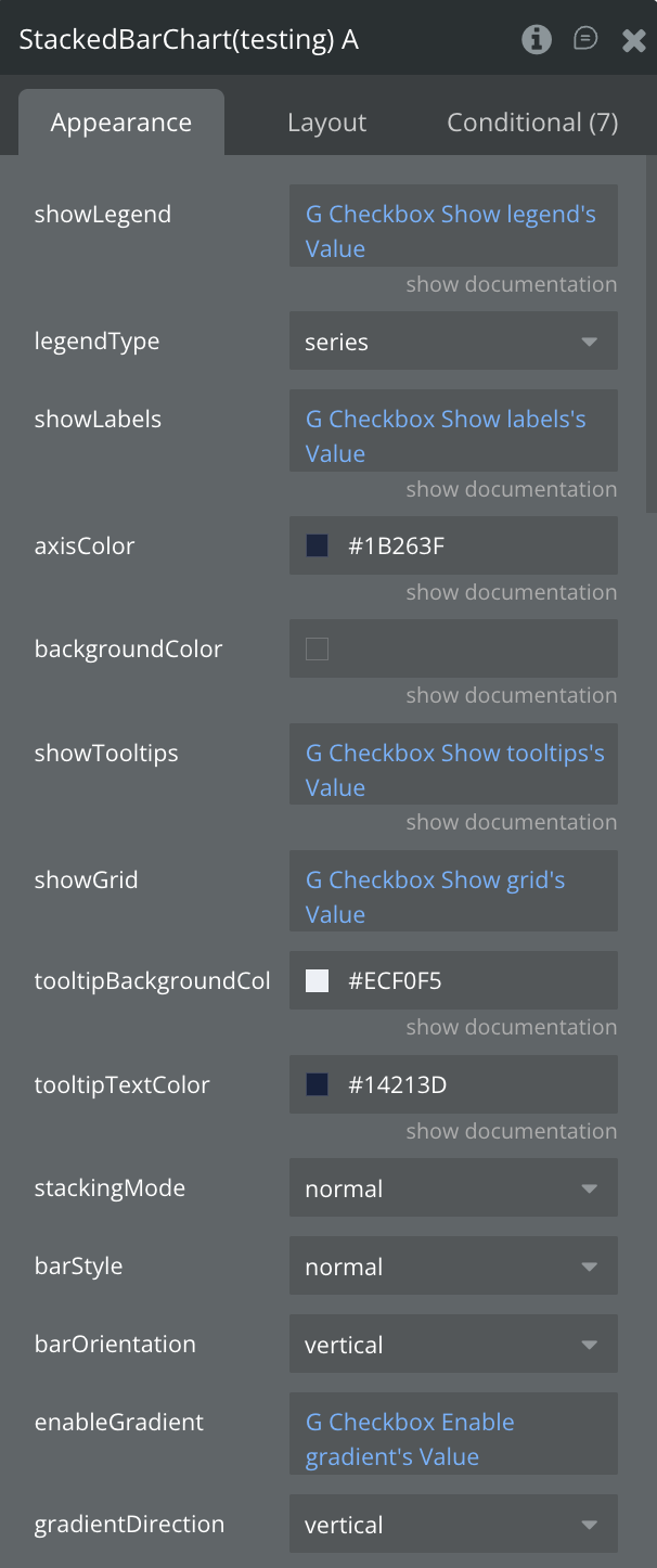
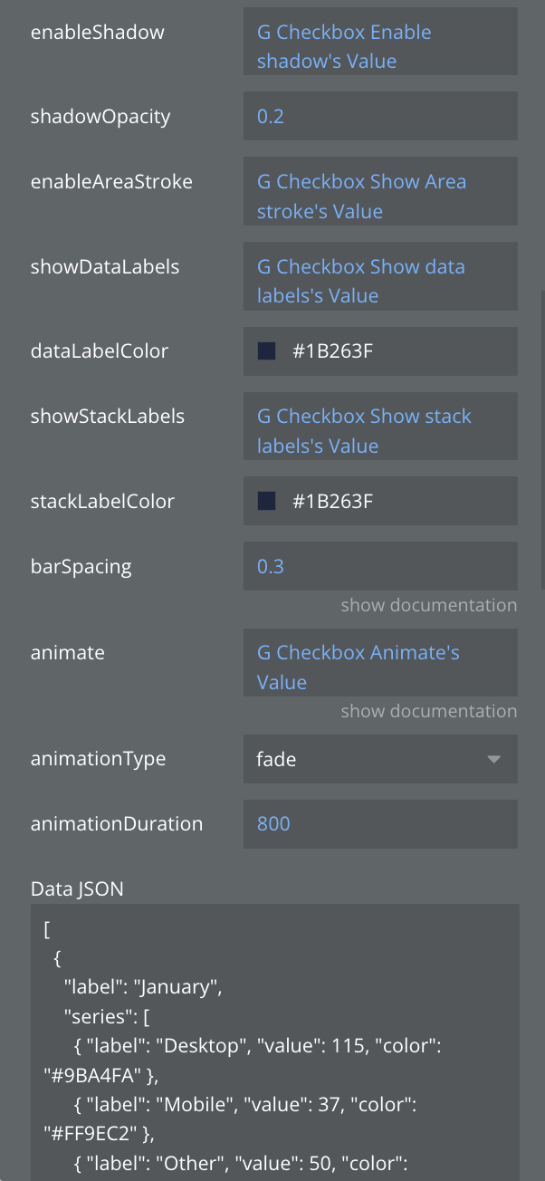
Fields:
Title | Description | Type |
Data JSON | Stacked chart data in JSON format with series and labels.
Example JSON:
[{"label": "January","series": [{"label": "Desktop","value": 120,"color": "#2196F3"},{"label": "Mobile","value": 90,"color": "#FF5722"}]},{"label": "February","series": [{"label": "Desktop","value": 150,"color": "#2196F3"},{"label": "Mobile","value": 110,"color": "#FF5722"}]},{"label": "March","series": [{"label": "Desktop","value": 180,"color": "#2196F3"},{"label": "Mobile","value": 140,"color": "#FF5722"}]}] | Text |
animate | Enable smooth animations when chart loads or updates | Boolean |
animationDuration | Animation duration in milliseconds (e.g., 800ms) | Number |
animationType | Animation style when chart appears: grow, fade, slide, or rotate | Dropdown |
axisColor | Customize the color of X and Y axes | Text |
backgroundColor | Set the background color for the entire chart area | Text |
barOrientation | Bar direction: vertical (columns) or horizontal (rows) | Dropdown |
barSpacing | Space between bars as a ratio (0.0 = no space, 1.0 = max space) | Number |
barStyle | Visual style of bars: rounded corners, square, or gradient | Dropdown |
dataLabelColor | dataLabelColor | Color |
enableAreaStroke | Add border line around filled areas | Boolean |
enableGradient | Apply gradient color effects to chart elements | Boolean |
enableShadow | Add shadow effects to chart elements | Boolean |
gradientDirection | Direction of gradient: vertical, horizontal, or radial | Dropdown |
legendType | Legend display mode: by areas, series, bars, or segments | Dropdown |
shadowOpacity | Transparency of shadow (0.0 = invisible, 1.0 = solid) | Number |
showDataLabels | Display numeric values on or near chart elements | Boolean |
showGrid | Display grid lines for better data reading | Boolean |
showLabels | Show or hide data point labels on the chart | Boolean |
showLegend | Enable or disable the chart legend display | Boolean |
showStackLabels | Display total values for each stack | Boolean |
showTooltips | Enable interactive tooltips on hover/tap over data points | Boolean |
stackLabelColor | stackLabelColor | Color |
stackingMode | Stacking calculation: normal (absolute values) or percent (relative %) | Dropdown |
tooltipBackgroundColor | Background color for tooltip popup | Color |
tooltipTextColor | Text color inside the tooltip | Color |
States:
Name | Description | Type |
currentType | Current chart type being displayed | Text |
currentData | Current chart data in JSON format | Text |
error | Error message if chart fails to render | Text |
selected_label | Label of the selected chart item | Text |
selected_value | Value of the selected chart item | Number |
tooltipVisible | Whether tooltip is currently visible | Boolean |
tooltipData | Data of the currently displayed tooltip | Text |
animationState | Current animation state | Text |
currentStackingMode | Current stacking mode | Text |
selectedDatasetIndex | Index of selected dataset | Number |
stackTotals | Total values for each stack | Text |
hoveredBarIndex | Index of hovered bar | Number |
maxStackValue | Maximum stack value | Number |
visibleSeriesCount | Count of visible series | Number |
barWidth | Current bar width | Number |
Events:
Name | Description |
Item Selected | Triggered when a user taps/clicks on a chart item |
onTooltipShow | Triggered when a tooltip becomes visible |
onTooltipHide | Triggered when a tooltip is hidden |
Animation Completed | Triggered when chart animation completes |
Dataset Selected | Triggered when a dataset is selected |
Stack Selected | Triggered when a stack is selected |
Bar Double Tap | Triggered when a bar is double tapped |
⬇️
Below you will see a description of the old elements. They are no longer supported
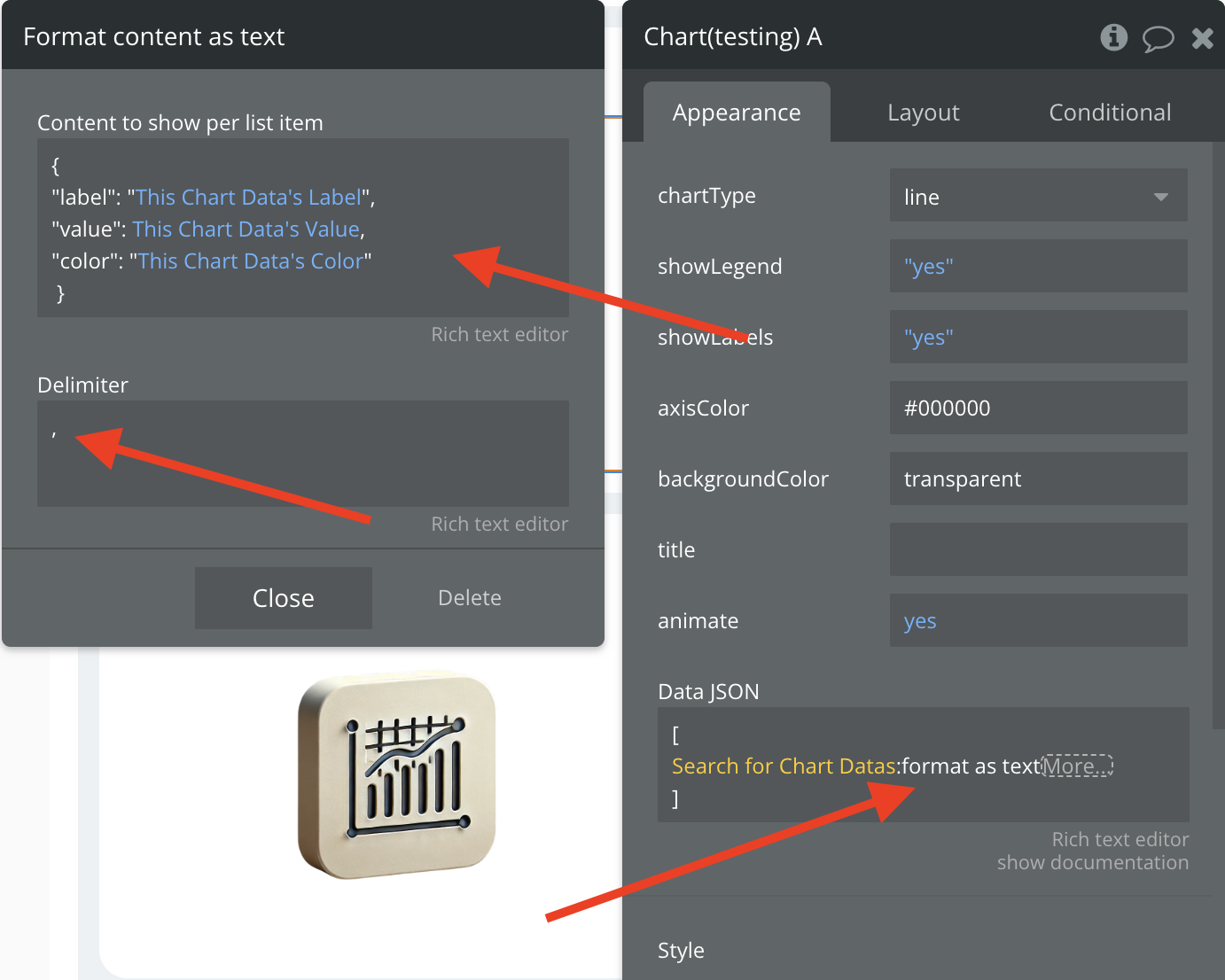
Chart (Deprecated)
The main Chart element supports various chart types including line, bar, pie, area, donut, and horizontal bar charts.
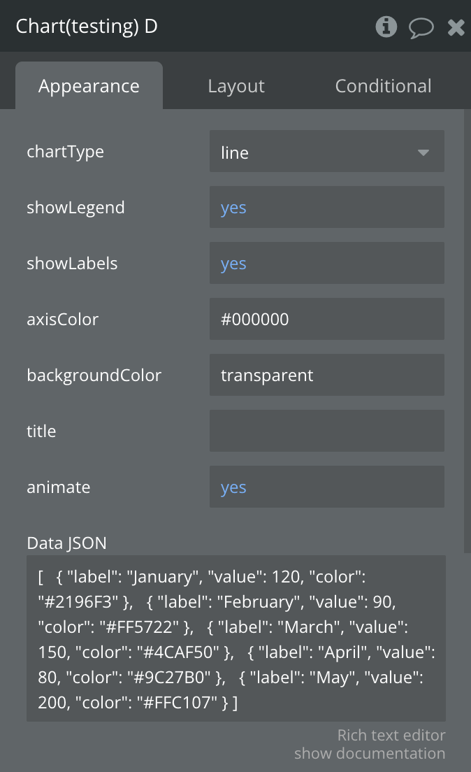
Fields:
Title | Description | Type |
chartType | Defines the type of chart to display (line, bar, or pie) | Dropdown |
showLegend | Toggles the visibility of the chart legend | Boolean |
showLabels | Toggles the visibility of data labels on the chart | Boolean |
axisColor | Sets the color of the chart axes (for line and bar charts) | Text (color code) |
backgroundColor | Sets the background color of the chart area | Text (color code) |
title | Sets the title text displayed above the chart | Text |
animate | Enables or disables chart animations | Boolean |
Data JSON | JSON string containing the data to be visualized in the chart | Text (long) |
showTooltips | Whether to show tooltips on hover/tap | Boolean |
tooltipBackgroundColor | Background color of tooltips | Color |
tooltipTextColor | Text color of tooltips | Color |
States:
Plugin States are part of plugins that are exposed values of the plugin.
Name | Description | Type |
currentType | Current chart type being displayed | Text |
currentData | Current chart data in JSON format | Text |
Error | Error message if chart fails to render | Text |
Selected label | Label of the selected chart item | Text |
Selected value | Value of the selected chart item | Number |
tooltip Visible | Whether tooltip is currently visible | Boolean |
tooltipData | Data of the currently displayed tooltip | Text |
Events:
Name | Description |
Item Selected | Triggered when a user taps/clicks on a chart item |
onTooltipShow | Triggered when a tooltip becomes visible |
onTooltipHide | Triggered when a tooltip is hidden |
Stacked Chart (Deprecated)
The Stacked Chart element is designed for displaying stacked area and stacked bar charts with multiple data series.
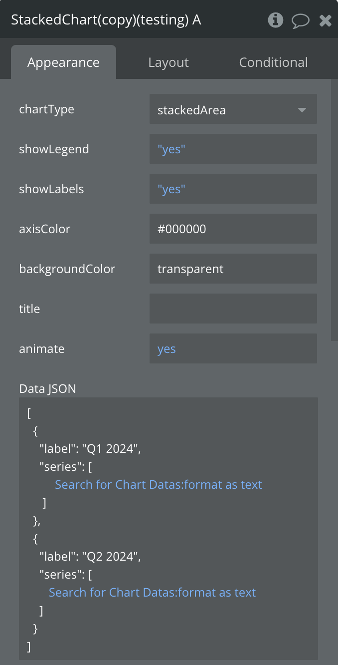
Fields:
Title | Description | Type |
chartType | Defines the type of chart to display (line, bar, or pie) | Dropdown |
showLegend | Toggles the visibility of the chart legend | Boolean |
showLabels | Toggles the visibility of data labels on the chart | Boolean |
axisColor | Sets the color of the chart axes (for line and bar charts) | Text (color code) |
backgroundColor | Sets the background color of the chart area | Text (color code) |
title | Sets the title text displayed above the chart | Text |
animate | Enables or disables chart animations | Boolean |
Data JSON | Stacked chart data in JSON format with series and labels | Text (long) |
showTooltips | Whether to show tooltips on hover/tap | Boolean |
tooltipBackgroundColor | Background color of tooltips | Color |
tooltipTextColor | Text color of tooltips | Color |
States:
Plugin States are part of plugins that are exposed values of the plugin.
Name | Description | Type |
currentType | Current chart type being displayed | Text |
currentData | Current chart data in JSON format | Text |
Error | Error message if chart fails to render | Text |
Selected label | Label of the selected chart item | Text |
Selected value | Value of the selected chart item | Number |
tooltip Visible | Whether tooltip is currently visible | Boolean |
tooltipData | Data of the currently displayed tooltip | Text |
Events:
Name | Description |
Item Selected | Triggered when a user taps/clicks on a chart item |
onTooltipShow | Triggered when a tooltip becomes visible |
onTooltipHide | Triggered when a tooltip is hidden |
Workflow example
Example 1: Creating a Basic Line Chart
- Add the Line Chart element to your page.
- Set display settings (Colors, Line style, Animation etc.)
- In the Data JSON field, enter your data in the following format:
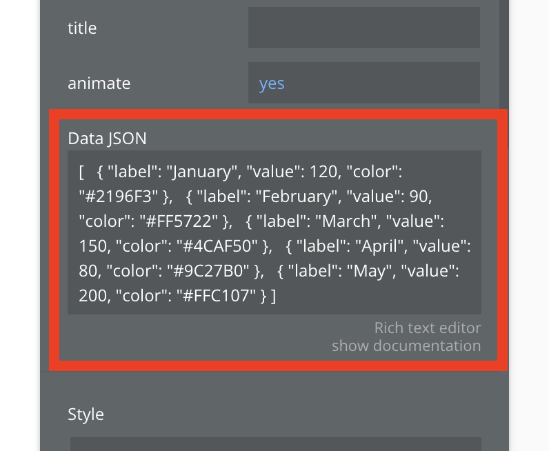
plain text[
  { "label": "January", "value": 120, "color": "#2196F3" },
  { "label": "February", "value": 90, "color": "#FF5722" },
  { "label": "March", "value": 150, "color": "#4CAF50" },
  { "label": "April", "value": 80, "color": "#9C27B0" },
  { "label": "May", "value": 200, "color": "#FFC107" }
]
- Set the chart size
Example 2: Dynamic Data Visualization
- Create a database with your chart data.
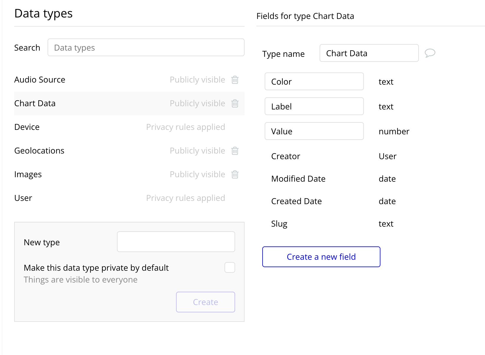
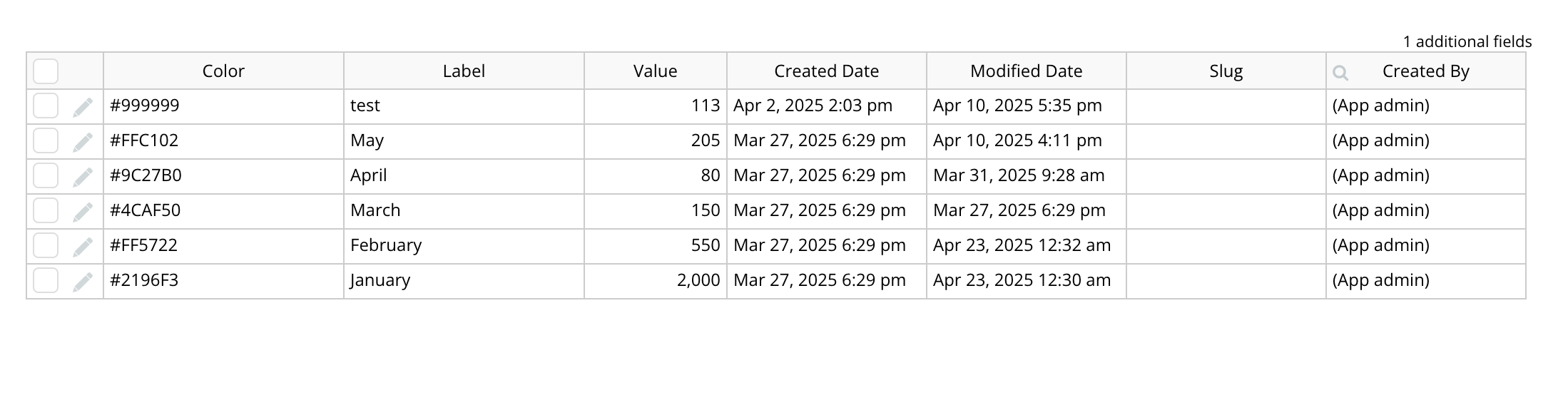
- Transform your database data into the required JSON format using Bubble's built-in functions.
- Connect the resulting JSON to the Data JSON property of the chart element using a dynamic expression.

Changelogs
Update 15.04.26 - Version 1.13.0
- improved tactile interaction with all charts.
Update 06.03.26 - Version 1.12.0
- Bubble Plugin Page Update (Category).
Update 10.12.25 - Version 1.11.0
- Bubble Plugin Page Update (Logo).
Update 08.12.25 - Version 1.10.0
- Fixed chart bugs and added new fields for deeper customization across all charts.
Update 14.11.25 - Version 1.9.0
- Bubble Plugin Page Update (Description).
Update 27.10.25 - Version 1.8.0
- Bubble Plugin Page Update (Name).
Update 12.09.25 - Version 1.7.0
- Improved chart features + new elements.
Update 29.07.25 - Version 1.6.0
- Bubble Plugin Page Update (Docs).
Update 22.07.25 - Version 1.5.0
- Bubble Plugin Page Update (Demo editor).
Update 07.07.25 - Version 1.4.0
- Added the “Stacked Chart” element, new chart types, and tooltip functionality..
Update 18.06.25 - Version 1.3.0
- Minor change (changed recommendations).
Update 09.05.25 - Version 1.2.0
- Minor update (Marketing update).
Update 25.04.25 - Version 1.1.0
- Сomponent code update.
Update 17.04.25 - Version 1.0.0
- Minor update (Marketing Update).