
Link to the plugin page:
Demo to preview the plugin:
Introduction
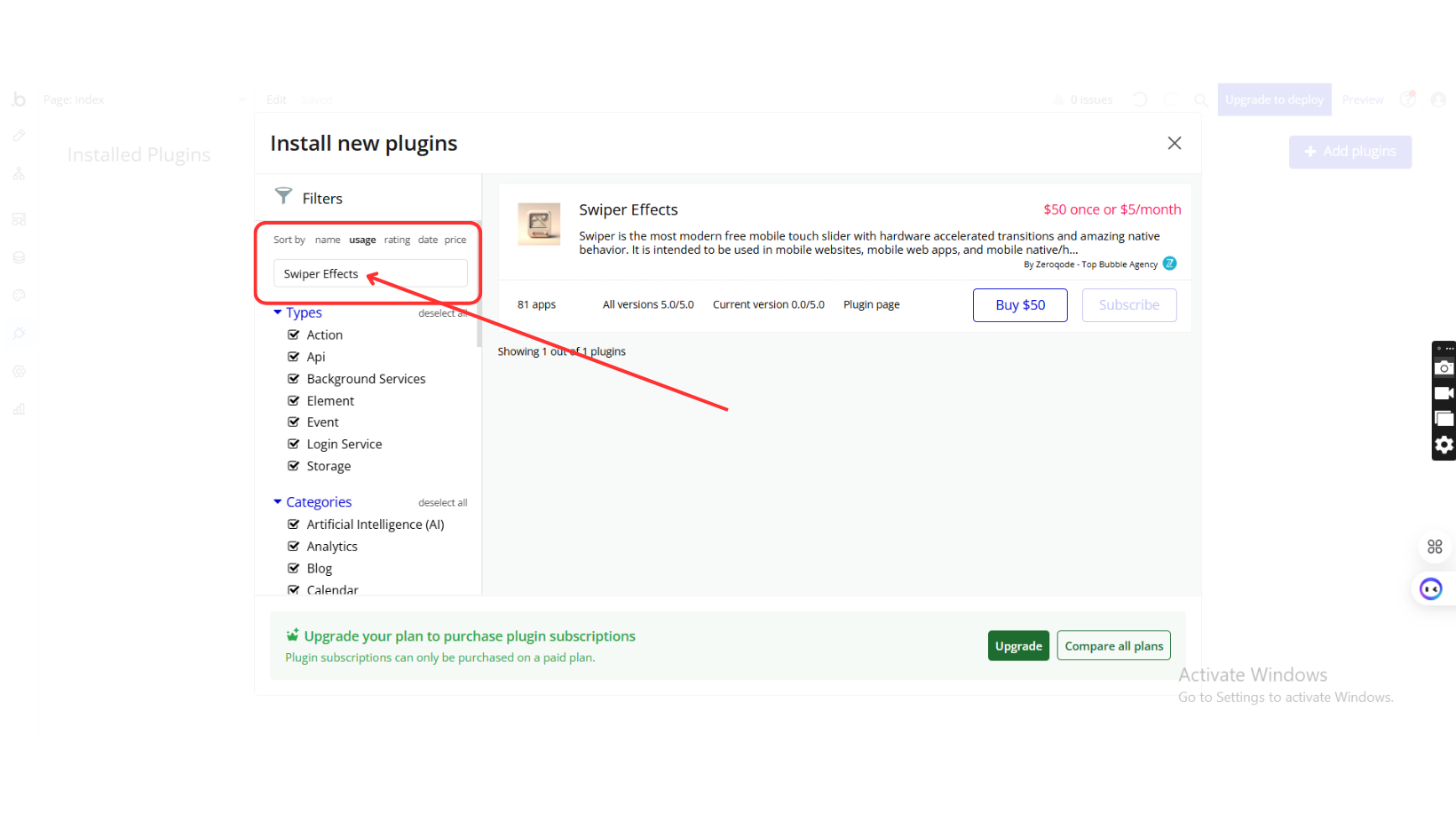
Swiper is the most modern free mobile touch slider with hardware accelerated transitions and amazing native behavior. It is intended to be used in mobile websites, mobile web apps, and mobile native/hybrid apps. The plugin has 5 effects, different pagination types, autoplay mode, and many other features.
Key Features
Prerequisites
Before using the Swiper Effects Plugin, ensure you have:
- A Bubble.io application where the plugin will be integrated.
- Installed the Swiper Effects Plugin from Zeroqode.
- A basic understanding of Bubble workflows and custom states.

How to setup
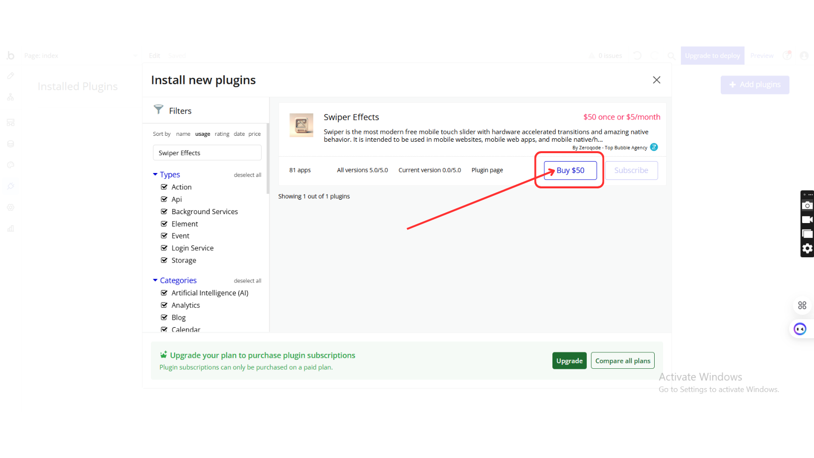
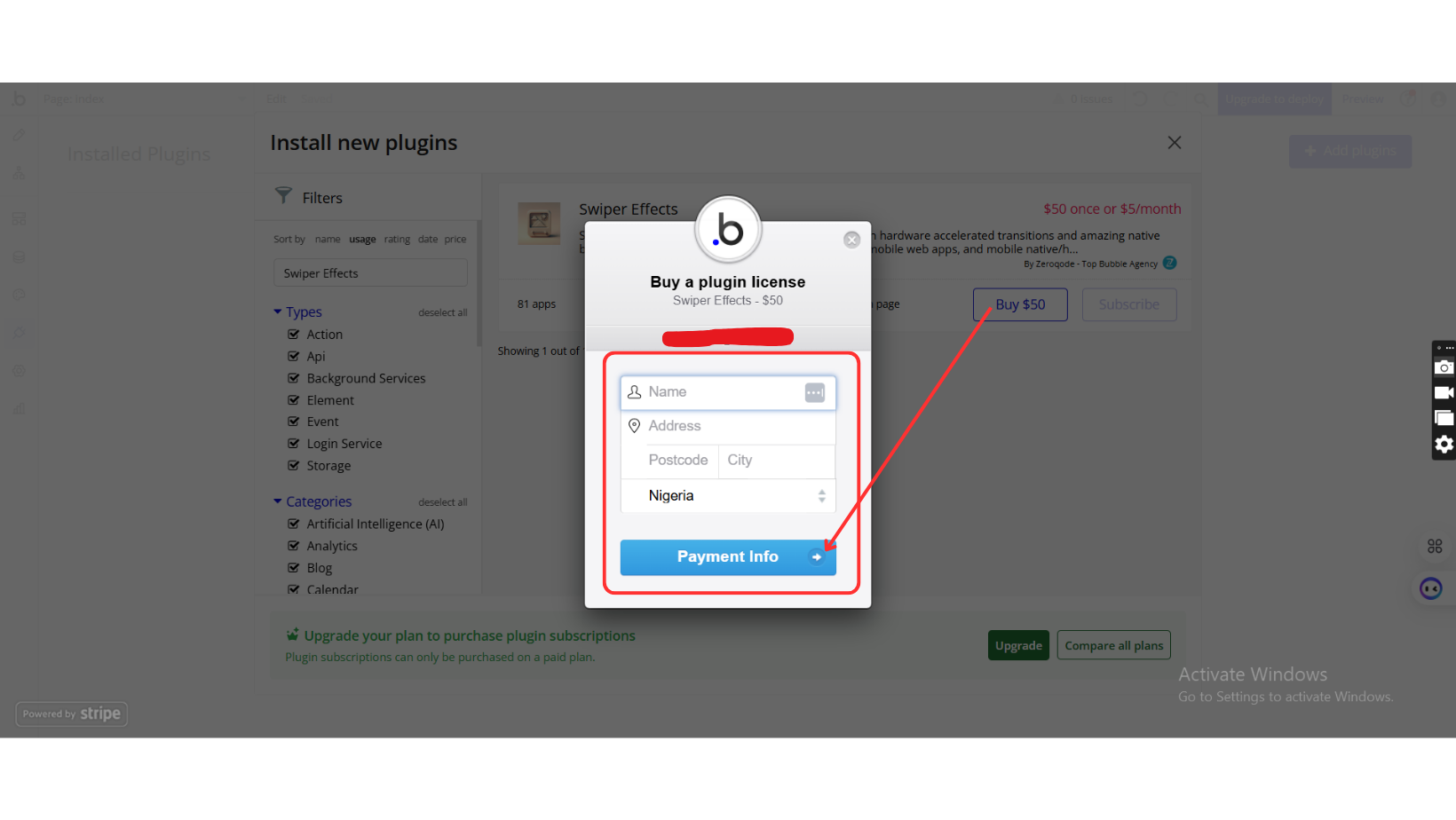
Step 1: Install the Plugin
Step 2: Add the Plugin Element to Your Page
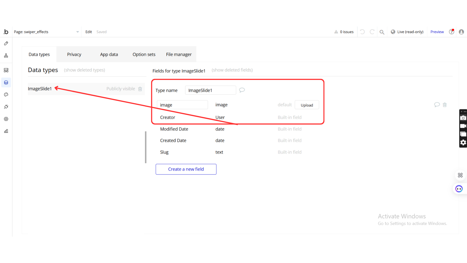
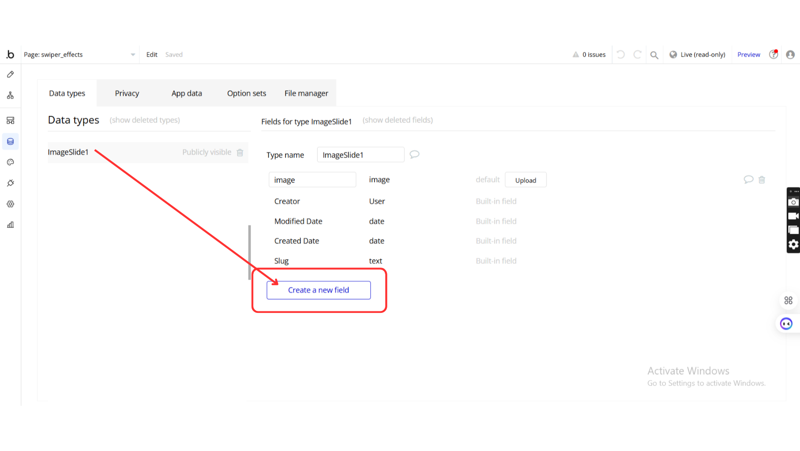
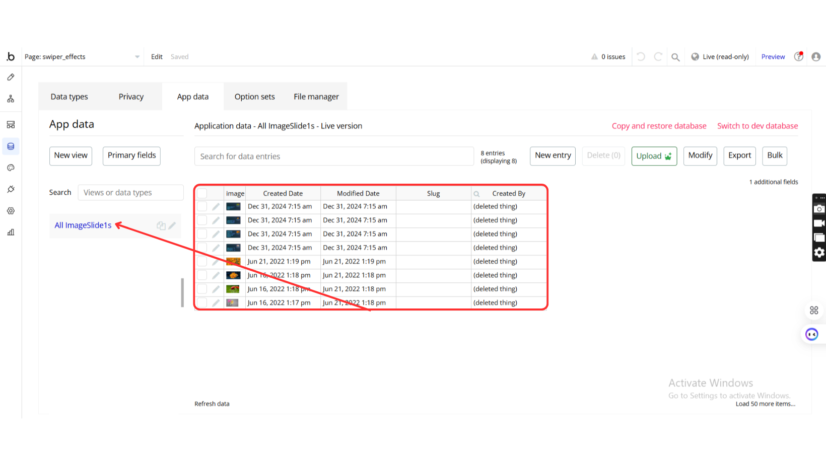
Step 3: Set Up the Database
Step 4: Configure the Repeating Group
Step 5: Add a Group Inside the Repeating Group
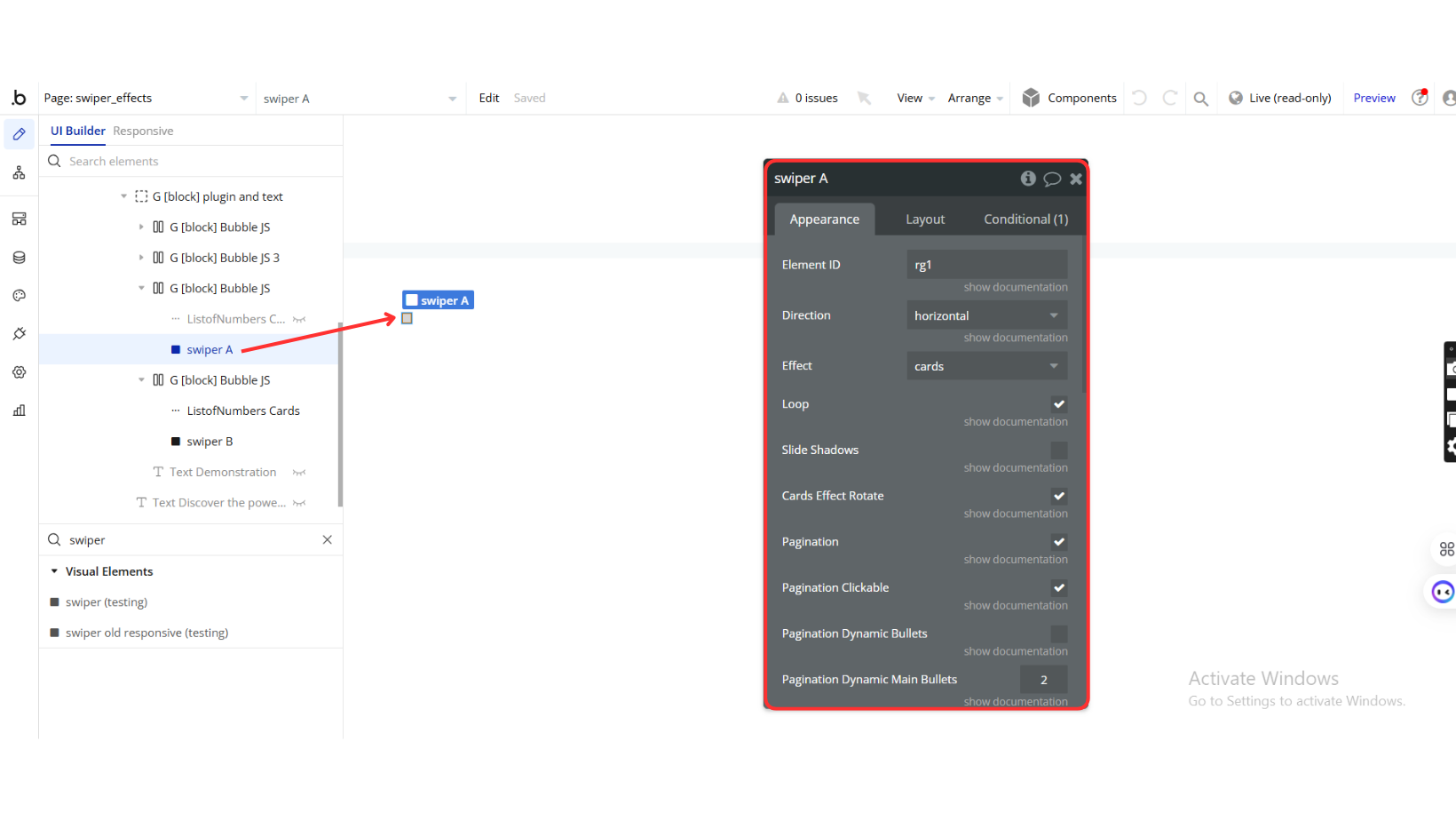
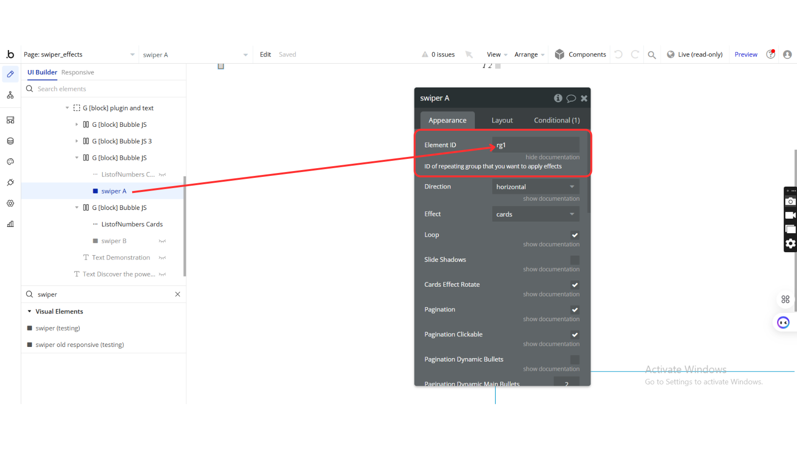
Plugin Element Properties
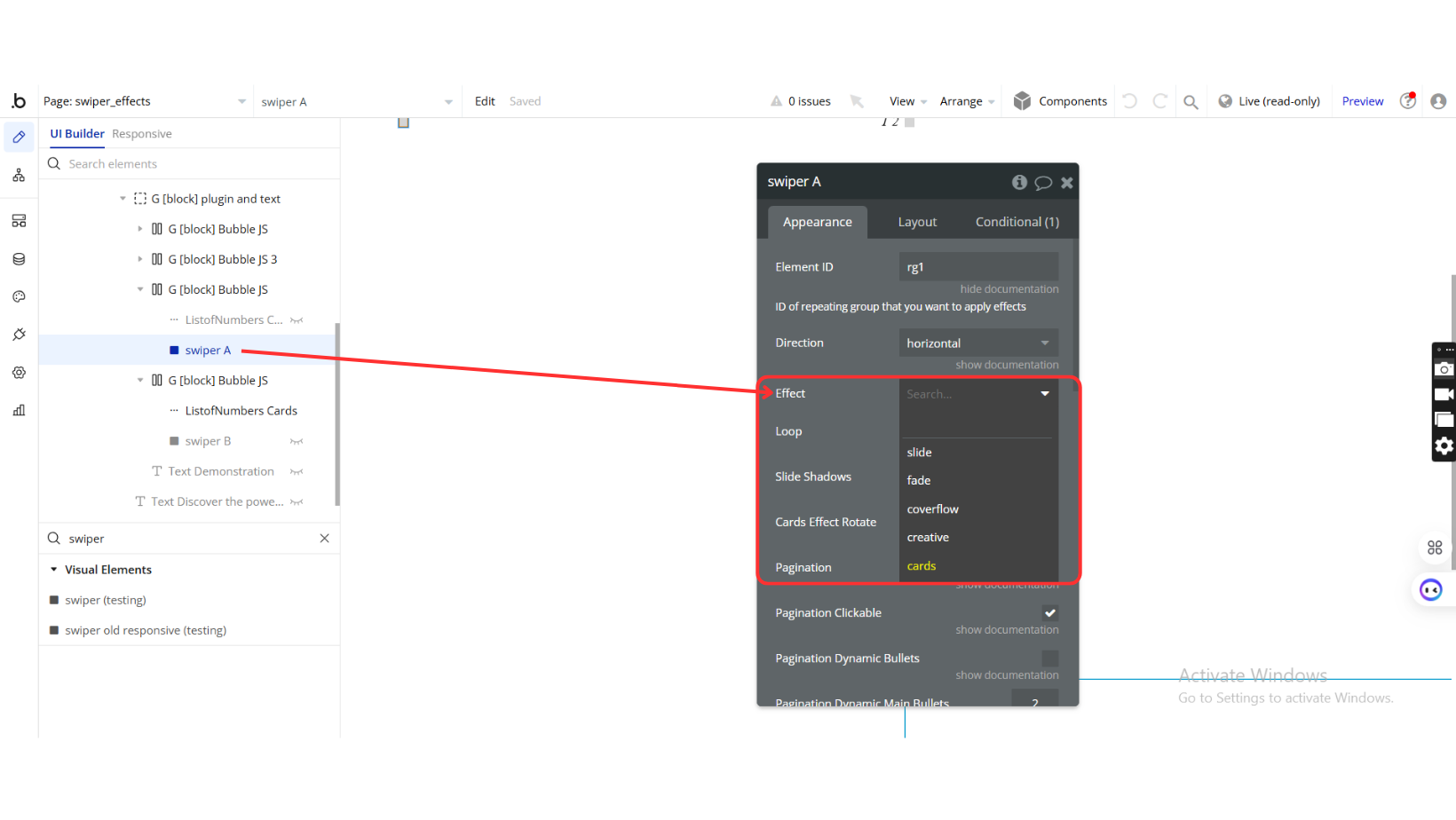
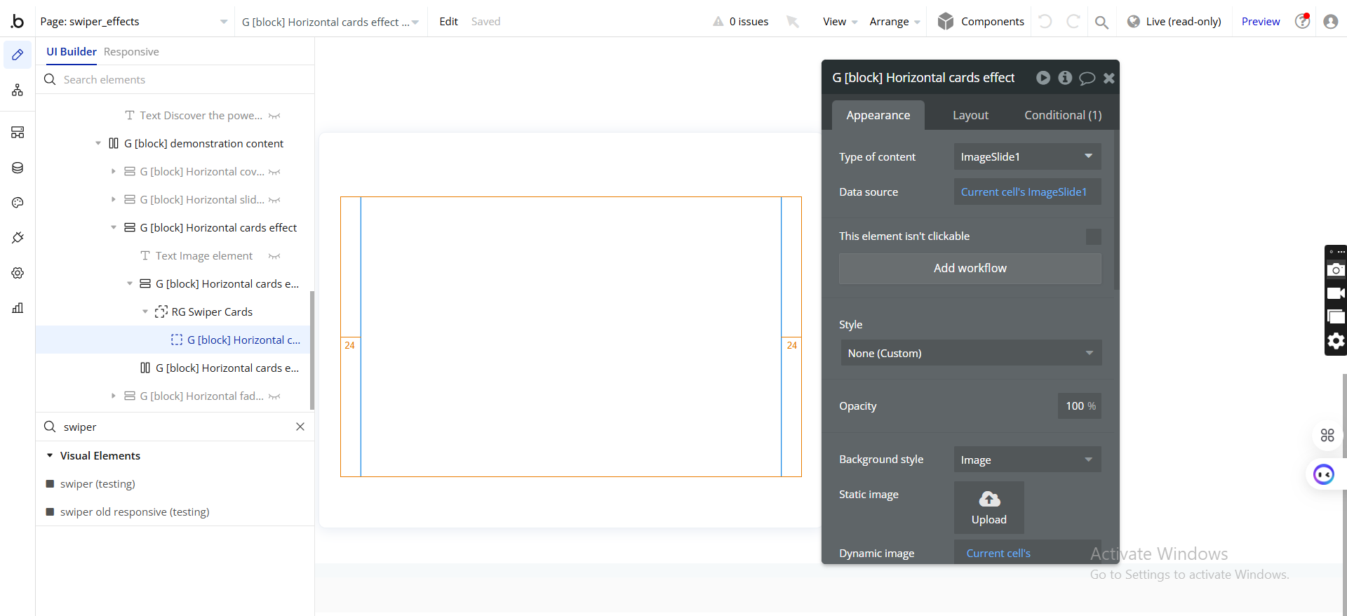
The Swiper element is the core component of the plugin, responsible for rendering the slider and applying the selected effects. It provides extensive customization options, allowing users to configure navigation, autoplay, pagination, and various transition effects. Below is a breakdown of its key settings and properties.
Swiper
Fields:
Title | Description | Type |
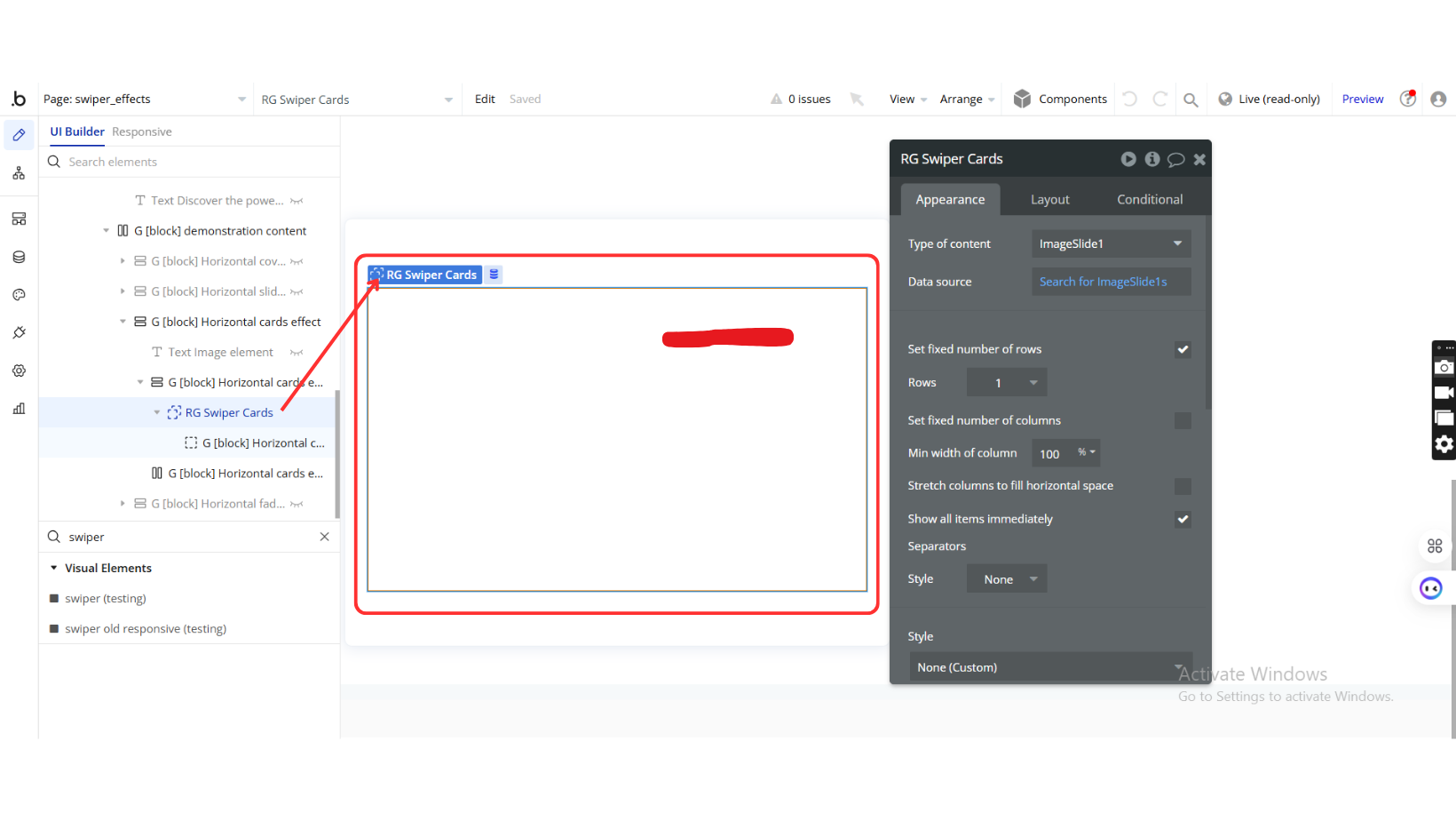
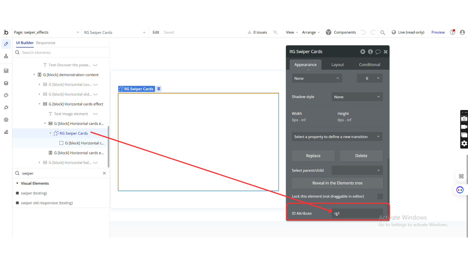
Element_id | ID of the repeating group where effects are applied | Text |
Direction | Defines slider direction: horizontal or vertical | Text |
Effect | Choose from slide, fade, coverflow, creative, cards | Dropdown |
Loop | Enables continuous loop mode | Checkbox (yes/no) |
SlideShadows | Enables slide shadows for enhanced visuals | Checkbox (yes/no) |
Cardseffect_rotate | Enables card rotation for Cards Effect | Checkbox (yes/no) |
Pagination | Enables pagination controls | Checkbox (yes/no) |
Pagination_clickable | Allows pagination bullets to be clickable | Checkbox (yes/no) |
Pagination_dynamicBullets | Displays only a few bullets at a time for better visibility | Checkbox (yes/no) |
Pagination_dynamicMainBullets | Sets the number of visible main bullets when dynamic bullets are enabled | Number |
Pagination_type | Options: bullets, fraction, progressbar | Dropdown |
Pagination_el_id | Assigns an element ID for pagination | Text |
Autoplay | Enables autoplay mode | Checkbox (yes/no) |
Autoplay_delay | Sets delay between slide transitions (in milliseconds) | Number (optional) |
Coverflow_rotate | Sets rotation degree for Coverflow effect | Number |
Coverflow_scale | Defines scale effect for Coverflow effect | Number |
Prev_translate | Sets transformations for the previous slide in Creative Effect | Text |
Next_translate | Sets transformations for the next slide in Creative Effect | Text |
Initial Slide | Defines the initial slide index (starts from 1) | Number |
Element Actions
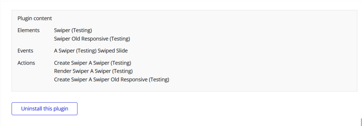
- Create Swiper
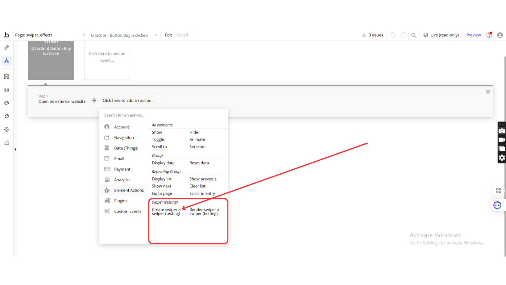
Initializes the swiper element with selected settings.
- Render Swiper
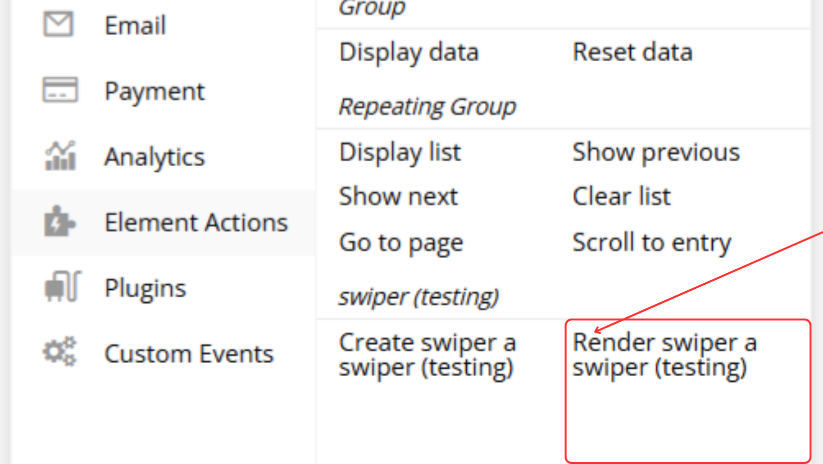
Renders the swiper component dynamically.
Exposed states
Title | Description | Type |
Current Index | Returns the index number of the currently active slide | Number |
Element Events
Title | Description |
Swiped Slide | Event triggered when a slide is swiped |
