Plugin Information
Link to the plugin page: https://zeroqode.com/plugin/1617625558039x787747316858042600
Demo to Preview the Plugin
Introduction
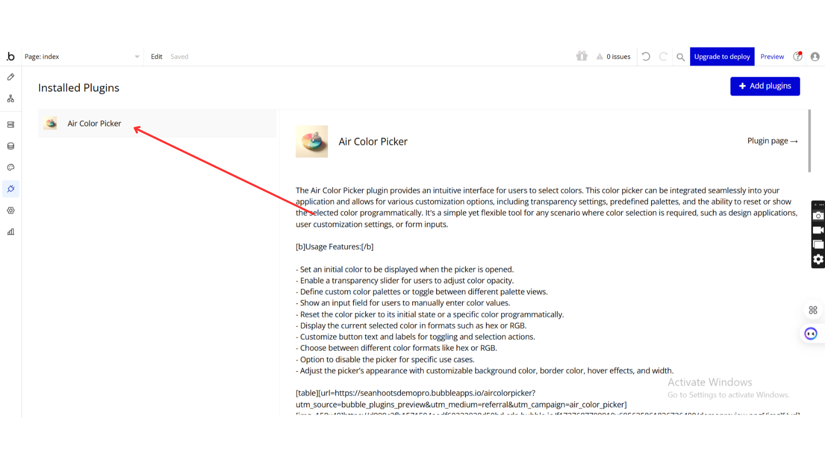
The Air Color Picker plugin provides an intuitive interface for users to select colors. This color picker can be integrated seamlessly into your application and allows for various customization options, including transparency settings, predefined palettes, and the ability to reset or show the selected color programmatically. It's a simple yet flexible tool for any scenario where color selection is required, such as design applications, user customization settings, or form inputs.
See Key Features:
Prerequisites
To use the Air Color Picker Plugin for Bubble by Zeroqode, ensure the following:
- You must have an active Bubble account.
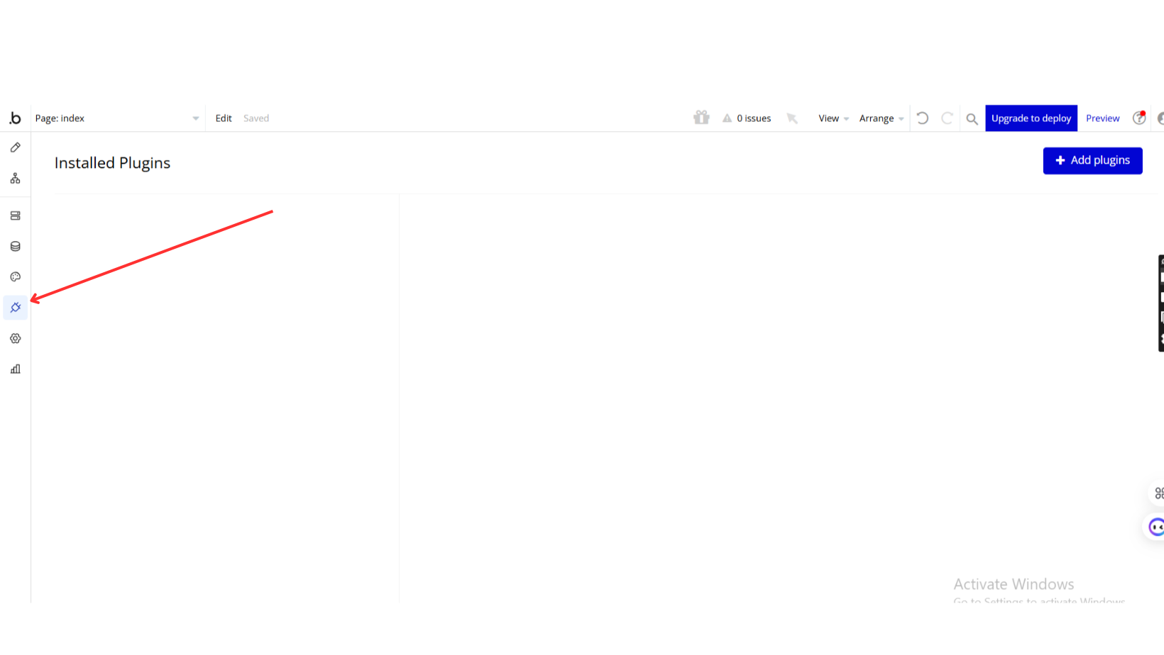
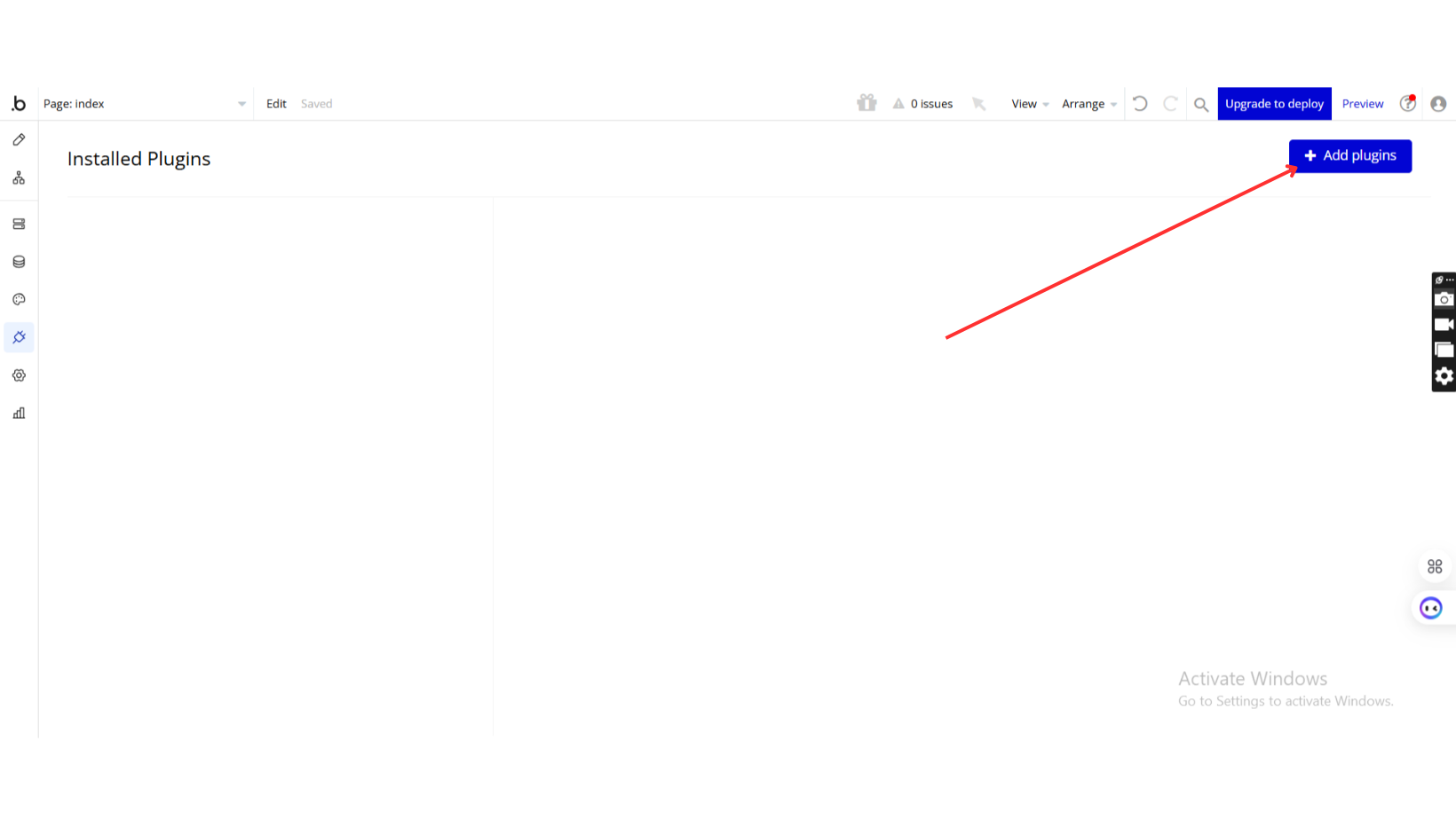
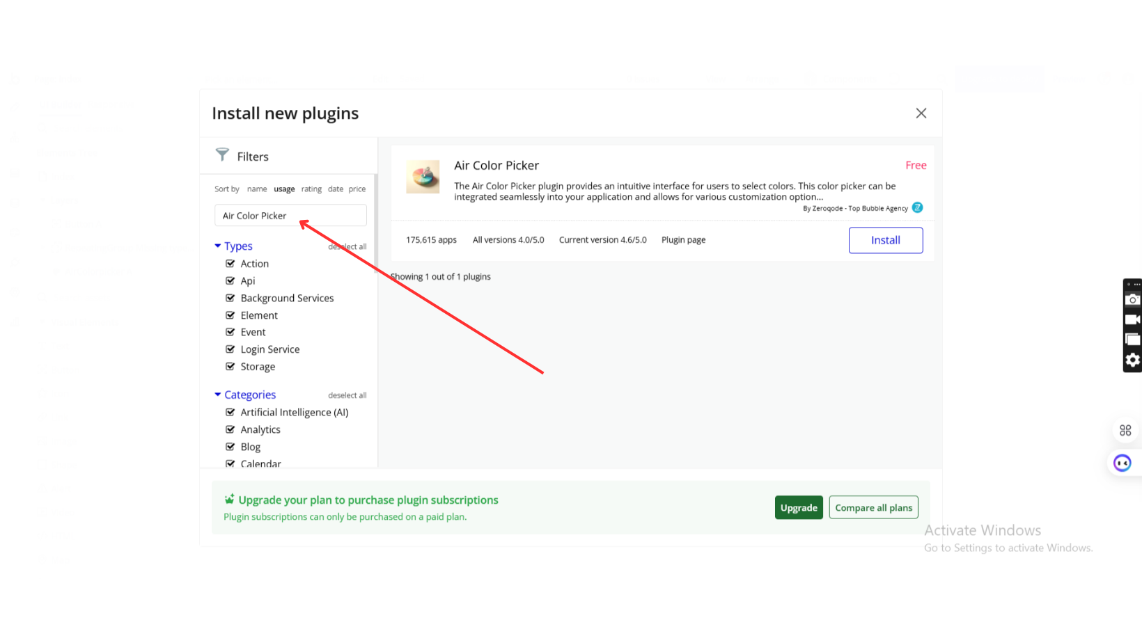
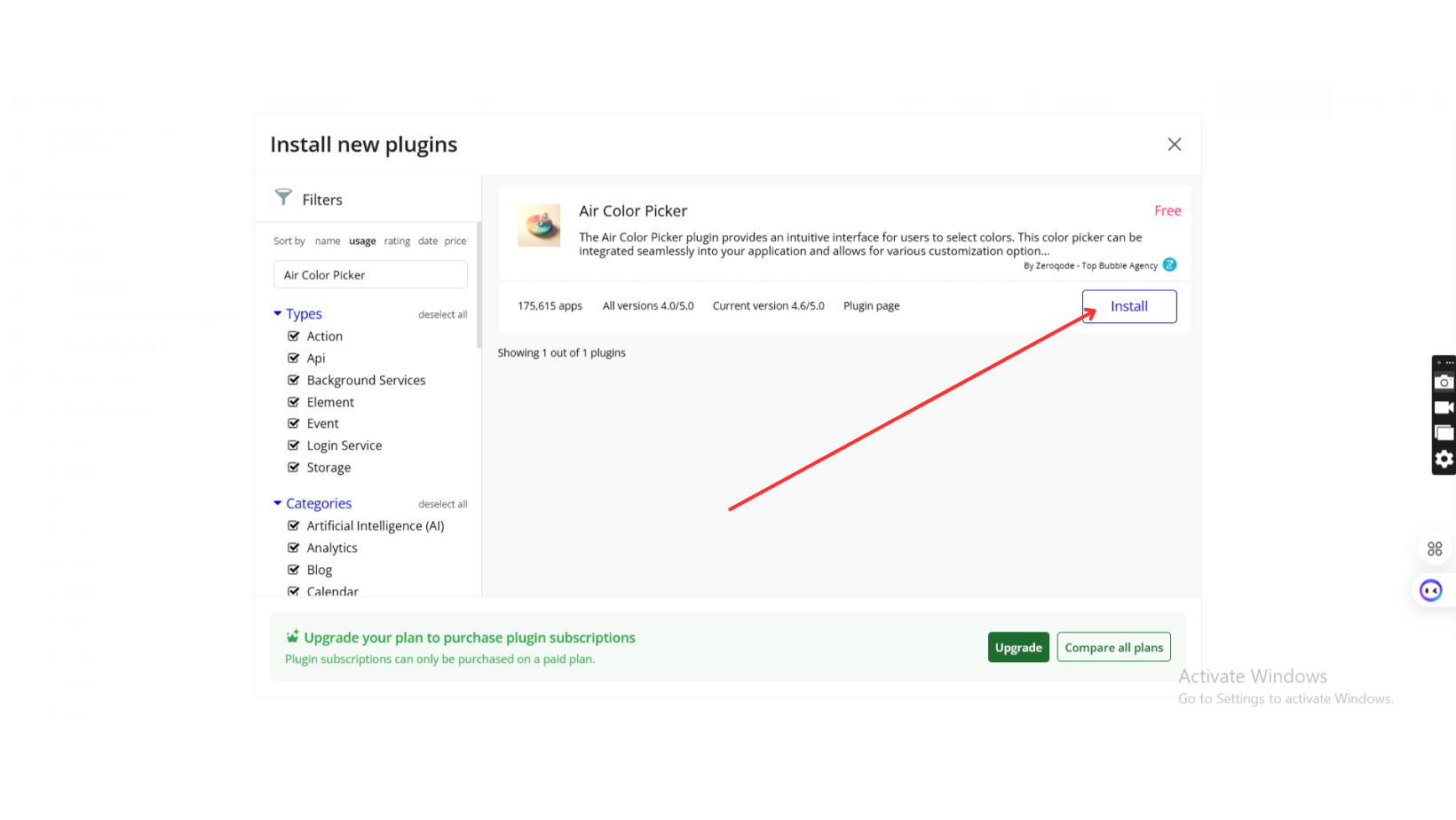
- The plugin should be installed from the Zeroqode Plugin Marketplace or added directly from the plugin page.
- The plugin is compatible with a wide range of browsers, allowing users to access and use it on both desktop and mobile devices, including:
- Internet Explorer 6 and later
- Chrome 4 and later
- Firefox 3.6 and later
- Safari 4 and later
- Opera 11.1 and later
- macOS devices
Support Our Efforts
👛 Support our mission to keep this plugin free! Your donations allow us to dedicate time and resources to maintaining and improving it for everyone’s benefit. Contribute here: https://zeroqo.de/support.

How to setup
Step 1: Install the Plugin
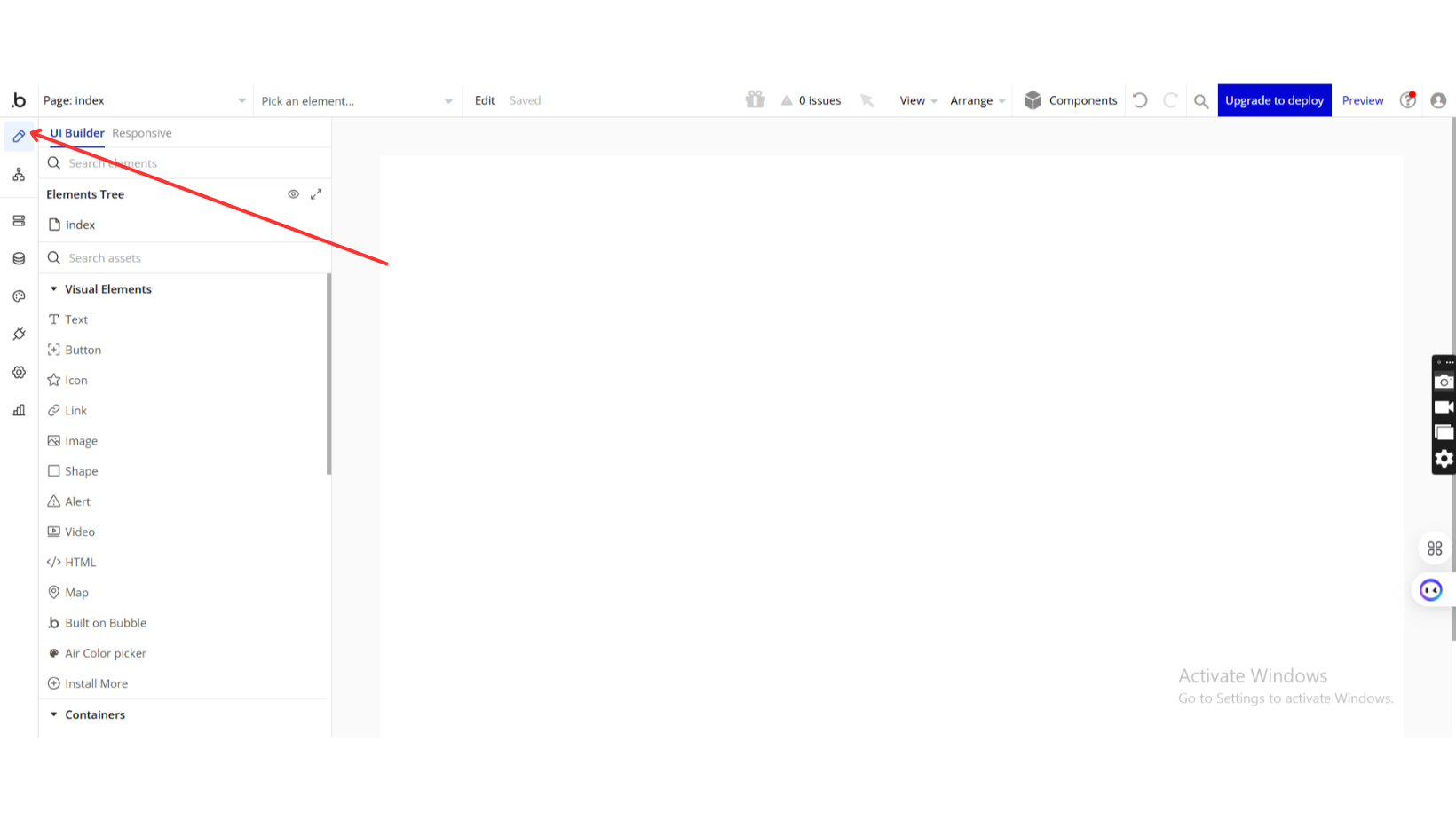
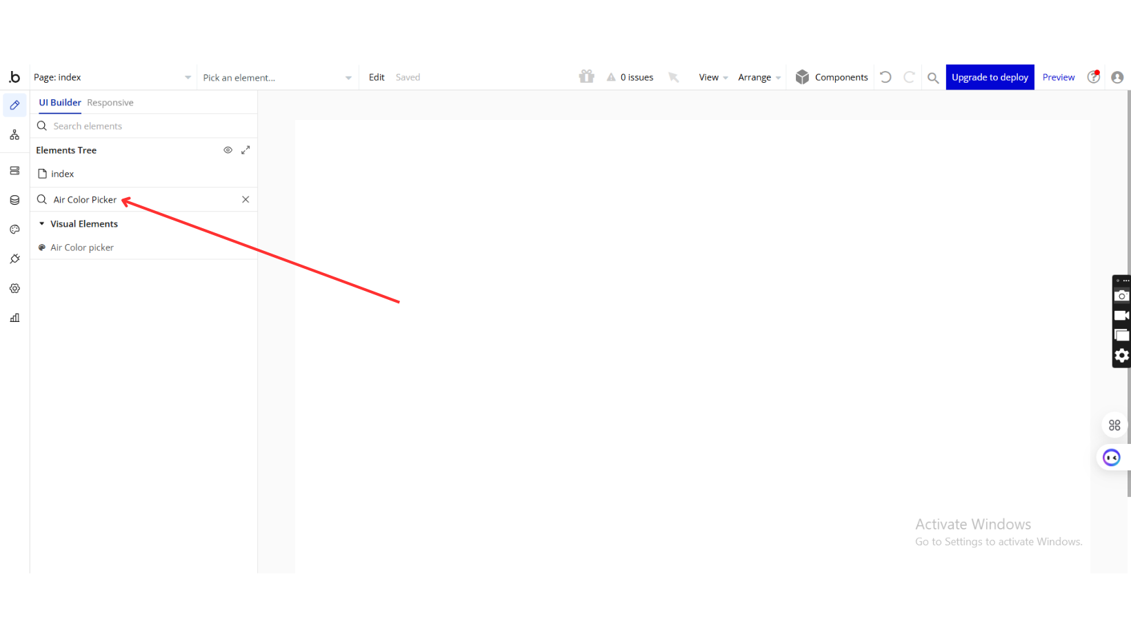
Step 2: Add Air Color Picker to Your App
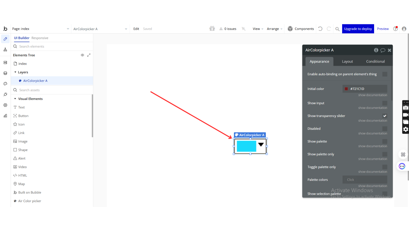
Step 3: Configure the Air Color Picker
Plugin Element Properties
Air Color picker
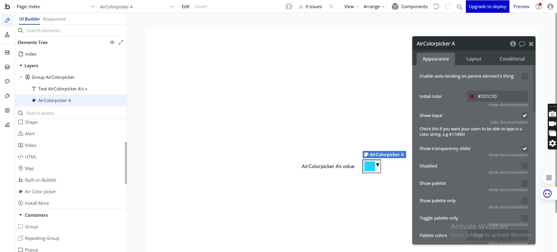
Fields:
Title | Description | Type |
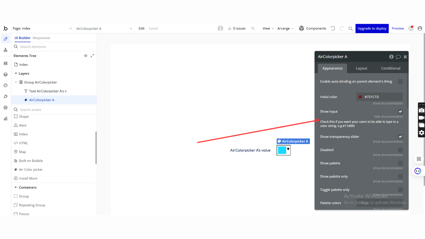
Initial color | The initial color of the color picker | Text |
Show input | Check this if you want your users to be able to type in a color string. e.g #17d9fd | Checkbox (yes/no) |
Show transparency slider | Check to allow for alpha transparency selection | Checkbox (yes/no) |
Disabled | If checked, the color picker will be disabled | Checkbox (yes/no) |
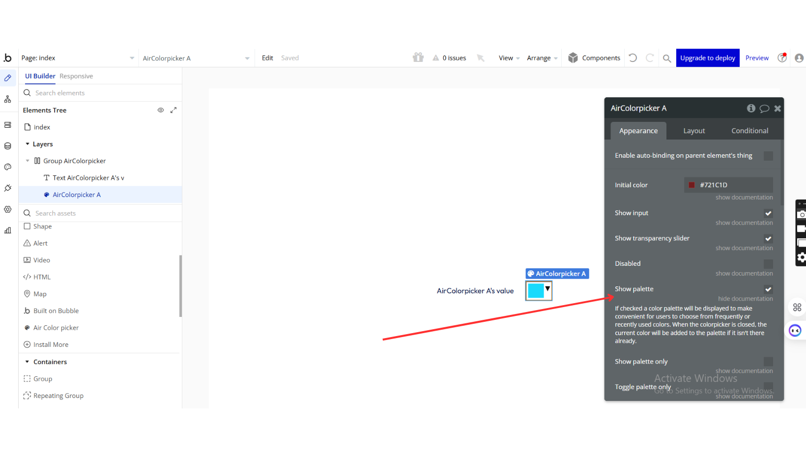
Show palette | If checked, a color palette will be displayed to make it convenient for users to choose from frequently or recently used colors. When the color picker is closed, the current color will be added to the palette if it isn’t there already. | Checkbox (yes/no) |
Show palette only | Check this box if you want only the palette to show. | Checkbox (yes/no) |
Toggle palette only | The color picker can show a button to toggle the color picker next to the palette. This way, the user can choose from a limited number of colors in the palette but still be able to pick a color that’s not in the palette. | Checkbox (yes/no) |
Palette colors | (list of color strings) Initial color palette | Text (optional) |
Show selection palette | Color Picker can keep track of what has been selected by the user when this is checked. | Checkbox (yes/no) |
Max selection size | This is how many elements are allowed in the selection palette at once. | Number (optional) |
Hide after palette select | You can have the colorpicker automatically hide after a palette color is selected. | Checkbox (yes/no) |
Clickout will accept color | When clicking outside of the colorpicker, you can force it to fire a change event rather than having it revert the change. | Checkbox (yes/no) |
Show previous color | Colorpicker can show the color that was initially set when opening. This provides an easy way to click back to what was set when opened. | Checkbox (yes/no) |
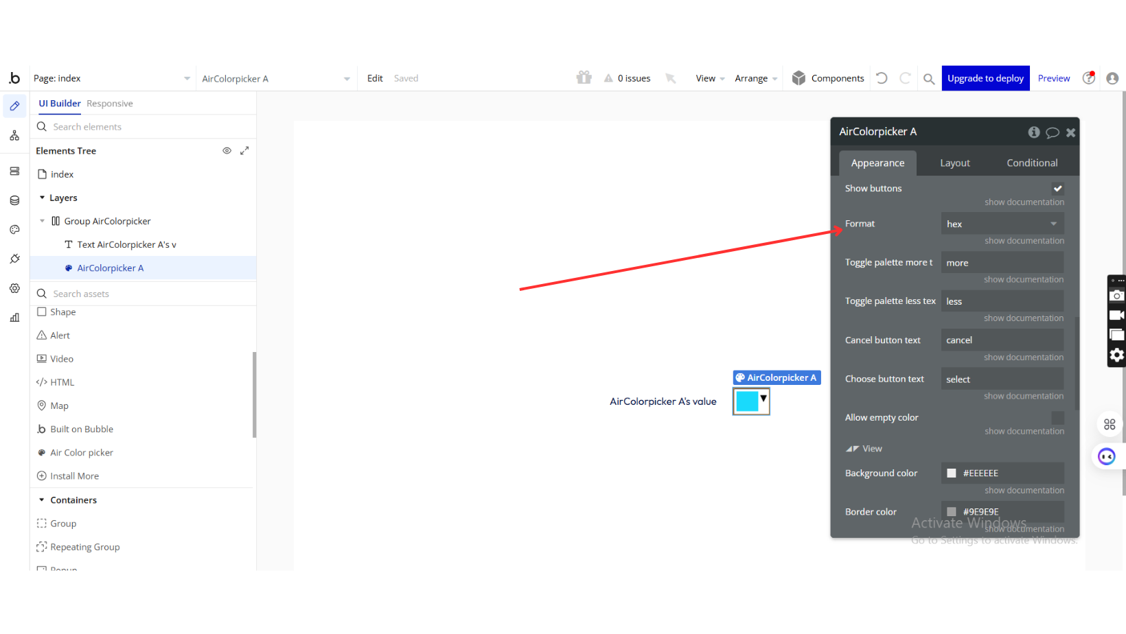
Show buttons | You can show or hide the buttons using the showButtons property. If there are no buttons, the behavior will be to fire the change event (and update the original input) when the picker is closed. | Checkbox (yes/no) |
Format | You can set the format that is displayed in the text box. This will also change the format that is displayed in the titles from the palette swatches. Available options: hex, hex3, hsl, rgb, rgba, name | Dropdown |
Toggle palette more text | Text label for more button | Text (optional) |
Toggle palette less text | Text label for less button | Text (optional) |
Cancel button text | Label for cancel button | Text (optional) |
Choose button text | Label for choose button | Text (optional) |
Allow empty color | Check this to allow selection of empty color | Checkbox (yes/no) |
◢◤ View | ||
Background color | Choose background color | Color |
Border color | Choose border color | Color |
Border hover color | TODO: Fill in description | Color |
Border width | Value in px. | Number |
Corner roundness | Specify corner roundness Available options: 0, 1, 2, 3, 4, 5, 6, 7, 8, 9, 10, 11, 12, 13, 14, 15, 16, 20, 24, 28, 32, 36, 40, 44, 48, 52, 56, 64 | Dropdown (optional) |
Padding left/right | Value in px. | Number |
Padding top/bottom | Value in px. | Number |
Element Actions
- Reset Picker:
Resets the color picker to its initial state, reverting the selected color to the
Initial colordefined in the settings.
Exposed states
Title | Description | Type |
Value | Current selected color as a color string. | Text |
Element Events
Title | Description |
color changed | Called as the original input changes. Only happens when the input is closed or the ‘Choose’ button is clicked. |


