
Link to the plugin page: https://zeroqode.com/plugin/charts-and-graphs-plugin-for-bubble-1695288237815x161412653225651900
Demo to preview the plugin:
Introduction
The Charts and Graphs plugin enables you to display a variety of data visualizations in your Bubble app, including Line, Pie, Donut, and Bar charts. These customizable charts are ideal for representing data in a clear and visually appealing way, offering control over colors, legend locations, tooltips, and more. Perfect for dashboards, data analysis, and interactive data presentations.
Usage Features:
- Line, Pie, Donut, and Bar charts available for diverse data representation.
- Customizable appearance, including colors, legend position, and border radius.
- Tooltips and values display options for enhanced user interactivity.
- Ability to adjust chart properties such as border color, donut hole size, and arc spacing.
- Events triggered on data interaction, like area click in Pie/Donut and bar click in Bar charts.
👛 Please support our efforts to keep this plugin free—your donations help us invest the time and resources needed to continue maintaining and improving it for everyone’s benefit: https://zeroqo.de/support.

How to setup
- Place a Chart Element on the Page
- Go to the Design tab.
- Drag one of the chart elements (Line Chart, Pie & Donut Chart, or Bar Chart) onto your page where you want the chart to appear.
- Configure the Chart Settings
Depending on the chart type you choose, you’ll need to provide the data you want to display (like values, labels, or categories) and customize the appearance (colors, titles, legends, and so on).
Simply fill in the element’s properties in the Bubble editor to suit the type of chart you want to create.
Plugin Element Properties
Line Chart 📈
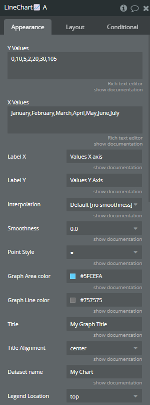
Fields:
Title | Description | Type |
Y Values | The data that represents the Y-axis values. Please separate values with comma (,). | Text |
X Values | The data that represents the X-axis values. Please separate values with comma (,). | Text |
Label X | (optional) The name for X-axis. | Text (optional) |
Label Y | (optional) The name for Y-axis. | Text (optional) |
Interpolation | The type of line interpolation. Available options: Cubic Interpolation - monotone, Cubic Interpolation, Default [no smoothness] | Dropdown |
Smoothness | The smoothness of line. Available options: 0.0, 0.1, 0.2, 0.3, 0.4, 0.5, 0.6, 0.7, 0.8, 1.0 | Dropdown |
Point Style | The style of points in the coordinate system. Available options: ⬥, ● | Dropdown |
Graph Area color | The color of the area below line. | Color |
Graph Line color | The color of the line. | Color |
Title | (optional) The title of chart. | Text (optional) |
Title Alignment | (optional) The title alignment. Available options: start, center, end | Dropdown (optional) |
Dataset name | (optional) The name for provided data set. If the field is empty, the ‘Dataset’ will be assigned as default. | Text (optional) |
Legend Location | The position of legend. Available options: top, right, bottom, left | Dropdown |
Tooltip enable | If it is checked, the tooltip will appear on hover. | Checkbox (yes/no) |
Vertical Grid Color | The color of vertical lines of grid lines. | Color |
Horizontal Grid Color | The color of horizontal lines of grid lines. | Color |
Values Color | The color of axis values. | Color |
Line style | The style of the line. Available options: —, – –, – | Dropdown |
Display legend | If it is checked, the legend will be displayed on “Legend Location” position. | Checkbox (yes/no) |
Legend align | The vertical legend alignment. Available options: start, center, end | Dropdown |
Y-axis stepsize | The stepsize for Y-axis values. | Text |
Suggested min | The min value on the Y-axis. | Text |
Suggested max | The max value on the Y-axis. | Text |
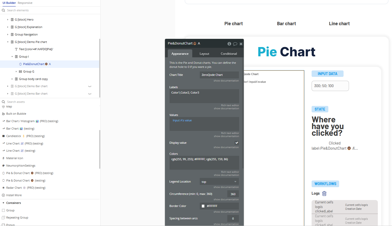
Pie & Donut Chart 🍩
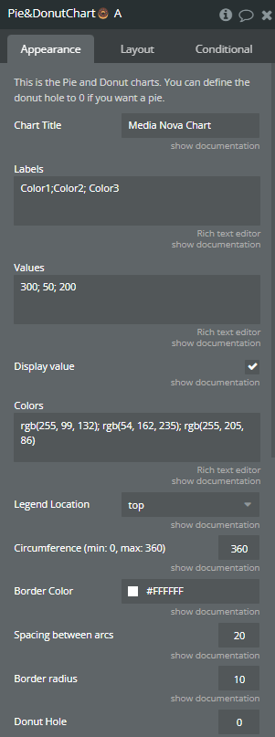
Fields:
Title | Description | Type |
This is the Pie and Donut charts. You can define the donut hole to 0 if you want a pie. | ||
Chart Title | The title of chart. | Text |
Labels | The lables of chart. Please separate values with semicolon (;). | Text |
Values | The values of chart. Please separate the values with semicolon (;). | Text |
Colors | The color of slices of chart. Please separate the values with semicolon (;). | Text |
Legend Location | The position of legend. Available options: top, right, bottom, left | Dropdown |
Circumference (min: 0, max: 360) | The radial size of chart. 360 - full circle, 180 - half circle. Min: 0. Max: 360. | Number |
Border Color | The border color for every slice of chart. | Color |
Spacing between arcs | The space between slices of chart. | Number |
Border radius | The border radius for every slice of chart. | Number |
Donut Hole | The size of inner circle of chart. For pie chart leave 0. | Number |
Tooltip presence | If it is checked, the tooltip will appear on hover. | Checkbox (yes/no) |
Display legend | If it is checked, the legend will be displayed on “Legend Location” position. Available options: t | Checkbox (yes/no) |
Exposed states
Title | Description | Type |
LabelClicked | Returns the label on click. | Text |
Element Events
Title | Description |
Area is clicked | This event is triggered when the slice of chart is clicked. |
Bar Chart 📊
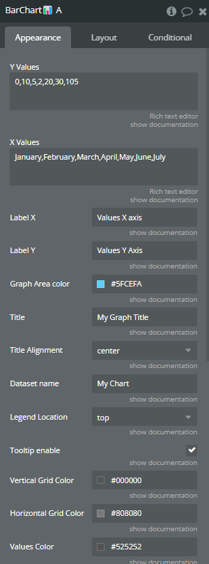
Fields:
Title | Description | Type |
Y Values | The data that represents the Y-axis values. Please separate values with comma (,). | Text |
X Values | The data that represents the X-axis values. Please separate values with comma (,). | Text |
Label X | (optional) The name for X-axis. | Text (optional) |
Label Y | (optional) The name for Y-axis. | Text (optional) |
Graph Area color | The color for the bars. | Color |
Title | (optional) The title of chart. | Text (optional) |
Title Alignment | (optional) The title alignment. Available options: start, center, end | Dropdown (optional) |
Dataset name | (optional) The name for provided data set. If the field is empty, the ‘Dataset’ will be assigned as default. | Text (optional) |
Legend Location | The position of legend. Available options: top, right, bottom, left | Dropdown |
Tooltip enable | If it is checked, the tooltip will appear on hover. | Checkbox (yes/no) |
Vertical Grid Color | The color of vertical lines of grid lines. | Color |
Horizontal Grid Color | The color of horizontal lines of grid lines. | Color |
Values Color | The color of axis values. | Color |
Display legend | If it is checked, the legend will be displayed on “Legend Location” position. | Checkbox (yes/no) |
Exposed states
Title | Description | Type |
Labelclicked | Returns the label (X-axis value) of the bar that was clicked by the user. | Text |
Element Events
Title | Description |
Bar is clicked | Triggered when a user clicks on a bar in the chart. Returns the label (X-axis value) of the clicked bar through the exposed state Labelclicked. |
