Demo to preview the settings
Introduction
This plugin gives you an Excel-like experience for editing tabular data directly within your app. You can add, edit, sort, filter, and select rows of multiple types including, progress, rating, text, number and file. You can also customize table’s appearance by changing the color of elements and highlighting the rows on click. Editable Data Table is a powerful tool that can help you manage your data with flexibility and ease.

How to setup
Drag the element into the page and position it where you want to have the table.
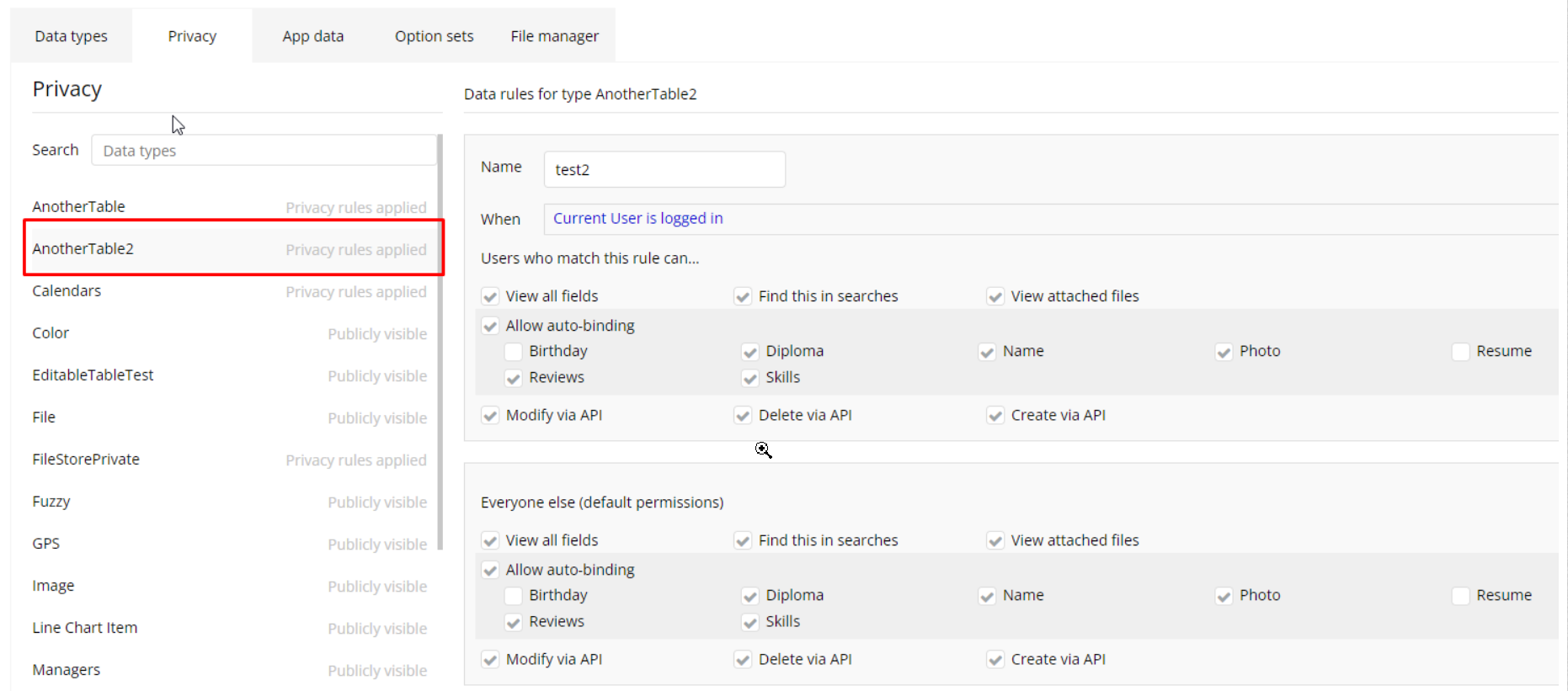
To allow the plugin to access the database, set privacy rules for the table you reference in the plugin.
The plugin uses Database API. To give it access to the new data in the Database table, please enable Data API.
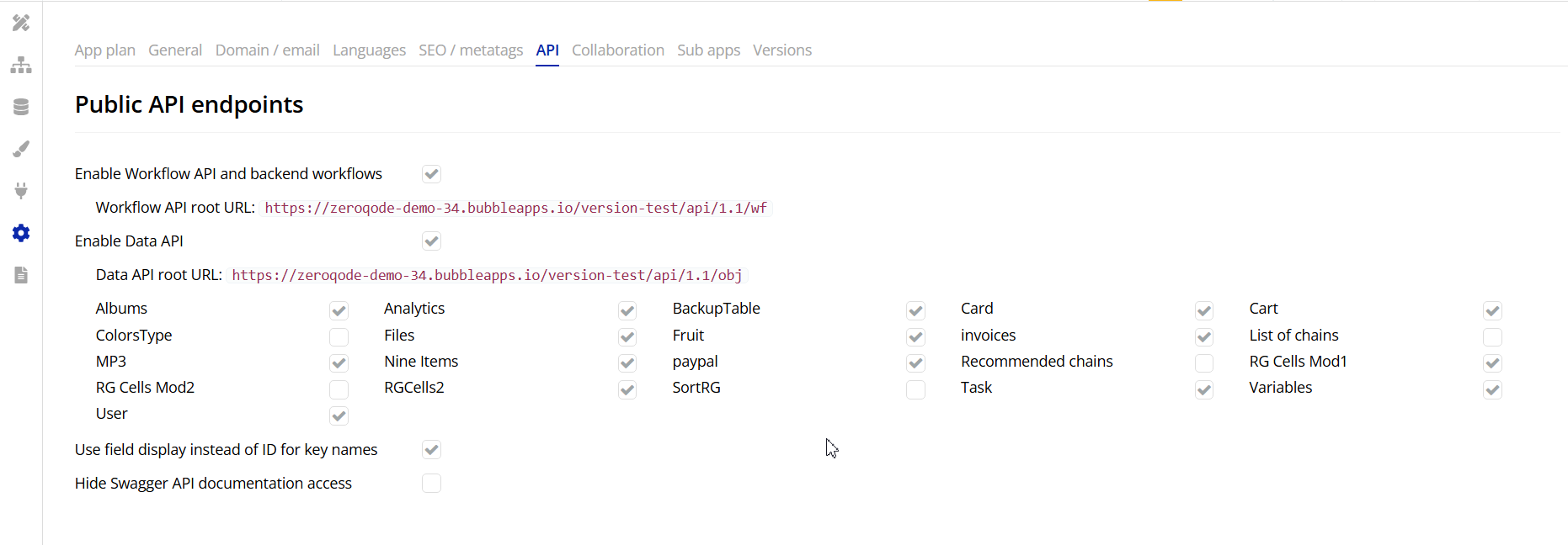
Table Element
Fields
Name | Description | Type |
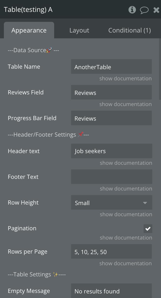
Type | The type of table from database where the data will be written to and extracted from | App type |
Data source | List of objects from database to display on table | Dynamic value |
Progress bar field | The name of the column that will serve as progress bar field | Static text |
Reviews field | The name of the column that will display the rating stars | Static text |
Header text | Arbitrary text to add to the header | Dynamic value |
Footer Text | Arbitrary text to add to the footer | Dynamic value |
Table name | The name of the table where the data is stored in the Bubble database | Static text |
Row height | The height of the rows | Dropdown |
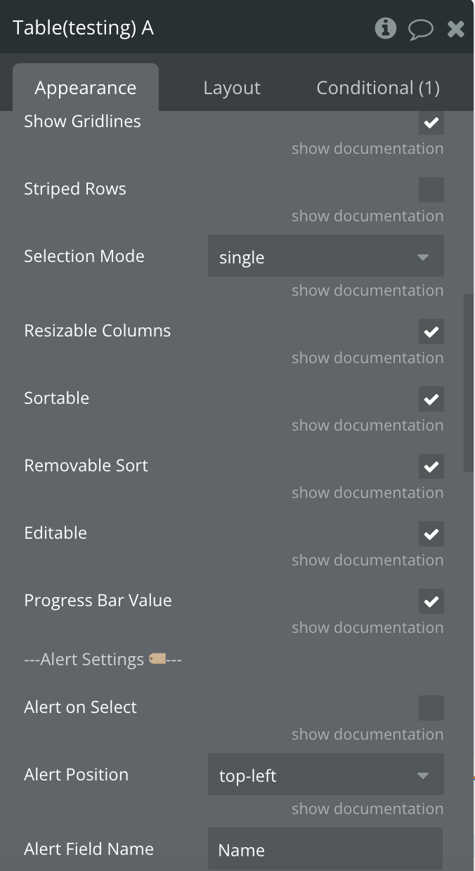
Show gridlines | The gridlines should be visible | Checkbox |
Striped rows | The rows should have interchanging background colors | Checkbox |
Pagination | To display pagination | Checkbox |
Rows per page | The number of rows to display on one page | Static text |
Sortable | Make the table sortable on heading click | Checkbox |
Removable sort | Should the 3rd click remove sorting? | Checkbox |
Empty message | The message to display when the table is empty | Static text |
Selection mode | How many rows can be selected at once | Dropdown |
Editable | Ability to add and edit rows | Checkbox |
Progress bar value | Show progress bar value | Checkbox |
Progress bar value color | Progress bar value color | Color |
Progress bar height | Progress bar height | Static number |
Primary color | The color of the buttons, highlighted text, and more | Color |
Highlight color | The secondary color used for additional highlight effect | Color |
Alert on select | Show alert on select | Checkbox |
Alert position | The position of the alert modal | Dropdown |
Alert field name | The field to show in the alert as it appears in the database. | Static text |
Image field name | Enter the name of the image column as it appears in the database. | Static text |
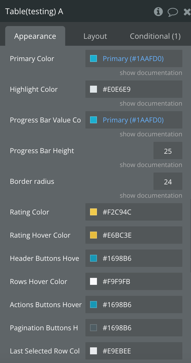
Primary Color | The color of the buttons, highlighted text, and more | Color, Optional |
Highlight Color | The secondary color used for additional highlight effect | Color, Required |
Progress Bar Value Color | Progress bar value color | Color, Required |
Progress Bar Height | Progress bar height | Number, Optional |
Border radius | Border radius | Number, Optional |
Rating Color | Rating Color | Color, Required |
Rating Hover Color | Rating Hover Color | Color, Required |
Header Buttons Hover Color | Color of the header buttons on hover | Color, Required |
Rows Hover Color | Color of the rows on hover | Color, Required |
Actions Buttons Hover Color | Color of the action buttons on hover | Color, Required |
Pagination Buttons Hover Color | Color of the pagination buttons on hover | Color, Required |
Last Selected Row Color | Color of the last selected row | Color, Required |
Key | Specifies which field or data key the constraint applies to. Use _all to apply the constraint across all searchable fields. | Text |
Constraint Type | Determines the filtering condition applied to the data. For example, “text contains” filters entries that include the specified value. | Dropdown |
Value | The text or data value used in the filter condition. | Text |
Origin address | The starting point (address or coordinates) for geographic search filtering. | Text |
Range | Defines the maximum distance for the geographic filter. | Number |
Unit | Specifies the distance measurement unit (e.g., kilometers or miles). | Dropdown |
Sort field | Indicates which field is used to sort the data results. | Text |
Descending | When enabled, sorts the data in descending order. | Checkbox |

