
✅
Demo to preview the plugin:
✅
✅
Introduction
The Modern Rich Text Editor (Editor.js) plugin brings a powerful, block-based content editor into your Bubble application. Built on the popular Editor.js framework, this plugin enables you to create structured, dynamic, and highly interactive content experiences without sacrificing performance or flexibility.
It is ideal for applications such as content management systems, SaaS dashboards, documentation tools, learning platforms, blogs, and internal admin tools where rich, modular content creation is required.
Key Features
Inline Formatting Toolbar
Apply essential formatting such as bold, italic, underline, links, code blocks, alignment, and more.
Multiple Block Types
Create structured layouts using paragraphs, headers, lists, images, files, quotes, embeds, and custom blocks.
Image Compression
Automatically compress uploaded images to improve performance and reduce storage usage.
Privacy Controls
Mark uploaded files as private, ensuring sensitive content is protected and access-controlled.
Internationalization Support
Supports multi-language configurations for localized or global applications.
Prerequisites
Before using the Modern Rich Text Editor (Editor.js) plugin, ensure the following:
- Bubble Account & Editor Access
You must have an active Bubble account with editor access to install and configure the plugin.
- Basic Knowledge of Bubble Data & Workflows
Familiarity with dynamic data binding, workflows, and database fields is recommended.
- Database Fields Prepared (Recommended)
Create text fields to store editor output in JSON and/or HTML formats.
- File Storage Enabled
Required for image and file uploads, including private file handling.
- Responsive Layout Awareness
Place the editor inside a responsive container for optimal performance across screen sizes.

How to Set Up
Step 1. Install the Plugin
- Open your Bubble Editor.
- From the left panel, go to the Plugins tab.
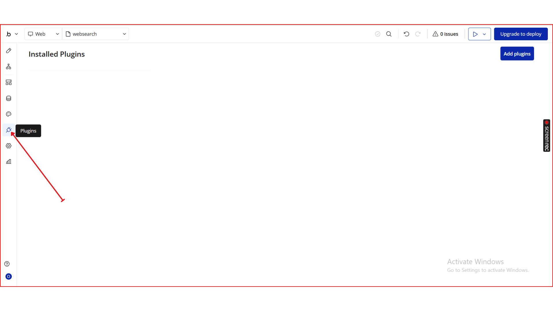
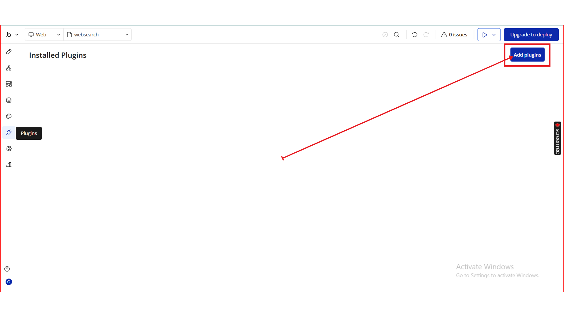
- Click the Add Plugins button.
- In the search bar, type Modern Rich Text Editor (Editor.js).
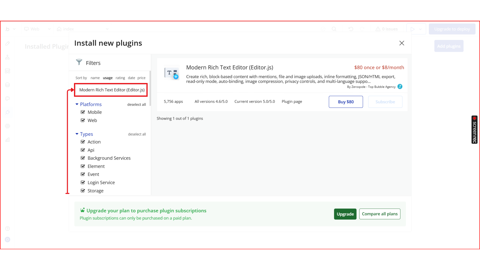
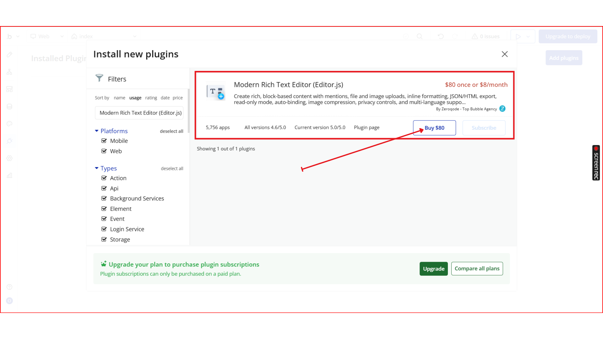
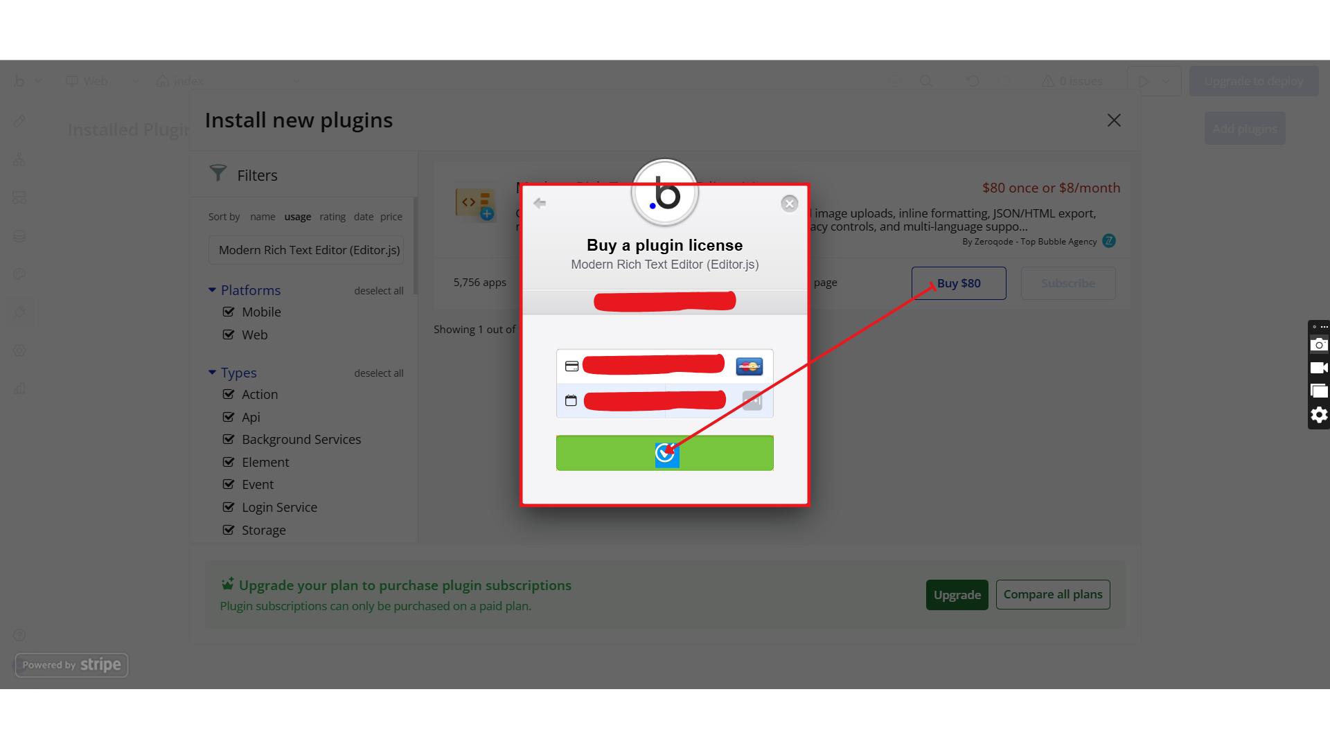
- Locate the Modern Rich Text Editor (Editor.js) plugin by Zeroqode and click Install (or Buy if it’s a paid plan).
- After installation, it will appear under Installed plugins.
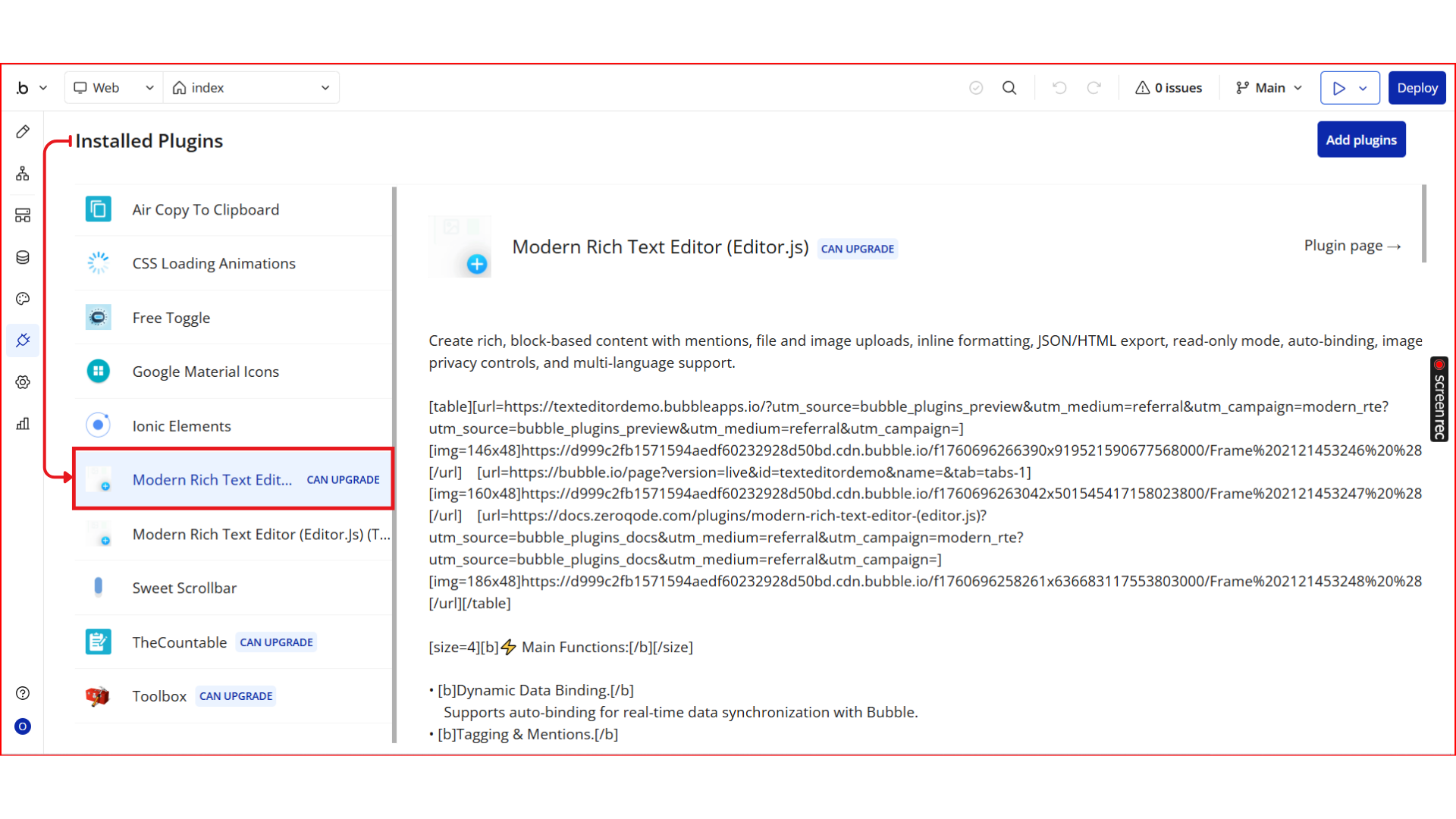
Step 2. Add the Editor Element to Your Page
- Go to the Design tab in the Bubble editor.
- In the Visual elements → section, locate Modern Rich Text Editor (Editor.js).
- Drag and drop the editor element onto your page.
- Resize the element and place it inside a responsive container (recommended).
💡 The editor automatically adapts to the width of its parent container.
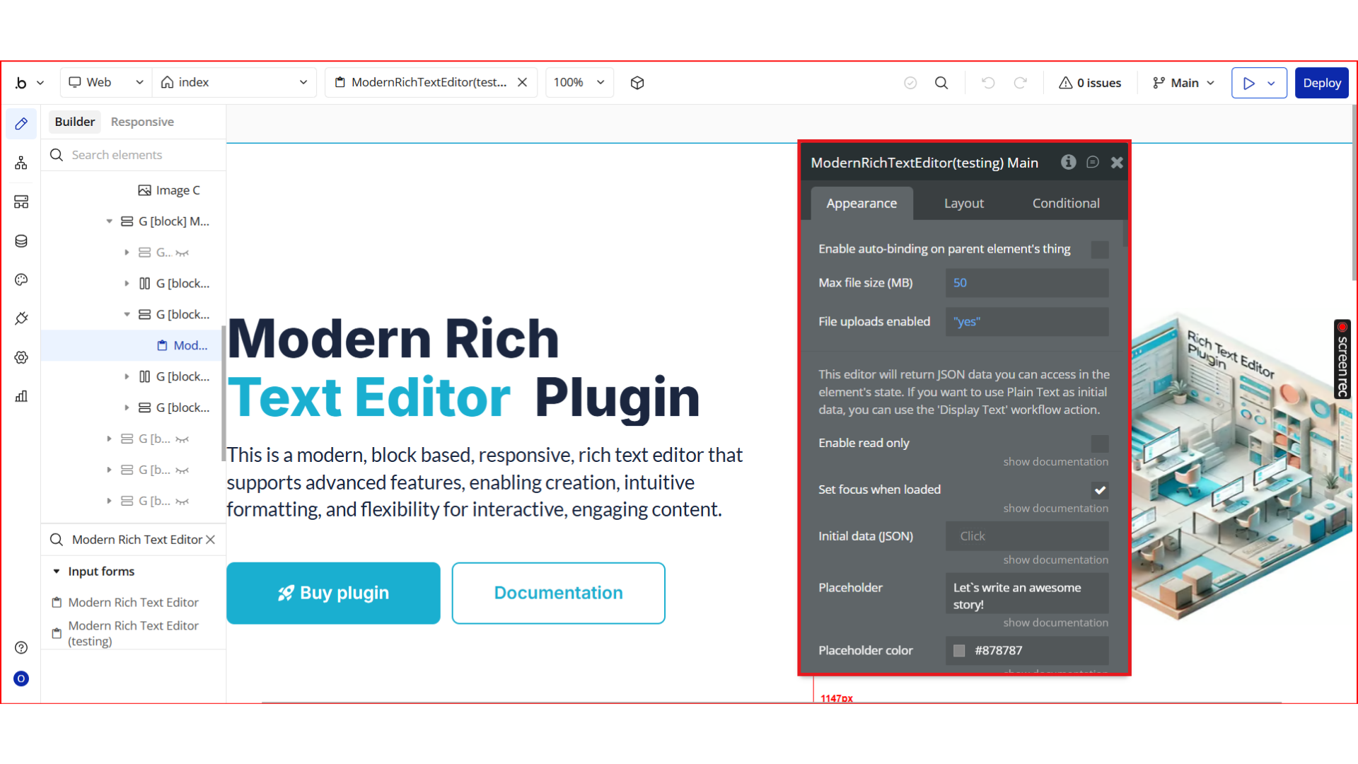
Step 3. Core Editor Configuration
Configure the editor behavior using the Appearance panel.
General Settings

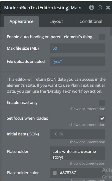
- Enable auto-binding on parent’s thing (Yes/No)
- Initial data (JSON) – preload saved content
- Placeholder text
- Placeholder color
- Enable read-only mode
- Set focus when loaded
- Instantly trigger event change
- Initial block type (paragraph, header, etc.)
- RTL mode (right-to-left support)
Step 4. Block-Level Configuration
You can enable, disable, or customize each block independently.
Header Block
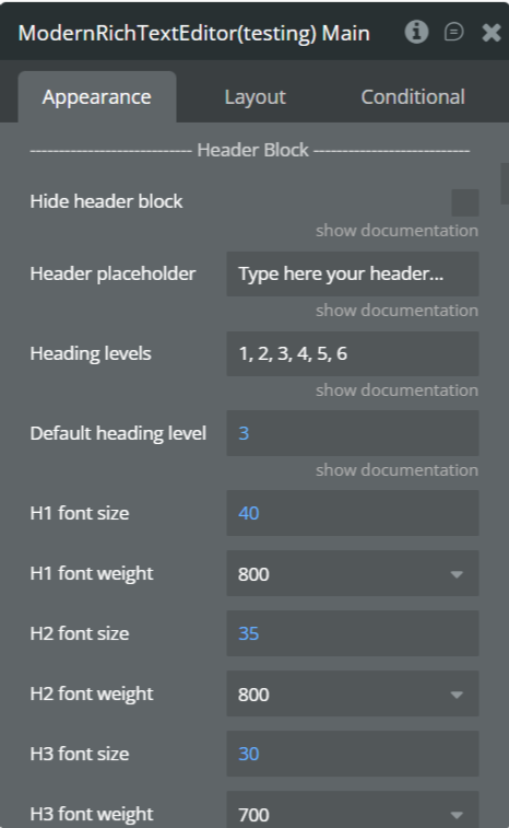
- Hide header block
- Header placeholder
- Allowed heading levels
- Default heading level
- Font size & weight for H1–H6
Image Block
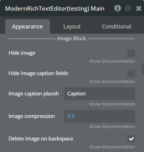
- Hide image block
- Hide caption fields
- Caption placeholder
- Enable image compression
- Delete image on backspace
- Border, background, stretch options
List Block
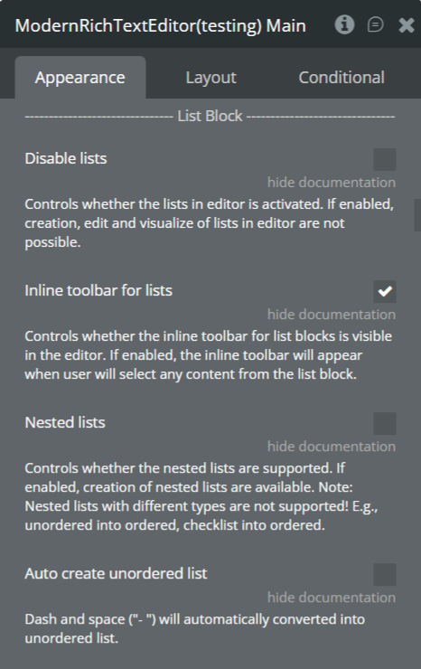
- Disable lists
- Enable inline toolbar
- Nested lists
- Auto-correct unordered lists
Quote Block
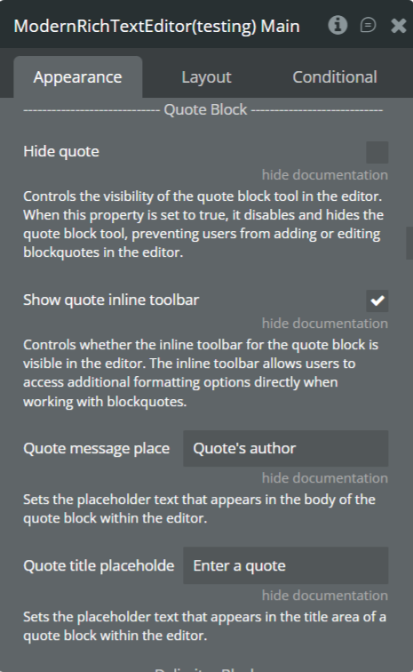
- Hide quote block
- Show inline toolbar
- Quote message placement
- Quote title placeholder
Delimiter Block
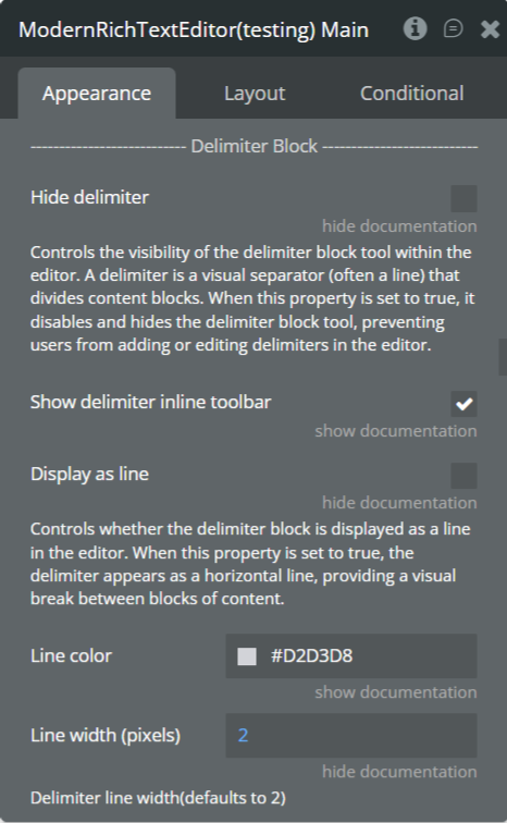
- Hide delimiter
- Inline toolbar
- Display as line
- Line color & width
Code Block
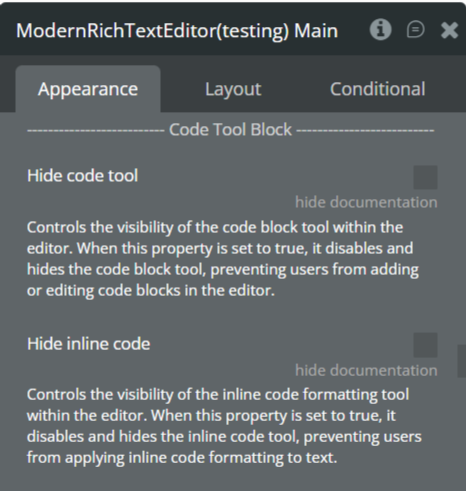
- Hide code tool
- Hide inline tool
Table Block
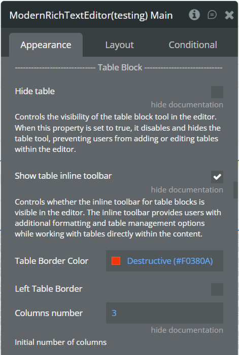
- Hide table
- Inline toolbar
- Border color
- Column count
- Add/remove rows and columns
- Headings support
Warning Block
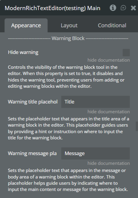
- Hide warning
- Title placeholder
- Message placeholder
Embed Options
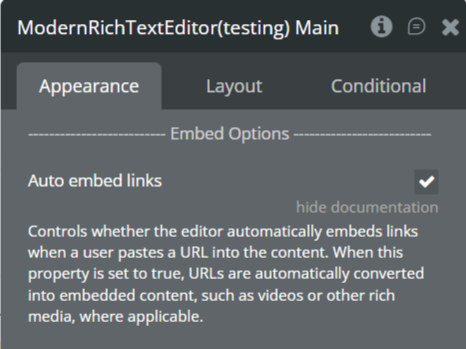
- Auto-embed links
Step 5. Mentions, Files & Styling
@Mention / Tagging
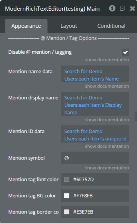
- Enable or disable tagging
- Mention name data
- Display name
- ID data
- Trigger symbol
- Tag font, background, and border colors
File Uploader
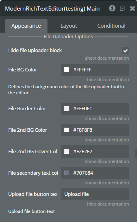
- Hide file uploader block
- File background & border colors
- Secondary background & hover colors
- Secondary text color
- Upload button text
Privacy Options
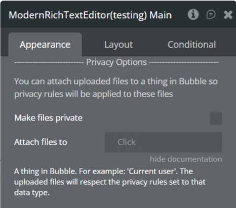
- Make uploaded files private
- Attach files to a database thing
Styling Options
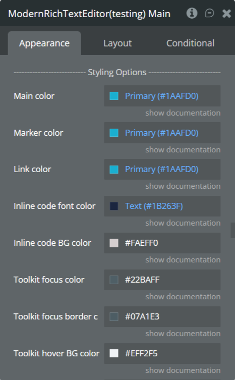
- Main color
- Marker color
- Link color
- Inline code font & background color
- Toolbar focus, hover, and border colors
- Toolbox background & border
- Tooltip background & font color
- Block highlight color
- Bottom padding
Step 6. Internationalization (i18n)
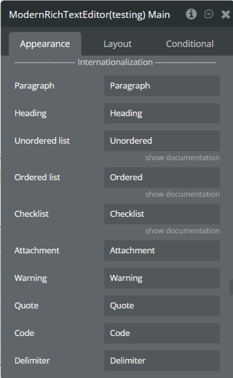
Customize labels and text for:
- Paragraph
- Heading
- Lists
- Checklist
- Attachments
- Warning
- Quote
- Code
- Delimiter
- Image
- Table
- Toggle
- Button
- Inline tools (Bold, Italic, Marker, etc.)
- Editor actions (Add, Move, Delete, Convert)
Step 7. Preview & Test
- Click Preview in the Bubble editor
- Test content creation and formatting
- Verify uploads, mentions, and styling
- Test read-only mode
- Check responsiveness on desktop and mobile
Plugin Element - Modern Rich Text Editor
Fields
Title | Description | Type |
(Editor Output) | Returns structured JSON data representing the editor content. This data is accessible via the element’s state. To display plain text as initial content, use the Display Text workflow action. | State (JSON) |
Enable read only | Prevents users from editing the document content when enabled. Useful for view-only modes. | Checkbox (yes/no) |
Set focus when loaded | Automatically places the cursor inside the editor when the page loads. | Checkbox (yes/no) |
Initial data (JSON) | Loads previously saved Editor.js JSON as the editor’s initial content. | Text (optional) |
Placeholder | Default placeholder text for empty paragraph blocks. | Text (optional) |
Placeholder color | Sets the color of placeholder text inside the editor. | Color |
Header Block
Title | Description | Type |
Hide header block | Disables and hides the header block tool from the editor. | Checkbox (yes/no) |
Header placeholder | Placeholder text displayed inside header blocks. | Text (optional) |
Heading levels | Comma-separated list of allowed heading levels (1–6). | Text |
Default heading level | Sets the default heading level when a header is added. | Number |
H1–H6 font size | Controls font size for each heading level. | Number |
H1–H6 font weight | Sets font weight for each heading level (100–900). | Dropdown |
Image Block
Title | Description | Type |
Hide image | Disables the image block tool entirely. | Checkbox (yes/no) |
Hide image caption fields | Hides caption input below images. | Checkbox (yes/no) |
Image caption placeholder | Placeholder text for image captions. | Text (optional) |
Image compression | Compression ratio (1 = full quality, lower values = smaller images). | Number |
Delete image on backspace | Allows deleting an image block using backspace. | Checkbox (yes/no) |
List Block
Title | Description | Type |
Hide list | Disables ordered and unordered lists. | Checkbox (yes/no) |
Show list inline toolbar | Displays inline list formatting tools. | Checkbox (yes/no) |
List default style | Sets default list type (ordered/unordered). | Dropdown |
Enable nested lists | Allows lists inside lists. | Checkbox (yes/no) |
Dash + Space creates list | Automatically converts “- ” into a list. | Checkbox (yes/no) |
Inline Tools
Title | Description | Type |
Hide text alignment | Removes alignment controls from toolbar. | Checkbox |
Hide inline marker | Disables text highlighting tool. | Checkbox |
Hide strikethrough tool | Disables strikethrough formatting. | Checkbox |
Quote Block
Title | Description | Type |
Hide quote | Disables quote block tool. | Checkbox |
Show quote inline toolbar | Displays formatting toolbar inside quotes. | Checkbox |
Quote message placeholder | Placeholder for quote text. | Text |
Quote title placeholder | Placeholder for quote author/title. | Text |
Checklist Block
Title | Description | Type |
Hide checklist | Disables checklist block. | Checkbox |
Show checklist inline toolbar | Enables inline checklist tools. | Checkbox |
Delimiter Block
Title | Description | Type |
Hide delimiter | Disables content separators. | Checkbox |
Show delimiter inline toolbar | Shows inline delimiter controls. | Checkbox |
Display as line | Renders delimiter as a horizontal line. | Checkbox |
Line color | Sets delimiter line color. | Color |
Line width (pixels) | Controls thickness of delimiter line. | Number |
Code Block
Title | Description | Type |
Hide code tool | Disables code block tool. | Checkbox |
Hide inline code | Disables inline code formatting. | Checkbox |
Table Block
Title | Description | Type |
Hide table | Disables table block tool. | Checkbox |
Show table inline toolbar | Enables inline table controls. | Checkbox |
Table border color | Sets table border color. | Color |
Left table border | Displays left border in tables. | Checkbox |
@Mention / Tagging
Title | Description | Type |
Disable @mention/tagging | Enables or disables tagging system. | Checkbox |
Mention name data | Searchable names list. | Text |
Mention display name data | Displayed label in editor. | Text |
Mention ID data | Unique IDs for mentions. | Text |
Mention symbol | Trigger character (default: @). | Text |
Mention tag font color | Text color of mention tags. | Color |
Mention tag BG color | Background color of mention tags. | Color |
Mention tag border color | Border color of mention tags. | Color |
Warning Block
Title | Description | Type |
Hide warning | Disables warning block. | Checkbox |
Warning title placeholder | Placeholder for warning title. | Text |
Warning message placeholder | Placeholder for warning body. | Text |
Embed Options
Title | Description | Type |
Auto embed links | Automatically embeds supported URLs. | Checkbox |
Styling Options
Title | Description | Type |
Main color | Primary UI color. | Color |
Marker color | Highlight background color. | Color |
Link color | Hyperlink color. | Color |
Inline code font color | Inline code text color. | Color |
Inline code BG color | Inline code background color. | Color |
Toolkit focus color | Active tool background color. | Color |
Toolkit focus border color | Active tool border color. | Color |
Toolkit hover BG color | Hover background color. | Color |
Toolbox BG / Border color | Toolbox styling colors. | Color |
Search BG color | Toolbox search background. | Color |
Icon BG hover color | Icon hover background. | Color |
Tooltip BG / font color | Tooltip colors. | Color |
Block highlight color | Selected block background color. | Color |
Bottom padding | Overrides default 300px editor padding. | Number |
File Uploader
Title | Description | Type |
Hide file uploader block | Disables file uploads. | Checkbox |
File BG / Border / Secondary colors | Visual styling for file blocks. | Color |
File secondary text color | Secondary file text color. | Color |
Upload file button text | Custom upload button label. | Text |
Privacy Options
Title | Description | Type |
Make files private | Applies Bubble privacy rules to uploaded files. | Checkbox |
Attach files to | Associates files with a Bubble thing. | Any Thing |
Internationalization (i18n)
Title | Description | Type |
(All labels) | Custom text for editor UI labels (Paragraph, Quote, Bold, Delete, Move, etc.). | Text |
Other Options
Title | Description | Type |
Enable reorder by drag & drop | Allows block reordering via drag. | Checkbox |
Instantly trigger change event | Fires change event without blur. | Checkbox |
Hide search field | Hides toolbox search. | Checkbox |
Display Plus & Settings below block | Moves toolbar below blocks. | Checkbox |
Hide Plus & Settings icon | Removes left toolbar entirely. | Checkbox |
Hide inline toolbar | Disables selection toolbar. | Checkbox |
Reset highlighted state | Clears selection when clicking outside. | Checkbox |
Initial block | Default block type on load. | Dropdown |
Element Actions
1. Reset
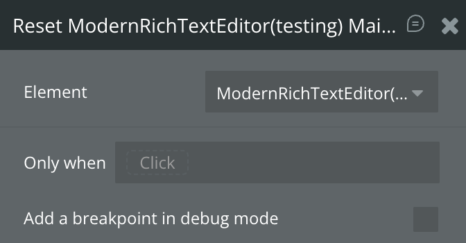
Clears all content inside the editor and resets it to an empty state. This action removes all blocks currently rendered in the editor.
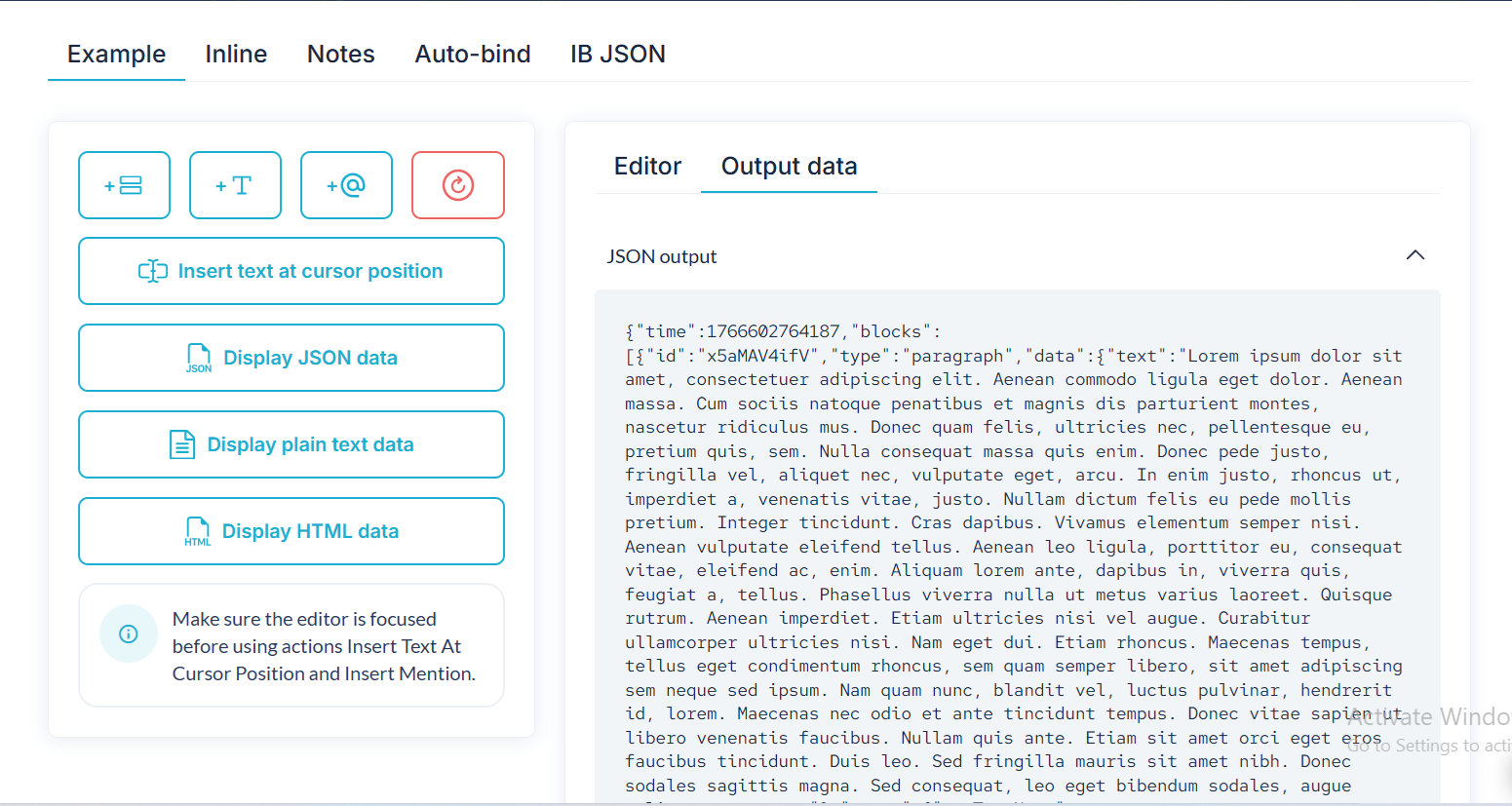
2. Display Data (JSON)
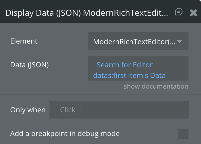
Renders previously saved Editor.js JSON output back into the editor. Use this action to restore structured content exactly as it was saved.
Title | Description | Type |
Data (JSON) | The JSON data generated by the editor output to be rendered inside the editor. | Text |
3. Insert Empty Block
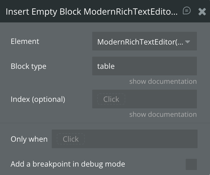
Inserts an empty block of a specified type into the editor. This is useful for programmatically creating placeholders or guiding user input.
Title | Description | Type |
Block type | The block type to insert. Accepted values (case-sensitive): paragraph, header, image, list, quote, checklist, code, delimiter, table, warning. | Text |
Index (optional) | Determines where the block is inserted. If empty, the block is inserted after the currently active block. | Number (optional) |
4. Display Plain Text
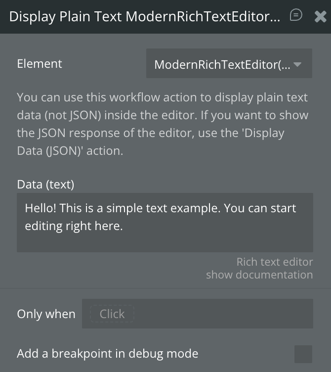
Displays raw plain text inside the editor by automatically converting it into paragraph blocks. Use this when your content is not in JSON format.
Title | Description | Type |
Data (text) | Plain text that will be converted into paragraph blocks inside the editor. | Text |
To display structured Editor.js content, use Display Data (JSON) instead.
5. Insert Paragraph (Text) Block
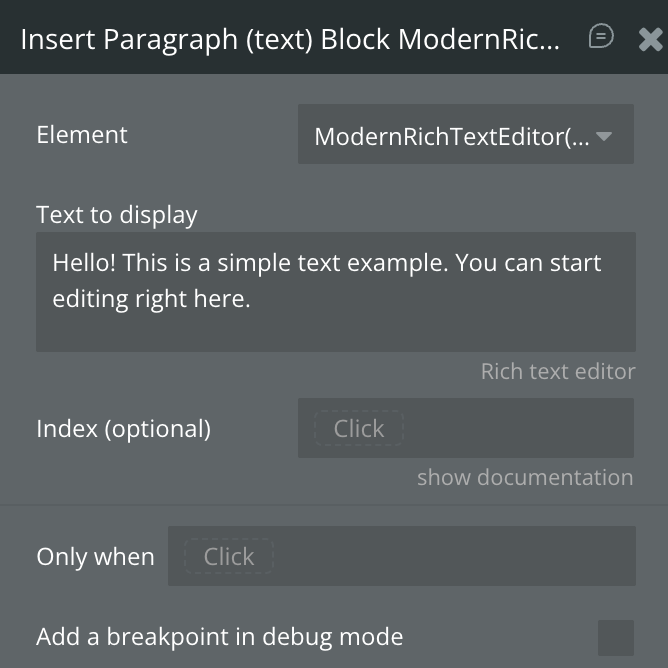
Inserts a paragraph block containing text at a specific position or cursor location in the editor.
Title | Description | Type |
Text to display | The text content to insert as a paragraph block. | Text |
Index (optional) | Position (1–N) where the paragraph block should be inserted. If empty, the current cursor position is used. | Number (optional) |
6. Re-render
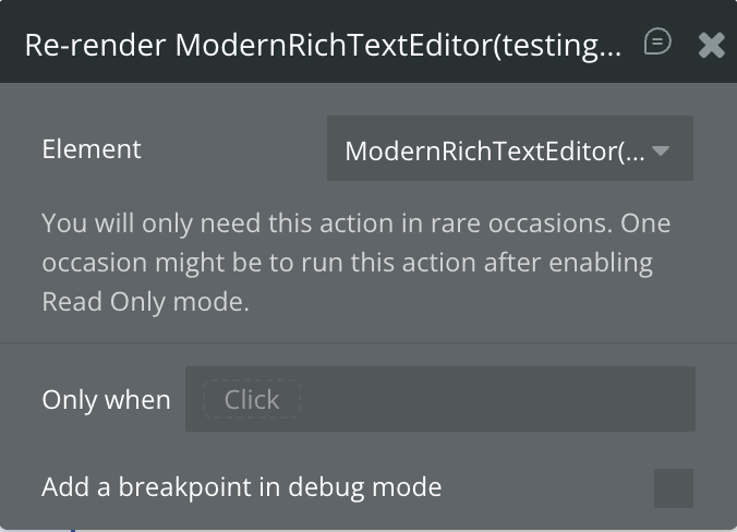
Forces the editor to re-render its content. This action is rarely needed and is typically used after toggling properties such as Read Only mode.
Title | Description | Type |
— | Rebuilds the editor UI and content rendering. | — |
7. Insert Text at Cursor Position
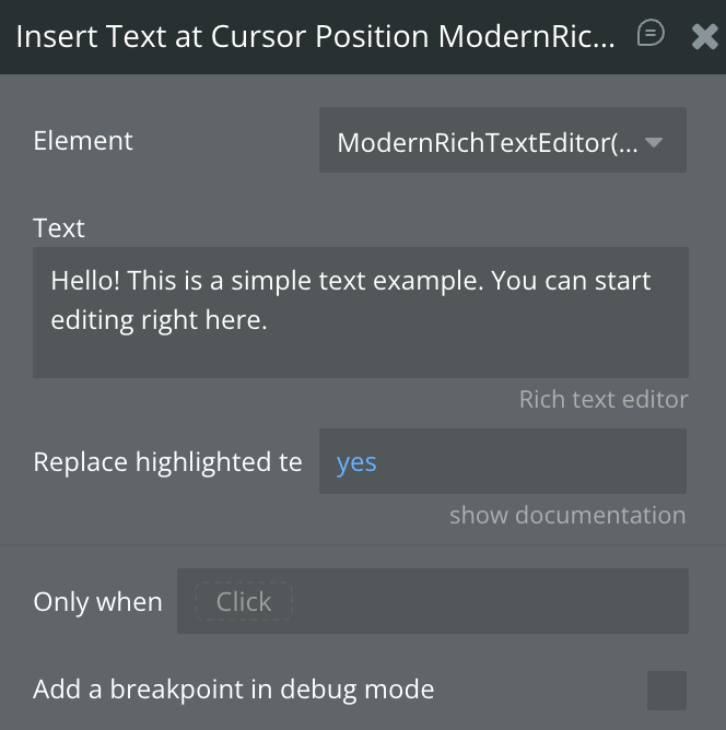
Inserts text directly at the user’s current cursor position inside the editor.
Title | Description | Type |
Text | The text to insert at the cursor position. | Text |
Replace highlighted text? | If enabled, replaces any currently selected text with the inserted text. | Checkbox (yes/no) |
8. Focus the Editor
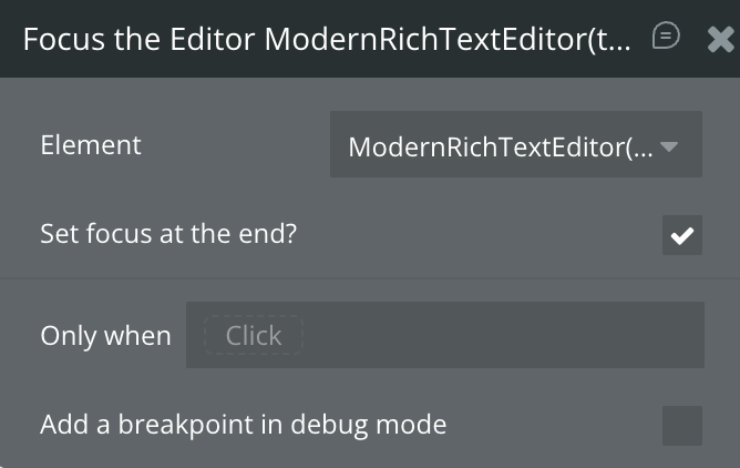
Programmatically focuses the editor, placing the cursor inside it so the user can begin typing immediately.
Title | Description | Type |
Set focus at the end? | If enabled, places the cursor at the end of the document instead of the last cursor position. | Checkbox (yes/no) |
9. Insert Block Using JSON
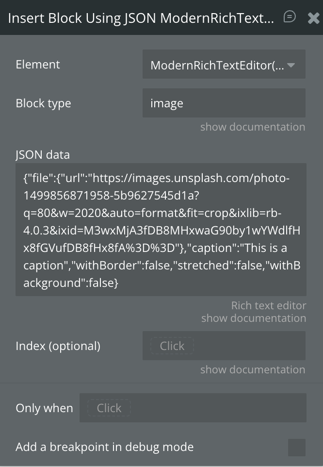
Inserts a fully defined block using raw Editor.js JSON. This allows advanced, programmatic block creation.
Title | Description | Type |
Block type | The type of block to insert (case-sensitive). | Text |
JSON data | JSON object defining the block’s content (e.g. { "text": "Hello world" }). | Text |
Index (optional) | Position (1–N) where the block should be inserted. If empty, the cursor position is used. | Number (optional) |
10. Toggle Formatting on Highlighted Text (BETA)
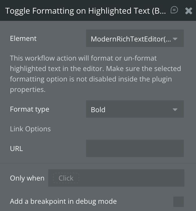
Applies or removes formatting on currently highlighted text. The selected format must not be disabled in the editor’s properties.
Title | Description | Type |
Format type | Formatting to apply or remove. Options include: Bold, Italics, Underline, Strikethrough, Link, Code, Marker. | Dropdown |
URL | URL to apply when the selected format type is Link. | Text (optional) |
11. Display HTML
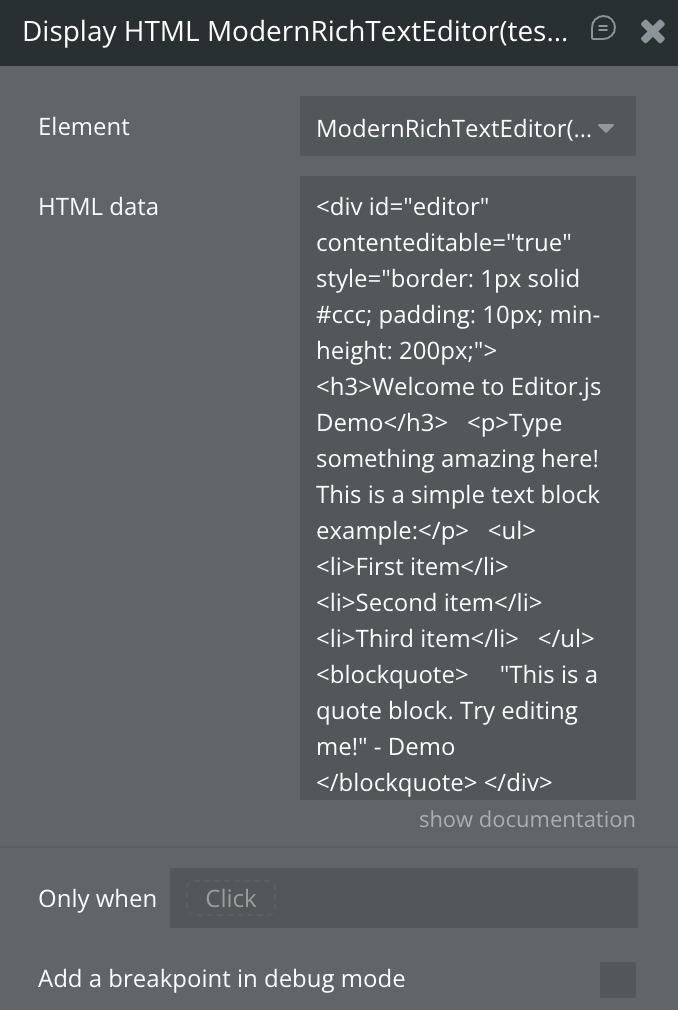
Renders raw HTML content inside the editor by converting it into supported blocks.
Title | Description | Type |
HTML data | HTML content to render inside the editor. | Text |
12. Insert Mention / Tag at Cursor Position
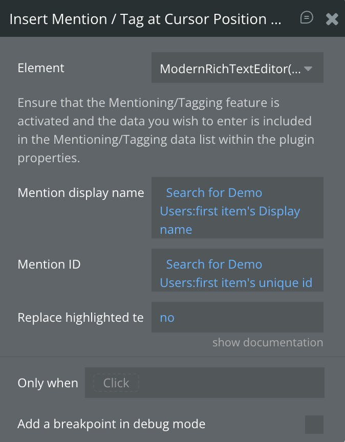
Inserts a mention or tag into the editor at the cursor position. The tagging feature must be enabled and properly configured.
Title | Description | Type |
Mention display name | The visible label shown inside the editor (e.g. username). | Text |
Mention ID | Unique identifier associated with the mention. | Text |
Replace highlighted text? | Replaces selected text with the mention if enabled. | Checkbox (yes/no) |
Exposed states
Title | Description | Type |
Value (JSON as text) | Returns the full Editor.js output in JSON format, including all blocks, metadata, and structure. Use this to save or restore rich content. | Text |
Value (HTML) (ignores warning block) | Returns the editor content converted to clean HTML. The Warning block is excluded from the HTML output. | Text |
Total block count | Returns the total number of content blocks currently present in the editor. | Number |
Is loaded? | Indicates whether the editor has finished loading and is ready for interaction. | Checkbox (yes/no) |
Current block index | Returns the index position of the currently active block where the cursor is located. | Number |
Plain text data (only text content) | Returns a plain-text version of the editor content with all formatting and blocks stripped out. | Text |
Highlighted / selected value | Returns the currently selected or highlighted text inside the editor. | Text |
Focused? | Indicates whether the editor is currently focused and ready for user input. | Checkbox (yes/no) |
Uploaded image | Returns the most recently uploaded image file from the Image block. | Image |
List of Mentions (Name data) | Returns a list of mention “name” values inserted into the editor content. | Text |
List of Mentions (Display Name data) | Returns a list of visible display names for all mentions used in the editor. | Text |
List of Mentions (ID data) | Returns a list of unique IDs associated with mentions inserted into the editor. | Text |
Uploaded file | Returns the most recently uploaded file from the File Attachment block. | File |
Element Events
Title | Description |
Content is changed | Triggers whenever the editor content is modified, including typing, formatting, block changes, or uploads. |
Editor is loaded | Triggers once the editor has fully initialized and is ready for interaction. |
Image is uploaded | Triggers when an image is successfully uploaded via the Image block. |
Undo / Redo Action Performed | Triggers when a user performs an undo or redo action inside the editor. |
File is uploaded | Triggers when a file is successfully uploaded via the File Attachment block. |

Changelogs
Update 06.03.26 - Version 2.1.0
- Bubble Plugin Page Update (Category) .
Update 29.01.26 - Version 2.0.0
- Bubble Plugin Page Update (Docs).
Update 26.01.26 - Version 1.133.0
- added fields 'Strikethrough' & 'Delete row'.
Update 26.12.25 - Version 1.132.0
- Bubble Plugin Page Update (GIF).
Update 01.12.25 - Version 1.131.0
- Bubble Plugin Page Update (Description).
Update 29.10.25 - Version 1.130.0
- Bubble Plugin Page Update (Description).
Update 29.10.25 - Version 1.129.0
- Bubble Plugin Page Update (Description) .
Update 29.10.25 - Version 1.128.0
- Bubble Plugin Page Update (Recommendations).
Update 12.09.25 - Version 1.127.0
- Bubble Plugin Page Update (Tutorial).
Update 12.09.25 - Version 1.126.0
- Added "RTL mode" field.
Update 29.08.25 - Version 1.125.0
- Bubble Plugin Page Update (Logo).
Update 27.08.25 - Version 1.124.0
- Fixed "invalid index" error when "Automatically create unordered list" option is checked.
Update 14.08.25 - Version 1.123.0
- Bubble Plugin Page Update (Logo).
Update 11.08.25 - Version 1.122.0
- Improved initialization for large initial data.
Update 09.07.25 - Version 1.121.0
- moved all libraries to the Bubble server.
Update 08.07.25 - Version 1.120.0
- Bubble Plugin Page Update (Logo).
Update 24.06.25 - Version 1.119.0
- Fixed "Auto create unordered list" feature.
Update 11.06.25 - Version 1.117.0
- Upgraded lists, update documentation & fixed autobinding.
- Upgraded plugin "list" from v1.8.0 to v2.0.8.
- Removed plugin "nested-list".
- Removed plugin "checklist".
- Removed override of "List" class (PatchedList).
- Adapted CSS styles for "checklist" items.
- Removed "checklist" parser.
- Defined new parser for "list" plugin.
- Removed "Checklist Block" section with the following fields:
- Hide checklist.
- Show checklist inline toolbar.
- Renamed "List" field from "Internationalization" section in "Unordered list".
- Added "Order list" field into "Internationalization" section.
- Reordered "Checklist" field from "Internationalization" section.
- Removed "List default style" field.
- Renamed "Hide list" into "Disable lists" field.
- Renamed "Show list inline toolbar" into "Disable lists" field.
- Renamed "Enable nested lists" into "Nested lists" field.
- Renamed "Dash + Space creates list" into "Auto create unordered list" field.
- Updated fields' docs from "List Block" section.
- Fixed "Auto create unordered list" when "Disable lists" is enabled.
- Fixed autobinding.
Update 31.05.25 - Version 1.116.0
- Added "Dropdown opened?" state.
Update 31.05.25 - Version 1.115.0
- Minor update (Marketing update).
Update 05.03.25 - Version 1.114.0
- Enabled embed video in "Value (HTML)" state.
Update 24.01.25 - Version 1.111.0
- Console error in Read only mode fixed
Update 20.01.25 - Version 1.110.0
- New field table columns number added
Update 31.12.24 - Version 1.109.0
- Fixed initial data/json bug.
Update 19.12.24 - Version 1.108.0
- Fixed mentions list states and displaying links in lists.
Update 10.12.24 - Version 1.107.0
- Left table border checkbox added
Update 09.12.24 - Version 1.106.0
- Documentation fields improvement
Update 28.11.24 - Version 1.105.0
- Minor update(Marketing update).
Update 30.10.24 - Version 1.104.0
- Fixed problem with autobinding and uploaded images name.
Update 10.10.24 - Version 1.103.0
- Acquired by Zeroqode.
Update 16.09.24 - Version 1.102.4
- Added ability to display delimiter as a line.
Update 07.09.24 - Version 1.102.3
- Improved the global placeholder styling.
Update 07.09.24 - Version 1.102.2
- Fixed a bug causing the placeholder color to not reflect the set color.
Update 03.09.24 - Version 1.102.1
- Update nested list block to latest version.
Update 23.08.24 - Version 1.102.0
- The button block is now disabled by default .
Update 22.08.24 - Version 1.101.3
- Improvements for block drag-and-drop.
Update 22.08.24 - Version 1.101.2
- Minor optimizations.
Update 22.08.24 - Version 1.101.1
- Fix for bug causing toolbar to not show when toolbox was hidden.
Update 22.08.24 - Version 1.101.0
- Added file upload max size control, a new attachment block, fix for drag and drop of blocks and dependency upgrades.
Update 10.08.24 - Version 1.100.4
- Fix for a browser console error that shows up in rare cases.
Update 31.07.24 - Version 1.100.3
- Fixed a bug regarding the undo action and the data output.
Update 12.06.24 - Version 1.100.2
- Fix for a bug caused by "delete_image_on_backspace" when read only mode is enabled.
Update 08.06.24 - Version 1.100.1
- Improvements for update 1.100.0.
Update 08.06.24 - Version 1.100.0
- Fixed a "backspace to delete" bug regarding the normal List block.
Update 07.06.24 - Version 1.99.3
- Added translation fields for the image block properties.
Update 04.06.24 - Version 1.99.2
- Additional improvements for Display HTML action.
Update 04.06.24 - Version 1.99.1
- Display HTML actions now supports non-nested lists.
Update 04.06.24 - Version 1.99.0
- Rebuilt the display HTML action + other improvements.
Update 15.05.24 - Version 1.98.4
- Improvements for highlighting nested list items.
Update 15.05.24 - Version 1.98.3
- General improvements.
Update 15.05.24 - Version 1.98.2
- Improvements for the undo action.
Update 15.05.24 - Version 1.98.1
- Improvements regarding the list block.
Update 11.05.24 - Version 1.98.0
- Added a workflow action to format texts (Bold, Italics, Link etc.).
Update 07.05.24 - Version 1.97.8
- Added support for animated GIFs.
Update 06.05.24 - Version 1.97.7
- You can now specify the color of links added in the RTE.
Update 01.05.24 - Version 1.97.6
- Implemented margin fix for some widths.
Update 30.04.24 - Version 1.97.5
- Added the ability to specify the "Initial block".
Update 11.04.24 - Version 1.97.4
- Improved the logic for selecting multiple nested bullet points.
Update 05.04.24 - Version 1.97.3
- Dependency updates.
Update 05.04.24 - Version 1.97.2
- Minor improvements and removed the deprecated footnotes block.
Update 20.03.24 - Version 1.97.1
- Improvements & Footnote block is deprecated, will be removed in a future update.
Update 19.03.24 - Version 1.97.0
- You can now customize Heading Levels + Set Default Level.
Update 01.03.24 - Version 1.96.5
- Added more internationalization fields for the Table Block.
Update 28.02.24 - Version 1.96.4
- Fixed a bug that removed the transparency from PNG images.
Update 26.02.24 - Version 1.96.3
- Added the ability to highlight nested items in a list.
Update 11.02.24 - Version 1.96.2
- Fixed a bug that caused recursive mentions.
Update 31.01.24 - Version 1.96.1
- Fixed a bug caused by the toolbox.
Update 02.01.24 - Version 1.96.0
- You can now hide the search field and display the icons below block!.
Update 02.01.24 - Version 1.95.3
- Fixed a bug regarding the 'total block count' state.
Update 29.12.23 - Version 1.95.2
- Improvements.
Update 27.12.23 - Version 1.95.1
- Improvements.
Update 20.12.23 - Version 1.95.0
- Enabled re-ordering by drag and drop. You can also disable this feature.
Update 19.12.23 - Version 1.94.0
- Added the feature to insert mentions via workflow actions.
Update 10.12.23 - Version 1.93.0
- Added option to hide image caption field + backspace to delete image + other image improvements.
Update 06.12.23 - Version 1.92.0
- Fixed a bug for the Checklist block causing enter not to add a new item.
Update 04.12.23 - Version 1.91.1
- Performance improvements.
Update 30.11.23 - Version 1.91.0
- Improvements for the mentioning feature.
Update 15.11.23 - Version 1.90.0
- Implemented a 'Text' style cursor when hovered the Text editor for better UX.
Update 10.11.23 - Version 1.89.2
- Improved autobinding and the Insert at cursor position WF action.
Update 09.11.23 - Version 1.89.1
- Minor improvements.
Update 08.11.23 - Version 1.89.0
- Improved autobinding when data is empty.
Update 06.11.23 - Version 1.88.1
- Improvements for the shortcut to create a list.
Update 06.11.23 - Version 1.88.0
- Improvements for the delimiter block when mentioning is enabled.
Update 02.11.23 - Version 1.87.0
- Added a workflow option to display HTML data in the editor.
Update 01.11.23 - Version 1.86.1
- Improvements.
Update 01.11.23 - Version 1.86.0
- Added ability to hide inline toolbar + Updated Strike-Through icon.
Update 29.10.23 - Version 1.85.5
- Improvements to mentions in read only mode.
Update 29.10.23 - Version 1.85.4
- Improvements for Read Only mode.
Update 29.10.23 - Version 1.85.3
- Improved the sanitize function of the table block.
Update 29.10.23 - Version 1.85.2
- Improvements for the mention feature.
Update 29.10.23 - Version 1.85.1
- Improvements for the 1.85.0 update.
Update 29.10.23 - Version 1.85.0
- SHIFT + ENTER now creates and saves line break in table cell!.
Update 26.10.23 - Version 1.84.4
- Patch.
Update 26.10.23 - Version 1.84.3
- Improvements.
Update 26.10.23 - Version 1.84.2
- Added the ability to hide the plus and settings icon.
Update 26.10.23 - Version 1.84.1
- Minor improvements for the toggle block.
Update 25.10.23 - Version 1.84.0
- Improved the 'Display plain text' workflow action.
Update 25.10.23 - Version 1.83.0
- Fixed a bug regarding the "Add JSON Block" WF action.
Update 25.10.23 - Version 1.82.2
- Improvements.
Update 25.10.23 - Version 1.82.1
- Improvements.
Update 25.10.23 - Version 1.82.0
- Improved Undo/Redo + Blanks are preserved in the Paragraph block!.
Update 23.10.23 - Version 1.81.1
- Improvements to the styling properties.
Update 18.10.23 - Version 1.81.0
- Improved read only mode.
Update 18.10.23 - Version 1.80.0
- Fixed a bug causing Plain text Output to be longer than expected.
Update 18.10.23 - Version 1.79.0
- Performance improvements + Updated important features.
Update 18.10.23 - Version 1.78.0
- Fixed a bug caused when a normal and read only instance were loaded at the same time.
Update 18.10.23 - Version 1.77.0
- Fixed a bug regarding the saved state being empty sometimes.
Update 18.10.23 - Version 1.76.3
- Old version with updated paragraph block.
Update 18.10.23 - Version 1.76.2
- Fixed a bug related to Undo action.
Update 17.10.23 - Version 1.76.1
- Improvements.
Update 17.10.23 - Version 1.76.0
- Important Fix: jsDelivr files are now set to a fixed version.
Update 17.10.23 - Version 1.75.0
- Fix for paragraph block not loading.
Update 12.10.23 - Version 1.74.0
- Improvements for empty editors with auto binding enabled.
Update 11.10.23 - Version 1.73.1
- Improvements.
Update 11.10.23 - Version 1.73.0
- Improved Read Only mode and fixed a bug regarding drag and drop of images.
Update 11.10.23 - Version 1.72.2
- Updated to node 18.
Update 10.10.23 - Version 1.72.1
- Autobinding improvements.
Update 10.10.23 - Version 1.72.0
- Fixed a bug regarding Read Only Mode.
Update 10.10.23 - Version 1.71.3
- Minor bug fixes.
Update 10.10.23 - Version 1.71.2
- Improvements.
Update 10.10.23 - Version 1.71.1
- Added styling options.
Update 10.10.23 - Version 1.71.0
- Improved the 'Display plain text' workflow action.
Update 10.10.23 - Version 1.70.3
- Stability improvements.
Update 10.10.23 - Version 1.70.2
- Optimizations .
Update 10.10.23 - Version 1.70.1
- Improvements.
Update 10.10.23 - Version 1.70.0
- No re-render needed when enabling read-only mode. Plugin renders content 8x as fast!.
Update 09.10.23 - Version 1.69.4
- Improved the way the style options are applied to the editor.
Update 09.10.23 - Version 1.69.3
- Improvements.
Update 09.10.23 - Version 1.69.2
- Improvements.
Update 05.10.23 - Version 1.69.1
- Improvements.
Update 30.09.23 - Version 1.69.0
- Added the feature to compress uploaded images.
Update 28.09.23 - Version 1.68.0
- Added the ability to change the inline code colors + added the ability to enable instantly triggering of change event.
Update 18.09.23 - Version 1.67.1
- Improvements.
Update 16.09.23 - Version 1.67.0
- Improved the Drag and Drop indicator e.g. for images.
Update 06.09.23 - Version 1.66.1
- Fixed a bug that resets the editor in certain situations.
Update 06.09.23 - Version 1.66.0
- Added the ability to change the mention '@' symbol.
Update 27.08.23 - Version 1.65.3
- Improvements.
Update 09.08.23 - Version 1.65.2
- The specified ID data will be the ID attribute for the Mention <span> element ion the Editor.
Update 09.08.23 - Version 1.65.1
- Improvements for the Mention / Tagging feature in read only mode.
Update 09.08.23 - Version 1.65.0
- Added the ability for Mentioning / Tagging with '@ symbol'!.
Update 27.07.23 - Version 1.64.0
- Added the ability to change the 'Block highlight color'.
Update 24.07.23 - Version 1.63.0
- Fixed a Z-index bug for Tooltips in floating groups.
Update 23.07.23 - Version 1.62.0
- Added the ability to hide the loader.
Update 21.07.23 - Version 1.61.2
- Stability improvements.
Update 21.07.23 - Version 1.61.1
- Improvements.
Update 21.07.23 - Version 1.61.0
- Added the feature to hide the alignment tool.
Update 06.07.23 - Version 1.60.0
- Improved the feature that turned '- ' into bullets to only work in paragraph blocks.
Update 19.06.23 - Version 1.59.1
- Improvements.
Update 19.06.23 - Version 1.59.0
- Added the 'Toggle' block!.
Update 08.06.23 - Version 1.58.0
- Fixed a bug regarding the checkboxes.
Update 17.05.23 - Version 1.57.1
- Bug fixes.
Update 17.05.23 - Version 1.57.0
- Improvements.
Update 17.05.23 - Version 1.56.0
- Upgraded to the latest Editor.js version.
Update 10.05.23 - Version 1.55.0
- Fixed a bug where pasted text got rendered multiple times.
Update 28.04.23 - Version 1.54.0
- Added a WF event for when an image get uploaded + associated state.
Update 04.04.23 - Version 1.53.0
- Improved autobinding.
Update 31.03.23 - Version 1.52.1
- Improvements.
Update 31.03.23 - Version 1.52.0
- Ability to replace highlighted text when using 'Insert Text at Cursor Position'.
Update 27.03.23 - Version 1.51.0
- Added the 'Focussed?' state to the plugin element.
Update 22.03.23 - Version 1.50.2
- Bug fixes.
Update 22.03.23 - Version 1.50.1
- Bug fix.
Update 22.03.23 - Version 1.50.0
- Improvements.
Update 22.03.23 - Version 1.49.0
- Fixed a bug with hiding the inline marker tool.
Update 20.03.23 - Version 1.48.1
- Improvements for the 1.48.0 update.
Update 20.03.23 - Version 1.48.0
- Improved 'undo' behavior.
Update 19.03.23 - Version 1.47.0
- General refactoring.
Update 19.03.23 - Version 1.46.2
- Improvements.
Update 14.03.23 - Version 1.46.1
- Improvements.
Update 13.03.23 - Version 1.46.0
- Added a way to insert a block with 'data' object.
Update 24.02.23 - Version 1.45.2
- Improvements.
Update 22.02.23 - Version 1.45.1
- Fixed a bug regarding image upload and privacy rules.
Update 22.02.23 - Version 1.45.0
- Added the ability to create lists from '-' + 'space' shortcut.
Update 18.02.23 - Version 1.44.4
- Autobinding improvements.
Update 18.02.23 - Version 1.44.3
- Improvements.
Update 18.02.23 - Version 1.44.2
- Improvements.
Update 16.02.23 - Version 1.44.1
- Improvements.
Update 16.02.23 - Version 1.44.0
- Fixed a bug with autobinding when data changes.
Update 06.02.23 - Version 1.43.0
- Added the 'Editor is loaded' WF event.
Update 03.02.23 - Version 1.42.0
- Initial content is not required anymore for autobinding.
Update 29.01.23 - Version 1.41.2
- Improvements.
Update 29.01.23 - Version 1.41.1
- Improvements.
Update 29.01.23 - Version 1.41.0
- Improvements.
Update 28.01.23 - Version 1.40.0
- Bug fixes.
Update 28.01.23 - Version 1.39.2
- Improvements.
Update 28.01.23 - Version 1.39.1
- Improvements.
Update 26.01.23 - Version 1.39.0
- Added a state that contains the Highlighted/selected value of the editor.
Update 25.01.23 - Version 1.38.0
- Added a workflow action to set focus to the editor.
Update 25.01.23 - Version 1.37.0
- Improved the WF action 'display JSON data'.
Update 25.01.23 - Version 1.36.2
- Improvements.
Update 24.01.23 - Version 1.36.1
- Improvements.
Update 24.01.23 - Version 1.36.0
- Added basic internationalization features!.
Update 20.01.23 - Version 1.35.3
- Fixed a bug regarding an appearing debugger error.
Update 18.01.23 - Version 1.35.2
- Improvements.
Update 17.01.23 - Version 1.35.1
- Improvements.
Update 17.01.23 - Version 1.35.0
- Added 'Plain text' output + minor improvements.
Update 17.01.23 - Version 1.34.0
- Improved the 'display plain text' WF action.
Update 17.01.23 - Version 1.33.0
- Fixed a bug regarding the text color on the delete button + added a feature to output HTML data for autobinding.
Update 16.01.23 - Version 1.32.1
- Fixed a bug regarding the 'insert text at cursor position' WF action.
Update 16.01.23 - Version 1.32.0
- Added 'insert text ad cursor position' action + insert text block now supports index + added state 'current block index'.
Update 15.01.23 - Version 1.31.0
- Improved read only styles warning and image block.
Update 13.01.23 - Version 1.30.0
- Improved the initial state of the editor.
Update 13.01.23 - Version 1.29.1
- Improvements.
Update 13.01.23 - Version 1.29.0
- Improved the way the plugin handles data changes.
Update 30.12.22 - Version 1.28.0
- Images will now include 'https:' in the URL.
Update 23.12.22 - Version 1.27.0
- Fixed a bug with autobinding with an empty data source.
Update 15.12.22 - Version 1.26.0
- Added support for footnotes (light mode only).
Update 15.12.22 - Version 1.25.0
- Improvements for read-only mode.
Update 15.12.22 - Version 1.24.0
- Improved the auto-binding feature.
Update 13.12.22 - Version 1.23.0
- Improvements + Updated to the latest version of the library.
Update 01.12.22 - Version 1.22.0
- Responsiveness improvements.
Update 01.12.22 - Version 1.21.0
- Icon fix.
Update 11.11.22 - Version 1.20.2
- Improvements.
Update 09.11.22 - Version 1.20.1
- Improvements for the 1.20.0 update.
Update 09.11.22 - Version 1.20.0
- Added a re-render WF action + reduced the padding to 0 in read-only mode.
Update 09.11.22 - Version 1.19.0
- Responsiveness improvements.
Update 08.11.22 - Version 1.18.0
- Vimeo embeds can now be played on fullscreen..
Update 08.11.22 - Version 1.17.0
- Checklists supported in HTML + Strikethrough inline tool added + Added ability to customize marker color.
Update 06.10.22 - Version 1.16.0
- Added a debugger message if you use plain text instead of JSON data as initial data.
Update 04.10.22 - Version 1.15.1
- Fix for the 'inspect' button not showing up in debug mode.
Update 04.10.22 - Version 1.15.0
- Added the 'auto embed' of URLs feature!.
Update 22.09.22 - Version 1.14.0
- Improved the way the editor handles changes of initial data.
Update 16.09.22 - Version 1.13.0
- Added the 'Is loaded' state so you know when the editor is loaded!.
Update 06.09.22 - Version 1.12.0
- Added the feature to make uploaded files private!.
Update 06.09.22 - Version 1.11.1
- Improvements.
Update 06.09.22 - Version 1.11.0
- Added the option to use nested lists instead of normal lists.
Update 28.08.22 - Version 1.10.0
- Added the feature to insert a paragraph (text) block with data.
Update 25.08.22 - Version 1.9.3
- Improvements for the 1.9.0 update.
Update 25.08.22 - Version 1.9.2
- Improvements.
Update 25.08.22 - Version 1.9.1
- Improvements.
Update 25.08.22 - Version 1.9.0
- Added the Button Block to the table. Added HTML support for tables & buttons. Added more styling options for darkmode! .
Update 24.08.22 - Version 1.8.1
- Improvements.
Update 24.08.22 - Version 1.8.0
- Added a way to overwrite the default 300px bottom padding.
Update 24.08.22 - Version 1.7.0
- Added the 'text alignment' feature!.
Update 23.08.22 - Version 1.6.1
- Improvements.
Update 23.08.22 - Version 1.6.0
- Added the 'word-break: break-all' property to the table.
Update 21.08.22 - Version 1.5.0
- Added the workflow action to display text in the editor that will be automatically converted to paragraph blocks.
Update 21.08.22 - Version 1.4.1
- Improvements.
Update 21.08.22 - Version 1.4.0
- Added the feature to add new blocks via workflow actions.
Update 17.08.22 - Version 1.3.0
- Added the ability to change the font size & weight for the different heading types (H1-6).
Update 17.08.22 - Version 1.2.3
- Improvements.
Update 17.08.22 - Version 1.2.2
- Improvements.
Update 17.08.22 - Version 1.2.1
- Improvements.
Update 17.08.22 - Version 1.2.0
- The editor now exposes the HTML of the editor's content as-well for most blocks!.
Update 17.08.22 - Version 1.1.0
- Improved how the initial state is set.
Update 16.08.22 - Version 1.0.0
- Launch.
Update 16.08.22 - Version 0.0.8
- Improvements.
Update 16.08.22 - Version 0.0.7
- Added Code Tool Block.
Update 16.08.22 - Version 0.0.6
- Improved how the element's state gets updated.
Update 16.08.22 - Version 0.0.5
- Improvements.
Update 16.08.22 - Version 0.0.4
- Improvements.
Update 16.08.22 - Version 0.0.3
- Improvements.
Update 16.08.22 - Version 0.0.2
- Improvements.
Update 15.08.22 - Version 0.0.1
- Pre-launch.