Demo to preview the settings
Introduction
This plugin is a versatile editor with a Notion-like interface. It supports custom blocks including paragraphs, headings, tables, images, lists, inline code, delimiters, raw HTML, checkboxes, quotes, warnings, and iFrame embeds. Autobinding ensures real-time updates to your content. Ideal for creating rich, interactive documents effortlessly.

How to setup
Adding the element to the page
Start by adding the
Notion-like Rich Text Editor element to the page from the sidebar. Fill the Content
Fill the Initial Content you would like to have (can be a dynamic value).
Define Styling
Define styling & select the tools and blocks you want.
Plugin Element “Notion-like Rich Text Editor”
Element Fields:
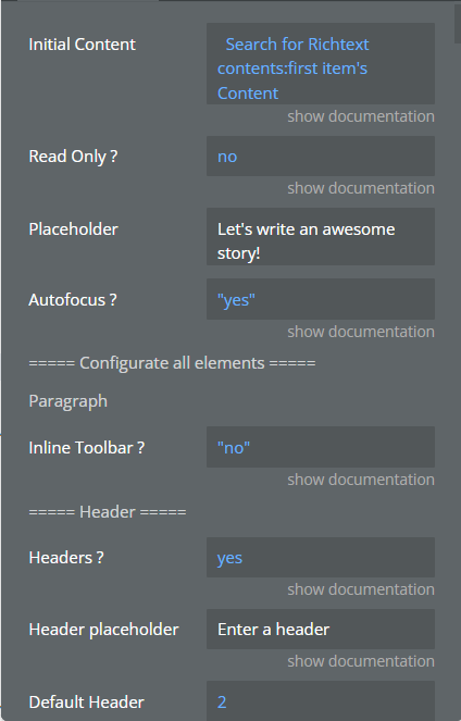
The list with all fields:
Title | Description | Type |
Initial Content | (Optional) This property defines the initial content to be displayed within the editor upon initialization. It has to be JSON-formatted in the same format that what the editor gives as output. | Text |
Read Only | When set to “Yes”, this property makes the editor read-only, meaning users can't make changes to the content, but can see/read it. | Yes/No |
Autofocus | Use this property to determine whether the editor should automatically focus on load or if the user needs to manually click into it to start editing.
If set to “Yes”, the editor automatically gains focus when it's loaded. | Yes/No |
===== Configurate all elements ===== | ||
===== Paragraph ===== | ||
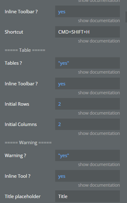
Inline Toolbar | The inline toolbar provides users with quick access to formatting options while they are editing text within a Paragraph block.
Enabling the inline toolbar allows users to format text without needing to select the entire block. Instead, they can simply highlight the portion of text they wish to format and use the inline toolbar options. | Yes/No |
Paragraph placeholder | Serves to define placeholder text for the Paragraph block within the editor. This text appears when the Paragraph block is empty, offering guidance or context for users regarding the content they should input into the block. | Text |
Headers | ||
Headers | Makes the Header block available for users, empowering them to include headings in their Editor.js content to improve readability and structure.
Do not let “Initial Content” have headers if this field is set to “No” | Yes/No |
Header placeholder | Serves to define placeholder text for the Header block within the editor. This text appears when the Header block is empty, offering guidance or context for users regarding the content they should input into the block. | Text |
Default Header | This determines the default size or importance of the header text when a new Header block is added. Header levels typically range from 1 to 6, with 1 being the largest and most important, and 6 being the smallest and least important. By specifying a default level, users can streamline their editing process by automatically applying their preferred header size whenever they add a new Header block.
The weight of the default header (1 for H1, 2 for H2, 3 for H3...) | Number |
Inline Toolbar | Determines whether the inline toolbar is enabled for the Header block in the editor. When set to yes, it allows users to access formatting options directly within the Header block itself, simplifying the editing process by providing quick access to styling tools. If set to no, the inline toolbar for the Header block will be disabled, and users will need to use the main toolbar at the top of the editor to apply formatting to their headers. | Yes/No |
Shortcut | Refers to the keyboard shortcut assigned to quickly make from block a Header block in the editor. When configured, users can use this shortcut combination to efficiently set header sections without the need to navigate through the toolbar. | Text |
===== Table ===== | ||
Tables | When set to yes, users can add tables to their content, facilitating the organization and presentation of tabular data within the editor interface.
Be aware when setting this field to “no”, and your initial content should not contain it. | Yes/No |
Inline Toolbar | Specifies whether the inline toolbar should be enabled for the Table block. When set to “ yes”, users can access a set of formatting options directly within the Table block, making it easier to customize the appearance and structure of the table without needing to navigate to a separate toolbar. | Yes/No |
Initial Rows | The number of rows initially displayed when a new table is created. | Number |
Initial Columns | The number of columns initially displayed when a new table is created. | Number |
===== Warning ===== | ||
Warning | When set to yes, it allows users to add Warning blocks to their content, providing a visual warning or alert message within the editor interface. This feature can be useful for highlighting important information, notifying users about potential risks, or drawing attention to specific content elements. | Yes/No |
Inline Tool | Specifies whether the inline toolbar for the Warning block is enabled or disabled. | Yes/No |
Title placeholder | Defines the placeholder text that appears in the input field for the title of a Warning block. This placeholder text provides guidance or a suggestion to the user regarding the type of content expected in the title field. It helps users understand the purpose of the field and prompts them to enter relevant information related to the warning message's title. | Text |
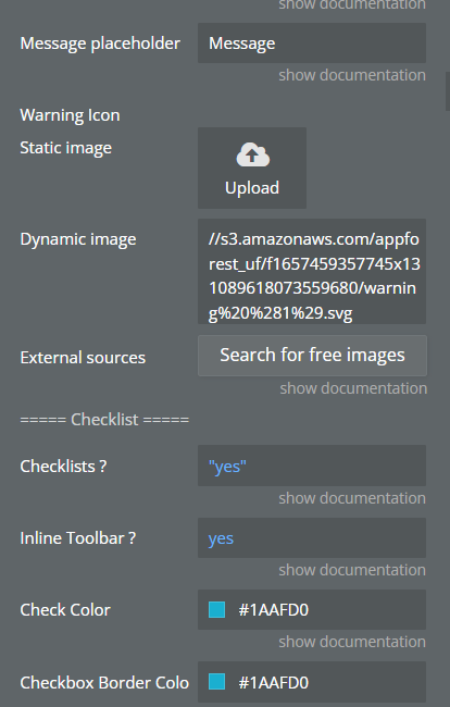
Message placeholder | Specifies the placeholder text that appears in the input field for the message content of a Warning block. This placeholder text serves as a temporary hint or suggestion to users, indicating the type of information expected in the message field. By providing descriptive placeholder text, users are guided on what kind of content to input, enhancing the usability and clarity of the editor interface. | Text |
Warning Icon | Refers to the icon that is displayed alongside a Warning block in the editor interface. This icon serves as a visual indicator to users, alerting them to the presence of a warning message. | Image |
===== Checklist ===== | ||
Checklists | Determines whether the Checklist block is enabled or disabled in the editor. When enabled, users can create checklist items within the editor interface to organize tasks, create to-do lists, or outline steps in a process. | Yes/No |
Inline Toolbar | Specifies whether the Checklist block should have an inline toolbar enabled or not. When set to yes, it allows users to access formatting options directly within the Checklist block. | Yes/No |
Check Color | Defines the color of the checkbox when it is checked. | Color |
Checkbox Border Color | Defines the border color of the checkbox when it is checked. | Color |
===== Quote ===== | ||
Quotes | It enables users to insert and style block quotes, which are visually distinct sections of text often used to highlight important or noteworthy content. | Yes/No |
Inline toolbar | If set to yes, users can insert and edit quote blocks directly within the text flow, allowing for seamless integration of quoted text within paragraphs or other content. | Yes/No |
Quote placeholder | Defines the placeholder text displayed within the quote block for the quote itself, guiding users on where to input their quoted text. | Text |
Author placeholder | Sets the placeholder text within the quote block for the author attribution, indicating where users should provide the name or source of the quote. | Text |
Border Color | This property allows you to specify the color of the border surrounding the quote block. | Color |
Border Width (px) | This property determines the thickness in px of the border surrounding the quote block. | Number |
Border Radius | With this property, you can define the curvature of the corners of the quote block's border. A higher value will result in rounder corners, while a lower value will make them sharper. | Number |
===== Image ===== | ||
Images | This property enables the functionality to add images to your text editor. When set to yes, users can insert images into their content. | Yes/No |
Button Content | This property defines the content or text displayed on the button used to insert images. It allows you to customize the label or wording on the button, making it more intuitive for users to add images to their content. | Text |
===== Inline Code Tool ===== | ||
Inline Code | When this property is set to yes, it enables the ability to insert inline code blocks into the text editor. These inline code blocks are used to display code snippets within the text seamlessly. | Yes/No |
Background Color | This property determines the background color of the inline code blocks. | Color |
Font Color | With this property, users can specify the color of the text within the inline code blocks. | Color |
===== Delimiter ===== | ||
Delimiters | When set to yes, this property enables the option to insert delimiter blocks into the text editor. Delimiter blocks visually separate sections of text, aiding in organizing and structuring content. | Yes/No |
Content | This property defines the content or symbol used as the delimiter within the delimiter blocks. | Text |
Color | With this property, users can specify the color of the delimiter within the delimiter blocks. | Color |
Font Size | This property determines the size of the font used for the delimiter content within the delimiter blocks. | Number |
===== Raw HTML ===== | ||
Raw HTML | When set to yes, this property allows users to insert raw HTML code blocks into the text editor. Raw HTML blocks enable users to directly input and customize HTML code within the editor. | Yes/No |
Font Color | This property defines the color of the text displayed within the raw HTML code blocks. | Color |
Background Color | The background color of the raw HTML code blocks. | Color |
===== Lists ===== | ||
Lists | When set to yes, this property enables the option to create lists and nested lists within the text editor.
Use Tab and Shift+Tab keys to create or remove nested list. | Yes/No |
Inline toolbar | The inline toolbar provides users with quick access to formatting options while they are editing text within a Lists block. | Yes/No |
===== Embed (iFrame) ===== | ||
Embeds (iFrames) | When set to yes, this property enables users to insert embedded content blocks into the text editor. Embedded content can include items like videos, social media posts, or interactive elements.
Just paste the link to the resource as a simple text, if it is accessible it will be shown on the page. | Yes/No |
===== Code ===== | ||
Code Blocks | When set to yes, this property enables users to insert code blocks into the text editor. Code blocks are used for displaying and formatting code snippets within the text. | Yes/No |
===== Marker ===== | ||
Markers Tool | If set to yes, this property enables the marker tool within the text editor. The marker tool allows users to highlight or mark specific portions of text for emphasis. | Yes/No |
Marker Color | The color of the Marker. | Color |
===== Alerts ===== | ||
Alerts | When set to yes, this property enables the functionality to add alert blocks to the text editor. Alert blocks are used to display important messages or notifications within the content. | Yes/No |
Inline Toolbar | Enables the inline-toolbar for Alerts blocks. | Yes/No |
Default | This property specifies the default type of alert block to be used.
Type can be set in the editor, but this sets the default type when adding alert. | Dropdown ( primary,secondary,info,success,warning,danger,light,dark ) |
Placeholder | This property defines the placeholder text displayed within the alert block for users to input their message or notification content. It provides guidance to users on what type of information to enter into the alert block. | Text |
===== Text Variant ===== | ||
Text Variant Tool | This option decides whether users can use different styles (like callouts, citations, or details) to make text stand out. | Yes/No |
Callout Border Color | The border color of the callout block. | Color |
Callout Shadow Color | The shadow color of the callout block. | Color |
For Paragraphs | Allow users to apply special styles (like callouts or citations) to paragraphs of text. | Yes/No |
For Headers | Enable users to use special styles (like callouts or citations) for headers. | Yes/No |
For Lists | Provide the option to apply unique styles (like callouts or citations) to items in a list. | Yes/No |
For Checklists | Allow users to use special styles (like callouts or citations) for items in a checklist. | Yes/No |
===== Button ===== | ||
Buttons | Indicates whether the button block is enabled or not. | Yes/No |
Buttons Type | Define the type of the buttons. If set to 'Open Tab', it will open a new tab with destination the link you provided. If you select 'Trigger Custom Workflow', it will trigger the event "Custom Button is Clicked". | Dropdown (Open Tab,Trigger Custom Workflow) |
Background color | The background color of the button. | Color |
Text Color | The color of the text inside the button. | Color |
Border Color | The color of the border of the button. | Color |
==== Text Alignment ===== | ||
Direction | Direction from which the text will start | Dropdown |
Text Alignment | This property likely controls whether a text alignment tuning tool is available within the editor. | Yes/No |
For Paragraphs | Allow text-alignment for paragraphs. | Yes/No |
For Headers | Allow text-alignment for headers. | Yes/No |
For Quotes | Allow text-alignment for quotes. | Yes/No |
For Images | Allow text-alignment for images caption. | Yes/No |
For Warnings | Allow text-alignment for warnings. | Yes/No |
===== Drag & Drop ===== | ||
Enable Drag & Drop | Determines whether the drag and drop functionality for blocks is enabled. | Yes/No |
===== Font Tools ===== | ||
Enable Underline tool | Determines whether the underline formatting tool is enabled. | Yes/No |
Enable Strikethrough tool | Determines whether the strikethrough formatting tool is enabled. | Yes/No |
===== Attachment ===== | ||
Enable Attachment tool | Determines whether the attachment tool for adding files to the editor is enabled. | Yes/No |
Attachment button content | Text for the Attachment Button | Text |
Upload failed text | Text when the upload attachment content fails. | Text |
===== Translation ===== | ||
Enable Translation | Determines whether internationalization (translation) support is enabled.
Changes in the editor the exiting text with the one written to the corresponding field. | Yes/No |
Convert to | Translation for the text in the inline toolbar for converting block types. | Text |
Click to tune | Translation for the tooltip message when clicking to open block settings. | Text |
Add | Translation for the 'Add' button text in the toolbar. | Text |
Paragraph | Translation for the 'Paragraph' block type. | Text |
Heading | Translation for the 'Heading' block type. | Text |
List | Translation for the 'List' block type. | Text |
Warning | Translation for the 'Warning' block type. | Text |
Quote | Translation for the 'Quote' block type. | Text |
Checklist | Translation for the 'Checklist' block type. | Text |
Code | Translation for the 'Code' block type. | Text |
Delimiter | Translation for the 'Delimiter' block type. | Text |
Raw HTML | Translation for the 'Raw HTML' block type. | Text |
Table | Translation for the 'Table' block type. | Text |
Marker | Translation for the 'Marker' tool. | Text |
Bold | Translation for the 'Bold' text formatting. | Text |
Inline Code | Translation for the 'Inline Code' text formatting. | Text |
Italic | Translation for the 'Italic' text formatting. | Text |
Image | Translation for the 'Image' block type. | Text |
Alert | Translation for the 'Alert' block type. | Text |
Link | Translation for the 'Link' tool. | Text |
Underline | Translation for the 'Underline' text formatting. | Text |
Font Family | Translation for the 'Font Family' tool. | Text |
Font Size | Translation for the 'Font Size' tool. | Text |
Text Color | Translation for the 'Text Color' tool. | Text |
Strikethrough | Translation for the 'Strikethrough' text formatting. | Text |
Move up | Translation for the 'Move Up' action (for blocks). | Text |
Move down | Translation for the 'Move Down' action (for blocks). | Text |
Delete | Translation for a 'Delete' block action. | Text |
Click to delete | Translation for a 'Click to delete' block action. | Text |
Unordered | Translation for the 'Unordered List' block type. | Text |
Ordered | Translation for the 'Ordered List' block type. | Text |
Unavailable block | Translation for an indication that a block type is unavailable or not supported. | Text |
Details | Translation for the 'Details' block type. | Text |
Call-out | Translation for the 'Callout' block type. | Text |
Citation | Translation for the 'Citation' block type. | Text |
Attachment | Translation for the 'Attachment' block type. | Text |
Select file to upload | Translation for the text displayed on the attachment tool's select file button. | Text |
File upload failed | Translation for a message indicating that attachment upload has failed. | Text |
With border | Translation for option indicating an image can have a border. | Text |
Stretch image | Translation for an option indicating an image can be stretched. | Text |
With background | This property defines the translation for indicating whether an image can have a background. | Text |
Button | This property defines the translation for the block "Button". It specifies how the term "Button" should be translated in the user interface. | Text |
Set (for Buttons) | This property expects a translation for the action of setting a button. | Text |
Button Text | This property expects a translation for the placeholder text used for entering button text. | Text |
Link Url | This property expects a translation for the placeholder text used for entering button URLs. | Text |
With Headings | This property expects a translation for indicating the option to include headings in tables. | Text |
Without Headings | This property expects a translation for indicating the option to exclude headings in tables. | Text |
Add row above | This property expects a translation for the action of adding a row above in a table. | Text |
Add row below | This property expects a translation for the action of adding a row below in a table. | Text |
Delete row | This property expects a translation for the action of deleting a row in a table. | Text |
Add column left | This property expects a translation for the action of adding a column to left in a table. | Text |
Add column right | This property expects a translation for the action of adding a column to right in a table. | Text |
Delete column | This property expects a translation for the action of deleting a column in a table. | Text |
Left | Translation for the 'Left' alignment. | Text |
Right | Translation for the 'Right' alignment. | Text |
Center | Translation for the 'Center' alignment. | Text |
Danger | Translation for the 'Danger' option in alert block. | Text |
Dark | Translation for the 'Dark' theme. | Text |
Light | Translation for the 'Light' theme. | Text |
Info | Translation for the 'Info' option in alert block. | Text |
Success | Translation for the 'Success' option in alert block. | Text |
Warning | Translation for the 'Warning' option in alert block. | Text |
Primary | Translation for the 'Primary' option in alert block. | Text |
Secondary | Translation for the 'Secondary' option in alert block. | Text |
Element States
Title | Description |
Content (JSON as Text) | Represents the structured data that represents the content within the Editor.js instance. This data typically includes information about the blocks of text, images, tables, and other elements present in the editor. It's serialized into a JSON format to be stored, manipulated, and transferred more easily within the application. |
Last Event Triggered | The ID you specified in the Button Field that has just been clicked.
Use this state to get the id of the clicked button. Important to know the state works only with the Button Type set to “Trigger Custom Workflow”.
Ex: www.google.com/id123 ⇒ id = id123 |
Last Action Type | The last action done. Can be one of those : "block-added", "block-changed", "block-removed” |
Last Action Block Type | The block type on which the last action was done. Can be "paragraph", "header", "checklist"... depending on what you've enabled. |
Is Read-Only | Returns "yes" if the Editor is currently in read-only mode. |
Element Events
Title | Description |
Caret Position has been changed | Is fired when the caret position has been modified by action "Set Caret Position".
The caret position is typically represented as a vertical line or blinking cursor on the screen, indicating the exact position within the text where the user's input will take effect. |
Custom Button is Clicked | Is fired when a Editor Button is Clicked. Important to know the event works only with the Button Type set to “Trigger Custom Workflow”. |
New Block is added | Is fired when a new block is added inside an Editor. |
Block is removed | Is fired when a block is being removed from an Editor. |
Block is changed | Is fired when a block is being changed inside an Editor. |
Block is moved | Is fired when a block is being moved inside an Editor. |
Element Actions
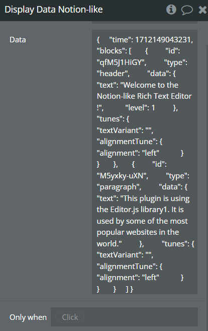
Display Data
Action to display data inside an Editor
Title | Description | Type |
Data | Data to display in the editor, if the data is empty and action called, the editor is cleared.
It has to be JSON-formatted in the same format that what the editor gives as output. | Text |
Open toolbar
Action to open the toolbar.

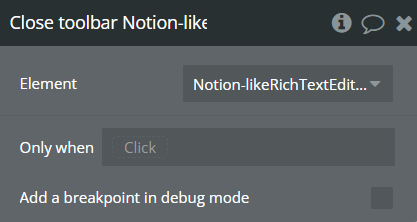
Close toolbar
Action to close the toolbar if it is opened.
Set Caret Position
Action to define the caret's position and trigger the caret event.
A caret position is the location where the text cursor (the blinking vertical line) is currently placed within a text editor or input field. It indicates where new text will be inserted when you start typing.
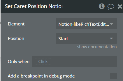
Title | Description | Type |
Position | Define the new position of the caret from the given dropdown: Start, End, Focus.
If the value of is 'Start', it sets the caret position to the start of the first block in the editor.
If the value is 'End', it sets the caret position to the end of the first block in the editor.
If the value is 'Focus', it focuses on the editor, presumably bringing it into view or activating it. | Dropdown (Start, End, Focus ) |
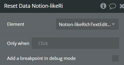
Reset Data
Reset data of an Editor, clears all the content.
Set Read-only
Sets value of read-only mode.
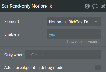
Title | Description | Type |
Enable | Enable or disable read-only mode | Yes/No |
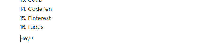
Add a Paragraph
Adds a paragraph with dynamic text at the end of the Editor.
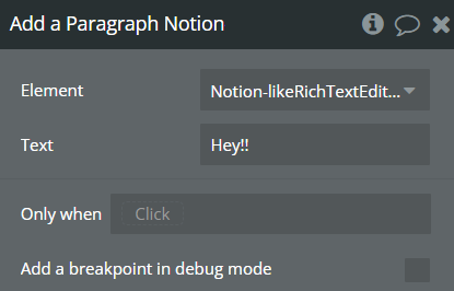
Title | Description | Type |
Text | Paragraph content | Text |