
Link to the plugin page: https://zeroqode.com/plugin/paint--signature-pad-plugin-for-bubble--1527080158066x421238979880812540
Demo to preview the plugin:
Introduction
Our no-code plugin allows your users to draw their own pictures directly within a Bubble application. Use it to create your own graphics or sign a document. Setting it up is simple.
In order to set the plugin up, just place it on a page, enable the necessary functions, and let your users take care of the rest.
Users can upload existing images from their desktop or add them by dragging from any page. As a result, the plugin returns an image that can be saved into a database or downloaded by the user.
Note: The plugin may not function correctly on iOS devices running versions up to 12.
To receive special offers and important updates please visit:

Video Tutorial
How to setup
- Add the Element to Your Bubble Page
- In the Design tab of the Bubble editor, drag and drop the "Paint & Signature Pad" element onto your page.
- Adjust the size and settings of the element as needed.
- Configure the Workflow.
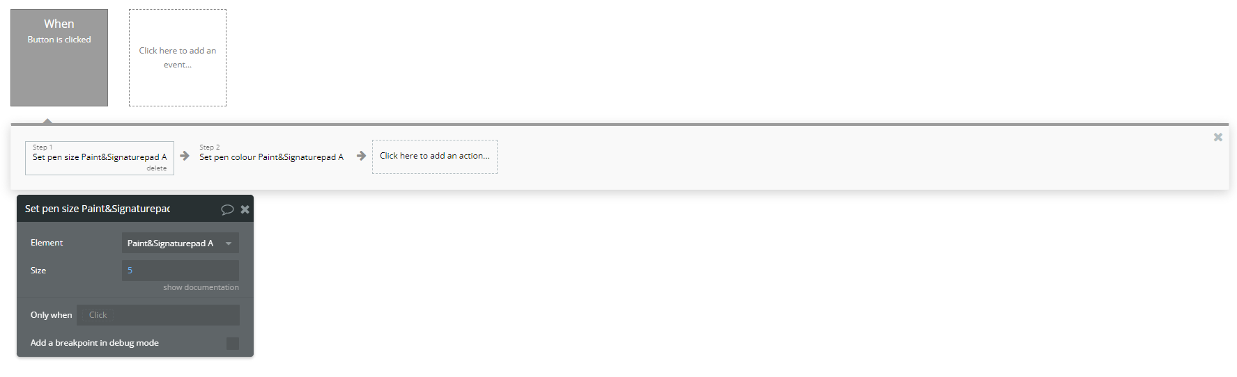
- Add a button named "Set Pen Style" to your page.
- In the Workflows tab, create a new workflow event: "When Button Set Pen Style is clicked".
- Click "Add an Action" → "Plugins" → "Set Pen Size A Paint & Signature Pad".
- Select the Paint & Signature Pad element and set the pen size (e.g.,
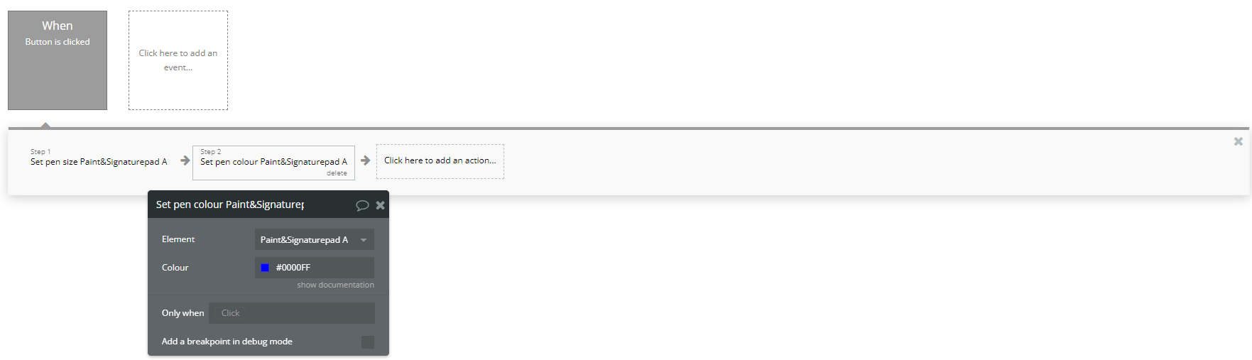
5for a medium stroke). - Add another action "Set Pen Colour A Paint & Signature Pad" and define a color (e.g.,
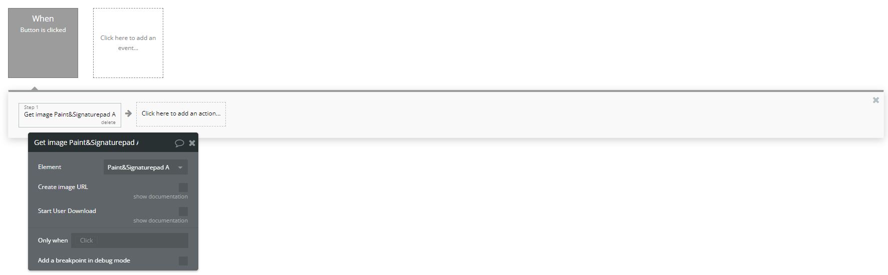
#0000FFfor blue). - Add a button named "Save Drawing".
- In the Workflows tab, create a new workflow event: "When Button Save Drawing is clicked".
- Add the action "Get Image A Paint & Signature Pad".
- Save the resulting image to the database (e.g., in an image-type field inside the User table).
- Display the saved image in an Image Element on the page.
- Add a button named "Clear".
- In the Workflows tab, create a new workflow event: "When Button Clear is clicked".
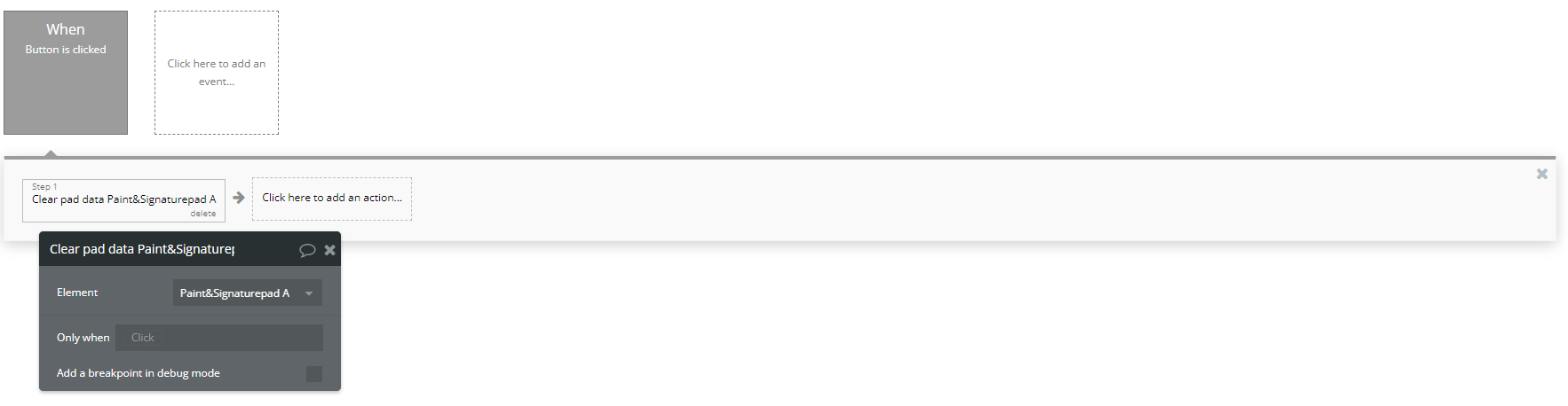
- Add the action "Clear Pad Data A Paint & Signature Pad" to erase all drawings and signatures from the pad.
The plugin provides several actions to interact with the drawing pad. Here are some practical examples:
Example 1: Set Pen Size and Color
Example 2: Save a Signature or Drawing
Example 3: Clear the Canvas
- Additional Features
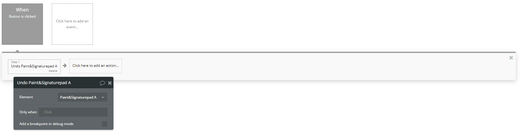
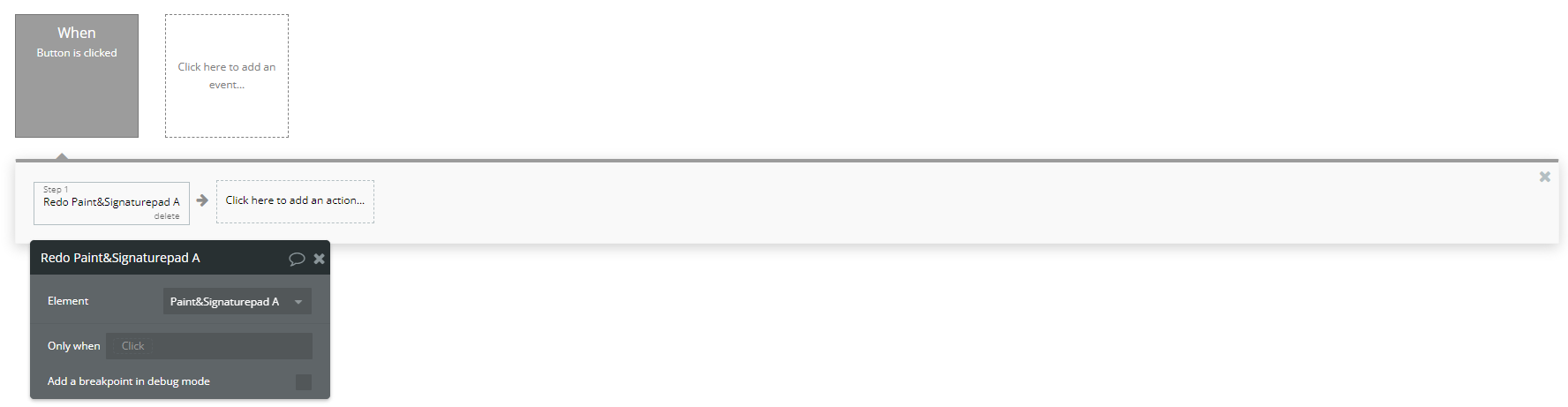
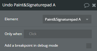
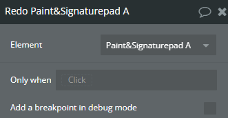
- Undo and Redo: Add buttons for "Undo" and "Redo", then create workflows using the respective actions to let users revert or redo a drawing.
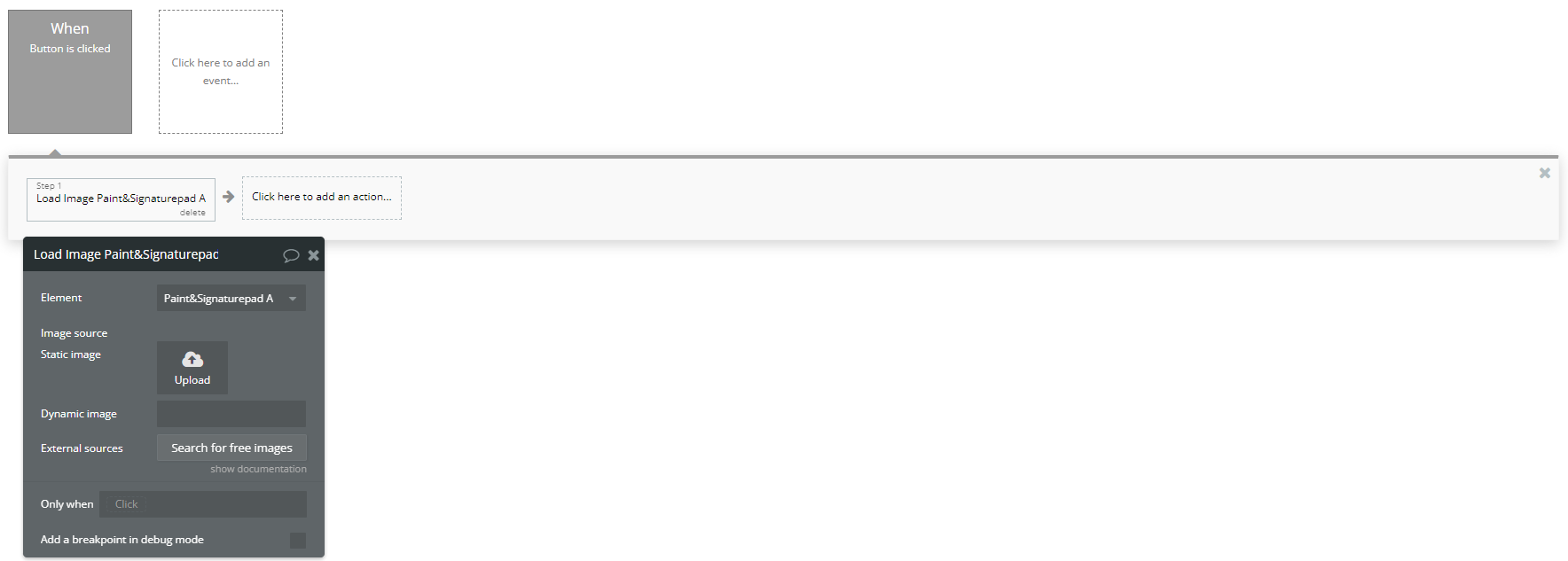
- Load an Image: Add a button named "Load Image", and in the workflow, use the "Load Image A Paint & Signature Pad" action to upload an image onto the pad as a background.
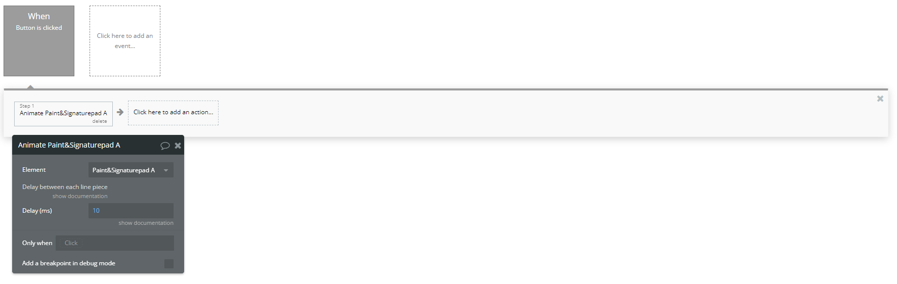
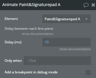
- Animate the Drawing Process: Add a button named "Animate Drawing", then use the "Animate A Paint & Signature Pad" action to replay the drawing process.
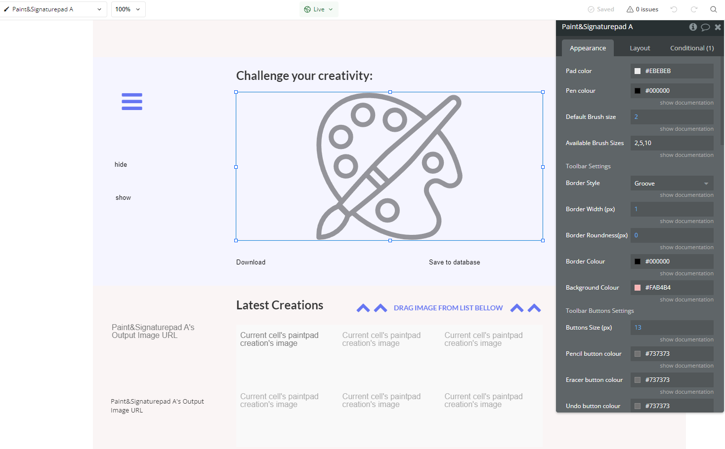
Plugin Element Properties
Paint & Signature pad
Fields:
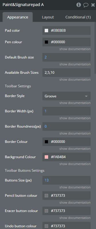
Title | Description | Type |
Pad color | Defines the background color of the drawi | Color |
Pen colour | Pen colour | Color |
Default Brush size | Pen size | Number |
Available Brush Sizes(5) | Available Brush sizes | Text |
Toolbar Settings | ||
Border Style | Border Style Available options: None, Solid, Dotted, Dashed, Double, Groove, Ridge, Inset, Outset | Dropdown |
Border Width (px) | ToolbarBorderWidth | Number |
Border Roundness(px) | Border Roundness | Number |
Border Colour | Border Colour | Color (optional) |
Background Colour | Background Colour | Color (optional) |
Toolbar Buttons Settings | ||
Buttons Size (px) | Button Size (px) | Number |
Pencil button colour | Pencil button colour | Color |
Eracer button colour | Eraser button colour | Color |
Undo button colour | Undo button colour | Color |
Redo button colour | Redo button colour | Color |
Upload button colour | Upload button colour | Color |
TextBox button colour | Save button colour | Color |
Fill button colour | Fill button colour | Color |
Download button colour | Download button colour | Color |
Remove button colour | Remove button colour | Color |
Sub-menu background | Defines the background color of the sub-menus within the toolbar. | Color |
Sub-menu elements | Defines the color of the text and icons inside the sub-menus. | Color |
Insert desired font sizes (should be comma separated) | ||
Fonts | Defines the font options available for text elements on the pad. Example: Arial, Times New Roman, Helvetica | Text |
GOOGLE Fonts API Key | Allows access to Google Fonts for additional font customization. | Text |
Upload to server | If enabled, the generated image will be automatically uploaded to the server. | Checkbox (yes/no) |
Keep Proportions | Keep Proportions | Checkbox (yes/no) |
Save as format | Available options: png, jpeg(deprecated) | Dropdown (optional) |
Toolbar position | Available options: Left, Right | Dropdown |
Choose tools | ||
Pencil | Enables or disables the pencil tool for drawing. | Checkbox (yes/no) |
Eraser | Enables or disables the eraser tool. | Checkbox (yes/no) |
Undo | Enables or disables the undo function. | Checkbox (yes/no) |
Redo | Enables or disables the redo function. | Checkbox (yes/no) |
Image | Allows users to upload an image to the pad. | Checkbox (yes/no) |
Font | Enables text input functionality. | Checkbox (yes/no) |
Minicolors | Enables or disables the color selection tool. | Checkbox (yes/no) |
Fill | Enables the fill tool for filling areas with a selected color. | Checkbox (yes/no) |
Download | Allows users to download their drawing as an image file. | Checkbox (yes/no) |
Trash | Enables the trash button to clear the entire pad. | Checkbox (yes/no) |
Element Actions
- Set pen size - Edit pen size
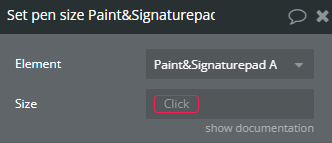
Title | Description | Type |
Size | Size | Number |
- Set pen colour - Edit pen colour
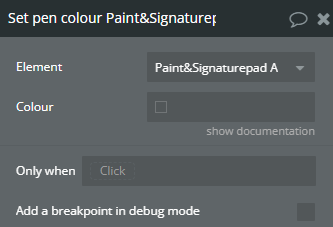
Title | Description | Type |
Colour | Colour | Color |
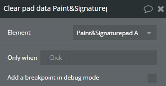
- Clear pad data - Clear out pad
- Load Image - Load Image
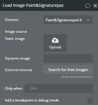
Title | Description | Type |
Image source | Image source | Image |
- Get image - Get image
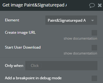
Title | Description | Type |
Create image URL | Allows creating an URL to download the image | Checkbox (yes/no) |
Start User Download | Allows the user to automatically start the image download process | Checkbox (yes/no) |
- Undo - Undo
- Redo - Redo
- Animate - Animate
Title | Description | Type |
Delay between each line piece | ||
Delay (ms) | Delay | Number |
Exposed states
Title | Description | Type |
Output Image URL | Output Image URL | Image |
Element Events
Title | Description |
output image is ready | image is ready |
