The Onboarding for Bubble Mobile Plugin helps you welcome new users with a smooth and engaging experience. It includes:
Intro screens for key messages or branding
Walkthrough carousels to show features or give quick tutorials
Progress indicators to guide users step by step
All elements are easy to customize and can trigger workflows based on user actions. You can also personalize the onboarding flow using user data.
It offers smooth animations, flexible layouts, and works without needing any code – helping users better understand your app from the start.
Prerequisites
This plugin is designed specifically for the mobile version of the Bubble editor. To test the plugin on your mobile device, use the TestFlight app available at:
Please note that the testing app is currently available for iOS only.
How to setup
Install the Plugin: Navigate to your Bubble app’s Plugin tab and install the Onboarding for Bubble Mobile Plugin from the Plugin store.
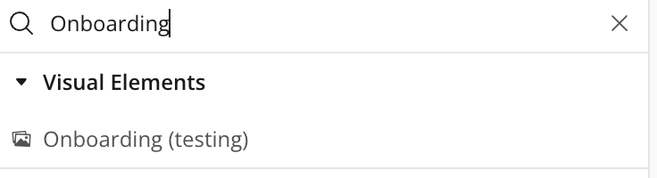
Add the Onboarding Element from the Visual Elements section onto your page.
Configuration: In the element properties panel, select whether the element should be displayed as a popup or a slider and configure accordingly.
Plugin Element - Onboarding
This Onboarding helps you create smooth, engaging first-time user experiences in your mobile app. Easily add intro screens, feature walkthroughs, and progress indicators—no code needed.
Fields
Title
Description
Type
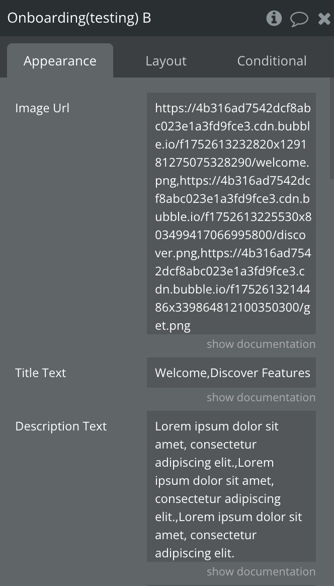
Image Url
Comma-separated string or list of image URLs
Text
Title Text
Comma-separated string or list of slide titles.
Text
Description Text
Comma-separated string or list of slide descriptions.
Text
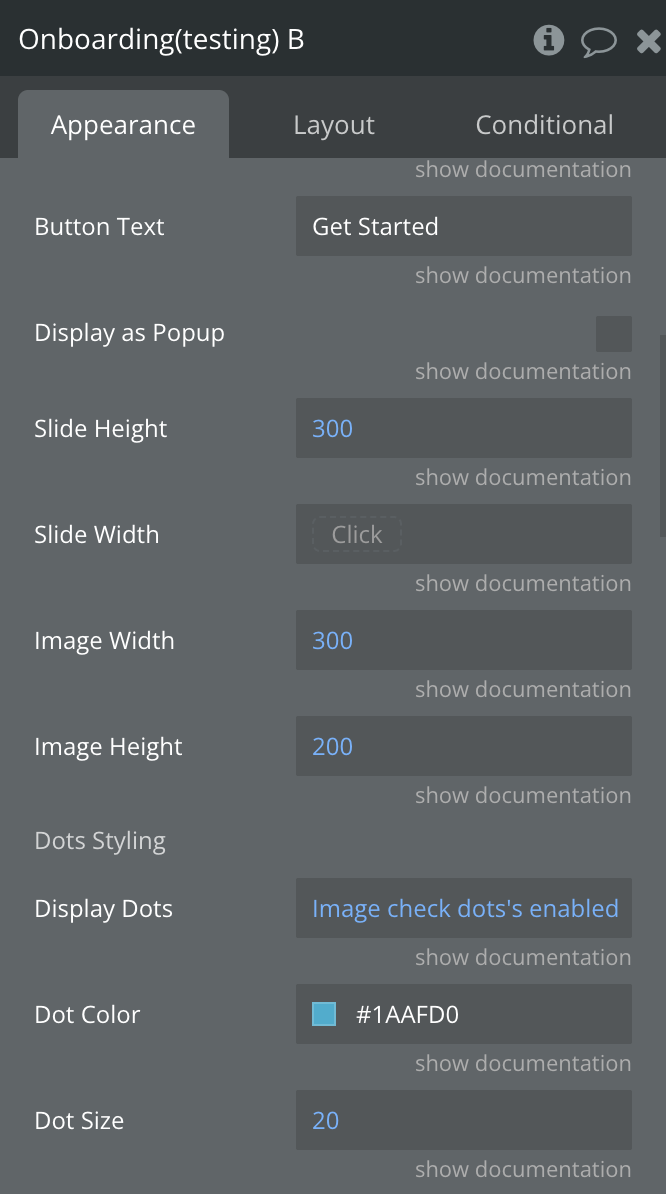
Button Text
Text inside the button to complete onboarding
Text
Display as Popup
Indicates if the Onboarding should Be a Popup or Slider
Checkbox
Slide Height
Slide Width in pixels
Number
Slide Width
Slide height in pixels
Number
Image Width
Image Width in pixels
Number
Image Height
Image height in pixels
Number
Dots Styling
Display Dots
Show/hide pagination dots.
Yes/No
Dot Color
Color for pagination dots
Color
Dot Size
Size of pagination dots in pixels.
Number,
Arrows Styling
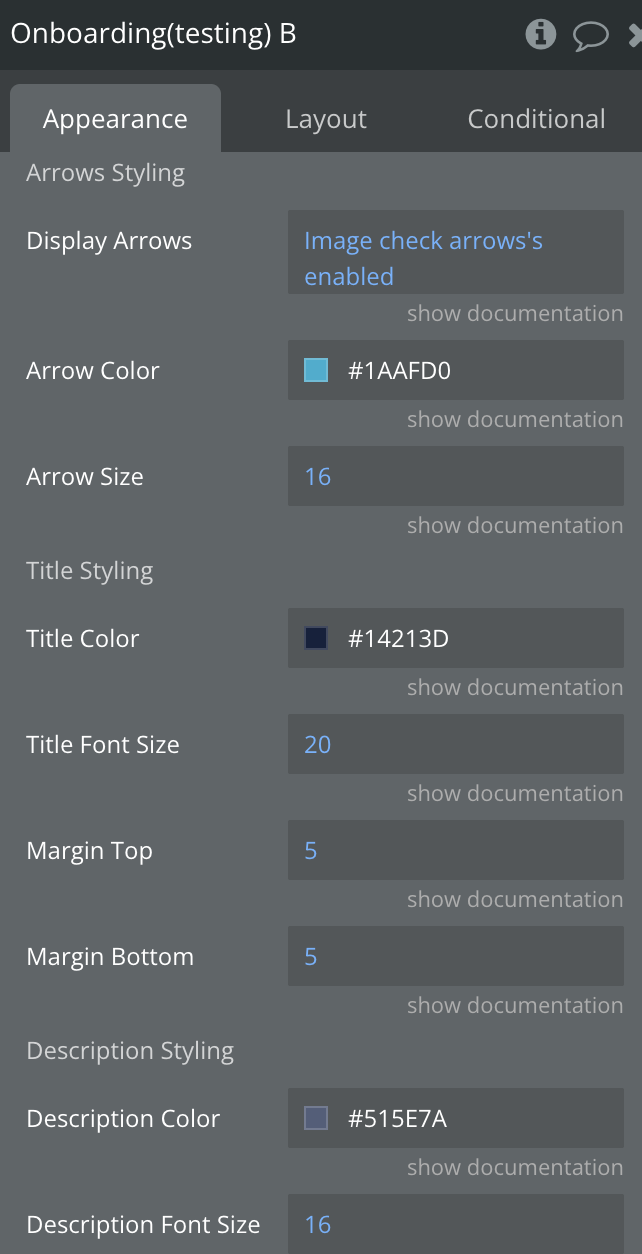
Display Arrows
Show/hide navigation arrows.
Yes/No
Arrows Color
Color for navigation arrowss
Color
Arrows Size
Size of navigation arrows in pixels.
Number
Title Styling
Title Color
Color for slide title text
Color
Title Font Size
Font size for slide title text in pixels.
Number
Margin Top
Top margin for title text in pixels.
Number
Margin Bottom
Bottom margin for title text in pixels.
Number
Description Styling
Description Color
Color for slide description text
Color
Description Font Size
Font size for slide description text in pixels.
Number
Margin Top
Top margin for description text in pixels.
Number
Margin Bottom
Bottom margin for description text in pixels.
Number
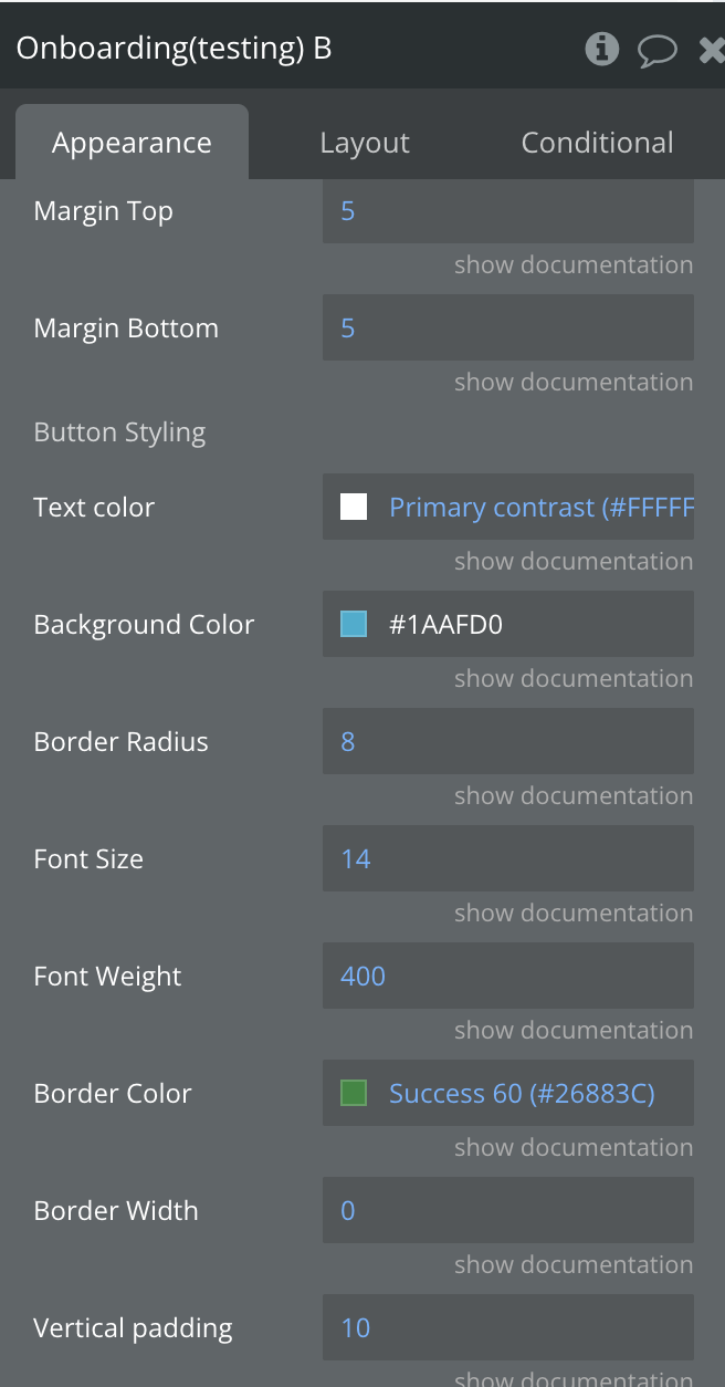
Button Styling
Text Color
Color for button text
Color
Background Color
Background color for button
Color
Font Size
Font size for slide description text in pixels.
Number
Border Radius
Border radius for button in pixels.
Number
Font Size
Font size for button text in pixels.
Number
Font Weight
Font weight for button text
Number
Border Color
Border color for button
Color
Border Width
Border width for button in pixels.
Number
Vertical padding
Vertical padding for button in pixels.
Number
Horizontal padding
Horizontal padding for button in pixels.
Number
Margin Top
Top margin for button in pixels.
Number
Margin Bottom
Bottom margin for button text in pixels.
Number
Theme
Onboarding theme
Dropdown
Skip Button Styling
Text Color
Text Color of Skip Button
Color
Background Color
Background Color of Skip Button
Color
Font Size
Font Size of Skip Button
Number
Font Weight
Font Weight of Skip Button
Number
Element States
Title
Description
Type
Active Slide Index
Indicates the current index
Number
Onboarding Completed
Indicates whether the onboarding is complete
Yes/No
Element Events
Title
Description
A Slide Changed
Triggered when a slide is changed
Complete Button Clicked
Triggered when the complete onboarding button is clicked
Element Action
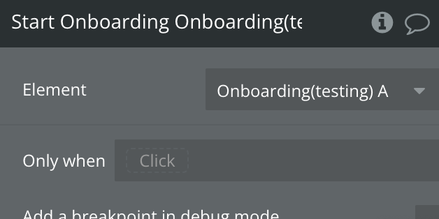
Start Onboarding
Begins the user onboarding process by displaying welcome screens, feature walkthroughs, and progress indicators to guide new users through their first interactions with the app.
Plugin Element - Tooltip
A native tooltip element that renders a fully styled overlay at exact page coordinates in Bubble Mobile, allowing developers to display contextual information at any position on the page, with directional arrow support, theme control, and open/close state reporting.
Fields
Name
Description
Type
Visible
Controls whether the tooltip is visible
Yes/No
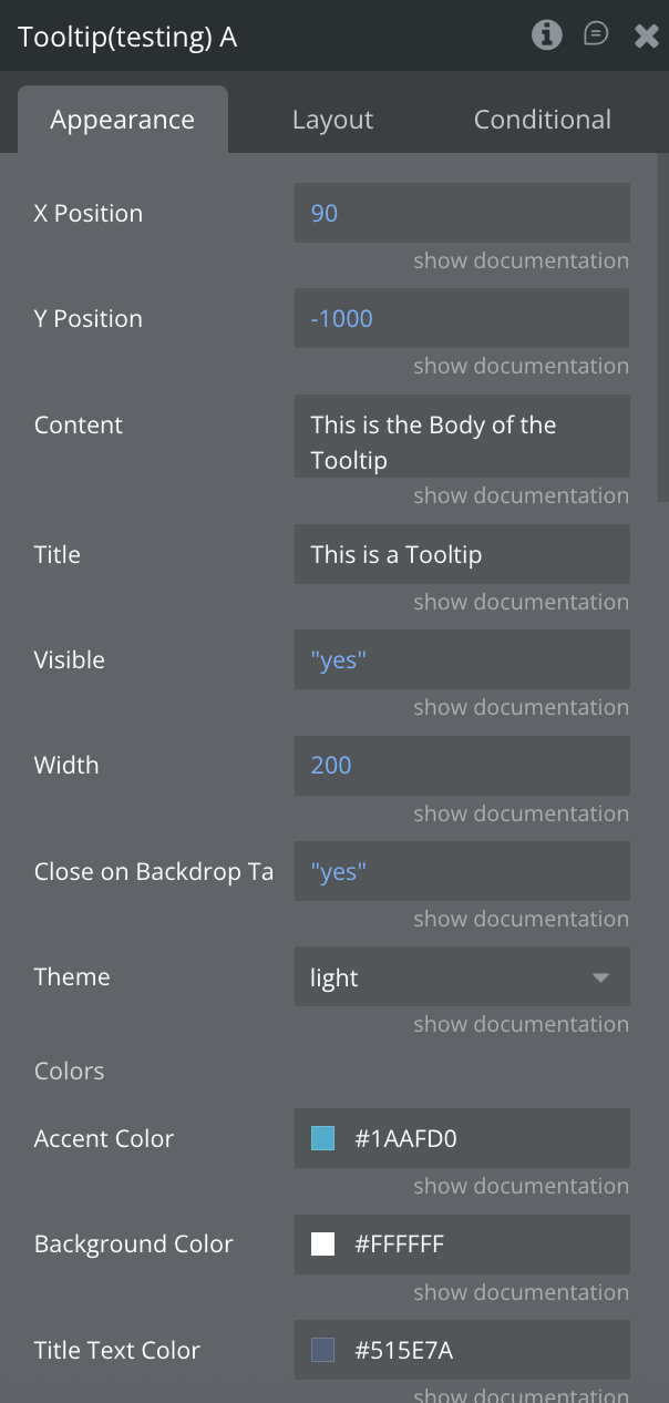
X Position
Horizontal (left) position of the tooltip in pixels
Number
Y Position
Vertical (top) position of the tooltip in pixels
Number
Content
Main body text displayed inside the tooltip
Text
Title
Header title text displayed at the top of the tooltip
Text
Theme
Tooltip theme ("dark" or "light")
Text
Width
Width of the tooltip in pixels
Number
Accent Color
Accent color used for highlights and indicators
Color
Background Color
Custom background color of the tooltip
Color
Title Text Color
Custom title text color
Color
Content Text Color
Custom body text color
Color
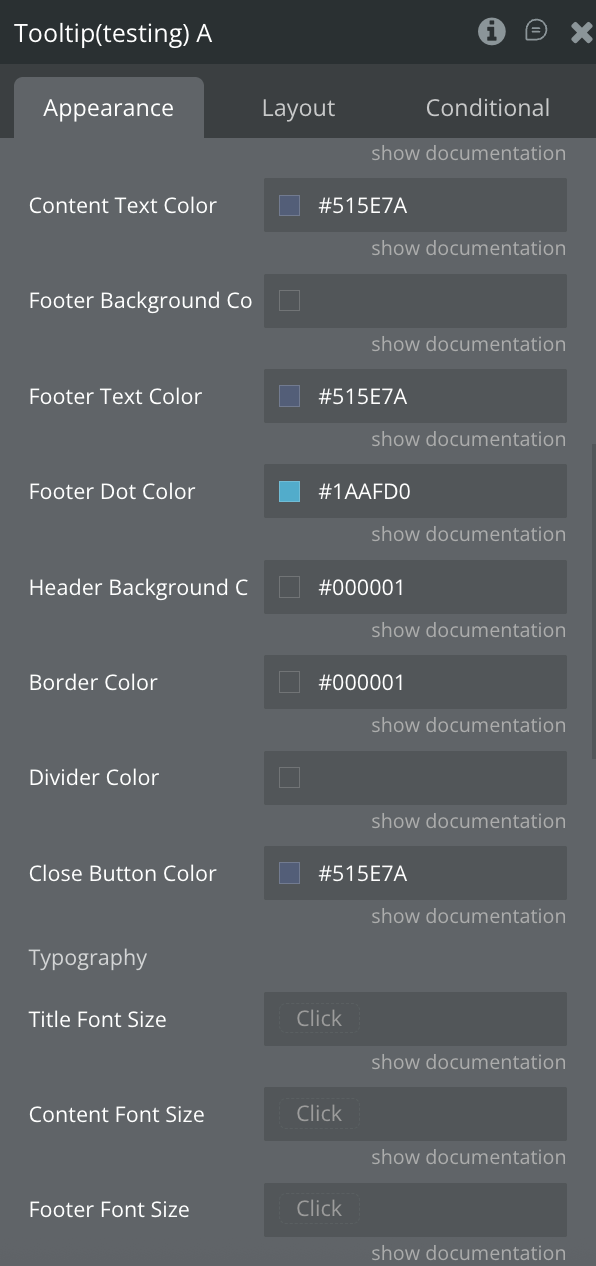
Footer Background Color
Background color of the footer tag
Color
Footer Text Color
Text color of the footer label
Color
Footer Dot Color
Color of the small footer indicator dot
Color
Header Background Color
Background color of the header section
Color
Border Color
Border color of the tooltip
Color
Divider Color
Color of header/footer divider lines
Color
Close Button Color
Color of the close (✕) button
Color
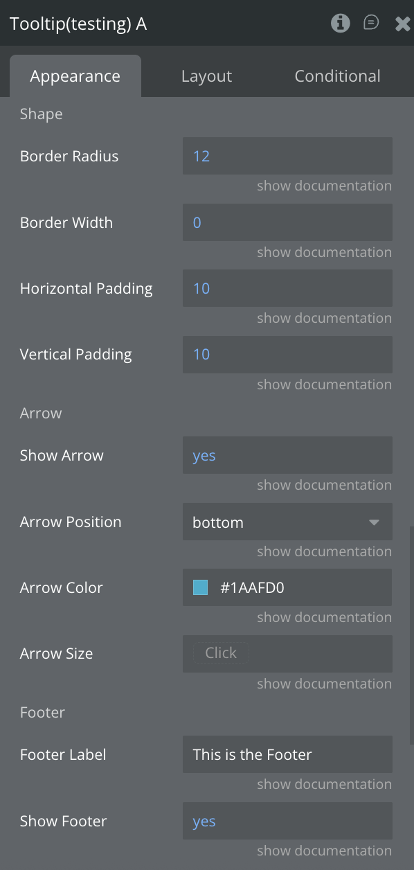
Arrow Color
Color of the tooltip arrow
Color
Arrow Position
Position of the arrow ("left", "right", "top", "bottom")
Text
Arrow Size
Size of the tooltip arrow in pixels
Number
Show Arrow
Controls whether the arrow is displayed
Yes/No
Title Font Size
Font size of the title text
Number
Content Font Size
Font size of the body text
Number
Footer Font Size
Font size of the footer label
Number
Border Radius
Border radius of the tooltip corners
Number
Border Width
Border width of the tooltip
Number
Horizontal Padding
Horizontal padding inside the tooltip
Number
Vertical Padding
Vertical padding inside the tooltip
Number
Footer Label
Text displayed inside the footer tag
Text
Show Footer
Controls whether the footer section is shown
Yes/No
Close on Backdrop Tap
If enabled, tapping outside the tooltip closes it
Yes/No
Element Actions
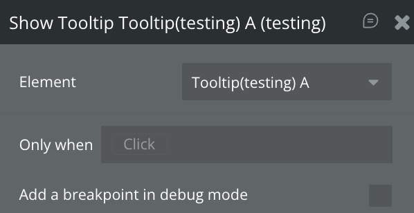
Show Tooltip
Displays the Tooltip
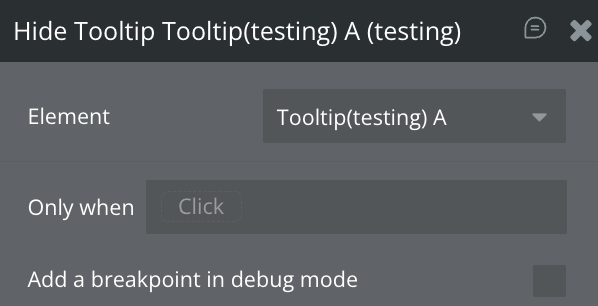
Hide Tooltip
Hides the Tooltip
Exposed states
Name
Description
Type
Is Visible
Indicates whether the tooltip is currently visible
Yes/No
Element Events
Name
Description
Tooltip Opened (tooltip_opened)
Triggered when the tooltip becomes visible (visible changes to true)
Tooltip Closed (tooltip_closed)
Triggered when the tooltip is hidden (visible changes to false)
Workflow example
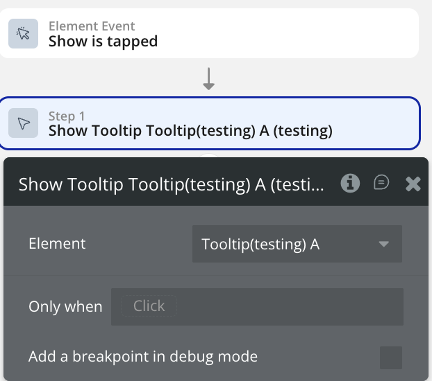
Display Tooltip Element
Use this workflow to the display the Tooltip element
Create a workflow that calls the “Show Tooltip” action.
The selected element should now be displayed on the page.
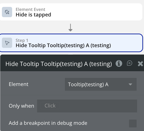
Hide Tooltip Element
Use this workflow to the hide the Tooltip element
Create a workflow that calls the “Hide Tooltip” action.
The selected element should now be displayed on the page.
Changelogs
Update 15.05.26 - Version 1.12.0
Added "Show On Load" and "Hide Onboarding" in Onboarding element.