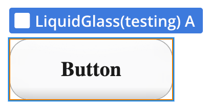
The Liquid Glass Bubble Mobile plugin brings the modern “frosted glass” (glassmorphism) look to apps built with Bubble’s mobile editor. It renders a real Gaussian blur of whatever sits behind it, combined with a customizable tint, color or gradient overlay, inner/outer glow, and a rounded glass edge - all without writing any code.
The element works in three modes: a plain glass panel, a glass panel with centered text, or a fully interactive glass button that reacts to taps. On top of that it ships with smooth entrance/exit animations (fade, scale, slide-up), an optional continuous “live glass” pulse, and a press animation, so the surface always feels responsive. It is ideal for floating headers, bottom bars, cards, overlays, and buttons in dashboards or content-heavy mobile apps.
⚠️
Please note: the real glass/blur effect is supported only on iOS. On Android the element gracefully falls back to a transparent background (blur is not applied), while all other layers (tint, overlay, gradient, glow, border, text and animations) keep working.

How to setup
Setting up the Liquid Glass Mobile plugin is straightforward:
Add the element: Drag and drop the Liquid Glass element onto your mobile page.
Choose a mode: Set the Mode field to simple, text, or button depending on what you need.
Style the glass: Adjust Blur Intensity, Tint, Background Opacity, Overlay Color (or turn on Use Gradient), Glow and Border to match your design.
Plugin Element Properties - Liquid Glass
The plugin contains a single visual element, Liquid Glass, designed to be placed on a mobile page. It is used to render a blurred, tinted glass surface with optional text or button behavior.
Fields
Title
Description
Type
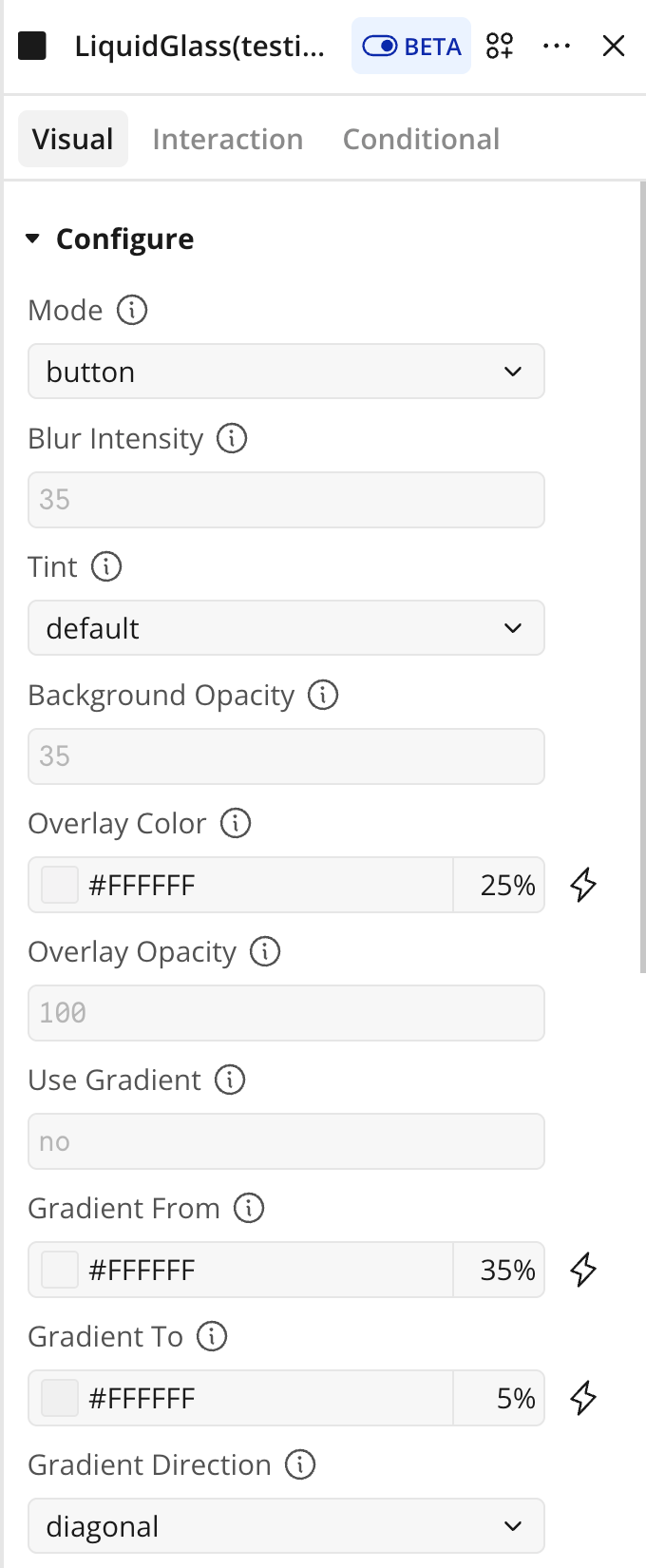
Mode
Element mode: a plain glass panel, glass with text, or a glass button. In button mode it reacts to taps and triggers the “Pressed” event.
Options: simple, text, button.
Dropdown
Blur Intensity
Strength of the blur applied to the content behind the element, from 0 (no blur) to 100 (maximum).
Number
Tint
Glass tone: light, dark, or the device’s system theme. Sets both the blur tint and the base glass color.
Options: light, dark, default.
Dropdown
Background Opacity
Density of the base glass layer, from 0 to 100.
Higher values hide more of the content behind.
Number
Overlay Color
A semi-transparent color layer drawn on top of the glass. Ignored when Use Gradient is on.
Color
Overlay Opacity
Opacity of the color overlay (solid or gradient), from 0 to 100.
Number
Use Gradient
Replaces the solid overlay color with a gradient from Gradient From to Gradient To.
Boolean
Gradient From
Start color of the gradient.
Color
Gradient To
End color of the gradient.
Color
Gradient Direction
Direction of the overlay gradient.
Options: vertical, horizontal, diagonal.
Dropdown
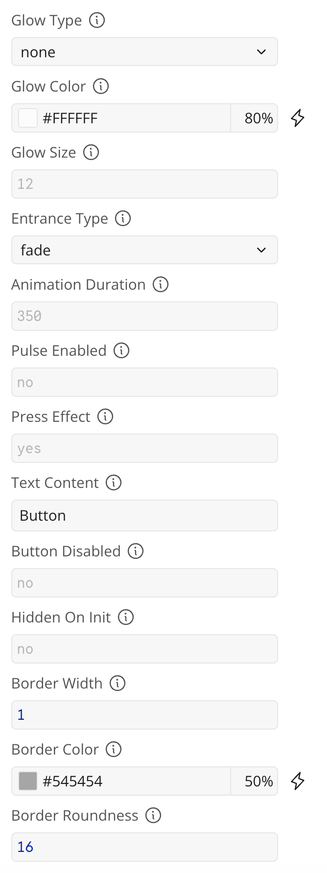
Glow Type
Glow style: none, inner (along the inside edge), or outer (ambient glow outside the element).
Options: none, inner, outer.
Dropdown
Glow Color
Color of the glow.
Color
Glow Size
Thickness of the glow, in pixels.
Number
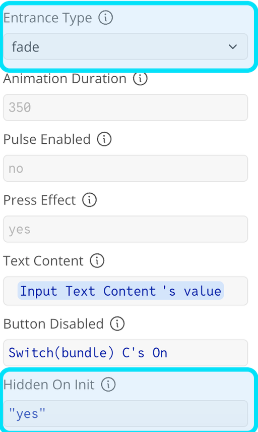
Entrance Type
Animation used when the glass appears and disappears.
Options: fade, scale, slide-up.
Dropdown
Animation Duration
Duration of the entrance and exit animations, in milliseconds.
Number
Pulse Enabled
Continuously pulses the glass with a soft scaling motion. For a single pulse, use the Pulse action instead.
Boolean
Press Effect
Plays a small squeeze animation when the glass is tapped (button mode only).
Boolean
Text Content
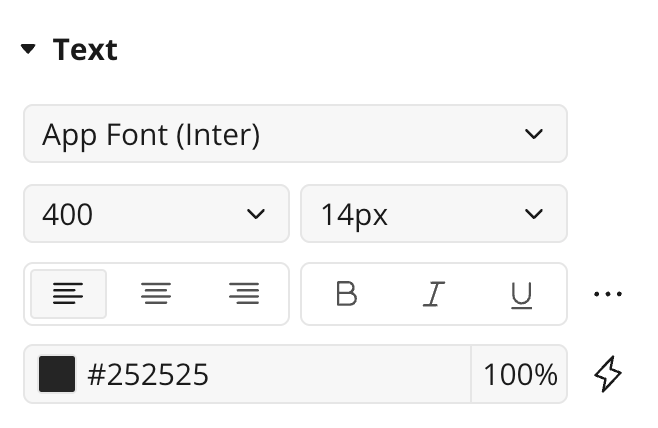
Text shown inside the glass (text and button modes). Font, size, color and alignment come from the element’s Bubble style.
Text
Button Disabled
Disables taps in button mode, so the “Pressed” event and press animation do not fire.
Boolean
Hidden On Init
Starts the element hidden, waiting for the Show Glass action.
Turn off to have it animate in on page load.
Boolean
Border Width
Border thickness in pixels.
Set to 0 for no border.
Number
Border Color
Border color.
A semi-transparent white gives a glass-edge highlight.
Color
Border Roundness
Corner radius of the glass, in pixels.
Leave empty to use the element’s standard Bubble rounding.
Number
Element Actions
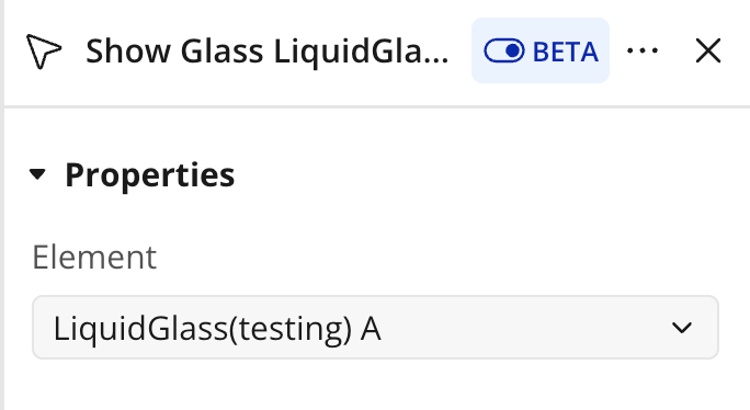
Show Glass
Animates the element into view using the configured Entrance Type and Animation Duration. Useful when the element starts hidden (Hidden On Init) or was hidden earlier. On completion it triggers the “Shown” event.
This action has no fields.
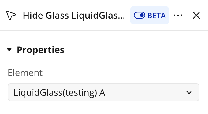
Hide Glass
Animates the element out of view using the configured entrance/exit animation. On completion it triggers the “Hidden” event.
This action has no fields.
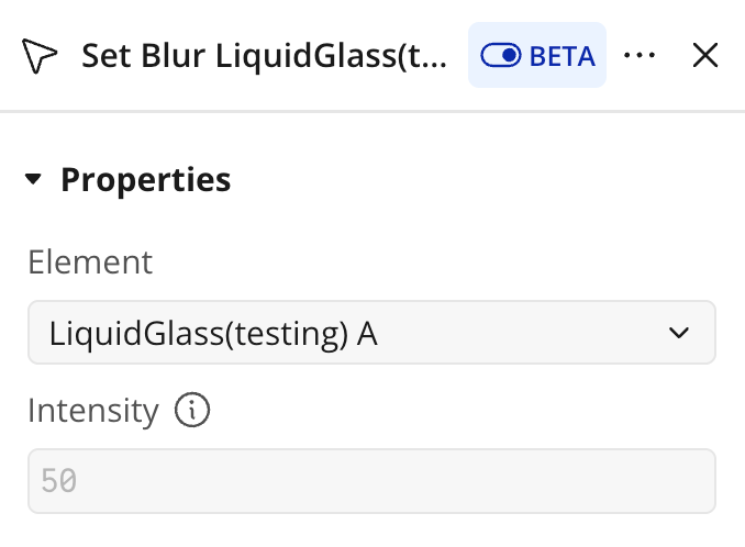
Set Blur
Dynamically changes the blur intensity of the glass at runtime, overriding the Blur Intensity field.
Fields:
Title
Description
Type
Intensity
New blur intensity to apply, from 0 to 100.
Number
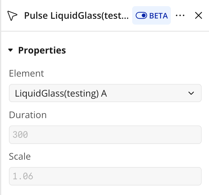
Pulse
Plays a single pulse (scale up then back) animation on the glass — a one-shot version of the continuous Pulse Enabled option.
Fields:
Title
Description
Type
Duration
Duration of the pulse animation, in milliseconds.
Number
Scale
Peak scale factor reached at the middle of the pulse (e.g. 1.06).
Number
Element Events
Name
Description
Pressed
Triggered when the glass button is tapped (button mode).
Shown
Triggered when the glass finishes appearing.
Hidden
Triggered when the glass finishes disappearing.
Exposed States
Name
Description
Type
Is Visible
Whether the glass is currently shown.
Boolean
Press Count
Number of times the glass button has been tapped.
Number
Workflow example
Glass background behind a Floating Group
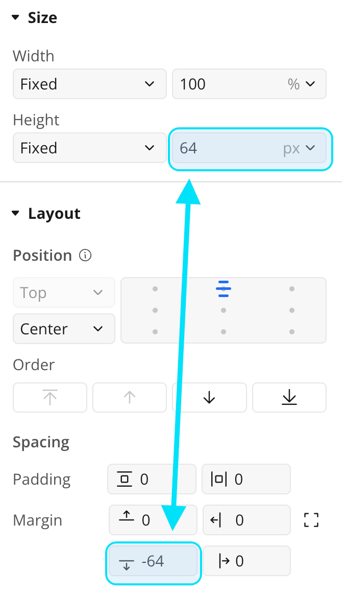
To make the element act as a glass background for other content, place it first inside a Floating Group, give it a fixed size, and apply a negative bottom margin to the following content so the Floating Group’s content is lifted up and sits on top of the glass surface. This lets the blurred glass render behind your buttons, text, and other UI.
Add a Floating Group to your mobile page and place the Liquid Glass element as its first child.
Give the Liquid Glass element a fixed size matching the area you want to cover.
Apply a negative bottom margin to the content that follows, so the rest of the Floating Group’s content is lifted up and overlaps the glass.
Configure Blur Intensity and Tint to taste, then preview on iOS via TestFlight.
Show / hide on demand
Enable Hidden On Init so the glass starts hidden.
Pick an Entrance Type (fade, scale, or slide-up) and set the Animation Duration.
Run the Show Glass action from any workflow to animate it in; use Hide Glass to animate it out.
React to the Shown and Hidden events to chain further actions.