Demo to preview the plugin:
Introduction
This plugin allows you to add a circle and semi-circle progress bar to your app.
You can choose the size of the progress bar, the percentage value, the color, animation style and more!
Simply drag the element onto your app and specify all parameters within the element inspector. You can use this plugin to enhance the user experience of your app.

How to setup
- Add a Progress Bar to Your Page
- Go to the Design tab.
- Drag and drop either:
Circle Progress Bar, orSemi-Circle Progress Bar
In the Bubble editor:
onto your page from the Visual Elements section.
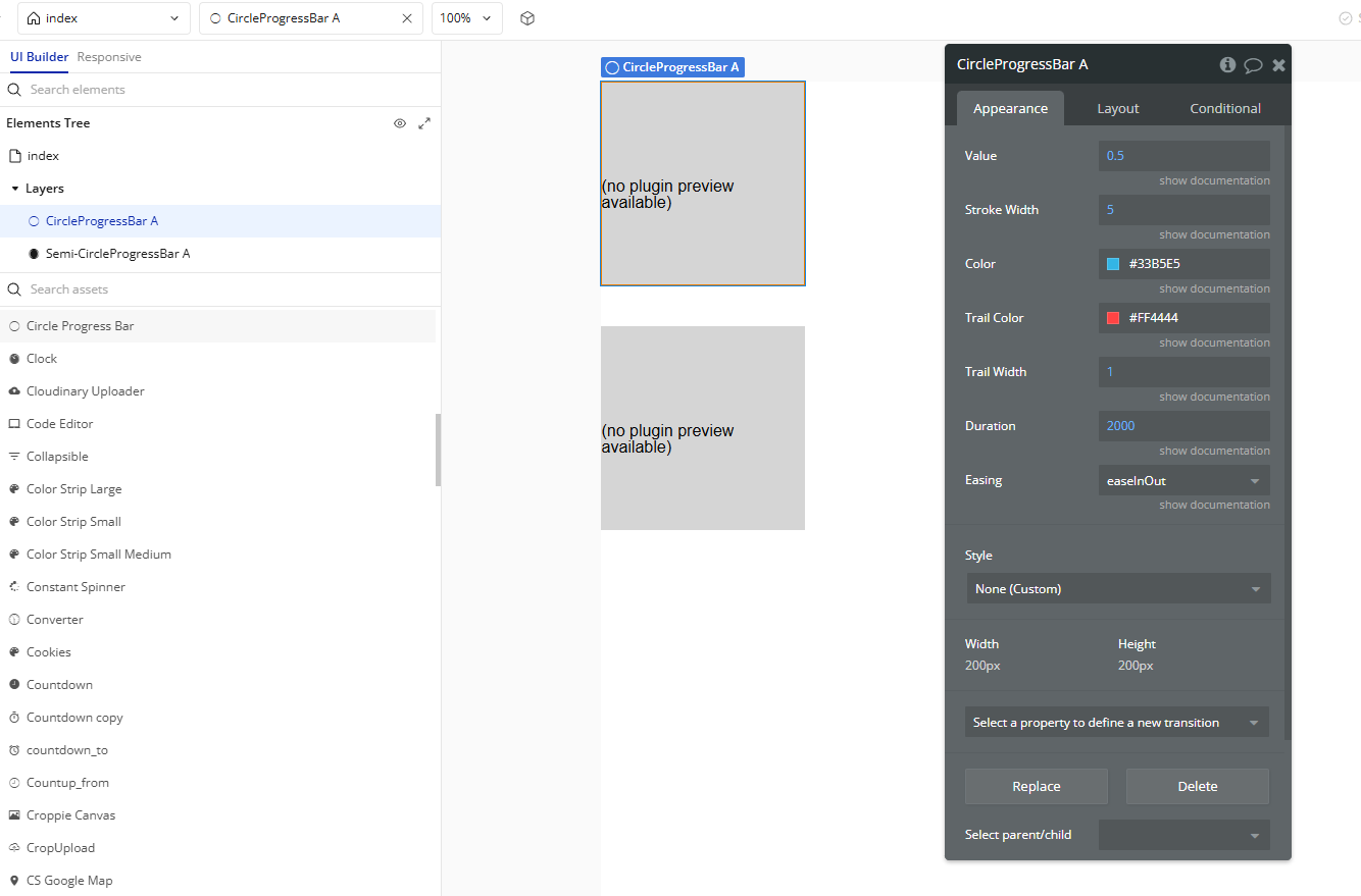
- Configure Initial Properties
- Value: Progress value between
0and1(e.g.,0.5= 50%). - Stroke Width: Thickness of the progress arc.
- Color: The color of the progress stroke (e.g.,
#33B5E5). - Trail Color: The background stroke color (e.g.,
#FF4444). - Trail Width: Thickness of the trail stroke.
- Duration: Animation duration in milliseconds (e.g.,
2000= 2 seconds). - Easing: Defines the easing function for animation (e.g.,
easeInOut).
With the element selected, configure its properties in the Appearance tab:
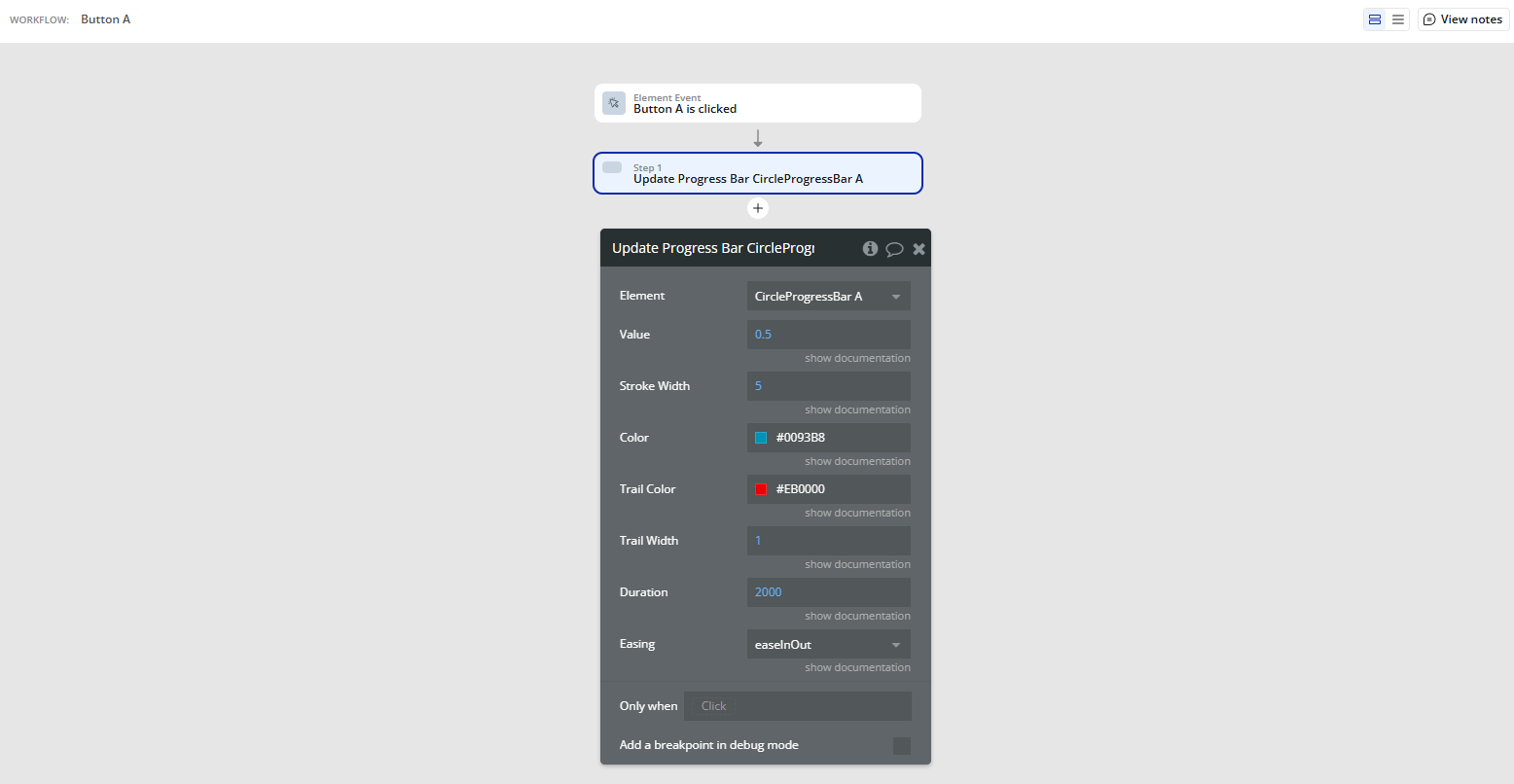
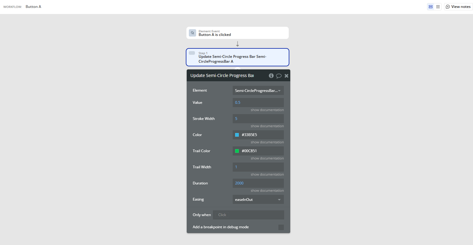
- Update Progress via Workflow
Update Progress Bar A Circle Progress BarUpdate Semi-Circle Progress Bar A Semi-Circle Progress Bar
If you want to dynamically change the progress, use the corresponding workflow actions:
Plugin Element Properties
Circle Progress Bar
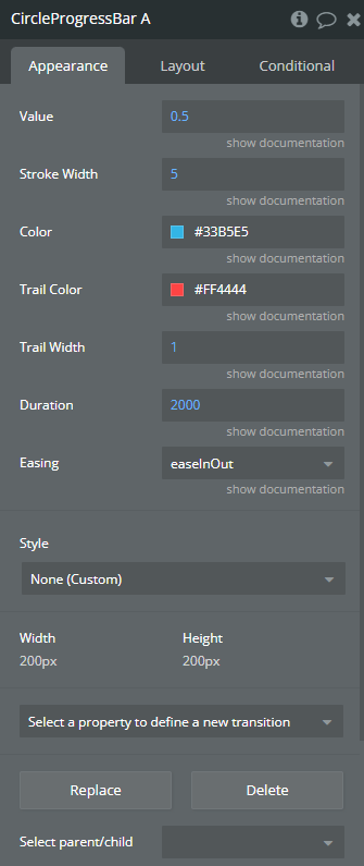
Fields:
Title | Description | Type |
Value | The progress value - number between 0 and 1.0 | Number |
Stroke Width | The width of the stroke in pixels | Number |
Color | The color of the progress circle | Color |
Trail Color | The color of the trail (outline) | Color |
Trail Width | The width of the trail in pixels | Number |
Duration | The duration of the animation in milliseconds | Number |
Easing | Choose the type of easing animation Available options: easeInOut, bounce, easeIn, easeOut, linear | Dropdown |
Semi-Circle Progress Bar
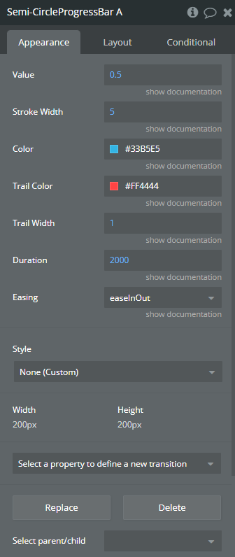
Fields:
Title | Description | Type |
Value | The progress value - number between 0 and 1.0 | Number |
Stroke Width | The width of the stroke in pixels | Number |
Color | The color of the progress circle | Color |
Trail Color | The color of the trail (outline) | Color |
Trail Width | The width of the trail in pixels | Number |
Duration | The duration of the animation in milliseconds | Number |
Easing | Choose the type of easing animation Available options: easeInOut, bounce, easeIn, easeOut, linear | Dropdown |
Element Actions
Update Progress Bar
Update Progress Bar refers to the function or method in a software plugin or API that dynamically adjusts the visual representation of progress in a loading or processing task.
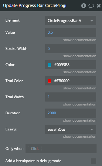
Title | Description | Type |
Value | The progress value - number between 0 and 1.0 | Number |
Stroke Width | The width of the stroke in pixels | Number |
Color | The color of the progress circle | Color |
Trail Color | The color of the trail (outline) | Color |
Trail Width | The width of the trail in pixels | Number |
Duration | The duration of the animation in milliseconds | Number |
Easing | Choose the type of easing animation Available options: easeInOut, bounce, easeIn, easeOut, linear | Dropdown |
Update Semi-Circle Progress Bar
The term Update Semi-Circle Progress Bar refers to the action of refreshing or changing the status displayed on a semi-circle progress bar in a software plugin or API.
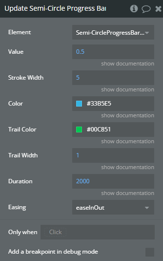
Title | Description | Type |
Value | The progress value - number between 0 and 1.0 | Number |
Stroke Width | The width of the stroke in pixels | Number |
Color | The color of the progress circle | Color |
Trail Color | The color of the trail (outline) | Color |
Trail Width | The width of the trail in pixels | Number |
Duration | The duration of the animation in milliseconds | Number |
Easing | In the context of a software plugin or API, “Easing” refers to the gradual acceleration or deceleration of movement to create smoother transitions in animations. Available options: easeInOut, bounce, easeIn, easeOut, linear | Dropdown |