Effortlessly integrate a Gantt / Timeline & Chart Advanced into any app to give users a clear, customizable way to visualize project tasks, milestones, and deadlines. With support for multiple project layers, it simplifies tracking across teams and phases while blending seamlessly with the app’s interface.
Customizable colors, labels, and durations allow the chart to match specific design needs, while interactive features like real-time updates enhance efficiency. The result is a powerful tool that improves organization, planning, and overall project management.
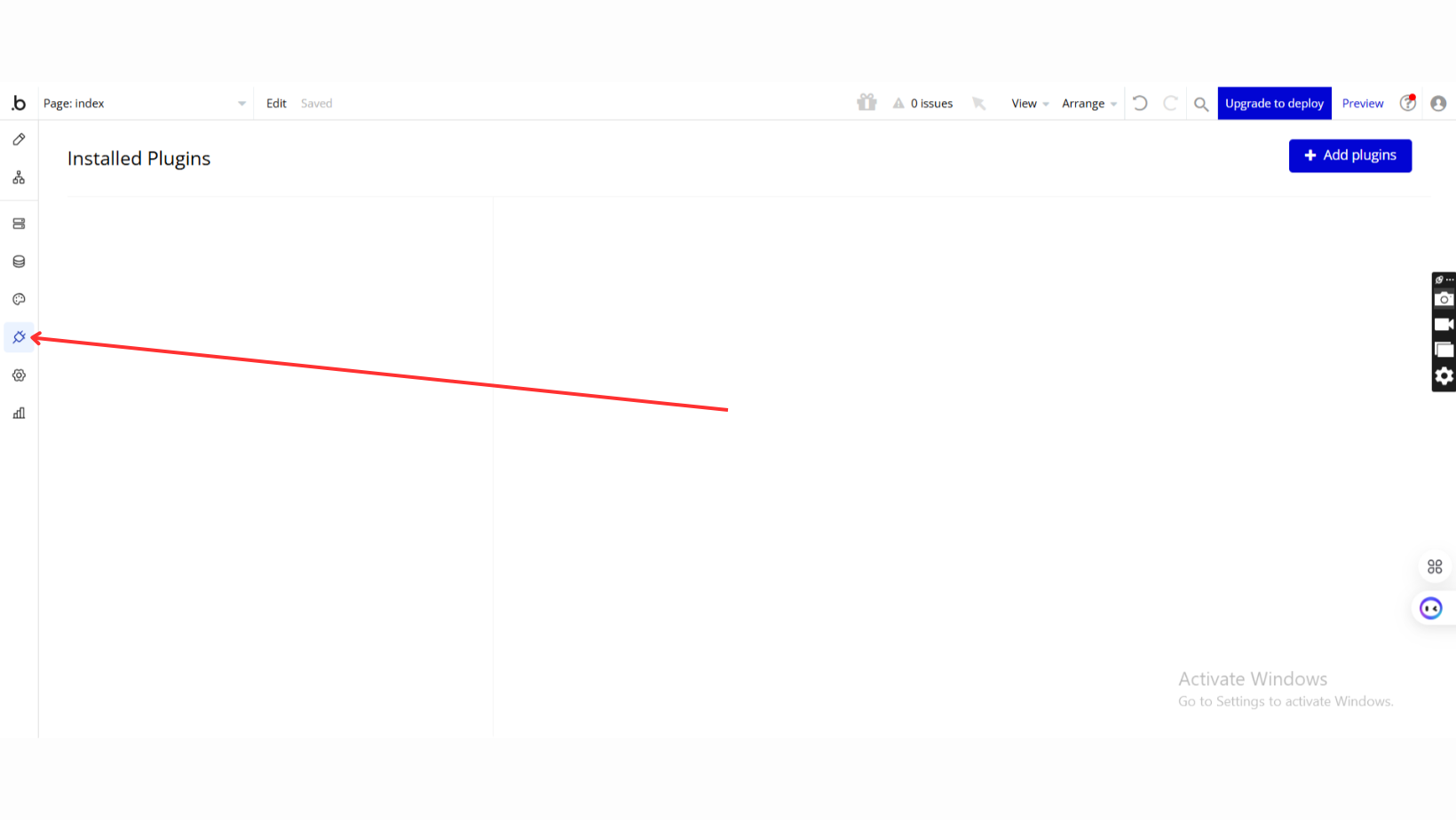
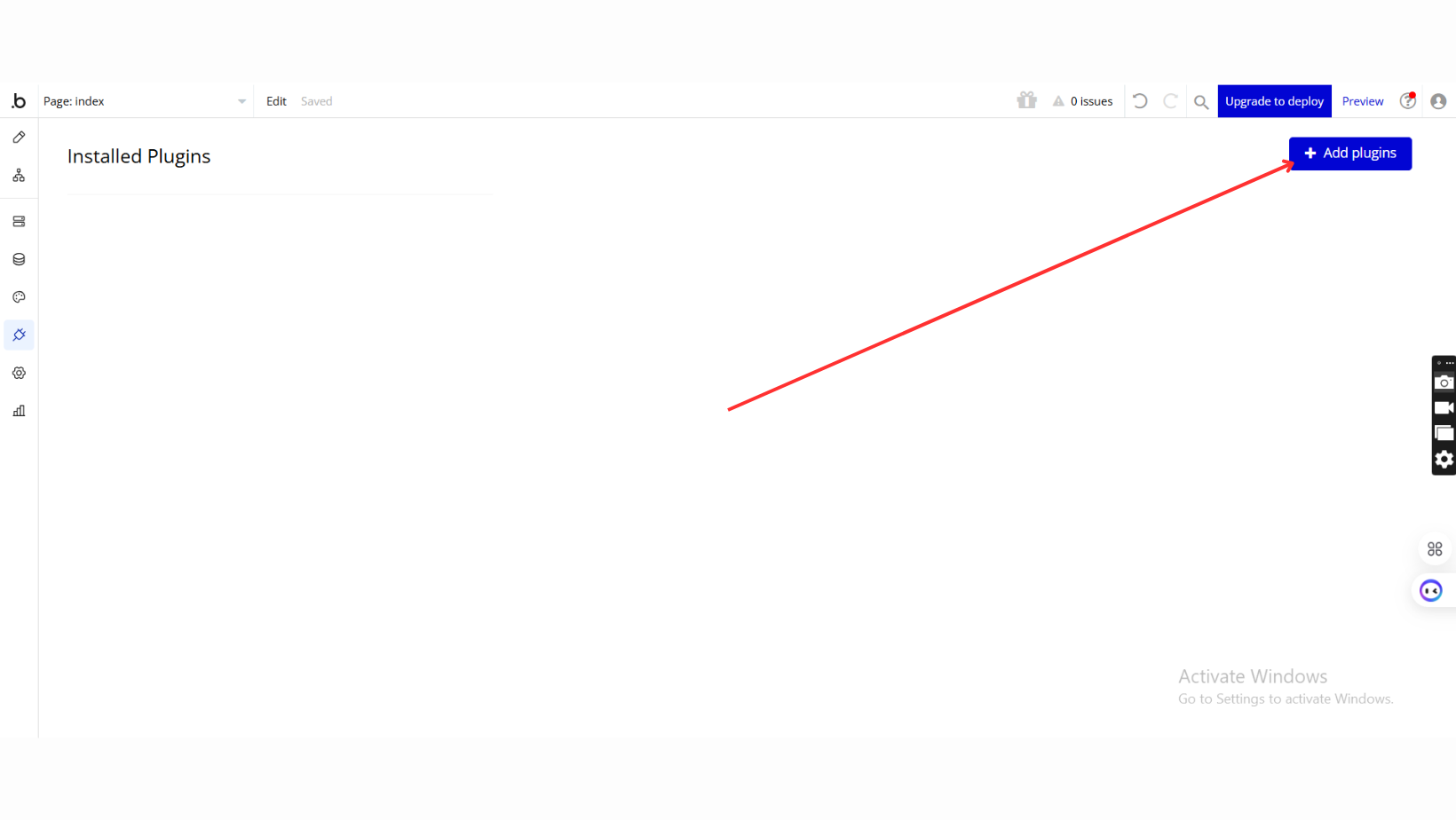
Once in the Plugins tab, click the Add Plugins button.
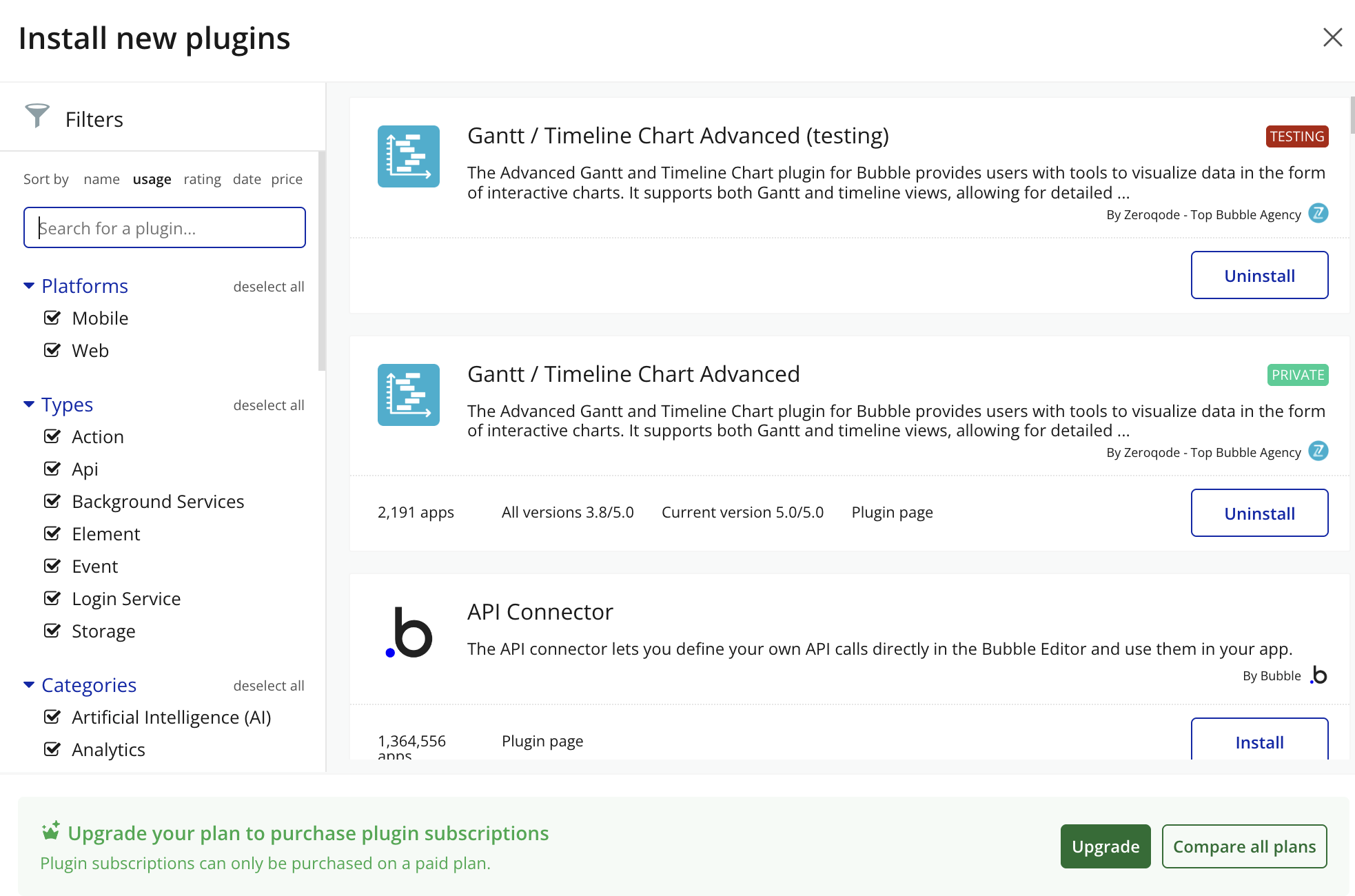
Search for the Plugin
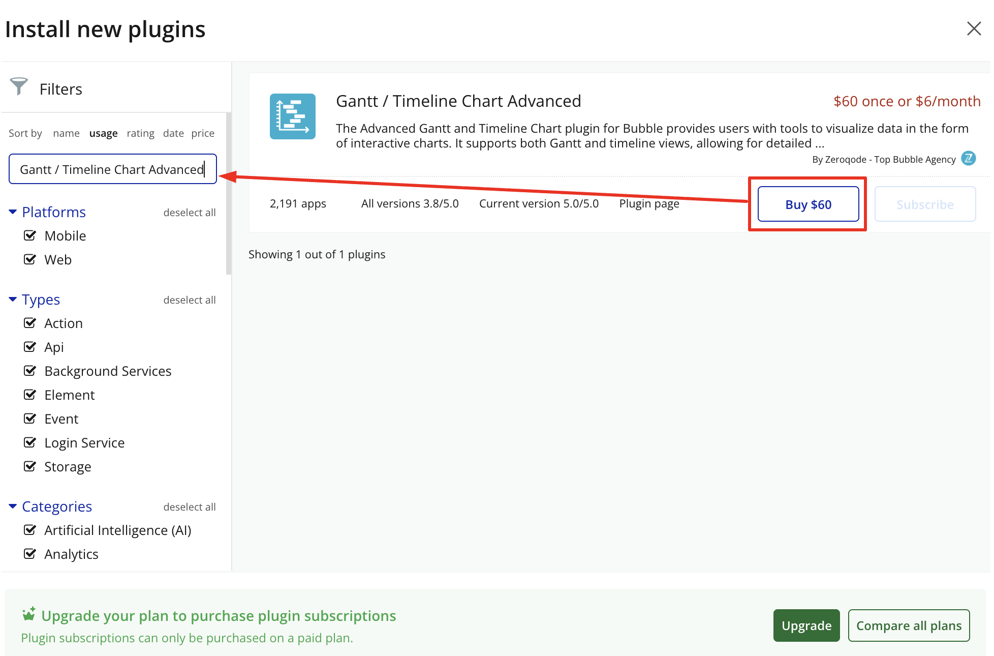
Use the search bar to type Gantt & Timeline Chart Advanced.
Locate the plugin in the search results.
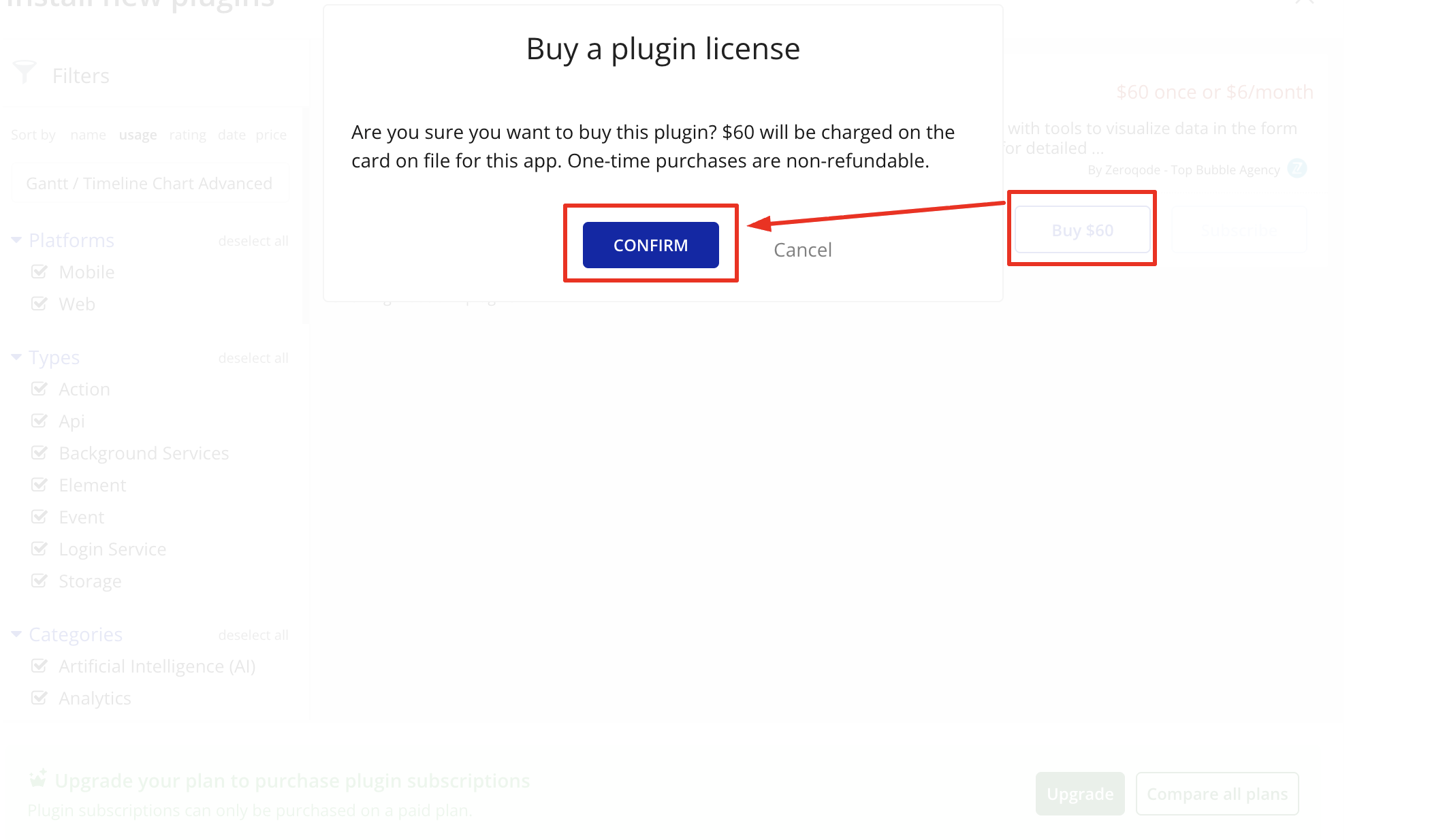
Install/Buy
Click Buy and follow the purchase instructions.
Payment Information (For Paid Plugins)
Fill in your payment details and make payment.
Charges will be added to your Bubble billing account.
Remember, if you unsubscribe from the plugin shortly after installation, charges will be prorated based on the days used.
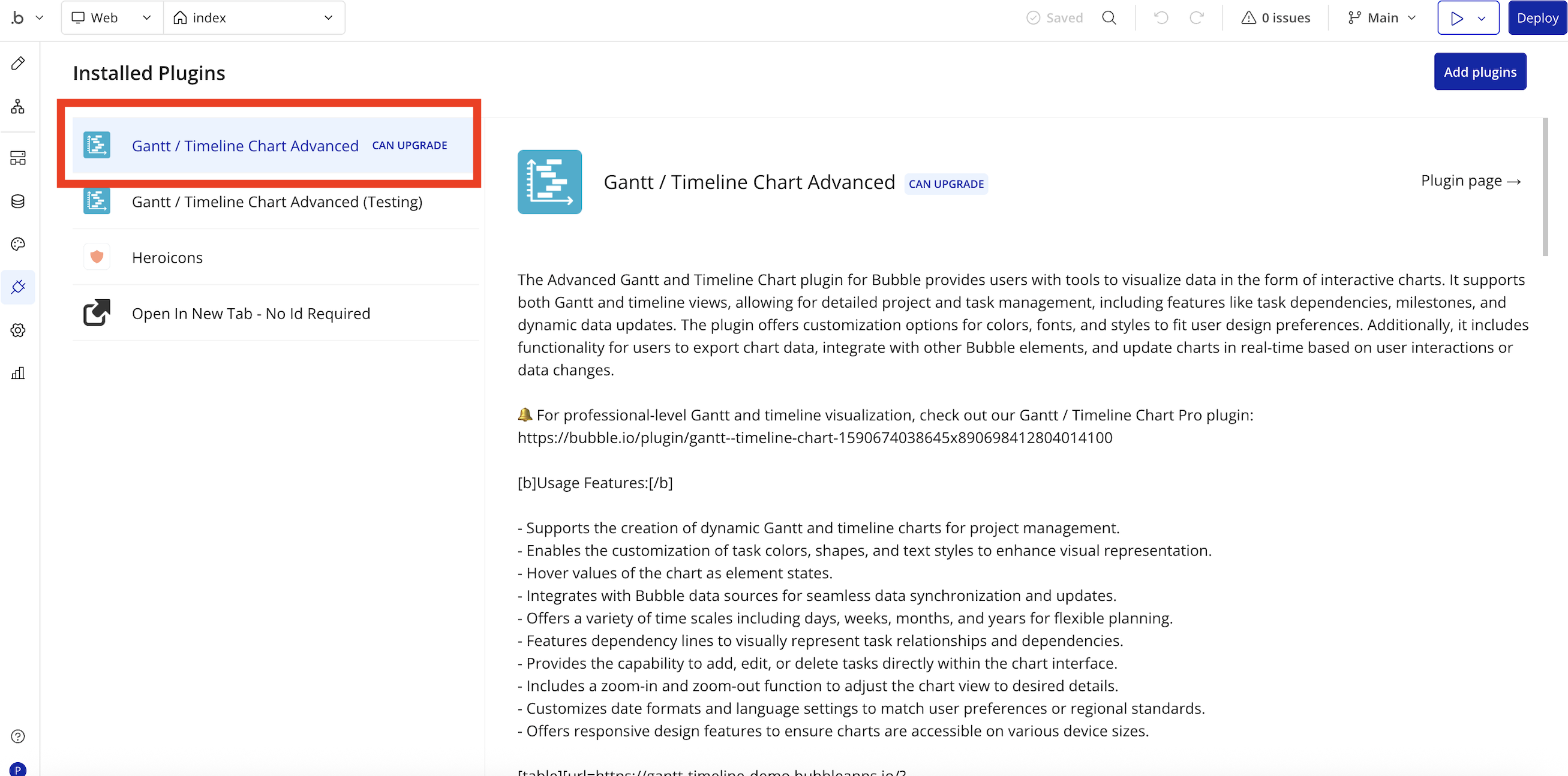
Plugin Installed
Once installed, the plugin will appear under the Installed Plugins list in your Bubble Editor.
Step 2 – Add the Plugin Element to Your Page
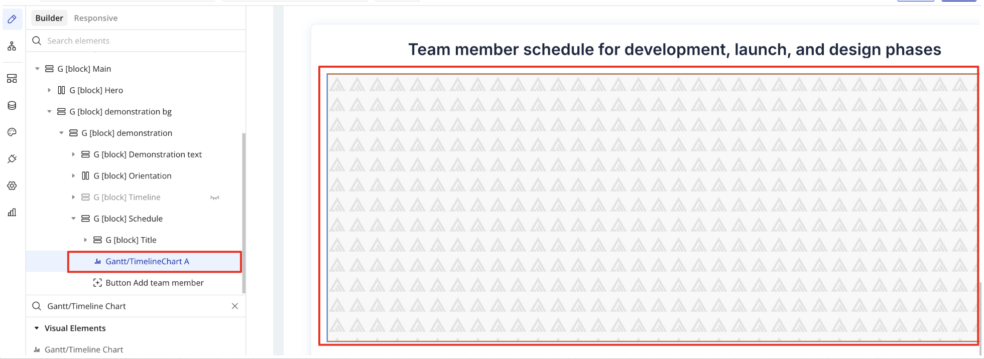
Open the Design tab in your Bubble editor.
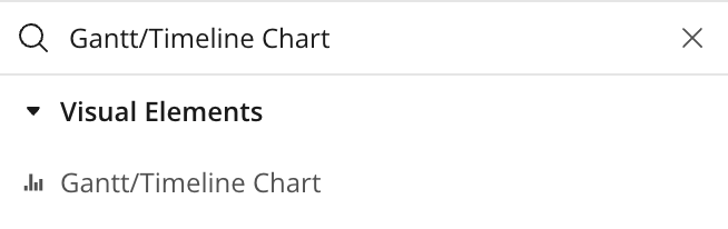
Search for the Gantt/Timeline Chart element in the Elements panel.
Drag and drop the element onto your job listing page.
Step 3 – Configure Properties
Select the element and configure its properties in the Property Editor.
Plugin Element Gantt/Timeline Chart
Fields
Title
Description
Type
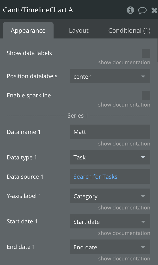
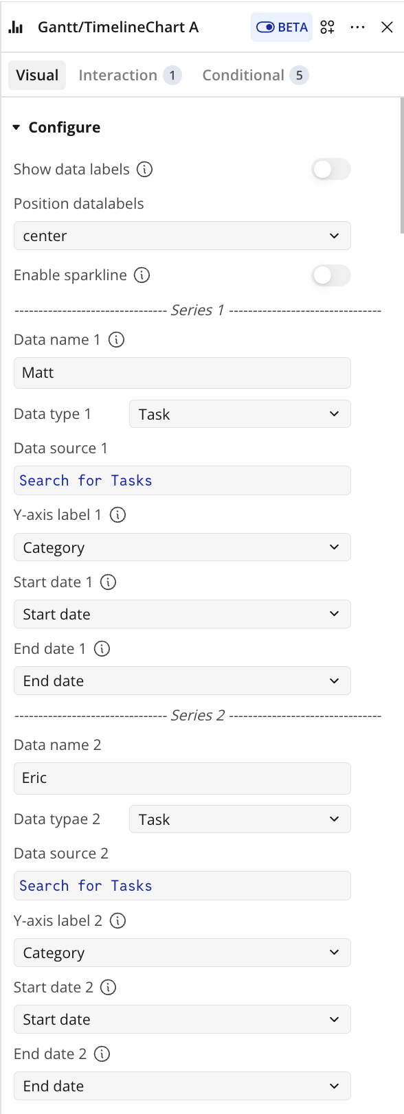
Show data labels
Shows data labels on the place of markers. Make sure to turn the makers of if you enable this option.
Checkbox
Position datalabels
Position of datalabels, top,center,bottom
Dropdown
Enable sparkline
Sparkline hides all the elements of the charts other than the primary paths. Helps to visualize data in small areas line like for a graph in a sidebar or header.
Checkbox
------------—-- Series 1 --------------------
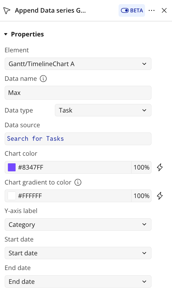
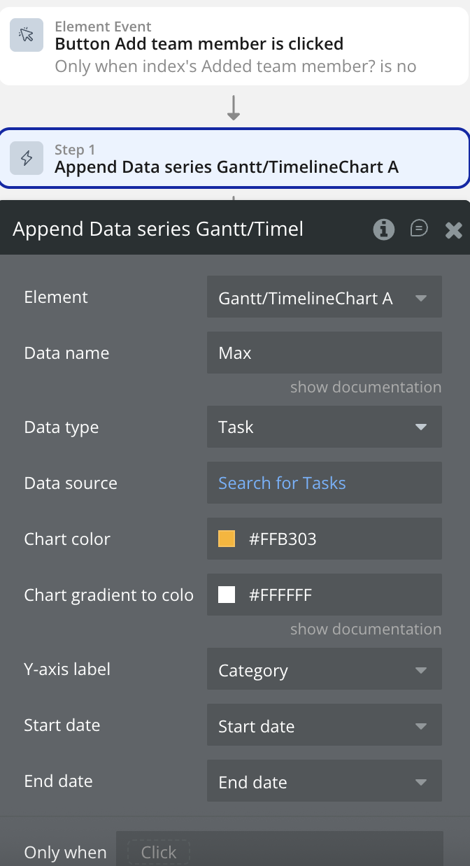
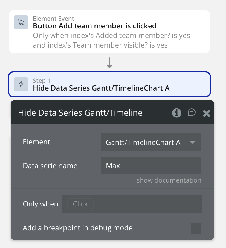
Data name 1
The name of the data. Will be shown in the tooltip and legend.
Text, Required
Data type 1
Data type 1
App Type
Data source 1
Source of data 1
Data type 1
Y-axis label 1
Needs to be a text
Text, Required
Start date 1
Needs to be a date
Date, Required
End date 1
Needs to be a date
Date, Required
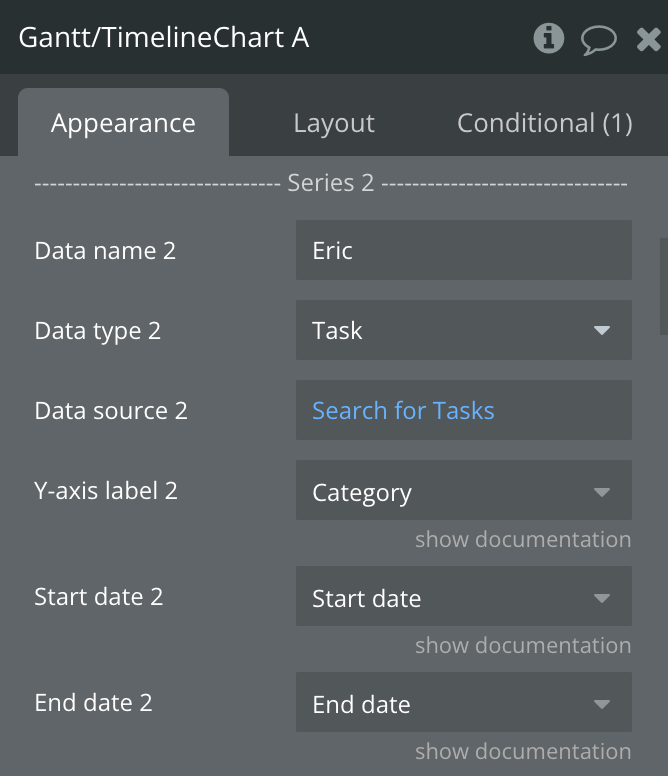
------------—-- Series 2 --------------------
Data name 2
The name of the data. Will be shown in the tooltip and legend.
Text, Optional
Data type 2
Data type 2
App Type
Data source 2
Source of data 2
Data type 2
Y-axis label 2
Needs to be a text
Text, Optional
Start date 2
Needs to be a date
Date, Optional
End date 2
Needs to be a date
Date, Optional
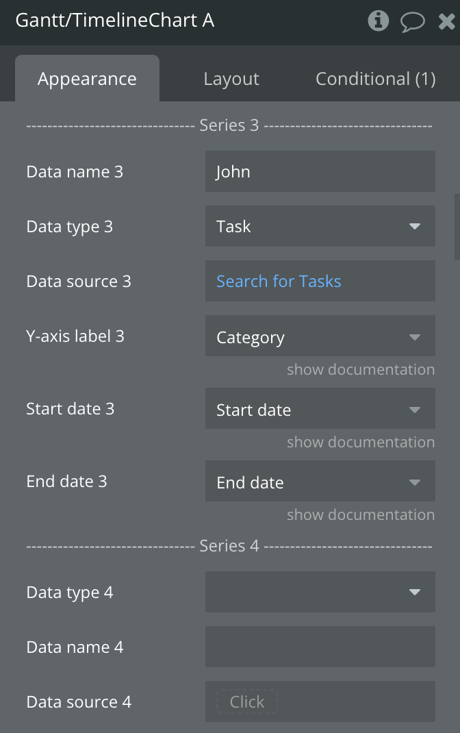
------------—-- Series 3 --------------------
Data name 3
The name of the data. Will be shown in the tooltip and legend.
Text, Optional
Data type 3
Data type 3
App Type
Data source 3
Source of data 3
Data type 3
Y-axis label 3
Needs to be a text
Text, Optional
Start date 3
Needs to be a date
Date, Optional
End date 3
Needs to be a date
Date, Optional
------------—-- Series 4 --------------------
Data name 4
The name of the data. Will be shown in the tooltip and legend.
Text, Optional
Data type 4
Data type 4
App Type
Data source 4
Source of data 4
Data type 4
Y-axis label 4
Needs to be a text
Text, Optional
Start date 4
Needs to be a date
Date, Optional
End date 4
Needs to be a date
Date, Optional
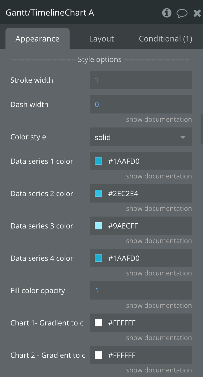
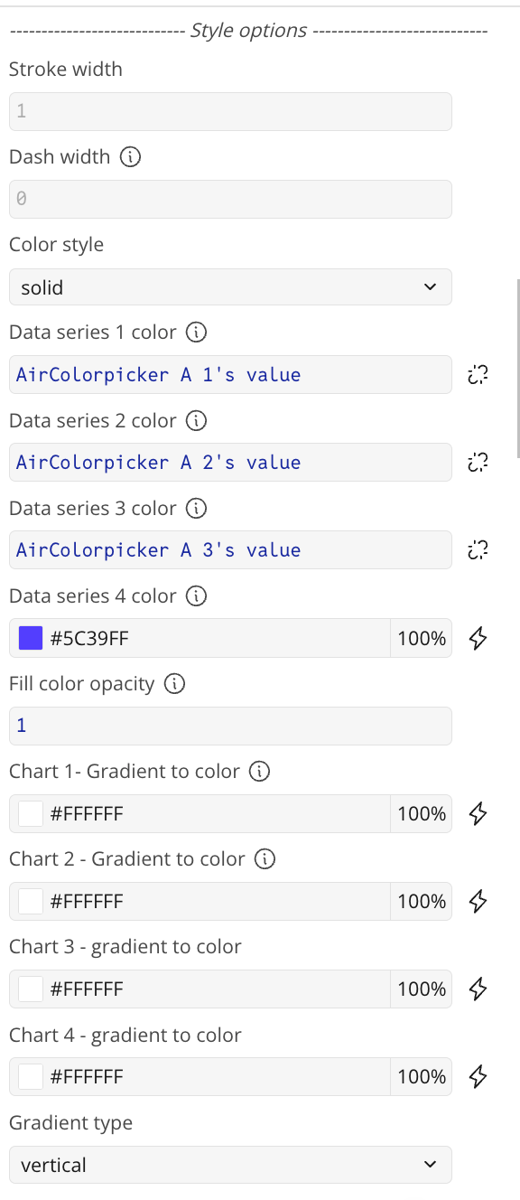
------------— Style Options ------------------
Stroke width
Stroke width
Number, Optional
Dash width
A value higher of 1 or higher will create a dashed line
Number, Optional
Color style
Color Style can be solid,gradient
Dropdown
Data series 1 color
If you want to use dynamic colors, make sure to use RGBA colors instead of HEX colors.
Color
Data series 2 color
If you want to use dynamic colors, make sure to use RGBA colors instead of HEX colors.
Color
Data series 3 color
If you want to use dynamic colors, make sure to use RGBA colors instead of HEX colors.
Color
Data series 4 color
If you want to use dynamic colors, make sure to use RGBA colors instead of HEX colors.
Color
Fill color opacity
Fill color of the chart. Value between 0 and 1. Works when color style is 'solid'.
Number, Required
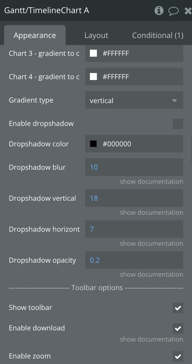
Chart 1- Gradient to color
Chart 1- Gradient to color.
Color
Chart 2- Gradient to color
Chart 2- Gradient to color.
Color
Chart 3- Gradient to color
Chart 3- Gradient to color.
Color
Chart 4- Gradient to color
Chart 4- Gradient to color.
Color
Gradient type
Type of gradient, horizontal,vertical
Dropdown
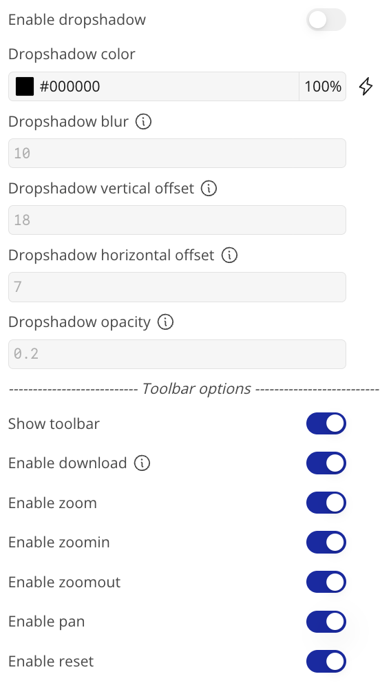
Enable dropshadow
Enables dropshadow
Checkbox
Dropshadow color
Color of dropshadow
Color
Dropshadow blur
Value between 0 and 100
Number, Optional
Dropshadow vertical offset
The amount for the vertical offset in px
Number, Optional
Dropshadow horizontal offset
The amount for the horizontal offset in px
Number, Optional
Dropshadow opacity
A value between 0 and 1
Number, Optional
------------—Toolbar options-----------------
Show toolbar
Displays the toolbar options
Checkbox
Enable download
Enable download in toolbar
Checkbox
Enable zoom
Enables zoom
Checkbox
Enable zoomin
Enables zoomin
Checkbox
Enable zoomout
Enables zoomout
Checkbox
Enable pan
Enables pan
Checkbox
Enable reset
Enables reset
Checkbox
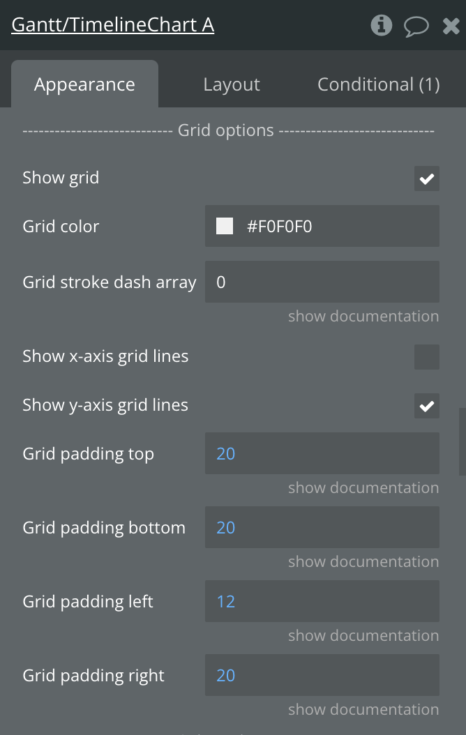
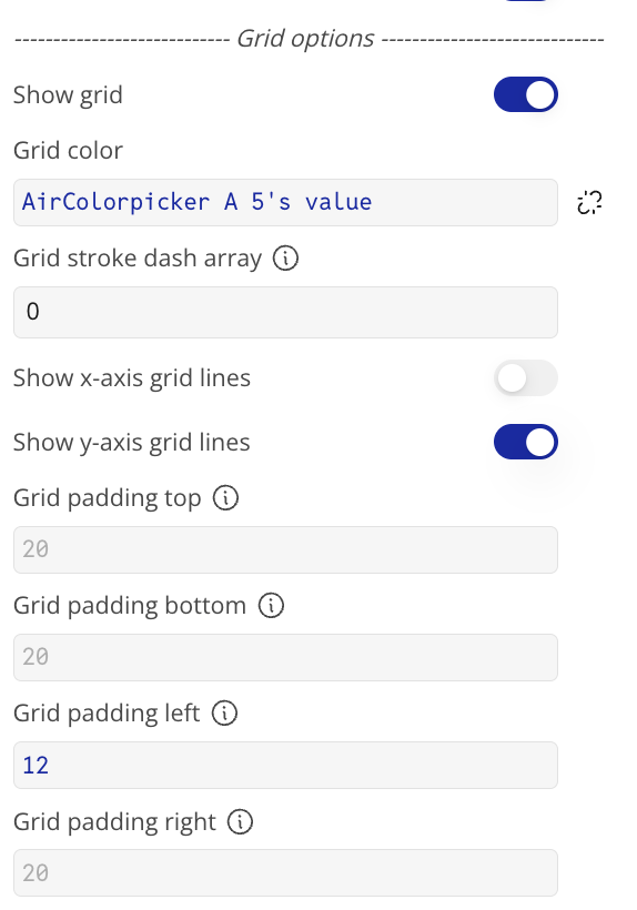
--------------- Grid options -----------------
Show grid
Displays the grid
Checkbox
Grid color
Grid color
Color
Grid stroke dash array
Grid stroke dash array in px
Text, Optional
Show x-axis grid lines
Displays x-axis grid lines
Checkbox
Show y-axis grid lines
Displays y-axis grid lines
Checkbox
Grid padding top
Grid padding in px
Number, Required
Grid padding bottom
Grid padding in px
Number, Required
Grid padding left
Grid padding in px
Number, Required
Grid padding right
Grid padding in px
Number, Required
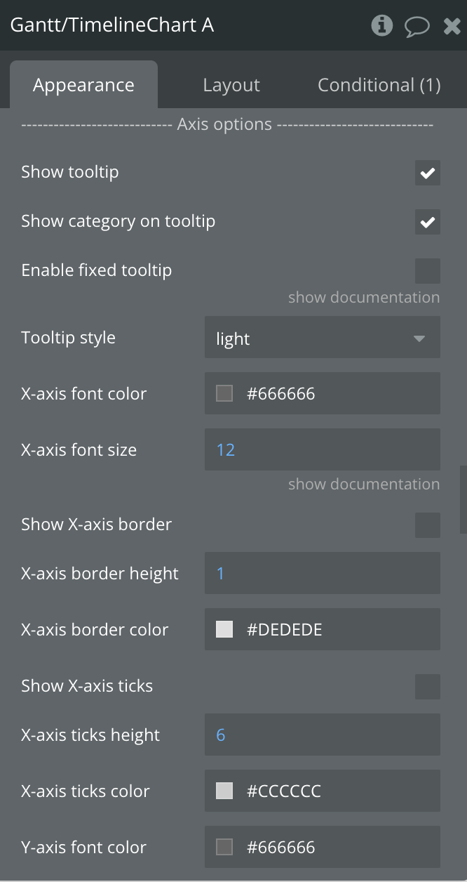
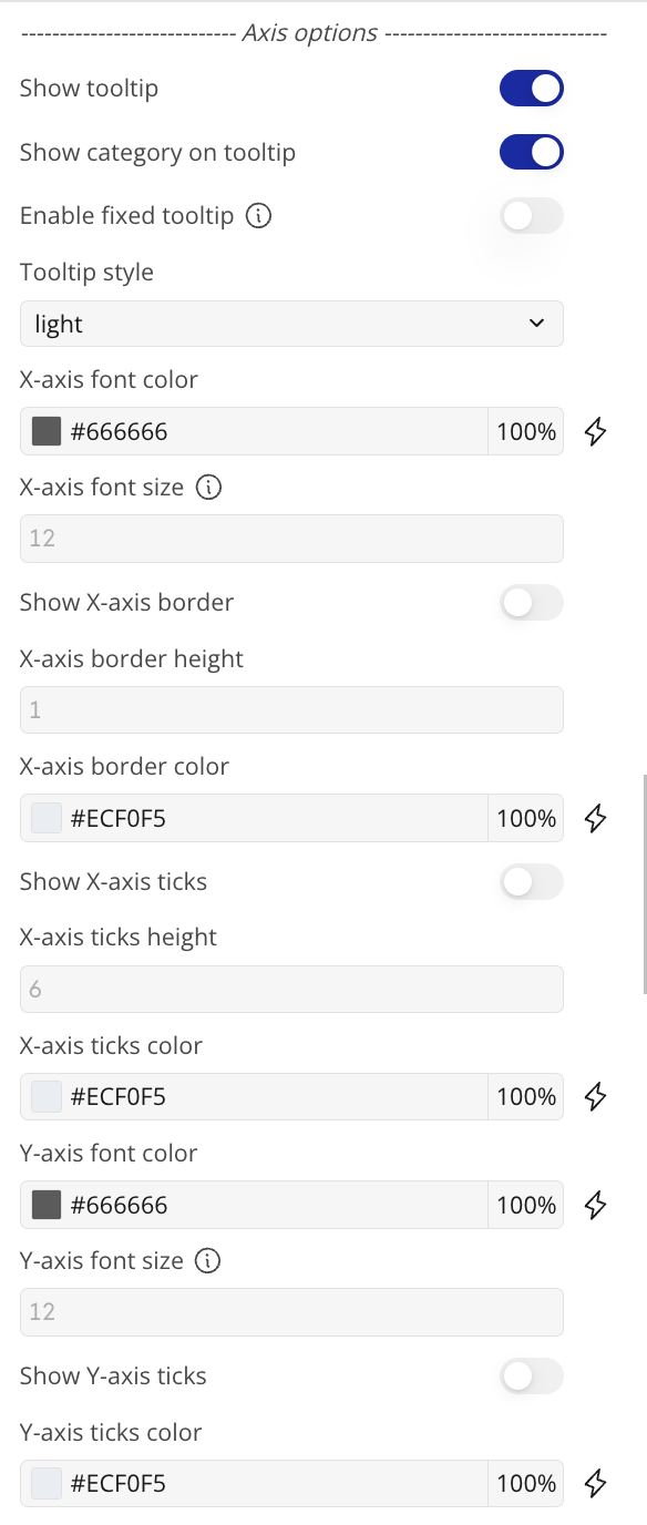
----------------- Axis options ----------------
Show tooltip
Displays the tooltip
Checkbox
Show category on tooltip
Displays the category inside the tooltip
Checkbox
Enable fixed tooltip
Fixes the tooltip to the top left of the chart.
Checkbox
Tooltip style
Tooltip style can be dark or light
Dropdown
X-axis font color
x-axis font color
Color
X-axis font size
x-axis font size
Number, Required
Show X-axis border
Displays the X-axis border
Checkbox
X-axis border height
X-axis border height
Number, Required
X-axis border color
X-axis border color
Color
Show X-axis ticks
Show X-axis ticks
Checkbox
X-axis ticks height
X-axis ticks height
Number, Required
X-axis ticks color
X-axis ticks color
Color
Y-axis font color
Y-axis font color
Color
Y-axis font size
Y-axis font size
Number, Required
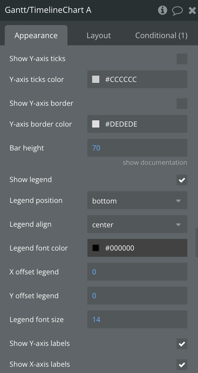
Show Y-axis ticks
Show Y-axis ticks
Checkbox
Y-axis ticks color
Y-axis ticks color
Color
Show Y-axis border
Show Y-axis border
Checkbox
Y-axis border color
Y-axis border color
Color
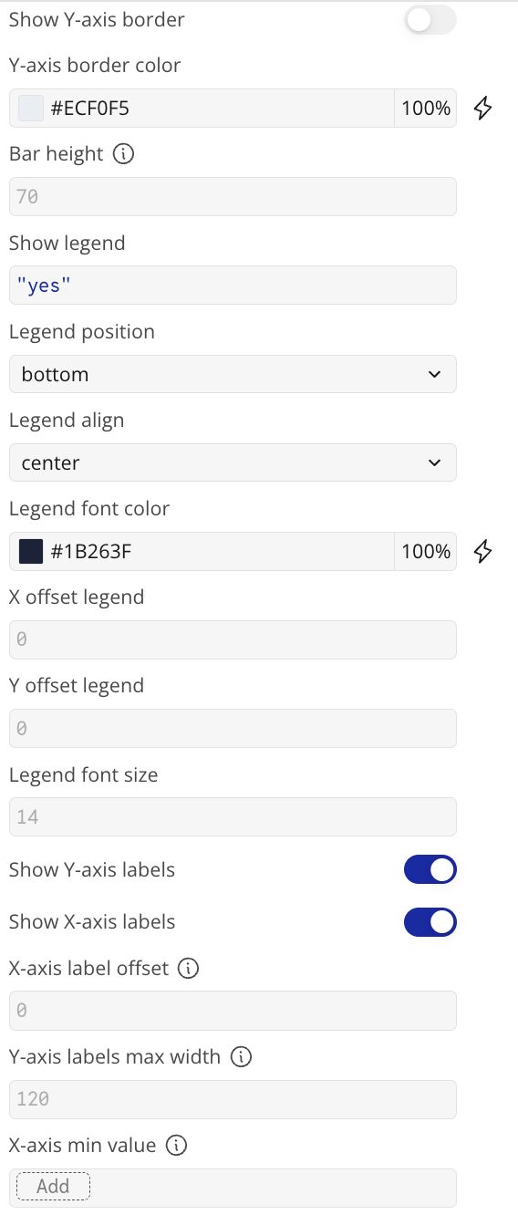
Bar height
A value between 0 and 100
Number, Required
Show legend
Displays the legend
Checkbox
Legend position
Legend position top,bottom,left,right
Dropdown
Legend align
Legend alignment
Dropdown
Legend font color
Legend font color
Color
X offset legend
X offset legend
Number, Required
Y offset legend
Y offset legend
Number, Required
Legend font size
Legend font size
Number, Required
Show Y-axis labels
Show Y-axis labels
Checkbox
Show X-axis labels
Show X-axis labels
Checkbox
X-axis label offset
The vertical offset of the X-axis labels
Number, Required
Y-axis labels max width
The vertical offset of the Y-axis labels
Number, Required
X-axis min value
The minimum value for X-axis.
date (optional)
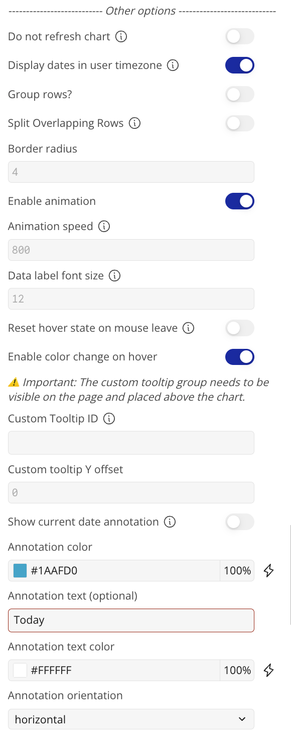
-------------- Other options -----------------
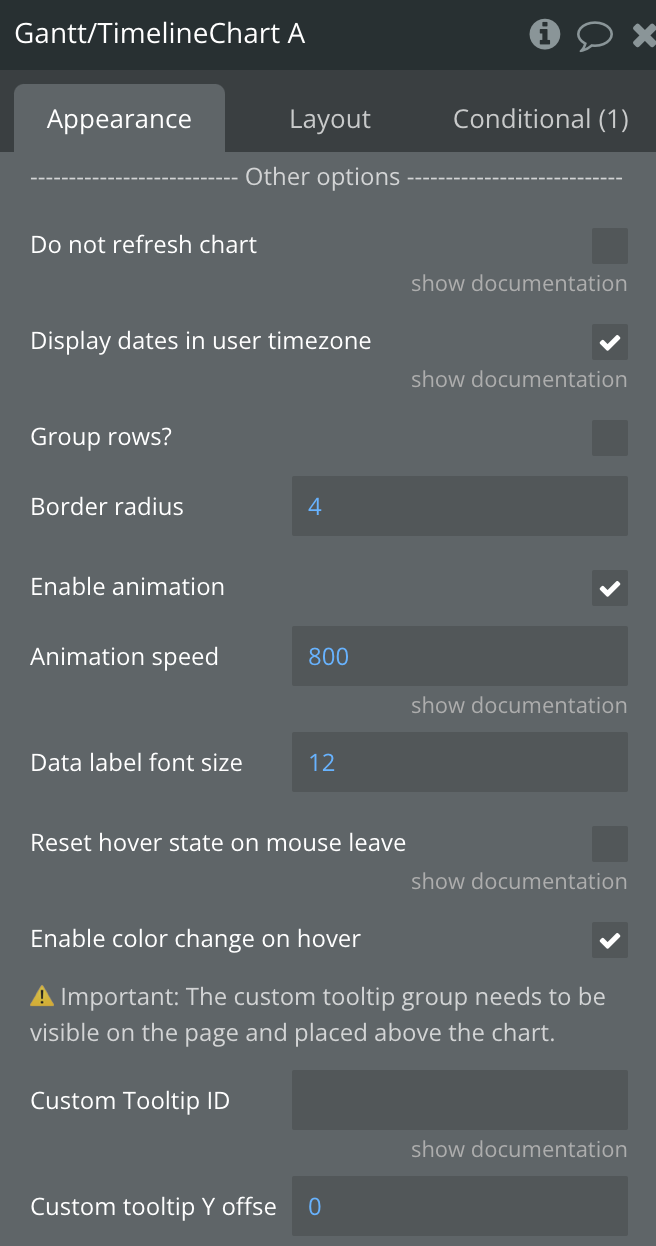
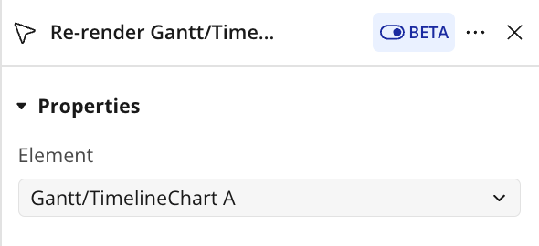
Do not refresh chart
The chart will not refresh automatically. This improves chart performance. You can manually update the chart by running the re-render workflow action.
Checkbox
Display dates in user timezone
If unchecked, the dates will be displayed in UTC timezone
Checkbox
Group rows?
Groups all tasks that share the same Y-axis label onto a single row, so multiple date ranges are drawn on one line instead of separate rows.
Useful for compact timelines where one resource or project has several tasks.
Checkbox
Split Overlapping Rows
When "Group rows?" is enabled, automatically separates overlapping tasks that share the same name into distinct rows to improve chart readability.
Has no effect if "Group rows?" is disabled.
Checkbox
Border radius
Border radius
Number, Required
Enable animation
Enables animation
Checkbox
Animation speed
Animation speed in milliseconds
Number, Required
Data label font size
The font size of the data labels displayed on the bars, in px.
Number, Required
Reset hover state on mouse leave
Resets hover state on mouse leave
Checkbox
Enable color change on hover
Enables color change on hover
Checkbox
⚠️ Important: The custom tooltip group needs to be visible on the page and placed above the chart.
Custom Tooltip ID
The element ID of a Bubble group you want to use as tooltip. You can access the hover values of the chart as element states. Make sure that the group is visible on page load.
Text, Optional
Custom tooltip Y offset
Custom tooltip Y offset
Number, Optional
Show current date annotation
Adds an annotation to the page that indicates the current time
Checkbox
Annotation color
Annotation color
Color
Annotation text (optional)
Annotation text (optional)
Text, Optional
Annotation text color
Annotation text color
Color
Annotation orientation
Annotation orientation
Dropdown
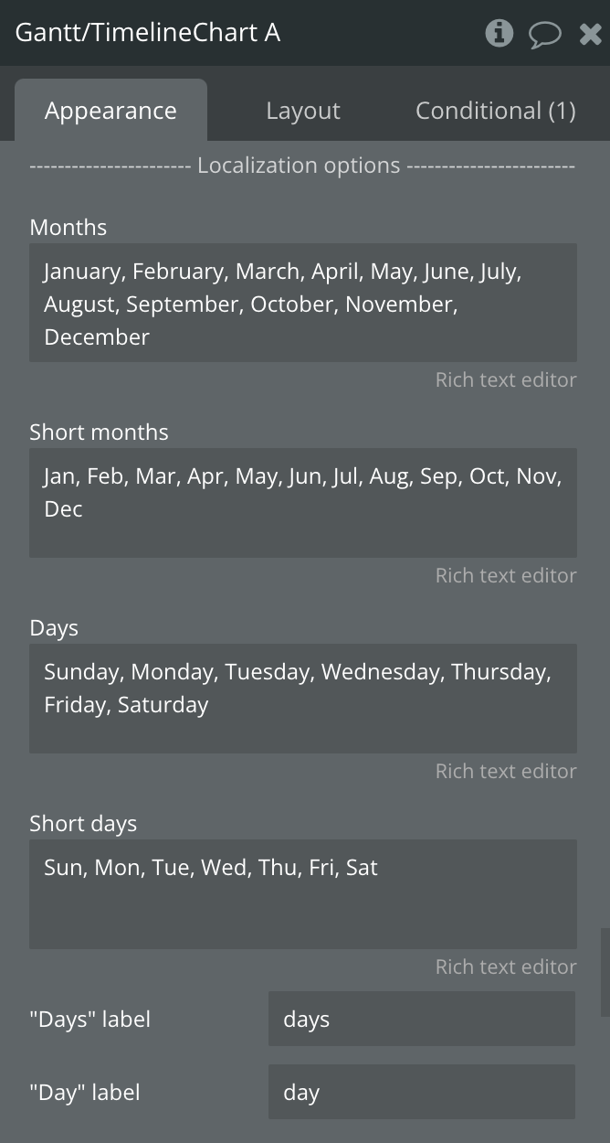
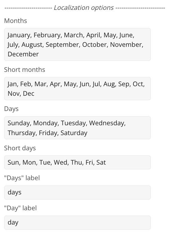
------------ Localization options -------------
Months
January, February, March, April, May, June, July, August, September, October, November, December
Text, Required
Short months
Jan, Feb, Mar, Apr, May, Jun, Jul, Aug, Sep, Oct, Nov, Dec