Demo to preview the settings
Introduction
Bring smooth, native-like interactions to your Bubble mobile app with the UI Components Bubble Mobile Plugin. This plugin offers essential interface elements—sliders, switches, and marquees—that help you build intuitive, responsive, and visually dynamic mobile experiences.
Use the Slider to capture and respond to user input with precision. The Switch element enables sleek toggles ideal for settings, filters, and quick on/off controls. The Marquee lets you display scrolling text—perfect for news tickers, promotions, or real-time updates.
Each component is highly customizable and integrates seamlessly with your workflows. Trigger events when users interact with components, or dynamically update content based on app logic. The plugin also exposes key states such as current slider value or toggle status, giving you full control over the UI behavior.
Enhance usability and interactivity with native-feeling controls, reduce friction in user input, and create clean, modern interfaces—without writing a single line of code
Prerequisites
No external API accounts or services are required for this plugin. The plugin works natively within your Bubble application with no additional dependencies.
This plugin is designed specifically for the mobile version of the Bubble editor. To test the plugin on your mobile device, use the TestFlight app available at:
Please note that the testing app is currently available for iOS only.

How to setup
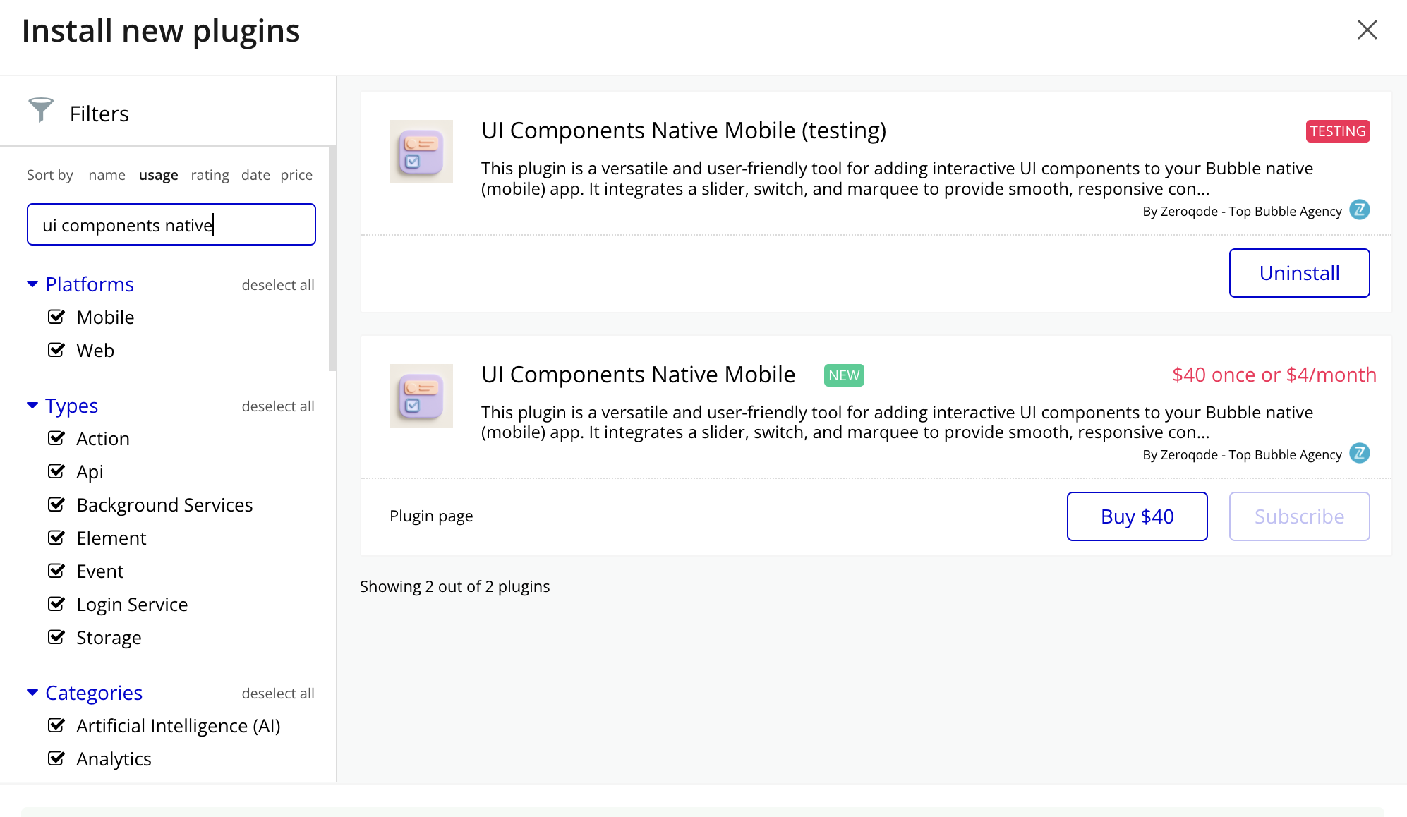
- Install the Plugin: Navigate to your Bubble app’s Plugin tab and install the UI Components Bubble Mobile Plugin from the Plugin store.
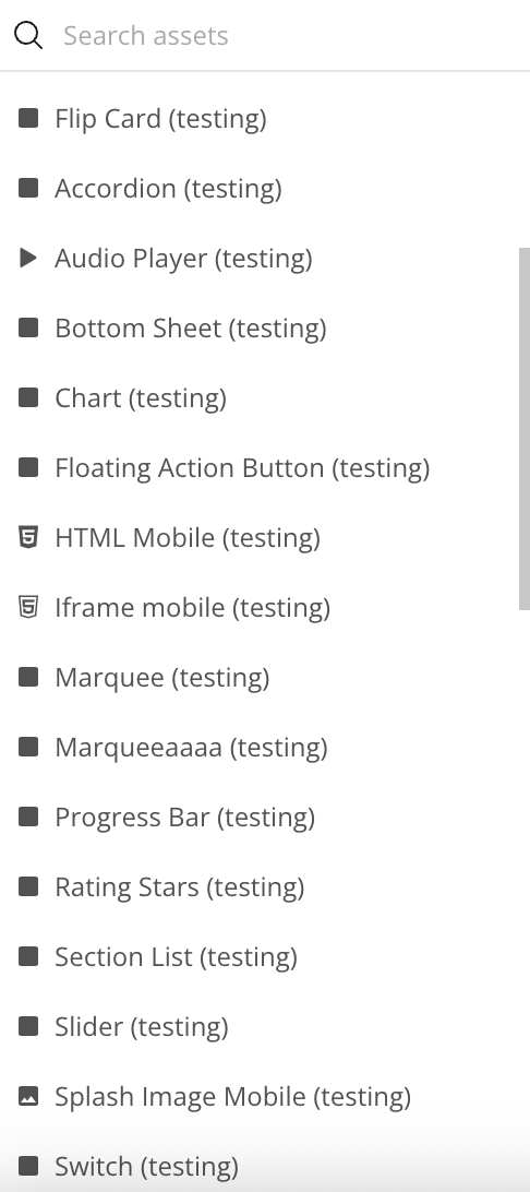
- Add the Element: Drag and drop the Switch/Slider/Marquee/Bottom Sheet/Floating Action Button/Flip Card/Accordion/Section List/Rating Stars/Progress Bar element from the Visual Elements section onto your page.
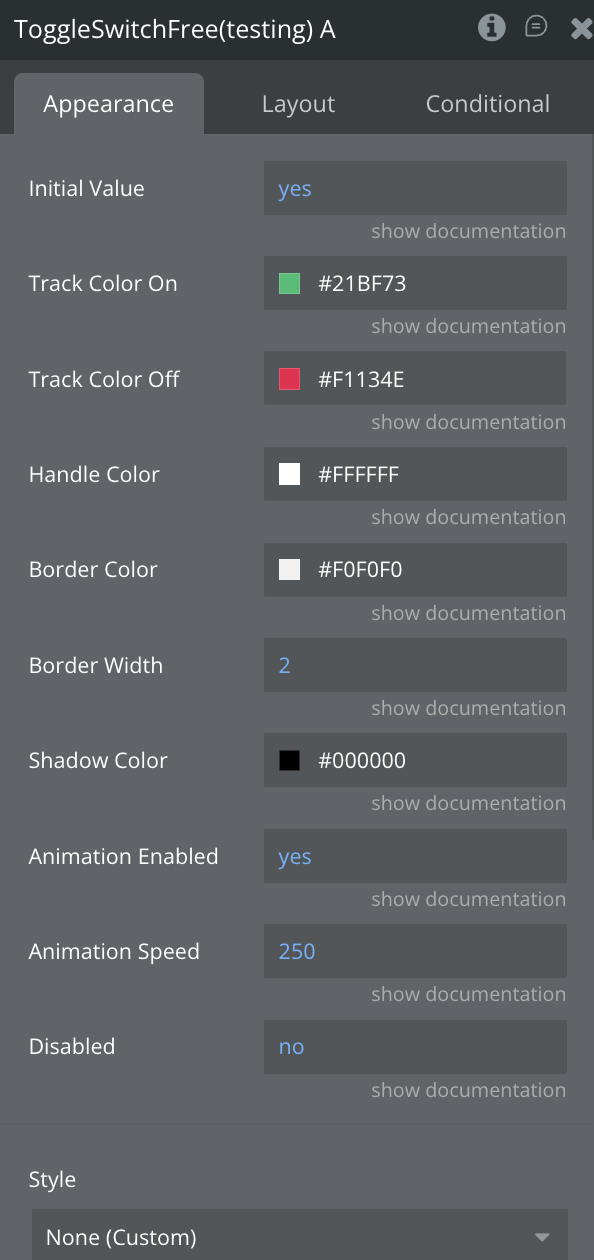
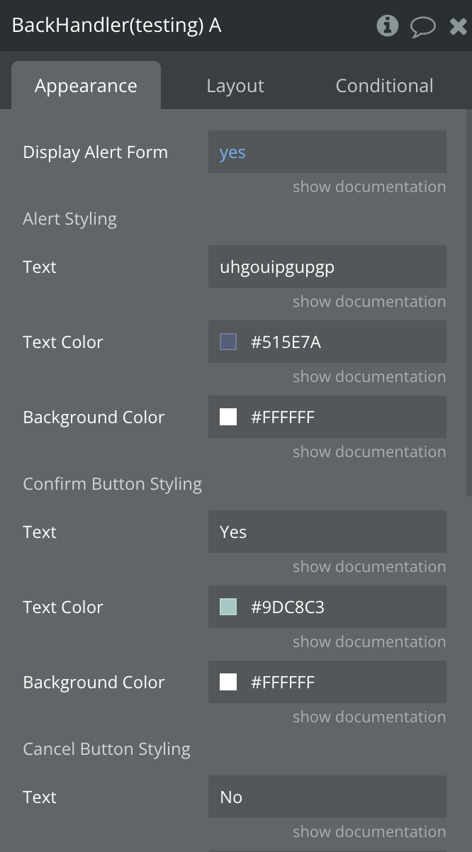
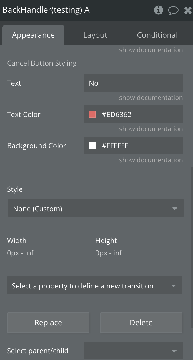
- Configuration: In each element properties panel, set the "Color", "Text", "Content", "Image Url" fields (either static text or a dynamic value from your database).
- Set Dimensions: All elements comes with default dimensions of 393x200 pixels, but you can resize it to fit your design needs
Plugin Element Properties
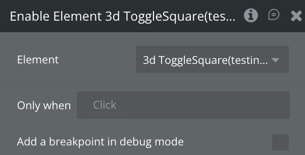
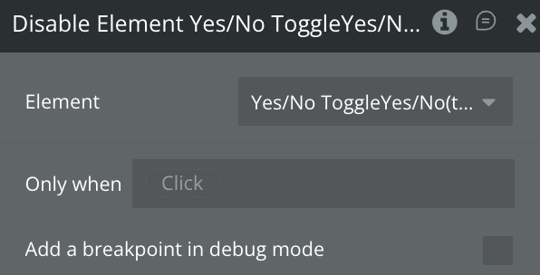
Toggle Switch
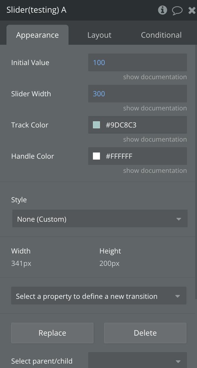
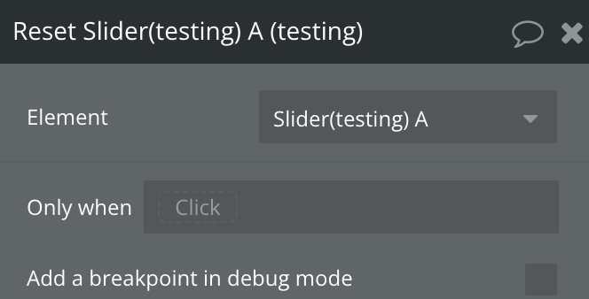
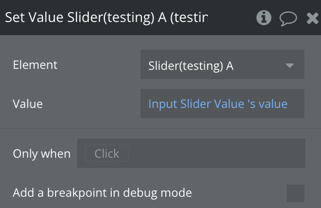
Slider Element
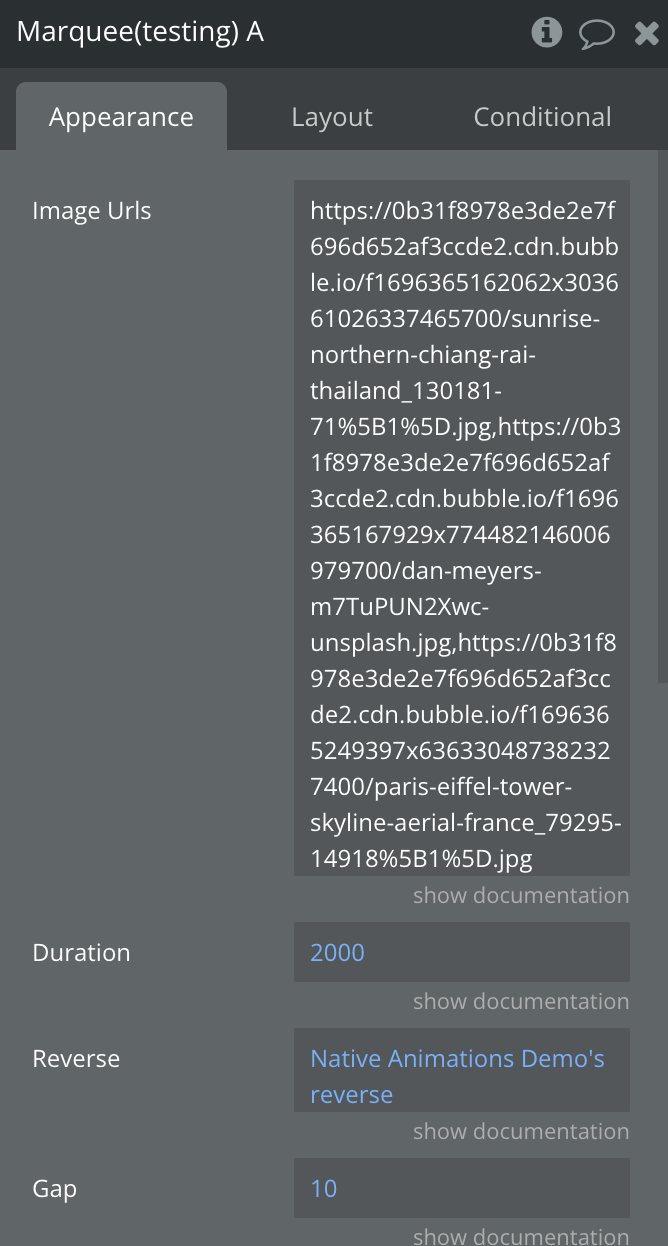
Marquee Element
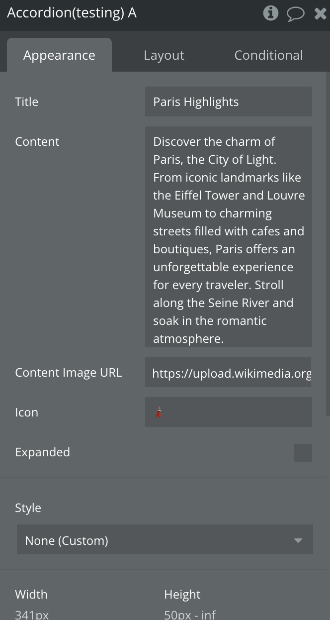
Accordion Element
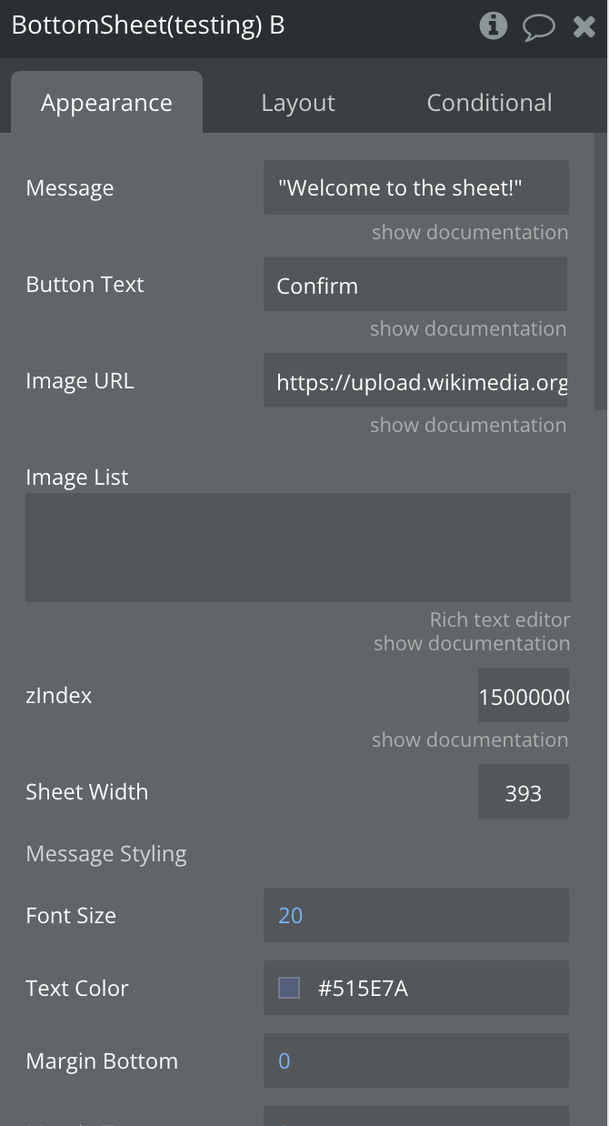
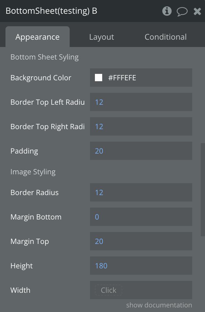
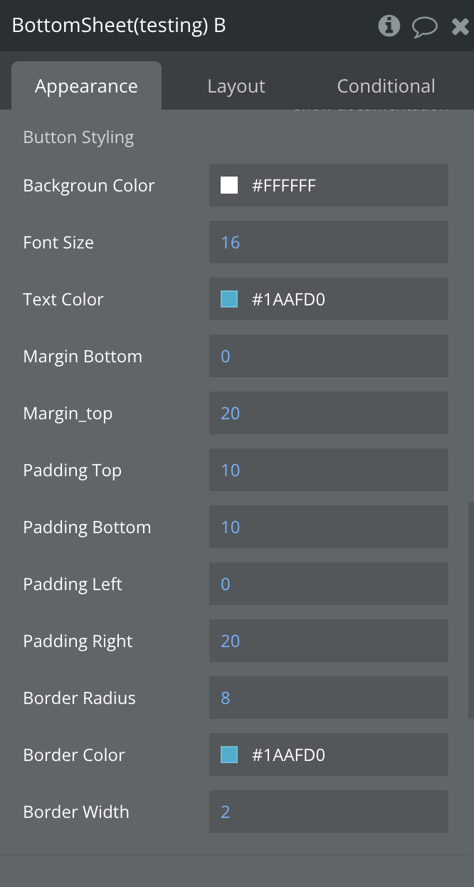
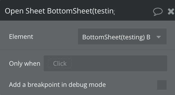
Bottom Sheet Element
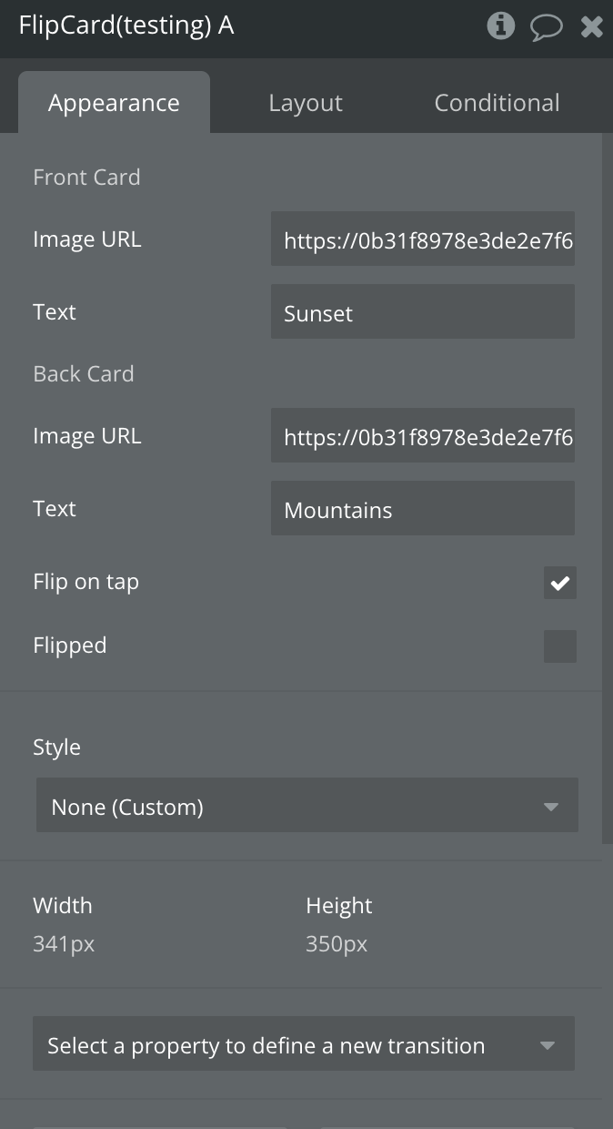
Flip Card Element
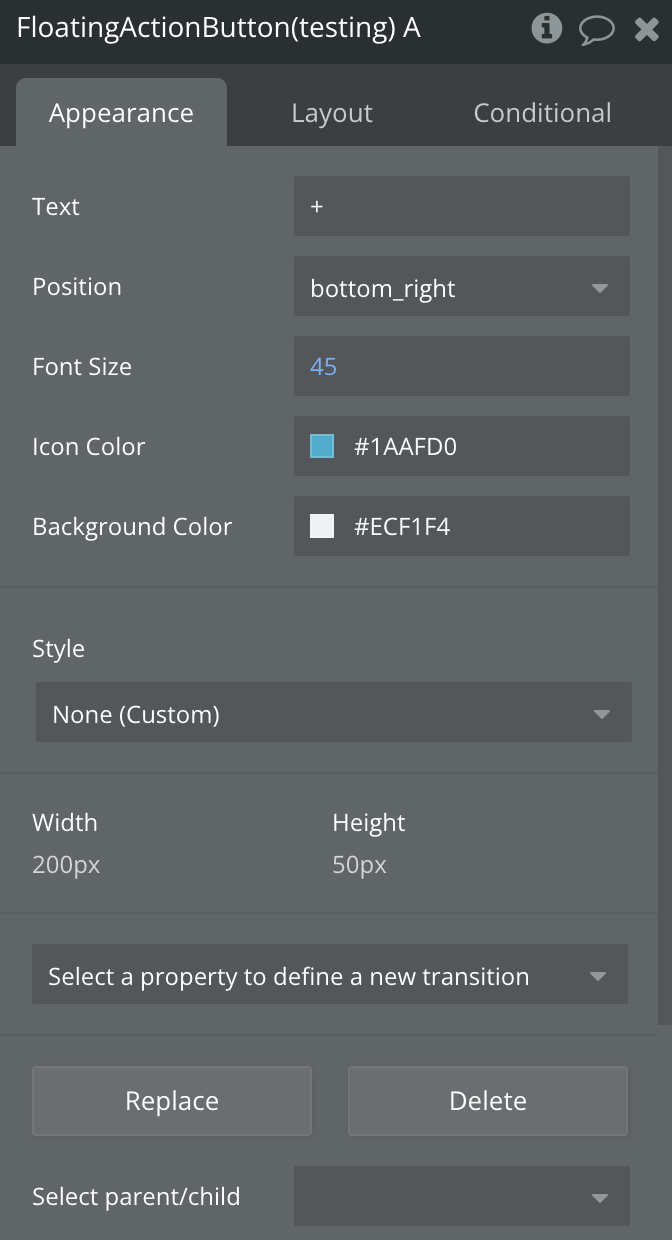
Floating Action Button Element
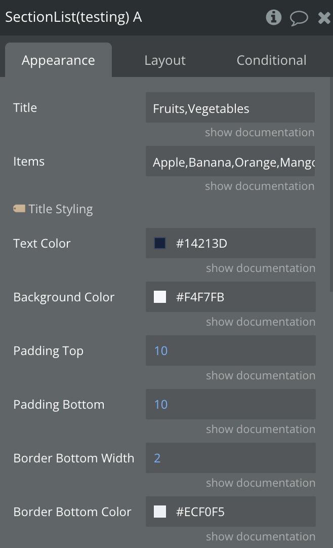
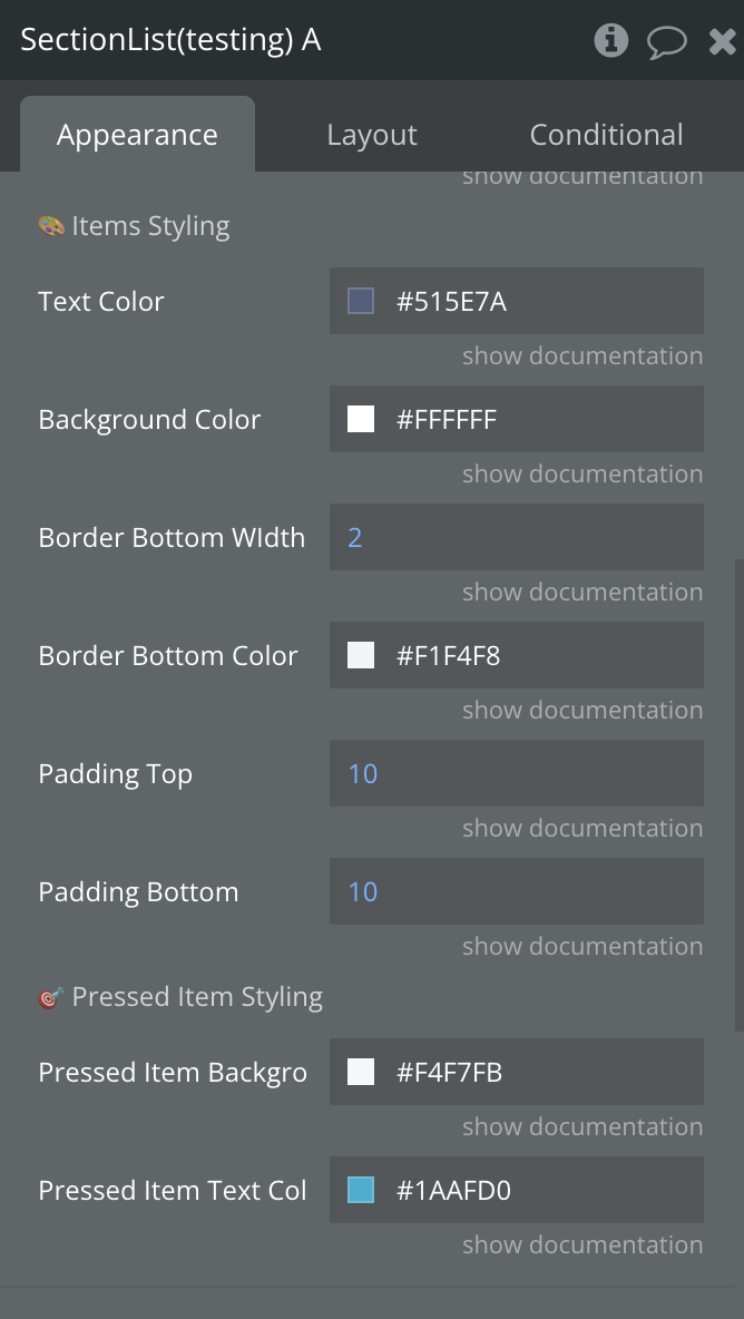
Section List Element
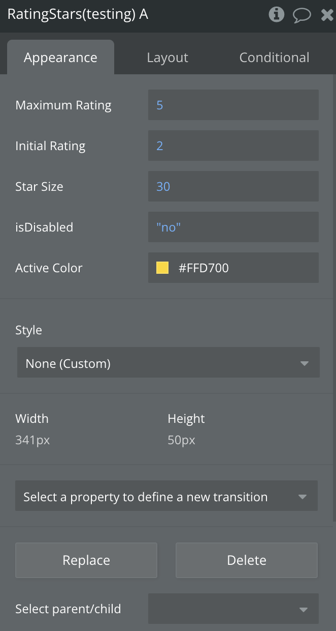
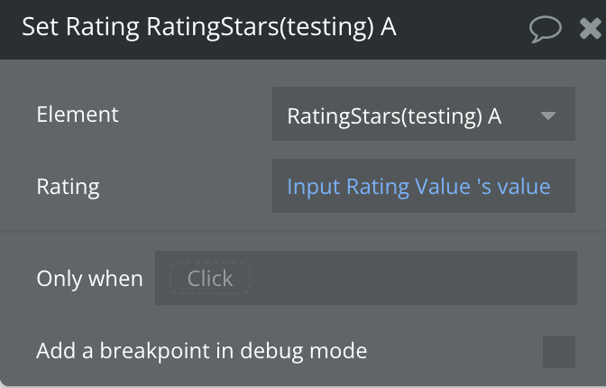
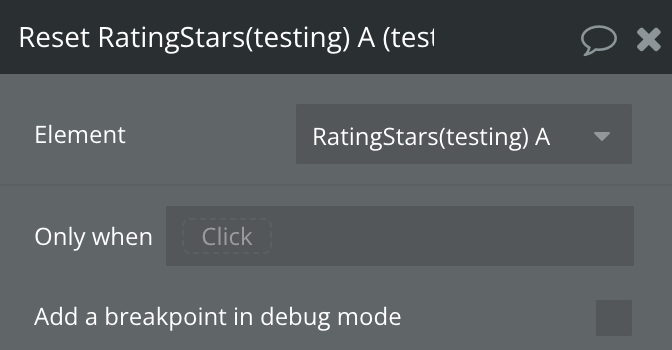
Rating Stars Element
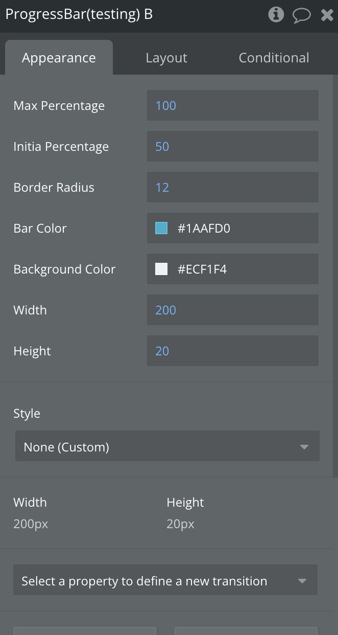
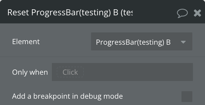
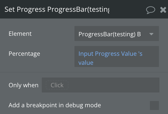
Progress Bar Element

Backhandler Element

Exposed states
Title | Description | Type |
On | Indicates the current value of the switch | Yes/No |
Value | Indicates the value of the slider | Number |
Gesture Active | Indicates whether the user is actively interacting with the slider via a pan gesture | Yes/No |
Reversed | Indicates whether the direction of the scroll is reversed | Yes/No |
Current Snap Index | Indicates z-idex | Number |
Sheet Open | Indicates whether the sheet is open | Yes/No |
Flipped | Indicates whether the Flic Card is flipped | Yes/No |
Expanded | Indicates whether the Accordion is expanded | Yes/No |
Selected Item | Indicates the selected item | Text |
Current Rating | Indicates the current rating number | Number |
Disabled | Indicates whether the rating is enabled | Yes/No |
Current Percentage | Indicates whether the percentage number | Number |
Elements events
Title | Description |
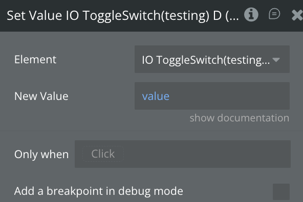
A Switch Turned On | Triggered when the switch is turned on |
A Switch Turned Off | Triggered when the switch is turned off |
A Slider Value Changed | Triggered when the slider's offset value changes |
A Marquee Reverse Changed | Triggered when the orientation of the scroll is changed |
A Bottom Sheet Opened | Triggers when a sheet is opened |
A Bottom Sheet Closed | Triggers when a sheet is close |
A Bottom Sheet Button Clicked | Triggers when a sheet button is clicked |
A Flip Card Card Flipped | Triggered when Card is flipped |
An Accordion Toggled | Triggered when accordion is toggled |
A Section List Section Item Pressed | Toggled when an item is pressed |
A Rating Stars Rating Changed | Triggered When Rating Changed |
A Progress Bar Progress Changed | Triggered When Progress Changed |