Demo to preview the settings
Introduction
The most advanced emoji picker for Bubble. It supports native iOS emojis and is a highly reliable, customizable picker.
FEATURES
- Add custom images and GIFs!
- Automatically bind to input or retrieve in the element state
- Supports auto, light and dark themes, with the ability to extend them to create your own
- Full support for skin tone variations where applicable
- Supports over 30+ locales
- Emojis are searchable by name or tags
- Remembers recently used emojis
- Fully keyboard accessible
- Emoji data is loaded once from a CDN and cached in the browser for subsequent sessions.
- Auto and custom positioning to the reference element
- Smooth and animated
- Fully customizable categories, categories order and picker tabs
- Three clicks only implementation
- Fully responsive
- Based on a reliable and lightweight library

Plugin Element Properties
Emoji Picker
Fields:
Title | Description | Type |
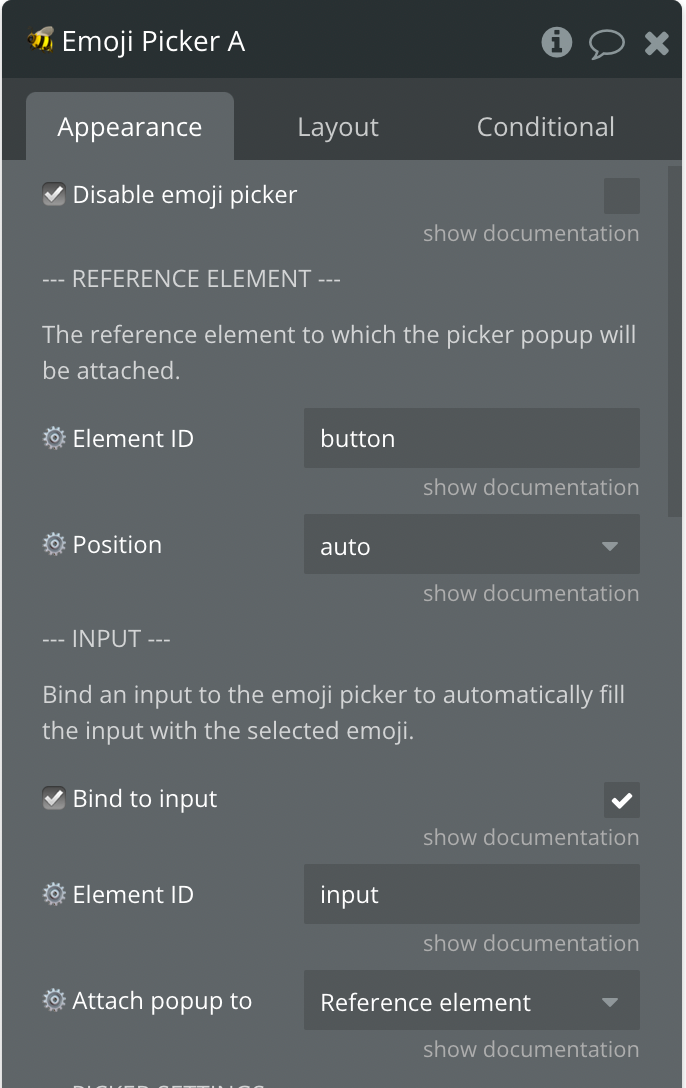
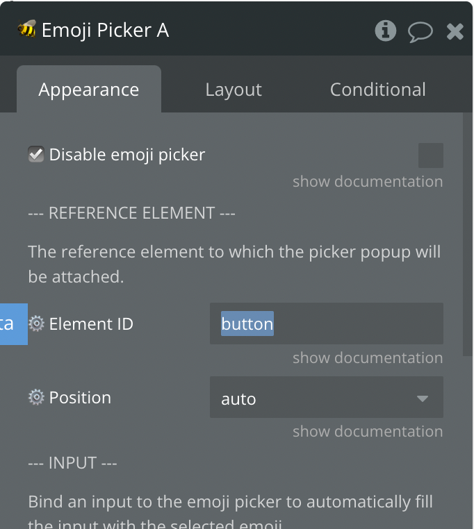
☑️ Disable emoji picker | Whether or not the emoji picker should be disabled. | Checkbox (yes/no) |
— TRIGGER ELEMENT — | ||
The element that will trigger the popup. | ||
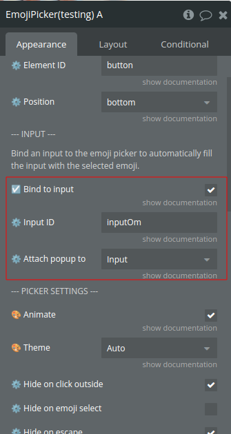
⚙️ Element ID | The ID of the element that will trigger the popup. | Text (optional) |
⚙️ Position | The position of the picker popup regarding the reference element.
Available options: auto, top, top-start, top-end, right, right-start,
right-end, bottom, bottom-start, bottom-end, left, left-start,
left-end | Dropdown |
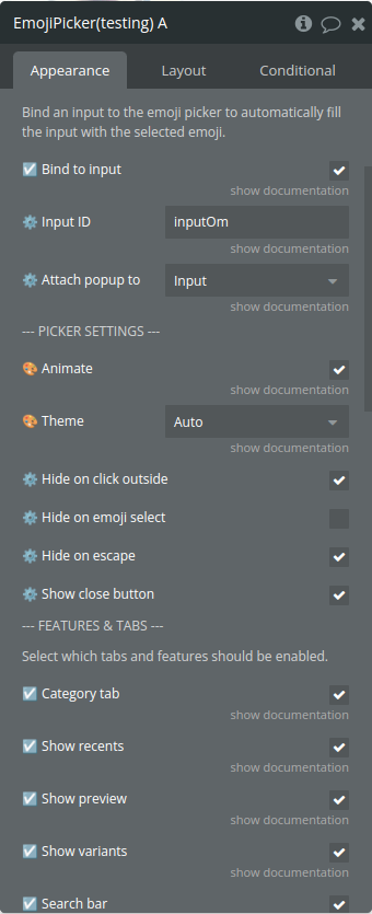
— INPUT — | ||
Bind an input to the emoji picker to automatically fill the input
with the selected emoji. | ||
☑️ Bind to input | Enable to bind the emoji picker to an input and automatically fill
the input with the selected emoji. | Checkbox (yes/no) |
Input ID | The HTML ID of the input to which the picker popup will bind | Text (optional) |
⚙️ Attach popup to | The reference element to which the picker popup will be attached to.
If set to “custom”, you must fill the element ID under the “⚙️ Custom
reference element” setting at the bottom. Available options: Reference
element, Input | Dropdown |
— PICKER SETTINGS — | ||
🎨 Animate | Whether or not to show animated transitions in the picker. | Checkbox (yes/no) |
🎨 Theme | The color theme to use for the picker. Available options: Auto,
Light mode, Dark mode | Dropdown |
⚙️ Hide on click outside | TODO: Fill in description | Checkbox (yes/no) |
⚙️ Hide on emoji select | TODO: Fill in description | Checkbox (yes/no) |
⚙️ Hide on escape | TODO: Fill in description | Checkbox (yes/no) |
⚙️ Show close button | TODO: Fill in description | Checkbox (yes/no) |
— FEATURES & TABS — | ||
Select which tabs and features should be enabled. | ||
☑️ Category tab | Whether or not to show the category tabs at the top of the
picker. | Checkbox (yes/no) |
☑️ Show preview | Whether or not to show the preview area at the bottom of the
picker. | Checkbox (yes/no) |
☑️ Show recents | Whether or not to show recently used emojis. | Checkbox (yes/no) |
☑️ Search bar | Whether or not to show the search box at the top of the picker. | Checkbox (yes/no) |
☑️ Show variants | Whether or not to show the variants of an emoji, where supported. If
not enabled, the default variant will always be emitted | Checkbox (yes/no) |
⚙️ Auto-focus | Specify if the search field will receive focus when opened (Must
have “⚙️ Show search” enabled). | Checkbox (yes/no) |
— CATEGORIES — | ||
This can be used to limit which categories are shown, and in what
order. | ||
⚙️ Categories | If specified, only the categories specified on this setting will be
shown in the picker, in the order they appear in the setting. The
categories array also limits what emojis can be found by searching.
Categories need to be comma separated, and can be any of the following:
“activities”,“animals-nature”,“custom”,“flags”,“food-drink”,“objects”,“people-body”,“recents”,“smileys-emotion”,“symbols”,“travel-places” | Text (optional) |
— ADVANCED — | ||
Advanced settings for the emoji picker | ||
⚙️ Locale | The locale to use for emoji data and picker. Available options: da,
de, en-gb, en, es-mx, es, et, fi, fr, hu, it, ja, ko, lt, ms, nb, nl,
pl, pt, ru, sv, th, uk, zh-hant, zh | Dropdown |
⚙️ Max recents | The maximum number of recent emojis to cache locally. Available
options: 0, 1, 2, 3, 4, 5, 6, 7, 8, 9, 10, 11, 12, 13, 14, 15, 16, 17,
18, 19, 20, 25, 30, 50, 75, 100 | Dropdown |
⚙️ Emoji size | TODO: Fill in description | Text |
⚙️ Emojis per rows | Available options: 1, 2, 3, 4, 5, 6, 7, 8, 9, 10, 11, 12, 13, 14,
15, 16, 17, 18, 19, 20, 25, 30, 50 | Dropdown |
⚙️ Visible rows | The number of visible rows to show in the emoji grid. Available
options: 1, 2, 3, 4, 5, 6, 7, 8, 9, 10, 11, 12, 13, 14, 15, 16, 17, 18,
19, 20, 25, 30, 50 | Dropdown |
⚙️ Custom class | Sets any additional CSS classes to be applied to the picker. This is
typically used to override theme styles. | Text (optional) |
— CUSTOM EMOJIS — | ||
Add your own emojis to the picker. This is an advanced feature and
we recommend following our documentation. | ||
☑️ Enable | TODO: Fill in description | Checkbox (yes/no) |
⚙️ Data type | The data type to use as custom emojis. | App Type (optional) |
⚙️ Data source | The data source of the list of emojis as defined above to use as
custom emojis. | Item reperesenting ⚙️ Data type (optional) |
⚙️ Or use custom JSON instead | Please refer to documentation. “☑️ Enable” parameter from “CUSTOM
EMOJIS” must be checked. This parameter will override above custom
settings. | Text (optional) |
⚪ Image field | The image to be showed in the popup picker, it’s also the image that
will be returned in the “Selected | Custom” image state when a custom emoji is picked. |
⚪ Tags field | A list of text to be used as search keywords within the picker
popup. | Filed of ⚙️ Data type, represent Text, image or file(list)
(optional) |
⚪ Label field | The label field to be used as the emoji description in the picker
preview, it’s also the text that will be returned in the “Selected | Label” state when a custom emoji is picked. |
⚪ Data field | An additional data field to be returned as the “Selected | Custom data” state when a custom emoji is picker. Useful to pass a
unique ID. |
⚪ Emoji field | The text to be returned as the “Selected | Emoji” state when a custom emoji is picker. |
Element Actions
- Show - shows the emoji popup
- Hide - hides the emoji popup
- Clear recents - clears recent emojis
Exposed states
Title | Description | Type |
Emoji | The Unicode or character representation of the selected emoji. This provides a way to display or use the selected emoji within the application. | text |
Hexcode | The hex code of the selected emoji, providing a standard reference to the emoji character in Unicode. | text |
Label | A text label or description of the selected emoji. This can be used for accessibility purposes or to provide context to the user about the emoji's meaning or use. | text |
Custom image | The URL of the image if a custom emoji is selected. This is useful for applications that need to display custom emojis using their image URLs. | image |
Data | Additional data associated with the selected emoji. This could be an identifier, JSON object, or any metadata provided during the emoji configuration. | text |
Selected is a custom emoji? | Flags whether a custom emoji was selected. true indicates that the selected emoji is a custom emoji, while false would indicate a standard emoji selection. | yes/no |
Popup picker is ready? | Indicates whether the emoji picker has completed its initialization and is ready for interaction. | yes/no |
Element Events
Title | Description |
emoji is selected | Fired when an emoji is selected by the user. This event signifies that the user has chosen an emoji and potentially triggers updates or actions within the host application based on the selection. |
emoji picker is opened | Emitted when the emoji picker is opened. This can be used to trigger animations, logging, or other actions that should occur when the picker becomes visible. |
emoji picker is closed | Emitted when the emoji picker is closed. Similar to the opened event, this can trigger actions that should occur when the picker is no longer visible, such as resetting certain UI elements or states. |
emoji picker is ready | This event is fired when the picker is fully loaded and ready for interaction, corresponding to the ready published state becoming true. It is useful for triggering actions that depend on the picker being interactive, such as enabling buttons or inputs associated with the picker. |
Configuration
In this section, you will find all the required information to setup the plugin. We strongly recommend following this if you just purchased the plugin.
Getting started
Adding the plugin & basic setup

Using custom emojis
Customising categories
Keyboard interactions
Size and layout
Custom theming
Emoji variants

FAQ
Why are some emojis not rendering correctly?