
Link to the plugin page: https://zeroqode.com/plugin/1530019019753x836188844381962200
Demo to preview the plugin:
Introduction
Get this plugin to present a feature or in order to guide users step by step on a page. It’s your best choice when you need to demonstrate your product features to the new users.
Additionally, this no-code plugin can be used to showcase new features to your existing users in easy-to-follow steps.

How to setup
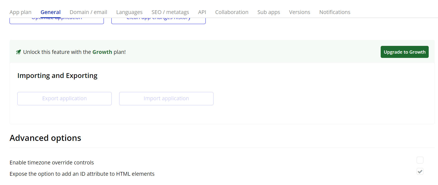
- Enable ID Attributes
Go to the settings page in your editor. Under the General tab click on the checkbox “Expose the option to add an ID attribute to HTML elements”
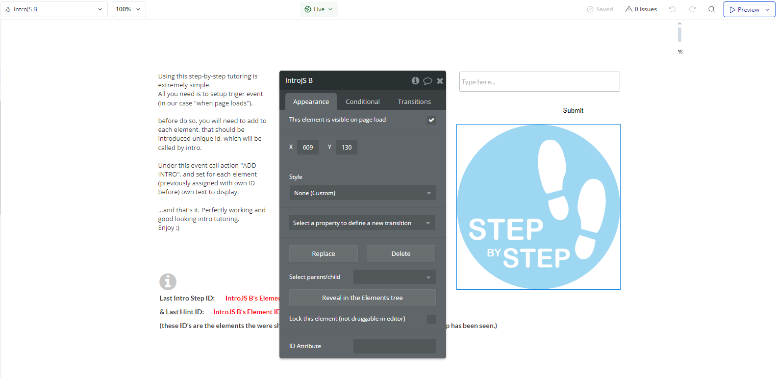
- Adding the IntroJS Element to the Page
- Drag and drop the IntroJS element onto your page.
- This element is necessary for the plugin’s actions and events to function properly.
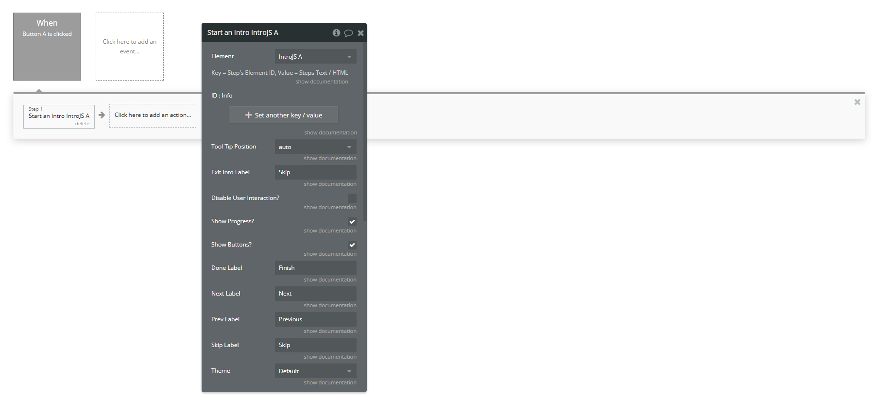
- Creating a Step-by-Step Tutorial
- Open the Workflows tab.
- Create an event (e.g., when a user clicks a "Start Tutorial" button).
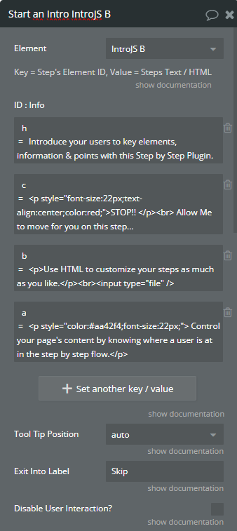
- Add the action "Start an Intro IntroJS".
To start an interactive guide, you need to configure the "Start An Intro A IntroJS" workflow action.
Steps:
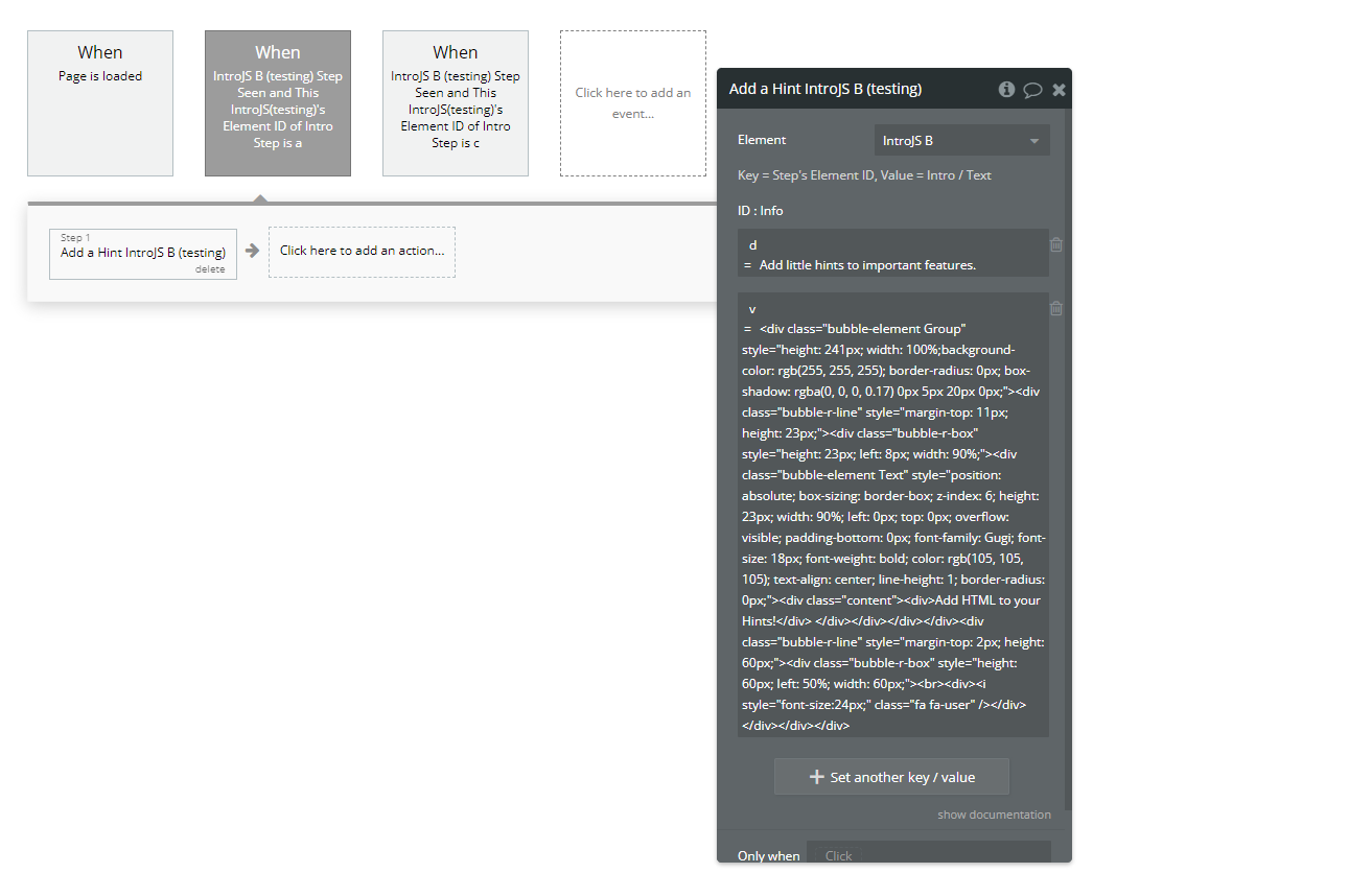
- Add Interactive Hints
- Open the Workflows tab.
- Create an event (e.g., "When Page is Loaded").
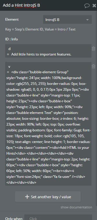
- Add the action "Add a Hint IntroJS".
- Configure the required fields.
IntroJS also supports hints—small messages that appear next to elements.
Steps to Add a Hint
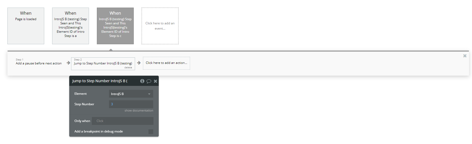
- Jump to a Specific Step
If you want users to skip to a specific step, use the "Jump To Step Number A IntroJS" action.
- Track User Progress with Events
- Triggered when a user reaches a specific step.
- Can be used to store progress in the database.
- Triggered when a user clicks on a hint.
- Can be used to track which hints were useful.
The plugin provides two key events to track user interactions:
Events:
A IntroJS Step Seen
A IntroJS Hint Clicked
Plugin Element Properties
IntroJS
Element Actions
- Start an Intro - This action starts a guided tutorial on your page, highlighting elements step by step. It requires defining each step with an element ID and corresponding text or HTML instructions.
Title | Description | Type |
Key = Step’s Element ID, Value = Steps Text / HTML | ||
ID : Info | ID : Info | List of key/value reperesenting text |
Tool Tip Position | Tool Tip Position Available options: auto, left, center, right | Dropdown |
Exit Into Label | Exit Into Label | Text |
Disable User Interaction? | Disable Interaction? | Checkbox (yes/no) |
Show Progress? | Show Progress? | Checkbox (yes/no) |
Show Buttons? | Show Buttons | Checkbox (yes/no) |
Done Label | Done Label | Text |
Next Label | Next Label | Text |
Prev Label | Prev Label | Text |
Skip Label | Skip Label | Text |
Theme | Theme Available options: Default, Modern, Dark, Royal, Nazanin, Custom | Dropdown |
CUSTOM Theme Style | CUSTOM Theme Style | Text |
- Add a Hint - This action adds an interactive hint to an element on the page. Hints appear as small tooltips that users can click to reveal additional information.
Title | Description | Type |
Key = Step’s Element ID, Value = Intro / Text | ||
ID : Info | ID : Info | List of key/value reperesenting text |
- Jump to Step Number - This action allows the user to jump to a specific step in the tutorial.
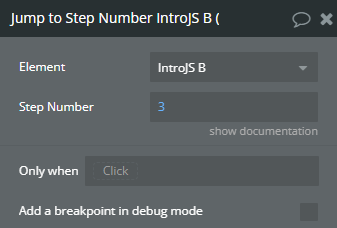
Title | Description | Type |
Step Number | Step Number | Number |
Exposed states
Title | Description | Type |
Element ID of Intro Step | Intro ID | Text |
Element ID of Hint Step | Hint ID | Text |
Element Events
Title | Description |
Step Seen | Step Seen |
Hint Clicked | Hint Clicked |
