This no-code plugin enables you to integrate a fully functional Rich Text Editor into your Bubble app. The plugin offers extensive features and settings that make it a useful RTE.
Some of the supported features include lightweight (display) mode, mentions, hashtags, image pasting from the clipboard, content saving in browser storage, and many more.
Prerequisites
No external accounts or API keys are required for basic functionality. However, if you plan to upload images to cloud storage (AWS S3 or Wasabi), you will need:
AWS S3: AWS Access Key, AWS Secret Key, and AWS Region
Wasabi: Wasabi Access Key, Wasabi Secret Key, and Wasabi Region
These credentials should be configured in the plugin’s shared keys settings.
Tutorial
How to setup
Add the element to your page
Drag the “RTE [beta]” element from the plugin elements to your page
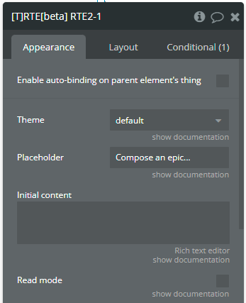
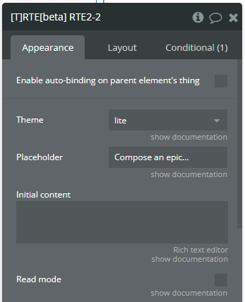
Configure basic properties
Set the Theme (default or lite)
Add a Placeholder text (optional)
Configure Initial content if needed (supports HTML, plain text, or Delta JSON)
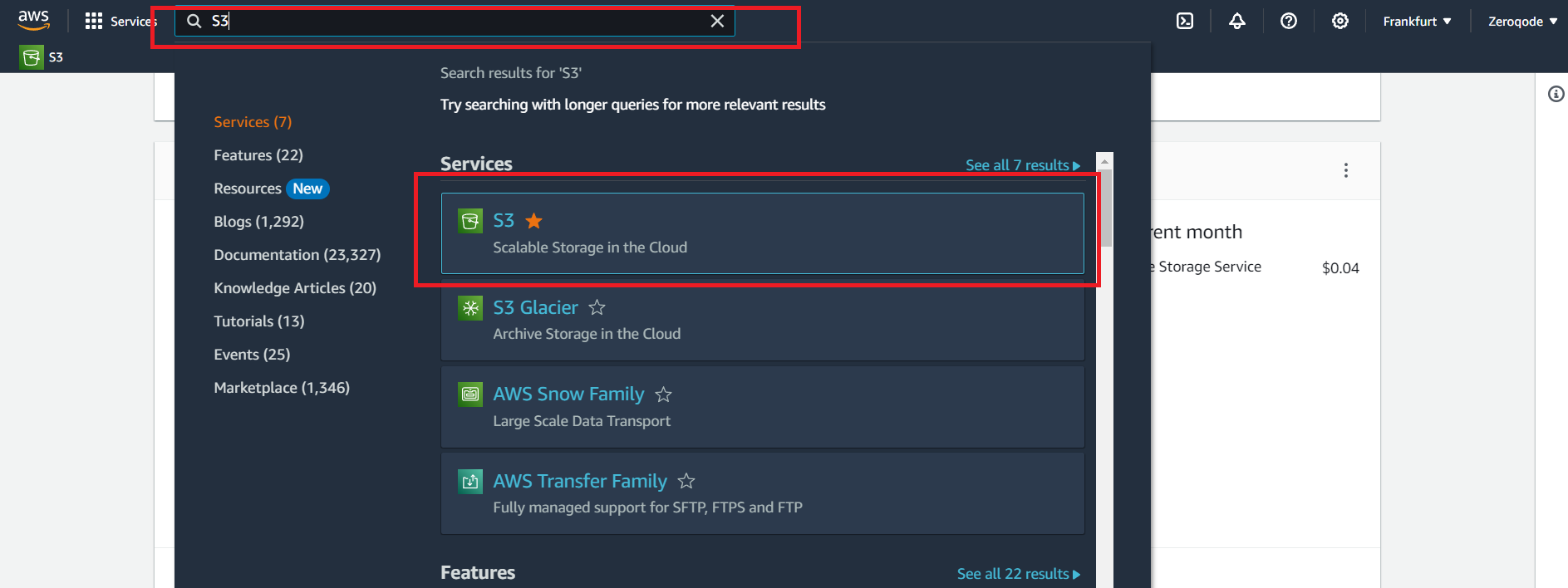
In the AWS services search bar at the top, type "S3" and click on "S3" in the dropdown to navigate to the S3 Dashboard or open this link.
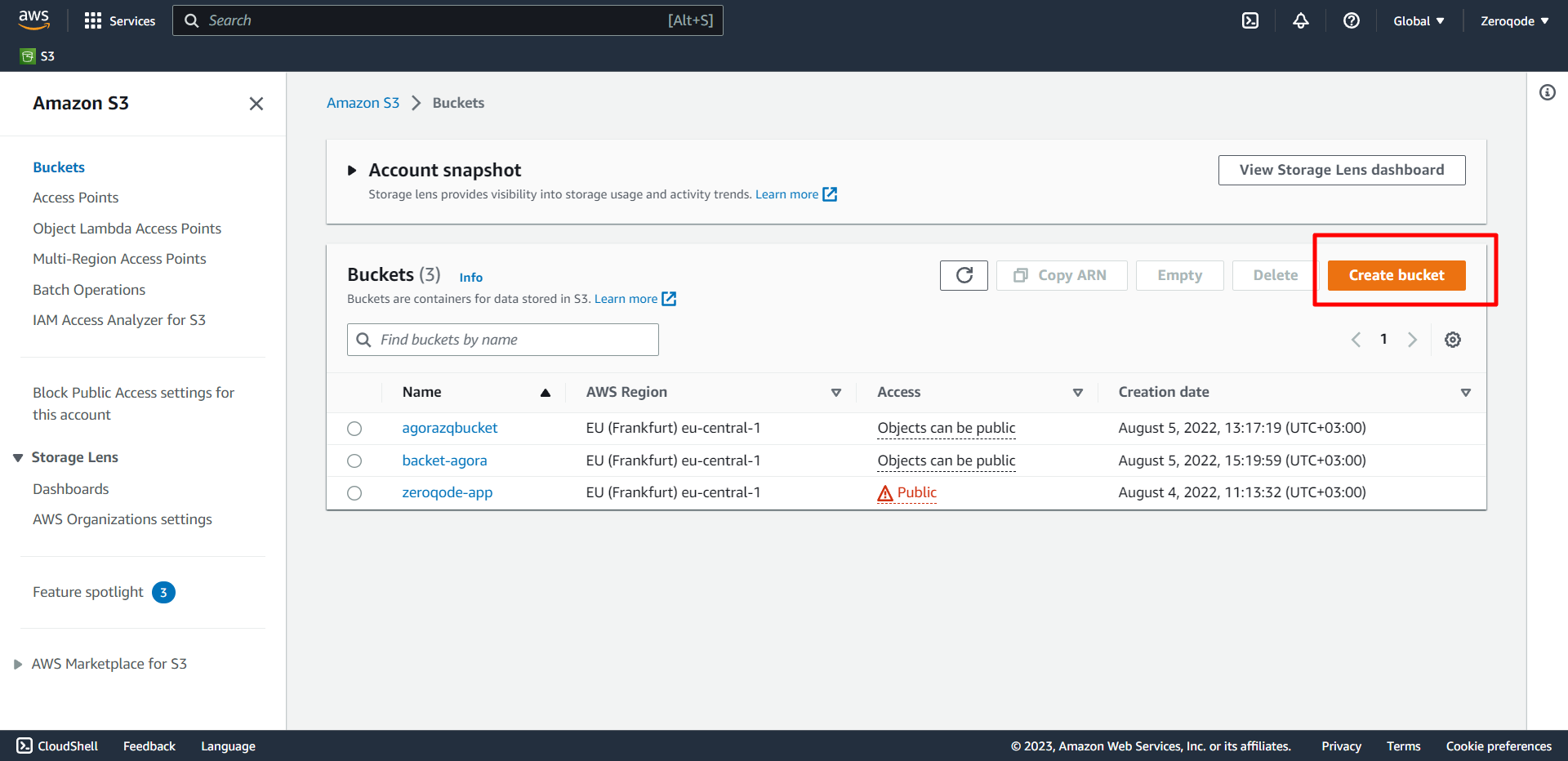
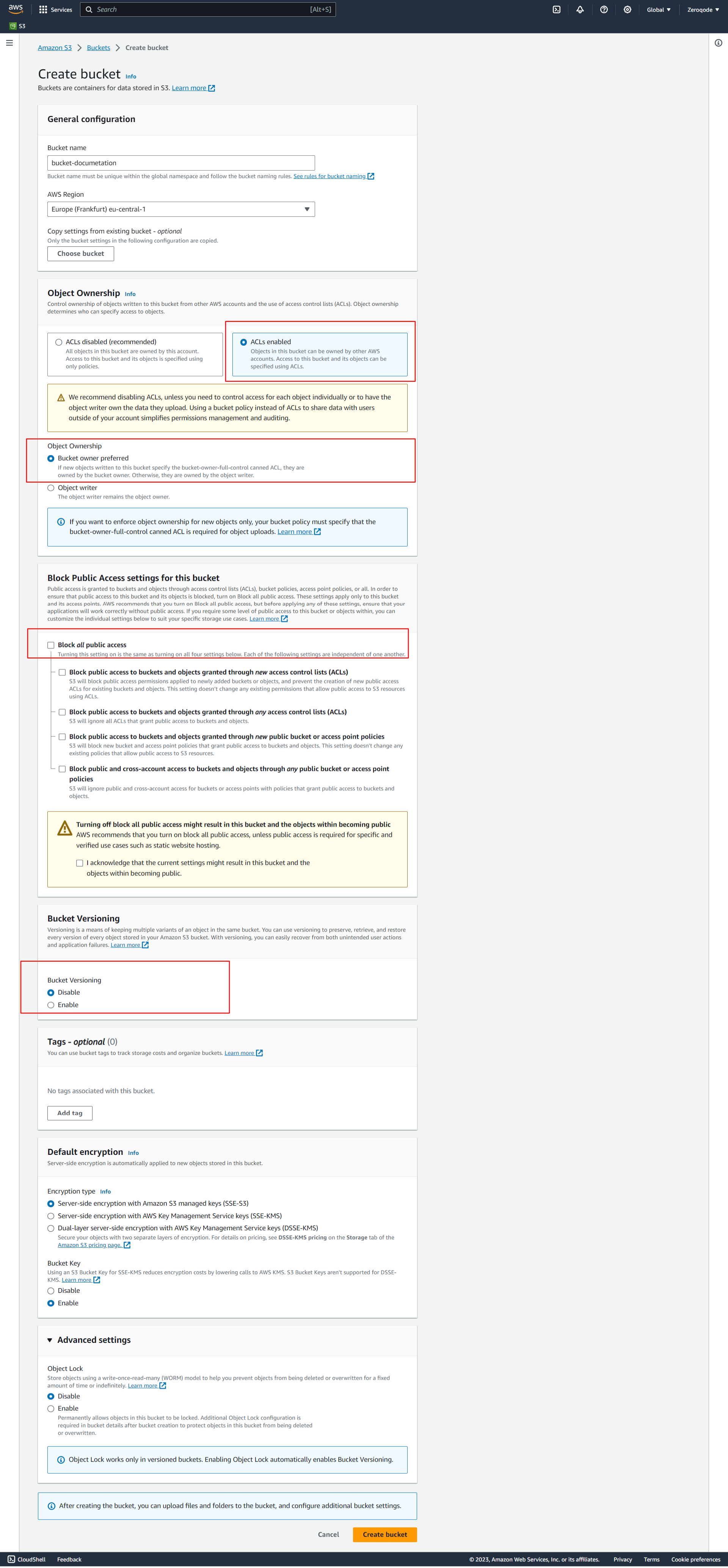
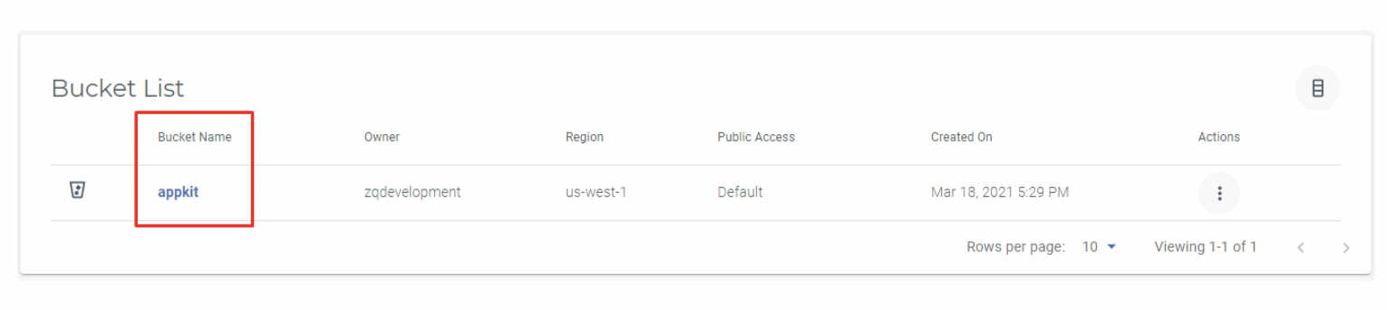
Choose to Create bucket. The Create bucket page opens:
The bucket name must be created with the following conditions:
The name should be between 3 and 63 characters long.
Consist only of lowercase letters, numbers, dots (.), and hyphens (-). For best compatibility, we recommend that you avoid using dots (.) in bucket names, except for buckets that are used only for static website hosting.
The name should begin and end with a letter or number.
After you create the bucket, you cannot change its name. For more information about naming buckets, see Bucket naming rules.
❗
IMPORTANT! Avoid including sensitive information, such as account numbers, in the bucket name. The bucket name is visible in the URLs that point to the objects in the bucket.
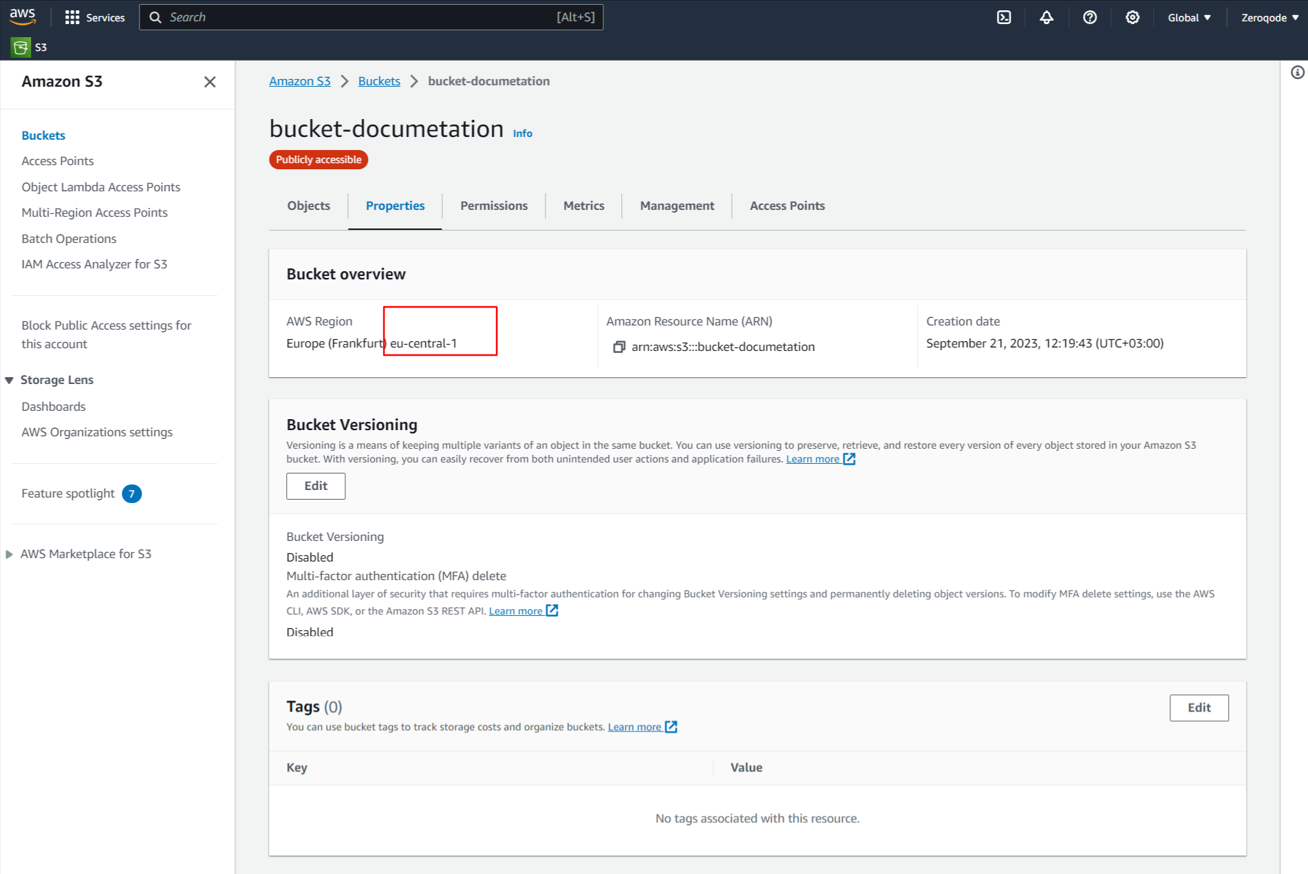
For Region, choose the AWS Region where you want the bucket to reside. To minimize latency and costs and address regulatory requirements, choose a Region close to you. Objects stored in a Region never leave that Region unless you explicitly transfer them to another Region.
For a list of Amazon S3 AWS Regions, see AWS service endpoints in the Amazon Web Services General Reference.
Under Object Ownership, to disable or enable ACLs and control ownership of objects uploaded in your bucket, choose one of the following settings:
ACLs disabled
Bucket owner enforced – ACLs are disabled, and the bucket owner automatically owns and has full control over every object in the bucket. ACLs no longer affect access permissions to data in the S3 bucket. The bucket uses policies to define access control.
Bucket owner preferred – The bucket owner owns and has full control over new objects that other accounts write to the bucket with the bucket-owner-full-control canned ACL.
If you apply the bucket owner preferred setting, to require all Amazon S3 uploads to include the bucket-owner-full-control canned ACL, you can add a bucket policy that allows only object uploads that use this ACL.
Object writer – The AWS account that uploads an object owns the object, has full control over it and can grant other users access to it through ACLs.
Under Block Public Access settings for this bucket, choose the Block Public Access settings that you want to apply to the bucket. We recommend that you keep all settings enabled unless you know that you need to turn off one or more of them for your use case, such as to host a public website. The Block Public Access settings that you enable for the bucket are also enabled for all access points that you create on the bucket.
For more information about blocking public access, see Blocking public access to your Amazon S3 storage.
(Optional) Under Bucket Versioning, you can choose if you wish to keep variants of objects in your bucket. For more information about versioning, see Using Versioning in S3 buckets. To disable or enable versioning on your bucket, choose either Disable or Enable.
(Optional) Under Tags, you can choose to add tags to your bucket. Tags are key-value pairs used to categorize storage. To add a bucket tag, enter a Key and optionally a Value and choose Add Tag.
Under Default encryption, choose Edit.
To configure default encryption, under the Encryption key type, choose one of the following
⚠️Please see in our screenshot how we create our bucket
Get credentials
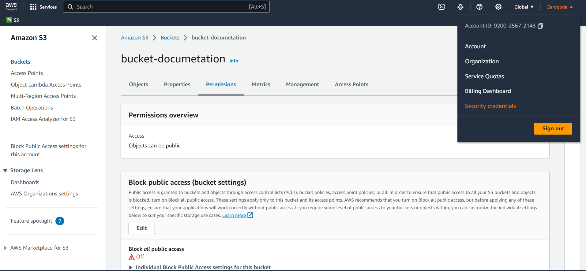
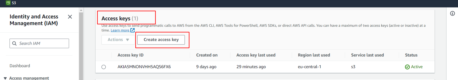
Navigate to Your Account: At the top-right corner of the AWS Management Console, you'll see your account name or number. Click on it to open the dropdown menu.
From the dropdown, select the "Security Credentials" option.
Access Keys Section: Once on the Security Credentials page, expand the "Access keys (access key ID and secret access key)" section.
Create New Access Key:
-If you already have existing access keys, you'll see them listed here.
-To create a new access key, click the "Create New Access Key" button.
⚠️
Download Credentials: After creating a new access key, you'll have the option to download it as a .csv file. Save this file securely, as AWS will not show these credentials again for security reasons.
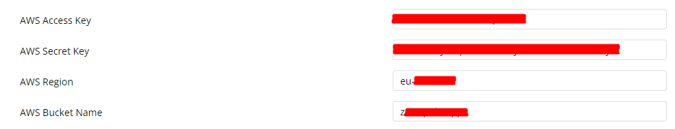
Open plugin settings in the Plugins tab from the Bubble.
Fill in the following AWS fields.
AWS Access Key - The access key from the downloaded file.
AWS Secret Key - The secret key from the downloaded file.
AWS Region - In AWS (Amazon Web Services), a "Region" is a specific geographical area where AWS has data centers.
AWS Bucket Name - The name of the bucket in AWS.
Setting Cross-origin and Politics
CROSS Configuration is required for the case when your resources should not be accessed by external resources.
For example, if you set the domain "https://your-domain/" in the cross, this means that only apps with the domain "https://your-domain/" will be able to access AWS Bucket.
Add security to your AWS bucket by configuring policies on the 'Permissions' tab:
In the next steps, we'll show you how to set Access Control, Bucket Policy, and CORS policy to get started with basic security restrictions.
In the 'Block public access' area unlock public access to all for the time being.
In the 'Bucket Policy' area you can configure the rules for security and privacy via Bucket Policy. Take a look at the "Action", "Resource" and "Condition" fields where we grant access to reading the objects from our bucket.
In this case, we are granting read file access only to users from our application domain, so if a user gets an image URL and tries to open it in a new tab or a new window, the bucket policy will block this request because we stated in the privacy rules that the link can be opened only from our domain:
YOUR-BUCKET-NAME - should be your S3 bucket name (ex: zeroqodedemo02).
You can find more Bucket Policy examples here. Feel free to try out other rules to improve your bucket security, since this documentation presents only our example of the settings.
In the Access Control List (ACL) area make sure that all the options look like the image below to match our configuration:
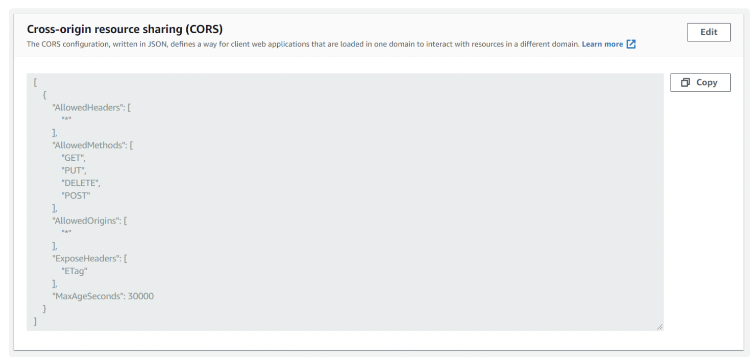
Use the 'Cross-origin resource sharing' area to configure the CORS policy for the S3 bucket.
To configure access from all domains, you can use the following JSON for the CORS policy:
Setting the CORS policy like this will allow everyone to change anything in your bucket, but you can definitely go deeper and set it up more securely.
For example, you can use the following JSON for CORS policy to allow access from your domain only (change the allowed origin to the URL of your app starting with https://)
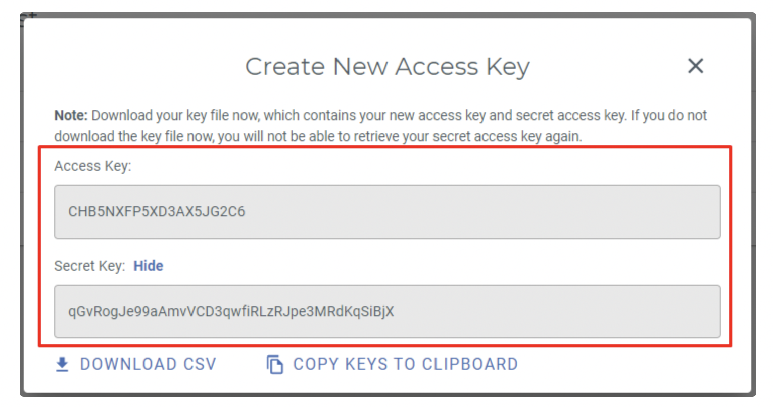
Create a Wasabi account at https://wasabi.com/. Visit wasabi.com to sign up for their service, you will get an email with link to your console. In your Wasabi console go to Billing->Payment settings then add your Payment method. While you do receive a month free trial to upload private files, a paid account is required to upload public files.
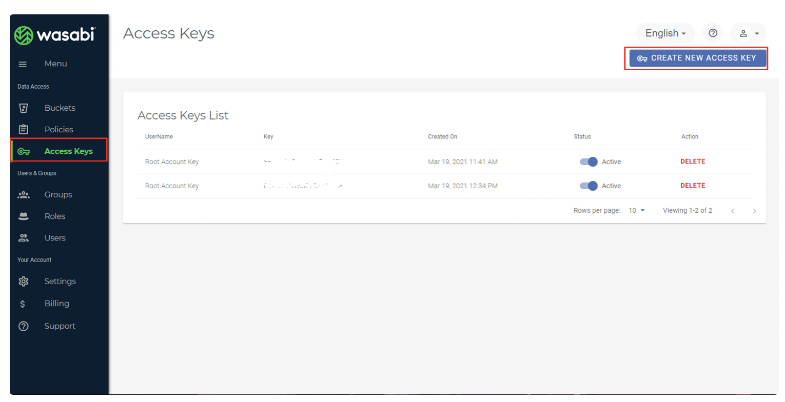
Next, go to the Access Keys page & create a new access key.
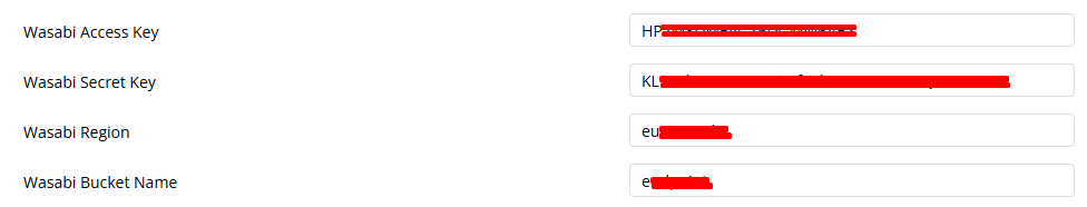
Open plugin settings in the Plugins tab from the Bubble.
Fill in the following Wasabi fields.
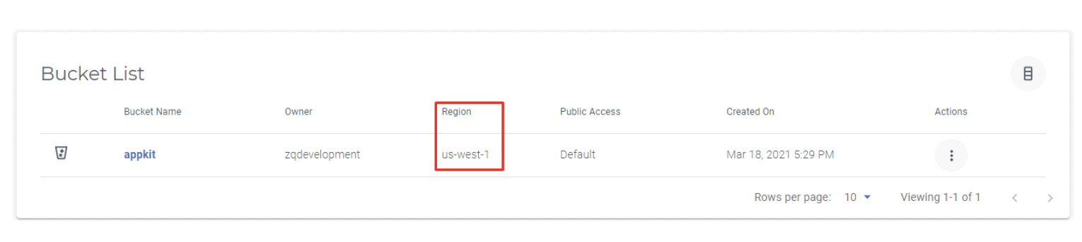
Wasabi_region - The region of where this Bucket is stored. Enter one of the following: us-west-1, eu-central-1, us-east-1, us-east-2.
Wasabi_bucket - The name of the Bucket you would like to upload to.
Plugin Elements Properties
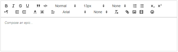
The plugin contains three editor elements. We recommend using RTE as it’s the most modern and feature-rich version.
RTE
Default
Lite
Preview
Fields
Title
Description
Type
Theme
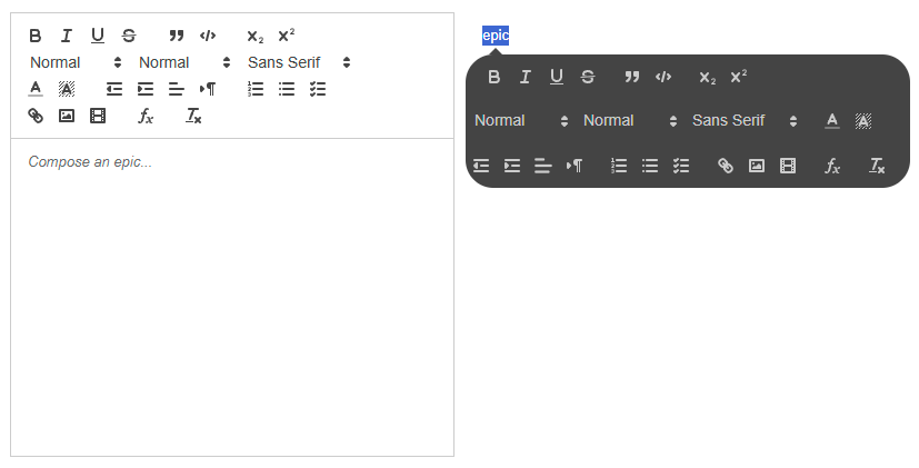
The element theme. NOTE: 'default' - editor with fixed toolbar and borders; 'lite' - editor with tooltip toolbar and no borders.
Dropdown
Placeholder
Placeholder text displayed when editor is empty.
text (optional)
Initial content
Content to display when editor first loads.
text (optional)
Read mode
When enabled, users can view but not edit content. Useful for displaying formatted content or creating approval workflows.
Checkbox
—————-
Toolbar
—————-
Toolbar position
Position of toolbar. NOTE: available only for 'default' theme editor.
Dropdown
—————-
Toolbar (inline)
—————-
Bold
Show/hide the bold text formatting button in the toolbar. Users can apply bold styling to selected text
Checkbox
Italic
Show/hide the italic text formatting button in the toolbar. Users can apply italic styling to selected text.
Checkbox
Underline
Show/hide the underline text formatting button in the toolbar. Users can apply underline styling to selected text.
Checkbox
Strike
Show/hide the strikethrough formatting button in the toolbar. Users can apply strikethrough styling (crossed-out text) to selected text.
Checkbox
—————-
Toolbar (block)
—————-
Blockquote
Show/hide the blockquote formatting button. Allows users to format selected text as a quoted block, typically indented with a visual indicator.
Checkbox
Code block
Show/hide the code block formatting button. Allows users to format text as monospaced code blocks with syntax preservation. Useful for technical documentation.
Checkbox
—————-
Toolbar (script)
—————-
Subscript
Show/hide the subscript formatting button. Allows users to format text as subscript (smaller text below the baseline), useful for chemical formulas (H₂O) or mathematical notation.
Checkbox
Superscript
Show/hide the superscript formatting button. Allows users to format text as superscript (smaller text above the baseline), useful for exponents (x²) or footnote markers.
Checkbox
—————-
Toolbar (font size)
—————-
Font size
Show/hide the font size dropdown in the toolbar. Users can select from preset font sizes to change text size.
Checkbox
Headers
Show/hide the header formatting dropdown. Allows users to format text as headings (H1-H6) for document structure and hierarchy.
Checkbox
Fonts
Show/hide the font family dropdown in the toolbar. Users can change the typeface of selected text to available fonts.
Checkbox
—————-
Toolbar (colors)
—————-
Font color
Show/hide the text color picker in the toolbar. Users can change the color of selected text.
Checkbox
Background color
Show/hide the background color picker (text highlighter) in the toolbar. Users can apply background color to selected text.
Checkbox
—————-
Toolbar (align)
—————-
Indentation
Show/hide the indent and outdent buttons in the toolbar. Users can increase or decrease text indentation, useful for creating nested structures.
Checkbox
Alignment
Show/hide the text alignment buttons (left, center, right, justify) in the toolbar. Users can change paragraph alignment.
Checkbox
Direction
Show/hide the text direction button. Allows switching between left-to-right (LTR) and right-to-left (RTL) text direction for languages like Arabic or Hebrew.
Checkbox
—————-
Toolbar (lists)
—————-
Ordered list
Show/hide the numbered list button in the toolbar. Users can create ordered lists with automatic numbering (1, 2, 3...).
Checkbox
Unordered list
Show/hide the bullet list button in the toolbar. Users can create unordered lists with bullet points.
Checkbox
Checkbox list
Show/hide the checkbox list button in the toolbar. Users can create interactive to-do lists with checkable items.
Checkbox
—————-
Toolbar (media)
—————-
Links
Show/hide the hyperlink button in the toolbar. Users can insert and edit URLs to create clickable links in the content.
Checkbox
Images
Show/hide the image insertion button in the toolbar. Users can upload or embed images into the editor. Configure cloud storage settings for external hosting.
Checkbox
Videos
Show/hide the video embedding button in the toolbar. Users can embed videos by providing a URL (supports YouTube, Vimeo, and other providers).
Checkbox
—————-
Toolbar (other)
—————-
Formulas
Enable/disable formula insertion button.
Checkbox
Reset
Show/hide the clear formatting button in the toolbar. Allows users to remove all formatting from selected text, returning it to plain text.
Checkbox
—————-
Others
—————-
Stop typing delay
Time delay (in seconds) after user stops typing before the "typing ended" event fires. Useful for triggering auto-save or search functions without excessive updates. Default: 2 seconds.
number
States
Name
Description
Type
is editable
Whether the editor is currently editable.
yes/no
value
Plain text content of the editor.
text
HTML value
HTML formatted content of the editor.
text
content length
Character count of the editor content.
number
cursor position
Current cursor position in the editor.
number
selection
Currently selected plain text.
text
HTML selection
Currently selected content as HTML.
text
selection cursor start
Start position of current selection.
number
selection cursor end
End position of current selection.
number
selection length
Length of current selection.
number
is typing
Whether user is currently typing.
yes/no
is focused
Whether the editor currently has focus.
yes/no
Events
Name
Description
value changed
Triggered when the editor content changes.
selection changed
Triggered when text selection changes.
typing started
Triggered when user starts typing.
typing ended
Triggered when user stops typing. (after specified delay into “Stop typing delay” field)
was focused
Triggered when the editor gains focus.
was blurred
Triggered when the editor loses focus.
Element actions:
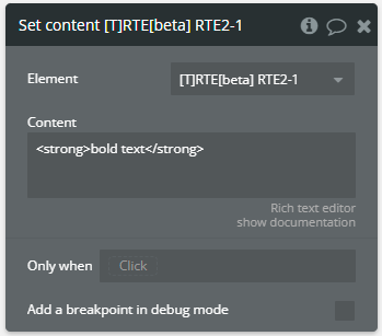
1.Set content — Sets the entire content of the editor, replacing any existing content.
Fields
Title
Description
Type
Content
The content to set. NOTE: accepted HTML or plain text.
text
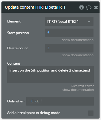
2.Update content — Updates content at a specific position in the editor, optionally deleting existing content.
Fields
Title
Description
Type
Start position
Position where content should be inserted/updated.
number
Delete count
Number of characters to delete from start position. NOTE: left 0 (zero) to delete nothing.
number
Content
The content to insert. NOTE: accepted HTML or plain text.
text
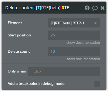
3. Delete content — Deletes content from the editor at a specific position.
Fields
Title
Description
Type
Start position
Position where deletion should start.
number
Delete count
Number of characters to delete.
number
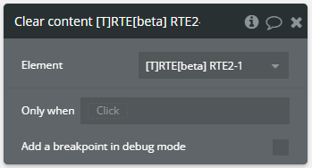
4. Clear content — Clears all content from the editor. No parameters required.
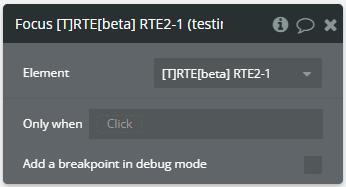
5. Focus — Sets focus to the editor programmatically. No parameters required.
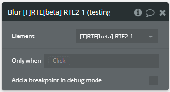
6. Blur — Removes focus from the editor programmatically. No parameters required.
Plugin Actions
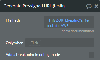
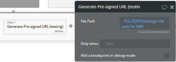
Generate Pre-signed URL - Generates a pre-signed URL to upload the image on the AWS/Wasabi.
Fields:
Title
Description
Type
Bucket Name
String representing the name of the cloud storage bucket where the file will be stored.
text
File Path
The options necessary for pre-signed URL generation. Note: Use the value of "file path for AWS" state from the element.
text
Returned values:
Title
Description
Type
pre-signed upload URL
Contains the list of pre-signed URLs.
list of texts
Delete File (AWS/Wasabi) - Server-side action that deletes a file from AWS S3 or Wasabi cloud storage.
Fields:
Name
Description
Type
File Info / URL
The ‘File Path for AWS’ state (JSON) from the RTE element, OR the file URL
Text
Bucket Name
The bucket name where the file is stored
Text
Dev Mode Service (Optional)
Force ‘aws’ or ‘wasabi’ if passing a raw URL and auto-detection fails
Dropdow
Workflow example
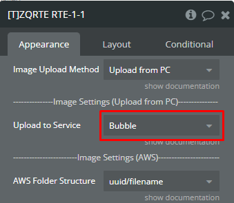
How to set up image upload on AWS/Wasabi
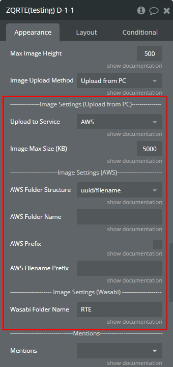
Image uploading on AWS and Wasabi needs additional setup form the plugin version 1.189.0.
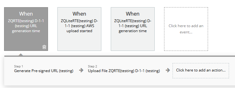
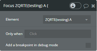
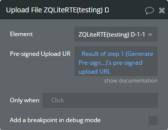
The following fields from the plugin elements are setup as in the image below, ZQ RTE/ZQ Lite RTE.
☝
This tutorial is available only if in the “Upload to Sercive” field is selected “AWS” or “Wasabi”!
In the Workflow tab, there is defined the “URL generation time” event.
👉
When the “URL generation time” event is triggered, the “file path for AWS” state contains all necessary data for generation pre-signed URL.
The pre-signed URL is generated by “Generate Pre-signed URL” action.
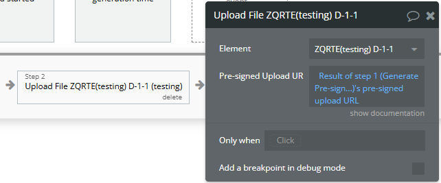
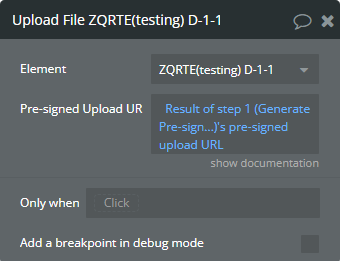
The final step of uploading should be executed thru the “Upload File” element action.
How to use Custom Fonts in the editor
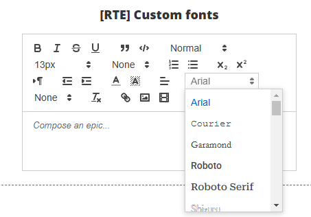
For some use cases, the predefined list of fonts is not enough. The “Custom Fonts” feature allows to extend the predefined list of fonts.
Extend with the external link
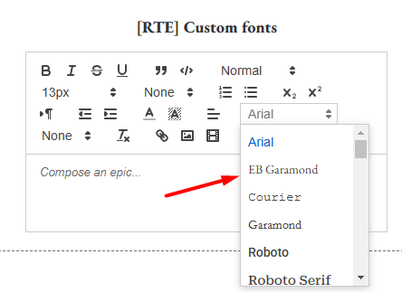
If your desired fonts are stored somewhere and you access them thru the link or you want to extend a Google font thru the link follow this workflow.
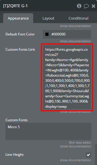
Initially, the “Micro 5” font was not available in the font list.
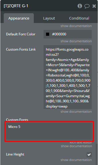
On the editor page, the “Custom Fonts Link” field is filled in with the font link from Google where is present the “Micro 5” font.
Additionally, the “Custom Fonts” field is filled in with the name of the desired font.
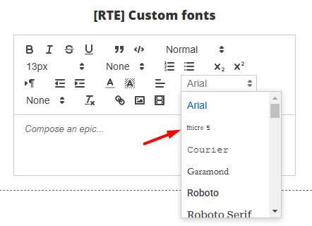
Finally, the “Micro 5” font was appended at the top of the list and is available to be used.
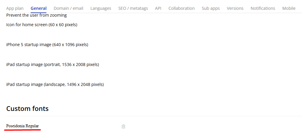
Extend with the Bubble Custom fonts
If your desired fonts are already imported in Bubble with Custom fonts, Settings → General → Custom fonts follow this worflow.
☝️
This example, also, is useful if you are importing any fonts thru the scripts in the header. I may be thru the HTML elements or SEO/metatags tab.
☝️
This method involves at least one element on the page using the desired font. Not a plugin element!
Import your desired fonts thru the Custom fonts.
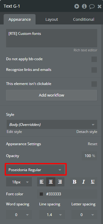
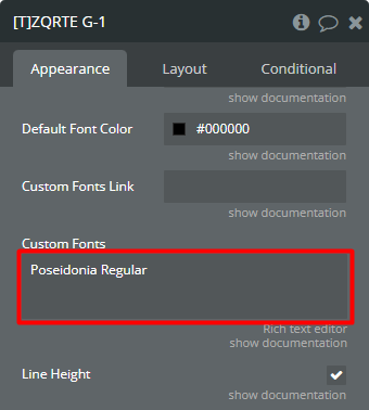
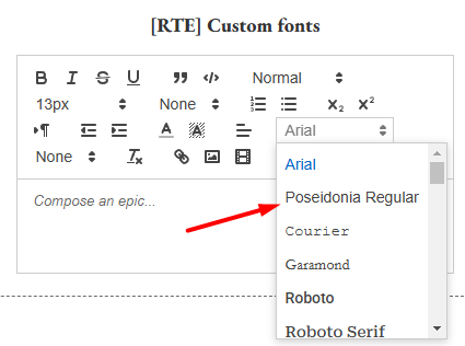
The Text element uses the “Poseidonia Regular” font.
The same font is mentioned, in the “Custom Fonts” field for the plugin element.
Finally, the “Poseidonia Regular” font was appended at the top of the list and is available to be used.
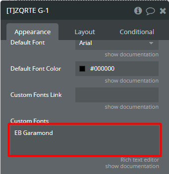
Extend with existent fonts from Bubble
Sometimes, a desired font is already used by Bubble but is not present in the predefined font list.
☝️
This method involves at least one element on the page using the desired font. Not a plugin element!
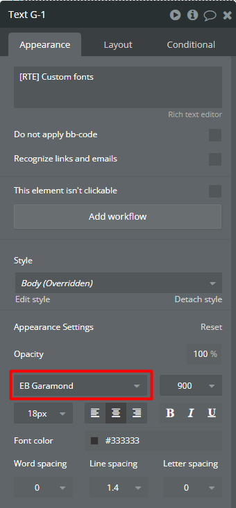
The Text element uses the “EB Garamond” font.
The same font is mentioned, in the “Custom Fonts” field for the plugin element.
Finally, the “EB Garamond” font was appended at the top of the list and is available to be used.
Deprecated Elements
⚠️
IMPORTANT: The elements below are deprecated(v1) and maintained only for backward compatibility. We strongly recommend using RTE [V2] for all new implementations. The deprecated(v1) elements will not receive new features and may be removed in future versions.
ZQ RTE [v1]
This element is a clean, flat toolbar theme.
☝️
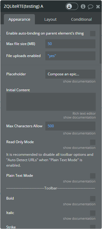
The limit from the Max file size (MB) field is applied only when the Upload to Service field is completed!
Preview
Element Fields
Title
Description
Type
Placeholder
Editor placeholder.
text (optional)
Initial Content
The initial content of the editor.
text (optional)
Max Characters Allowed
Maximum characters are allowed in the editor.
number
Read Only Mode
This option enables "read-only" mode. In this mode, you can't edit the editor.
Checkbox
Plain Text Mode
This option enables "plain text" mode. In this mode, all content in the editor will be reset to the default font and default font size.
Checkbox
Border Color
Border color for the editor.
Color (optional)
Toolbar Position
Select the toolbar position.
Dropdown
Background Color
Allows to change the background color for the toolbar.
Color
Icons Color
Allows to change the icons' color in the toolbar.
Color
Hover Icons Color
Allows to change the icons' color in the toolbar on hover.
Color
Bold
Enable the "bold" feature in the toolbar. It allows you to make bold text.
Checkbox
Italic
Enable the "italic" feature in the toolbar. It allows you to make italic text.
Checkbox
Strike
Enable the "strike" feature in the toolbar. It allows you to make strikethrough text.
Checkbox
Underline
Enable the "underline" feature in the toolbar. It allows you to make underlined text.
Checkbox
Blockquote
Enable the "blockquote" feature in the toolbar. It allows you to add blockquotes in the editor.
Checkbox
Code Block
Enable the "code block" feature in the toolbar. It allows you to add code blocks in the editor.
Checkbox
Header
Enable the "header" dropdown in the toolbar. It allows you to add headers in the editor.
Checkbox
Font Size
Enable the "font-size" dropdown in the toolbar. It allows you to change the text size in the editor.
Checkbox
Default Font Size
Select the default font size for the editor.
Dropdown
Weight
Enable the "weight" dropdown for text in the toolbar. It allows you to change the text weight in the editor.
Checkbox
Lists
Enable the "list" feature in the toolbar. It allows you to create ordered and bullet lists in the editor.
Checkbox
Script Text
Enable the "script text" feature in the toolbar. It allows you to create subscript and superscript text in the editor.
Checkbox
Text Direction
Enable the "text direction" feature in the toolbar. It allows you to change the text direction in the editor, rtl, or ltr.
Checkbox
Indentation
Enable the "indentation" feature in the toolbar. It allows you to change the text indentation level in the editor.
Checkbox
Text Color and Background Color
Enable the "color" feature in the toolbar. It allows you to change the text color and the background color in the editor.
Checkbox
Custom Colors
The comma-separated list of HEX colors. This list will replace the default colors in the toolbar.
text (optional)
Alignment
Enable the "alignment" feature in the toolbar. It allows you to change the text alignment in the editor.
Checkbox
Font
Enable the "font" dropdown for text in the toolbar. It allows you to change the text font in the editor.
Checkbox
Default Font
Select the default font for the editor.
Dropdown
Default Font Color
The default font color of the editor.
Color
Custom Fonts Link
The external link for your custom font styles.
text (optional)
Custom Fonts
The comma-separated list of custom fonts mentioned in the "Custom Fonts Link" field. This list will be appended to the start of the default list of fonts in the toolbar.
text (optional)
Line Height
Enable the "line-height" dropdown for text in the toolbar. It allows you to change the text line height in the editor.
Checkbox
Reset Formatting
Enable the "reset" option in the toolbar. It allows you to reset all formatting.
Checkbox
Link
Enable the "link" option in the toolbar. It allows you to attach links to the text in the editor.
Checkbox
Image
Enable the "image" option in the toolbar. It allows you to insert images in the editor.
Checkbox
Video
Enable the "video" option in the toolbar. It allows you to embed videos in the editor.
Checkbox
Toolbar Emoji
If checked, the emoji will be added to the toolbar.
Checkbox
Inline Emoji
If checked, the emoji will be inserted in the editor after the ":" mark. Type ":" then emoji name. Note: some diacritics that use the ":" key may not work.
Checkbox
Max Image Width
Limit the height of inserted images in the editor.
number (optional)
Max Image Height
Limit the height of inserted images in the editor.
number (optional)
Image Upload Method
Select the method for inserting images. We provide to upload from local storage or URL.
Dropdown
Upload to Service
When you are uploading from local storage, firstly, need to upload the image on external cloud storage. Select the cloud storage for image uploading. If the service is not selected, images will be inserted in "base64" format. NOTE: The file size limit is defined by the "Max file size (MB)" field!
For using another upload service please check setup instructions for Wasabi and AWS.
Dropdown
AWS Folder Structure
Structure to be used for uploaded files into AWS. If "folder_name/uuid_filename" is chosen, provide the 'AWS Folder Name' value below. If in this case the 'AWS Folder Name' is not indicated, the folder name 'unknown' will be used.
Dropdown
AWS Folder Name
The name to be used for the user folder on the S3 bucket. It is used only if the 'AWS Folder Structure' property is set to 'folder name/uuid filename'.
text (optional)
AWS Prefix
Enables prefix to filename.
Checkbox
AWS Filename Prefix
Add a prefix. For prefixes do not use any special characters like: ! $ # @ etc …
text (optional)
Wasabi Folder Name
The name to be used for the user folder on the Wasabi bucket.
text (optional)
Mentions
Select an app type (data) for mentions.
App Type (optional)
Mentions Captions
Select a caption that will be used for mentions.
text fields of Mentions (optional)
Mentions List
Use this field when mentioning the source from the bubble database type is "Object".
list of Mentions (optional)
Mentions List (text)
Use this field when mentioning the source type is "text".
list of Mentions (optional)
Mentions List Scrollbar
Enables the scroll bar for the mentions list.
Checkbox
Mention's Redirect
Provide URL redirect when mention is clicked. URL is concatenated with the mention "id".
text (optional)
Hashtags
Select an app type (data) for hashtags.
App Type (optional)
Hashtags Captions
Select a caption that will be used for hashtags.
text fields of Hashtags (optional)
Hashtags List
Use this field when the hashtags source from bubble database type is "Object".
list of Hashtags (optional)
Hashtags List (text)
Use this field when the hashtags source type is "text".
list of Hashtags (optional)
Add “{” as trigger for dropdown
Add “{” as a trigger for a dropdown, filled "Hashtags" fields required.
Checkbox
Auto Detect URLs
Enables auto-detection URLs when the text is inserted.
yes/no
Banned Words, Links
Words and links that you may want to ban.
text (optional)
Stop Typing Delay
This indicates after how long, in seconds, is considered to stop typing. Accepts values from 0 to 10. You can detect when the user stopped to write, by using the event "Stop Typing".
number
HTML with
This dropdown changes the content of the 'HTML style/nested lists' state. The 'HTML style/nested lists' state will be returned with styles or nested lists.
Dropdown
Element Actions
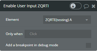
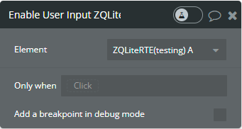
Enable User Input - This action is used to disable the Read Only mode.
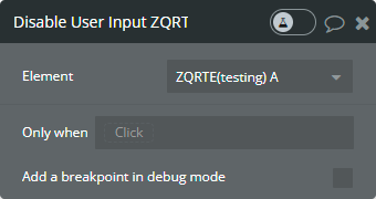
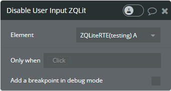
Disable User Input - This action is used to enable the Read Only mode.
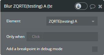
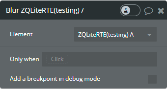
Blur - This action is used to remove focus from the editor.
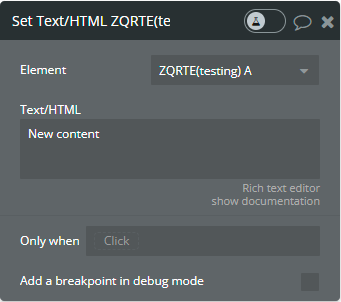
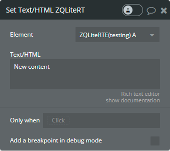
Set Text/HTML - This action is used to replace the editor content.
Fields:
Title
Description
Type
Text/HTML
New content, if left blank will reset the RTE.
text (optional)
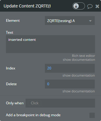
Update Content - This action is used to update the editor's content.
Fields:
Title
Description
Type
Text
Content to add, if blank it will not change anything.
text
Index
The index represents where we will insert new content.
number
Delete
Represent how much text we want to delete after the given index.
number
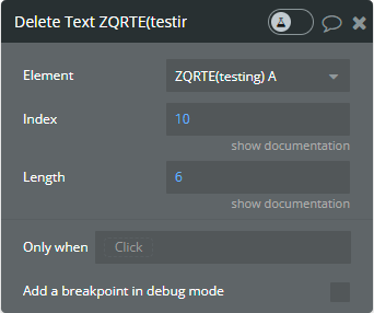
Delete Text - This action is used to delete a part of the content from the editor.
Fields:
Title
Description
Type
Index
Index for deleting the section.
number
Length
Length for deleting section.
number
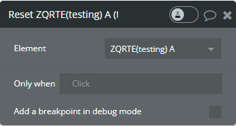
Reset - This action is used to delete all editor content.
Focus - This action is used to focus the editor.
Upload File - This action is used to finish the uploading process of image on the AWS.
Fields:
Title
Description
Type
Pre-signed Upload URL
The pre-signed URL that was generated with the "Generate Pre-signed URL" action. Note: Use the value of "pre-signed upload URL" state of "Generate Pre-signed URL" action!
text
Element Events
Title
Description
Selection Changed
Triggers when the user changes the selection.
Text Changed
Triggers when the user changes editor content.
Typing
Triggers when someone typing in the RTE.
Stop Typing
Triggers when someone stops typing in the RTE.
Limit Reached
Triggers when the characters limit is reached.
Blurred
Triggers when editor blurred.
Mention Clicked
Triggers when a mention is clicked.
Hashtag Clicked
Triggers when a hashtag is clicked.
Focused
Triggers when editor Focused.
The image is too large
Triggers when the image is too large.
AWS Image Uploaded
Triggers when Image Uploaded.
AWS upload started
Triggers when the process of uploading the image on the AWS started.
URL generation time
Triggers when the pre-signed URL must be generated on the server side.
Element States
Title
Description
Type
RTE Enabled
Publish editor read-only state.
yes/no
Last Selection
Publish the user's last selection.
text
Text
All the content of RTE.
text
Content Length
Returns the RTE content length.
number
HTML
Return the whole editor HTML.
text
User Typing
Return user typing state.
yes/no
Last Clicked Mention ID
Returns last clicked mention id.
text
Last Clicked Hashtag ID
Returns last clicked hashtag id.
text
Used Mentions IDs
Returns all used mentions IDs.
list of texts
Used Hashtags IDs
Returns all used hashtag IDs.
list of texts
Banned Words
Banned words and links.
list of texts
Cursor index
Returns the position of the cursor.
number
Font RTE
Returns the used font.
text
URL AWS Image
Returns the URL of the uploaded image on AWS.
text
HTML style/nested lists
Return the whole editor HTML with style or nested lists.
text
file path for AWS
Returns all necessary options for creation of pre-signed URL. It should be used in the "File Path" field from the "Generate Pre-signed URL" action.
text
ZQ Lite RTE [v1]
This element is a simple tooltip-based theme.
☝️
The limit from the Max file size (MB) field is applied only when the Upload to Service field is completed!
Preview
Element Fields
Title
Description
Type
Placeholder
Editor placeholder.
text (optional)
Initial Content
The initial content of the editor.
text (optional)
Max Characters Allowed
Maximum characters are allowed in the editor.
number
Read Only Mode
This option enables "read-only" mode. In this mode, you can't edit the editor.
Checkbox
Plain Text Mode
This option enables "plain text" mode. In this mode, all content in the editor will be reset to the default font and default font size.
Checkbox
Background Color
Allows to change the background color for the toolbar.
Color
Icons Color
Allows to change the icons' color in the toolbar.
Color
Hover Icons Color
Allows to change the icons' color in the toolbar on hover.
Color
Bold
Enable the "bold" feature in the toolbar. It allows you to make bold text.
Checkbox
Italic
Enable the "italic" feature in the toolbar. It allows you to make italic text.
Checkbox
Strike
Enable the "strike" feature in the toolbar. It allows you to make strikethrough text.
Checkbox
Underline
Enable the "underline" feature in the toolbar. It allows you to make underlined text.
Checkbox
Blockquote
Enable the "blockquote" feature in the toolbar. It allows you to add blockquotes in the editor.
Checkbox
Code Block
Enable the "code block" feature in the toolbar. It allows you to add code blocks in the editor.
Checkbox
Header
Enable the "header" dropdown in the toolbar. It allows you to add headers in the editor.
Checkbox
Font Size
Enable the "font-size" dropdown in the toolbar. It allows you to change the text size in the editor.
Checkbox
Default Font Size
Select the default font size for the editor.
Dropdown
Weight
Enable the "weight" dropdown for text in the toolbar. It allows to change the text weight in the editor.
Checkbox
Lists
Enable the "list" feature in the toolbar. It allows you to create ordered and bullet lists in the editor.
Checkbox
Script Text
Enable the "script text" feature in the toolbar. It allows you to create subscript and superscript text in the editor.
Checkbox
Text Direction
Enable the "text direction" feature in the toolbar. It allows you to change the text direction in the editor, rtl, or ltr.
Checkbox
Indentation
Enable the "indentation" feature in the toolbar. It allows to change the text indentation level in the editor.
Checkbox
Text Color and Background Color
Enable the "color" feature in the toolbar. It allows you to change the text color and the background color in the editor.
Checkbox
Custom Colors
The comma-separated list of HEX colors. This list will replace the default colors in the toolbar.
text (optional)
Alignment
Enable the "alignment" feature in the toolbar. It allows you to change the text alignment in the editor.
Checkbox
Font
Enable the "font" dropdown for text in the toolbar. It allows you to change the text font in the editor.
Checkbox
Default Font
Select the default font for the editor.
Dropdown
Default Font Color
The default font color of the editor.
Color
Custom Fonts Link
The external link for your custom font styles.
text (optional)
Custom Fonts
The comma-separated list of custom fonts mentioned in the "Custom Fonts Link" field. This list will be appended to the start of the default list of fonts in the toolbar.
text (optional)
Line Height
Enable the "line-height" dropdown for text in the toolbar. It allows you to change the text line height in the editor.
Checkbox
Reset Formatting
Enable the "reset" option in the toolbar. It allows you to reset all formatting.
Checkbox
Link
Enable the "link" option in the toolbar. It allows you to attach links to the text in the editor.
Checkbox
Image
Enable the "image" option in the toolbar. It allows you to insert images in the editor.
Checkbox
Video
Enable the "video" option in the toolbar. It allows you to embed videos in the editor.
Checkbox
Toolbar Emoji
If checked, the emoji will be added to the toolbar.
Checkbox
Inline Emoji
If checked, the emoji will be inserted in the editor after the ":" mark. Type ":" then emoji name. Note: some diacritics that use the ":" key may not work.
Checkbox
Max Image Width
Limit the height of inserted images in the editor.
number (optional)
Max Image Height
Limit the height of inserted images in the editor.
number (optional)
Image Upload Method
Select the method for inserting images. We provide to upload from local storage or URL.
Dropdown
Upload to Service
When you are uploading from local storage, firstly, need to upload the image on external cloud storage. Select the cloud storage for image uploading. If the service is not selected, images will be inserted in "base64" format. NOTE: The file size limit is defined by the "Max file size (MB)" field!
For using another upload service please check setup instructions for Wasabi and AWS.
Dropdown
AWS Folder Structure
Structure to be used for uploaded files into AWS. If "folder_name/uuid_filename" is chosen, provide the 'AWS Folder Name' value below. If in this case the 'AWS Folder Name' is not indicated, the folder name 'unknown' will be used.
Dropdown
AWS Folder Name
The name to be used for the user folder on the S3 bucket. Is used only if the 'AWS Folder Structure' property is set to 'folder name/uuid filename'.
text (optional)
AWS Prefix
Enables prefix to filename.
Checkbox
AWS Filename Prefix
Add a prefix. For prefixes do not use any special characters like: ! $ # @ etc …
text (optional)
Wasabi Folder Name
The name to be used for the user folder on the Wasabi bucket.
text (optional)
Mentions
Select an app type (data) for mentions.
App Type (optional)
Mentions Captions
Select a caption that will be used for mentions.
text fields of Mentions (optional)
Mentions List
Use this field when mentioning the source from the bubble database type is "Object".
list of Mentions (optional)
Mentions List (text)
Use this field when mentioning the source type is "text".
list of Mentions (optional)
Mentions List Scrollbar
Enables the scroll bar for the mentions list.
Checkbox
Mention's Redirect
Provide URL redirect when mention is clicked. URL is concatenated with the mention "id".
text (optional)
Hashtags
Select an app type (data) for hashtags.
App Type (optional)
Hashtags Captions
Select a caption that will be used for hashtags.
text fields of Hashtags (optional)
Hashtags List
Use this field when hashtags source from the bubble database type is "Object".
list of Hashtags (optional)
Hashtags List (text)
Use this field when the hashtags source type is "text".
list of Hashtags (optional)
Add “{” as trigger for dropdown
Add “{” as a trigger for a dropdown, filled "Hashtags" fields required.
Checkbox
Auto Detect URLs
Enables auto-detection URLs when the text is inserted.
yes/no
Banned Words, Links
Words and links that you may want to ban.
text (optional)
Stop Typing Delay
This indicates after how long, in seconds, is considered to stop typing. Accepts values from 0 to 10. You can detect when the user stopped to write, by using the event "Stop Typing".
number
HTML with
This dropdown changes the content of the 'HTML style/nested lists' state. The 'HTML style/nested lists' state will be returned with styles or nested lists.
Dropdown
Element Actions
Enable User Input - This action is used to disable the Read Only mode.
Disable User Input - This action is used to enable the Read Only mode.
Blur - This action is used to remove focus from the editor.
Set Text/HTML - This action is used to replace the editor content.
Fields:
Title
Description
Type
Text/HTML
New content, if left blank will reset the RTE.
text (optional)
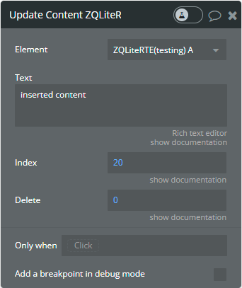
Update Content - This action is used to update the editor's content.
Fields:
Title
Description
Type
Text
Content to add, if blank it will not change anything.
text
Index
The index represents where we will insert new content.
number
Delete
Represent how much text we want to delete after the given index.
number
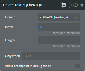
Delete Text - This action is used to delete a part of the content from the editor.
Fields:
Title
Description
Type
Index
Index for deleting the section.
number
Length
Length for deleting section.
number
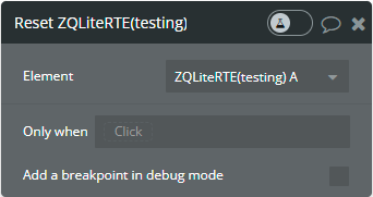
Reset - This action is used to delete all editor content.
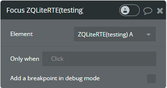
Focus - This action is used to focus the editor.
Upload File - This action is used to finish the uploading process of image on the AWS.
Fields:
Title
Description
Type
Pre-signed Upload URL
The pre-signed URL that was generated with the "Generate Pre-signed URL" action. Note: Use the value of "pre-signed upload URL" state of "Generate Pre-signed URL" action!
text
Element Events
Title
Description
Selection Changed
Triggers when the user changes the selection.
Text Changed
Triggers when the user changes editor content.
Typing
Triggers when someone typing in the RTE.
Stop Typing
Triggers when someone stops typing in the RTE.
Limit Reached
Triggers when the characters limit is reached.
Focused
Triggers when editor Focused.
Blurred
Triggers when editor blurred.
Mention Clicked
Triggers when a mention is clicked.
Hashtag Clicked
Triggers when a hashtag is clicked.
AWS Image Uploaded
Triggers when Image Uploaded
AWS upload started
Triggers when the process of uploading the image on the AWS started.
URL generation time
Triggers when the pre-signed URL must be generated on the server side.
Element States
Title
Description
Type
RTE Enabled
Publish editor read-only state.
yes/no
Last Selection
Publish the user's last selection.
text
Text
All the content of RTE.
text
Content Length
Returns the RTE content length.
number
HTML
Return the whole editor HTML.
text
User Typing
Return user typing state.
yes/no
Last Clicked Mention ID
Returns last clicked mention id.
text
Last Clicked Hashtag ID
Returns last clicked hashtag id.
text
Used Mentions IDs
Returns all used mentions IDs.
list of texts
Used Hashtags IDs
Returns all used hashtag IDs.
list of texts
Banned Words
Banned words and links.
list of texts
Cursor index
Returns the position of the cursor.
number
URL AWS Image
Returns the URL of the uploaded image on AWS.
text
HTML style/nested lists
Return the whole editor HTML with style or nested lists.
text
File path for AWS
Returns all necessary options for creation of pre-signed URL. It should be used in the "File Path" field from the "Generate Pre-signed URL" action.
text
ZQ RTE [v2]
Fields:
Title
Description
Type
Theme
The element theme. ‘default’ - editor with fixed toolbar and borders; ‘lite’ - editor with tooltip toolbar and no borders
Dropdown
Placeholder
Placeholder text displayed when editor is empty
Text
Initial content
Content to display when editor first loads. Supports plain text, HTML, or Delta JSON format
Text
Read mode
When enabled, users can view but not edit content
Boolean
Plain Text Mode
Enables plain text mode - all content will be reset to default font and size, formatting disabled
Boolean
Toolbar position
Position of toolbar (top/bottom). Available only for ‘default’ theme
Dropdown
Bold
Show/hide the bold text formatting button
Boolean
Italic
Show/hide the italic text formatting button
Boolean
Underline
Show/hide the underline text formatting button
Boolean
Strike
Show/hide the strikethrough formatting button
Boolean
Blockquote
Show/hide the blockquote formatting button
Boolean
Code block
Show/hide the code block formatting button
Boolean
Subscript
Show/hide the subscript formatting button
Boolean
Superscript
Show/hide the superscript formatting button
Boolean
Font size
Show/hide the font size dropdown
Boolean
Headers
Show/hide the header formatting dropdown (H1-H6)
Boolean
Fonts
Show/hide the font family dropdown
Boolean
Font Weight
Show/hide the font weight dropdown
Boolean
Line Height
Show/hide the line height dropdown
Boolean
Font color
Show/hide the text color picker
Boolean
Background color
Show/hide the background color picker (highlighter)
Boolean
Indentation
Show/hide the indent and outdent buttons
Boolean
Alignment
Show/hide the text alignment buttons
Boolean
Direction
Show/hide the text direction button (LTR/RTL)
Boolean
Ordered list
Show/hide the numbered list button
Boolean
Unordered list
Show/hide the bullet list button
Boolean
Checkbox list
Show/hide the checkbox list button
Boolean
Links
Show/hide the hyperlink button
Boolean
Images
Show/hide the image insertion button
Boolean
Videos
Show/hide the video embedding button
Boolean
Formulas
Enable/disable formula insertion button
Boolean
Reset
Show/hide the clear formatting button
Boolean
Enable Emoji Picker
Enables emoji picker button in toolbar
Boolean
Emoji Theme
Theme for emoji picker (auto/light/dark)
Dropdown
Emoji Set
The set of emojis to use (native/apple/google/twitter/facebook)
Dropdown
Stop typing delay
Time delay (in seconds) after user stops typing before “typing ended” event fires
Number
Mentions
Select an app type (data) for mentions
Custom Type
Mentions Captions
Select a caption field for mentions
Custom Field
Mentions List
Mention source when type is “Object”
List
Mentions List (text)
Mention source when type is “text”
Text List
Mentions Location
URL redirect when mention is clicked (concatenated with mention ID)
Text
Mentions List Scrollbar
Enables scroll bar for mentions list
Boolean
Mentions descriptions
HTML or text shown in mention tooltips
Custom Field
Add “{” as trigger for dropdown
Adds curly bracket as trigger character
Boolean
Hashtags
Select an app type (data) for hashtags
Custom Type
Hashtags Captions
Select a caption field for hashtags
Custom Field
Hashtags List
Hashtag source when type is “Object”
List
Hashtags List (text)
Hashtag source when type is “text”
Text List
Hashtags descriptions
HTML or text shown in hashtag tooltips
Custom Field
Tooltip trigger
When to show tooltips (hover/click/both)
Dropdown
Tooltip delay
Delay in milliseconds before showing tooltip
Number
Tooltip bg color
Background color of tooltips
Color
Tooltip text color
Text color of tooltips
Color
Tooltip font size
Font size of tooltips
Text
Tooltip_max_width
Maximum width of tooltips
Text
Tooltip position
Position of tooltips (auto/top/bottom/left/right)
Dropdown
Max characters
Maximum characters allowed (0 = no limit)
Number
Banned words
List of banned words
Text List
Banned links
List of banned links
Text List
Validation mode
Validation mode: off (no validation), warn (show warnings), prevent (block invalid content)
Dropdown
Enable highlighting
Enable/disable validation highlighting
Boolean
Default Font
Default font family for editor content
Dropdown
Default Font Size
Default font size in pixels
Number
Default Font Color
Default text color
Color
Custom Fonts
Comma-separated list of custom font names
Text
Custom Fonts Link
Google Fonts URL or custom font stylesheet
Text
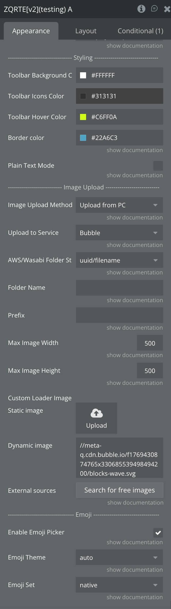
Toolbar Background Color
Background color of the toolbar
Color
Toolbar Icons Color
Color of toolbar icons
Color
Toolbar Hover Color
Color of toolbar icons on hover
Color
Border color
Border color for the editor
Color
Image Upload Method
Method for inserting images (Upload from PC/Upload from URL)
Dropdown
Upload to Service
Cloud storage service (Wasabi/AWS/Bubble). If not selected, images stored as base64
Dropdown
AWS/Wasabi Folder Structure
Folder structure for uploaded files
Dropdown
Folder Name
Folder name for S3/Wasabi bucket
Text
Prefix
Prefix for uploaded files
Text
Max Image Width
Maximum width of inserted images in pixels
Number
Max Image Height
Maximum height of inserted images in pixels
Number
Custom Loader Image
Custom image to display while file is uploading
Image
Element Actions
Set content
Sets the entire content of the editor, replacing any existing content. Supports plain text, HTML, or Delta JSON format.
Fields:
Title
Description
Type
Content
The content to set. Accepts HTML, plain text, or Delta JSON format
Text
Update content
Updates content at a specific position in the editor, optionally deleting existing content.
Fields:
Title
Description
Type
Start position
Position where content should be inserted/updated
Number
Delete count
Number of characters to delete from start position (0 to delete nothing)
Number
Content
The content to insert (HTML or plain text)
Text
Delete content
Deletes content from the editor at a specific position.
Fields:
Title
Description
Type
Start position
Position where deletion should start
Number
Delete count
Number of characters to delete
Number
Clear content
Clears all content from the editor.
Fields: None
Focus
Sets focus to the editor programmatically.
Fields: None
Blur
Removes focus from the editor programmatically.
Fields: None
Refresh highlighting
Manually refresh validation highlighting.
Fields: None
Upload File
This action is used to finish the uploading process of image on AWS and Wasabi.
Fields:
Title
Description
Type
Pre-signed Upload URL
The pre-signed URL generated with “Generate Pre-signed URL” action
Text
Exposed states
Name
Description
Type
is editable
Whether the editor is currently editable
Boolean
value
Plain text content of the editor
Text
html_value
HTML formatted content of the editor
Text
delta_value
Content in Quill Delta format (JSON string) with all formatting metadata
Text
content length
Character count of the editor content
Number
cursor position
Current cursor position in the editor
Number
selection
Currently selected plain text
Text
html_selection
Currently selected content as HTML
Text
selection cursor start
Start position of current selection
Number
selection cursor end
End position of current selection
Number
selection length
Length of current selection
Number
is typing
Whether user is currently typing
Boolean
is focused
Whether the editor currently has focus
Boolean
Last Clicked Mention ID
Returns last clicked mention id
Text
Used Mentions IDs
Returns all used mentions IDs
Text (list)
Last Clicked Hashtag ID
Returns last clicked hashtag id
Text
Used Hashtags IDs
Returns all used hashtag IDs
Text (list)
mention hovered
ID of currently hovered mention
Text
mention hover left
Description of currently hovered mention
Text
hovered hashtag id
ID of currently hovered hashtag
Text
hovered hashtag description
Description of currently hovered hashtag
Text
is valid
Whether content passes validation
Boolean
validation error
Error message if validation fails
Text
character count
Current character count
Number
characters remaining
Characters remaining (if max is set)
Number
detected banned words
List of detected banned words
Text (list)
detected banned links
List of detected banned links
Text (list)
File Path for AWS
JSON string containing file info for AWS/Wasabi signing
Text
URL AWS Image
The URL of the uploaded image
Text
Removed Image URL
The URL of the image removed from the editor
Text
Element Events
Name
Description
value changed
Triggered when the editor content changes
selection changed
Triggered when text selection changes
typing started
Triggered when user starts typing
typing ended
Triggered when user stops typing (after specified delay)
was focused
Triggered when the editor gains focus
was blurred
Triggered when the editor loses focus
Mention Clicked
Triggers when a mention is clicked
Hashtag Clicked
Triggers when a hashtag is clicked
mention hovered
Triggers when hovering over a mention
mention hover left
Triggers when leaving a mention
hashtag hovered
Triggers when hovering over a hashtag
hashtag hover left
Triggers when leaving a hashtag
validation failed
Triggered when validation fails
AWS Upload Started
Triggers when image upload to AWS starts
AWS Image Uploaded
Triggers when image is uploaded
URL Generation Time
Triggers when pre-signed URL must be generated
Image Too Large
Triggers when the image is too large
Image Removed
Triggers when an uploaded image is removed from editor
Changelogs
Update 06.03.26 - Version 1.208.0
Bubble Plugin Page Update (Category).
Update 12.02.26 - Version 1.207.0
Fixed vertical stretching, added "Fit height to content" field.
Update 09.02.26 - Version 1.206.0
Large update for RTE[v2], renamed elements.
Update 03.12.25 - Version 1.205.0
RTE: Introduced Image Resizing feature.
Update 03.12.25 - Version 1.204.0
Introduced Image Resizing feature.
Update 02.12.25 - Version 1.203.0
RTE: Fixed link html format .
Update 02.12.25 - Version 1.202.0
Fixed link html format .
Update 26.11.25 - Version 1.201.0
added support for the Delta format in element 'RTE'.
Added "HTML with style" & "HTML with nested lists" fields.
Update 27.12.23 - Version 1.163.0
updated description.
Update 27.12.23 - Version 1.162.0
Minor fixes.
Update 26.12.23 - Version 1.161.0
updated description.
Update 25.12.23 - Version 1.160.0
Fixed problems with "Default font" and "Default font size".
Update 19.12.23 - Version 1.159.0
updated description.
Update 14.12.23 - Version 1.158.0
Added "Plain Text Mode" & "Default Font Size" field for Lite.
Update 05.12.23 - Version 1.157.0
Fixed dropdown opening when toolbar is at bottom.
Update 01.12.23 - Version 1.156.0
Changed the AWS settings, added possibility to insert the images from URL, reordered fields..
Update 21.11.23 - Version 1.155.0
Fixed mentions list position on displaying.
Fixed emoji toolbar position on displaying.
Improved the link detection in editor.
Inserted styles in the HTML state.
Removed deprecated element.
Update 26.10.23 - Version 1.154.0
Fixed the opening links from the HTML state.
Update 25.10.23 - Version 1.153.0
Fixed default font assignation & formatting in HTML state. Fixed "Set Text/HTML" action..
Update 19.10.23 - Version 1.152.0
Updated description.
Update 20.09.23 - Version 1.151.0
Fixed formatting issue.
Update 18.09.23 - Version 1.150.0
updated description.
Update 13.09.23 - Version 1.149.0
minor updates.
Update 06.09.23 - Version 1.148.0
Obfuscation.
Update 23.08.23 - Version 1.147.0
Fixed bottom line and hidden empty toolbar.
Update 17.08.23 - Version 1.146.0
Minor fixes..
Update 14.08.23 - Version 1.145.0
fixed height settings.
Update 14.08.23 - Version 1.144.0
Removed "RTE Content Resizable.
Update 01.08.23 - Version 1.143.0
Fixed RTE Lite toolbar.
Update 24.07.23 - Version 1.142.0
Added "Mentions list scrollbar" field, and size and weight feature in editor. Fixed mentions list.
Update 10.07.23 - Version 1.141.0
updated description.
Update 07.07.23 - Version 1.140.0
Added "Mention's redirect" field for "ZQ RTE" & "ZQ Lite RTE" plugin elements.
Update 22.06.23 - Version 1.139.0
updated the description.
Update 17.06.23 - Version 1.138.0
Updated the description .
Update 16.06.23 - Version 1.137.0
Updated the description .
Update 16.06.23 - Version 1.136.0
Added default size field..
Update 16.05.23 - Version 1.135.0
Fixed content resizable after an image is uploaded & auto-binding..
Update 25.04.23 - Version 1.134.0
Fixed image uploading feature.
Update 12.04.23 - Version 1.133.0
Added "Stop Typing delay" field..
Update 23.03.23 - Version 1.132.0
With description : Added upload images to "Wasabi" option..
Update 21.02.23 - Version 1.131.0
updated the description.
Update 02.02.23 - Version 1.130.0
Updated description.
Update 31.01.23 - Version 1.129.0
Added option "Upload to Private AWS".
Update 20.01.23 - Version 1.128.0
Updated description.
Update 20.01.23 - Version 1.127.0
Updated description.
Update 02.01.23 - Version 1.126.0
minor fixes.
Update 27.10.22 - Version 1.125.0
Added "Font RTE" state.
Update 13.10.22 - Version 1.124.0
Updated description.
Update 12.10.22 - Version 1.123.0
Updated name.
Update 10.10.22 - Version 1.122.0
New doc link.
Update 05.10.22 - Version 1.121.0
improved auto-detect of hyperlinks.
Update 19.09.22 - Version 1.120.0
Adjusted common part.
Update 08.09.22 - Version 1.119.0
fixed image pasting in RTE when "Upload to AWS" is enabled.
Update 05.09.22 - Version 1.118.0
Updated common part.
Update 02.09.22 - Version 1.117.0
Added the possibility to change data type - "text" for mentions and hashtags.
Fixed font and added option to select default font.
Removed "null" from the hashtag list.
Update 29.08.22 - Version 1.116.0
Updated common part.
Update 29.08.22 - Version 1.115.0
Added possibility to choose hashtag type of text.
Update 25.08.22 - Version 1.114.0
Fixed "focus" action in RTE Lite element.
Update 22.08.22 - Version 1.113.0
Added default font option.
Fixed selecting font on Lite RTE.
Update 09.08.22 - Version 1.112.0
Fixed toolbar position - bottom.
Update 08.08.22 - Version 1.111.0
Fixed focus when creating hashtag.
Update 19.07.22 - Version 1.110.0
added option “{” as a trigger for a dropdown.
Update 07.07.22 - Version 1.109.0
ability to turn off text area emoji icon.
Update 05.07.22 - Version 1.108.0
fixed the max number of characters for RTE Lite element.
Update 05.07.22 - Version 1.107.0
small updates on documentation fields.
Update 22.06.22 - Version 1.106.0
Updated description.
Update 22.06.22 - Version 1.105.0
Fixed problem with bubble Rich text.
Update 21.06.22 - Version 1.104.0
emoji display fix.
Update 21.06.22 - Version 1.103.0
fixed the limit of the max number of characters.
Update 17.05.22 - Version 1.102.0
fixed problem with resize images.
Update 09.05.22 - Version 1.101.0
Added text in description.
Update 19.04.22 - Version 1.100.0
improved with detector of hyperlink.
Update 28.03.22 - Version 1.99.0
added new state "Cursor index"'.
Update 01.03.22 - Version 1.98.0
Added possibility to resize an image.
Update 25.02.22 - Version 1.97.0
Added Fonts.
Update 07.02.22 - Version 1.96.0
fixed problem with pop-up height.
Update 11.01.22 - Version 1.95.0
A new option for image.
Update 27.12.21 - Version 1.94.0
added auto binding.
Update 13.11.21 - Version 1.93.0
fixed the problem with update content.
Update 03.11.21 - Version 1.92.0
improved editor with emoji's short nam.
Update 15.09.21 - Version 1.91.0
removed extra linebreak.
Update 26.08.21 - Version 1.90.0
Fixed reset action, height counting in popup, max limit chars, and removed extra line break.
Update 04.08.21 - Version 1.89.0
fixed problem with resizable and dynamic content.
Update 28.07.21 - Version 1.88.0
Updated description.
Update 14.07.21 - Version 1.87.0
Updated icon.
Update 03.07.21 - Version 1.86.0
added feature 'RTE resizable'.
Update 01.07.21 - Version 1.85.0
added feature 'RTE resizable'.
Update 10.06.21 - Version 1.84.0
eliminated emoji button from top-right ZQLiteRTE.
Update 02.06.21 - Version 1.83.0
eliminated conflict between ZQ RTE and Bubbles RTE.
Update 26.04.21 - Version 1.82.0
Added Emoji and added an option for toggling individual items off.
Update 16.04.21 - Version 1.81.0
Updated description.
Update 05.04.21 - Version 1.80.0
fixed problem with states.
Update 31.03.21 - Version 1.79.0
fixed problem with the HTML's state.
Update 29.03.21 - Version 1.78.0
fixed problem with the 's HTML state.
Update 14.03.21 - Version 1.77.0
fixed problem with an empty value.
Update 13.03.21 - Version 1.76.0
Updated plugin name.
Update 03.03.21 - Version 1.75.0
Updated description.
Update 26.02.21 - Version 1.74.0
Minor fixes.
Update 26.02.21 - Version 1.73.0
fixed the problem with states Mention and Hashtag .
Update 09.02.21 - Version 1.72.0
Updated icon.
Update 05.02.21 - Version 1.71.0
fixed minor bug.
Update 20.01.21 - Version 1.70.0
Fixed problem with focus and hashtag event and state.
Update 29.12.20 - Version 1.69.0
fixed problem with the cursor.
Update 08.12.20 - Version 1.68.0
fixed problem with null value and style.
Update 09.09.20 - Version 1.67.0
Fixed Placeholder bug.
Update 25.06.20 - Version 1.66.0
improvement action "set text" for setting content HTML..
Update 11.06.20 - Version 1.65.0
Fixed bugs with cursor skip on dynamic data.
Update 06.06.20 - Version 1.64.0
Fixed bugs with element's HTML retrieval.
Update 04.06.20 - Version 1.63.0
Fixed bugs with editor's Content.
Update 28.05.20 - Version 1.62.0
Fixed bugs with height and plugin's event trigger issue.
Update 17.05.20 - Version 1.61.0
fixed reset last selection state.
Update 08.04.20 - Version 1.60.0
fixed bug with ToolBar.
Update 03.04.20 - Version 1.59.0
Update - Border color option for normal RTE. Autofocus and scroll fixed..
Update 25.02.20 - Version 1.58.0
ignoring base64 code in textual context processing..
Update 14.02.20 - Version 1.57.0
Update: banned words and links feature..
Update 04.02.20 - Version 1.56.0
Update - fixed responsive layout along with bubble updates.
Update 30.01.20 - Version 1.55.0
Fixes - the rte will not overlap with other groups, also fixed the issue with losing rte content.
Update 23.11.19 - Version 1.54.0
Fix - es6 loops fixed..
Update 22.11.19 - Version 1.53.0
Fix - es5 variables initialization fixed..
Update 20.11.19 - Version 1.52.0
Update - Fully updated functionalities compatibility from es6 to es5.
Update 19.11.19 - Version 1.51.0
Updated functionalities compatibility from es6 to es5.
Update 14.11.19 - Version 1.50.0
minor fixes.
Update 07.11.19 - Version 1.49.0
Completely rewritten from ground up, the RTE plugin just got smarter with new version 2.0. Lighter and more efficient code made the plugin element simple to use and feature rich..
Update 11.09.19 - Version 1.48.0
Fixed the issue with uploading images in lite version. Added new state, Uploaded Image..
Update 05.09.19 - Version 1.47.0
Fixed autoscroll&bounce when content was changed from DataBase and Stretch content is off. .
Update 03.09.19 - Version 1.46.0
dded feature to open image in modal for Read Only mode.
Update 28.08.19 - Version 1.45.0
Fixed stretch to fit content for display only mode..
Update 26.08.19 - Version 1.44.0
Fixed stretch content for Lite Mode.
Update 12.08.19 - Version 1.43.0
Added a feature that auto updates Initial Content if it was changed from DB.
Update 05.08.19 - Version 1.42.0
removed shortcuts.
Update 18.07.19 - Version 1.41.0
Fixed overlay on elements on first load. Fixed buggy incorrect height recalc when content changed. Improved time for height recalc so now it do it faster without delay..
Update 16.07.19 - Version 1.40.0
minor fixes.
Update 24.06.19 - Version 1.39.0
minor fixes.
Update 29.05.19 - Version 1.38.0
Minor improvements.
Update 28.05.19 - Version 1.37.0
Minor improvements.
Update 27.05.19 - Version 1.36.0
Minor fixes.
Update 02.05.19 - Version 1.35.0
Fixed height bug for Lite mode Fixed customize font & font size for display only mode (will get it from Default font & Default font size settings).
Update 27.03.19 - Version 1.34.0
Fixed scrolling problems when content changed. .
Update 12.03.19 - Version 1.33.0
Minor improvements.
Update 08.03.19 - Version 1.32.0
FIXED Focus and scroll on page load..
Update 05.03.19 - Version 1.31.0
Fixed:
When the selection is at a lower part of the editor, the pop-up box disappears partially.
Pasting things moves screen position up.
Added:
Added dynamic width for autoresize.
Added video custom size settings.
Update 01.03.19 - Version 1.30.0
updated docs link.
Update 01.03.19 - Version 1.29.0
updated docs and description.
Update 28.02.19 - Version 1.28.0
Minor Improvements.
Update 28.02.19 - Version 1.27.0
Fixed:
Empty spaces between icons when some of them are removed
Added:
Resize image checkbox (Autoresize images with width bigger than 1920px )
Custom width to resize ( default is 800px)
Update 26.02.19 - Version 1.26.0
Fixed cursor changing position when initial content is dynamically changed.
Update 26.02.19 - Version 1.25.0
Fixed:
Inserting an image causes it to overlap other elements. Loading HTML initial content causes overlap.
Added:
Enable font sizes checkbox
Enable fonts checkbox
Images max width (by default is 500)
Buttons hover color
Border radius
Tooltip Border radius.
Update 21.02.19 - Version 1.24.0
minor improvements.
Update 20.02.19 - Version 1.23.0
Mentions are now optional. Also fixed cursor position reset when Stretch to fit content is enabled.
Update 19.02.19 - Version 1.22.0
Minor fixes.
Update 18.02.19 - Version 1.21.0
Custom amount of seconds until event Content is Changed will trigger. By default is 1 second. Added this field at the bottom in plugin settings..
Update 12.02.19 - Version 1.20.0
Added paste image from clipboard..
Update 12.02.19 - Version 1.19.0
Fixed updating the displayed content when the source is changed. Added workflow to set focus and show RTE for Lite Mode. ( Focus For Lite Mode ).
Update 08.02.19 - Version 1.18.0
Fixed stretch to fit content in repeating group..
Update 04.02.19 - Version 1.17.0
Minor improvements.
Update 30.01.19 - Version 1.16.0
character count fix.
Update 15.01.19 - Version 1.15.0
Mentions work perfectly
Autoresize is working too (Don't forget to fill up "Maximum autoresize height" param if "Authoresize" checked )
ZQ-RTE is filling all the bubble element now
Instead of BB codes you can Use HTML equivalents for example <strong>something</strong>
Cut off content - not implemented, and cannot be implemented (maybe for "Display only" mode)
Caret position will be remembered by the editor now.
Preselect Font Color
Update 21.12.18 - Version 1.14.0
Minor Improvements.
Update 29.11.18 - Version 1.13.0
Minor improvements.
Update 26.11.18 - Version 1.12.0
Added ability to filter results for mentions.
Update 22.11.18 - Version 1.11.0
Minor improvements.
Update 13.09.18 - Version 1.10.0
Minor improvements.
Update 12.09.18 - Version 1.9.0
Minor improvements.
Update 10.08.18 - Version 1.8.0
Minor fixes.
Update 10.08.18 - Version 1.7.0
Added support for Google Fonts.
Update 09.08.18 - Version 1.6.0
Minor Fixes.
Update 08.08.18 - Version 1.5.0
Minor fixes.
Update 21.06.18 - Version 1.4.0
added new custom event "when output HTML is ready".