✅
Demo to preview the settings
✅
✅
Introduction
This is a free version of our premium charts plugin Apex Chart: 54 Charts & Graphs. This lite plugin has 3 charts: line, bar, area. It's quite flexible and easy to use. For better experience Data, Labels, Dataset Label and Chart Style are seated in Action Draw.
☝
More advanced chart functionality can be found in our Air Chart Pro plugin:

How to setup
Place the required elements on the page and fill in the fields. You can find a more detailed configuration of each element on the plugin demo page.
Plugin Elements Properties
This plugin has 3 visual elements which can be used on the page.
1. Line Chart
This element draws a line chart.
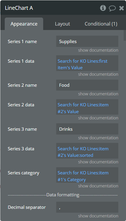
Element Fields
Title | Description | Type |
Series 1 name | Name for the 1st series. It should be unique. | text |
Series 1 data | These values represent Y-axis data for the 1st series. | list of numbers |
Series 2 name | Name for the 2nd series. It should be unique. | text (optional) |
Series 2 data | These values represent Y-axis data for the 2nd series. | list of numbers (optional) |
Series 3 name | Name for the 3rd series. It should be unique. | text (optional) |
Series 3 data | These values represent Y-axis data for the 3rd series. | list of numbers (optional) |
Series category | Values represent the X-axis data for all series. | list of texts |
Decimal separator | The symbol that separates the decimal part of the number area. | text (optional) |
Decimal amount | The number of digits of the decimal part. | number |
Thousand separator | The symbol that separates a thousand value from the rest of the number. | text (optional) |
Enable sparkline | This option hides all the elements of the charts other than the primary paths. Helps to visualize data in small areas. | Checkbox |
Show data labels | Show or hide data labels on the chart. | Checkbox |
Stacked chart | Will stack all the series on the chart. | Checkbox |
Stroke style | This option defines the style of the series points connection. | Dropdown |
Stroke width | The connection line's width of the series. | number |
Dashed width | If the value is more than 0 the connection points line will be dashed. | number |
Dashed width 1 (available in Pro version) | If the value is more than 0 the connection points line for the 1st series will be dashed. | number |
Dashed width 2 (available in Pro version) | If the value is more than 0 the connection points line for the 2nd series will be dashed. | number |
Dashed width 3 (available in Pro version) | If the value is more than 0 the connection points line for the 3rd series will be dashed. | number |
Chart color 1 | The color for the 1st series. If it is not specified, the default color will be assigned. | Color (optional) |
Chart color 2 | The color for the 2nd series. If it is not specified, the default color will be assigned. | Color (optional) |
Chart color 3 | The color for the 3rd series. If it is not specified, the default color will be assigned. | Color (optional) |
Color style | This option defines how to color the connection points line. | Dropdown |
Gradient type | This dropdown defines the gradient direction. This will work if only the “gradient” option was selected from the “Color style” dropdown. | Dropdown |
Gradient color 1 | The 2nd gradient color for the 1st series. If it is not specified, the default color will be assigned. It will be applied if only the “gradient” option was selected from the “Color style” dropdown. | Color (optional) |
Gradient color 2 | The 2nd gradient color for the 2nd series. If it is not specified, the default color will be assigned. It will be applied if only the “gradient” option was selected from the “Color style” dropdown. | Color (optional) |
Gradient color 3 | The 2nd gradient color for the 3rd series. If it is not specified, the default color will be assigned. It will be applied if only the “gradient” option was selected from the “Color style” dropdown. | Color (optional) |
Enable drop shadow | Draws a drop shadow for the series. Do not forget to set values for the "Drop shadow offset from the top" and "Drop shadow offset from the left" fields. | Checkbox |
Drop shadow color | The color of the shadow. Default color: #000000. | Color (optional) |
Drop shadow offset from the top | The top offset for shadow. | number |
Drop shadow offset from the left | The left offset for shadow. | number |
Drop shadow blur | The blur distance for shadow. | number |
Drop shadow opacity | The opacity for shadow. Accepted values from 0 to 1. | number |
Chart padding top | The top edge padding for the chart. | number |
Chart padding bottom | The bottom edge padding for the chart. | number |
Chart padding left | The left edge padding for the chart. | number |
Chart padding right | The right edge padding for the chart. | number |
Marker shape | The shape of markers. If the "Show data labels" field is active then labels will overlap the markers. | Dropdown |
Marker radius | The radius of square markers. This will work if only the “square” option were selected from the “Marker shape” dropdown. | number |
Marker size | The size of markers. If the value is more than 0 then markers will be displayed on the chart. Also, all element states will be available. | number |
Marker size on hover | The marker size on hover. | number |
Marker color 1 | The color for the 1st series markers. If it is not specified, the default color will be assigned. | Color (optional) |
Marker color 2 | The color for the 2nd series markers. If it is not specified, the default color will be assigned. | Color (optional) |
Marker color 3 | The color for the 3rd series markers. If it is not specified, the default color will be assigned. | Color (optional) |
Marker fill opacity | The opacity for markers. Accepted values from 0 to 1. | number |
Marker stroke color 1 | The color for the 1st series markers stroke. If it is not specified, the default color will be assigned. | Color (optional) |
Marker stroke color 2 | The color for the 2nd series markers stroke. If it is not specified, the default color will be assigned. | Color (optional) |
Marker stroke color 3 | The color for the 3rd series markers stroke. If it is not specified, the default color will be assigned. | Color (optional) |
Marker stroke width | The width of markers stroke. | number |
Marker stroke opacity | The opacity for markers stroke. Accepted values from 0 to 1. | number |
Marker stroke dashed width | If the value is more than 0 the markers stroke will be dashed. | number |
Enable grid lines for X-axis | This option allows displaying vertical grid lines. | Checkbox |
Enable grid lines for Y-axis | This option allows displaying horizontal grid lines. | Checkbox |
Grid line color | The color of grid lines. | Color |
Grid stroke dashed width | If the value is more than 0 the grid lines will be dashed. | number |
Enable grid column color | This option allows drawing the background space between vertical grid lines. | Checkbox |
Odd column color | The first vertical color. This color will be used to draw the odd color position. | Color |
Even column color | The second vertical color. This color will be used to draw the even color position. | Color |
Column color opacity | The opacity for vertical colors. Accepted values from 0 to 1. | number |
Enable grid row color | This option allows drawing the background space between horizontal grid lines. | Checkbox |
Odd row color | The first horizontal color. This color will be used to draw the odd color position. | Color |
Even row color | The second horizontal color. This color will be used to draw the even color position. | Color |
Row color opacity | The opacity for horizontal colors. Accepted values from 0 to 1. | number |
Forecast data points | The number of ending data points you want to indicate as forecast or prediction values. | number |
Forecast stroke width | The width of forecast connection points line of series. | number |
Forecast fill opacity | The opacity for forecast connection points line of series. | number |
Forecast dashed width | If the value is more than 0 the forecast connection points line will be dashed. | number |
Enable animation | This option allows animating the chart. | Checkbox |
Animation speed | This value represents the time in milliseconds allocated for animation. The more value - the more time for animation. | number |
Animation delay | This value represents the waiting time in milliseconds before animation. | number |
Show X-axis border | This option allows showing an X-axis border. | Checkbox |
X-axis border-color | The color of the X-axis border. | Color |
X-axis border size | The width of the X-axis border. If the value is more than 0 the border will be displayed. | number |
X-axis title | The title for X-axis. | text (optional) |
X-axis title color | The color for the X-axis title. | Color |
X-axis title size | The size for the X-axis title. | number |
X-axis title offset from the top | The top offset for the X-axis title. | number |
X-axis title offset from the left | The left offset for the X-axis title. | number |
Show X-axis ticks | This option allows showing the X-axis ticks. | Checkbox |
X-axis ticks color | The color for the X-axis ticks. | Color |
X-axis ticks height | The size for the X-axis ticks. | number |
Show X-axis labels | This option allows showing the X-axis labels. | Checkbox |
X-axis label count (available in Pro version) | The count of X-axis labels. Using a value that is less than half of the count of initial labels is recommended for displaying fewer values. | number (optional) |
X-axis labels color | The color for the X-axis labels. | Color |
X-axis labels size | The size for the X-axis labels. | number |
X-axis labels offset from the top | The top offset for the X-axis labels. | number |
X-axis labels max-height | The max height for the X-axis labels when they are rotated. | number |
Hide overlapping X-axis | This option allows hiding some of the X-axis labels if they overlap others. | Checkbox |
Trim X-axis labels | This option trims the label if it’s too long and adds “...” to its end. | Checkbox |
Rotate X-axis labels | This option rotates labels if they are too long. | Checkbox |
Always rotate X-axis labels | This option rotates labels permanently. | Checkbox |
X-axis labels rotation angle | The angle for the rotation of the label. Accepted negative values. | number |
Enable X-axis tooltip | This option shows a tooltip on X-axis on hover. | Checkbox |
X-axis crosshair width | The size for the crosshair. If the value is more than 0 the crosshair will be displayed. | number |
X-axis crosshair dashed width | If the value is more than 0 the crosshair line will be dashed. | number |
X-axis crosshair color | The color for the crosshair line. | Color |
Show Y-axis border | This option allows showing the Y-axis border. | Checkbox |
Y-axis border-color | The color of the Y-axis border. | Color |
Y-axis border size | The width of the Y-axis border. If the value is more than 0 the border will be displayed. | number |
Y-axis title | The title for Y-axis. | text (optional) |
Y-axis title color | The color for the Y-axis title. | Color |
Y-axis title size | The size for the Y-axis title. | number |
Y-axis title offset from the top | The top offset for the Y-axis title. | number |
Y-axis title offset from the left | The left offset for the Y-axis title. | number |
Show Y-axis ticks | This option allows showing the Y-axis ticks. | Checkbox |
Y-axis ticks color | The color for the Y-axis ticks. | Color |
Y-axis ticks width | The size for the Y-axis ticks. | number |
Y-axis min value | The minimum value for Y-axis. | number (optional) |
Y-axis max value | The maximum value for Y-axis. | number (optional) |
Show Y-axis labels | This option allows showing the Y-axis labels. | Checkbox |
Y-axis label count | The count of Y-axis labels. Using a value that is less than half of the count of initial labels is recommended for displaying fewer values. | number (optional) |
Y-axis labels color | The color for the Y-axis labels. | Color |
Y-axis labels size | The size for the Y-axis labels. | number |
Y-axis labels prefix | Prefix for the Y-axis label. | text (optional) |
Y-axis labels suffix | Suffix for the Y-axis label. | text (optional) |
Enable Y-axis tooltip | This option shows a tooltip on Y-axis on hover. | Checkbox |
Y-axis crosshair width | The size for the crosshair. If the value is more than 0 the crosshair will be displayed. | number |
Y-axis crosshair dashed width | If the value is more than 0 the crosshair line will be dashed. | number |
Y-axis crosshair color | The color for the crosshair line. | Color |
2nd Y-axis series name | The series name to assign for the second Y-axis. Please provide one of the series names that was assigned for one of the series. If left blank - will not be displayed. | text (optional) |
Show 2nd Y-axis border | This option allows showing the 2nd Y-axis border. | Checkbox |
2nd Y-axis border color | The color for the second Y-axis border. | Color |
2nd Y-axis border size | The width of the 2nd Y-axis border. If the value is more than 0 the border will be displayed. | number |
2nd Y-axis title | The title for the second Y-axis. | text (optional) |
2nd Y-axis title color | The color for the second Y-axis title. | Color |
Show 2nd Y-axis ticks | This option allows showing the 2nd Y-axis ticks. | Checkbox |
2nd Y-axis ticks color | The color for the second Y-axis ticks. | Color |
2nd Y-axis min value | The minimum value for the second Y-axis. | number (optional) |
2nd Y-axis max value | The maximum value for the second Y-axis. | number (optional) |
Show 2nd Y-axis labels | This option allows showing the 2nd Y-axis labels. | Checkbox |
2nd Y-axis label count | The count of second Y-axis labels. Using a value that is less than half of the count of initial labels is recommended for displaying fewer values. | number (optional) |
2nd Y-axis labels color | The color for the second Y-axis labels. | Color |
2nd Y-axis labels prefix | Prefix for the 2nd Y-axis label. | text (optional) |
2nd Y-axis labels the suffix | Suffix for the 2nd Y-axis label. | text (optional) |
Enable 2nd Y-axis tooltip | This option shows a tooltip on the 2nd Y-axis on hover. | Checkbox |
Show tooltip | This option shows a tooltip on the chart on hover. | Checkbox |
Show the category on the tooltip | This option allows showing the X-axis data in the tooltip. | Checkbox |
Tooltip theme | The tooltip theme. | Dropdown |
Show legend | This option adds a chart legend. Need at least 2 series for displaying the legend. | Checkbox |
Legend position | Place of the legend related to the chart. | Dropdown |
Horizontal legend alignment | Horizontal alignment of legend. | Dropdown |
Legend font size | The size for the legend text. | number |
Color legend labels (available in Pro version) | This option colors the labels of legend in series' colors. | Checkbox |
Enable toolbar | This option adds a toolbar to the top-right side of the chart. | Checkbox |
Enable download | This option adds a download option to the chart toolbar. | Checkbox |
Enable zoom | This option adds a zoom option to the chart toolbar. | Checkbox |
Zoom selection color | The color for the zoom square. | Color |
Zoom selection opacity | The opacity of zoom square. Accept the value from 0 to 1. | number |
Zoom selection stroke width | The width of the zoom square stroke. | number |
Zoom selection stroke color | The color of the zoom square stroke. | Color |
Zoom selection stroke opacity | The opacity of zoom square stroke. Accept the value from 0 to 1. | number |
Enable zoomIn | This option adds a zoom-in option to the chart toolbar. | Checkbox |
Enable zoomOut | This option adds a zoom-out option to the chart toolbar. | Checkbox |
Auto scale Y-axis on zoom | This option allows scaling the Y-axis values on zoom. | Checkbox |
Enable pan | This option adds a pan option to the chart toolbar. | Checkbox |
Enable reset | This option adds a reset option to the chart toolbar. | Checkbox |
Syncing ID | Fill in this field when you want to synchronize two charts. Create an ID and place it on the second chart in the same field. The ID should be the same for both charts. To correctly build the synced charts the count of the categories should be the same. | text (optional) |
Replace null/undefined values with 0 | This option allows to replacement of all "null" or "undefined" values from provided data. | Checkbox |
Reset the hover state on the mouse leave | With element is provided some states when the mouse is over the chart. This option allows to reset the states when the mouse leaves the chart. | Checkbox |
Summed data labels on a stacked chart | Show data labels as the sum of current and below values. This will be applied just when the "Show data labels" and "Stacked chart" options are checked. | Checkbox |
Element Actions
Append new series - This action is used to add up to 3 new series.
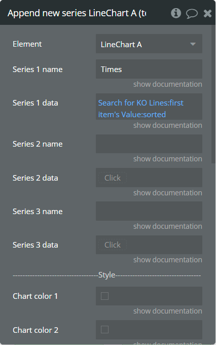
Fields:
Title | Description | Type |
Series 1 name | Name for the 1st added series. It should be unique. | text |
Series 1 data | These values represent Y-axis data for the 1st added series. | list of numbers |
Series 2 name | Name for the 2nd added series. It should be unique. | text (optional) |
Series 2 data | These values represent Y-axis data for the 2nd added series. | list of numbers (optional) |
Series 3 name | Name for the 3rd added series. It should be unique. | text (optional) |
Series 3 data | These values represent Y-axis data for the 3rd added series. | list of numbers (optional) |
Dashed width 1 (available in Pro version) | If the value is more than 0 the connection points line for the 1st series will be dashed. | number |
Dashed width 2 (available in Pro version) | If the value is more than 0 the connection points line for the 2nd series will be dashed. | number |
Dashed width 3 (available in Pro version) | If the value is more than 0 the connection points line for the 3rd series will be dashed. | number |
Chart color 1 | The color for the 1st added series. If it is not specified, the default color will be assigned. | Color (optional) |
Chart color 2 | The color for the 2nd added series. If it is not specified, the default color will be assigned. | Color (optional) |
Chart color 3 | The color for the 3rd added series. If it is not specified, the default color will be assigned. | Color (optional) |
Gradient color 1 | The 2nd gradient color for the 1st added series. If it is not specified, the default color will be assigned. It will be applied if only the “gradient” option was selected from the “Color style” dropdown from the element. | Color (optional) |
Gradient color 2 | The 2nd gradient color for the 2nd added series. If it is not specified, the default color will be assigned. It will be applied if only the “gradient” option was selected from the “Color style” dropdown from the element. | Color (optional) |
Gradient color 3 | The 2nd gradient color for the 3rd added series. If it is not specified, the default color will be assigned. It will be applied if only the “gradient” option was selected from the “Color style” dropdown from the element. | Color (optional) |
Marker color 1 | The color for the 1st added series markers. If it is not specified, the default color will be assigned. | Color (optional) |
Marker color 2 | The color for the 2nd added series markers. If it is not specified, the default color will be assigned. | Color (optional) |
Marker color 3 | The color for the 3rd added series markers. If it is not specified, the default color will be assigned. | Color (optional) |
Marker stroke color 1 | The color for the 1st added series markers stroke. If it is not specified, the default color will be assigned. | Color (optional) |
Marker stroke color 2 | The color for the 2nd added series markers stroke. If it is not specified, the default color will be assigned. | Color (optional) |
Marker stroke color 3 | The color for the 3rd added series markers stroke. If it is not specified, the default color will be assigned. | Color (optional) |
Show series - This action is used to show specific series on the chart.
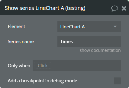
Fields:
Title | Description | Type |
Series name | The series name that will be shown. | text |
Hide series - This action is used to hide specific series on the chart.
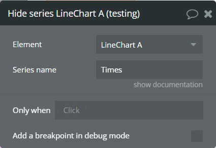
Fields:
Title | Description | Type |
Series name | The series name that is shown. | text |
Add X-Axis annotation - This action is used to add the X-axis annotation on the chart.
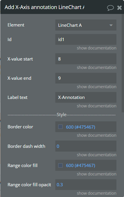
Fields:
Title | Description | Type |
Id | The unique id of the annotation to be added. This value can be used later for the "Remove annotation" action. | text (optional) |
X-value start | The existent label from the X-axis category. | text |
X-value end | The second existent label from the X-axis category. | text (optional) |
Label text | The text, which represents the annotation. | text |
Border color | The color of annotation edges. If the "X-value end" is not provided this color will be used to color the line. | Color |
Border dashed width | If the value is bigger than 0 the edges or line will be dashed. | number |
Range color fill | The color for filling the range between both provided "X-value..."s. | Color |
Range color fill opacity | The opacity of the range between both provided "X-value..."s. Accepted value from 0 to 1. | number |
Label border color | The color for the label border. | Color |
Label border width | The width of the label border. | number |
Label border radius | The border radius for label border. | number |
Label orientation | The orientation for the label. | Dropdown |
Text color | The color for the text from the label. | Color |
Background color | The color for the label background. | Color |
Add Y-Axis annotation - This action is used to add the Y-axis annotation on the chart.
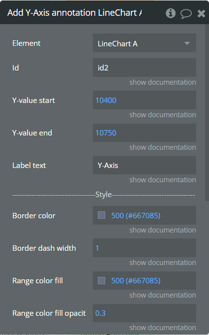
Fields:
Title | Description | Type |
Id | The unique id of the annotation to be added. This value can be used later for the "Remove annotation" action. | text (optional) |
Y-value start | The existent value from the Y-axis range. | number |
Y-value end | The second existent value from the Y-axis range. | number (optional) |
Label text | The text, which represents the annotation. | text |
Border color | The color of annotation edges. If the "Y-value end" is not provided this color will be used to color the line. | Color |
Border dashed width | If the value is bigger than 0 the edges or line will be dashed. | number |
Range color fill | The color for filling the range between both provided "Y-value..."s. | Color |
Range color fill opacity | The opacity of the range between both provided "Y-value..."s. Accepted value from 0 to 1. | number |
Label border color | The color for the label border. | Color |
Label border width | The width of the label border. | number |
Label border radius | The border radius for label border. | number |
Text color | The color for the text from the label. | Color |
Background color | The color for the label background. | Color |
Add Point annotation - This action is used to add the point annotation on the chart.
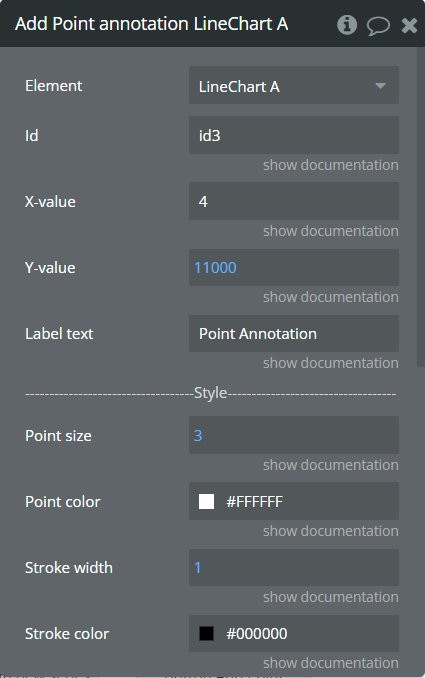
Fields:
Title | Description | Type |
Id | The unique id of the annotation to be added. This value can be used later for the "Remove annotation" action. | text (optional) |
X-value | The existent label from the X-axis category. | text |
Y-value | The existent value from the Y-axis range. | number |
Label text | The text, which represents the annotation. | text |
Point size | The size of the point that represents annotation. | number |
Point color | The color of the point annotation. | Color |
Stroke width | The stroke width of the point annotation. | number |
Stroke color | The color for the point stroke. | Color |
Point shape | The shape for annotation. | Dropdown |
Square border radius | The radius of square annotation. This will work just if was selected "square" from the "Point shape" field. | number |
Label border color | The color for the label border. | Color |
Label border width | The width of the label border. | number |
Label border radius | The border radius for label border. | number |
Text color | The color for the text from the label. | Color |
Background color | The color for the label background. | Color |
Remove annotation - This action is used to remove an annotation from the chart.
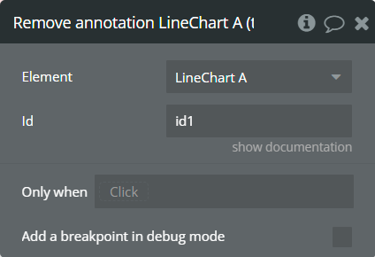
Fields:
Title | Description | Type |
Id | The annotation id that was added to the chart. | text |
Clear All annotations - This action is used to remove all annotations from the chart.
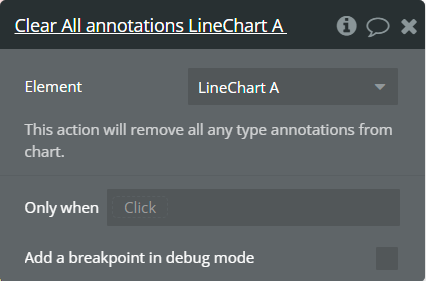
Generate PNG Url - This action is used to generate the PNG URL for the chart.
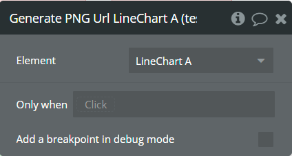
Element Events
Title | Description |
Chart is drawn | This event is triggered when the chart is completely drawn. |
Chart is clicked | This event is triggered when the chart is clicked. |
Chart has hovered | This event is triggered when the chart has hovered. |
PNG Url is available | This event is triggered when the PNG URL is available. |
Element States
Title | Description | Type |
Index on click | Returns the index of the X-axis label when the chart is clicked. | number |
Label on click | Returns the X-axis label when the chart is clicked. | text |
Index on hover | Returns the index of the X-axis label when the chart has hovered. | number |
Label on hover | Returns the X-axis label when the chart has hovered. | text |
PNG url | Returns the generated PNG url after execution of the "Generate PNG Url" action. | text |
Series names | Returns the list of all series names that are present on the chart. | list of texts |
Value on click | Returns the Y-axis value when the chart is clicked. | number |
Value on hover | Returns the Y-axis value when the chart has hovered. | number |
Series name on click | Returns the clicked series name. | text |
Series name on hover | Returns the hovered series name. | text |
2. Area Chart
This element draws an area chart.
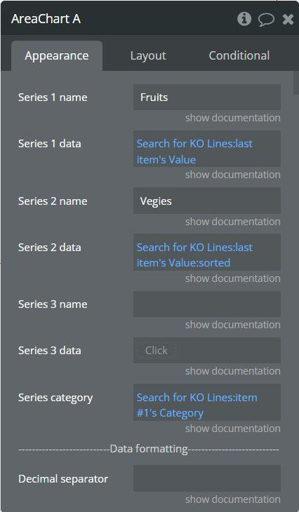
Element Fields
Title | Description | Type |
Series 1 name | Name for the 1st series. It should be unique. | text |
Series 1 data | These values represent Y-axis data for the 1st series. | list of numbers |
Series 2 name | Name for the 2nd series. It should be unique. | text (optional) |
Series 2 data | These values represent Y-axis data for the 2nd series. | list of numbers (optional) |
Series 3 name | Name for the 3rd series. It should be unique. | text (optional) |
Series 3 data | These values represent Y-axis data for the 3rd series. | list of numbers (optional) |
Series category | Values represent the X-axis data for all series. | list of texts |
Decimal separator | The symbol that separates the decimal part of the number area. | text (optional) |
Decimal amount | The number of digits of the decimal part. | number |
Thousand separator | The symbol that separates a thousand value from the rest of the number. | text (optional) |
Enable sparkline | This option hides all the elements of the charts other than the primary paths. Helps to visualize data in small areas. | Checkbox |
Show data labels | Show or hide data labels on the chart. | Checkbox |
Stacked chart | Will stack all the series on the chart. | Checkbox |
Stroke style | This option defines the style of the series points connection. | Dropdown |
Stroke width | The connection line's width of the series. | number |
Dashed width | If the value is more than 0 the connection points line will be dashed. | number |
Chart color 1 | The color for the 1st series. If it is not specified, the default color will be assigned. | Color (optional) |
Chart color 2 | The color for the 2nd series. If it is not specified, the default color will be assigned. | Color (optional) |
Chart color 3 | The color for the 3rd series. If it is not specified, the default color will be assigned. | Color (optional) |
Color style | This option defines how to color the connection points line. | Dropdown |
Gradient type | This dropdown defines the gradient direction. This will work if only the “gradient” option was selected from the “Color style” dropdown. | Dropdown |
Gradient color 1 | The 2nd gradient color for the 1st series. If it is not specified, the default color will be assigned. It will be applied if only the “gradient” option was selected from the “Color style” dropdown. | Color (optional) |
Gradient color 2 | The 2nd gradient color for the 2nd series. If it is not specified, the default color will be assigned. It will be applied if only the “gradient” option was selected from the “Color style” dropdown. | Color (optional) |
Gradient color 3 | The 2nd gradient color for the 3rd series. If it is not specified, the default color will be assigned. It will be applied if only the “gradient” option was selected from the “Color style” dropdown. | Color (optional) |
Gradient opacity from | The opacity for the 1st gradient color. Accepted values: from 0 to 1. | number |
Gradient opacity to | The opacity for the 2nd gradient color. Accepted values: from 0 to 1. | number |
Fill area to | When negative values are present in the Area chart, this option will fill the area with the background color either from 0 (origin) or from the end of the chart. | Dropdown |
Enable drop shadow | Draws a drop shadow for the series. Do not forget to set values for the "Drop shadow offset from the top" and "Drop shadow offset from the left" fields. | Checkbox |
Drop shadow color | The color of the shadow. Default color: #000000. | Color (optional) |
Drop shadow offset from the top | The top offset for shadow. | number |
Drop shadow offset from the left | The left offset for shadow. | number |
Drop shadow blur | The blur distance for shadow. | number |
Drop shadow opacity | The opacity for shadow. Accepted values from 0 to 1. | number |
Chart padding top | The top edge padding for the chart. | number |
Chart padding bottom | The bottom edge padding for the chart. | number |
Chart padding left | The left edge padding for the chart. | number |
Chart padding right | The right edge padding for the chart. | number |
Marker shape | The shape of markers. If the "Show data labels" field is active then labels will overlap the markers. | Dropdown |
Marker radius | The radius of square markers. This will work if only the “square” option was selected from the “Marker shape” dropdown. | number |
Marker size | The size of markers. If the value is more than 0 then markers will be displayed on the chart. Also, all element states will be available. | number |
Marker size on hover | The marker size on hover. If the marker size is 0 but you want it on hover to be visible and use this field value, it is required to uncheck "Tooltip intersect" field. | number |
Marker color 1 | The color for the 1st series markers. If it is not specified, the default color will be assigned. | Color (optional) |
Marker color 2 | The color for the 2nd series markers. If it is not specified, the default color will be assigned. | Color (optional) |
Marker color 3 | The color for the 3rd series markers. If it is not specified, the default color will be assigned. | Color (optional) |
Marker fill opacity | The opacity for markers. Accepted values from 0 to 1. | number |
Marker stroke color 1 | The color for the 1st series markers stroke. If it is not specified, the default color will be assigned. | Color (optional) |
Marker stroke color 2 | The color for the 2nd series markers stroke. If it is not specified, the default color will be assigned. | Color (optional) |
Marker stroke color 3 | The color for the 3rd series markers stroke. If it is not specified, the default color will be assigned. | Color (optional) |
Marker stroke width | The width of markers stroke. | number |
Marker stroke opacity | The opacity for markers stroke. Accepted values from 0 to 1. | number |
Marker stroke dashed width | If the value is more than 0 the markers stroke will be dashed. | number |
Enable grid lines for X-axis | This option allows displaying vertical grid lines. | Checkbox |
Enable grid lines for Y-axis | This option allows displaying horizontal grid lines. | Checkbox |
Grid line color | The color of grid lines. | Color |
Grid stroke dashed width | If the value is more than 0 the grid lines will be dashed. | number |
Enable grid column color | This option allows drawing the background space between vertical grid lines. | Checkbox |
Odd column color | The first vertical color. This color will be used to draw the odd color position. | Color |
Even column color | The second vertical color. This color will be used to draw the even color position. | Color |
Column color opacity | The opacity for vertical colors. Accepted values from 0 to 1. | number |
Enable grid row color | This option allows drawing the background space between horizontal grid lines. | Checkbox |
Odd row color | The first horizontal color. This color will be used to draw the odd color position. | Color |
Even row color | The second horizontal color. This color will be used to draw the even color position. | Color |
Row color opacity | The opacity for horizontal colors. Accepted values from 0 to 1. | number |
Forecast data points | The number of ending data points you want to indicate as forecast or prediction values. | number |
Forecast stroke width | The width of forecast connection points line of series. | number |
Forecast fill opacity | The opacity for forecast connection points line of series. | number |
Forecast dashed width | If the value is more than 0 the forecast connection points line will be dashed. | number |
Enable animation | This option allows animating the chart. | Checkbox |
Animation speed | This value represents the time in milliseconds allocated for animation. The more value - the more time for animation. | number |
Animation delay | This value represents the waiting time in milliseconds before animation. | number |
Show X-axis border | This option allows showing an X-axis border. | Checkbox |
X-axis border color | The color of the X-axis border. | Color |
X-axis border size | The width of the X-axis border. If the value is more than 0 the border will be displayed. | number |
X-axis title | The title for X-axis. | text (optional) |
X-axis title color | The color for the X-axis title. | Color |
X-axis title size | The size for the X-axis title. | number |
X-axis title offset from the top | The top offset for the X-axis title. | number |
X-axis title offset from the left | The left offset for the X-axis title. | number |
Show X-axis ticks | This option allows showing the X-axis ticks. | Checkbox |
X-axis ticks color | The color for the X-axis ticks. | Color |
X-axis ticks height | The size for the X-axis ticks. | number |
Show X-axis labels | This option allows showing the X-axis labels. | Checkbox |
X-axis label count (available in Pro version) | The count of X-axis labels. Using a value that is less than half of the count of initial labels is recommended for displaying fewer values. | number (optional) |
X-axis labels color | The color for the X-axis labels. | Color |
X-axis labels size | The size for the X-axis labels. | number |
X-axis labels offset from the top | The top offset for the X-axis labels. | number |
X-axis labels max height | The max height for the X-axis labels when they are rotated. | number |
Hide overlapping X-axis | This option allows hiding some of the X-axis labels if they overlap others. | Checkbox |
Trim X-axis labels | This option trims the label if it’s too long and adds “...” to its end. | Checkbox |
Rotate X-axis labels | This option rotates labels if they are too long. | Checkbox |
Always rotate X-axis labels | This option rotates labels permanently. | Checkbox |
X-axis labels rotation angle | The angle for the rotation of the label. Accepted negative values. | number |
Enable X-axis tooltip | This option shows a tooltip on X-axis on hover. | Checkbox |
X-axis crosshair width | The size for the crosshair. If the value is more than 0 the crosshair will be displayed. | number |
X-axis crosshair dashed width | If the value is more than 0 the crosshair line will be dashed. | number |
X-axis crosshair color | The color for the crosshair line. | Color |
Show Y-axis border | This option allows showing the Y-axis border. | Checkbox |
Y-axis border color | The color of the Y-axis border. | Color |
Y-axis border size | The width of the Y-axis border. If the value is more than 0 the border will be displayed. | number |
Y-axis title | The title for Y-axis. | text (optional) |
Y-axis title color | The color for the Y-axis title. | Color |
Y-axis title size | The size for the Y-axis title. | number |
Y-axis title offset from the top | The top offset for the Y-axis title. | number |
Y-axis title offset from the left | The left offset for the Y-axis title. | number |
Show Y-axis ticks | This option allows showing the Y-axis ticks. | Checkbox |
Y-axis ticks color | The color for the Y-axis ticks. | Color |
Y-axis ticks width | The size for the Y-axis ticks. | number |
Y-axis min value | The minimum value for Y-axis. | number (optional) |
Y-axis max value | The maximum value for Y-axis. | number (optional) |
Show Y-axis labels | This option allows showing the Y-axis labels. | Checkbox |
Y-axis label count | The count of Y-axis labels. Using a value that is less than half of the count of initial labels is recommended for displaying fewer values. | number (optional) |
Y-axis labels color | The color for the Y-axis labels. | Color |
Y-axis labels size | The size for the Y-axis labels. | number |
Y-axis labels prefix | Prefix for the Y-axis label. | text (optional) |
Y-axis labels suffix | Suffix for the Y-axis label. | text (optional) |
Enable Y-axis tooltip | This option shows a tooltip on Y-axis on hover. | Checkbox |
Y-axis crosshair width | The size for the crosshair. If the value is more than 0 the crosshair will be displayed. | number |
Y-axis crosshair dashed width | If the value is more than 0 the crosshair line will be dashed. | number |
Y-axis crosshair color | The color for the crosshair line. | Color |
2nd Y-axis series name | The series name to assign for the second Y-axis. Please provide one of the series names that was assigned for one of the series. If left blank - will not be displayed. | text (optional) |
Show 2nd Y-axis border | This option allows showing the 2nd Y-axis border. | Checkbox |
2nd Y-axis border color | The color for the second Y-axis border. | Color |
2nd Y-axis border size | The width of the 2nd Y-axis border. If the value is more than 0 the border will be displayed. | number |
2nd Y-axis title | The title for the second Y-axis. | text (optional) |
2nd Y-axis title color | The color for the second Y-axis title. | Color |
Show 2nd Y-axis ticks | This option allows showing the 2nd Y-axis ticks. | Checkbox |
2nd Y-axis ticks color | The color for the second Y-axis ticks. | Color |
2nd Y-axis min value | The minimum value for the second Y-axis. | number (optional) |
2nd Y-axis max value | The maximum value for the second Y-axis. | number (optional) |
Show 2nd Y-axis labels | This option allows showing the 2nd Y-axis labels. | Checkbox |
2nd Y-axis label count | The count of second Y-axis labels. Using a value that is less than half of the count of initial labels is recommended for displaying fewer values. | number (optional) |
2nd Y-axis labels color | The color for the second Y-axis labels. | Color |
2nd Y-axis labels prefix | Prefix for the 2nd Y-axis label. | text (optional) |
2nd Y-axis labels suffix | Suffix for the 2nd Y-axis label. | text (optional) |
Enable 2nd Y-axis tooltip | This option shows a tooltip on the 2nd Y-axis on hover. | Checkbox |
Show tooltip | This option shows a tooltip on the chart on hover. | Checkbox |
Show category on tooltip | This option allows showing the X-axis data in the tooltip. | Checkbox |
Tooltip theme | The tooltip theme. | Dropdown |
Tooltip intersect (available in Pro version) | Show tooltip only when user hovers exactly over datapoint. | Checkbox |
Shared tooltip (available in Pro version) | When having multiple series, show a shared tooltip. | yes/no |
Show legend | This option adds a chart legend. Need at least 2 series for displaying the legend. | Checkbox |
Legend position | Place of the legend related to the chart. | Dropdown |
Horizontal legend alignment | Horizontal alignment of legend. | Dropdown |
Legend font size | The size for the legend text. | number |
Use series colors (available in Pro version) | This option colors the labels of legend in series' colors. | Checkbox |
Legend labels colors (available in Pro version) | A text list with colors divided by "," (ex: #BC47A3, #24292E, #78909C) . Sets the colors for the legend labels. If you use this field please keep "Use series colors" unchecked. | text (optional) |
Legend markers colors (available in Pro version) | A text list with colors divided by "," (ex: #BC47A3, #24292E, #78909C) . Sets the colors for the legend markers. | text (optional) |
Enable toolbar | This option adds a toolbar to the top-right side of the chart. | Checkbox |
Enable download | This option adds a download option to the chart toolbar. | Checkbox |
Enable zoom | This option adds a zoom option to the chart toolbar. | Checkbox |
Zoom selection color | The color for the zoom square. | Color |
Zoom selection opacity | The opacity of zoom square. Accept the value from 0 to 1. | number |
Zoom selection stroke width | The width of the zoom square stroke. | number |
Zoom selection stroke color | The color of the zoom square stroke. | Color |
Zoom selection stroke opacity | The opacity of zoom square stroke. Accept the value from 0 to 1. | number |
Enable zoomIn | This option adds a zoom-in option to the chart toolbar. | Checkbox |
Enable zoomOut | This option adds a zoom-out option to the chart toolbar. | Checkbox |
Auto scale Y-axis on zoom | This option allows scaling the Y-axis values on zoom. | Checkbox |
Enable pan | This option adds a pan option to the chart toolbar. | Checkbox |
Enable reset | This option adds a reset option to the chart toolbar. | Checkbox |
Syncing ID | Fill in this field when you want to synchronize two charts. Create an ID and place it on the second chart in the same field. The ID should be the same for both charts. To correctly build the synced charts the count of the categories should be the same. | string (optional) |
Replace null/undefined values with 0 | This option allows to replacement of all "null" or "undefined" values from provided data. | Checkbox |
Reset hover state on mouse leave | With element is provided some states when the mouse is over the chart. This option allows to reset the states when the mouse leaves the chart. | Checkbox |
Summed data labels on stacked chart | Show data labels as the sum of current and below values. This will be applied just when the "Show data labels" and "Stacked chart" options are checked. | Checkbox |
Element Actions
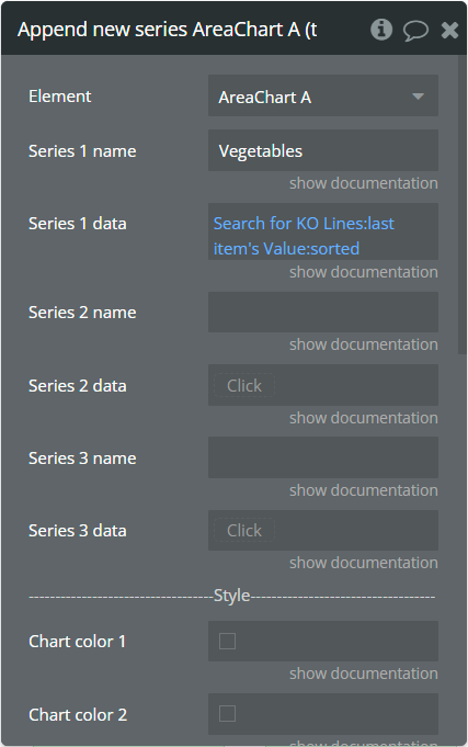
Append new series - This action is used to add up to 3 new series.
Fields:
Title | Description | Type |
Series 1 name | Name for the 1st added series. It should be unique. | text |
Series 1 data | These values represent Y-axis data for the 1st added series. | list of numbers |
Series 2 name | Name for the 2nd added series. It should be unique. | text (optional) |
Series 2 data | These values represent Y-axis data for the 2nd added series. | list of numbers (optional) |
Series 3 name | Name for the 3rd added series. It should be unique. | text (optional) |
Series 3 data | These values represent Y-axis data for the 3rd added series. | list of numbers (optional) |
Chart color 1 | The color for the 1st added series. If it is not specified, the default color will be assigned. | Color (optional) |
Chart color 2 | The color for the 2nd added series. If it is not specified, the default color will be assigned. | Color (optional) |
Chart color 3 | The color for the 3rd added series. If it is not specified, the default color will be assigned. | Color (optional) |
Gradient color 1 | The 2nd gradient color for the 1st added series. If it is not specified, the default color will be assigned. It will be applied if only the “gradient” option was selected from the “Color style” dropdown from the element. | Color (optional) |
Gradient color 2 | The 2nd gradient color for the 2nd added series. If it is not specified, the default color will be assigned. It will be applied if only the “gradient” option was selected from the “Color style” dropdown from the element. | Color (optional) |
Gradient color 3 | The 2nd gradient color for the 3rd added series. If it is not specified, the default color will be assigned. It will be applied if only the “gradient” option was selected from the “Color style” dropdown from the element. | Color (optional) |
Marker color 1 | The color for the 1st added series markers. If it is not specified, the default color will be assigned. | Color (optional) |
Marker color 2 | The color for the 2nd added series markers. If it is not specified, the default color will be assigned. | Color (optional) |
Marker color 3 | The color for the 3rd added series markers. If it is not specified, the default color will be assigned. | Color (optional) |
Marker stroke color 1 | The color for the 1st added series markers stroke. If it is not specified, the default color will be assigned. | Color (optional) |
Marker stroke color 2 | The color for the 2nd added series markers stroke. If it is not specified, the default color will be assigned. | Color (optional) |
Marker stroke color 3 | The color for the 3rd added series markers stroke. If it is not specified, the default color will be assigned. | Color (optional) |
Show series - This action is used to show specific series on the chart.
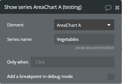
Fields:
Title | Description | Type |
Series name | The series name that will be shown. | text |
Hide series - This action is used to hide specific series on the chart.
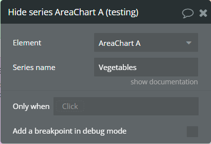
Fields:
Title | Description | Type |
Series name | The series name that is shown. | text |
Add X-Axis annotation - This action is used to add the X-axis annotation on the chart.
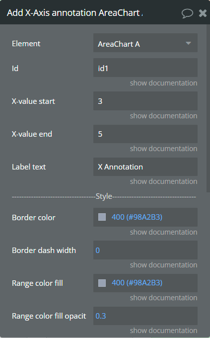
Fields:
Title | Description | Type |
Id | The unique id of the annotation to be added. This value can be used later for the "Remove annotation" action. | text (optional) |
X-value start | The existent label from the X-axis category. | text |
X-value end | The second existent label from the X-axis category. | text (optional) |
Label text | The text, which represents the annotation. | text |
Border color | The color of annotation edges. If the "X-value end" is not provided this color will be used to color the line. | Color |
Border dashed width | If the value is bigger than 0 the edges or line will be dashed. | number |
Range color fill | The color for filling the range between both provided "X-value..."s. | Color |
Range color fill opacity | The opacity of the range between both provided "X-value..."s. Accepted value from 0 to 1. | number |
Label border color | The color for the label border. | Color |
Label border width | The width of the label border. | number |
Label border radius | The border radius for label border. | number |
Label orientation | The orientation for the label. | Dropdown |
Text color | The color for the text from the label. | Color |
Background color | The color for the label background. | Color |
Add Y-Axis annotation - This action is used to add the Y-axis annotation on the chart.
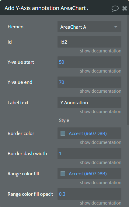
Fields:
Title | Description | Type |
Id | The unique id of the annotation to be added. This value can be used later for the "Remove annotation" action. | text (optional) |
Y-value start | The existent value from the Y-axis range. | number |
Y-value end | The second existent value from the Y-axis range. | number (optional) |
Label text | The text, which represents the annotation. | text |
Border color | The color of annotation edges. If the "Y-value end" is not provided this color will be used to color the line. | Color |
Border dashed width | If the value is bigger than 0 the edges or line will be dashed. | number |
Range color fill | The color for filling the range between both provided "Y-value..."s. | Color |
Range color fill opacity | The opacity of the range between both provided "Y-value..."s. Accepted value from 0 to 1. | number |
Label border color | The color for the label border. | Color |
Label border width | The width of the label border. | number |
Label border radius | The border radius for label border. | number |
Text color | The color for the text from the label. | Color |
Background color | The color for the label background. | Color |
Add Point annotation - This action is used to add the point annotation on the chart.
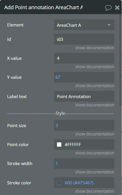
Fields:
Title | Description | Type |
Id | The unique id of the annotation to be added. This value can be used later for the "Remove annotation" action. | text (optional) |
X-value | The existent label from the X-axis category. | text |
Y-value | The existent value from the Y-axis range. | number |
Label text | The text, which represents the annotation. | text |
Point size | The size of the point that represents annotation. | number |
Point color | The color of the point annotation. | Color |
Stroke width | The stroke width of the point annotation. | number |
Stroke color | The color for the point stroke. | Color |
Point shape | The shape for annotation. | Dropdown |
Square border radius | The radius of square annotation. This will work just if was selected "square" from the "Point shape" field. | number |
Label border color | The color for the label border. | Color |
Label border width | The width of the label border. | number |
Label border radius | The border radius for label border. | number |
Text color | The color for the text from the label. | Color |
Background color | The color for the label background. | Color |
Remove annotation - This action is used to remove an annotation from the chart.
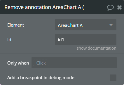
Fields:
Title | Description | Type |
Id | The annotation id that was added to the chart. | text |
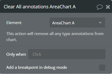
Clear All annotations - This action is used to remove all annotations from the chart.
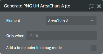
Generate PNG Url - This action is used to generate the PNG URL for the chart.
Element Events
Title | Description |
Chart is drawn | This event is triggered when the chart is completely drawn. |
Chart is clicked | This event is triggered when the chart is clicked. |
Chart has hovered | This event is triggered when the chart has hovered. |
PNG Url is available | This event is triggered when the PNG URL is available. |
Element States
Title | Description | Type |
Index on click | Returns the index of the X-axis label when the chart is clicked. | number |
Label on click | Returns the X-axis label when the chart is clicked. | text |
Index on hover | Returns the index of the X-axis label when the chart has hovered. | number |
Label on hover | Returns the X-axis label when the chart has hovered. | text |
PNG url | Returns the generated PNG url after execution of the "Generate PNG Url" action. | text |
Series names | Returns the list of all series names that are present on the chart. | list of texts |
Value on click | Returns the Y-axis value when the chart is clicked. | number |
Value on hover | Returns the Y-axis value when the chart has hovered. | number |
Series name on click | Returns the clicked series name. | text |
Series name on hover | Returns the hovered series name. | text |
3. Bar Chart
This element draws a bar chart.
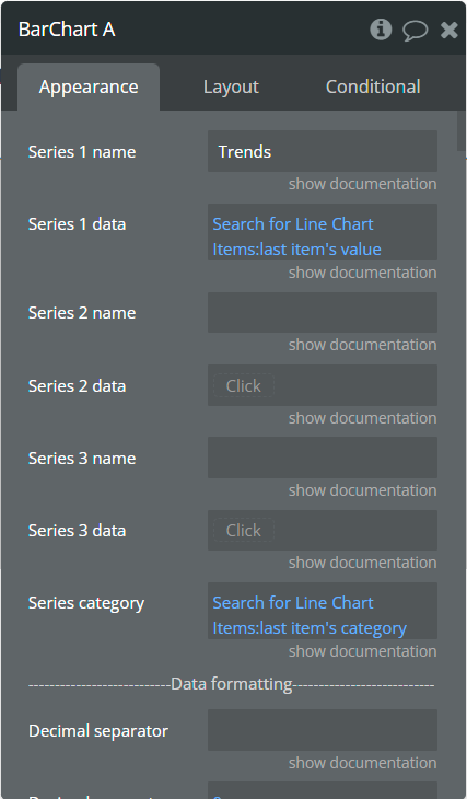
Element Fields
Title | Description | Type |
Series 1 name | Name for the 1st series. It should be unique. | text |
Series 1 data | These values represent Y-axis data for the 1st series. | list of numbers |
Series 2 name | Name for the 2nd series. It should be unique. | text (optional) |
Series 2 data | These values represent Y-axis data for the 2nd series. | list of numbers (optional) |
Series 3 name | Name for the 3rd series. It should be unique. | text (optional) |
Series 3 data | These values represent Y-axis data for the 3rd series. | list of numbers (optional) |
More Series (JSON Array) (available in Pro version) | Adds more series to the chart. Must follow the json example in a precise way, any issue in it may cause errors. | text (optional) |
Series category | Values represent the X-axis data for all series. | list of texts |
Decimal separator | The symbol that separates the decimal part of the number area. | text (optional) |
Decimal amount | The number of digits of the decimal part. | number |
Thousand separator | The symbol that separates a thousand value from the rest of the number. | text (optional) |
Enable sparkline | This option hides all the elements of the charts other than the primary paths. Helps to visualize data in small areas. | Checkbox |
Horizontal chart | This option allows for creating a horizontal bar chart. | Checkbox |
Show data labels | Show or hide data labels on the chart. | Checkbox |
Data labels position | The position of the label on the bar. | Dropdown |
Data labels orientation | The data label orientation. | Dropdown |
Stacked chart | Will stack all the series on the chart. | Checkbox |
Stacked chart in % | This option allows to conversion of stacked chart data into percentages chart. | Checkbox |
Bar width (%) | The size of the bar in percentages relates to two adjacent grid lines. | number |
Border radius (available in Pro version) | Sets rounded corners around the bars/columns. Do not use values above 10. | number |
Stroke width | The stroke width of the bar. | number |
Stroke color (available in Pro version) | The stroke color of the bar. Sets one single stroke color for all bars, if the field is unset it will use for every bar its original color, but darker. | color (optional) |
Stroke dashed width | If the value is more than 0 the stroke will be dashed. | number |
Chart color 1 | The color for the 1st series. If it is not specified, the default color will be assigned. | Color (optional) |
Chart color 2 | The color for the 2nd series. If it is not specified, the default color will be assigned. | Color (optional) |
Chart color 3 | The color for the 3rd series. If it is not specified, the default color will be assigned. | Color (optional) |
Color style | This option defines how to color the bars. | Dropdown |
Gradient type | This dropdown defines the gradient direction. This will work if only the “gradient” option was selected from the “Color style” dropdown. | Dropdown |
Gradient color 1 | The 2nd gradient color for the 1st series. If it is not specified, the default color will be assigned. It will be applied if only the “gradient” option was selected from the “Color style” dropdown. | Color (optional) |
Gradient color 2 | The 2nd gradient color for the 2nd series. If it is not specified, the default color will be assigned. It will be applied if only the “gradient” option was selected from the “Color style” dropdown. | Color (optional) |
Gradient color 3 | The 2nd gradient color for the 3rd series. If it is not specified, the default color will be assigned. It will be applied if only the “gradient” option was selected from the “Color style” dropdown. | Color (optional) |
Gradient opacity from | The opacity for the 1st gradient color. Accepted values: from 0 to 1. | number |
Gradient opacity to | The opacity for the 2nd gradient color. Accepted values: from 0 to 1. | number |
Enable drop shadow | Draws a drop shadow for the series. Do not forget to set values for the "Drop shadow offset from the top" and "Drop shadow offset from the left" fields. | Checkbox |
Drop shadow color | The color of the shadow. Default color: #000000. | Color (optional) |
Drop shadow offset from the top | The top offset for shadow. | number |
Dropshadow offset from the left | The left offset for shadow. | number |
Drop shadow blur | The blur distance for shadow. | number |
Drop shadow opacity | The opacity for shadow. Accepted values from 0 to 1. | number |
Chart padding top | The top edge padding for the chart. | number |
Chart padding bottom | The bottom edge padding for the chart. | number |
Chart padding left | The left edge padding for the chart. | number |
Chart padding right | The right edge padding for the chart. | number |
Start range value | The lower range value. This value should be lower or equal with "End range value". | number (optional) |
End range value | The higher range value. This value should be higher or equal with "Start range value". | number (optional) |
Range color | The color for bars that are in the indicated range. | Color |
Start range 1 value (available in Pro version) | The lower range 1 value. This value should be lower or equal with "End range value". | number (optional) |
End range 1 value (available in Pro version) | The higher range 1 value. This value should be higher or equal with "Start range value". | number (optional) |
Range 1 color (available in Pro version) | The color for bars that are in the indicated range 1. | Color |
Start range 2 value (available in Pro version) | The lower range 2 value. This value should be lower or equal with "End range 2 value". | number (optional) |
End range 2 value (available in Pro version) | The higher range 2 value. This value should be higher or equal with "Start range 2 value". | number (optional) |
Range 2 color (available in Pro version) | The color for bars that are in the indicated range 2. | Color |
Start range 3 value (available in Pro version) | The lower range 3 value. This value should be lower or equal with "End range 3 value". | number (optional) |
End range 3 value (available in Pro version) | The higher range 3 value. This value should be higher or equal with "Start range 3 value". | number (optional) |
Range 3 color (available in Pro version) | The color for bars that are in the indicated range 3. | Color |
Enable grid lines for X-axis | This option allows displaying vertical grid lines. | Checkbox |
Enable grid lines for Y-axis | This option allows displaying horizontal grid lines. | Checkbox |
Grid line color | The color of grid lines. | Color |
Grid stroke dashed width | If the value is more than 0 the grid lines will be dashed. | number |
Enable grid column color | This option allows drawing the background space between vertical grid lines. | Checkbox |
Odd column color | The first vertical color. This color will be used to draw the odd color position. | Color |
Even column color | The second vertical color. This color will be used to draw the even color position. | Color |
Column color opacity | The opacity for vertical colors. Accepted values from 0 to 1. | number |
Enable grid row color | This option allows drawing the background space between horizontal grid lines. | Checkbox |
Odd row color | The first horizontal color. This color will be used to draw the odd color position. | Color |
Even row color | The second horizontal color. This color will be used to draw the even color position. | Color |
Row color opacity | The opacity for horizontal colors. Accepted values from 0 to 1. | number |
Enable animation | This option allows animating the chart. | Checkbox |
Animation speed | This value represents the time in milliseconds allocated for animation. The more value - the more time for animation. | number |
Animation delay | This value represents the waiting time in milliseconds before animation. | number |
Show X-axis border | This option allows showing an X-axis border. | Checkbox |
X-axis border color | The color of the X-axis border. | Color |
X-axis border size | The width of the X-axis border. If the value is more than 0 the border will be displayed. | number |
X-axis title | The title for X-axis. | text (optional) |
X-axis title color | The color for the X-axis title. | Color |
X-axis title size | The size for the X-axis title. | number |
X-axis title offset from the top | The top offset for the X-axis title. | number |
X-axis title offset from the left | The left offset for the X-axis title. | number |
Show X-axis ticks | This option allows showing the X-axis ticks. | Checkbox |
X-axis ticks color | The color for the X-axis ticks. | Color |
X-axis ticks height | The size for the X-axis ticks. | number |
Show X-axis labels | This option allows showing the X-axis labels. | Checkbox |
X-axis label count (available in Pro version) | The count of X-axis labels. Using a value that is less than half of the count of initial labels is recommended for displaying fewer values. | number (optional) |
X-axis labels color | The color for the X-axis labels. | Color |
X-axis labels size | The size for the X-axis labels. | number |
X-axis labels offset from the top | The top offset for the X-axis labels. | number |
X-axis labels max height | The max height for the X-axis labels when they are rotated. | number |
Hide overlapping X-axis | This option allows hiding some of the X-axis labels if they overlap others. | Checkbox |
Trim X-axis labels | This option trims the label if it’s too long and adds “...” to its end. | Checkbox |
Rotate X-axis labels | This option rotates labels if they are too long. | Checkbox |
Always rotate X-axis labels | This option rotates labels permanently. | Checkbox |
X-axis labels rotation angle | The angle for the rotation of the label. Accepted negative values. | number |
Enable X-axis tooltip | This option shows a tooltip on X-axis on hover. | Checkbox |
X-axis crosshair width | The size for the crosshair. If the value is more than 0 the crosshair will be displayed. | number |
X-axis crosshair dashed width | If the value is more than 0 the crosshair line will be dashed. | number |
X-axis crosshair color | The color for the crosshair line. | Color |
Show Y-axis border | This option allows showing the Y-axis border. | Checkbox |
Y-axis border color | The color of the Y-axis border. | Color |
Y-axis border size | The width of the Y-axis border. If the value is more than 0 the border will be displayed. | number |
Y-axis title | The title for Y-axis. | text (optional) |
Y-axis title color | The color for the Y-axis title. | Color |
Y-axis title size | The size for the Y-axis title. | number |
Y-axis title offset from the top | The top offset for the Y-axis title. | number |
Y-axis title offset from the left | The left offset for the Y-axis title. | number |
Show Y-axis ticks | This option allows showing the Y-axis ticks. | Checkbox |
Y-axis ticks color | The color for the Y-axis ticks. | Color |
Y-axis ticks width | The size for the Y-axis ticks. | number |
Y-axis min value | The minimum value for Y-axis. | number (optional) |
Y-axis max value | The maximum value for Y-axis. | number (optional) |
Show Y-axis labels | This option allows showing the Y-axis labels. | Checkbox |
Y-axis label count | The count of Y-axis labels. Using a value that is less than half of the count of initial labels is recommended for displaying fewer values. | number (optional) |
Y-axis labels color | The color for the Y-axis labels. | Color |
Y-axis labels size | The size for the Y-axis labels. | number |
Y-axis labels prefix | Prefix for the Y-axis label. | text (optional) |
Y-axis labels suffix | Suffix for the Y-axis label. | text (optional) |
Enable Y-axis tooltip | This option shows a tooltip on Y-axis on hover. | Checkbox |
Y-axis crosshair width | The size for the crosshair. If the value is more than 0 the crosshair will be displayed. | number |
Y-axis crosshair dashed width | If the value is more than 0 the crosshair line will be dashed. | number |
Y-axis crosshair color | The color for the crosshair line. | Color |
2nd Y-axis series name | The series name to assign for the second Y-axis. Please provide one of the series names that was assigned for one of the series. If left blank - will not be displayed. | text (optional) |
Show 2nd Y-axis border | This option allows showing the 2nd Y-axis border. | Checkbox |
2nd Y-axis border color | The color for the second Y-axis border. | Color |
2nd Y-axis border size | The width of the 2nd Y-axis border. If the value is more than 0 the border will be displayed. | number |
2nd Y-axis title | The title for the second Y-axis. | text (optional) |
2nd Y-axis title color | The color for the second Y-axis title. | Color |
Show 2nd Y-axis ticks | This option allows showing the 2nd Y-axis ticks. | Checkbox |
2nd Y-axis ticks color | The color for the second Y-axis ticks. | Color |
2nd Y-axis min value | The minimum value for the second Y-axis. | number (optional) |
2nd Y-axis max value | The maximum value for the second Y-axis. | number (optional) |
Show 2nd Y-axis labels | This option allows showing the 2nd Y-axis labels. | Checkbox |
2nd Y-axis label count | The count of second Y-axis labels. Using a value that is less than half of the count of initial labels is recommended for displaying fewer values. | number (optional) |
2nd Y-axis labels color | The color for the second Y-axis labels. | Color |
2nd Y-axis labels prefix | Prefix for the 2nd Y-axis label. | text (optional) |
2nd Y-axis labels suffix | Suffix for the 2nd Y-axis label. | text (optional) |
Enable 2nd Y-axis tooltip | This option shows a tooltip on the 2nd Y-axis on hover. | Checkbox |
Show tooltip | This option shows a tooltip on the chart on hover. | Checkbox |
Custom legend items (available in Pro version) | A list of legend labels, please divide them by "," (ex: Q1 Budget, Q2 Budget, Q3). Allows you to overwrite the default legend items with this customized set of labels. Please note that the click/hover events of the legend will stop working if you provide these custom legend labels. | text (optional) |
Show category on tooltip | This option allows showing the X-axis data in the tooltip. | Checkbox |
Tooltip theme | The tooltip theme. | Dropdown |
Enable fixed tooltip | This option shows a tooltip in a certain place on the chart. | Checkbox |
Fixed tooltip position | The place of the tooltip in the chart. | Dropdown |
Show legend | This option adds a chart legend. Need at least 2 series for displaying the legend. | Checkbox |
Legend position | Place of the legend related to the chart. | Dropdown |
Horizontal legend alignment | Horizontal alignment of legend. | Dropdown |
Legend font size | The size for the legend text. | number |
Color legend labels (available in Pro version) | This option colors the labels of legend in series' colors. | Checkbox |
Enable toolbar | This option adds a toolbar to the top-right side of the chart. | Checkbox |
Enable download | This option adds a download option to the chart toolbar. | Checkbox |
Enable zoom | This option adds a zoom option to the chart toolbar. | Checkbox |
Zoom selection color | The color for the zoom square. | Color |
Zoom selection opacity | The opacity of zoom square. Accept the value from 0 to 1. | number |
Zoom selection stroke width | The width of the zoom square stroke. | number |
Zoom selection stroke color | The color of the zoom square stroke. | Color |
Zoom selection stroke opacity | The opacity of zoom square stroke. Accept the value from 0 to 1. | number |
Enable zoomIn | This option adds a zoom-in option to the chart toolbar. | Checkbox |
Enable zoomOut | This option adds a zoom-out option to the chart toolbar. | Checkbox |
Auto scale Y-axis on zoom | This option allows scaling the Y-axis values on zoom. | Checkbox |
Enable pan | This option adds a pan option to the chart toolbar. | Checkbox |
Enable reset | This option adds a reset option to the chart toolbar. | Checkbox |
Syncing ID | Fill in this field when you want to synchronize two charts. Create an ID and place it on the second chart in the same field. The ID should be the same for both charts. To correctly build the synced charts the count of the categories should be the same. | string (optional) |
Replace null/undefined values with 0 | This option allows to replacement of all "null" or "undefined" values from provided data. | Checkbox |
Reset hover state on mouse leave | With element is provided some states when the mouse is over the chart. This option allows to reset the states when the mouse leaves the chart. | Checkbox |
Summed data labels on stacked chart | Show data labels as the sum of current and below values. This will be applied just when the "Show data labels" and "Stacked chart" options are checked. | Checkbox |
Element Actions
Append new series - This action is used to add up to 3 new series.
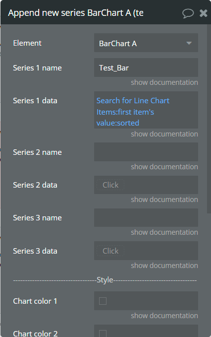
Fields:
Title | Description | Type |
Series 1 name | Name for the 1st added series. It should be unique. | text |
Series 1 data | These values represent Y-axis data for the 1st added series. | list of numbers |
Series 2 name | Name for the 2nd added series. It should be unique. | text (optional) |
Series 2 data | These values represent Y-axis data for the 2nd added series. | list of numbers (optional) |
Series 3 name | Name for the 3rd added series. It should be unique. | text (optional) |
Series 3 data | These values represent Y-axis data for the 3rd added series. | list of numbers (optional) |
Chart color 1 | The color for the 1st added series. If it is not specified, the default color will be assigned. | Color (optional) |
Chart color 2 | The color for the 2nd added series. If it is not specified, the default color will be assigned. | Color (optional) |
Chart color 3 | The color for the 3rd added series. If it is not specified, the default color will be assigned. | Color (optional) |
Gradient color 1 | The 2nd gradient color for the 1st added series. If it is not specified, the default color will be assigned. It will be applied if only the “gradient” option was selected from the “Color style” dropdown from the element. | Color (optional) |
Gradient color 2 | The 2nd gradient color for the 2nd added series. If it is not specified, the default color will be assigned. It will be applied if only the “gradient” option was selected from the “Color style” dropdown from the element. | Color (optional) |
Gradient color 3 | The 2nd gradient color for the 3rd added series. If it is not specified, the default color will be assigned. It will be applied if only the “gradient” option was selected from the “Color style” dropdown from the element. | Color (optional) |
Show series - This action is used to show specific series on the chart.
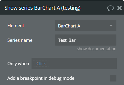
Fields:
Title | Description | Type |
Series name | The series name that will be shown. | text |
Hide series - This action is used to hide specific series on the chart.
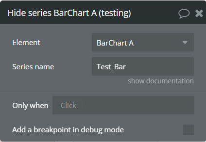
Fields:
Title | Description | Type |
Series name | The series name that is shown. | text |
Generate PNG Url - This action is used to generate the PNG URL for the chart.
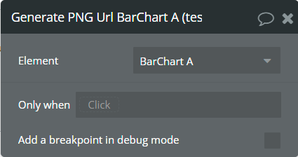
Add X-Axis annotation (available in Pro version) - This action is used to add the X-axis annotation on the chart.
Fields:
Title | Description | Type |
Id | The unique id of the annotation to be added. This value can be used later for the "Remove annotation" action. | text (optional) |
X-value start | The existent label from the X-axis category. | text |
X-value end | The second existent label from the X-axis category. | text (optional) |
Label text | The text, which represents the annotation. | text |
Border color | The color of annotation edges. If the "X-value end" is not provided this color will be used to color the line. | Color |
Border dashed width | If the value is bigger than 0 the edges or line will be dashed. | number |
Range color fill | The color for filling the range between both provided "X-value..."s. | Color |
Range color fill opacity | The opacity of the range between both provided "X-value..."s. Accepted value from 0 to 1. | number |
Label border color | The color for the label border. | Color |
Label border width | The width of the label border. | number |
Label border radius | The border radius for label border. | number |
Label orientation | The orientation for the label. | Dropdown |
Text color | The color for the text from the label. | Color |
Background color | The color for the label background. | Color |
Add Y-Axis annotation (available in Pro version) - This action is used to add the Y-axis annotation on the chart.
Fields:
Title | Description | Type |
Id | The unique id of the annotation to be added. This value can be used later for the "Remove annotation" action. | text (optional) |
Y-value start | The existent value from the Y-axis range. | number |
Y-value end | The second existent value from the Y-axis range. | number (optional) |
Label text | The text, which represents the annotation. | text |
Border color | The color of annotation edges. If the "Y-value end" is not provided this color will be used to color the line. | Color |
Border dashed width | If the value is bigger than 0 the edges or line will be dashed. | number |
Range color fill | The color for filling the range between both provided "Y-value..."s. | Color |
Range color fill opacity | The opacity of the range between both provided "Y-value..."s. Accepted value from 0 to 1. | number |
Label border color | The color for the label border. | Color |
Label border width | The width of the label border. | number |
Label border radius | The border radius for label border. | number |
Text color | The color for the text from the label. | Color |
Background color | The color for the label background. | Color |
Add Point annotation (available in Pro version) - This action is used to add the point annotation on the chart.
Fields:
Title | Description | Type |
Id | The unique id of the annotation to be added. This value can be used later for the "Remove annotation" action. | text (optional) |
X-value | The existent label from the X-axis category. | text |
Y-value | The existent value from the Y-axis range. | number |
Label text | The text, which represents the annotation. | text |
Point size | The size of the point that represents annotation. | number |
Point color | The color of the point annotation. | Color |
Stroke width | The stroke width of the point annotation. | number |
Stroke color | The color for the point stroke. | Color |
Point shape | The shape for annotation. | Dropdown |
Square border radius | The radius of square annotation. This will work just if was selected "square" from the "Point shape" field. | number |
Label border color | The color for the label border. | Color |
Label border width | The width of the label border. | number |
Label border radius | The border radius for label border. | number |
Text color | The color for the text from the label. | Color |
Background color | The color for the label background. | Color |
Remove annotation (available in Pro version) - This action is used to remove an annotation from the chart.
Fields:
Title | Description | Type |
Id | The annotation id that was added to the chart. | text |
Clear All annotations (available in Pro version) - This action is used to remove all annotations from the chart.
Element Events
Title | Description |
Chart is drawn | This event is triggered when the chart is completely drawn. |
Chart is clicked | This event is triggered when the chart is clicked. |
Chart has hovered | This event is triggered when the chart has hovered. |
PNG Url is available | This event is triggered when the PNG URL is available. |
Element States
Title | Description | Type |
Index on click | Returns the index of the X-axis label when the chart is clicked. | number |
Label on click | Returns the X-axis label when the chart is clicked. | text |
Index on hover | Returns the index of the X-axis label when the chart has hovered. | number |
Label on hover | Returns the X-axis label when the chart has hovered. | text |
PNG url | Returns the generated PNG url after execution of the "Generate PNG Url" action. | text |
Series names | Returns the list of all series names that are present on the chart. | list of texts |
Value on click | Returns the Y-axis value when the chart is clicked. | number |
Value on hover | Returns the Y-axis value when the chart has hovered. | number |
Series name on click | Returns the clicked series name. | text |
Series name on hover | Returns the hovered series name. | text |
Workflow examples
Minimal settings for chart
This example represents the minimal settings you can set for charts.
- In the database is created object with the following fields: category, value.

- In the database are added some data.

- On the page is placed a Line Chart element.
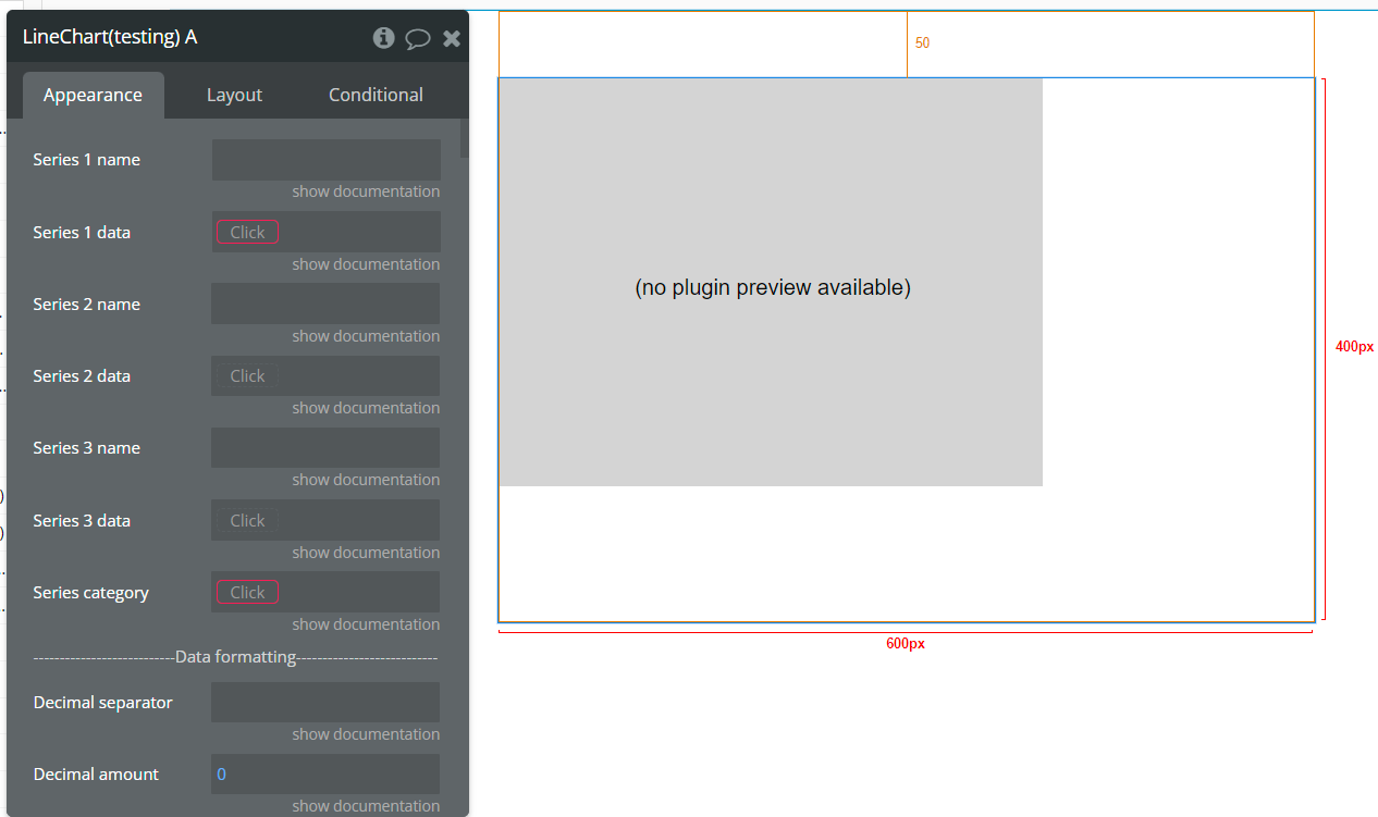
- The minimal settings for the chart are shown below. Was completed in just 3 fields.
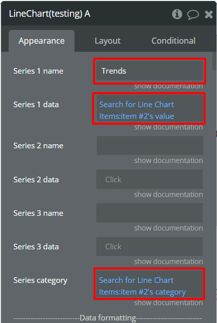
- After the above settings, in the preview, the chart will look like in the image below.
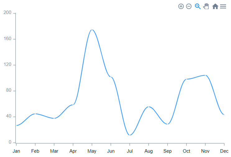
Append more than 3 series from the start
This example represents how to use Append new series action for adding more than 3 series on the chart from the start.
- In the database is created object with the following fields: category, value.
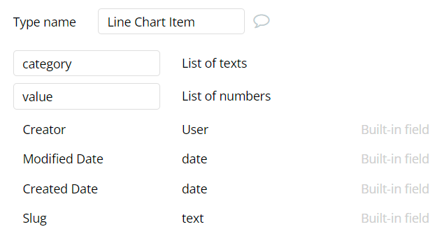
- In the database are added some data.

- On the page is placed a Line Chart element with completed data fields.
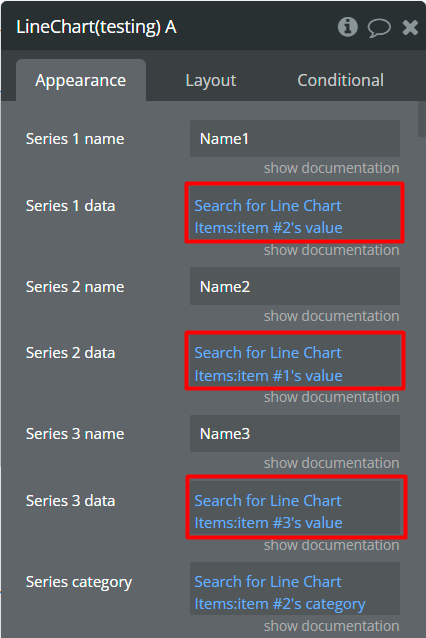
- In the workflow, when Chart is drawn event appears then is called Append new series. This action will add the 4th series on the chart from the start.
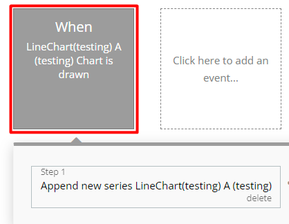
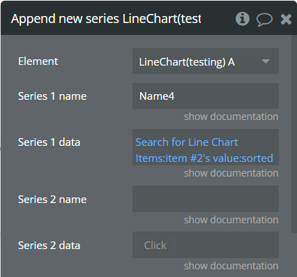
- In the preview, it will look like in the image below.
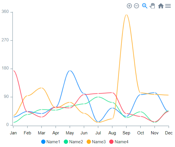
Add annotation
This example represents how to add annotation with one value on the chart.
- On the page is placed a Line Chart element.
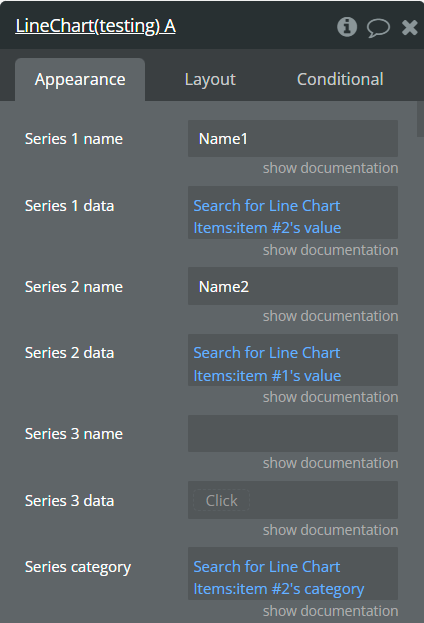
- Also, on the page, is placed a Button element.
- In the workflow, when the Add annotation button is clicked then is called Add X-Axis annotation action.
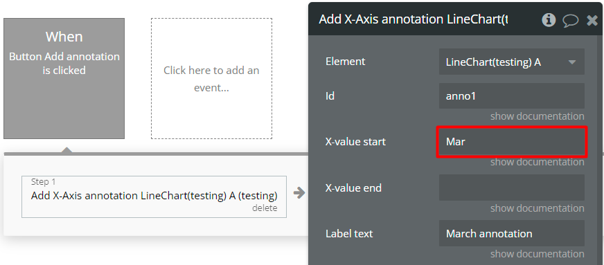
- In the preview, it will look like in the image below.
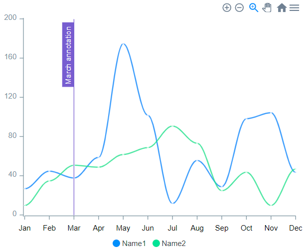

Changelogs
Update 16.10.25 - Version 2.33.0
- Bubble Plugin Page Update (Name).
Update 02.07.25 - Version 2.32.0
- Bubble Plugin Page Update (Logo).
Update 10.06.25 - Version 2.31.0
- Marketing update (minor change).
Update 18.11.24 - Version 2.30.0
- Minor update(Marketing update).
Update 06.11.24 - Version 2.29.0
- Minor update (Marketing update).
Update 05.11.24 - Version 2.28.0
- Added new fields for "Line Chart" & "Area Chart".
- Syncing ID
- Reset hover state on mouse leave
- Summed data labels on stacked chart.
Update 21.10.24 - Version 2.27.0
- Minor update (Marketing update).
Update 15.09.24 - Version 2.26.0
- Minor update (Marketing update).
Update 09.09.24 - Version 2.25.0
- Minor update (Marketing update).
Update 21.08.24 - Version 2.24.0
- Added new fields for "Line Chart" & "Area Chart".
- Gradient opacity from [Area]
- Gradient opacity to [Area]
- Fill area to [Area]
- Y-axis border size [Line, Area]
- 2nd Y-axis border size [Line, Area]
Update 19.07.24 - Version 2.23.0
- Minor update.
Update 06.06.24 - Version 2.22.0
- Minor update.
Update 31.05.24 - Version 2.21.0
- Updated demo/service links.
Update 20.04.24 - Version 2.20.0
- Fixed Y-axis label formatting.
Update 10.04.24 - Version 2.19.0
- Changed method of library import.
Update 09.03.24 - Version 2.18.0
- Fixed issue with different sizes of data and categories & console warning..
Update 15.12.23 - Version 2.17.0
- Fixed zero-value optional fields.
Update 07.12.23 - Version 2.16.0
- Added "Range" section for Bar Chart.
Update 23.10.23 - Version 2.15.0
- Replace null and undefined values with 0.
Update 19.10.23 - Version 2.14.0
- Updated description.
Update 05.10.23 - Version 2.13.0
- Minor fixes.
Update 18.09.23 - Version 2.12.0
- updated description.
Update 13.09.23 - Version 2.11.0
- minor updates.
Update 11.09.23 - Version 2.10.0
- Added support for "dynamic value" in Color type fields..
Update 29.07.23 - Version 2.9.0
- Minor updates.
Update 27.07.23 - Version 2.8.0
- Switched to Free.
Update 25.07.23 - Version 2.7.0
- updated logo.
Update 18.07.23 - Version 2.6.0
- Switched the plugin from paid to free.
Update 12.07.23 - Version 2.5.0
- updated description.
Update 05.07.23 - Version 2.4.0
- Minor updates.
Update 05.07.23 - Version 2.3.0
- updated the picture.
Update 05.07.23 - Version 2.2.0
- edited description.
Update 18.08.17 - Version 2.1.0
- Help updated.
Update 18.08.17 - Version 2.0.0
- changed over date format to YYYY MM DD.
Update 18.07.17 - Version 1.1.5
- minor coding change.
Update 18.07.17 - Version 1.1.4
- minor coding change.
Update 18.07.17 - Version 1.1.3
- another date change.
Update 18.07.17 - Version 1.1.2
- Changed date format.
Update 17.07.17 - Version 1.1.1
- Logo changed.
Update 14.07.17 - Version 1.1.0
- updated description and support.
Update 14.07.17 - Version 1.0.0
- amCharts public v0.1.
