Link to the plugin page: https://zeroqode.com/plugin/air-emoji-button-plugin-for-bubble-1656580711674x655238764270266000
Demo to preview the plugin:
Introduction
Enhance your Bubble app messaging UI with a no-code plugin that adds emojis and allows extensive customization. Just link this one-element plugin to any Bubble element using its ID.
Furthermore, it offers various settings such as themes, emoji position, search, skin tones feature, shows recent emoji, auto-hide, enabling and disabling emoji categories, emoji size, and more.

How to setup
- Enable ID Attributes
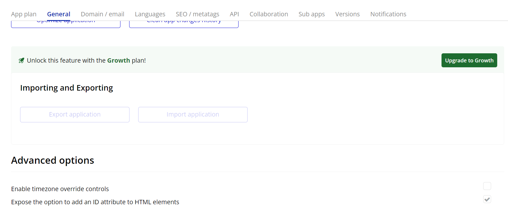
Go to the settings page in your editor. Under the General tab click on the checkbox “Expose the option to add an ID attribute to HTML elements”
- Add the AirEmojiButton Element to the Page:
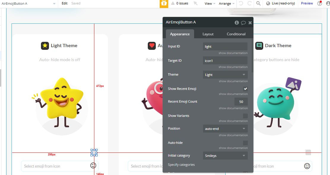
- Configure the following fields:
- Input ID: Enter the ID of the input where the selected emoji will appear.
- Target ID: Enter the ID assigned to the element that will trigger the emoji popup when clicked.
- Customize the element according to your preferences (e.g., theme, position, etc.).
- Add a Workflow to Show the Emoji Popup
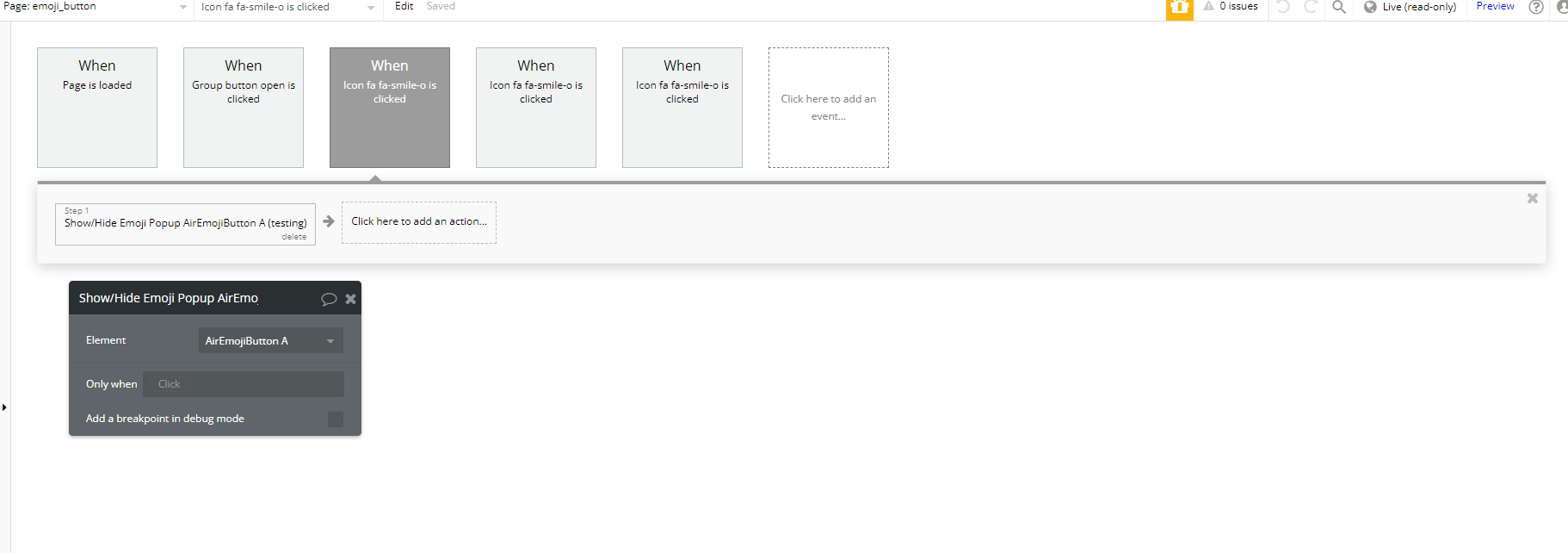
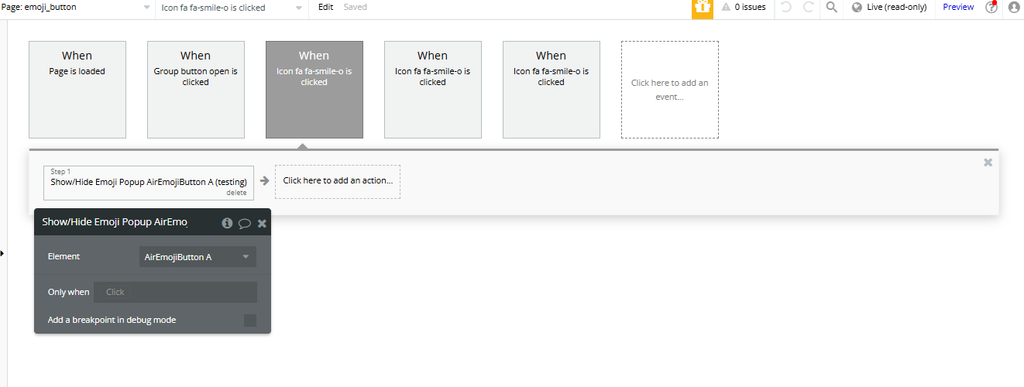
- In the workflow editor, create a workflow for the element that will trigger the emoji popup.
- Add the action "Show/Hide Emoji Popup A Air Emoji Button"
Plugin Element Properties
Air Emoji Button
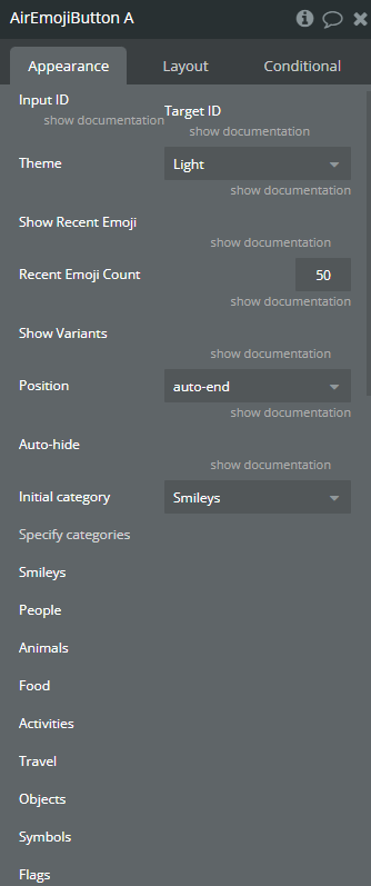
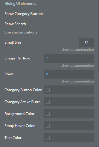
Fields:
Title | Description | Type |
Input ID | Input ID where to put selected emoji | Text (optional) |
Target ID | ID of target element. Emoji Button will be displayed | Text |
Theme | Like many operating systems, Emoji Button supports both a light and a dark theme. An automatic theme is also available, which will use the appropriate theme depending on the operating system’s current setting. Available options: Dark, Light, Auto | Dropdown |
Show Recent Emoji | Emoji Button will remember the most recently used emojis. | Checkbox (yes/no) |
Recent Emoji Count | By default, the 50 most recent emojis are saved. | Number |
Show Variants | Some emojis have skin tone variants. When an emoji is selected in the picker that has variants, a variant popup will appear so the user can select the desired variant. | Checkbox (yes/no) |
Position | The picker accepts a position option specifying where the picker should be positioned, relative to the reference element. Available options: auto, auto-start, auto-end, top, top-start, top-end, bottom, bottom-start, bottom-end, right, right-start, right-end, left, left-start, left-end | Dropdown |
Auto-hide | By default, the picker is hidden when an emoji is selected. | Checkbox (yes/no) |
Initial category | Available options: Smileys, People, Animals, Food, Activities, Travel, Objects, Symbols, Flags | Dropdown |
Specify categories | ||
Smileys | Displays smiley and expression emojis. | Checkbox (yes/no) |
People | Displays people emojis, including human figures and gestures. | Checkbox (yes/no) |
Animals | Displays animal emojis. | Checkbox (yes/no) |
Food | Displays food emojis. | Checkbox (yes/no) |
Activities | Displays emojis related to activities like sports and leisure. | Checkbox (yes/no) |
Travel | Displays emojis related to travel and transportation. | Checkbox (yes/no) |
Objects | Displays object emojis. | Checkbox (yes/no) |
Symbols | Displays emoji symbols and icons. | Checkbox (yes/no) |
Flags | Displays country and regional flag emojis. | Checkbox (yes/no) |
Hiding UI elements | ||
Show Category Buttons | Displays buttons for emoji categories. | Checkbox (yes/no) |
Show Search | Displays the search option in the emoji picker. | Checkbox (yes/no) |
Size customizations | ||
Emoji Size | Size of emoji icon in px | Number (optional) |
Emojis Per Row | Number of emojis per row | Number |
Rows | Number of visible rows | Number |
Category Button Color | The color of the category button for emojis. | Color (optional) |
Category Active Button Color | The color of the active category button for emojis. | Color (optional) |
Background Color | The background color of the emoji picker. | Color (optional) |
Emoji Hover Color | The color of the emoji when the cursor hovers over it. | Color (optional) |
Text Color | The color of the text displayed in the emoji picker. | Color (optional) |
Element Actions
- Show/Hide Emoji Popup - Toggles the visibility of the emoji picker. Use this action to show or hide the emoji selection popup when needed.
- Reset selected emoji - Clears the currently selected emoji. This action resets the input to its default state without any selected emoji.

Exposed states
Title | Description | Type |
Selected emoji | Displays the emoji that was selected. | Text |
Element Events
Title | Description |
Emoji selected | Triggered when an emoji is selected from the emoji picker. |

