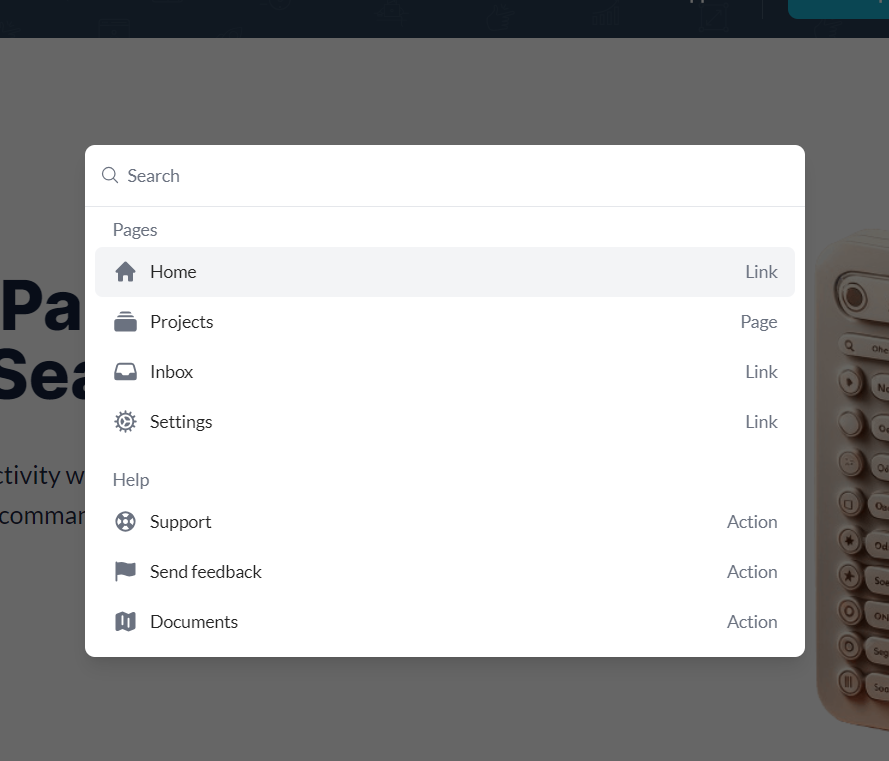
Demo to preview the settings
Introduction
This plugin turns a JSON structure into a command palette. Trigger workflows directly from the command palette and enable custom shortcuts for your users.

How to setup
- Put element Command Palette on the page.
- Setup the Command Palette:
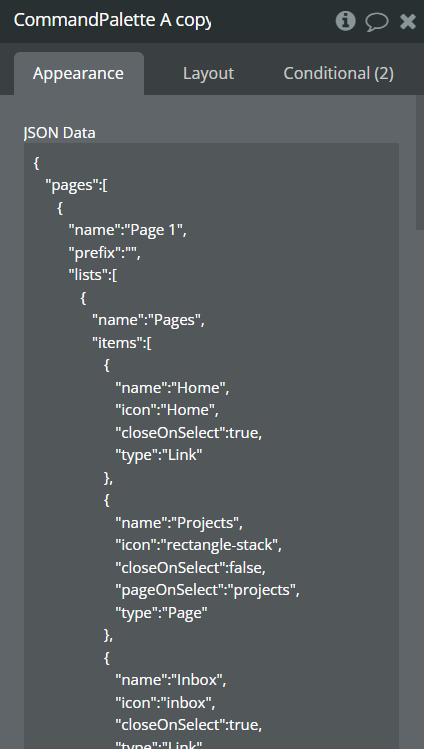
- Provide JSON structure:
json{ "pages": [ { "name": "Page 1", "prefix": "", "lists": [ { "name": "Pages", "items": [ { "name": "Home", "icon": "Home", "closeOnSelect": true, "type": "Link" }, { "name": "Projects", "icon": "rectangle-stack", "closeOnSelect": false, "pageOnSelect": "projects", "type": "Page" }, { "name": "Inbox", "icon": "inbox", "closeOnSelect": true, "type": "Link" }, { "name": "Settings", "icon": "cog", "closeOnSelect": true, "type": "Link" } ] }, { "name": "Help", "items": [ { "name": "Support", "icon": "lifebuoy", "closeOnSelect": true, "type": "Action" }, { "name": "Send feedback", "icon": "flag", "closeOnSelect": true, "type": "Action" }, { "name": "Documents", "icon": "map", "closeOnSelect": true, "type": "Action" } ] } ] }, { "name": "Projects", "prefix": "Projects", "lists": [ { "name": "Projects", "items": [ { "name": "Hobby Project", "icon": "cube", "closeOnSelect": true, "type": "Action" }, { "name": "My first project", "icon": "cube", "closeOnSelect": true, "type": "Action" }] } ] } ] }
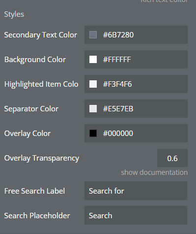
- Style the Command Palette
- Run preview, when page is loaded Launch Command Palette by pressing ⌘ + K or Alt + K.
- To make your own JSON structure you can use Builder on the demo page.
Plugin Element Properties
**Title ** | Description | Type |
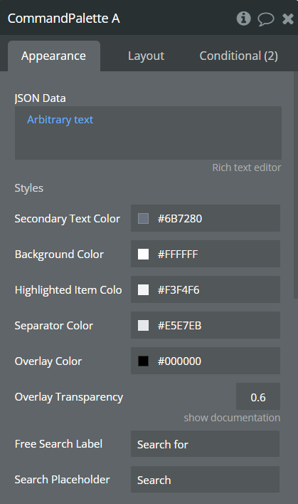
JSON Data | Palette JSON structure | String |
Styles | ||
Secondary Text Color | Text color. | Color |
Background Color | Background color of the Command Palette. | Color |
Highlighted Item Color | Background color on hover item. | Color |
Separator Color | Color of the line between search field and menu. | Color |
Overlay Color | Color of the overlay. | Color |
Overlay Transparency | Transparency for the overlay. | Number |
Free Search Label | Text appears on the left of the suggestion list, when user started typing in the search field. | String |
Search Placeholder | Text for place holder for the search field. | String |
Element Actions
- Open - Trigger to open command palette.
- Close - Trigger to close command palette.
Exposed states
Name | Type |
Last Executed Command Name | Text |
Is Open | Boolean (yes/no) |
Executed Command Type | Text |
Executed Command Argument | Text |
Current JSON Config | Text |
Element Events
Name | Description |
Command is Executed | Triggered when user executed command. |
Is Opened | Triggered when the Command Palette is opened. |
Is Closed | Triggered when the Command Palette is closed. |