Plugin Information
Link to the plugin page: https://zeroqode.com/plugin/add-dynamic-tags-plugin-for-bubble-1688382653799x814669328501512300
Demo to preview the plugin:
Introduction
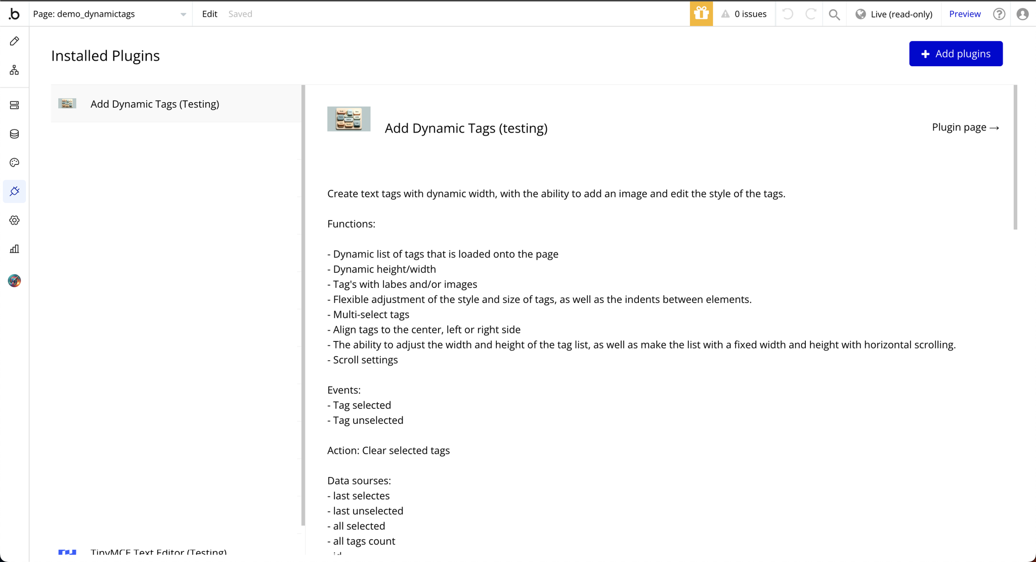
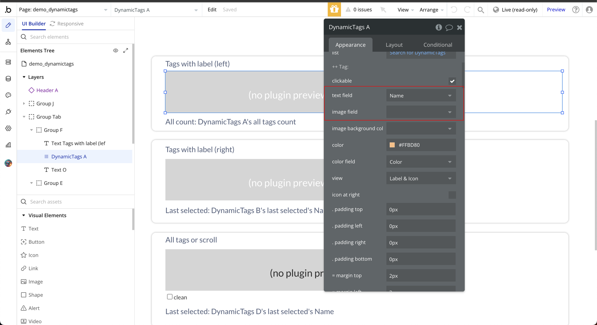
The Add Dynamic Tags plugin is a versatile no-code tool designed to create text tags with dynamically adjustable widths. It provides a seamless way to enhance content presentation with fully customizable styles, images, and interactivity.
See Key Features:
Prerequisites
To use the Add Dynamic Tags Plugin for Bubble by Zeroqode, ensure the following:
- You must have an active Bubble account.
- The plugin should be installed from the Zeroqode Plugin Marketplace or added directly from the plugin page.

How to setup
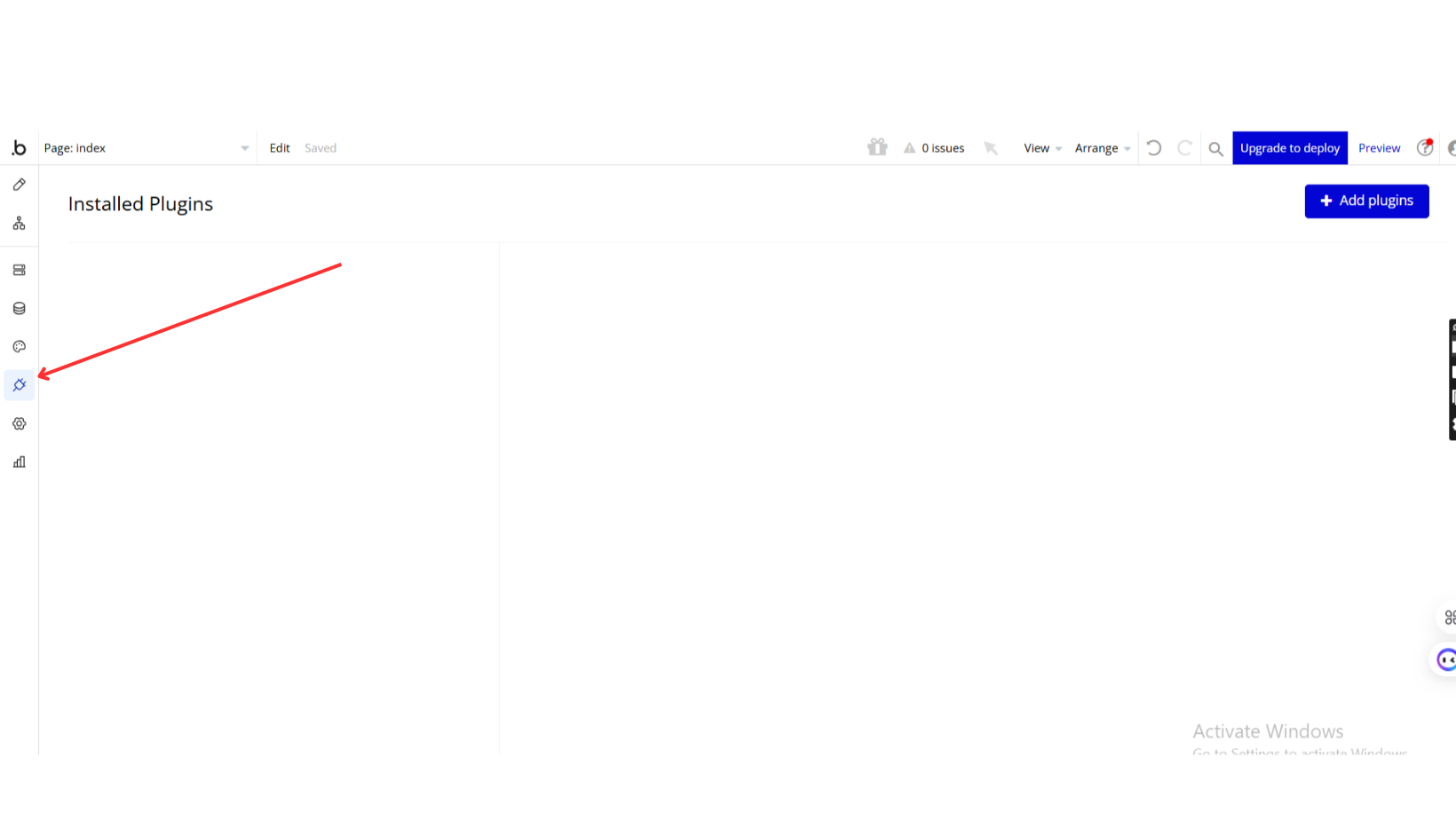
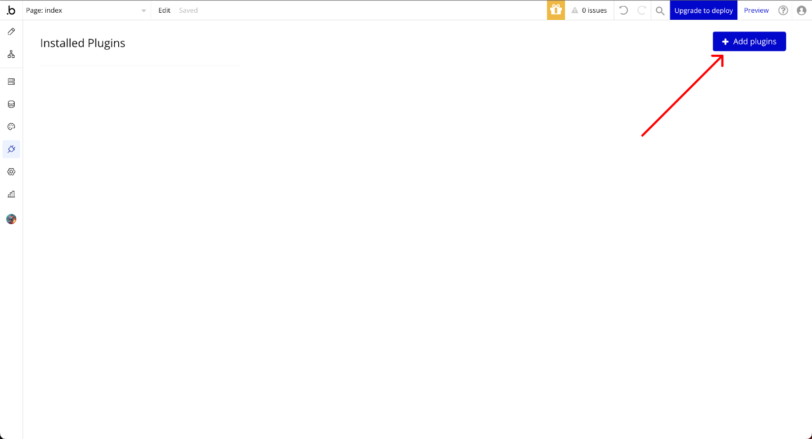
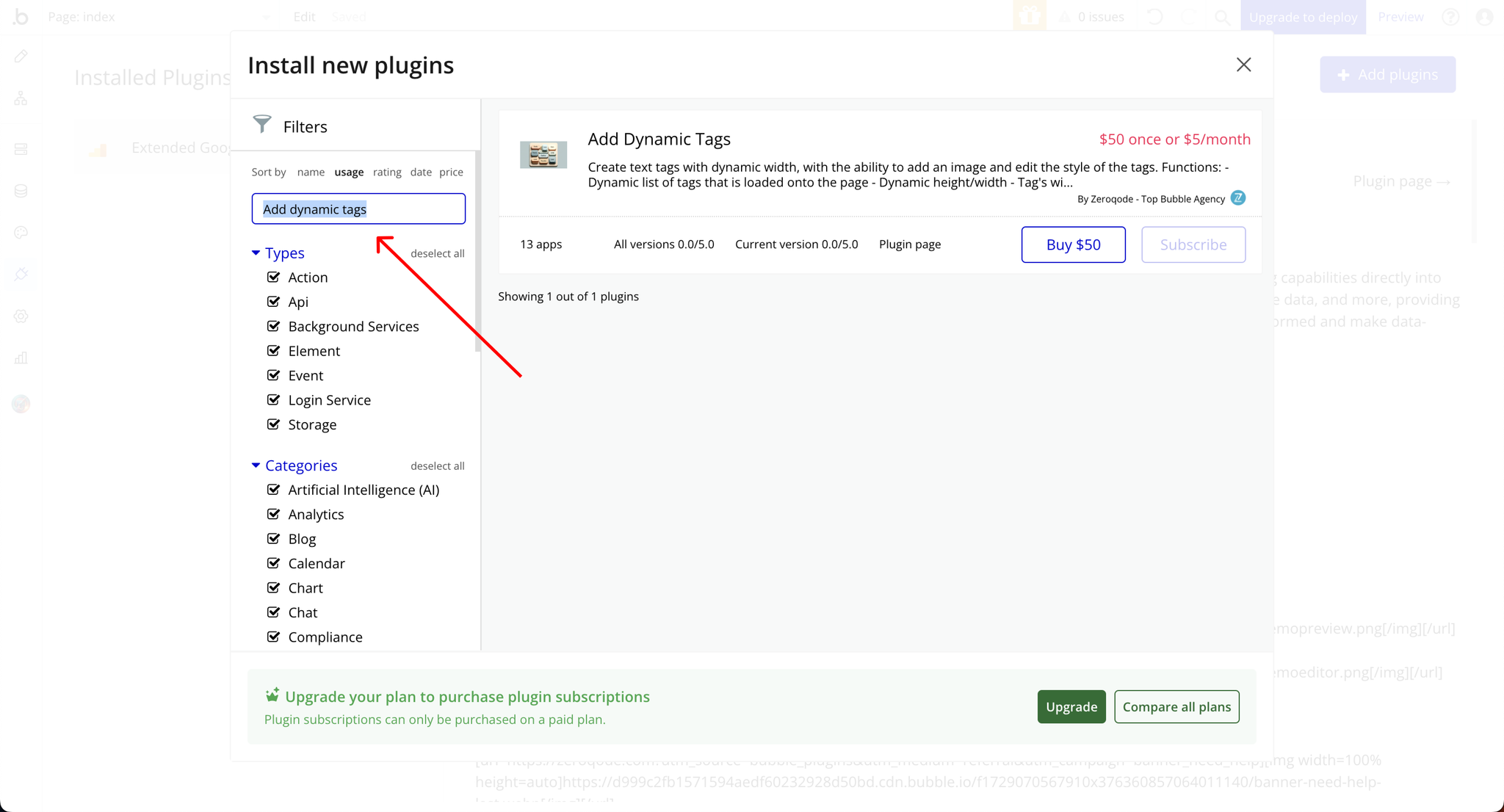
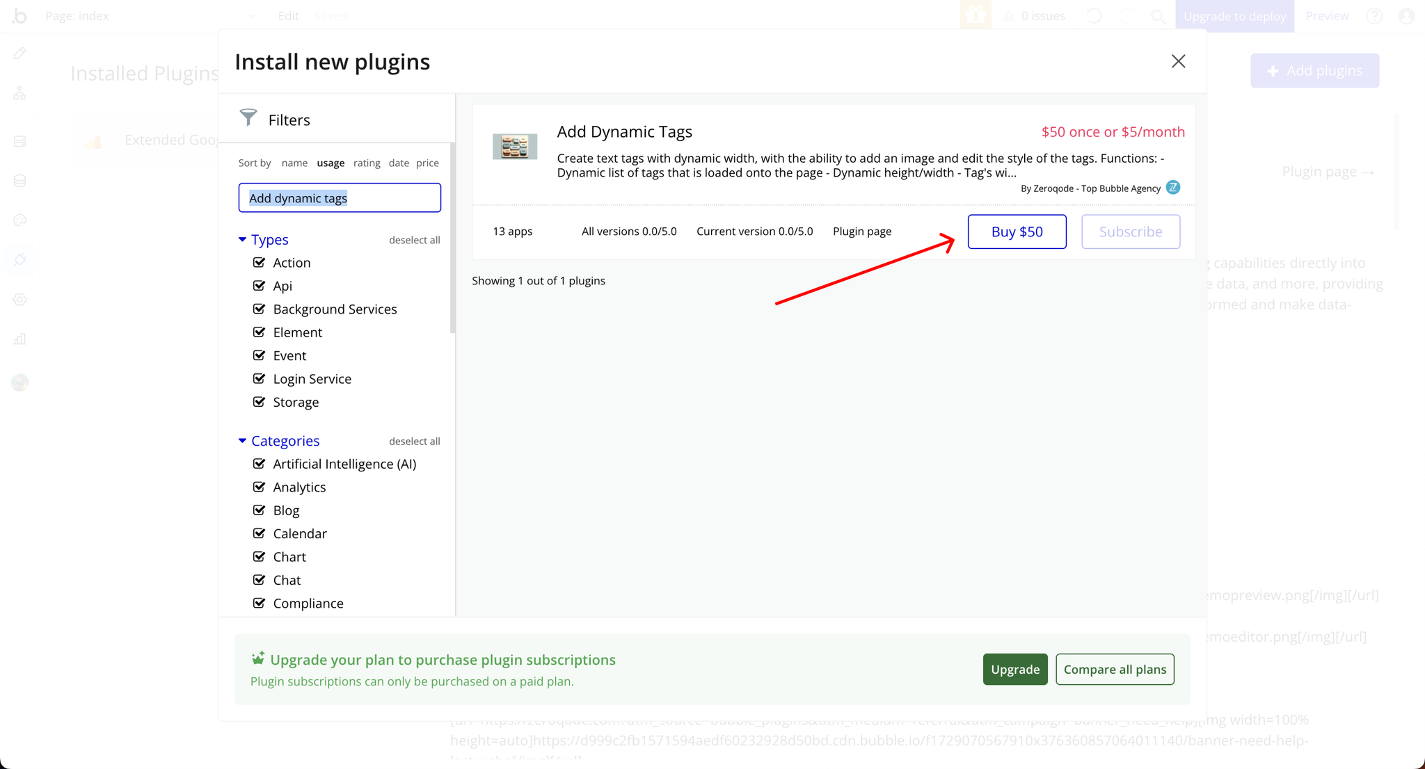
Step 1: Install the Plugin
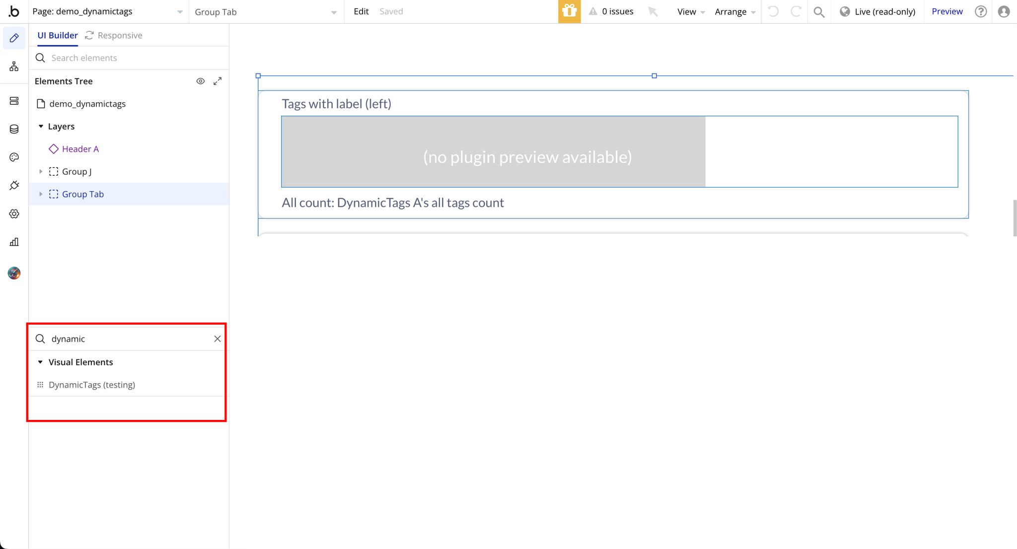
Step 2: Add Plugin Element to Page
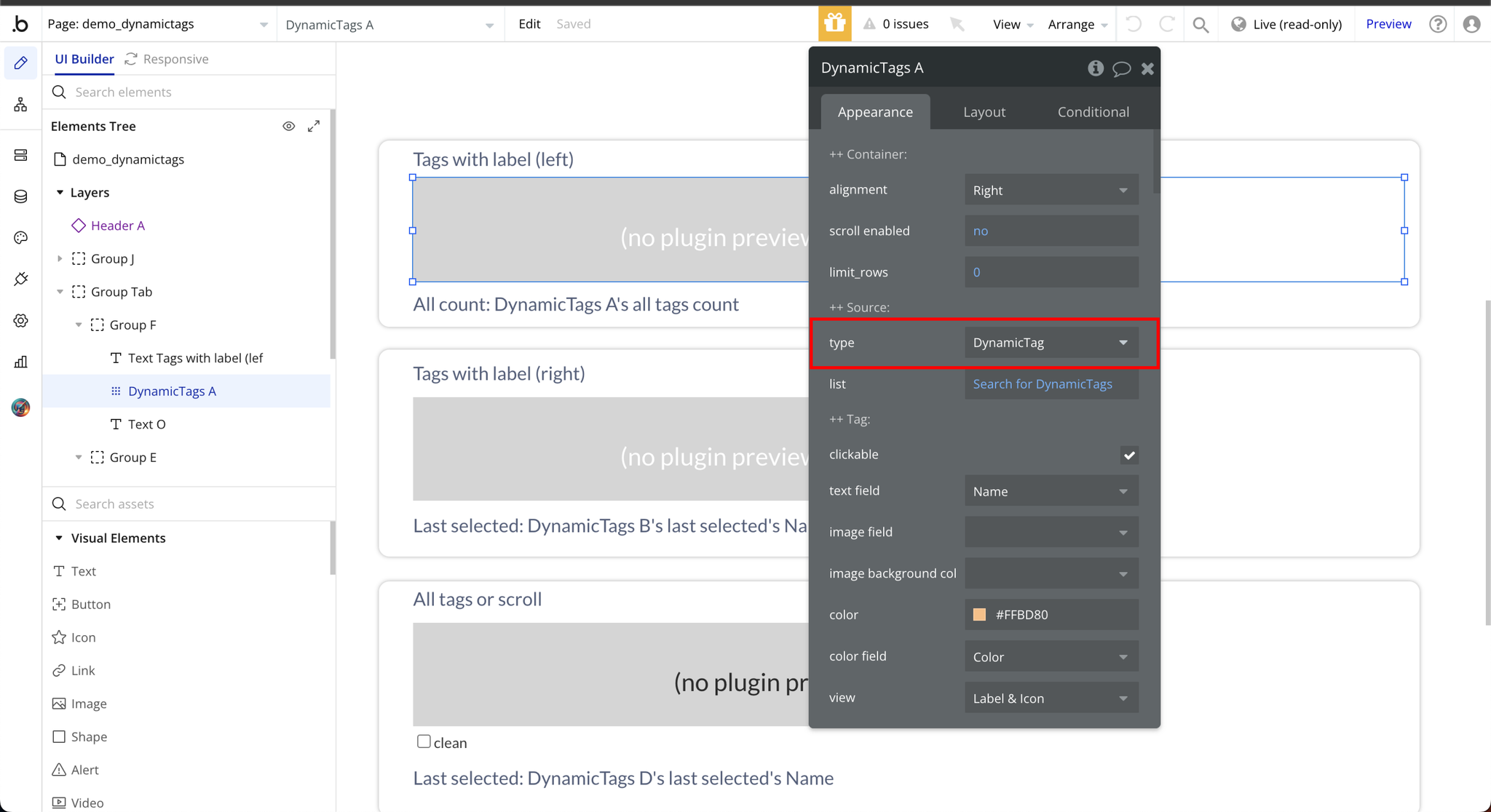
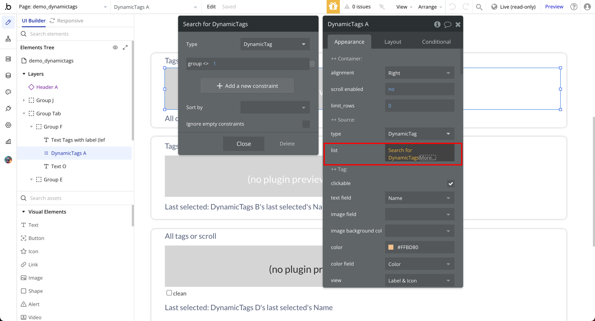
Step 3: Select Data Type to Display List and List Source
Plugin Element Properties
DynamicTags
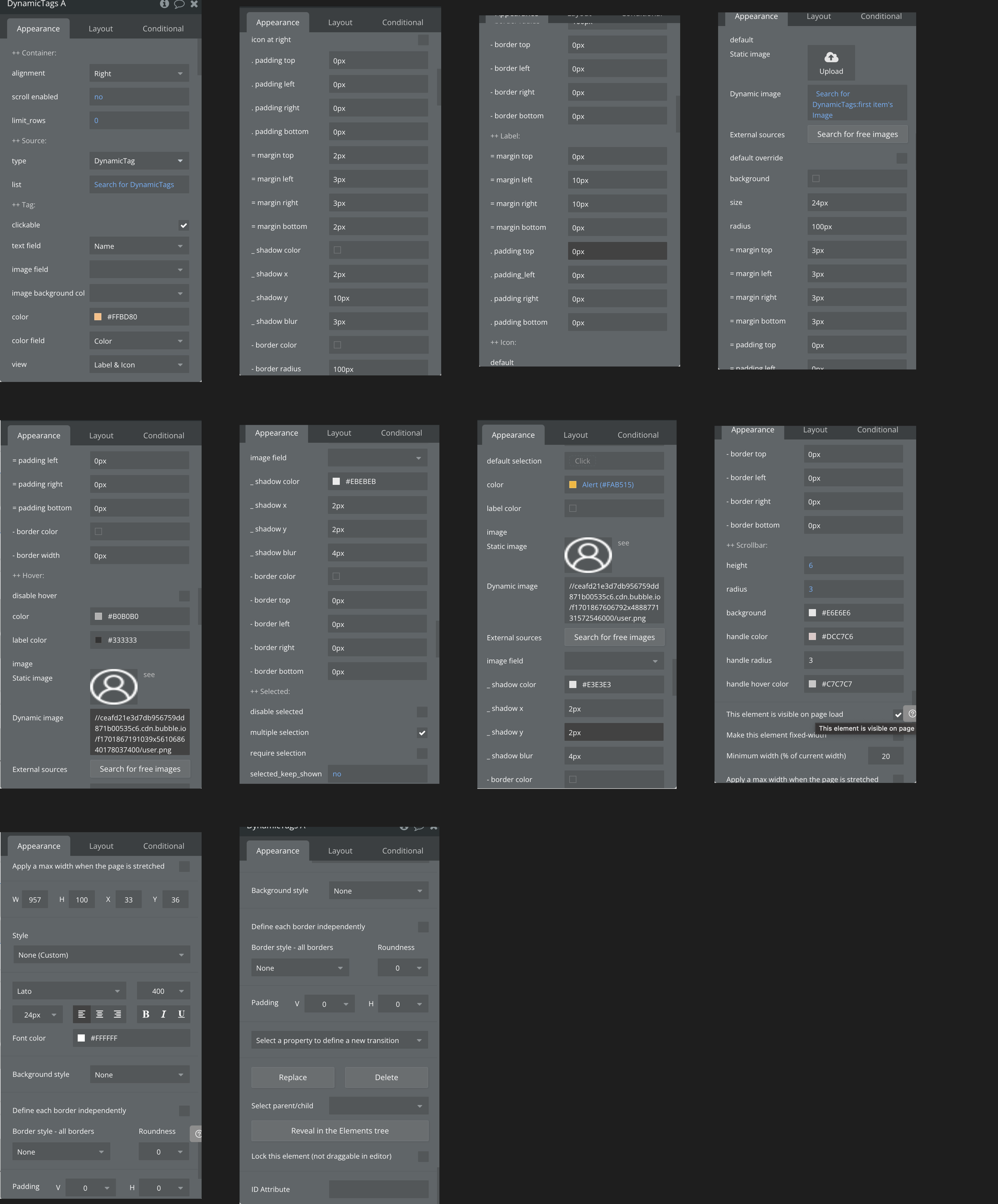
Fields:
Title | Description | Type |
++ Container: | ||
Alignment | Available options: Left, Right, Center | Dropdown |
Scroll enabled | Horizontal scrolling (left to right) | Checkbox (yes/no) |
Limit_rows | Select a fixed number of roles that should display | Number |
++ Source: | ||
Type | Available datatypes in the database | App Type |
List | Search for items in the datatype selected from type | Item representing type |
++ Tag: | ||
Clickable | Allows the tags to be clickable | Checkbox (yes/no) |
Text field | Allows tag name to be visible | Filed of type, represent Text, image or file (optional) |
Image field | Allows tag image to be visible: Fill in description | Filed of type, represent Text, image or file (optional) |
Image background color field | Apply background color to the image | Filed of type, represent Text, image or file (optional) |
Color | Choose a color for your tags | Color (optional) |
Color field | In the field color should be selected from the available options | Filed of type, represent Text, image or file (optional) |
View | Available options: Label & Icon, Label Only, Icon Only | Dropdown |
Icon at right | Check this to display icons on tags by the right side | Checkbox (yes/no) |
. padding top | Adds internal space between the top of the element and its content | Px |
. padding left | Adds internal space between the left side of the element and its content | Px |
. padding right | Adds internal space between the right side of the element and its content | Px |
. padding bottom | Adds internal space between the bottom of the element and its content | Px |
= margin top | Adds external spacing between the top of an element and the element above it | Px |
= margin left | Adds external spacing between the left of an element and the element beside it | Px |
= margin right | Adds external spacing between the right of an element and the element beside it | Px |
= margin bottom | Adds external spacing between the bottom of an element and the element below it | Px |
_ shadow color | Adds background shadow to the tags | Color (optional) |
_ shadow x | Horizontal placement of a shadow relative to the object | Px |
_ shadow y | Vertical placement of a shadow relative to the object | Px |
_ shadow blur | Controls the softness or sharpness of a shadow's edges | Px |
- border color | Color of tags border | Color (optional) |
- border radius | Roundness of the corners of tags | Px |
- border top | Border applied to the top of an element | Px |
- border left | Border applied to the left edge of an element | Px |
- border right | Border applied to the right edge of an element | Px |
- border bottom | Border applied to the bottom of an element | Px |
++ Label: | ||
= margin top | Adds external spacing between the top of an element and the element above it | Px |
= margin left | Adds external spacing between the left of an element and the element above it | Px |
= margin right | Adds external spacing between the right of an element and the element above it | Px |
= margin bottom | Adds external spacing between the bottom of an element and the element above it | Px |
. padding top | Adds internal space between the top of the element and its content | Px |
. padding_left | Adds internal space between the left of the element and its content | Px |
. padding right | Adds internal space between the right of the element and its content | Px |
. padding bottom | Adds internal space between the bottom of the element and its content | Px |
++ Icon: | ||
Default | Static Image: An image element that displays a fixed | Image (optional) |
Default override | Replace the plugin's default settings or behavior with custom configurations for specific use cases | Checkbox (yes/no) |
Background | Icon background | Color (optional) |
Size | Dimensions of the icon | Px |
Radius | Border-radius applied to the icon, which rounds the corners or edges of the icon's container | Px |
= margin top | External space added above the icon | Px |
= margin left | External space added on the left side of the icon | Px |
= margin right | External space added on the right side of the icon | Px |
= margin bottom | External space added below the icon | Px |
= padding top | Internal space added above the icon | Px |
= padding left | internal space added on the left side of the icon | Px |
= padding right | Internal space added on the right side of the icon | Px |
= padding bottom | Internal space added below the icon | Px |
- border color | The color applied to the border around the icon | Color (optional) |
- border width | The horizontal measurement of the icon's size | Px |
++ Hover: | ||
Disable hover | Preventing hover effects from being applied to an element when the user moves their cursor over only when checked | Checkbox (yes/no) |
Color | Change in color applied to an element when a user hovers their cursor over it | Color (optional) |
Label color | The color applied to the label that identifies an element | Color (optional) |
Image | Images applied to the label | Image (optional) |
Image field | Feld used to upload, store, and display images | Filed of type, represent Text, image or file (optional) |
_ shadow color | Adds background shadow to the tags | Color (optional) |
_ shadow x | Horizontal placement of a shadow relative to the object | Px |
_ shadow y | Vertical placement of a shadow relative to the object | Px |
_ shadow blur | Controls the softness or sharpness of a shadow's edges | Px |
- border color | Color of tags border | Color (optional) |
- border top | Border applied to the top of an element | Px |
- border left | Border applied to the left edge of an element | Px |
- border right | Border applied to the right edge of an element | Px |
- border bottom | Border applied to the bottom of an element | Px |
++ Selected: | ||
Disable selected | Preventing hover effects from being applied to an element when the user moves their cursor over only when checked | Checkbox (yes/no) |
Multiple selection | Preventing selecting more than one when checked description | Checkbox (yes/no) |
Require selection | When checked a tag must be selected | Checkbox (yes/no) |
Selected_keep_shown | When checked a selected will keep showing | Checkbox (yes/no) |
Default selection | Preassigned selected value | Item reperesenting type (optional) |
Color | Color of selected tag | Color |
Label color | Color of label (text) of tag | Color (optional) |
Image | TODO: Fill in description | Image (optional) |
Image field | TODO: Fill in description | Filed of type, represent Text, image or file (optional) |
_ shadow color | Adds background shadow to the tags | Color (optional) |
_ shadow x | Horizontal placement of a shadow relative to the object | Px |
_ shadow y | Vertical placement of a shadow relative to the object | Px |
_ shadow blur | Controls the softness or sharpness of a shadow's edges | Px |
- border color | Color of tags border | Color (optional) |
- border top | Border applied to the top of an element | Px |
- border left | Border applied to the left edge of an element | Px |
- border right | Border applied to the right edge of an element | Px |
- border bottom | Border applied to the bottom of an element | Px |
++ Scrollbar: | ||
Height | The vertical size of the scrollbar's horizontal track | Number |
Radius | The degree of rounding applied to the corners of a scrollbar's track | Number |
Background | The color or design applied to the track of a scrollbar | Color |
Handle color | The movable part of the scrollbar that users drag to scroll through content | Color |
Handle radius | The degree of rounding applied to the edges of the scrollbar thumb (handle) | Number |
Handle hover color | The color change applied to the scrollbar thumb (handle) when a user hovers over it with the cursor | Color |
Element Actions
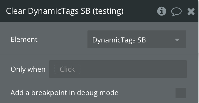
Clear DynamicTags
Exposed states
Title | Description | Type |
Last selected | The most recently selected tag by the user. | Text |
Last unselected | The most recently deselected tag by the user. | Text |
All selected | A list of all currently selected tags. | Text |
All tags count | The total number of tags available in the tag list. | Number |
Id | A unique identifier for the tag or tag list element, useful for tracking or referencing specific items. | Text |
Element Events
Title | Description |
tag selected | Trigger an event when a user selects a tag, allowing you to capture and respond to their choice dynamically |
tag unselected | Trigger an event when a user deselects a tag, enabling responsive updates to your page or system |


