Name | Description | Type |
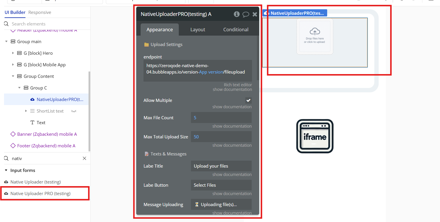
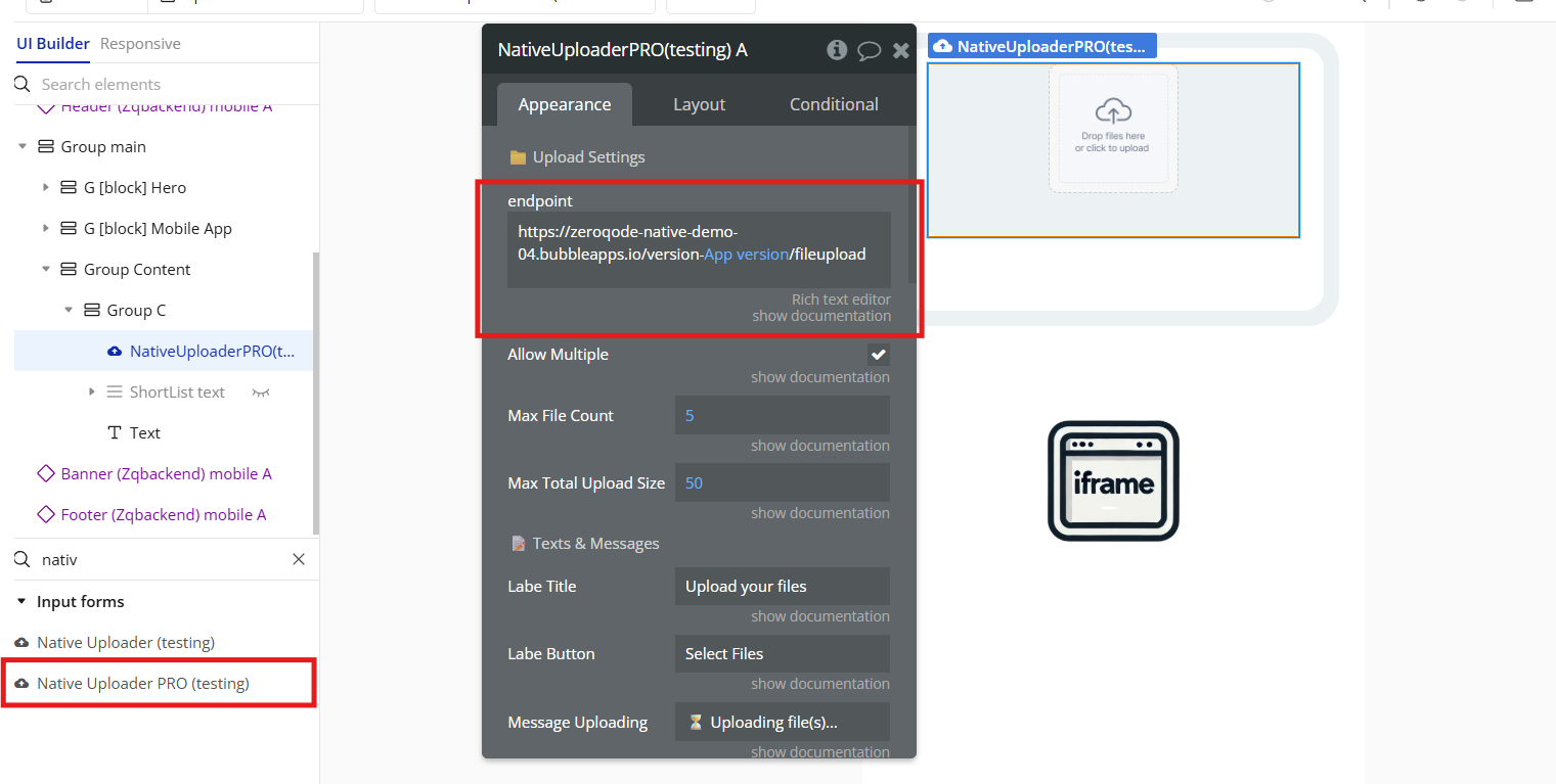
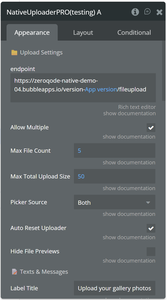
endpoint | | Text |
Allow Multiple | Lets the user select several files at once. Ignored when Max File Count is 1. | yes/no |
Max File Count | Maximum number of files per selection. Leave empty or 0 for no limit. | Number |
Max Total Upload Size MB | Maximum total size of all files in one selection, in MB. If empty, a 50 MB safety limit applies. Each file is also limited to 75 MB because it is processed in the device memory. | Number |
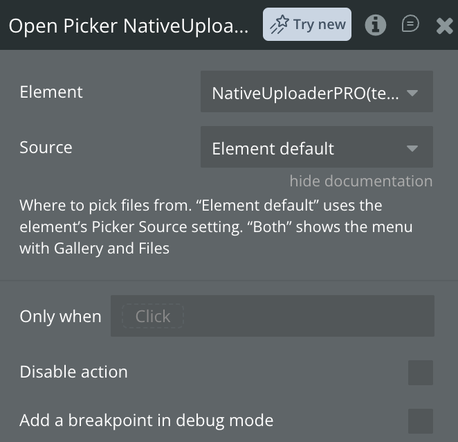
Picker Source | What the upload button opens: “Both” shows a menu with Gallery and Files, “Gallery” opens the photo library, “File Manager” opens the document picker. The Open Picker action can override it. | Text |
Auto Reset Uploader | When enabled, the uploader will automatically clear all internal data (images, status messages, progress bar) 2 seconds after a successful upload. This returns the element to its initial "Select files" state. | yes/no |
Hide File Previews | When enabled, the element will not display the built-in list of thumbnails or file names below the upload button. The upload process, progress bar, and status messages will still be visible. | yes/no |
Label Title | Text shown above the upload button. Leave empty to hide it. | Text |
Label Button | Text on the upload button (used when Button Content Mode is text or icon_text). | Text |
Message Uploading | Message shown during uploading. Use the '{count}' text key to display the count of files being uploaded. | Text |
Message Success | Message shown on successful upload. | Text |
Message Error | Message shown when the upload fails or access to the gallery is denied. | Text |
Message Cancelled | Message shown when the user closes the picker without selecting files. | Text |
Message Empty | Message shown when no files were selected. | Text |
Message Limit Exceeded | Message shown when max file count is exceeded. Use the '{maxCount}' text key to display the max count of files allowed. | Text |
Message Size Exceeded | Message shown when max total size is exceeded. Use the '{totalSize}' text key to display the total size of files being uploaded. Use the '{maxTotalSize}' text key to display max total size allowed. | Text |
Button Content Mode | Defines the content mode for the button's display. | Text |
Button Icon PNG&JPEG | Image shown on the button when Button Content Mode is icon or icon_text. | Image |
Icon Size Width | Width of the button icon, in pixels. | Number |
Icon Size Height | Height of the button icon, in pixels. | Number |
Button Background Color | Hex value of button background color (e.g. #1AAFD0). | Text |
Button Border Radius | Radius of the button’s corners (e.g. 8). | Number |
Button Text Bold | Specifies whether the button text should be bold. | yes/no |
Button Text Color | Hex value of button text color (e.g. #FFFFFF). | Text |
Button Font Size | Font size of the button label text (e.g. 24). | Number |
Button Text Italic | Specifies whether the button text should be italic. | yes/no |
Button Text Underline | Specifies whether the button text should be underlined. | yes/no |
Show Notifications | Controls the visibility of notifications. | yes/no |
Status Bg Color Info | Sets the background color for informational status messages. | Text |
Status Text Color Info | Defines the text color for informational status messages. | Text |
Status Bg Color Success | Sets the background color for successful status messages. | Text |
Status Text Color Success | Defines the text color for successful status messages. | Text |
Status Bg Color Error | Sets the background color for error status messages. | Text |
Status Text Color Error | Defines the text color for error status messages. | Text |
Status Text Size | Controls the font size of the alert text. | Number |
Status Text Weight | Controls the font weight of the alert text. | Text |
Icon Color | Color of the file icon shown in previews for non-image files. | Color |
| 📄 Image Optimization | |
Optimize images | Enable automatic image optimization before upload. When active, images are resized and compressed to reduce file size. | yes/no |
Image max dimension | Maximum width or height in pixels. Images exceeding this value will be proportionally resized down. Has no effect if Optimize Images is disabled. | Number |
Compression quality | Compression quality from 0 to 1 (values from 1 to 100 are also accepted, e.g. 80). Lower values give smaller files. Has no effect on PNG or if Optimize Images is disabled. | Number |
Output format | Output format for optimized images. JPEG: smaller files, best for photos. PNG: lossless, for graphics with transparency (compression quality has no effect). WebP: best compression on Android; on iOS JPEG is used instead. If empty, the original format is kept when possible, otherwise JPEG. Has no effect if Optimize Images is disabled. | Dropdown |
| Progress Bar | |
Show | Shows a built-in bar with the overall upload progress. | yes/no |
Color | Color of the built-in progress bar. | Color |
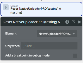
Hide Built-in UI | Hides the title and the upload button and removes the element’s inner padding, so you can use your own design. Open the picker with the “Open Picker” action. File previews, notifications and the progress bar keep their own settings: turn them off for a fully headless element. Keep the element visible on the page (it can be small): if the element is hidden, it is not rendered and cannot open the picker. | Checkbox |