
✅
Link to the plugin page: https://zeroqode.com/plugin/easy-video-player-mp4-plugin-for-bubble-1709591399142x958522151739430900
Demo to preview the plugin:
✅
Introduction
The Easy Video Player #mp4 plugin allows you to embed a smooth, modern, and fully customizable video player inside your Bubble app. It supports local video files as well as streaming links and integrates seamlessly with Bubble workflows through exposed states and custom events.
Built on a reliable third-party video library, this plugin ensures stable playback, modern controls, and full styling flexibility.
Key Features
- Embed a smooth, modern video player.
- Supports:
- Local/downloaded videos (.mp4)
- External hosted video URLs
- Streaming links (YouTube, Vimeo, etc.)
- Triggers custom events:
- Playing
- Paused
- Video Ended
- Exposes powerful custom states:
- Current State
- Is Muted
- Video Duration
- Current Time
- Remaining Time
- Formatted Time
- Fully customizable (colors, controls, styling).
- Seamless integration with Bubble workflows.
Prerequisites
- A Bubble app page where the video player will be placed.
- A valid video source:
- Direct
.mp4file (uploaded or external link), or - Supported streaming link (YouTube, Vimeo, etc.).
- Basic understanding of Bubble workflows (for events and states).
How to setup
Step 1 – Install the Plugin
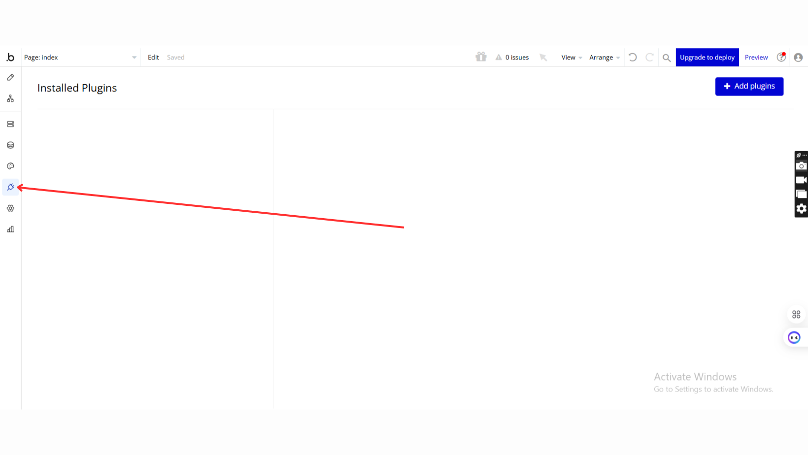
- Go to the Plugin Tab
- Open your Bubble Editor.
- Navigate to the Plugins tab on the left panel.
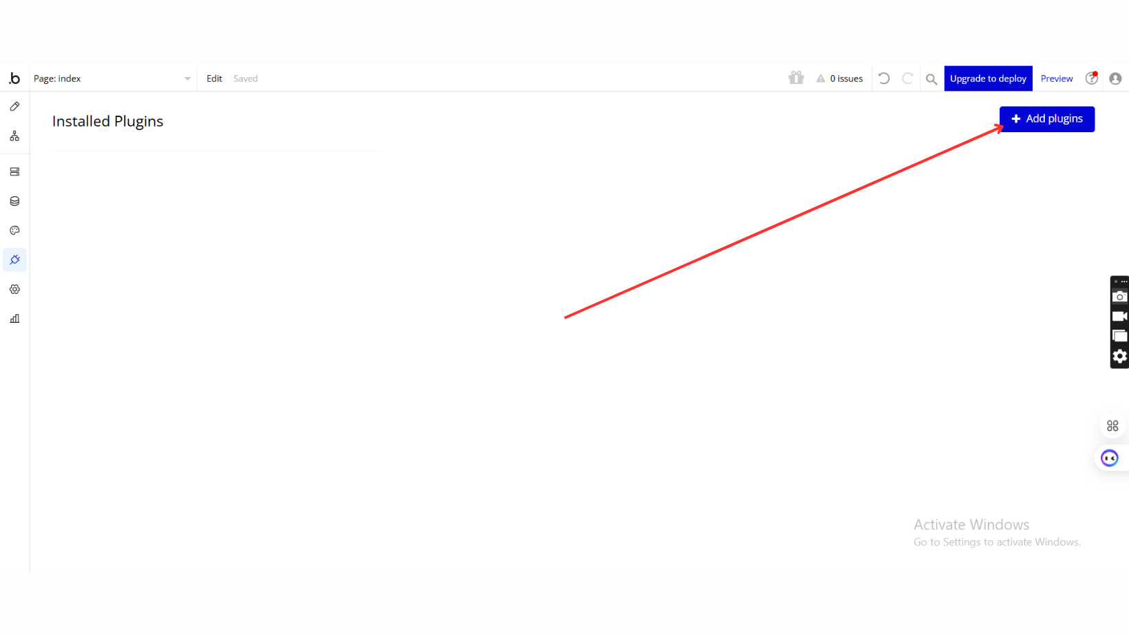
- Add Plugins
- Once in the Plugins tab, click the Add Plugins button.
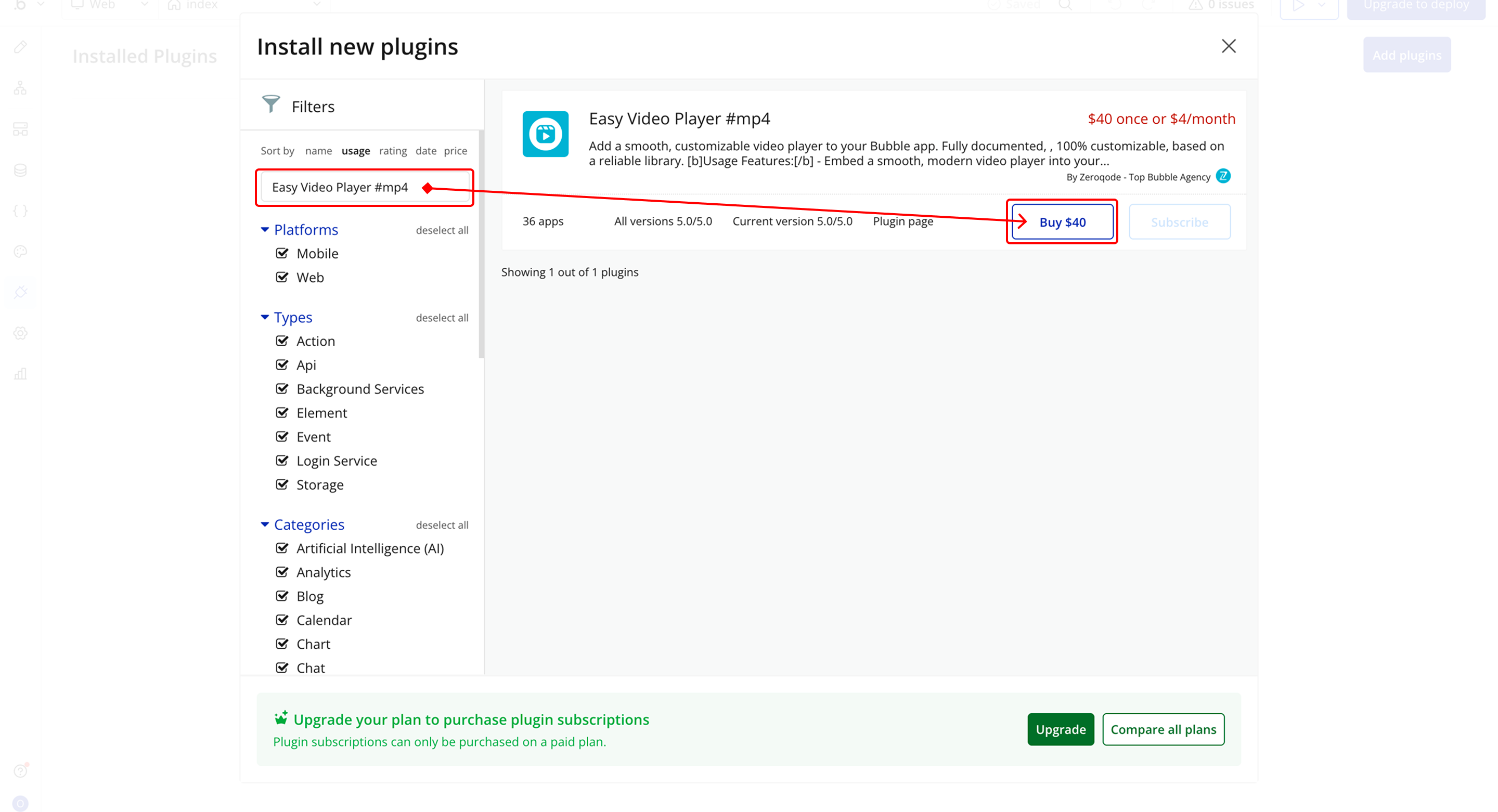
- Search for the Plugin
- Use the search bar to type Easy Video Player #mp4.
- Locate the plugin in the search results.
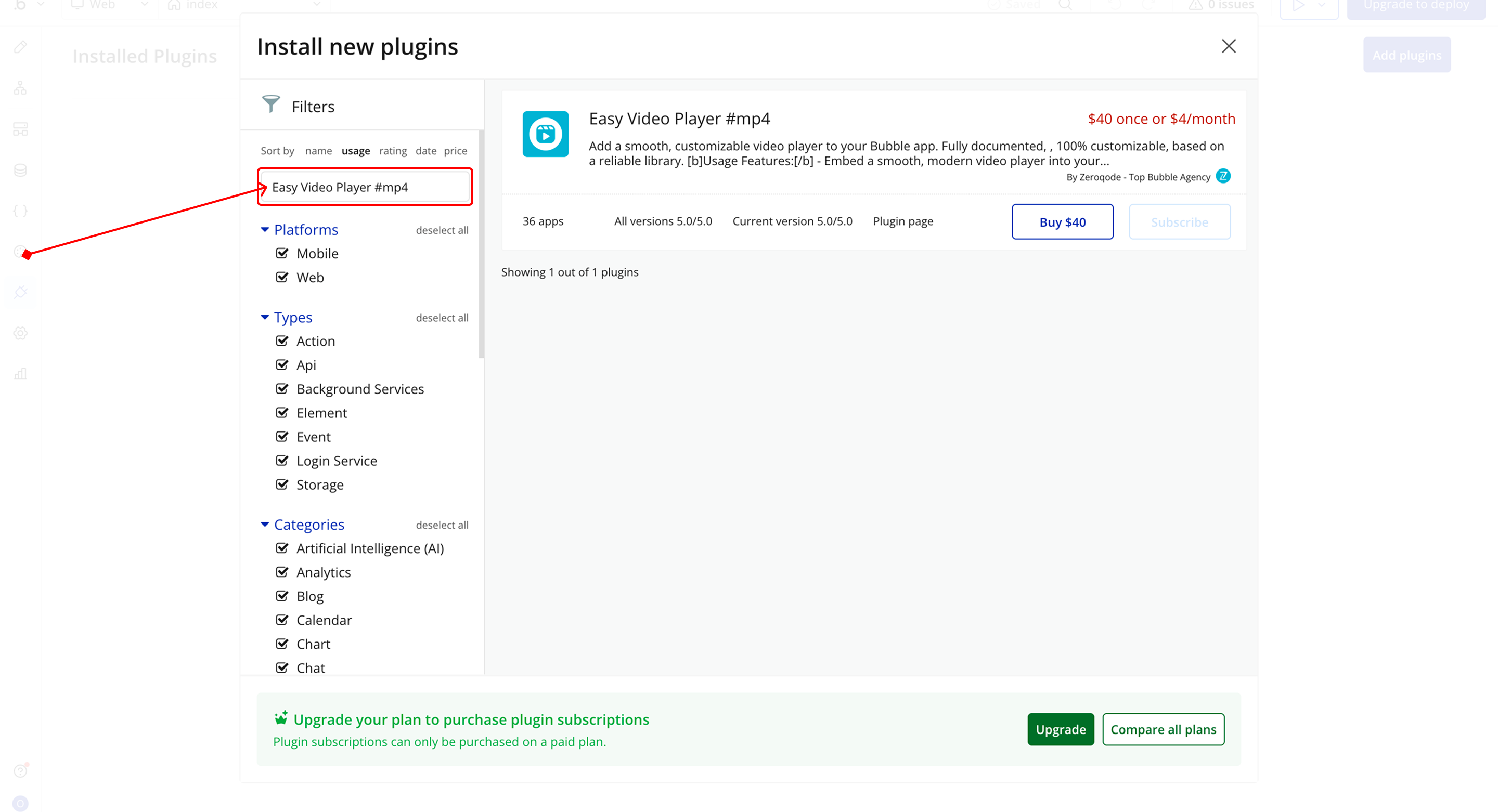
- Install/Buy
- If the plugin is free, click Install to add it to your application.
- For a paid plugin, click Buy and follow the purchase instructions.
- Payment Information (For Paid Plugins)
- If the plugin is a paid one, fill in your payment details and make payment.
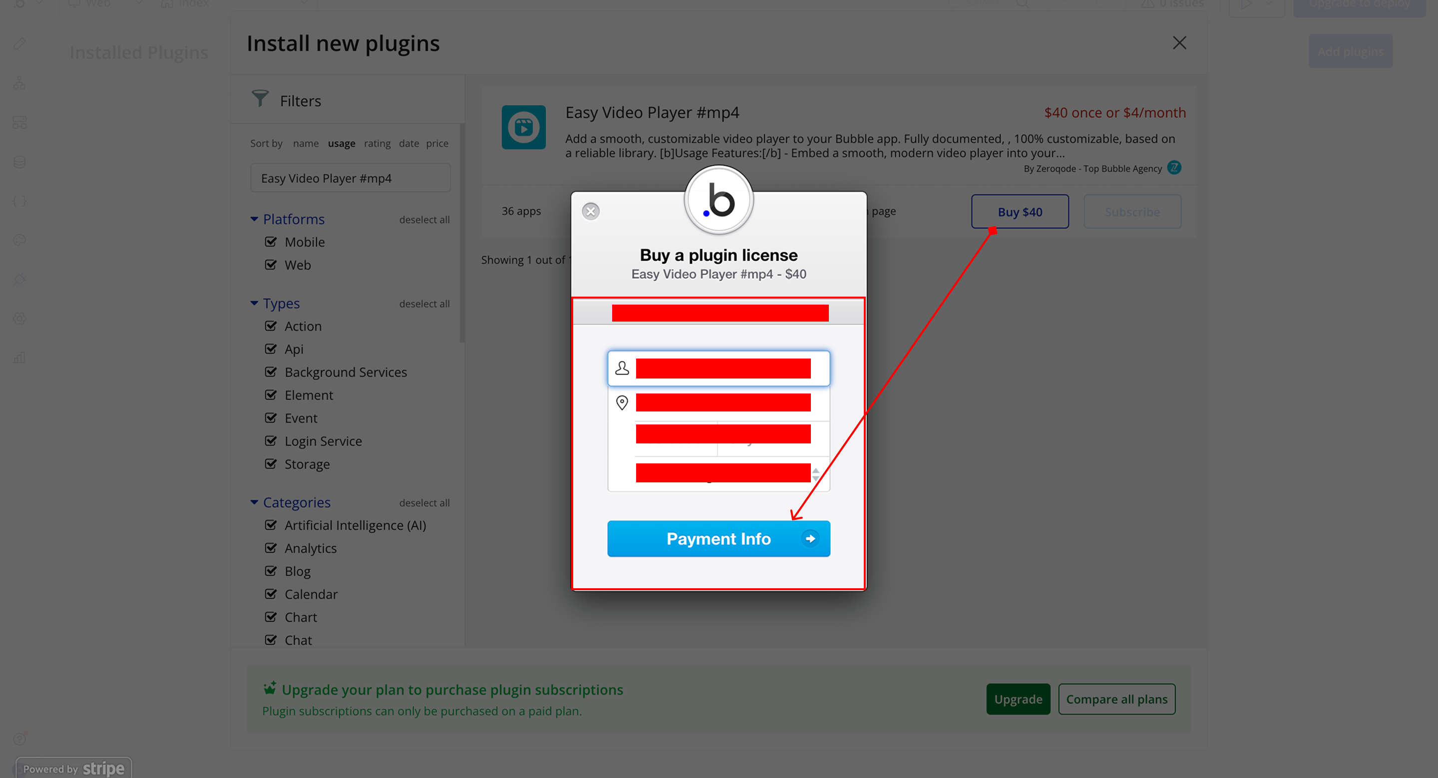
- Charges will be added to your Bubble billing account.
- Remember, if you unsubscribe from the plugin shortly after installation, charges will be prorated based on the days used.
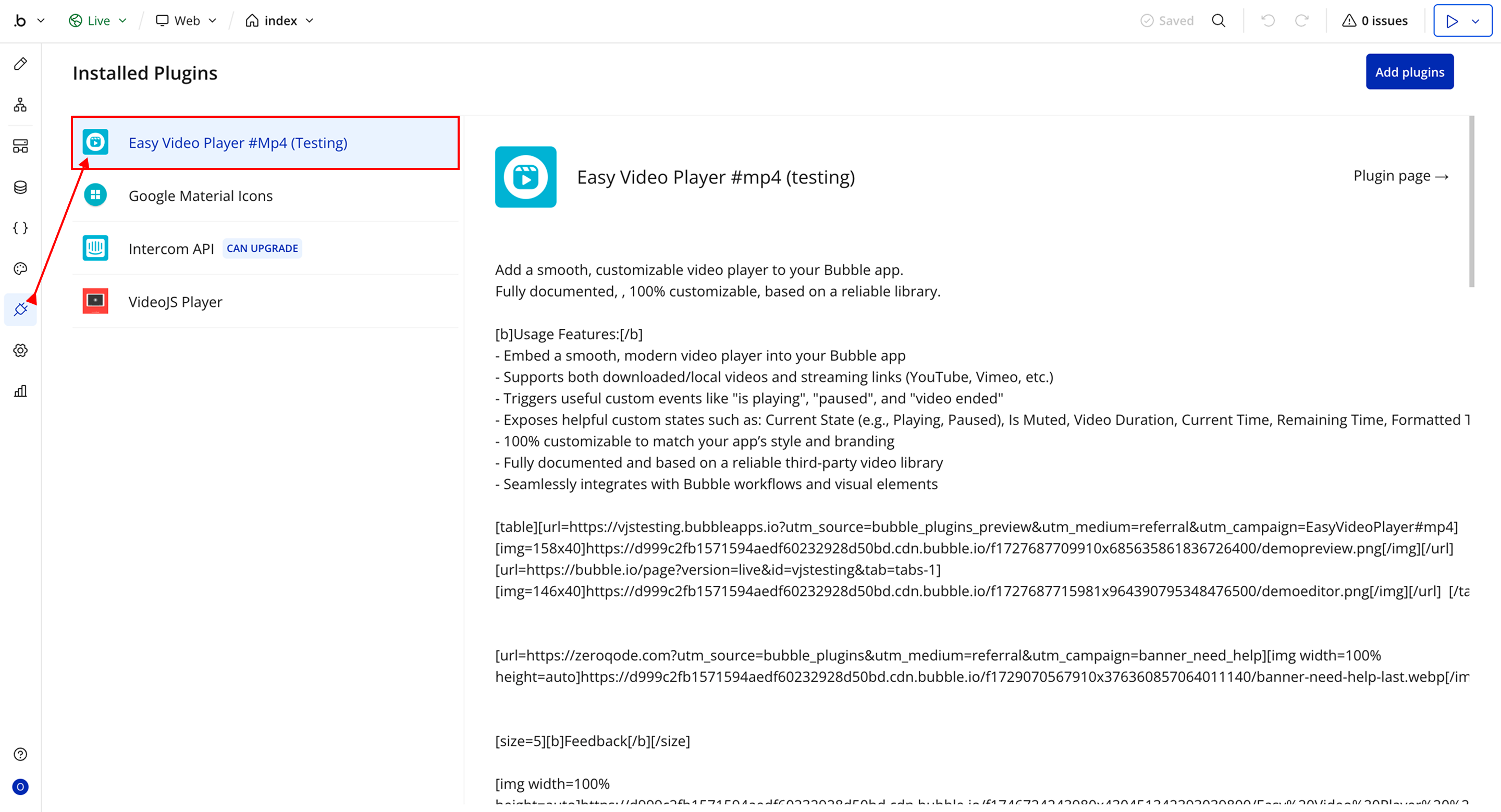
- Plugin Installed
- Once installed, the plugin will appear under the Installed Plugins list in your Bubble Editor.
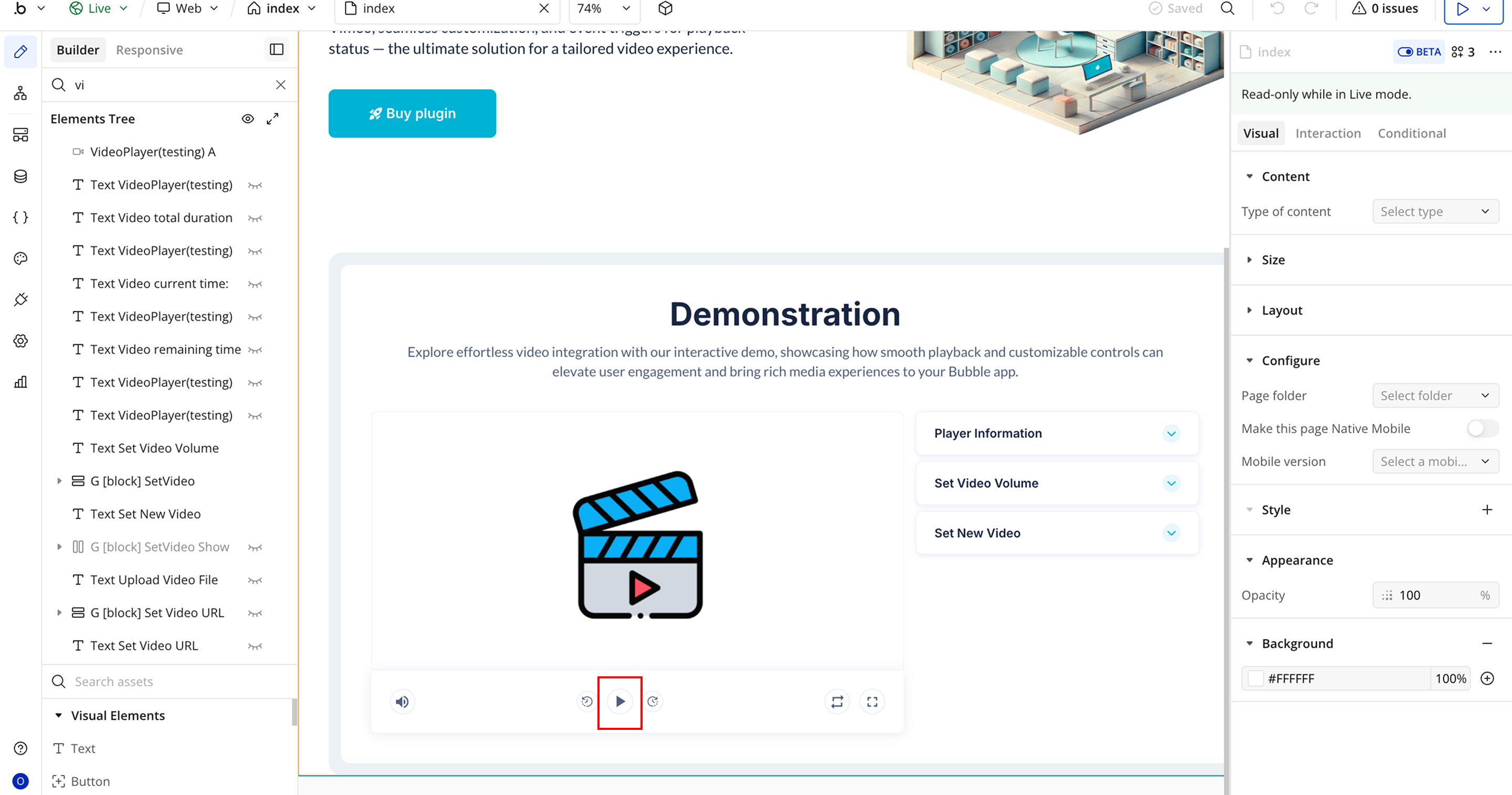
Step 2 – Add the Plugin Element to Your Page
- Open the Design tab in your Bubble editor.
- Search for the Easy Video Player element in the Elements panel.
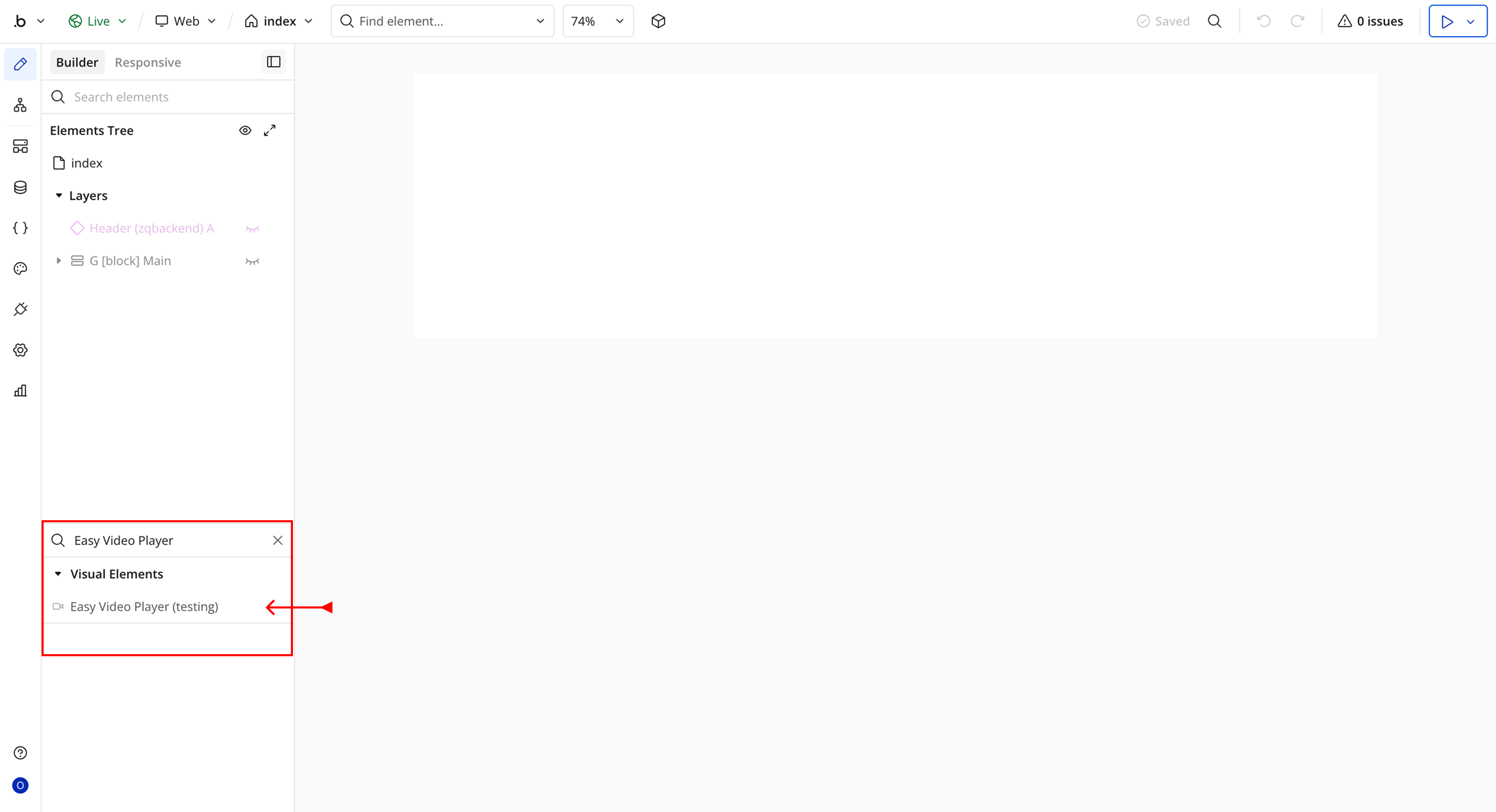
- You’ll see one option:
- Easy Video Player
- Drag and drop the element onto your page.
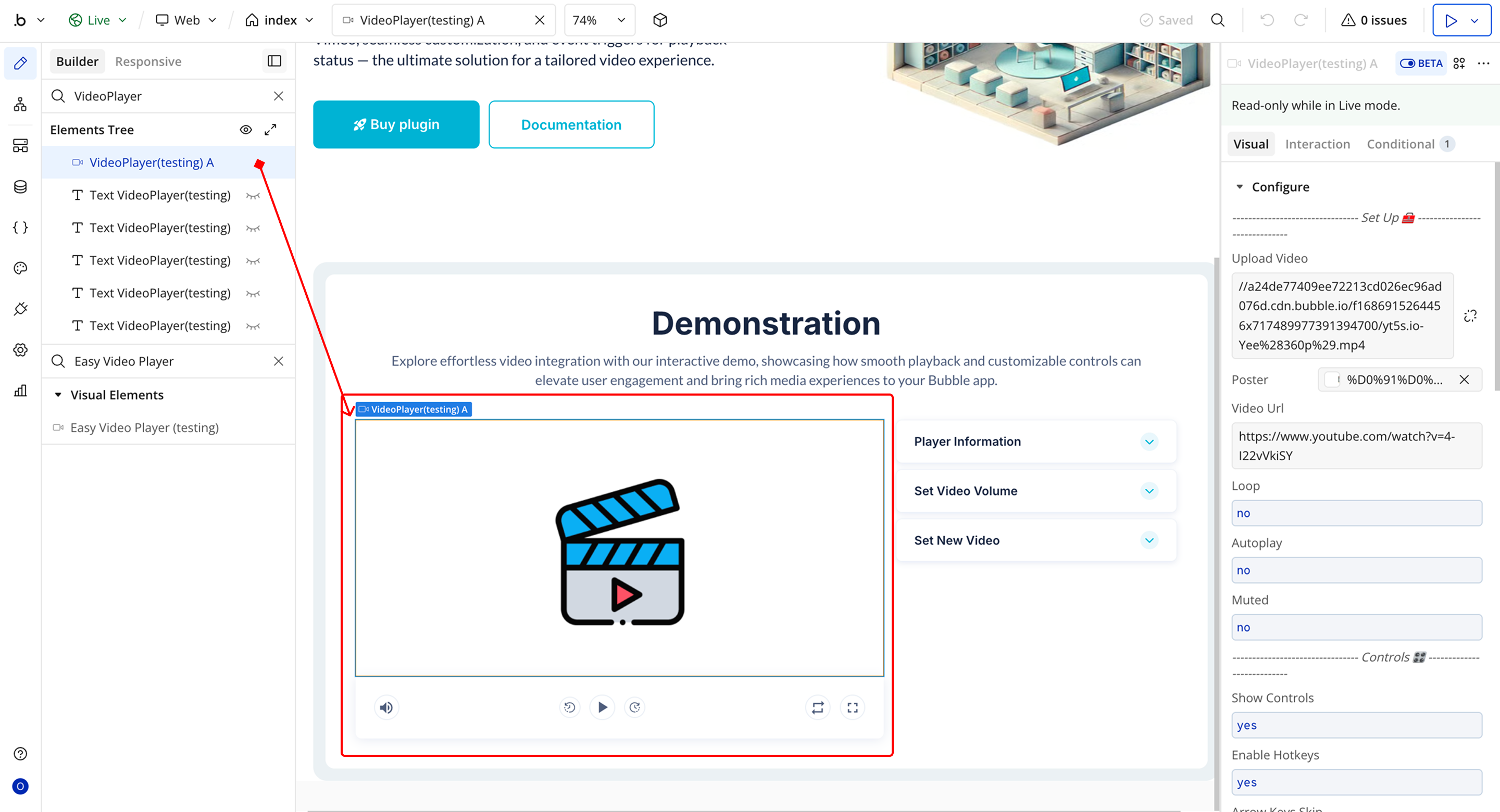
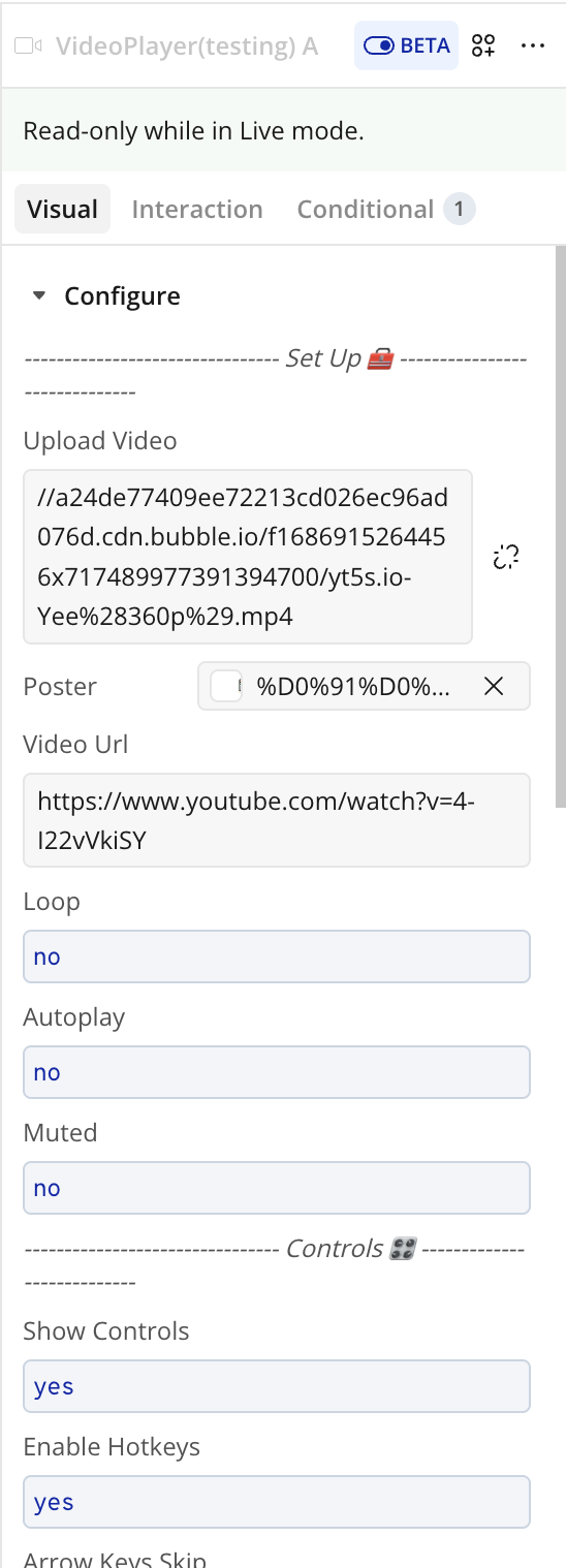
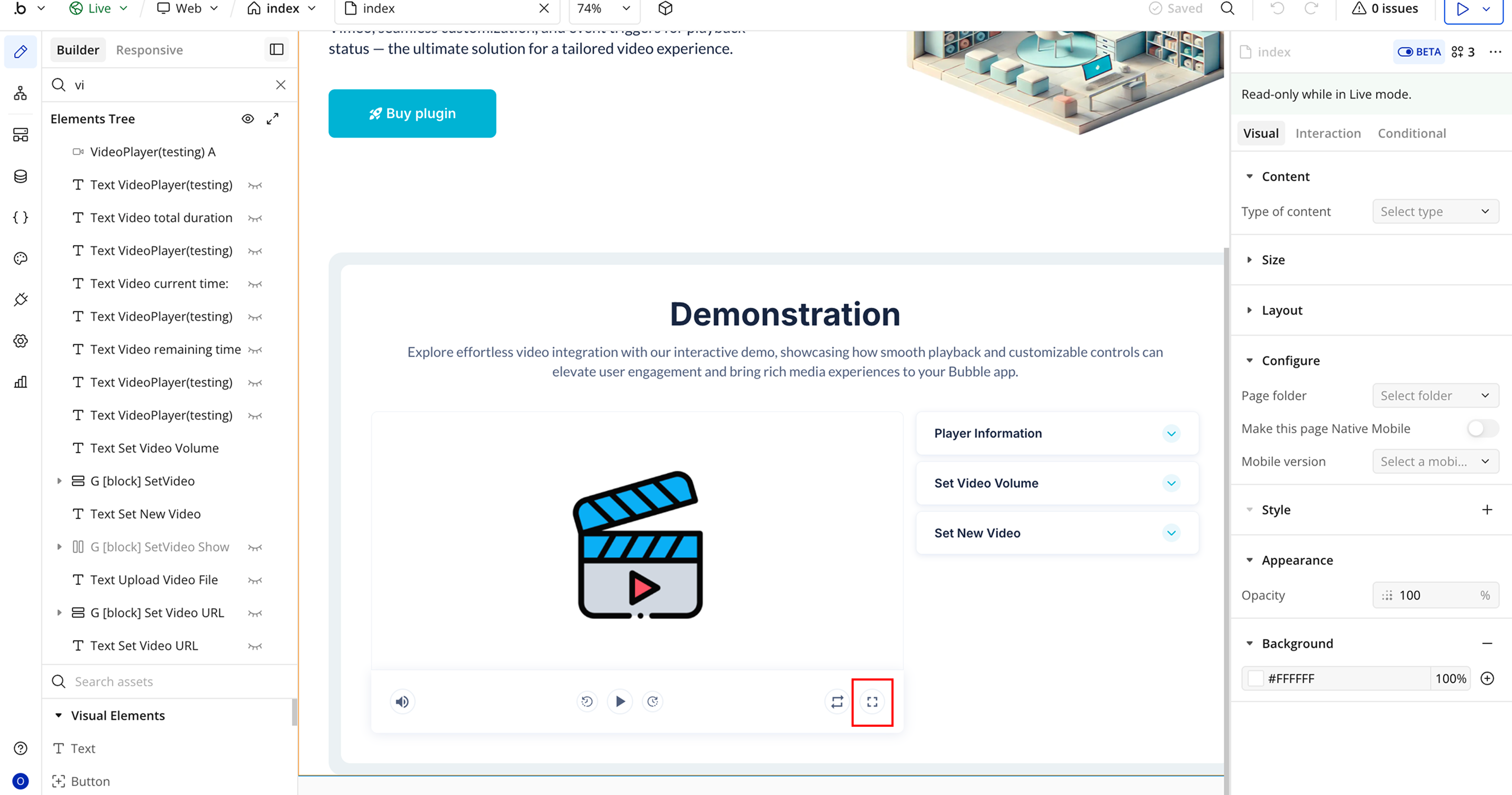
Step 3 – Configure Properties
- Upload Video → Upload a video file that will be played in the video player.
- Poster → Add an image that appears as the video thumbnail before playback starts.
- Video URL → Provide the direct link to the video that should load in the player.
- Loop → Determines whether the video restarts automatically after finishing.
- Autoplay → Starts the video automatically when the page loads.
- Muted → Loads the video with the sound muted.
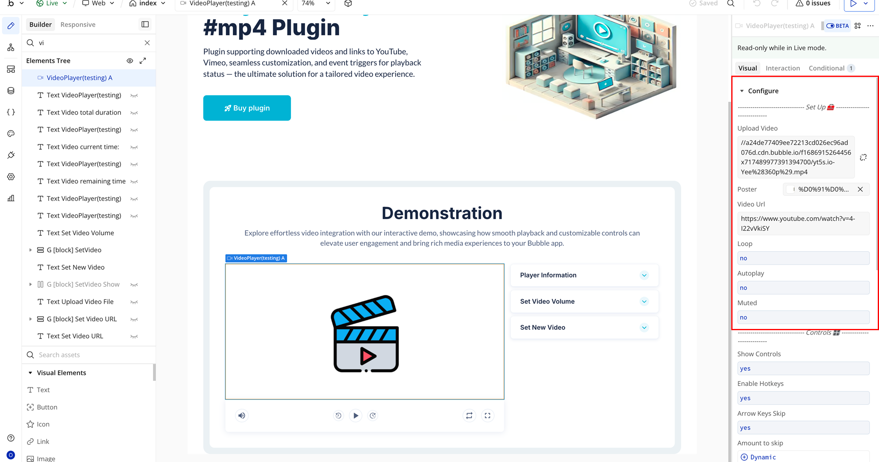
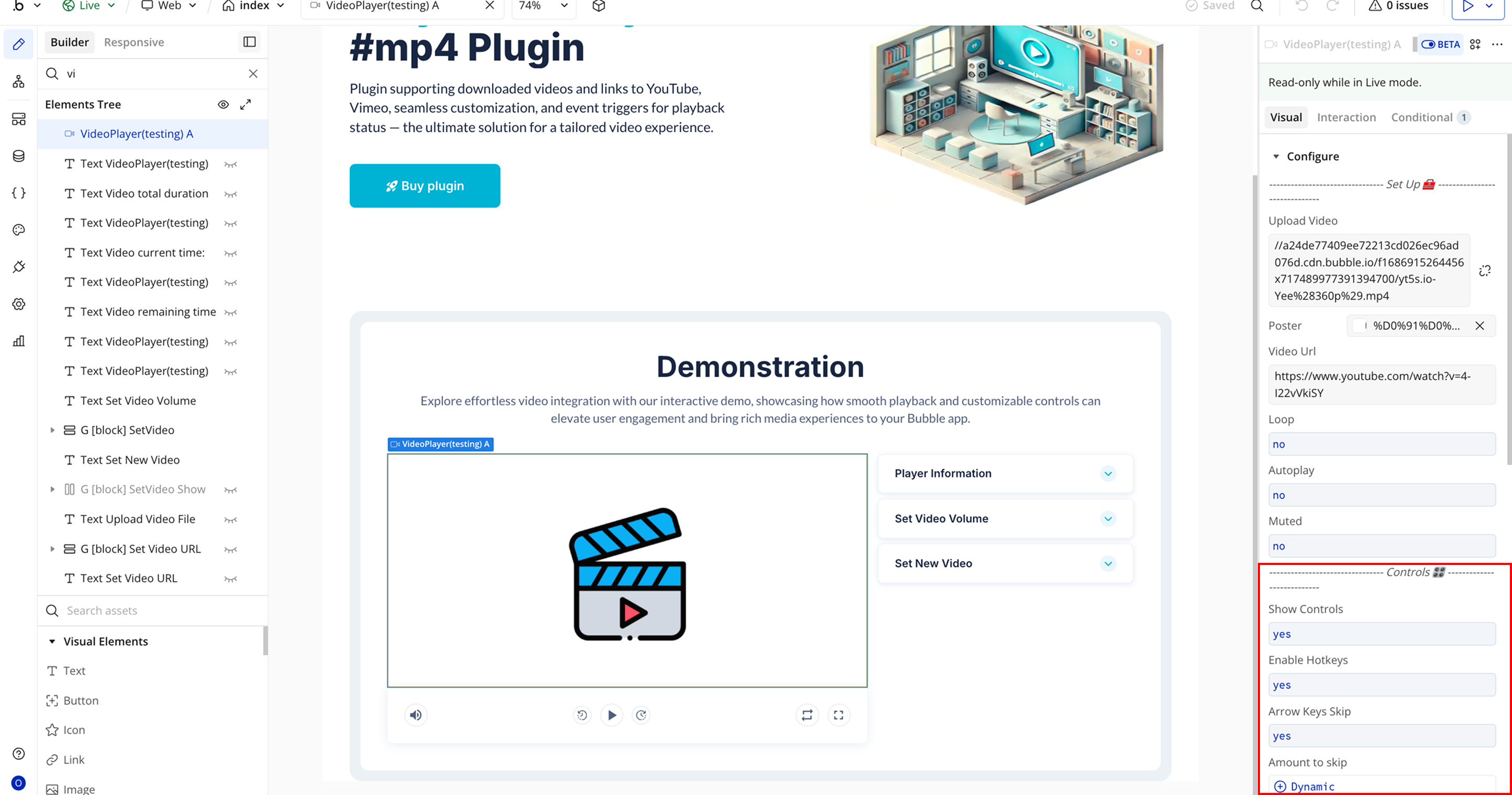
- Show Controls → Displays the player controls such as play, pause, progress bar, and volume.
- Enable Hotkeys → Allows users to control the video player using keyboard shortcuts.
- Arrow Keys Skip → Enables navigation through the video using the keyboard arrow keys.
- Amount to Skip → Sets the number of seconds skipped when using navigation controls.
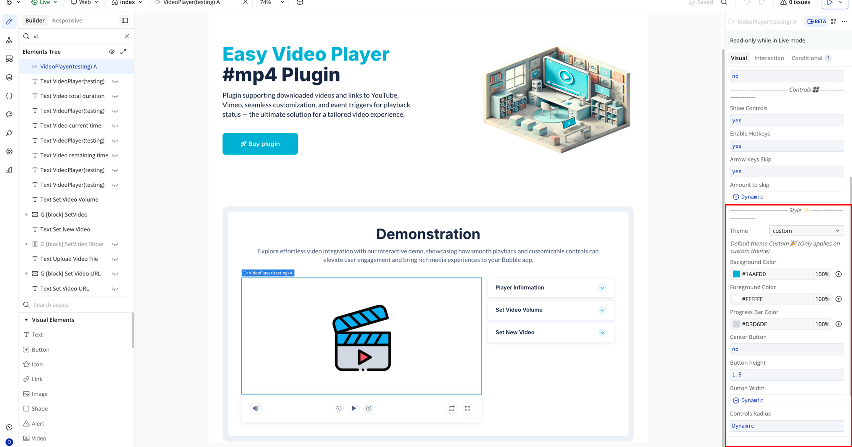
- Theme → Select a predefined visual theme such as Custom, City, Fantasy, Forest, or Sea.
- Background Color → Sets the background color of the video player.
- Foreground Color → Defines the color used for icons and interface elements.
- Progress Bar Color → Controls the color of the playback progress indicator.
- Center Button → Determines whether the main play button is centered in the player.
- Button Width → Adjusts the width of the play button.
- Controls Radius → Controls how rounded the corners of the button appear.
Plugin Element Properties - Easy Video Player
Fields
Title | Description | Type |
— Set Up 🧰 — | ||
Upload Video | Upload a video from your local storage. Do not set a Video URL if you want the uploaded file to be used in the player. | File |
Poster | (Optional) Poster for the uploaded video. If not set, the poster frame will be taken from the video itself. | Image (optional) |
Video URL | (Optional) URL of the video. If provided, the player will load the video from this URL. | Text (optional) |
Loop | Determines whether the video should loop back to the beginning once it ends. | Checkbox (yes/no) |
Autoplay | Specifies whether the video should start automatically when loaded. Some browsers may restrict autoplay under certain conditions. | Checkbox (yes/no) |
Muted | Specifies whether the video should start with audio muted. | Checkbox (yes/no) |
— Controls 🎛 — | ||
Show Controls | Determines whether the video player controls (play, pause, volume, etc.) should be displayed. | Checkbox (yes/no) |
Enable Hotkeys | Enables hotkeys for controlling the video (e.g., f for fullscreen, m for mute, spacebar for play/pause). | Checkbox (yes/no) |
Arrow Keys Skip | Allows users to fast forward or rewind using arrow keys. | Checkbox (yes/no) |
Amount to Skip | (Optional) Number of seconds to skip forward or backward when using arrow keys. | Number (optional) |
— Style ✨ — | ||
Theme | (Optional) Select a theme for the video player. Customization options below only apply to the custom theme. Available options: custom, city, fantasy, forest, sea. | Dropdown (optional) |
Default Theme Custom 🎉 (Applies only when theme is set to custom) | ||
Background Color | (Optional) Set the background color of the video player. | Color (optional) |
Foreground Color | (Optional) Set the foreground color (text/icons) of the video player controls. | Color (optional) |
Progress Bar Color | (Optional) Set the color of the progress bar in the video player controls. | Color (optional) |
Center Button | (Optional) Determines if the play button on the poster (before the video starts) should be centered. | Checkbox (yes/no) (optional) |
Button Height | (Optional) Height (in em) of the play button on the poster. | Number (optional) |
Button Width | (Optional) Width (in em) of the play button on the poster. | Number (optional) |
Controls Radius | (Optional) Border radius (in px) of the video player controls. | Number (optional) |
Element Actions
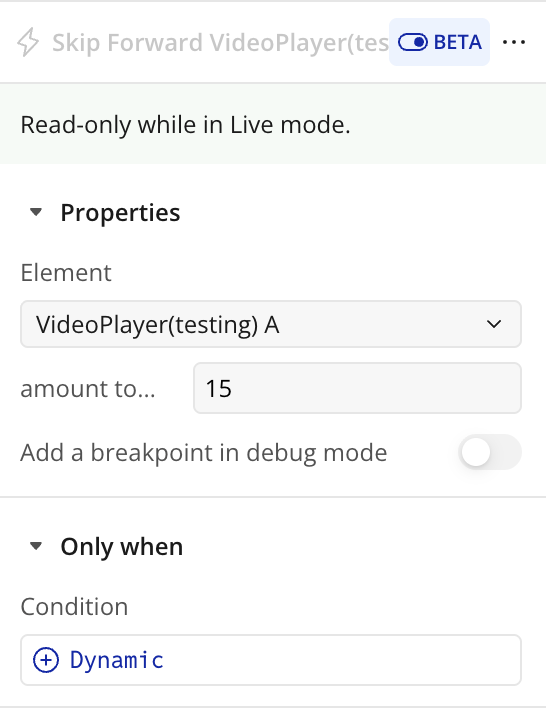
Skip Forward
Skips the video ahead by a specified number of seconds. Useful for creating custom fast-forward controls or integrating workflow-driven jumps in the video timeline.
Title | Description | Type |
Amount to skip (s) | The number of seconds the video should advance when the skip forward action is triggered. | Number |
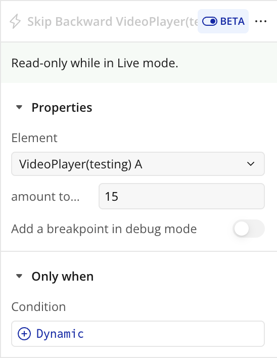
Skip Backward
Skips the video backward by a specified number of seconds. This allows users or workflows to quickly rewind the video for review or navigation purposes.
Title | Description | Type |
Amount to skip (s) | The number of seconds the video should move backward when the skip backward action is triggered. | Number |
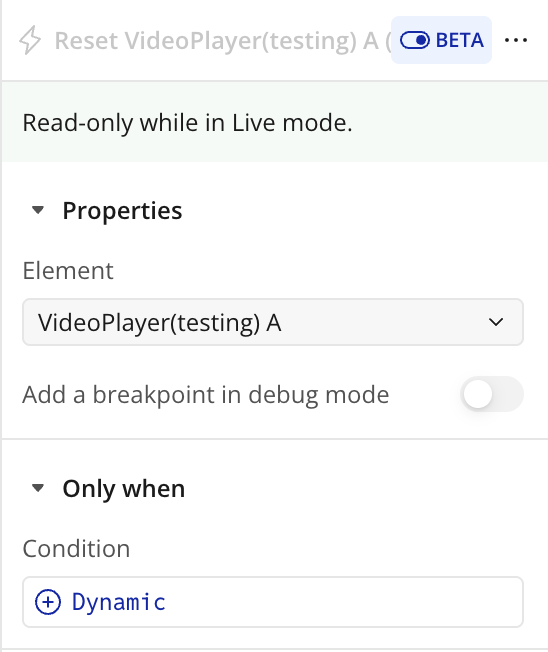
Reset
Resets the video player to its initial state. This stops the video, returns the playhead to the beginning, and resets any custom playback settings like volume, mute, or playback position.
Set Volume
Sets the video player’s audio level to a specified value. This allows workflows or users to programmatically adjust the volume without manually interacting with the player controls.
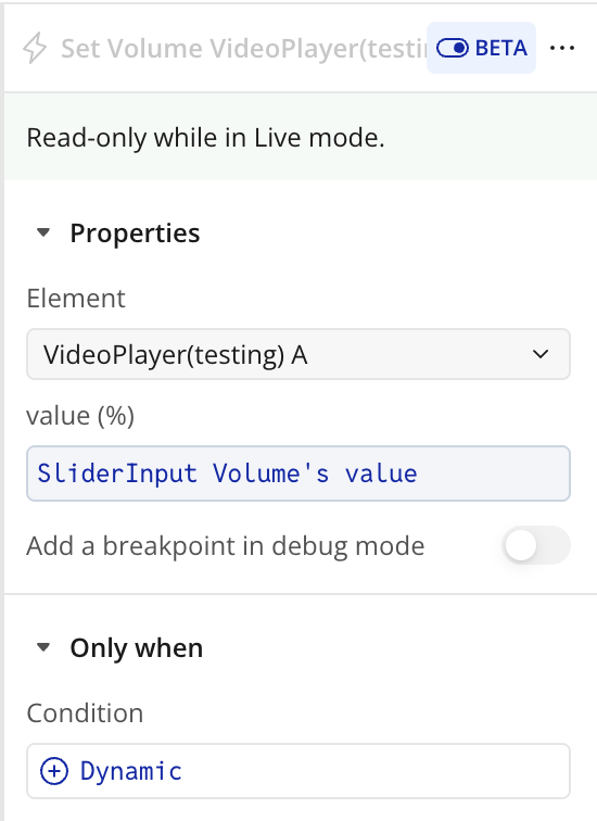
Title | Description | Type |
Value (%) | The desired volume level expressed as a percentage, where 0% is muted and 100% is full volume. | Number |
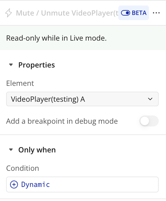
Mute / Unmute
Toggles the audio of the video player on or off. Use this action to programmatically mute the video or restore sound without affecting the volume setting.
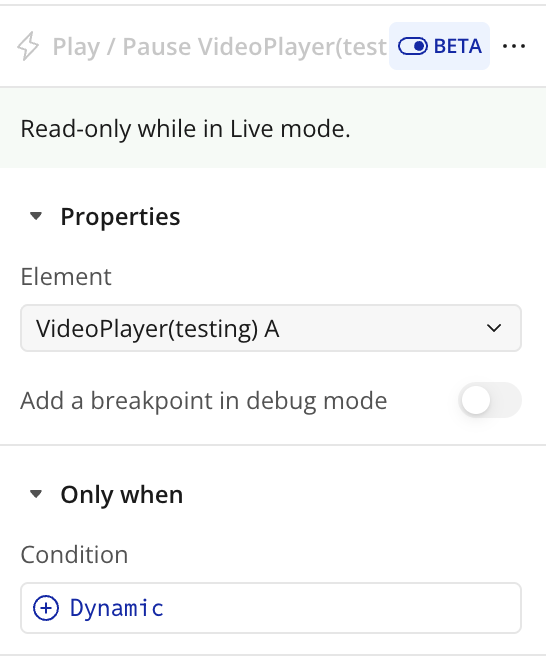
Play / Pause
Toggles the playback state of the video player. If the video is currently playing, it will pause; if paused, it will start playing from the current position.
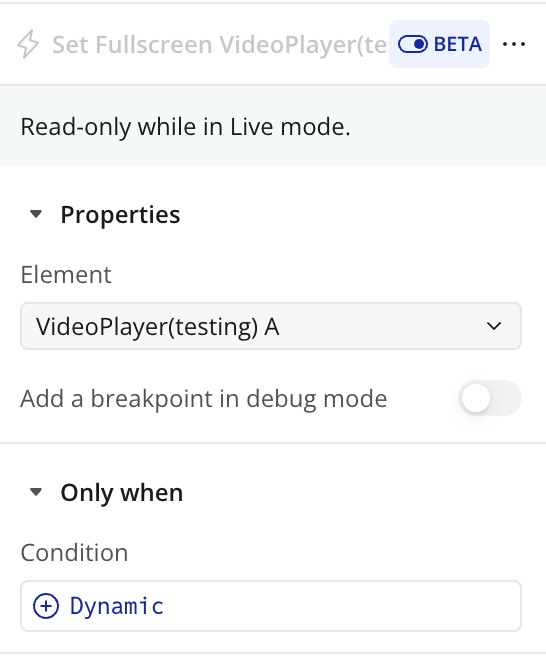
Set Fullscreen
Toggles the video player between fullscreen mode and normal embedded mode. When activated, the video expands to fill the entire screen for an immersive viewing experience.
Change Source
Updates the video player to play a different video. This allows you to dynamically switch between videos without reloading the page or the player.
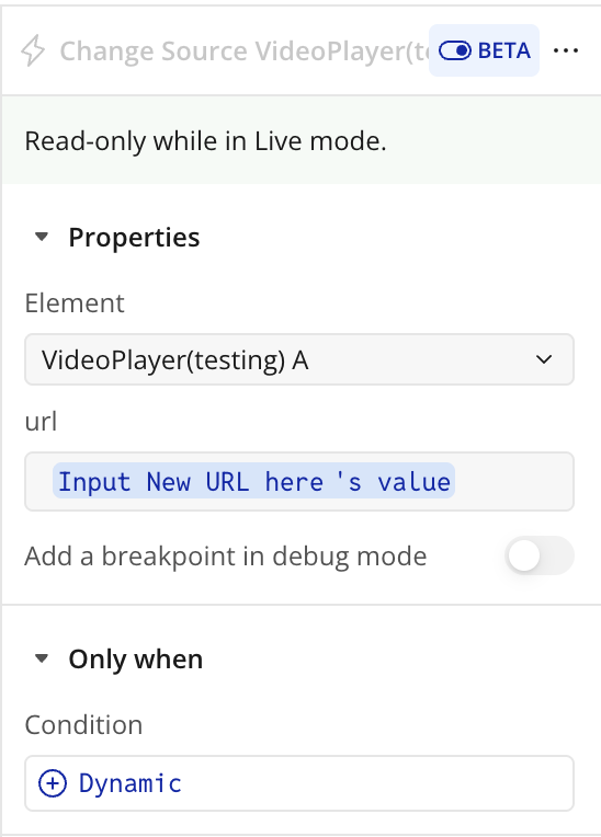
Title | Description | Type |
Url | The web address or file path of the video to load and play in the video player. | Text |
Upload New Video
Allows you to upload a new video file directly into the player from your local storage, replacing the current video if one is already loaded.
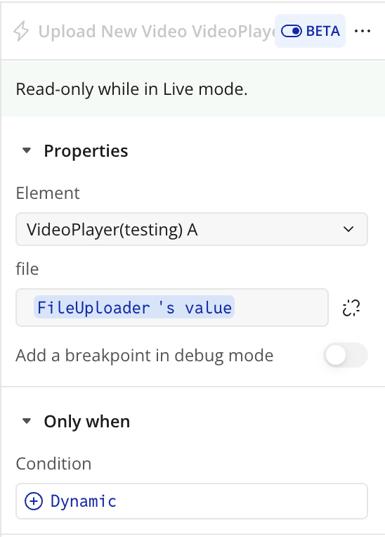
Title | Description | Type |
File | The video file selected from your device to be uploaded and played in the video player. | File |
Exposed States
Title | Description | Type |
Status | The current playback state of the video, e.g., Playing, Paused, or Ended. | Text |
Is Muted | Indicates whether the video is currently muted (yes) or not (no). | Checkbox (yes/no) |
Current time (s) | The current playback position of the video in seconds. | Number |
Total Duration (s) | The total length of the video in seconds. | Number |
Remaining time (s) | The remaining time left in the video in seconds. | Number |
Current Time (formatted) | The current playback time formatted as MM:SS or HH:MM:SS. | Text |
Is Playing? | Indicates whether the video is currently playing (yes) or paused/stopped (no). | Checkbox (yes/no) |
Total Duration (formatted) | The total length of the video formatted as MM:SS or HH:MM:SS. | Text |
Remaining time (formatted) | The remaining time in the video formatted as MM:SS or HH:MM:SS. | Text |
Volume (%) | The current volume level of the video, expressed as a percentage (0–100). | Number |
Element Events
Title | Description |
Reached the end of the video | Triggered when the video playback reaches the end. Useful for workflows like autoplaying the next video or showing a completion message. |
The video is playing | Triggered when the video starts or resumes playing. Can be used to update UI elements or trigger related actions. |
The video has been paused | Triggered when the video playback is paused. Can be used to pause timers, animations, or other dependent workflows. |
Workflow example
Workflow 1: Play or Pause the Video
- Place the Easy Video Player element on the page.
- Add an Icon element (for example, a play or pause icon).
- Create a workflow: When Play/Pause Icon is clicked.
- Add the plugin action Play / Pause A Easy Video Player.
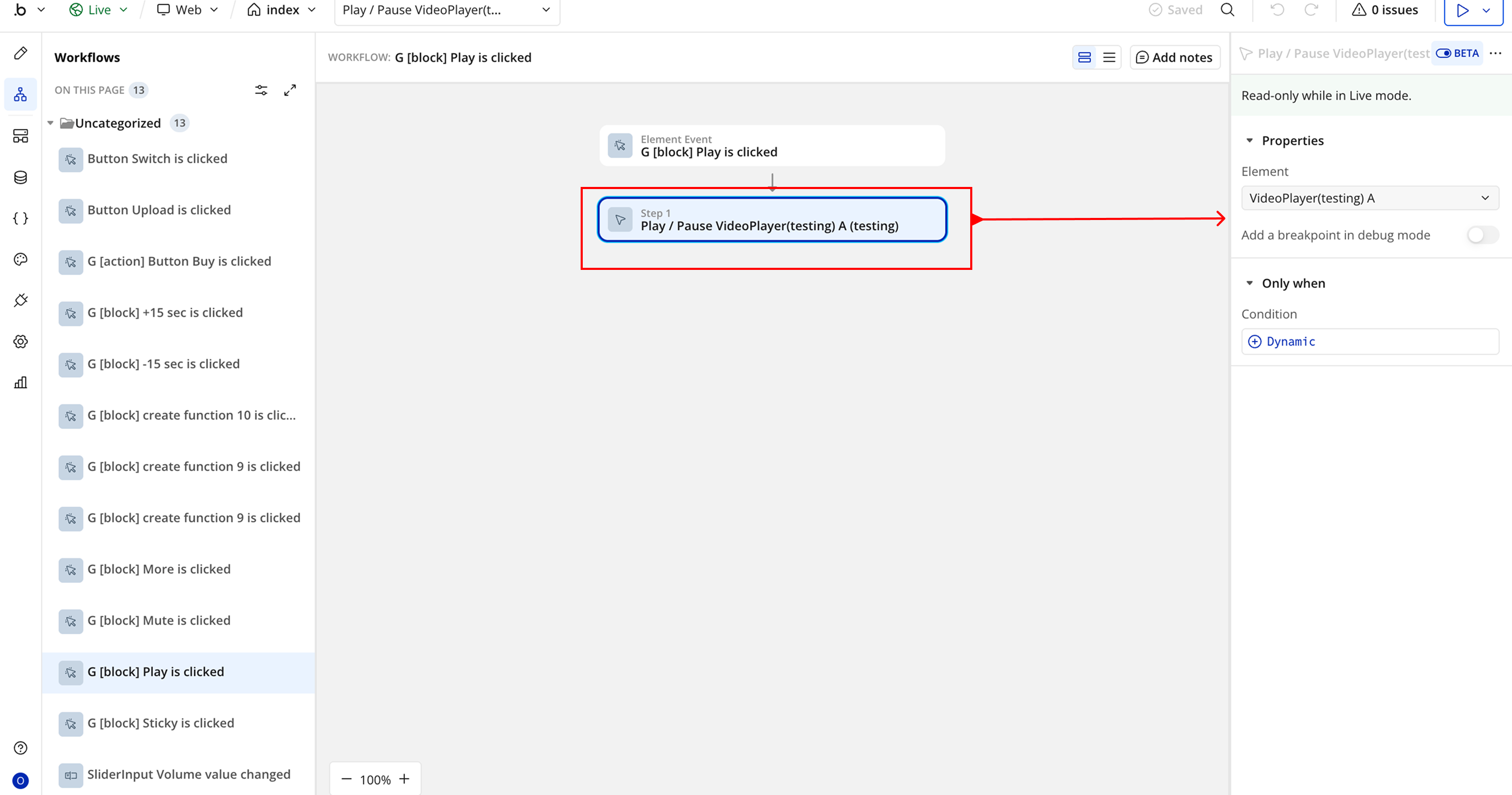
- In the Element field, select the Easy Video Player element placed on the page.
Workflow 2: Toggle Fullscreen Mode
- Add a Fullscreen icon to the page.
- Create a workflow: When Fullscreen Icon is clicked.
- Add the plugin action Set Fullscreen – Easy Video Player.
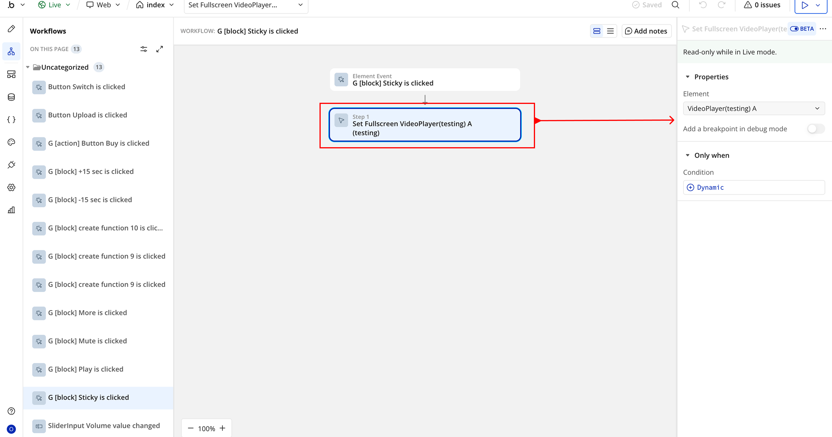
- In the Element field, select the Easy Video Player element placed on the page.
Changelogs
Update 26.03.26 - Version 2.1.0
- Migrated to v4.
Update 25.03.26 - Version 2.0.0
- Bubble Plugin Page Update (Docs).
Update 18.07.25 - Version 1.9.0
- Bubble Plugin Page Update (Logo).
Update 12.06.25 - Version 1.8.0
- Marketing update (minor change).
Update 30.05.25 - Version 1.7.0
- Minor update (Marketing update).
Update 17.05.25 - Version 1.6.0
- Minor update (Marketing update).
Update 20.07.24 - Version 1.5.0
- Minor update.
Update 13.06.24 - Version 1.4.0
- Updated demo/service links.
Update 01.04.24 - Version 1.3.0
- "border radius" fixed .
Update 07.03.24 - Version 1.2.0
- minor updates.
Update 05.03.24 - Version 1.1.0
- Acquired by Zeroqode.
Update 08.12.23 - Version 1.0.1
- Update.
Update 05.09.23 - Version 1.0.0
- Public version.
Update 31.08.23 - Version 0.0.6
- Volume.
Update 31.08.23 - Version 0.0.5
- Formatted Times.
Update 31.08.23 - Version 0.0.4
- Update.
Update 31.08.23 - Version 0.0.3
- Update.
Update 31.08.23 - Version 0.0.2
- xxx.
Update 21.07.23 - Version 0.0.1
- v0.1 - Testing.