
✅
Demo to preview the plugin:
✅
Introduction
Add UserWay’s accessibility tools to your Bubble app in seconds. This plugin enhances accessibility, helps meet compliance standards, and provides real-time accessibility features like contrast adjustment and keyboard navigation.
Key Features
- Add the UserWay element to your Bubble app with zero coding required.
- Instantly improve accessibility and support WCAG, ADA, and other compliance standards.
- Enable accessibility tools like:
- Text resizing
- Contrast adjustment
- Keyboard navigation
- Configure display settings to match your app’s layout and branding.
- Works seamlessly with existing Bubble apps.
- Improves inclusivity for users with visual, motor, or cognitive impairments.
- Helps meet legal accessibility requirements with minimal setup.
Prerequisites:
- A Bubble app where you want to add accessibility features.
- Optional: UserWay account for advanced configuration (some features may require an account).
- Basic knowledge of Bubble elements and workflows.

How to setup
Step 1 – Install the Plugin
- Go to the Plugin Tab
- Open your Bubble Editor.
- Navigate to the Plugins tab on the left panel.
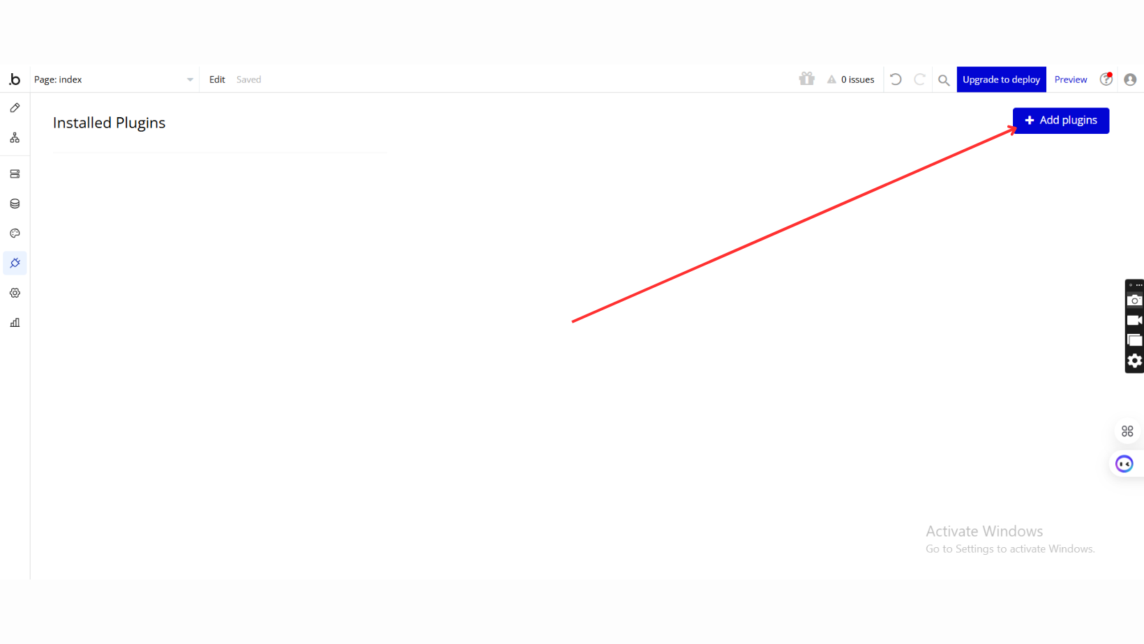
- Add Plugins
- Once in the Plugins tab, click the Add Plugins button.
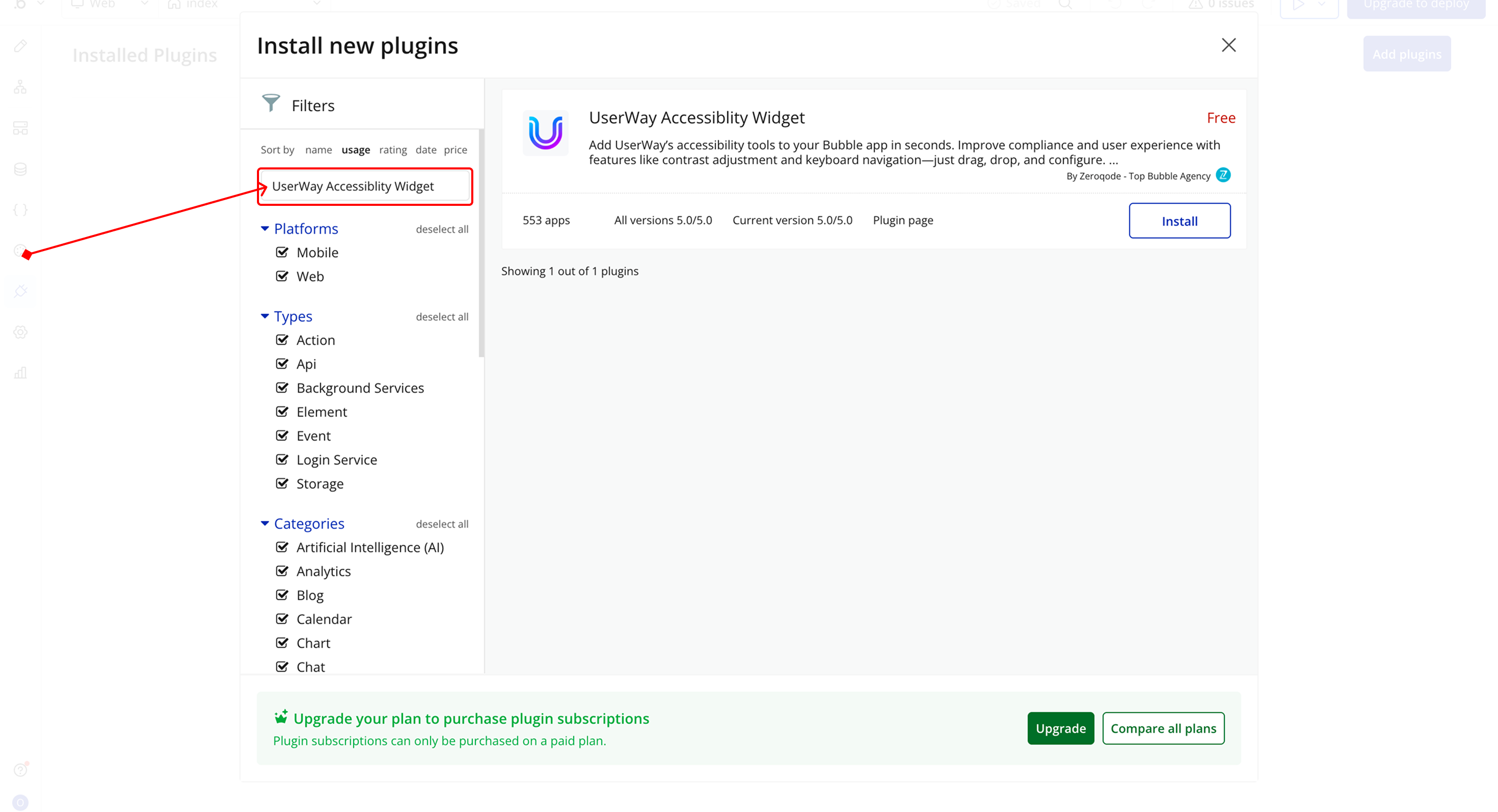
- Search for the Plugin
- Use the search bar to type UserWay Accessiblity Widget.
- Locate the plugin in the search results.
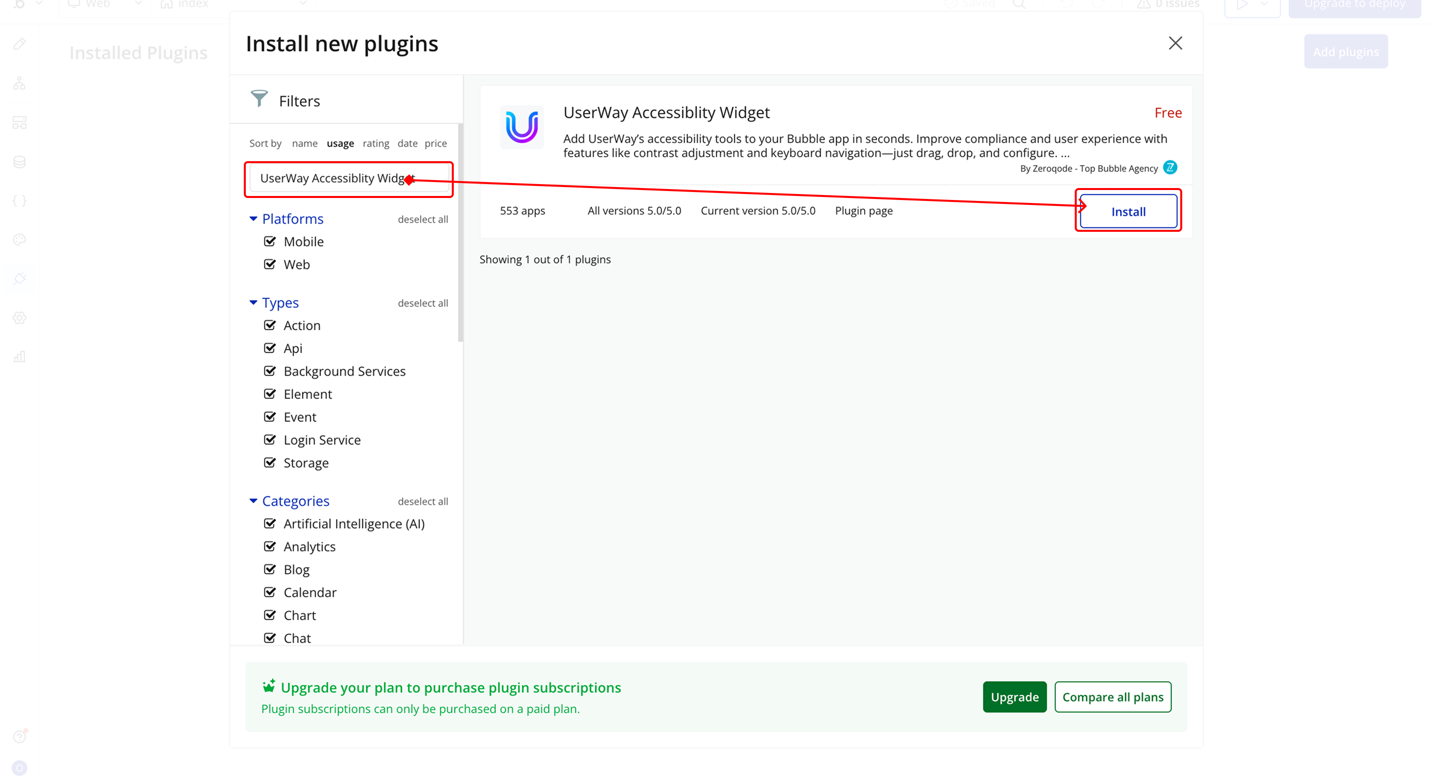
- Install/Buy
- If the plugin is free, click Install to add it to your application.
- For a paid plugin, click Buy and follow the purchase instructions.
- Payment Information (For Paid Plugins)
- If the plugin is a paid one, fill in your payment details and make payment.
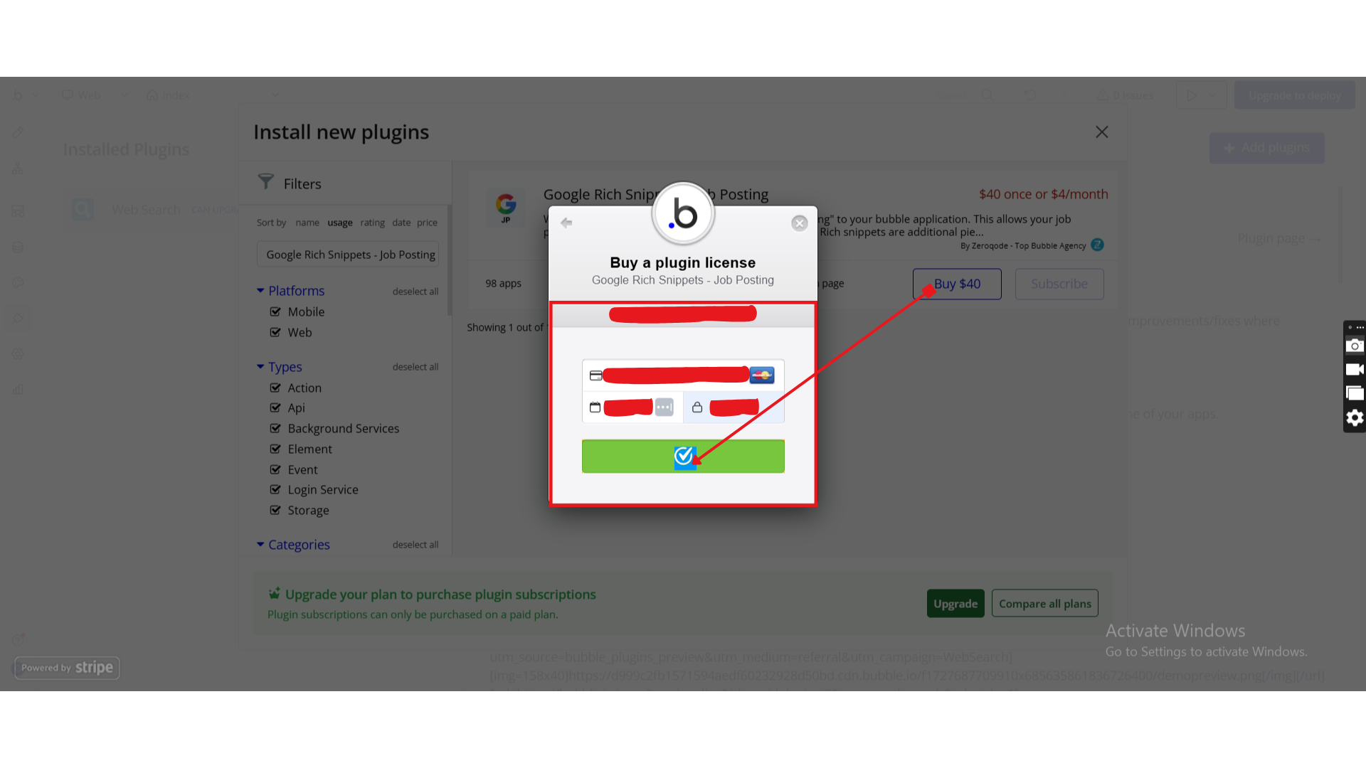
- Charges will be added to your Bubble billing account.
- Remember, if you unsubscribe from the plugin shortly after installation, charges will be prorated based on the days used.
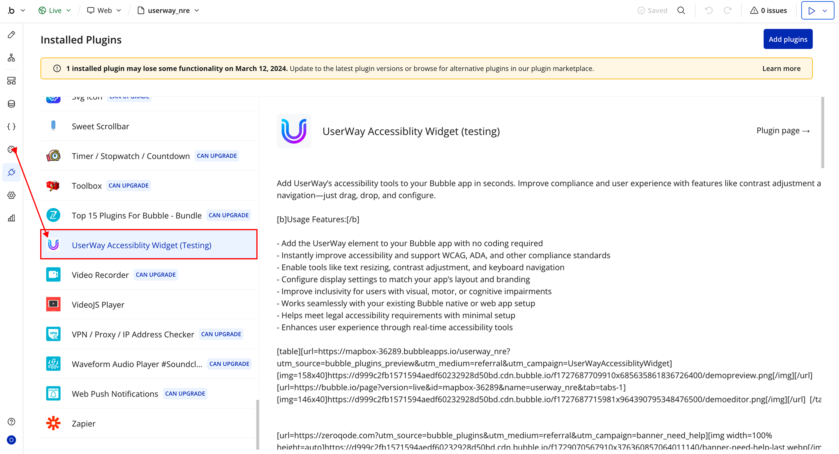
- Plugin Installed
- Once installed, the plugin will appear under the Installed Plugins list in your Bubble Editor.
Step 2 – Add the Plugin Element to Your Page
- Open the Design tab in your Bubble editor.
- Search for the UserWay element in the Elements panel.
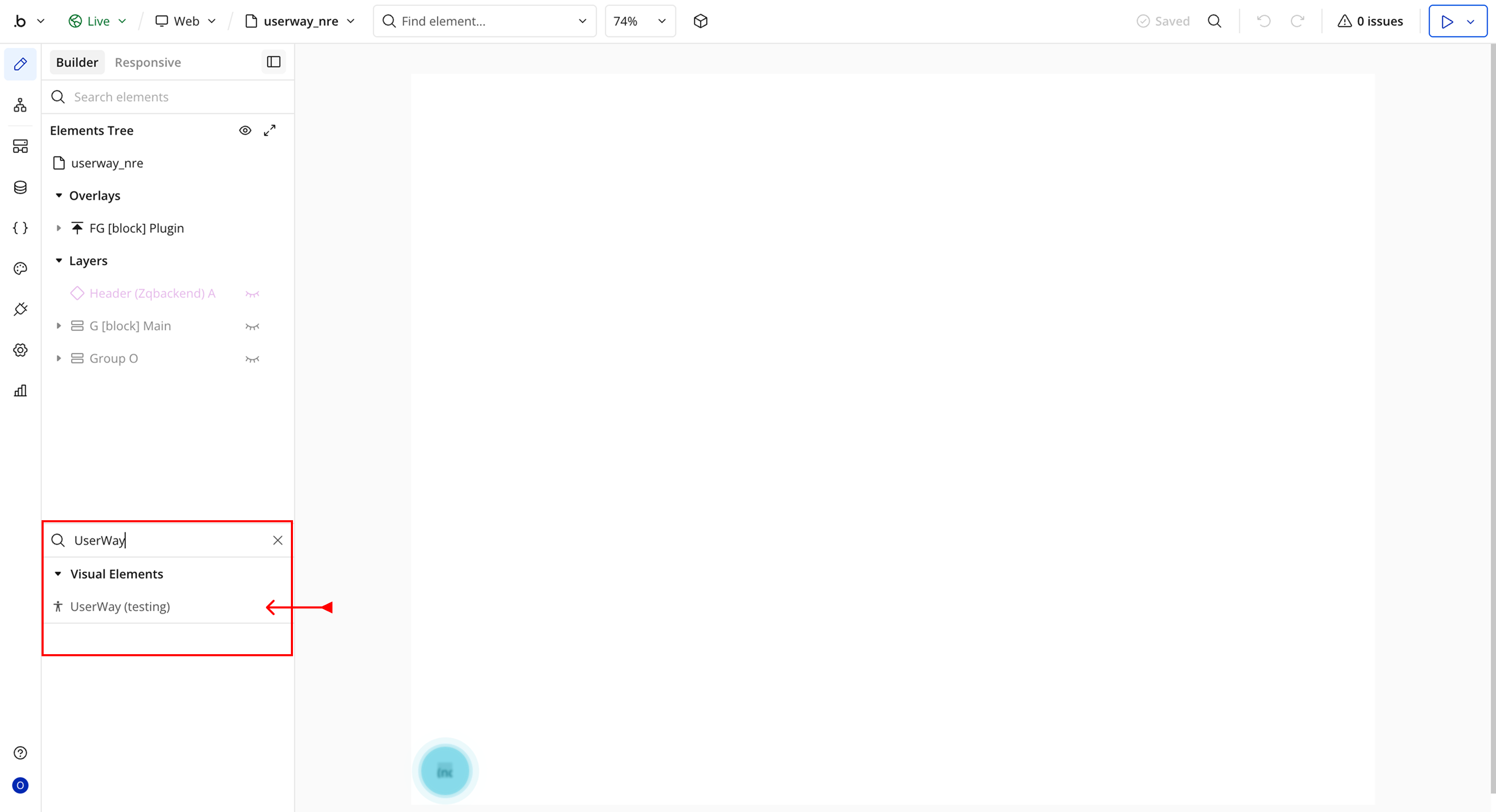
- You’ll see one option:
- UserWay
- Drag and drop the element onto your page.
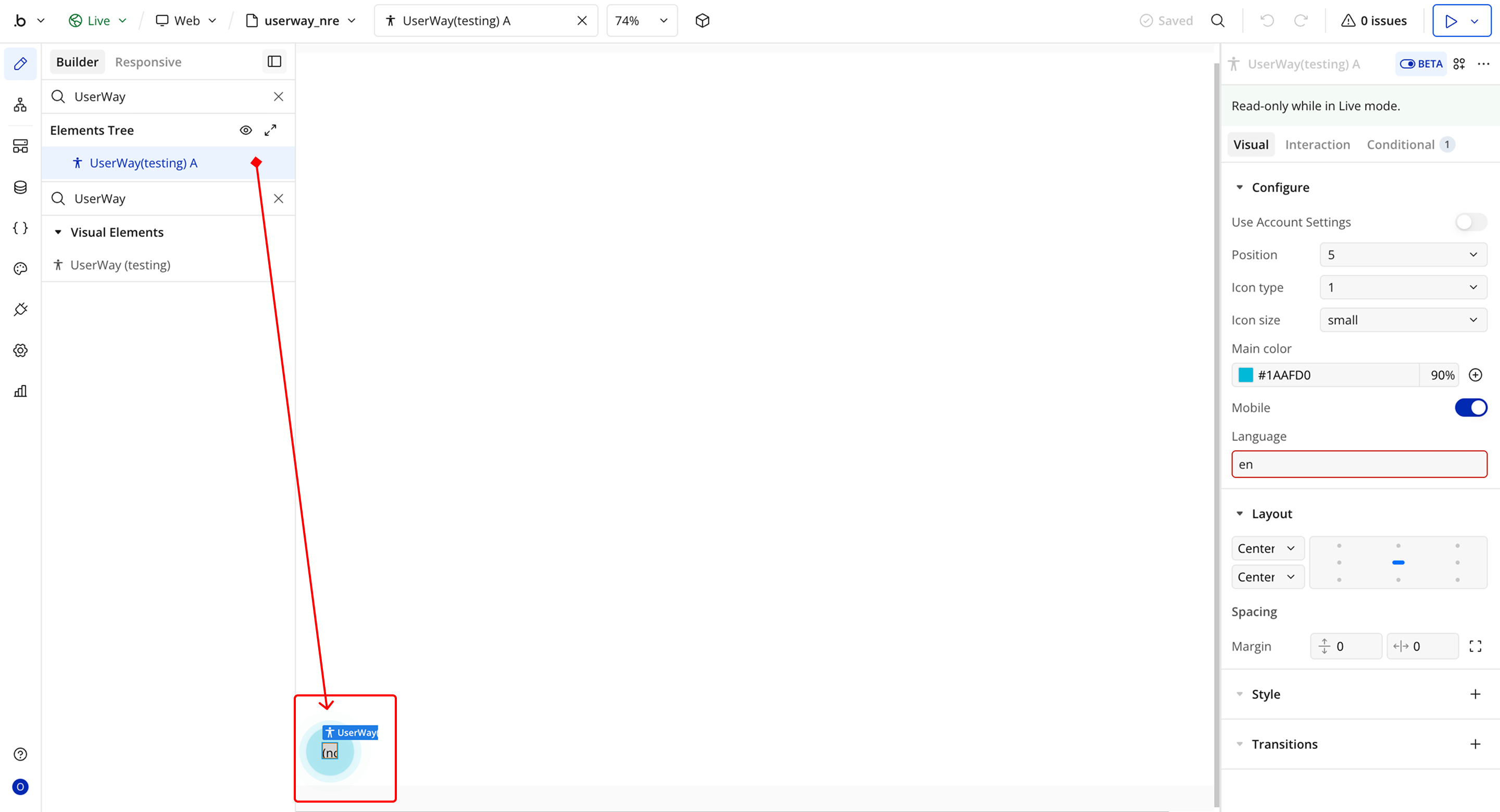
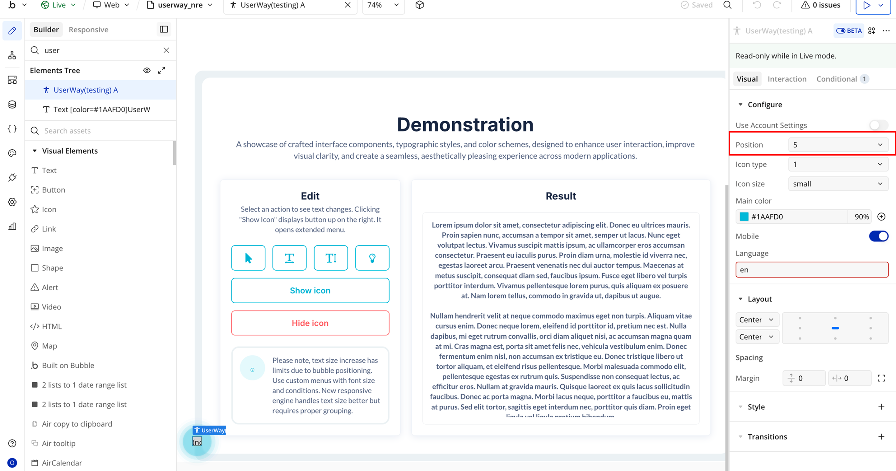
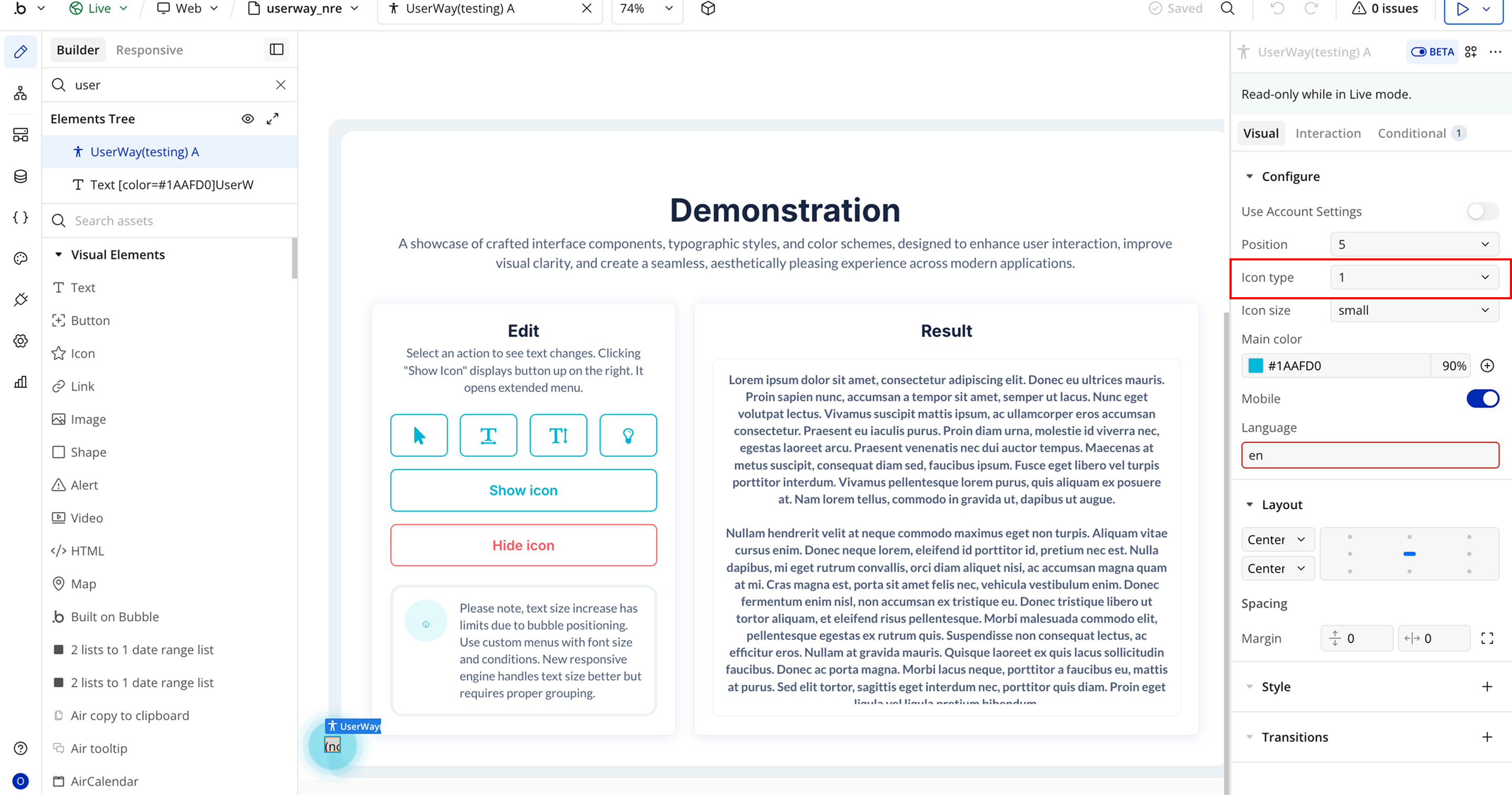
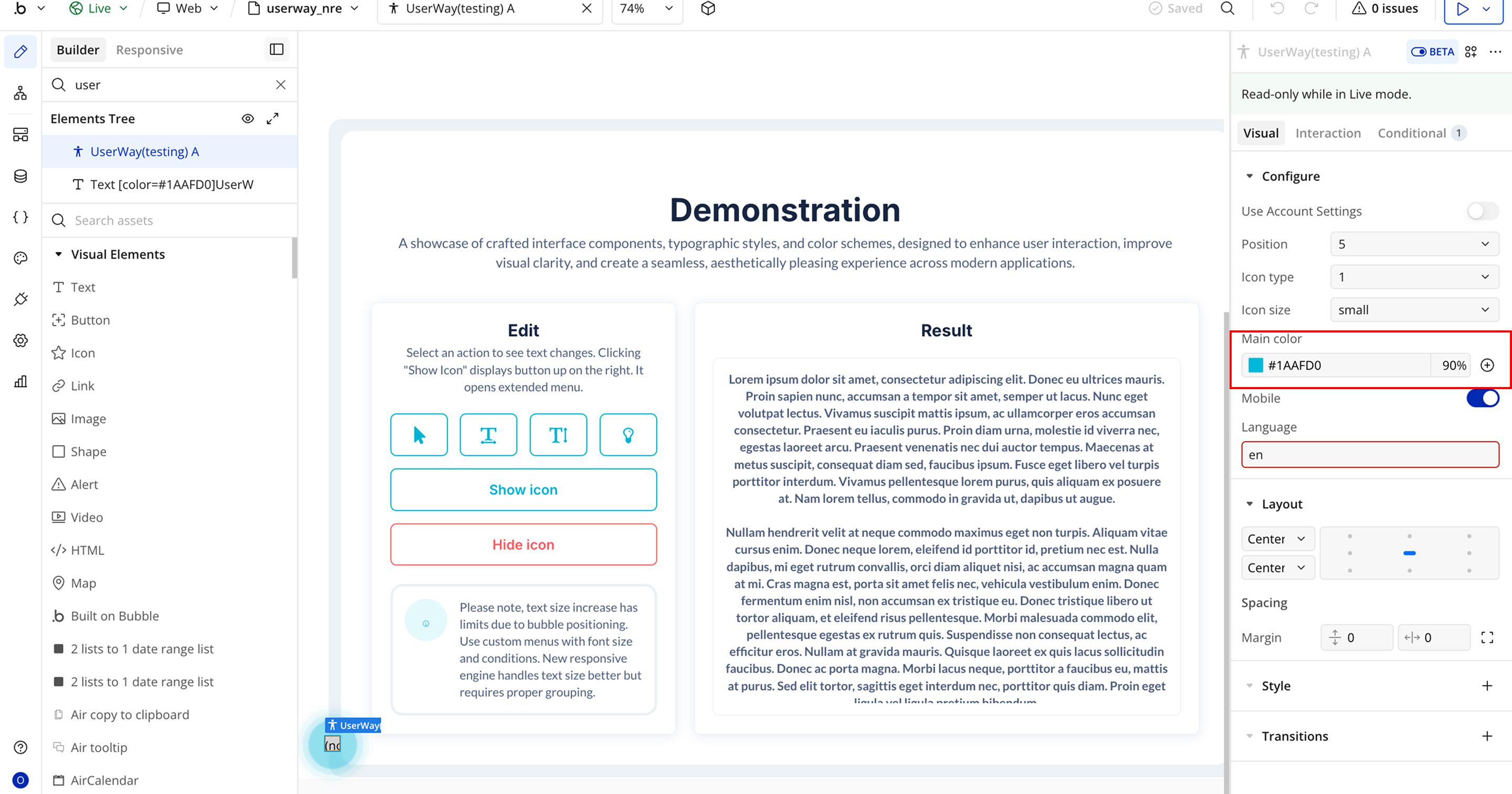
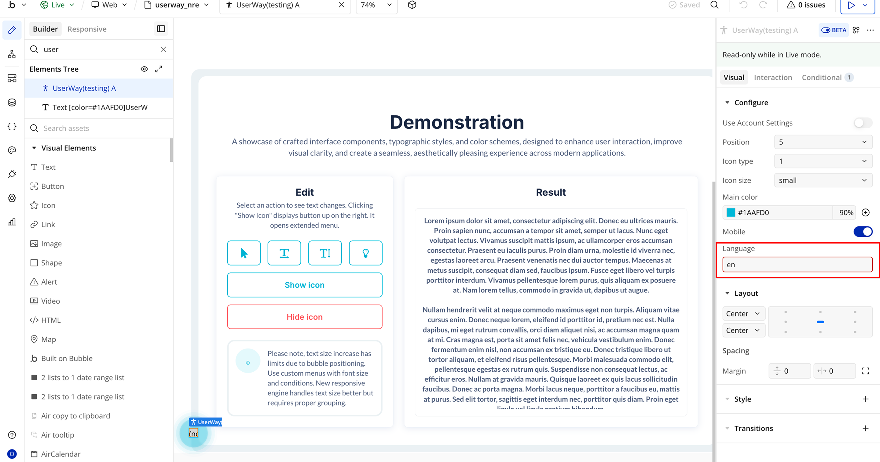
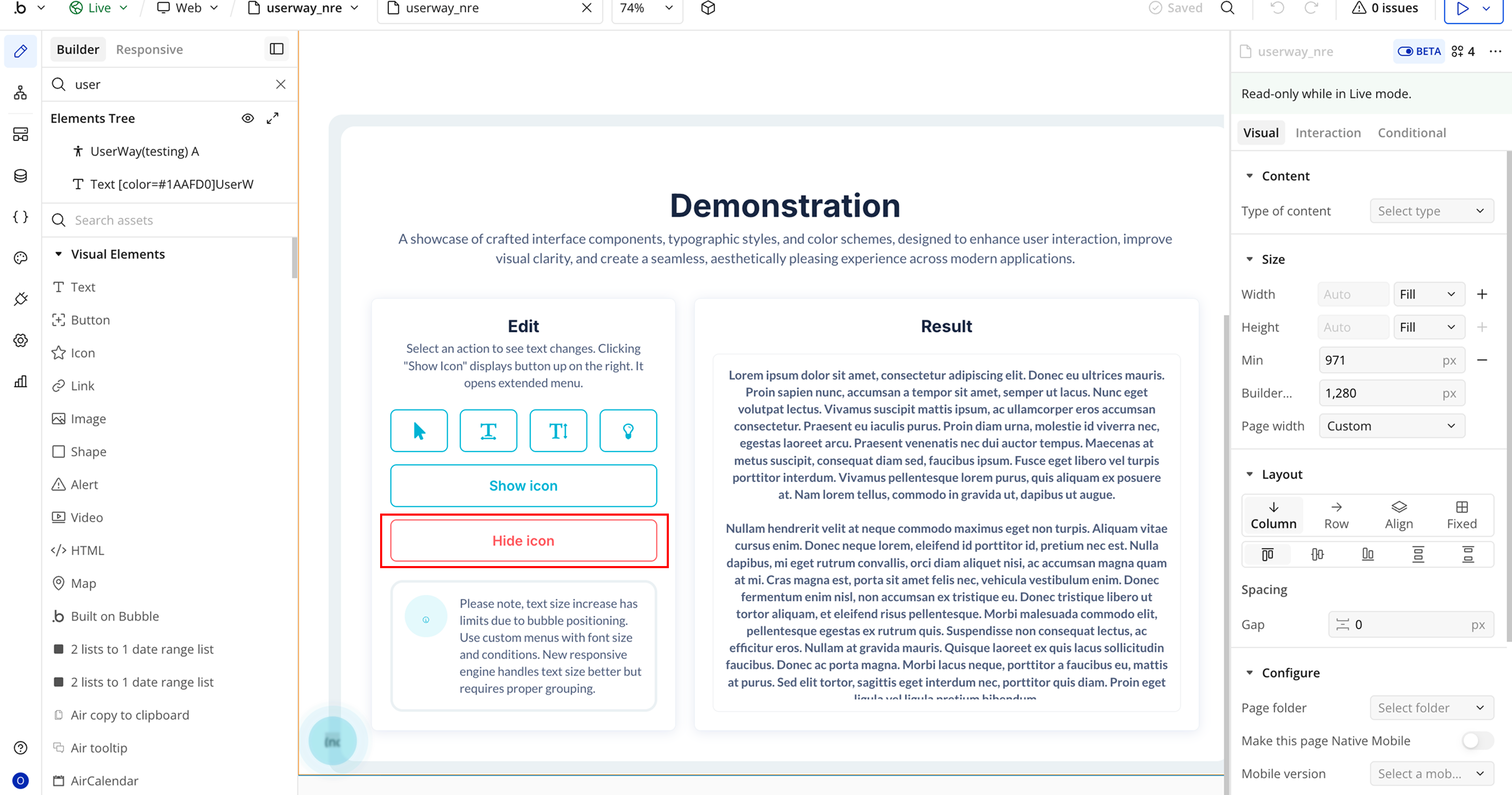
Step 3 – Configure Properties
- User Account Setting → When enabled, personal UserWay account settings will be applied, and other settings configured will be ignored.
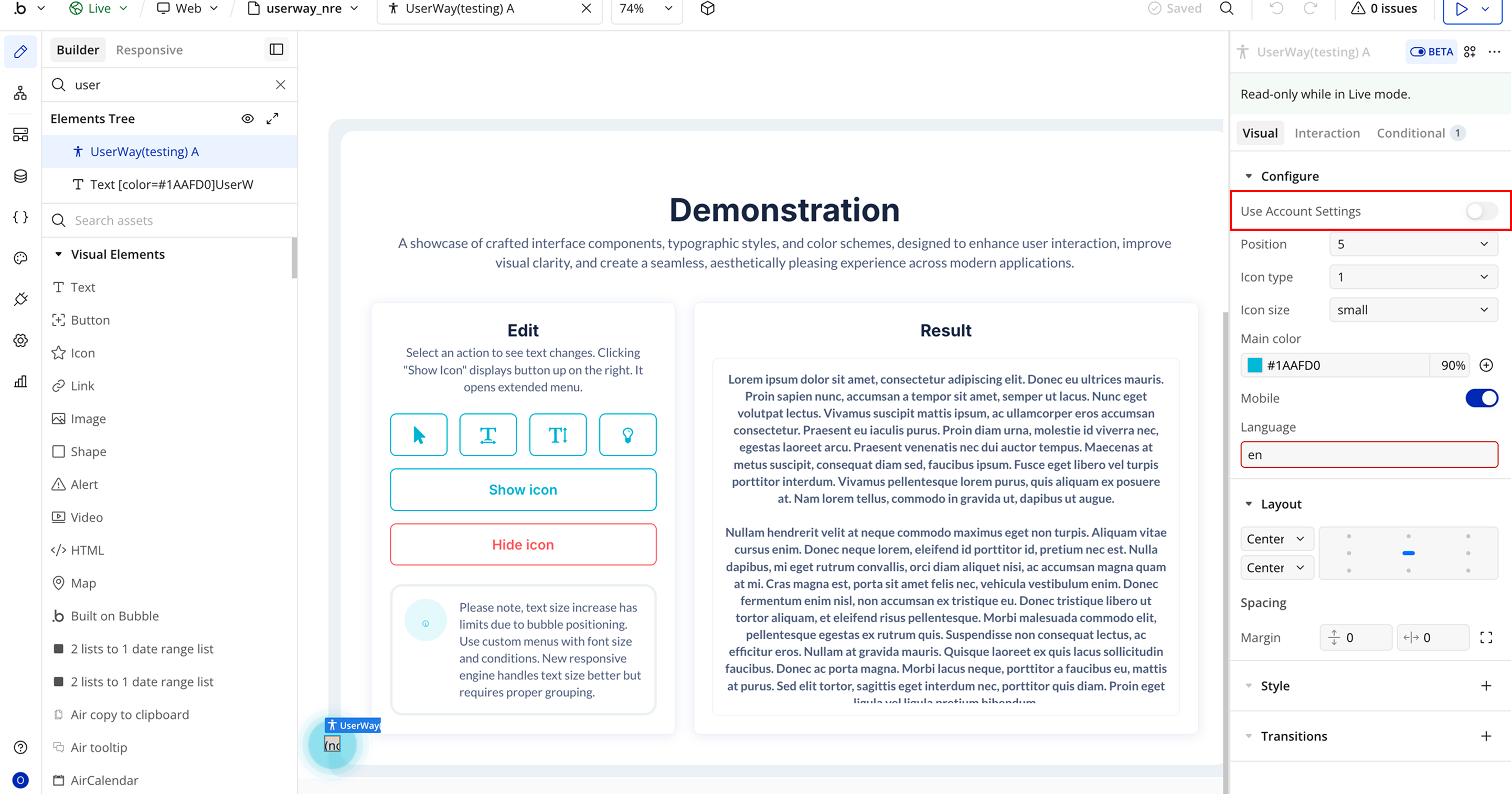
- Position → The position of the accessibility widget on the page.
- Icon Type → The widget’s icon.
- Icon Size → The widget’s icon size.

- Main Color → The primary color of the widget icon.
- Mobile → Enable support for mobile devices.
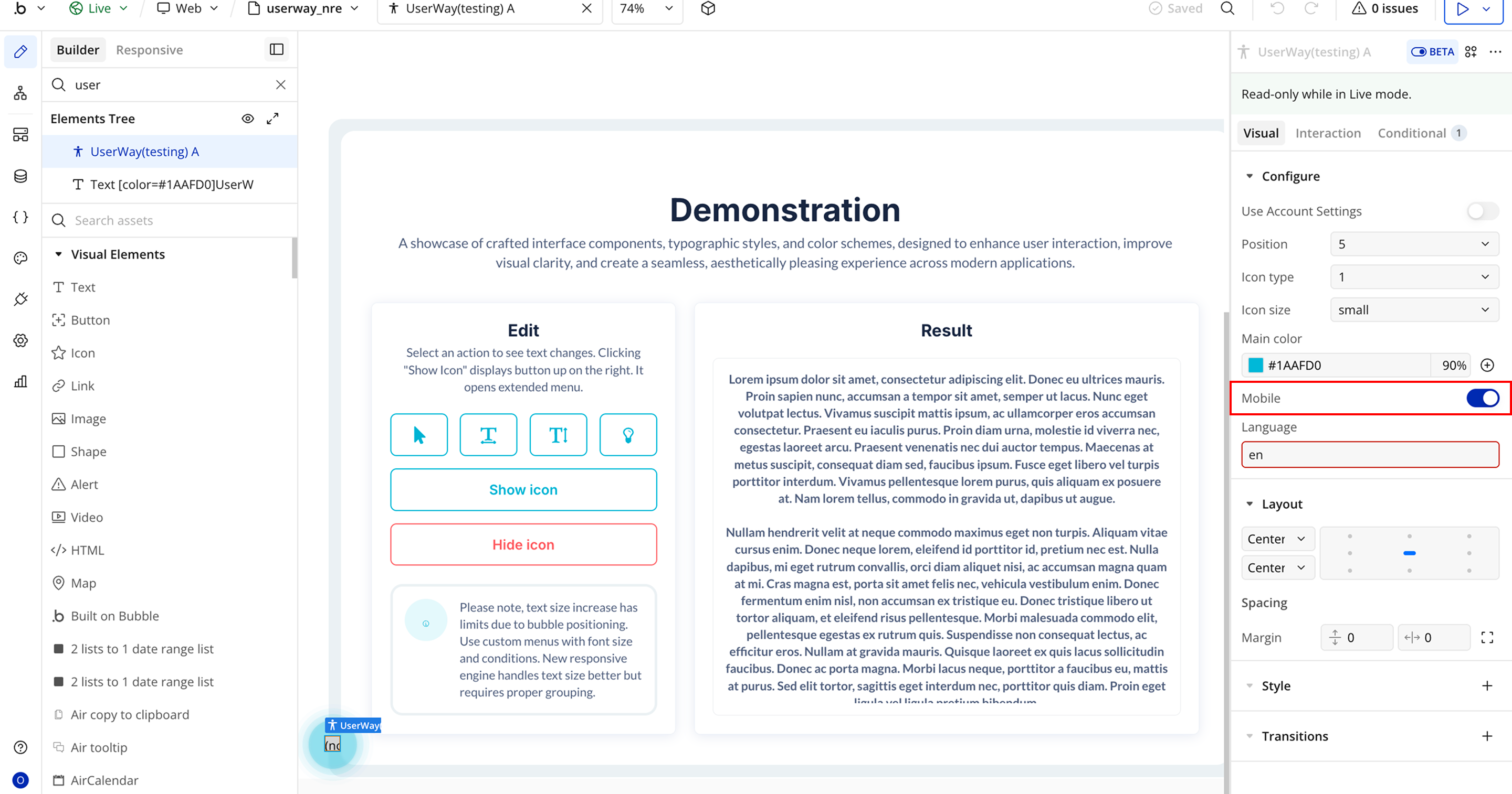
- Language → Set the widget language using a two-letter language code.
Plugin Element Properties - UserWay
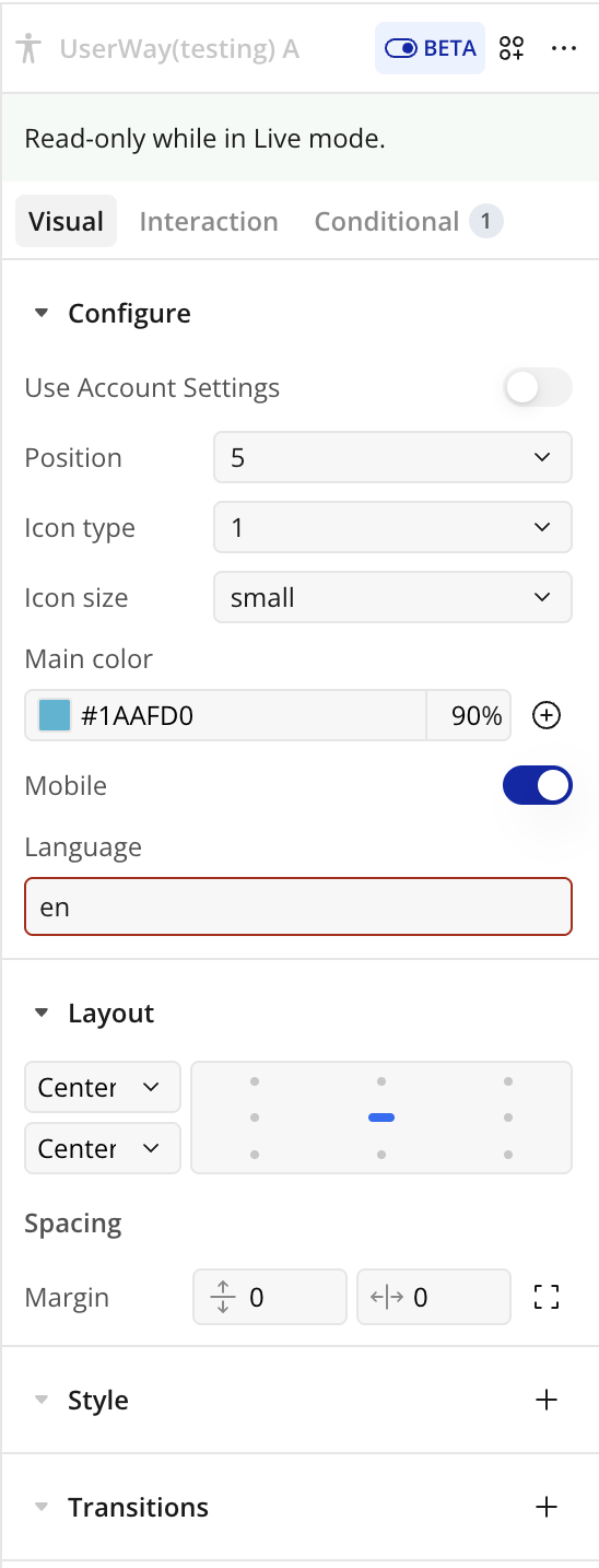
Fields
Title | Description | Type |
Use Account Settings | When enabled, your personal UserWay account settings will be applied, and the settings configured below will be ignored. | Toggle (yes/no) |
Position | The position of the accessibility widget on the page. Options start from top-right (1) and go clockwise: 2 = middle-right, 3 = bottom-right, 4 = bottom-middle, 5 = bottom-left, 6 = middle-left, 7 = top-left, 8 = top-middle. | Dropdown |
Icon Type | Select the widget’s icon: 1 = person, 2 = chair, 3 = eye, 4 = text. | Dropdown |
Icon Size | Choose the size of the widget icon. Options: small, large. | Dropdown |
Main Color | The primary color of the widget icon to match your app branding. | Color Picker |
Mobile | Enable support for mobile devices so users can access the widget on phones and tablets. | Toggle (yes/no) |
Language | Set the widget language using a two-letter language code (e.g., en, fr, de, es, he, nl). | Text |
Element Actions
- Modify Text Size - Changes the size of all text on the page according to the selected value, helping users with visual impairments read content more easily.
- Enable Highlight - Activates a text highlighting tool, helping users with reading difficulties or visual impairments track and focus on content more easily.
- Disable Highlight - Deactivates the text highlighting tool, so all previously highlighted text returns to normal, improving readability for users who no longer need the feature.
- Enable Legible font - Switches your app’s text to a font optimized for legibility, helping users read content more easily without affecting the layout.
- Show icon - Controls the visibility of the accessibility widget icon. When turned on, the icon appears in the selected position, allowing users to access accessibility features. When turned off, the icon is hidden from view.
- Disable Legible font - Turns off the enhanced readability font and returns all text to the default font defined in your app’s design.
- Enable Read Page - Turns on the built-in text-to-speech functionality, helping users with visual impairments, reading difficulties, or cognitive challenges by reading on-screen content aloud.
- Hide icon - Removes the accessibility widget icon from view while keeping the widget installed. Users will not see or be able to open the accessibility tools unless the icon is shown again.
- Disable Read Page - Deactivates the read-aloud functionality and restores the page to its normal, non-narrated state.
- Enable Keyboard nav - Improves accessibility by enabling users to move through interactive elements (links, buttons, forms, menus) using keys such as Tab, Shift+Tab, Enter, and arrow keys, without requiring a mouse.
- Show Page Structure (Headers) - Highlights and organizes the page’s heading elements (H1, H2, H3, etc.) so users can better understand the content layout and quickly navigate through sections. This is especially helpful for screen reader users and users with cognitive disabilities.
- Disable Keyboard nav - Deactivates the accessibility-focused keyboard controls, returning navigation to the app’s original interaction settings.
- Show Page Structure (Links) - Highlights or lists all clickable links on the page, helping users quickly identify and navigate available navigation paths. Especially useful for screen reader users and users with cognitive impairments.
- Enable Big Cursor - Activates a larger, more visible cursor to assist users with visual impairments or difficulty tracking small pointers.
- Hide Page Structure - Hides previously displayed header or link structure views and restores the page to its normal appearance.
- Disable Big Cursor - Turns off the enlarged cursor and returns to the standard system cursor size.
- Enable Tooltip - Activates descriptive tooltips that provide additional explanations for buttons, links, and interface elements to improve usability and clarity.
- Enable Reading Guide - Displays a horizontal guide or highlight that follows the cursor, helping users with dyslexia, ADHD, or visual tracking difficulties focus on content while reading.
- Disable Tooltip - Turns off the accessibility tooltips and restores the default page behavior.
- Disable Reading Guide - Deactivates the reading guide overlay and returns the page to its normal display.
- Enable Stop Animation - Pauses animations, transitions, GIFs, and auto-playing content to reduce motion distractions and assist users with motion sensitivity.
- Modify Contrast option - Allows users to change contrast modes (such as high contrast, dark mode, light mode, or inverted colors) to improve readability and accessibility based on their visual needs.
- Disable Stop Animation - Re-enables any ongoing animations on the page that were previously paused using the Enable Stop Animation action.
- Reset UserWay - Resets all UserWay accessibility settings to their default state, removing any customizations applied by the user or app.
Workflow example
Workflow 1: Show UserWay Icon
- Place the Userway Icon plugin element on your page.
- Add a Button labeled Show Icon.
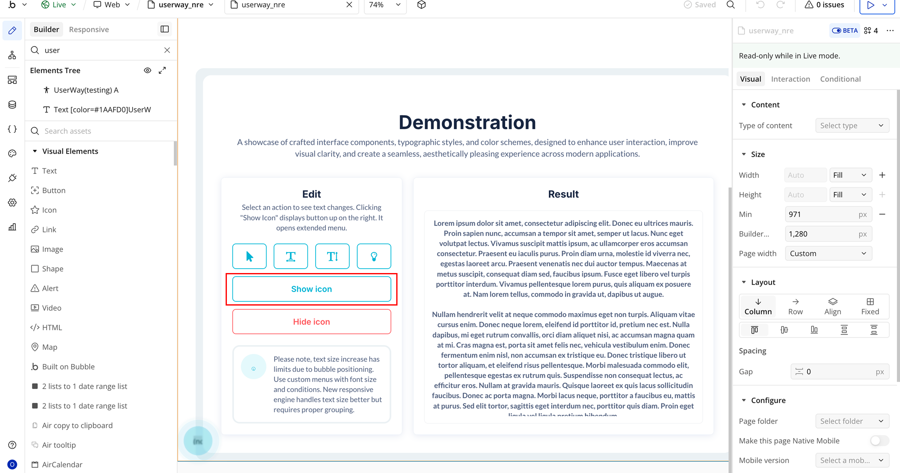
- Create a workflow: When Show Icon Button is clicked.
- Add the plugin action Show Icon A UserWay.
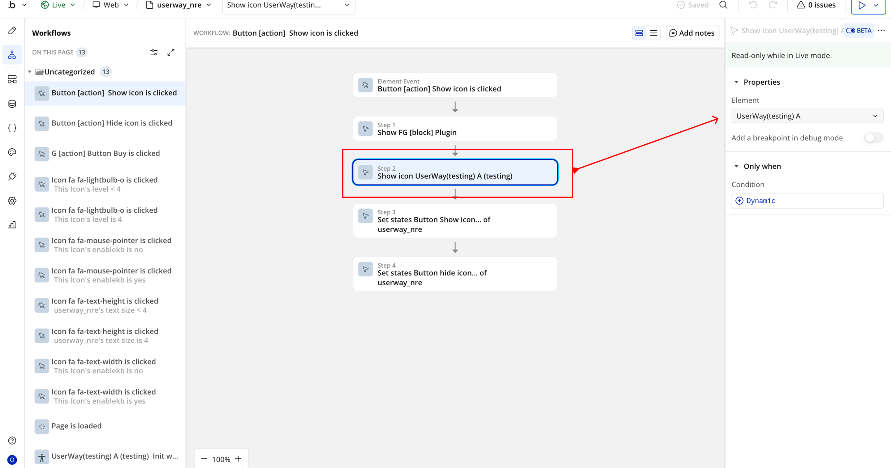
- In the action properties:
- Element → Select the Userway element placed on the page.
- Run the workflow to display the accessibility icon.
Workflow 2: Hide UserWay Icon
- Place the Userway Icon plugin element on the page.
- Add a Button labeled Hide Icon.
- Create a workflow: When Hide A Icon Button is clicked.
- Add the plugin action Hide A Icon Userway.
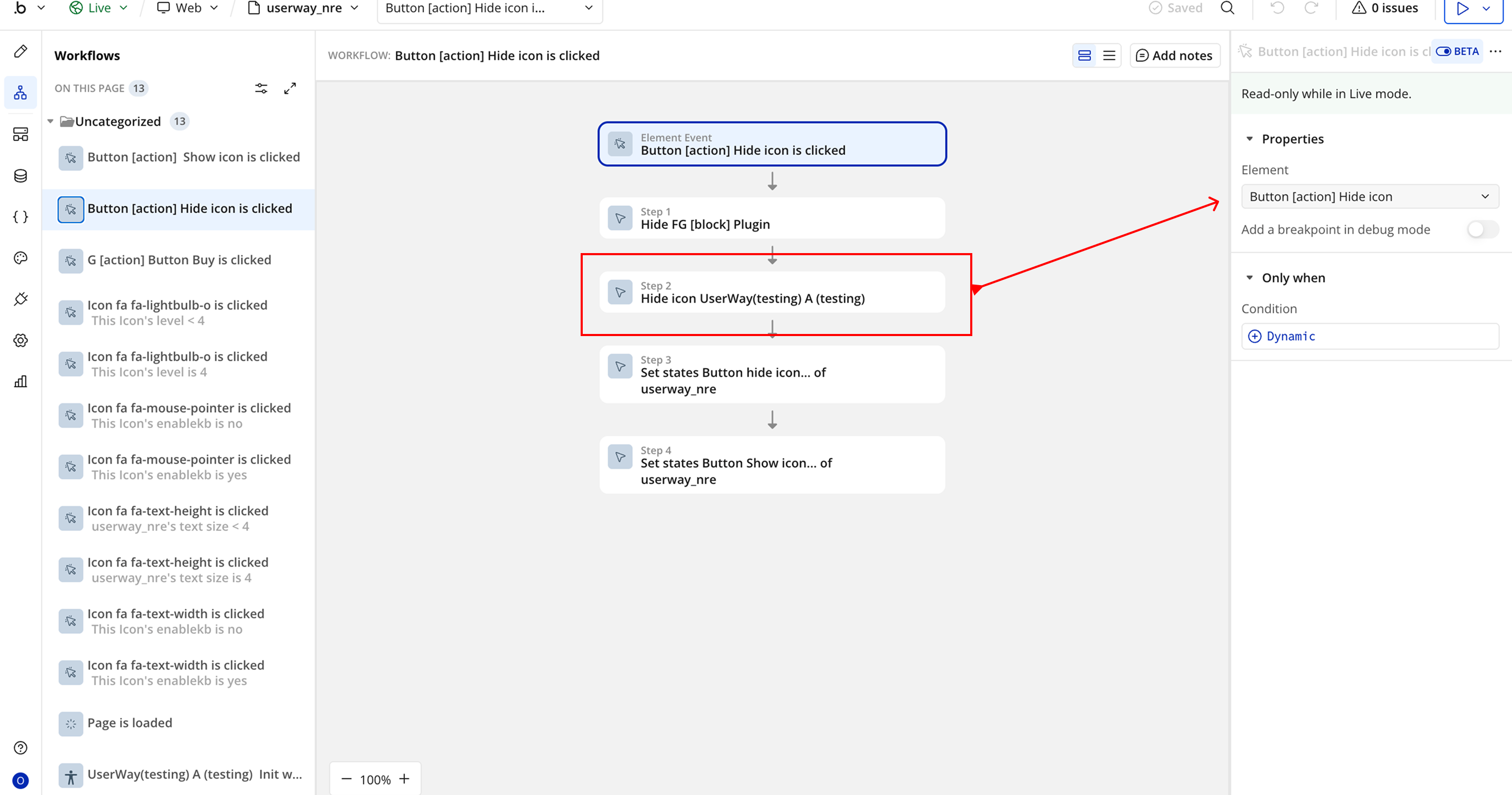
- In the action properties:
- Element → Select the Userway element placed on the page.
- Run the workflow to add the accessibility icon to the page.

Changelogs
Update 27.03.26 - Version 3.1.0
- Migrated to v4.
Update 25.03.26 - Version 3.0.0
- Bubble Plugin Page Update (Docs).
Update 27.06.25 - Version 2.7.0
- Bubble Plugin Page Update (Description).
Update 27.06.25 - Version 2.6.0
- Bubble Plugin Page Update (GIF).
Update 20.06.25 - Version 2.5.0
- Bubble Plugin Page Update (Logo).
Update 02.06.25 - Version 2.4.0
- Marketing update (minor change).
Update 02.06.25 - Version 2.3.0
- Marketing update (minor change).
Update 19.03.25 - Version 2.2.0
- Added event 'Init widget completed' and action 'Reset All'.
Update 10.10.24 - Version 2.1.0
- Acquired by Zeroqode.
Update 05.10.24 - Version 2.0.1
- Minor improvements.
Update 17.02.22 - Version 2.0.0
- BREAKING Change. You need to get your account ID.
Update 19.01.20 - Version 1.0.0
- Initial Release.