
✅
Link to the plugin page: https://zeroqode.com/plugin/lightbox-slider-plugin-for-bubble--1549448808525x489183551776358400
Demo to preview the plugin:
✅
Introduction
The Lightbox Slider Plugin for Bubble is a user-friendly, no-code image slider that allows you to showcase images with autoplay, zoom, rotate, and flip features. Perfect for galleries, product showcases, and visual presentations, this plugin is fully responsive and designed to enhance user experience across all devices.
Key Features
- Create an interactive image slider with minimal setup.
- Enable autoplay for smooth, hands-free image browsing.
- Let users zoom in and out for detailed image viewing.
- Add rotation capabilities for flexible viewing angles.
- Flip images horizontally or vertically for different perspectives.
- Fully responsive — works seamlessly on desktop, tablet, and mobile.
- Ideal for galleries, product showcases, and visual presentations.

How to setup
Step 1 – Install the Plugin
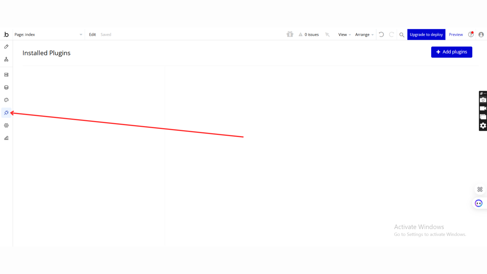
- Go to the Plugin Tab
- Open your Bubble Editor.
- Navigate to the Plugins tab on the left panel.
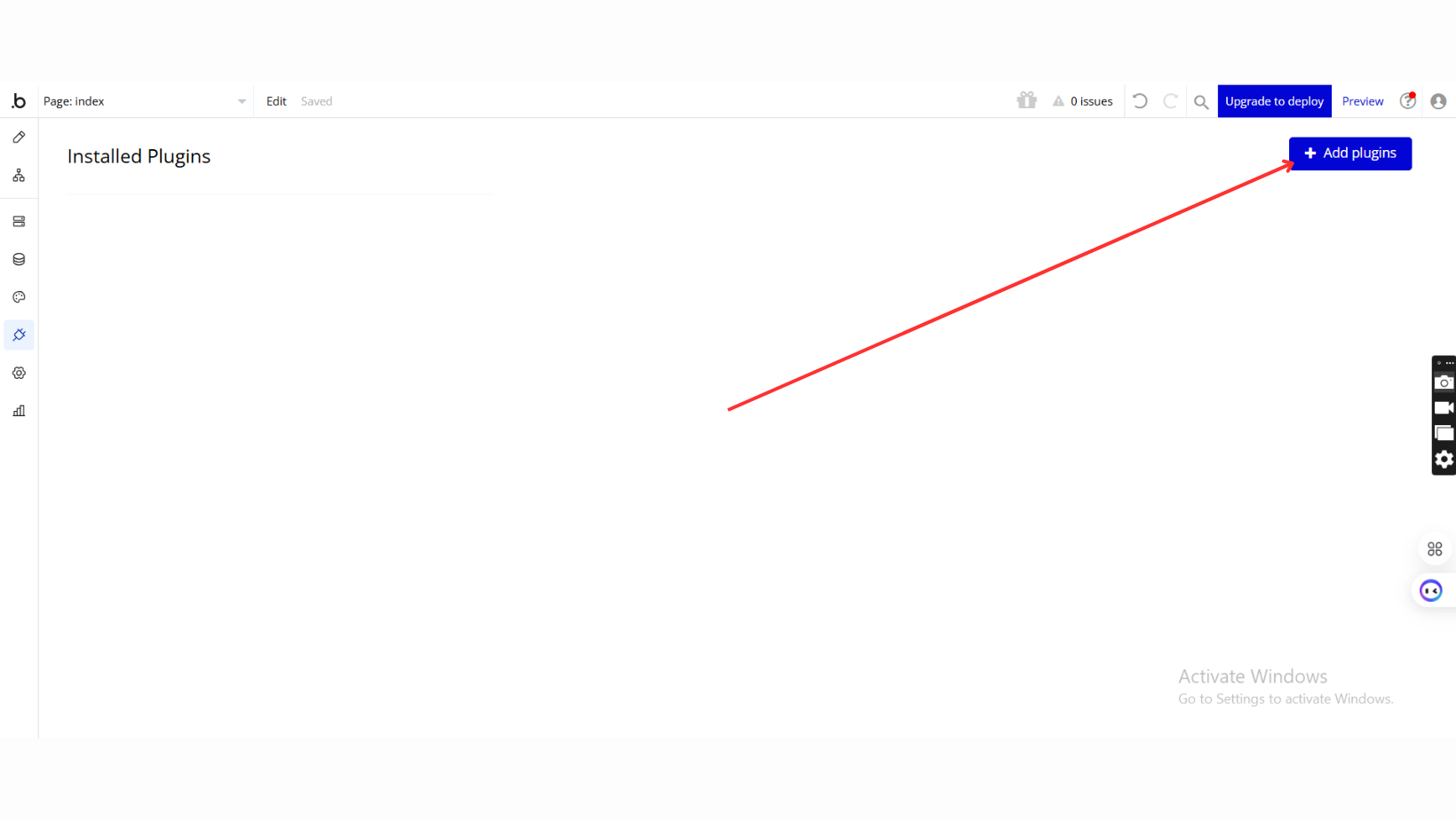
- Add Plugins
- Once in the Plugins tab, click the Add Plugins button.
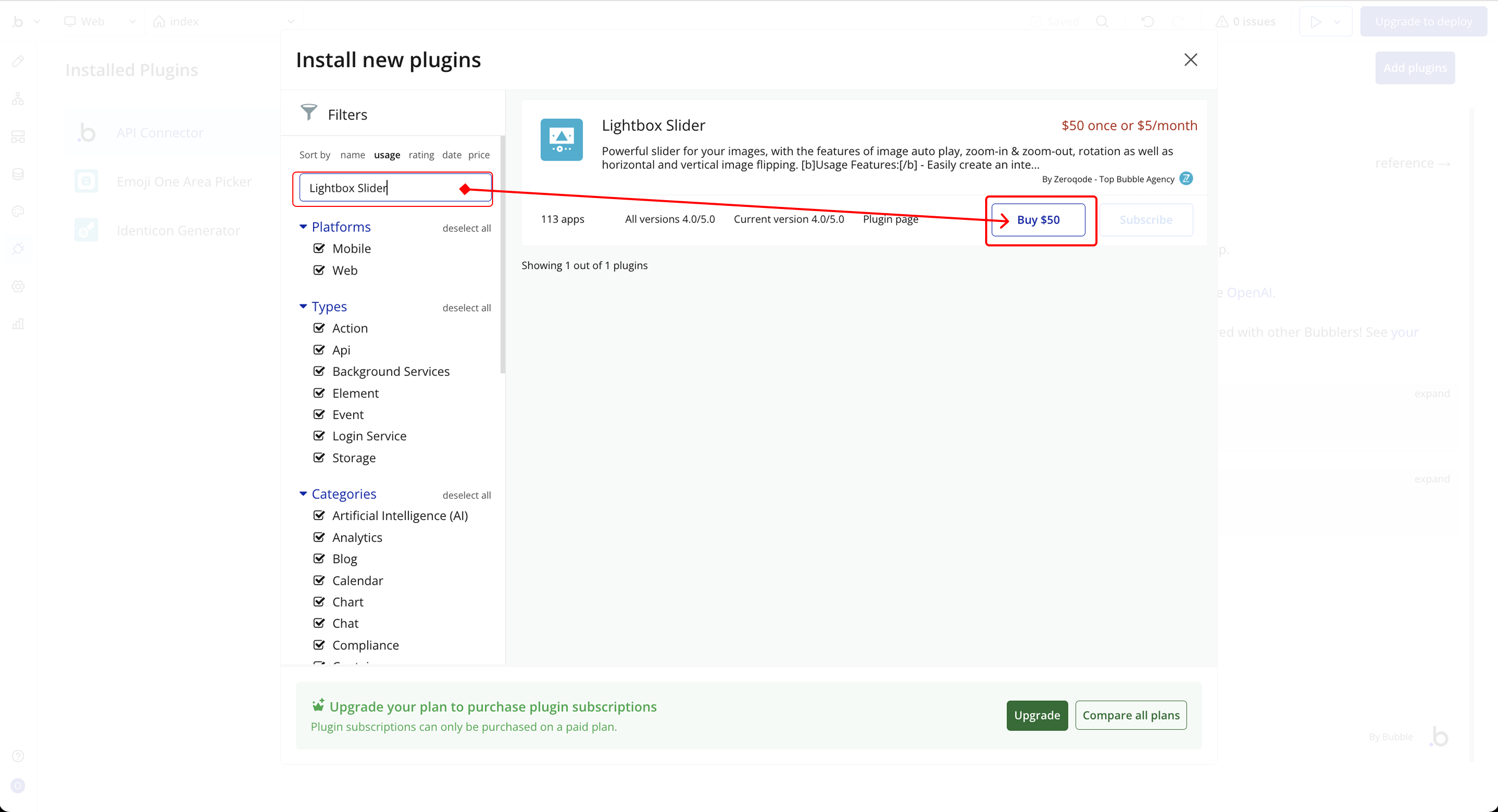
- Search for the Plugin
- Use the search bar to type Lightbox Slider
- Locate the plugin in the search results.
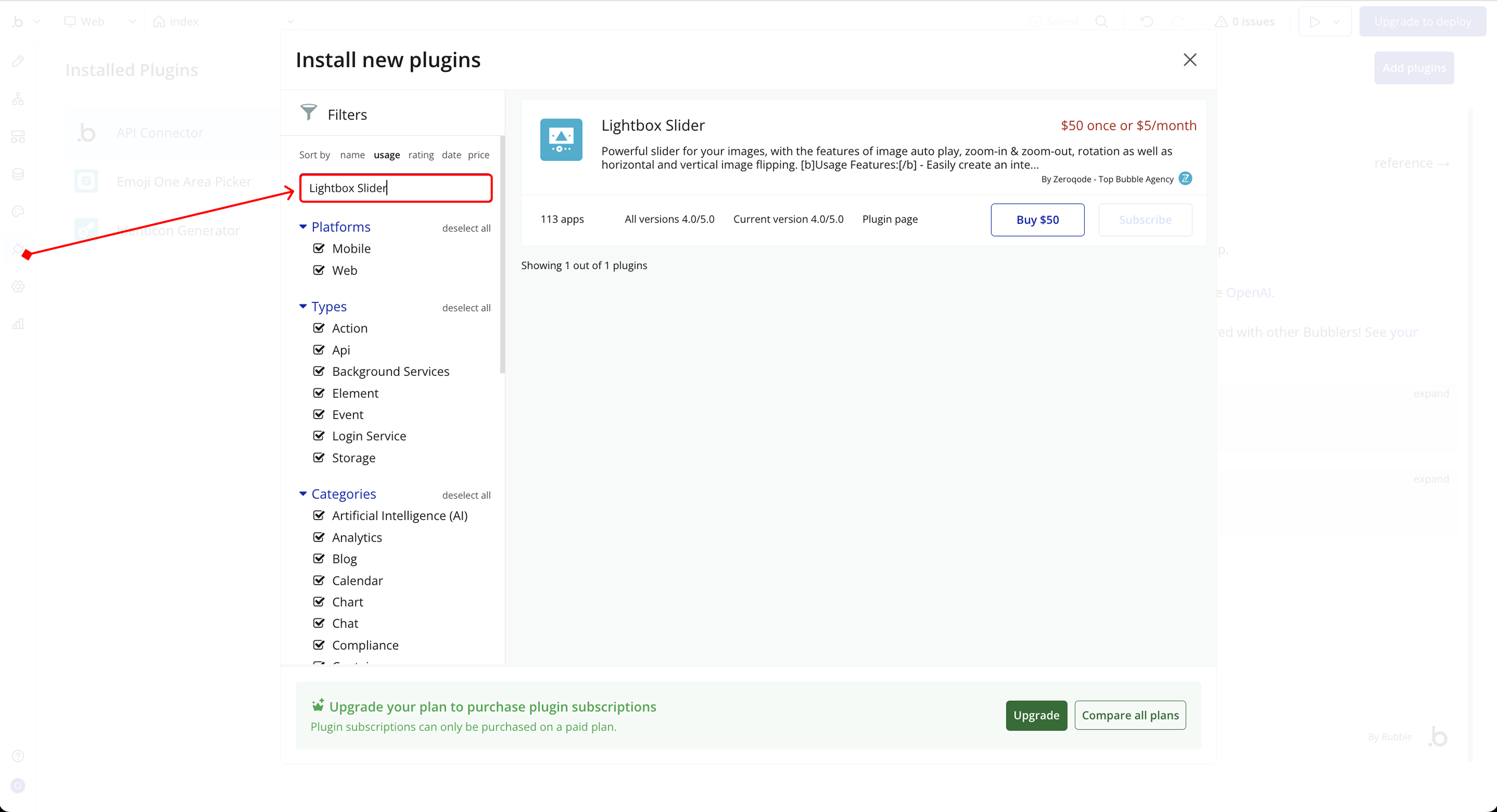
- Install/Buy
- If the plugin is free, click Install to add it to your application.
- For a paid plugin, click Buy and follow the purchase instructions.
- Payment Information (For Paid Plugins)
- If the plugin is a paid one, fill in your payment details and make payment.
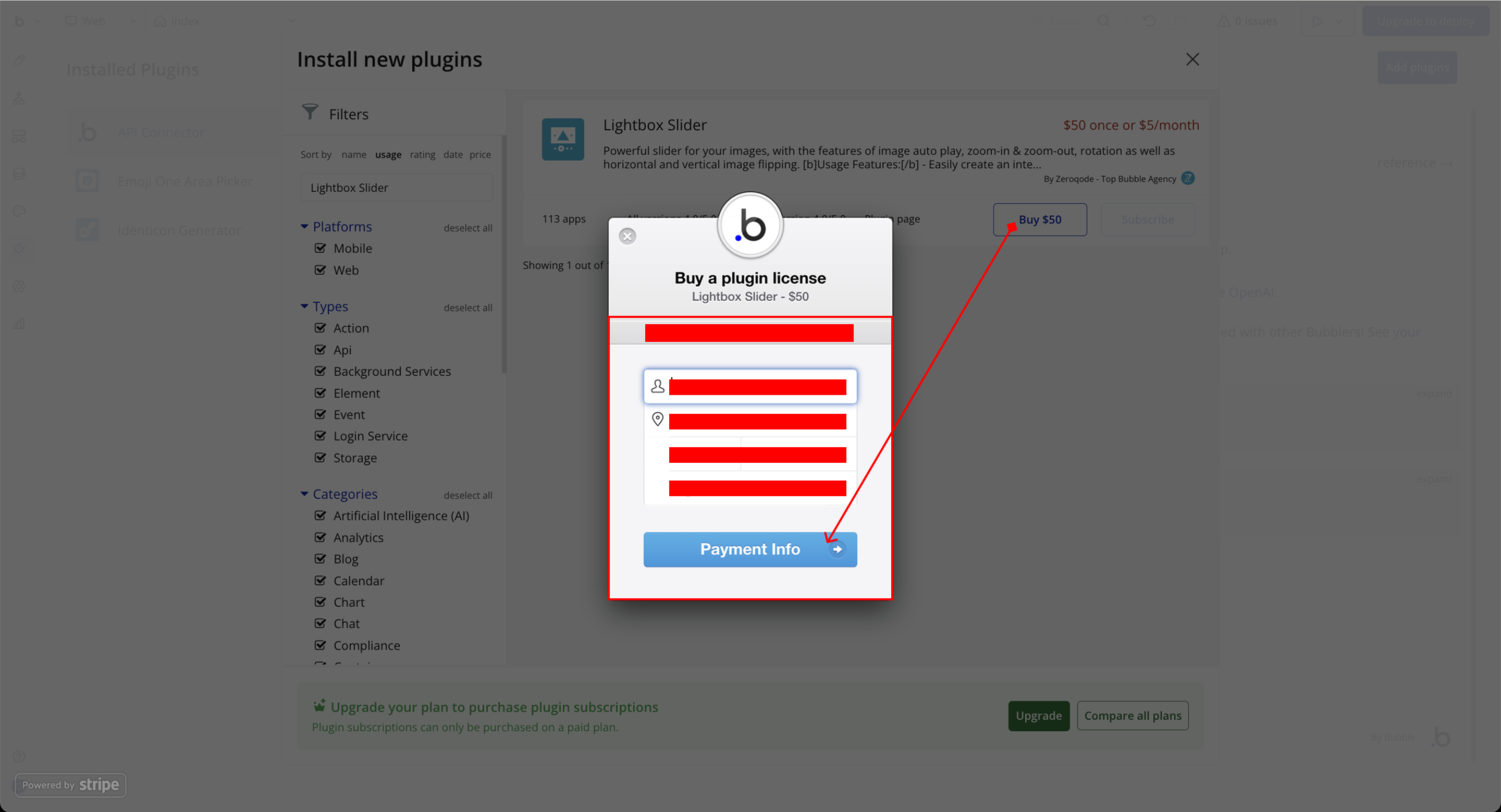
- Charges will be added to your Bubble billing account.
- Remember, if you unsubscribe from the plugin shortly after installation, charges will be prorated based on the days used.
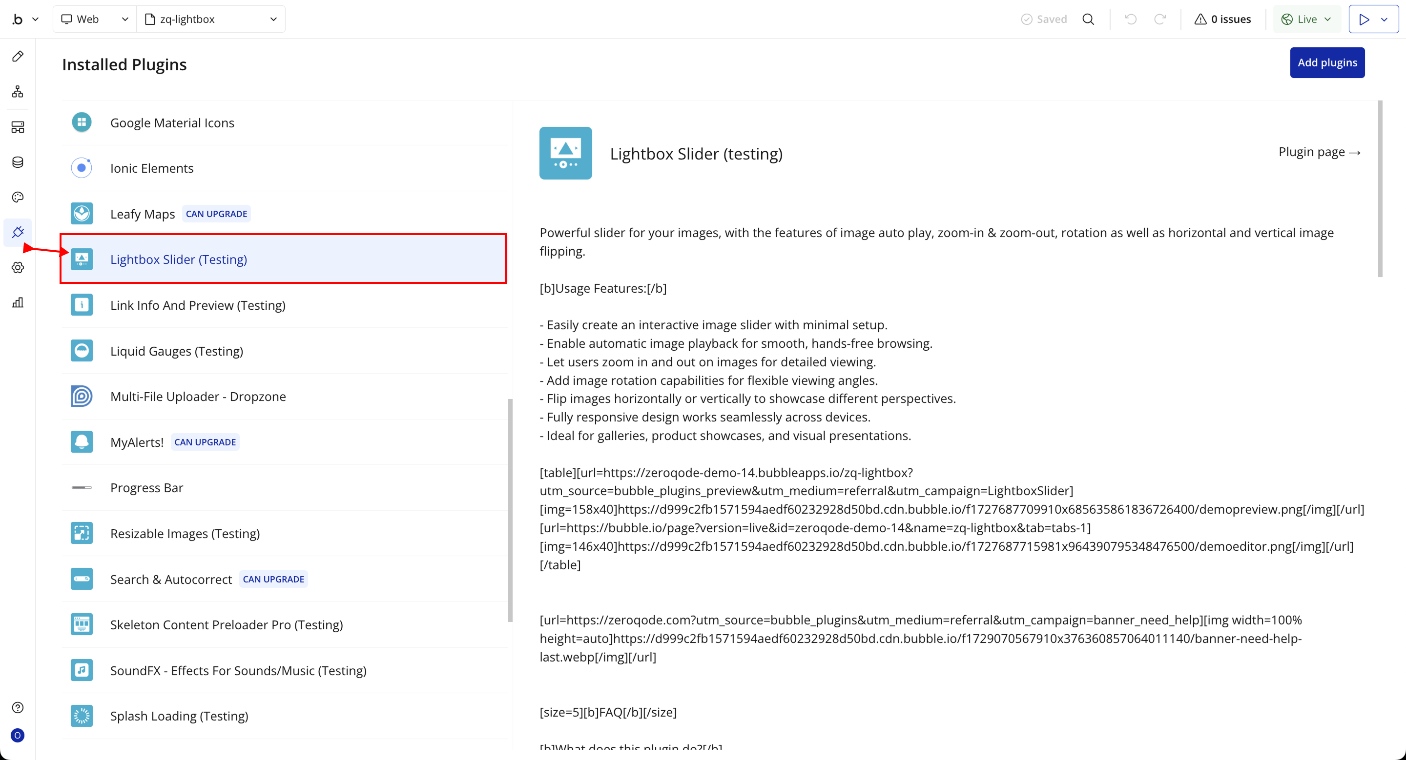
- Plugin Installed
- Once installed, the plugin will appear under the Installed Plugins list in your Bubble Editor.
Step 2 – Add the Plugin Element to Your Page
- Open the Design tab in your Bubble editor.
- Search for the Lightbox element in the Elements panel.
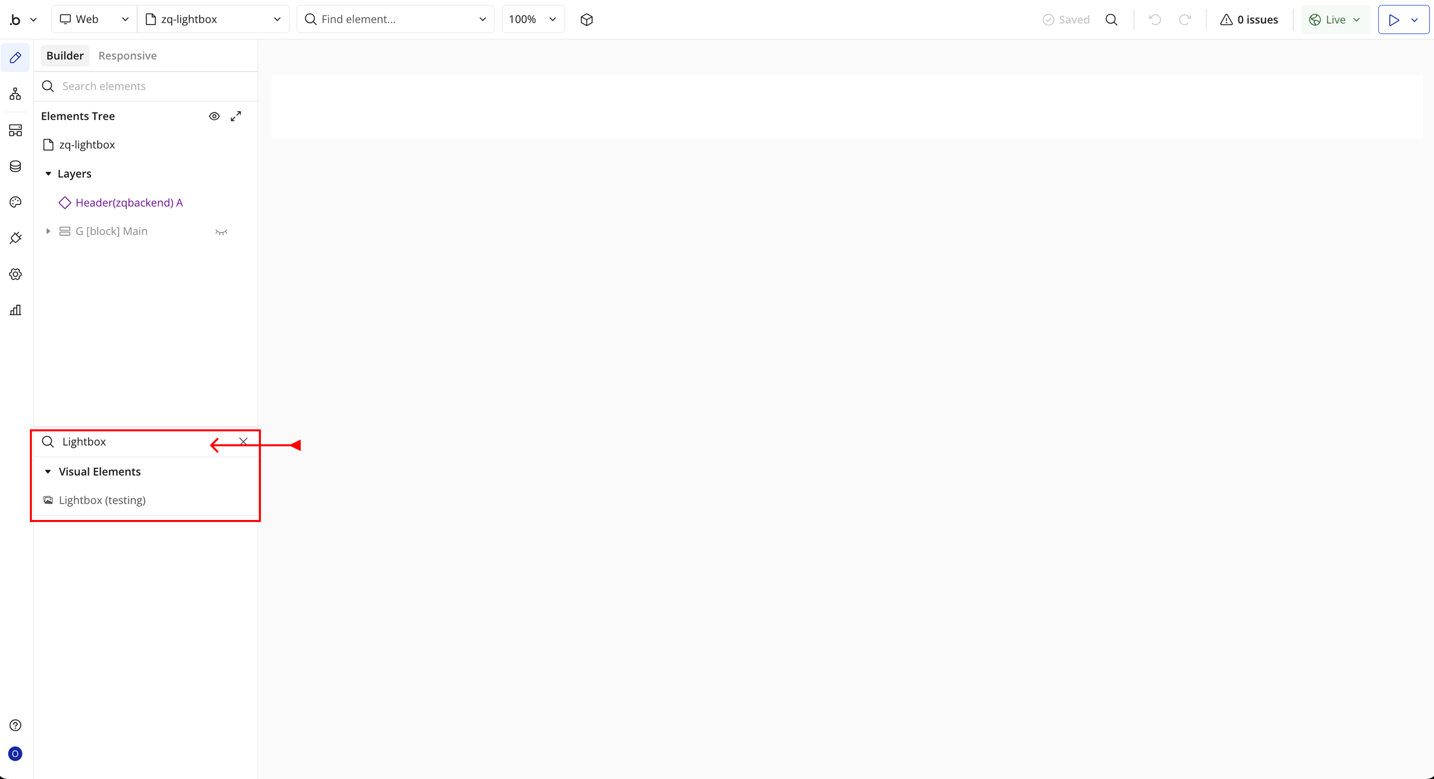
- You’ll see one option:
- Lightbox
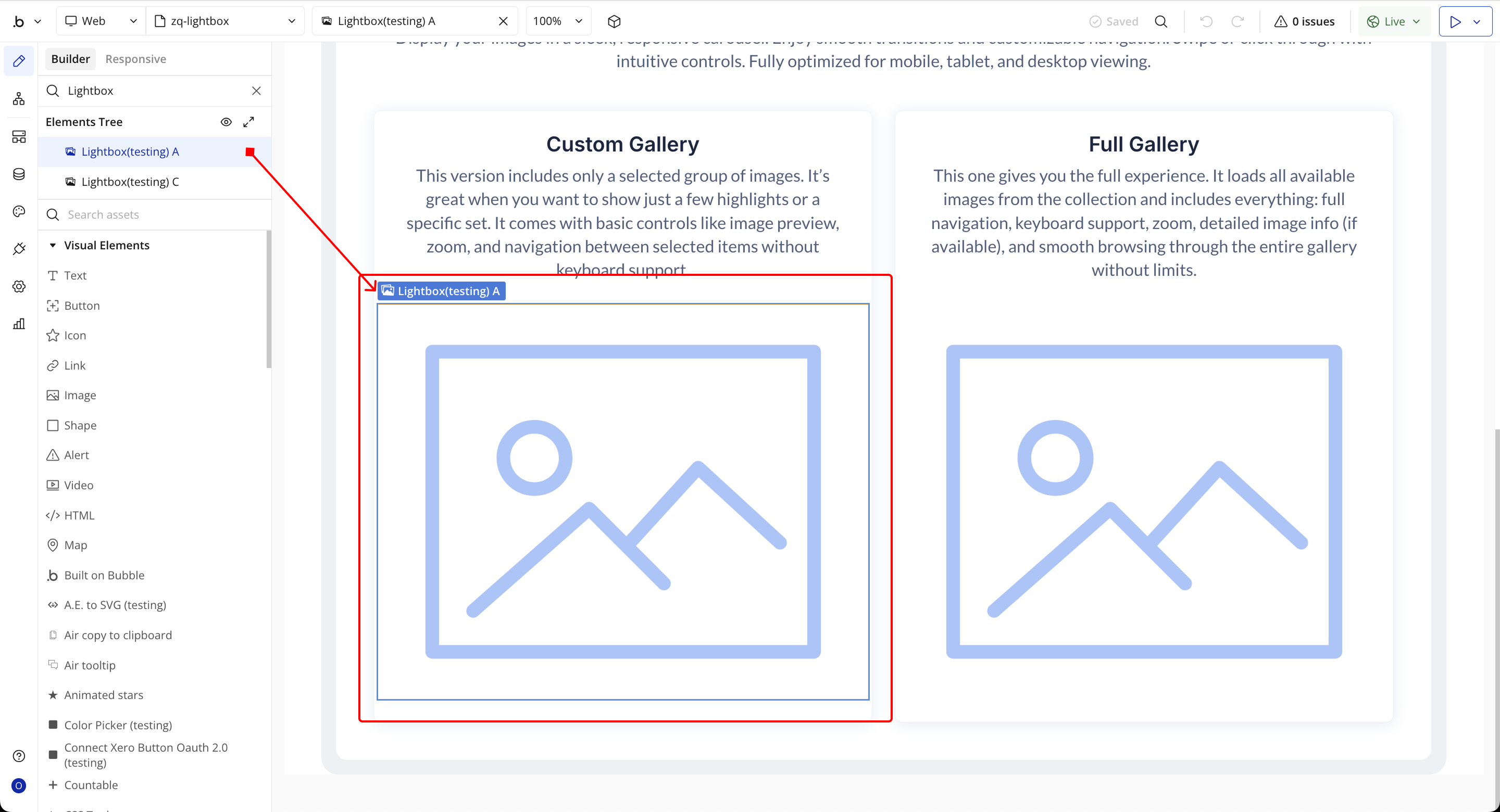
- Drag and drop the element onto your page.
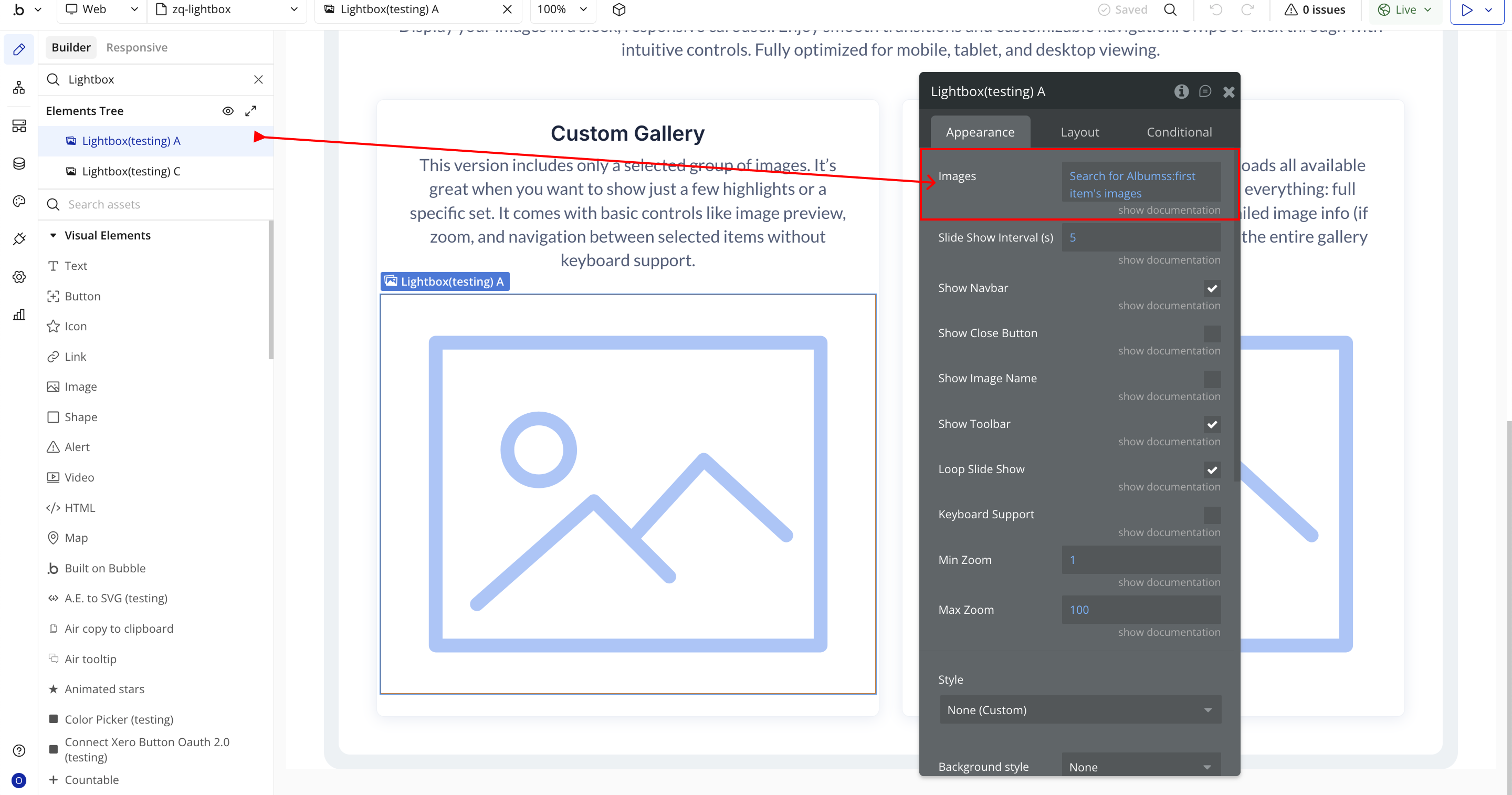
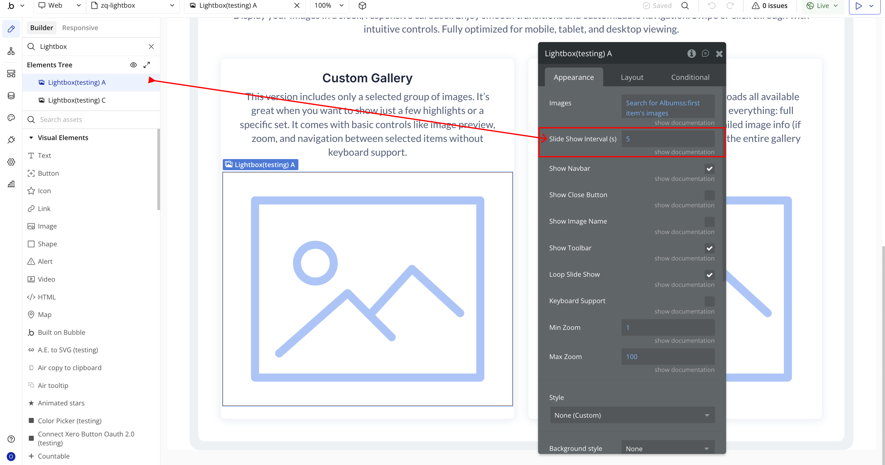
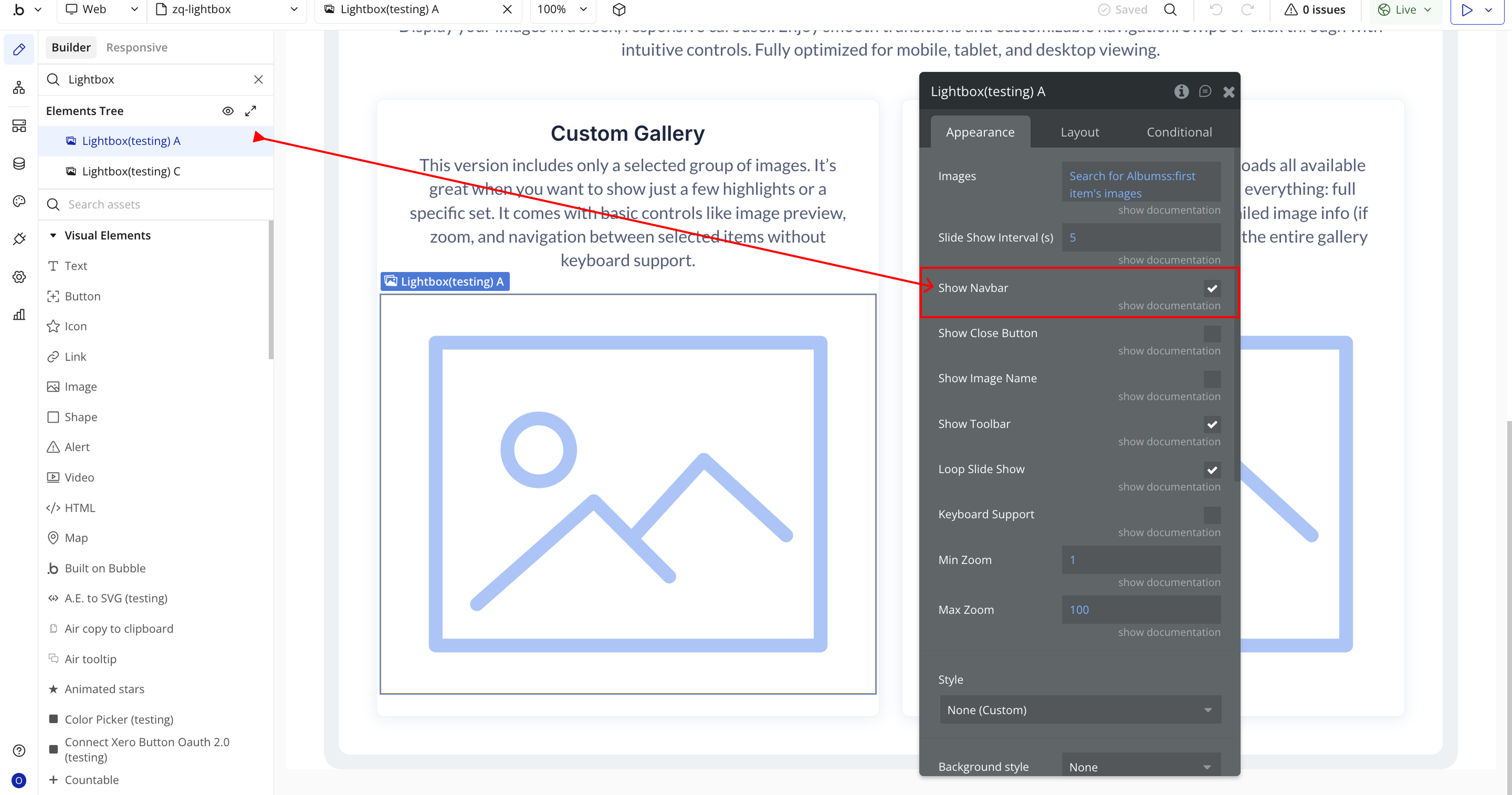
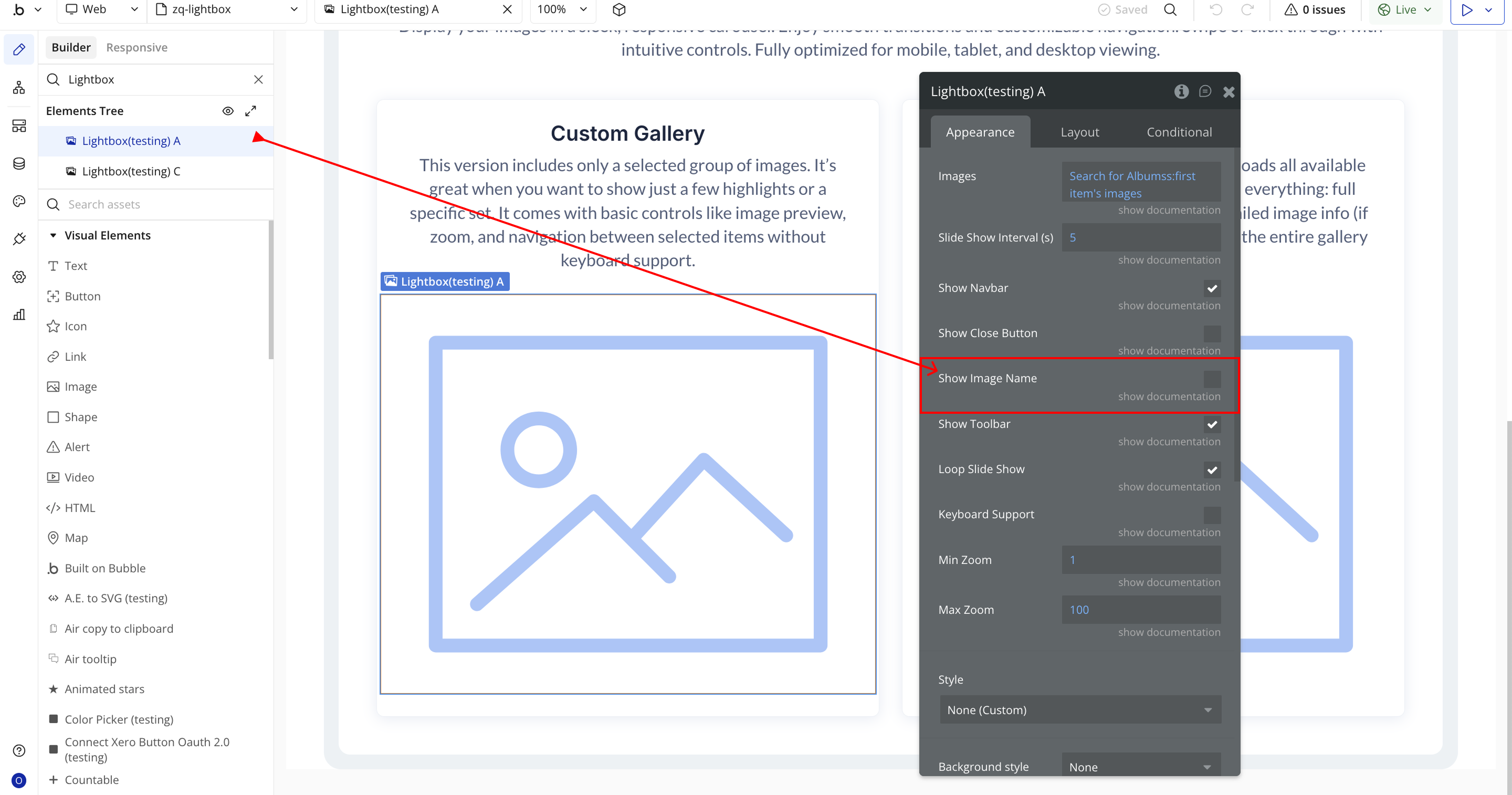
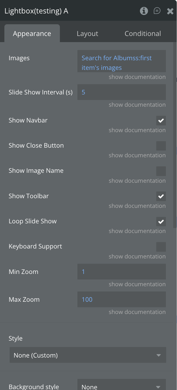
Step 3 – Configure Properties
Select the element and configure its properties in the Property Editor.
- Images → The list of images that will be displayed inside the lightbox slider.
- Slide Show Interval (s) → Sets how many seconds each slide stays visible during autoplay.
- Show Navbar → Toggles the visibility of the default navigation bar inside the lightbox.
- Show Close Button → Enables or disables the close button that allows users to exit the lightbox.

- Show Image Name → Shows or hides the image’s file name and dimensions.
- Show Toolbar → Toggles the toolbar that includes zoom, rotate, flip, and other controls.

- Loop Slide Show → Determines whether the slideshow should restart automatically after reaching the last image.
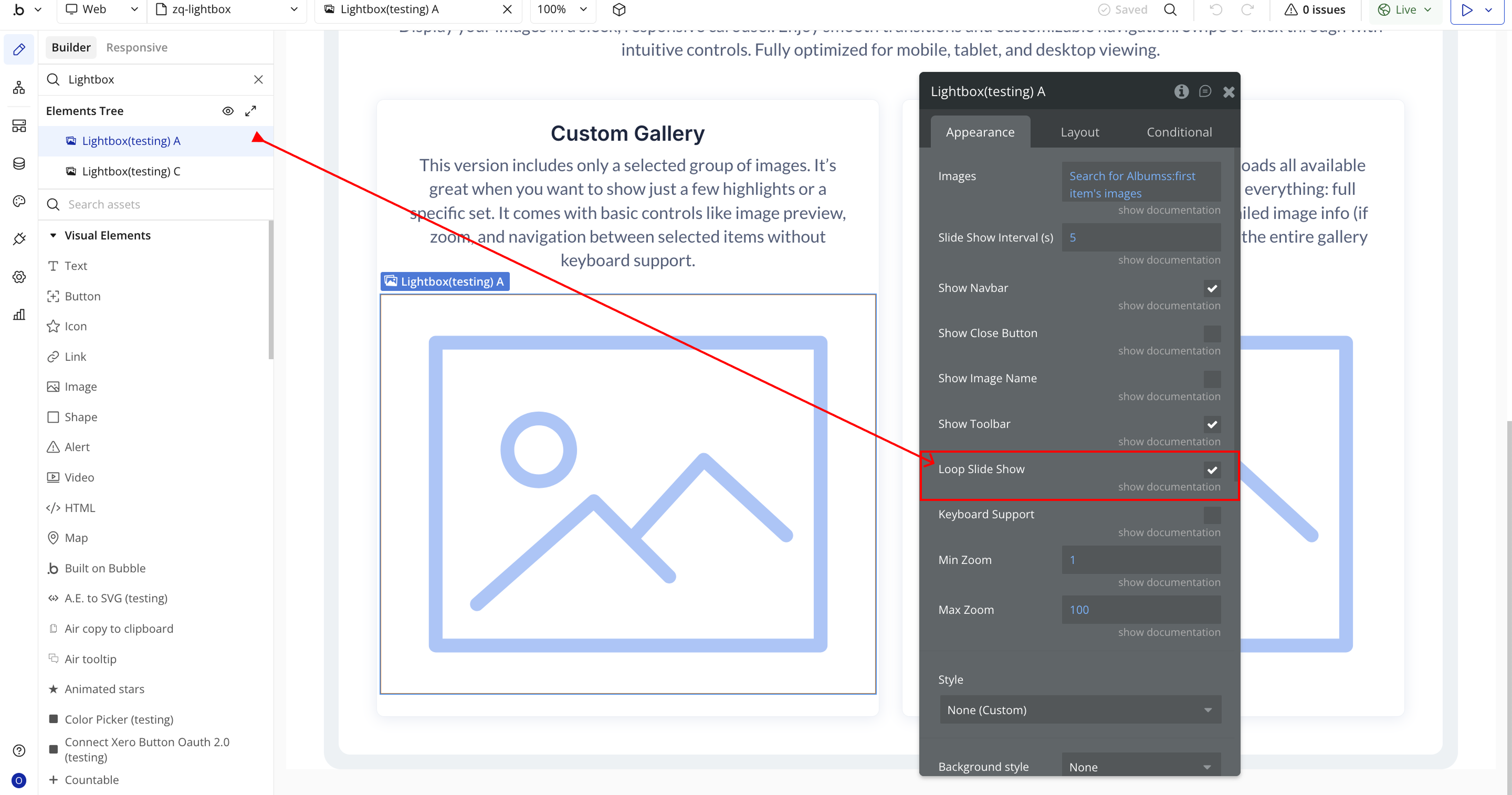
- Keyboard Support → Allows users to navigate the lightbox using keyboard keys such as arrows or Escape.

- Min Zoom → Sets the lowest zoom level the user can zoom out to (minimum value allowed is 1).
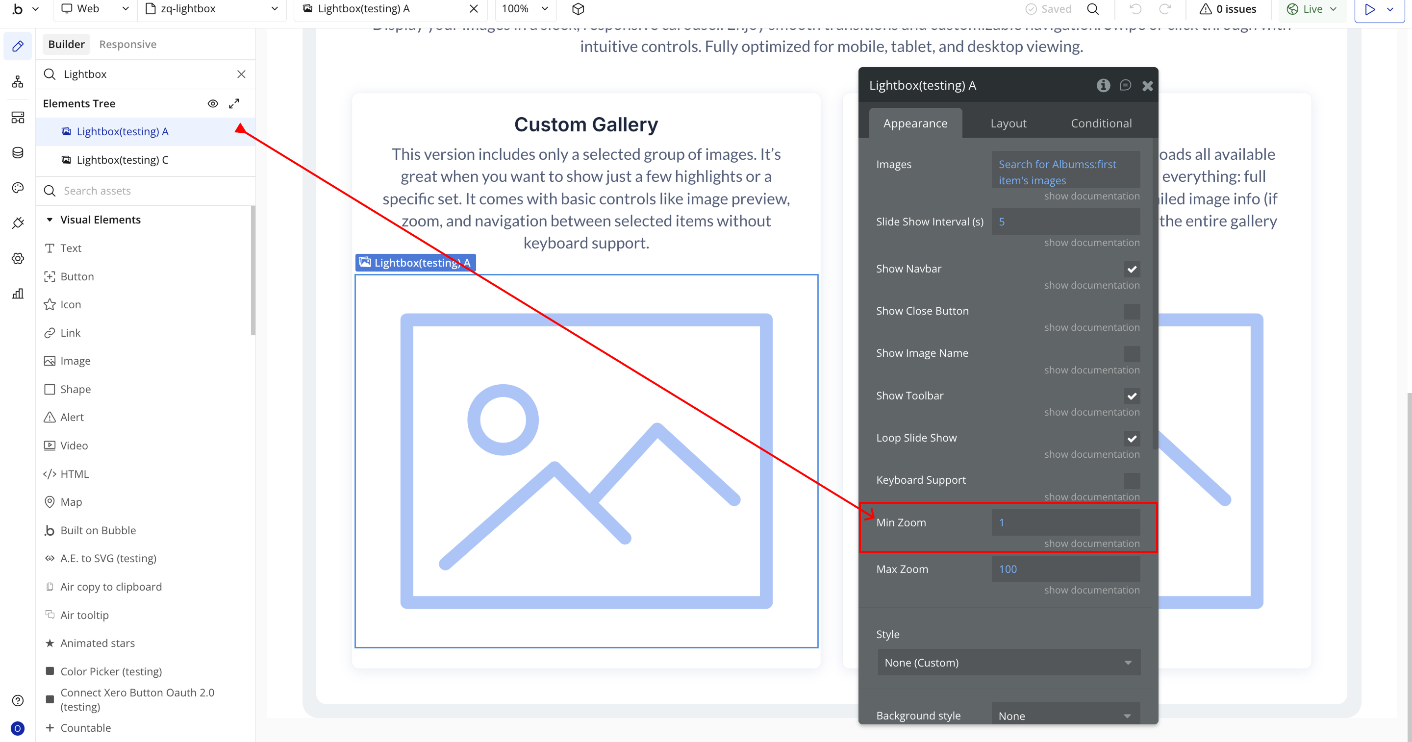
- Max Zoom → Sets the maximum zoom level the user can zoom into an image (up to 10,000).

Plugin Element Properties - Lightbox
Fields
Title | Description | Type |
Images | The list of images displayed in the lightbox slider. | Image |
Slide Show Interval (s) | Sets the duration (in seconds) between slides when autoplay is enabled. | Number (optional) |
Show Navbar | Shows or hides the default navigation bar inside the lightbox. | Checkbox (yes/no) (optional) |
Show Close Button | Displays a close button allowing users to exit the lightbox. | Checkbox (yes/no) (optional) |
Show Image Name | Shows the image file name and dimensions inside the lightbox. | Checkbox (yes/no) (optional) |
Show Toolbar | Displays the toolbar that contains interactive controls such as zoom, rotate, and flip. | Checkbox (yes/no) (optional) |
Loop Slide Show | Automatically loops the slideshow back to the first image after the last one is shown. | Checkbox (yes/no) (optional) |
Keyboard Support | Allows users to navigate using keyboard keys (e.g., arrow keys, escape, etc.). | Checkbox (yes/no) (optional) |
Min Zoom | Sets the minimum zoom level for the image (cannot be lower than 1). | Number (optional) |
Max Zoom | Sets the maximum zoom level for the image (up to 10,000). | Number (optional) |
Element Actions
- Zoom - Zoom Image.
Title | Description | Type |
Zoom Ratio | Controls the zoom direction and intensity. Use a positive number to zoom in, and a negative number to zoom out. | Number |
- Rotate - Rotate Image.
Title | Description | Type |
Degree | Controls image rotation. Use a positive number to rotate right, and a negative number to rotate left. | Number |
- Play Slideshow - Play Slideshow.
- Stop Slideshow - Stop Slideshow.
- Exit Slideshow - Exit Slideshow.
- Reset - Reset Image Initial State.
- Update - Update the viewer instance when the source images changed (added, removed or sorted).
- Destroy - Destroy the viewer and remove the instance.
- Open - Open Gallery.
- Close - Close Gallery.
- Show Previous - Show Previous Image.
- Show Next - Show Next Image.
Exposed states
Title | Description | Type |
Error | Displays an error message when something goes wrong (e.g., no images selected). | Text |
Element Events
Title | Description |
Error | Triggered when the lightbox is opened without any images selected. |
Is Ready | Triggered when the lightbox slider has fully loaded and is ready for interaction. |

Changelogs
Update 16.12.25 - Version 1.22.0
- migrated to v4.
Update 09.09.25 - Version 1.21.0
- Bubble Plugin Page Update (Forum).
Update 17.07.25 - Version 1.20.0
- Bubble Plugin Page Update (Logo).
Update 16.06.25 - Version 1.19.0
- Marketing update (minor change).
Update 30.04.25 - Version 1.18.0
- Minor update (Marketing update).
Update 25.07.24 - Version 1.17.0
- Minor update .
Update 24.06.24 - Version 1.16.0
- Updated demo/service links.
Update 09.04.24 - Version 1.15.0
- minor updates.
Update 19.10.23 - Version 1.14.0
- Updated description.
Update 18.09.23 - Version 1.13.0
- updated description.
Update 12.09.23 - Version 1.12.0
- minor updates.
Update 12.09.23 - Version 1.11.0
- minor updates.
Update 06.09.23 - Version 1.10.0
- Obfuscation.
Update 10.07.23 - Version 1.9.0
- updated description.
Update 16.06.23 - Version 1.8.0
- Updated the description .
Update 23.02.23 - Version 1.7.0
- deleted the icons.
Update 21.02.23 - Version 1.6.0
- updated the description.
Update 09.02.22 - Version 1.5.0
- Minor fix.
Update 19.07.21 - Version 1.4.0
- Updated icon.
Update 09.02.21 - Version 1.3.0
- Updated icon.
Update 05.02.21 - Version 1.2.0
- Added new properties with maximum and minimum scaling ranges.
Update 23.07.19 - Version 1.1.0
- Added event: is Ready. Autoplay now can be set when event, is Ready, triggers. .
Update 09.02.19 - Version 1.0.0
- Initial Release.