
Demo to preview the settings
Introduction
The plugin enables dynamic radial bar and gauge charts with customizable design, and seamless workflow integration for intuitive data visualization.

How to setup
Place the required element on the page and fill in the fields. You can find a more detailed configuration of element on the plugin demo page.
Plugin Element Properties
This plugin has 1 (one) visual element which can be used on the page.
APEX Gauge
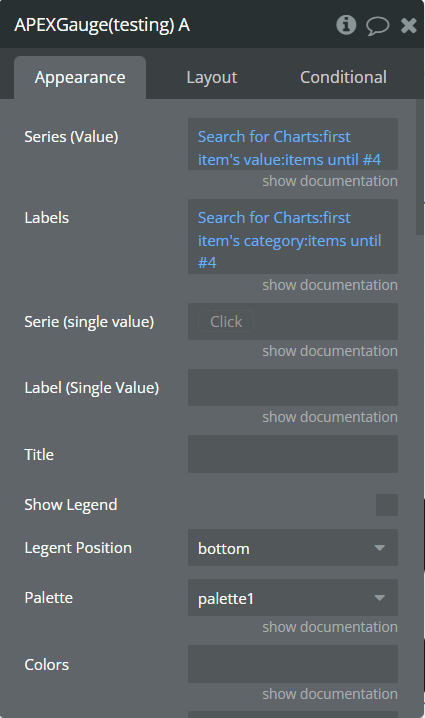
Element Fields
Title | Description | Type |
Labels | Label text that will appear when values are selected. | list of texts (optional) |
Series (values) | Values between 0 and 100. | list of numbers (optional) |
Label (single value) | Label text that will appear when value is selected. | text (optional) |
Serie (single value) | Value between 0 and 100. | number (optional) |
Title | The chart title. | text (optional) |
Show legend | Enables the chart legend. | Checkbox |
Legent position | The legend position beside chart. Available options: top, bottom, right, left. | Dropdown |
Palette | Use one of 10 preselected color pallets for data. | Dropdown |
Colors | Comma separated of own HEX colors. This will override the "Pallete" field. | text (optional) |
Stroke linecap | For setting the starting and ending points of stroke. butt: ends the stroke with a 90-degree angle square: similar to butt except that it extends the stroke beyond the length of the path round: ends the path-stroke with a radius that smooths out the start and end points. Available options: butt, square, round. | Dropdown |
Start angle | Can be negative (-90). This is the starting point if you don't need to reach full circle. | number |
End angle | Can be negative (-90). This is the ending point if you don't need to reach full circle. | number |
Show total | Show (average) total when nothing is hovered. | yes / no |
Total label | Text to display as 'total' label. | text |
Hollow size (%) | The inner space in percentages relative to the total available size of the chart. Recommended: 50. | number |
Show track | Enables track. | yes / no |
Track width (%) | The width of track. | number |
Track color | The color of track. | Color |
Track margin | The track margin (px). | number |
Track opacity | The track opacity. Value between 0 and 1. | number |
Show values | Enables displaying the chart value on hover. | yes / no |
Grid top padding | Chart padding from top in px. | number |
Grid bottom padding | Chart padding from bottom in px. | number |
Grid left padding | Chart padding from left in px. | number |
Grid light padding | Chart padding from right in px. | number |
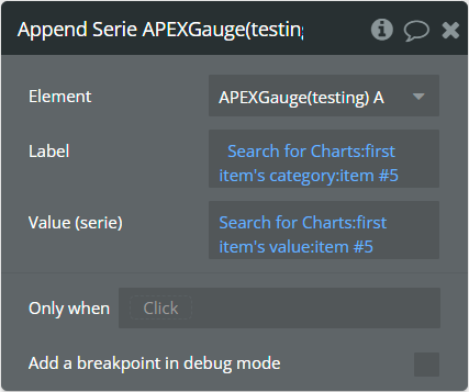
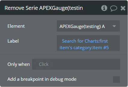
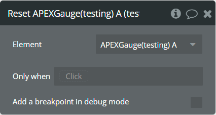
Element Actions
Append serie — This action will append a new pair of data, label and value, to the chart.
Remove serie — This action will remove a pair of data by label from the chart.
Reset — This action will reset all toggled series and bring back the chart to its original state.
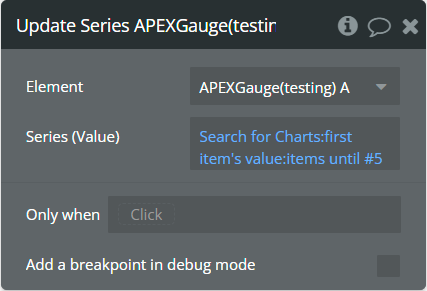
Update series — This action will update the existent values in the chart.
Element Events
Title | Description |
Data point is clicked | This event is triggered when the chart is clicked. |
Element States
Title | Description | Type |
selected label | Returns the selected label when the chart has clicked. | Text |
selected serie | Returns the selected value when the chart has clicked. | Number |
