
Link to the plugin page:
Demo to preview the plugin:
Introduction
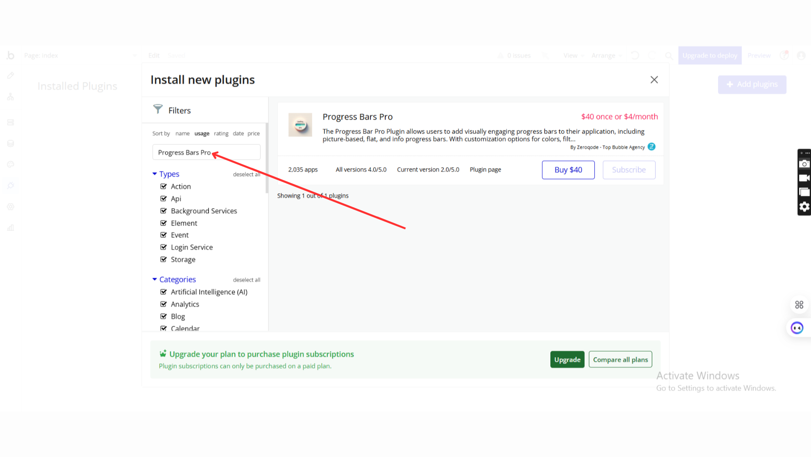
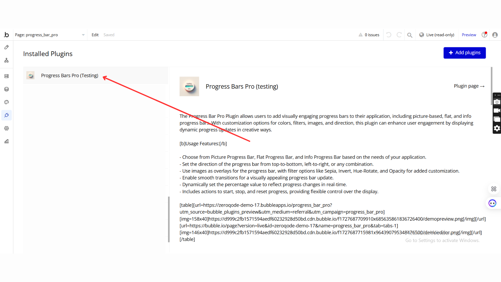
The Progress Bar Pro Plugin allows users to add visually engaging progress bars to their application, including picture-based, flat, and info progress bars. With customization options for colors, filters, images, and direction, this plugin can enhance user engagement by displaying dynamic progress updates in creative ways.
See Key Features
Prerequisite
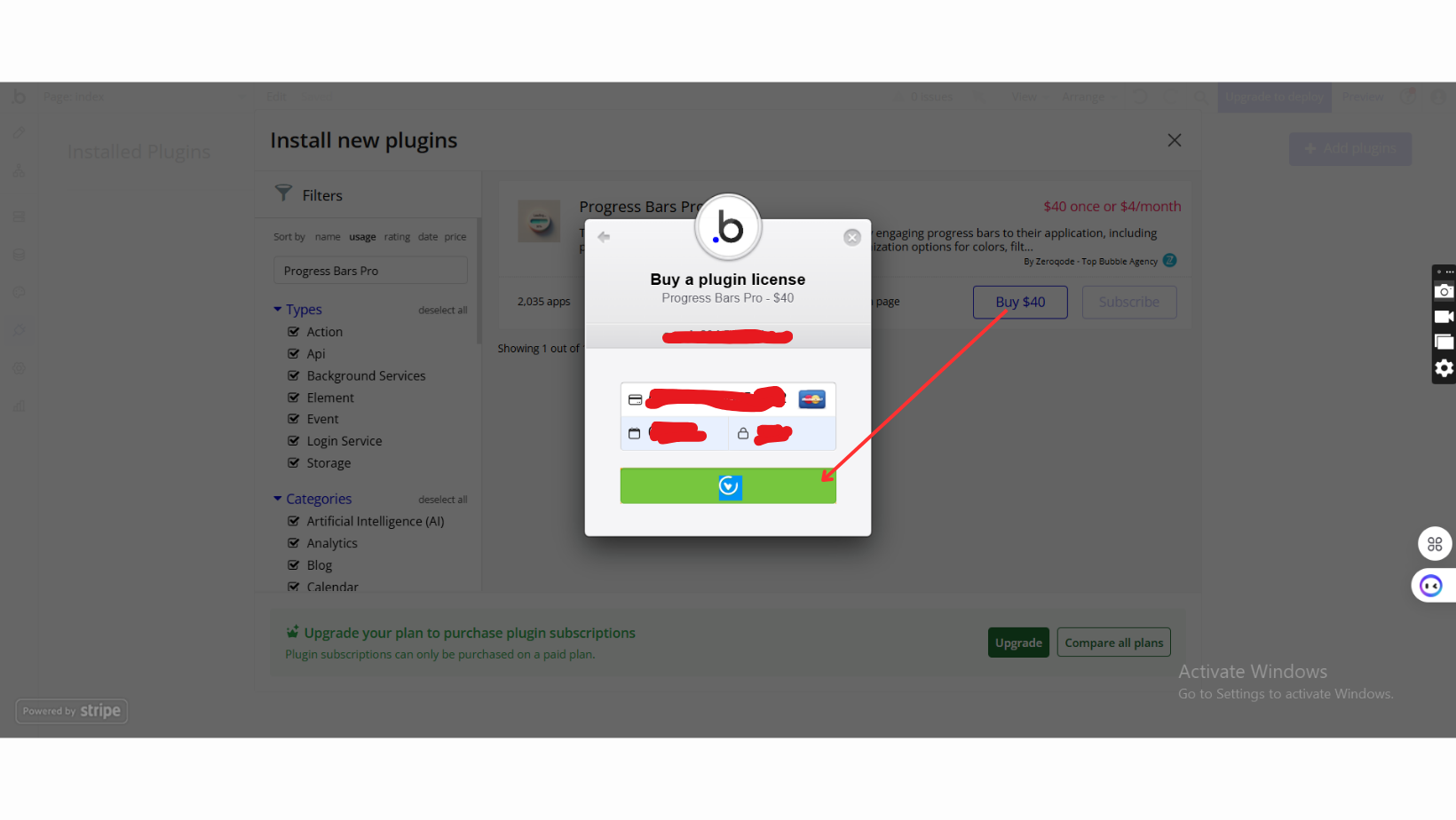
- Bubble Account: An active Bubble.io account is required to install and use the plugin.
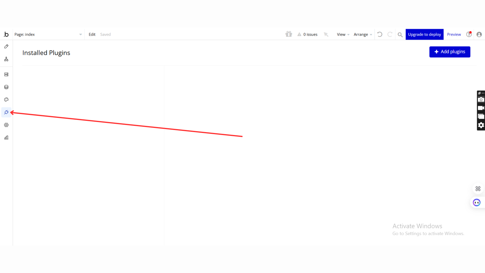
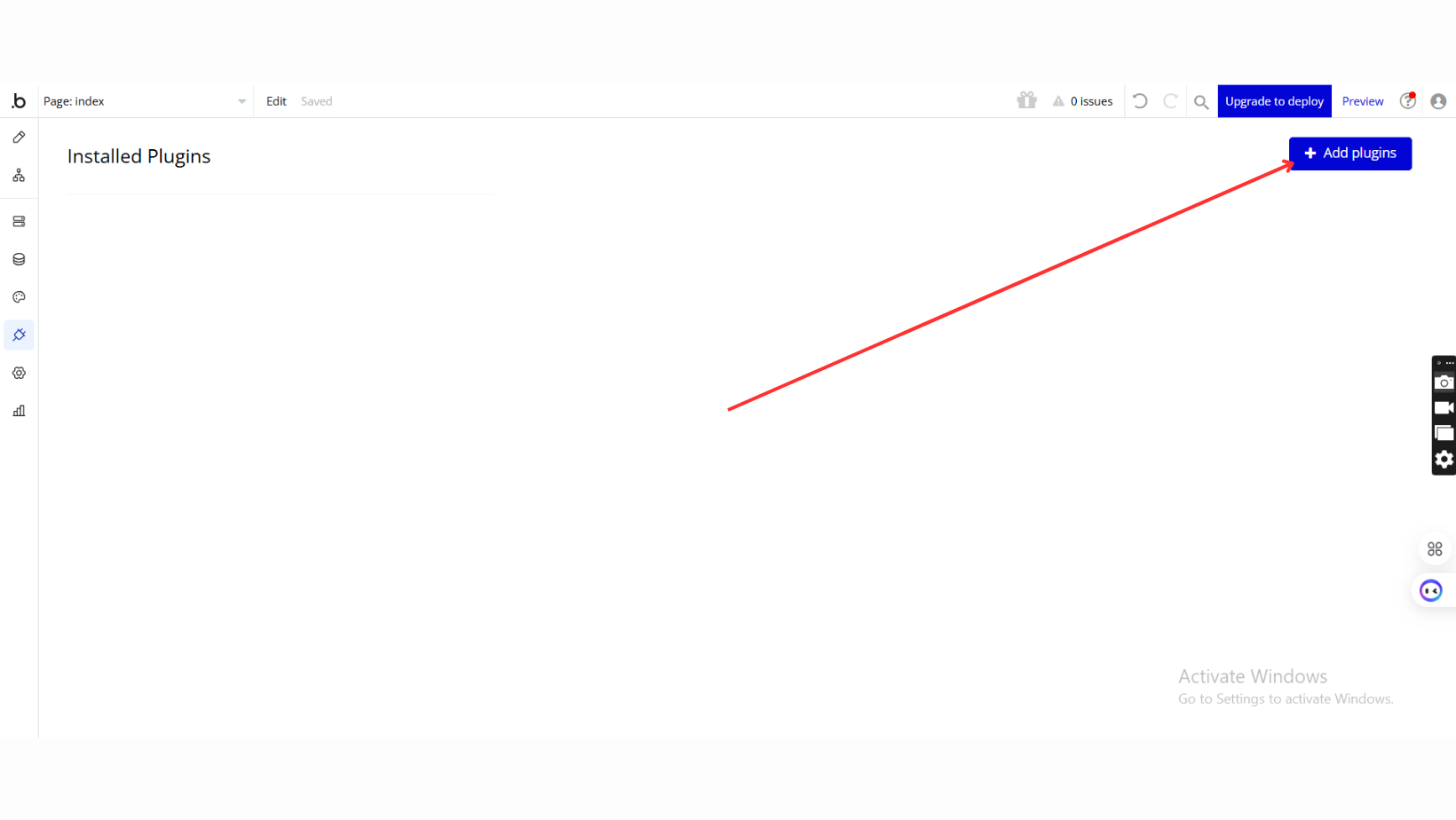
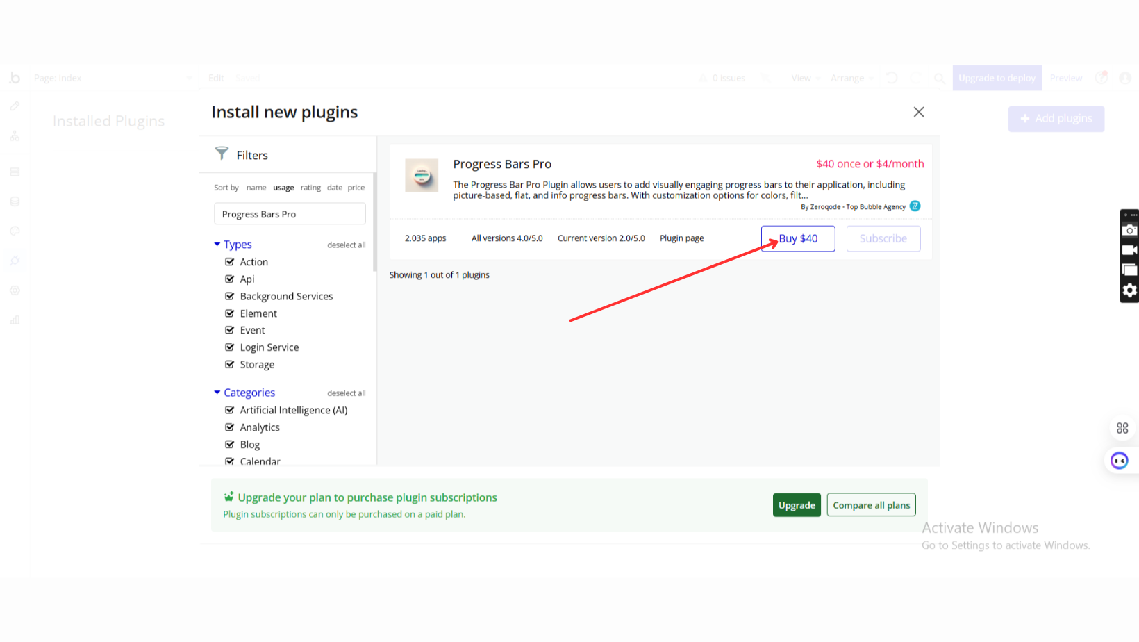
- Plugin Installation: The plugin can be installed directly from the Zeroqode Plugin Store or from the Plugins section of your Bubble Editor.
- Familiarity with Bubble Workflows: Basic knowledge of Bubble workflows is required to dynamically control progress values and actions.

How to setup
Step 1: Installation
Step 2: Place the Element
Step 3: Configure Appearance Settings
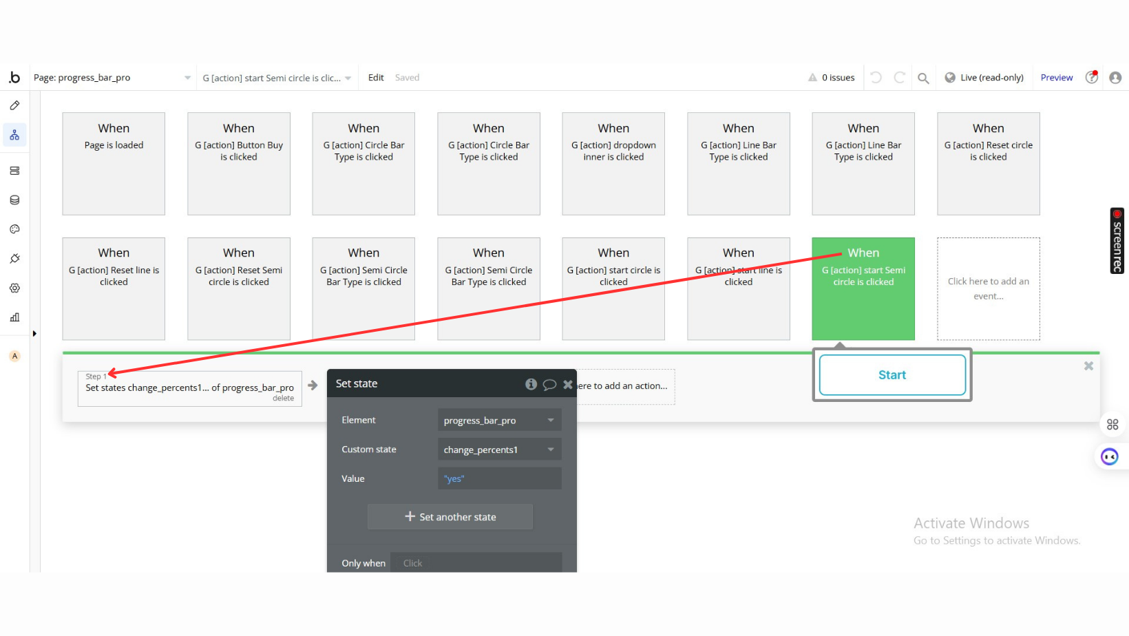
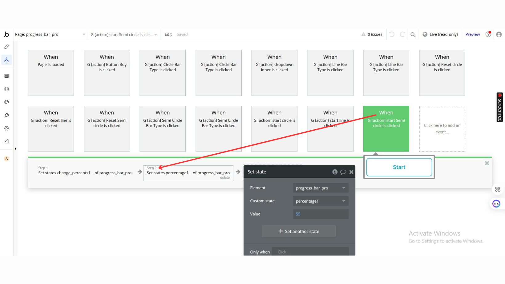
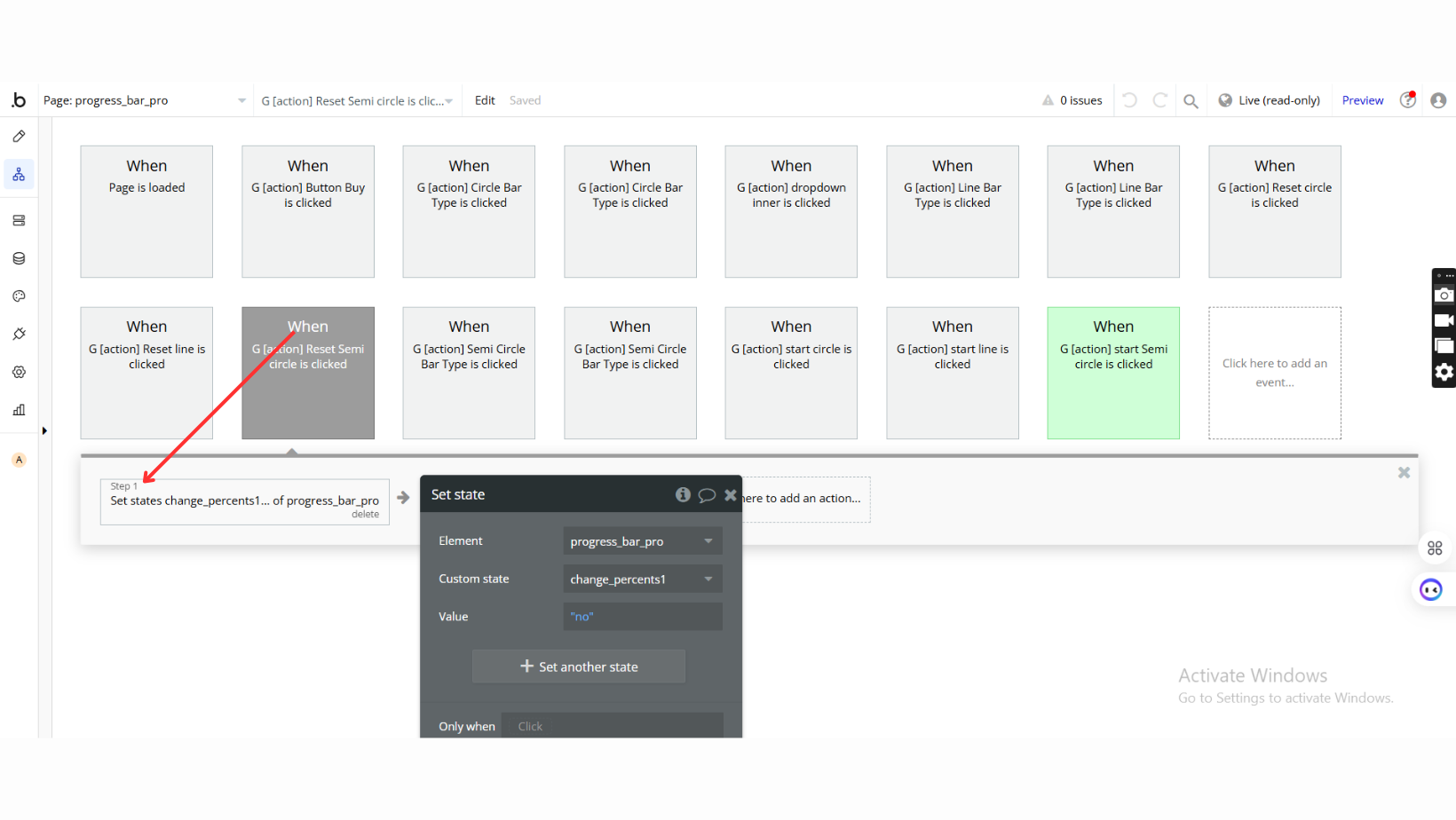
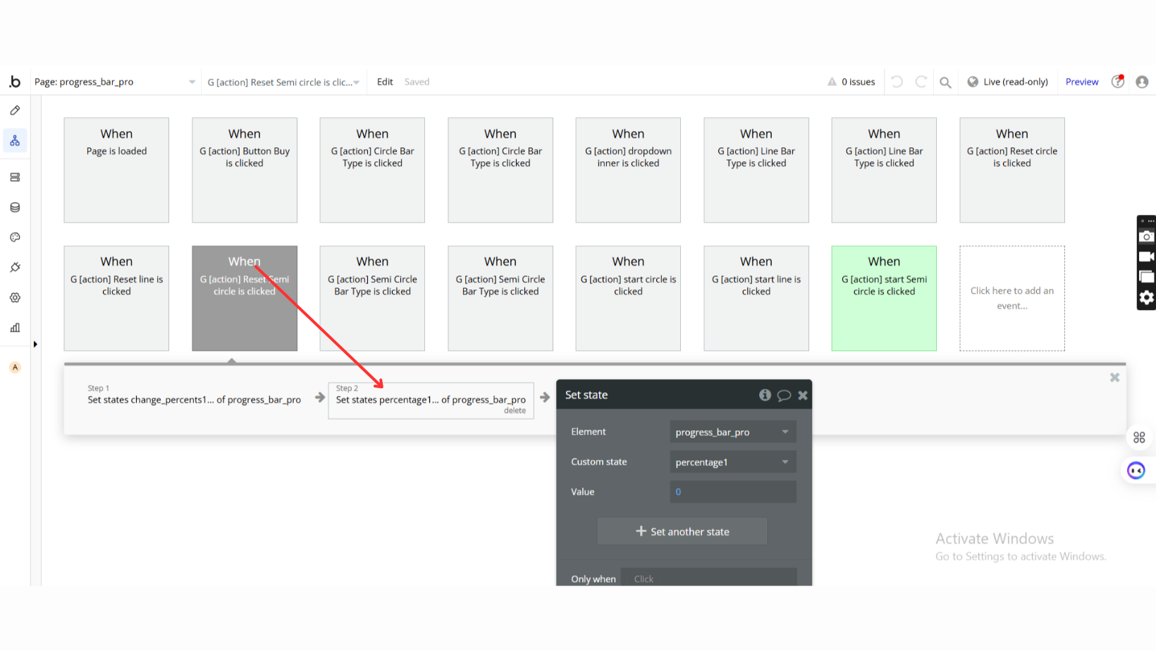
Step 4: Set Dynamic Percentage Values
Plugin Element Properties
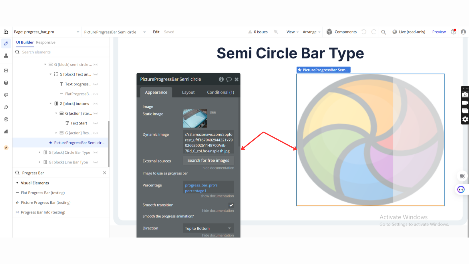
Picture Progress Bar
Fields:
Title | Description | Type |
Image | Image to use as progress bar | Image |
Percentage | Current percentage of progress bar. Set it dynamically. | Number |
Smooth transition | Apply smooth animation to the progress bar transition. | Checkbox (yes/no) |
Direction | Direction of animation: Left to Right, Right to Left, Bottom to Top, Top to Bottom | Dropdown |
Background Color | Color of the progress bar background overlay. | Color |
Opacity | Opacity of overlay (0 to 1 scale). | Number |
Image Overlay | Use a separate image as an overlay over the progress bar. | Image (optional) |
Filter | Apply a filter progressively: Blur, Sepia, Invert, Hue-Rotate, Opacity, Grayscale | Dropdown (optional) |
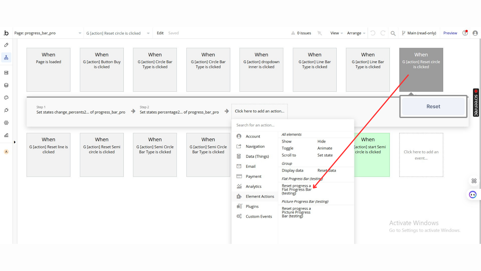
Element Actions
- Reset progress: Resets the progress bar back to 0%.
Fields:
Title | Description | Type |
Reset to 0% on completion | Reset the progress back to 0% once loading completes. | Checkbox (yes/no) |
Hide Bubble progress bar | Hide the default Bubble progress bar when enabled. | Checkbox (yes/no) |
Remove Progress Bar | Remove the progress bar completely (it cannot be used with other properties). | Checkbox (yes/no) |
Element Actions
- Start Fake Progress: Begin a simulated progress bar.
Title | Description | Type |
Time (seconds) | The total duration for the progress to complete. | Number |
Steps to reach time | Number of steps to increment the progress. | Number |
Indeterminate (time is approximate) | If enabled, the time duration is approximate. | Checkbox (yes/no) |
- Stop Fake Progress: Stop the fake progress bar ## Exposed states
Title | Description | Type |
Percent Loaded | Returns the current progress bar status as a percentage. | Number |
Is Loading? | Returns 'yes' if the progress bar is active. | Checkbox (yes/no) |
Fake Percent | Returns the current percentage for the fake progress bar. | Number |
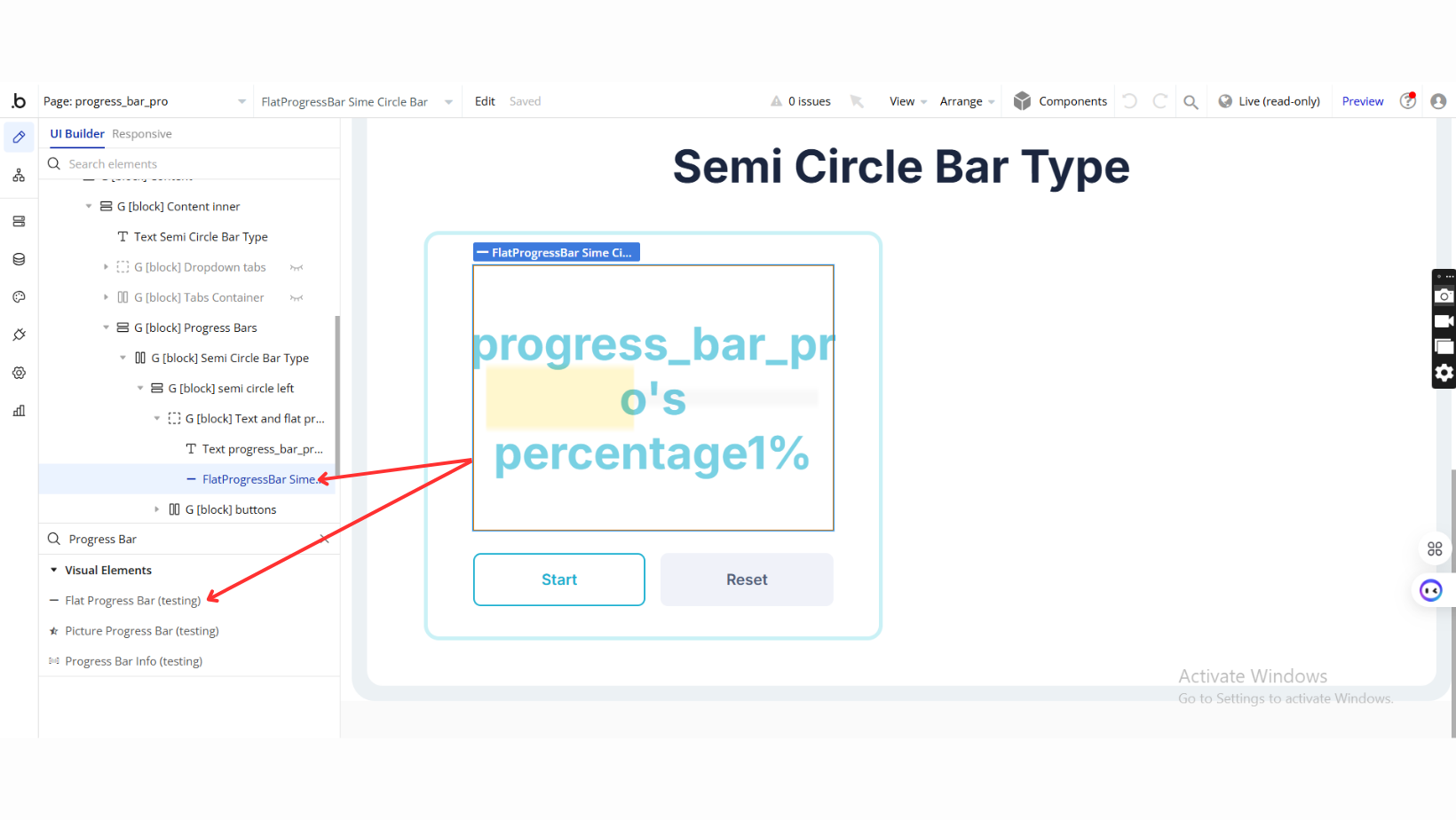
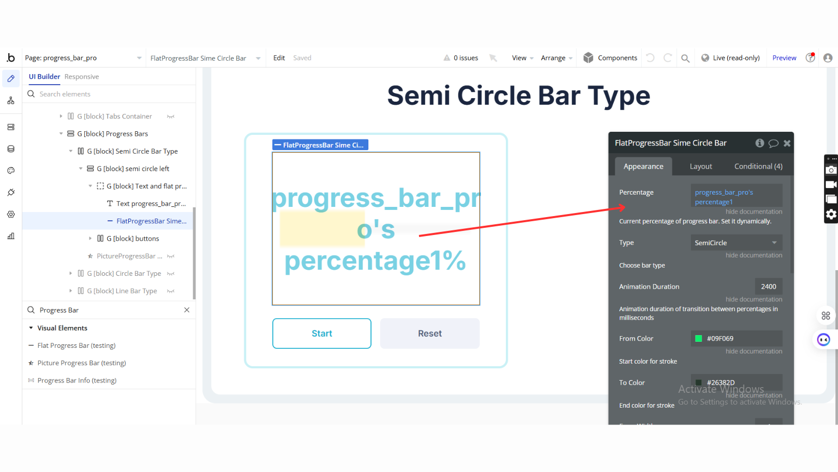
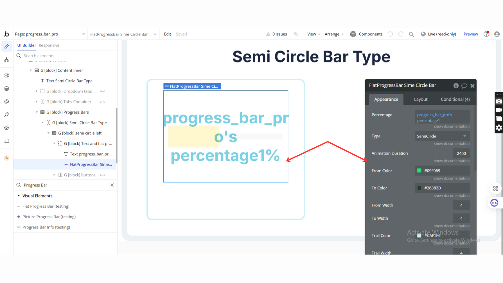
Flat Progress Bar
Fields:
Title | Description | Type |
Percentage | Current percentage of progress bar. Set it dynamically. | Number |
Type | Choose the type of progress bar: Line, Circle, SemiCircle. | Dropdown |
Animation Duration | Duration of transition between progress percentages (ms). | Number |
From Color | Starting color of the progress bar stroke. | Color |
To Color | Ending color of the progress bar stroke. | Color |
From Width | Starting width of the progress bar stroke. | Number |
To Width | Ending width of the progress bar stroke. | Number |
Trail Color | Color of the trail (background) behind the progress. | Color |
Trail Width | Width of the trail behind the progress. | Number |
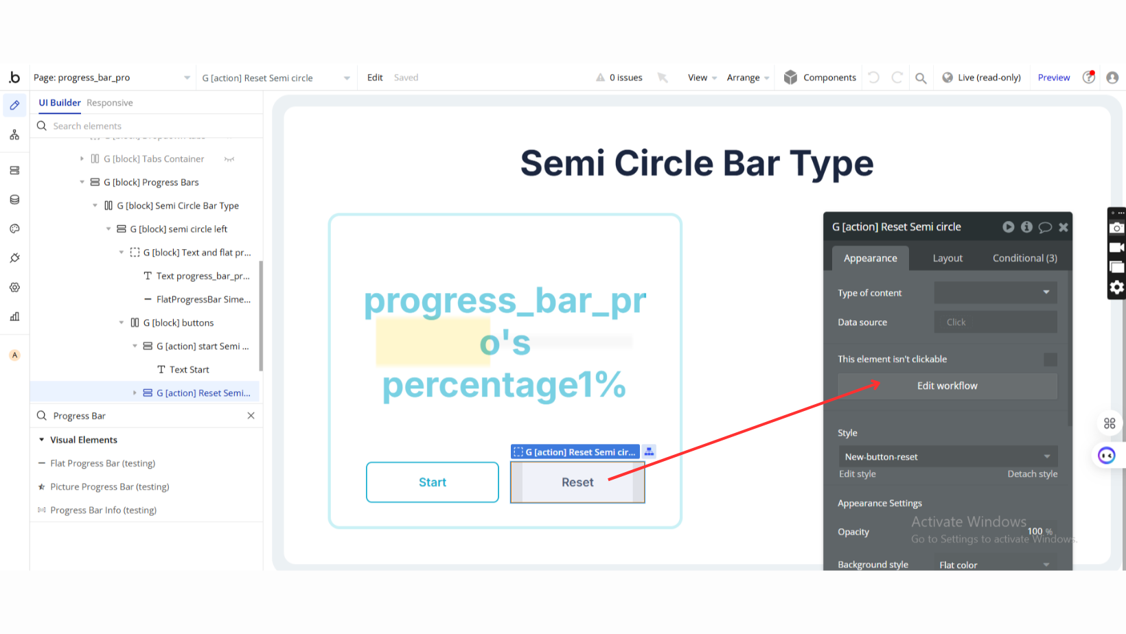
See Workflow Example
