
Link to the plugin page: https://zeroqode.com/plugin/-circular-sliders-plugin-for-bubble-1739738284795x235803144487424000
Demo to preview the plugin:
Introduction
This plugin allows you to add Circular Sliders to your Bubble application.
FEATURES:
- Set Minimum/Maximum value
- Autobinding on parent group’s thing
- Access to the current value
- Tooltip displayed in the center of the slider
- Set Initial Value
- Enable Animations
- Set Handle and Slider Shape
- Specify color of handle, path and range
- Specify the Radius (size) of the slider and more!

How to setup
- Add the Element to Your Page.
In the Bubble Editor, go to the Visual Elements panel and drag the Circular Slider element into your design.
- Customize the Slider.
Use the property editor on the right panel to customize the appearance and behavior of the slider.
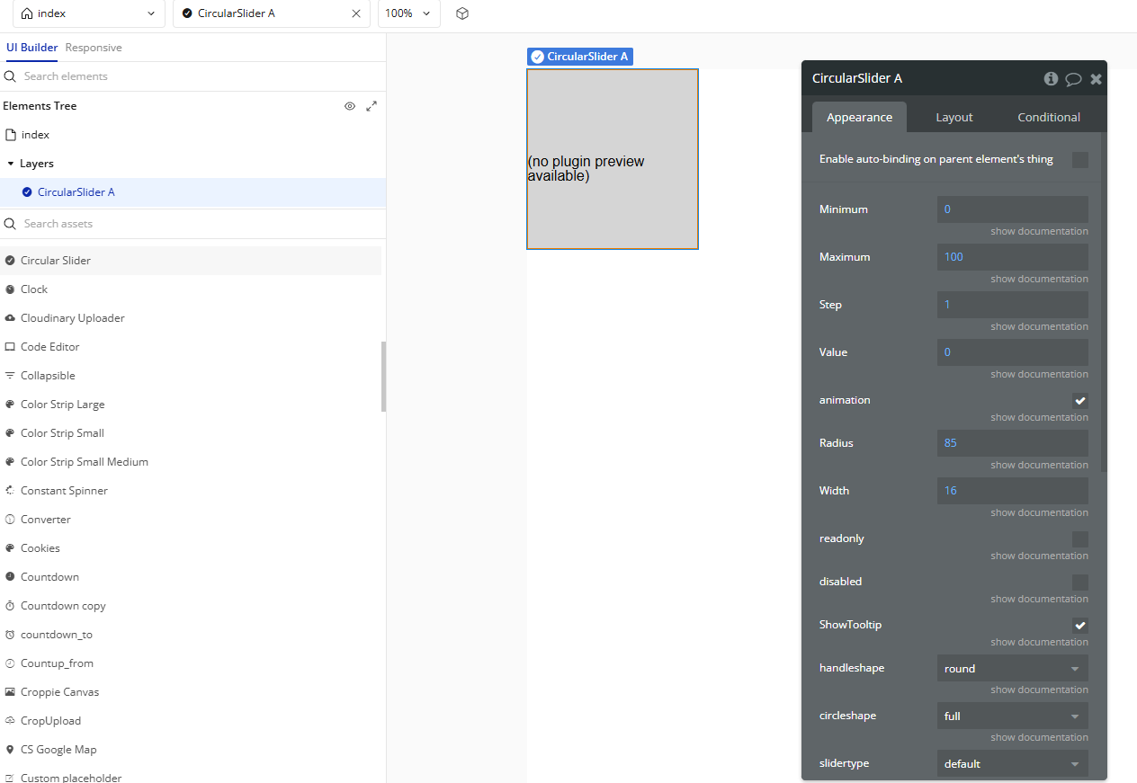
Plugin Element Properties
Circular Slider
Fields:
Title | Description | Type |
Minimum | The minimum (starting) value of the slider. | Number |
Maximum | The maximum (end) value of the slider. | Number |
Step | Specify by how much a user can adjust the value of the slider. | Number |
Value | The starting value of the slider. Please choose a value that is within the minimum and maximum range specified above. | Number |
Animation | Enable animations for the slider. | Checkbox (yes/no) |
Radius | The radius (size) of the slider. You will have to adjust the size of the element when increasing the radius. | Number |
Width | The width of the Slider Path. | Number |
Readonly | Enable if you don’t want users to change the value of the slider. | Checkbox (yes/no) |
Disabled | Disable the Slider. | Checkbox (yes/no) |
ShowTooltip | Specify whether a tooltip with the current value should be displayed in the center of the slider. | Checkbox (yes/no) |
Handleshape | Choose a shape for the Handle of the slider. Available options: round, square, dot. | Dropdown |
Circleshape | Choose the shape of the slider. Available options: full, half-top, half-bottom, half-left, half-right, pie. | Dropdown |
Slidertype | Specify the type of Slider. Available options: default, min-range. | Dropdown |
Range Color | Choose a color for the range. Only applies to Sliders of type min-range. | Color |
Path Color | Choose a color for the path. | Color |
Handle Color | Choose a color for the handle of the slider. | Color |
Exposed states
Title | Description | Type |
Value | The numeric value of the Slider | Number |
